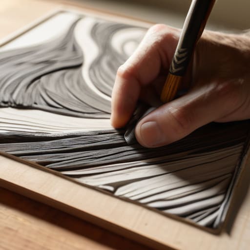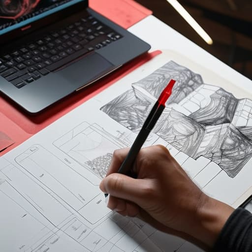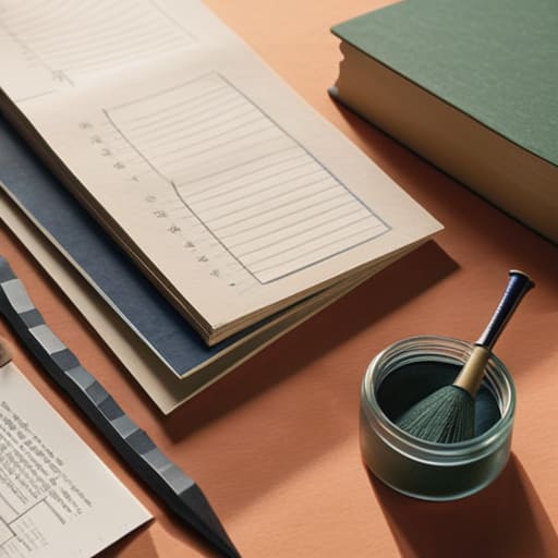
Creative research for impactful design.

The Importance of Research in Design

I remember sitting in a cramped studio back in the late nineties, the air thick with the scent of spray adhesive and stale coffee, surrounded by literal mountains of physical paper clippings. We weren’t just scrolling through a curated feed of aesthetic perfection; we were digging through the grit of real-world textures and forgotten typography. Today, I see so many designers mistake a quick Pinterest scroll for actual creative research, treating it like a superficial hunt for “vibes” rather than a deep, intentional investigation. They’re chasing a polished, frictionless illusion that ultimately leaves their work feeling hollow and utterly devoid of soul.

I’m not here to give you a checklist of expensive software or a lecture on data analytics that feels disconnected from the actual act of making. Instead, I want to talk about how we can reclaim the intentionality of our process. I’m going to share the practical, unvarnished methods I use to bridge the gap between raw inspiration and meaningful execution. We’re going to look at how to conduct creative research that respects the friction of human touch, ensuring your next project isn’t just another beautiful screen, but a piece of work with actual substance.

Table of Contents

Sharpening Sensory Observation Skills for Deeper Meaning

Sharpening Sensory Observation Skills for Deeper Meaning

To truly move beyond the superficial, we have to stop looking at screens and start looking at the world. When I’m stuck on a typeface or a brand identity, I step away from the monitor and pick up my Leica. There is a specific kind of intelligence found in the way light hits a weathered brick wall or how a shadow stretches across a matte surface. Developing your sensory observation skills isn’t about collecting more data; it’s about training your eyes to notice the intentionality of texture. If you only rely on what’s already been digitized, your work will inevitably feel like a copy of a copy.

This level of artistic investigation methods requires a certain kind of patience that our current software often discourages. Instead of rushing to a mood board, try sitting with a physical object. Feel the weight of the paper, the resistance of the ink, or the grain of a photograph. By grounding your ideation through visual research in these tactile realities, you bring a layer of soul back into the digital space. We aren’t just arranging pixels; we are translating the physical world into a digital language that still feels human.

Artistic Investigation Methods That Honor the Maker
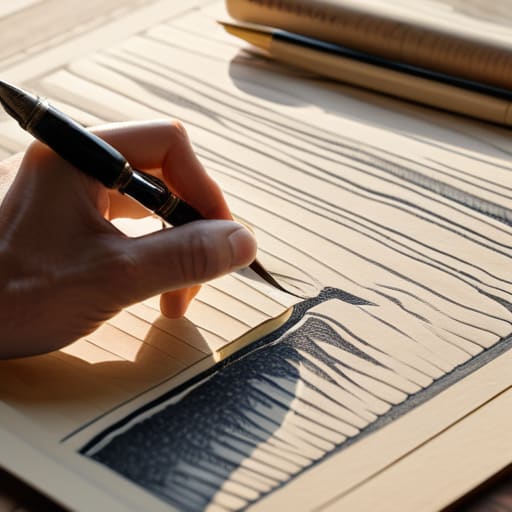
Artistic Investigation Methods That Honor the Maker

When I sit down with a new client, I find that the most profound breakthroughs rarely come from scrolling through endless Pinterest feeds. Instead, I lean into more rigorous artistic investigation methods that require actual presence. One approach I swear by is the “analog detour.” Before I ever touch a vector point in Illustrator, I spend time sketching the weight of a letterform or the way light hits a textured paper stock. This isn’t just a nostalgic habit; it’s a way to ground my creative process methodology in something tactile. By forcing myself to translate a concept through a fountain pen first, I avoid the trap of settling for the first “clean” digital solution the software suggests.

I also advocate for a more disciplined approach to ideation through visual research. Rather than just collecting images that “look cool,” I focus on dissecting why a specific composition works. I look for the tension in a layout or the specific way a color palette evokes a sense of history. It’s about moving beyond mere decoration and toward a deeper understanding of how visual elements communicate intent. When we treat our research as a form of study rather than a quick search, we build work that actually has something to say.

Practical Anchors for Your Research Process

  • Step away from the screen to find your baseline. If you spend your entire research phase looking at Pinterest or Behance, you aren’t researching; you’re just participating in a feedback loop of existing trends. Go to a library, a museum, or even a hardware store. Look at how things are physically constructed.
  • Document the “why,” not just the “what.” When you find a typeface or a color palette that works, don’t just save the screenshot. Write down why it hits you. Is it the tension between the strokes? The way the weight shifts? Capture the feeling so you can replicate the intent, not just the aesthetic.
  • Embrace the messy middle. Your sketchbook shouldn’t look like a finished brand identity; it should look like a struggle. Use your fountain pen to map out connections between disparate ideas. The friction of physical sketching often reveals connections that a clean digital canvas hides.
  • Treat your archives as a living resource. Don’t let your past inspirations die in a forgotten folder. Periodically revisit your old research notes and see how they intersect with your current projects. Often, the most profound breakthroughs come from combining an old observation with a new problem.
  • Test for tactile resonance. Even in digital design, ask yourself how a concept would feel if it were made of paper, wood, or metal. If a design concept only works because of a specific digital gradient and fails the “materiality test,” it probably lacks the structural integrity needed to stand the test of time.

The Intentionality of the Process

Stop treating research as a checkbox for a client presentation; treat it as the tactile foundation that prevents your work from feeling hollow or derivative.

Lean into the friction of physical sketching and analog observation to find the nuances that a digital search engine will always overlook.

Use your findings not to automate your decisions, but to ground your creative intuition in something human, messy, and real.

Beyond the Moodboard

Creative research isn’t about collecting a buffet of aesthetics to mimic; it’s about digging into the texture of why things work, so we can build something with actual weight instead of just more digital noise.

Ingrid Bellamy

The Intentional Path Forward
The Intentional Path Forward through creative research.

Ultimately, creative research isn’t about amassing a digital library of mood boards or scrolling through endless feeds of “inspiration” that all look the same. It is about the discipline of looking closer—using sensory observation and tactile investigation to find the soul within a concept. When we move beyond the surface level, we stop designing for algorithms and start designing for people. By integrating these methods, we ensure that our work isn’t just a collection of polished assets, but a deliberate response to the world around us, grounded in something much deeper than a trending color palette.

As you step away from your screen and back into your process, I encourage you to embrace the messiness of the search. Don’t be afraid of the slow, sometimes frustrating moments where nothing seems to click; that is often where the most meaningful breakthroughs are hiding. We are more than just operators of software; we are curators of meaning. Let your research be the bridge that connects your technical skill to your human intuition. Build something that doesn’t just fill a screen, but actually demands to be felt.

Frequently Asked Questions

How do I balance the need for structured research with the messy, unpredictable nature of actual creative intuition?

Think of structure as the armature, not the sculpture. I use research to build a reliable skeleton—the typography rules, the user constraints, the color theory. But once that frame is set, you have to step away from the grid. Let the research sit in the back of your mind while you sketch aimlessly or tinker with a lens. The magic happens in the tension between the data you’ve gathered and the gut feeling that tells you the data is wrong.

In a world obsessed with data and user metrics, how can I justify spending time on sensory or analog research methods?

Data tells you what people did, but it rarely tells you why it felt meaningful. Metrics are a rearview mirror; they track behavior, not intention. When I advocate for analog research, I’m not being nostalgic—I’m being rigorous. Sensory exploration uncovers the nuances that a heat map misses: the weight of a texture, the rhythm of a typeface, the “soul” of a brand. We use these methods to build depth that data simply cannot quantify.

How do I prevent my research from becoming a mere collection of references that ends up diluting my own original voice?

The trap is thinking that a mood board is a destination. It isn’t. If you’re just collecting “vibes,” you’re just curating, not creating. To protect your voice, treat every reference as a question rather than an answer. Ask why a specific typeface or color palette works, then strip it down to its core principle. Use the reference to understand the mechanics, but leave the aesthetic to your own hand.
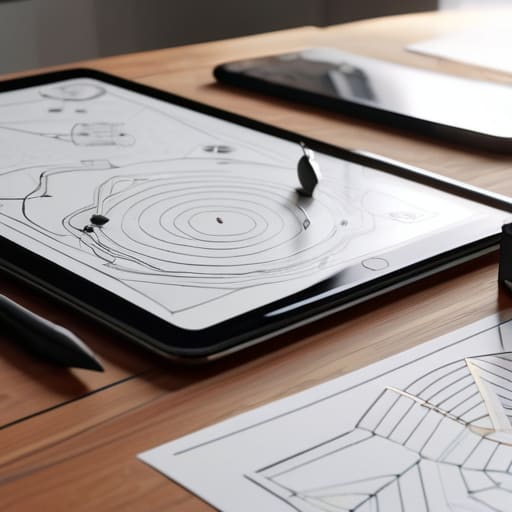
Digital product user flow mapping process.

Mapping User Flows for Digital Products

I remember sitting in a dim studio back in the late nineties, the smell of spray adhesive and fresh ink heavy in the air, trying to trace a logical path through a complex layout using nothing but X-Acto blades and physical strips of paper. There was a tactile weight to every decision, a sense that every line drawn had a consequence. Today, I see designers drowning in bloated, automated software, clicking through endless, sterile diagrams that feel more like math homework than human experience. We’ve turned user flow mapping into this high-speed, frictionless exercise of moving digital boxes around a screen, but in doing so, we’ve lost the soul of the journey.

I’m not here to teach you how to master a new piece of expensive software or how to make your diagrams look pretty for a stakeholder presentation. Instead, I want to talk about how we can approach user flow mapping as a way to respect the actual, messy reality of human behavior. I promise to share the practical, unvarnished lessons I’ve learned from twenty years in the trenches—focusing on how to design paths that don’t just move users from point A to point B, but actually honor their intent.

Table of Contents

Beyond Pixels Respecting Friction Points in Ux

Beyond Pixels Respecting Friction Points in Ux

In my years of type design, I’ve learned that the most beautiful letterforms are defined by the negative space around them. The same logic applies to the digital experience. We often treat the ux design process as a race toward the “path of least resistance,” aiming to strip away every possible obstacle. But when we eliminate every moment of hesitation, we risk creating a hollow, mindless interaction. If a user moves through an interface without ever feeling the weight of their decisions, they aren’t engaging with your brand; they are simply reacting to stimuli.

Instead of viewing every hurdle as a failure, we need to identify meaningful friction points in UX that actually demand attention. Think of it like the tactile resistance of a well-tuned Leica shutter—that slight mechanical delay tells your brain that something significant is happening. When we are wireframing user paths, we should intentionally design pauses around critical decisions, such as a subscription confirmation or a high-stakes purchase. By respecting these moments of cognitive friction, we move away from mindless scrolling and toward a more intentional, human-centric interaction.

Visualizing the Human Journey Through User Journey Visualization

Visualizing the Human Journey Through User Journey Visualization

When we move from abstract theory into the actual act of user journey visualization, I find it helpful to step away from the screen entirely. I often grab my sketchbook to trace the emotional arc of a user, rather than just the technical clicks. It’s easy to get lost in the sterile logic of a flowchart, but a journey isn’t just a series of binary decisions; it’s a sequence of feelings. If we only focus on the shortest distance between point A and point B, we miss the nuance of why a user might hesitate or feel overwhelmed.

As you begin wireframing user paths, try to treat the layout as a narrative structure. Instead of just mapping out functional requirements, look for the rhythm of the experience. Are you providing enough breathing room, or are you crowding the user with too much information at once? By applying fundamental information architecture principles to your visual maps, you create a blueprint that respects the user’s cognitive load. We aren’t just building paths; we are designing the space in which a person lives and breathes digitally.

The Tactile Blueprint: Five Ways to Map with Purpose

  • Step away from the screen. Before you touch a single pixel in Figma, grab that sketchbook and a pen. There is a specific kind of cognitive clarity that comes from the physical resistance of paper that a digital canvas simply cannot replicate.
  • Map the “why,” not just the “how.” A flow that only tracks clicks is a hollow skeleton. I want to see the intention behind the movement—why is the user moving from point A to point B, and what emotional state are they carrying with them?
  • Don’t fear the dead ends. In real life, people get distracted, they change their minds, or they simply stop. Your map should account for these human detours rather than assuming a perfect, linear progression through your interface.
  • Treat decision nodes like typographic hierarchy. Just as a well-set typeface guides the eye to what matters most, your flow nodes should clearly distinguish between a trivial choice and a high-stakes moment that requires user focus.
  • Audit for “frictionless” fatigue. We often obsess over removing every ounce of resistance, but some friction is necessary. If a user is performing a sensitive action, like deleting data or making a purchase, design a moment of intentional pause to ensure they are acting with purpose.

The Craft of Intentional Flow

Stop designing for pure speed; instead, identify the “meaningful pauses” in a user flow where a person needs to reflect, confirm, or feel a sense of accomplishment.

Treat your user journey maps as living sketches rather than rigid blueprints, allowing room for the messy, non-linear ways humans actually interact with digital tools.

Use flow mapping to protect the user’s cognitive load, ensuring that every step serves a clear purpose rather than just adding another layer of digital noise.

The Architecture of Intent

A user flow isn’t just a blueprint for a seamless transaction; it’s a map of human decision-making. If your flow is too smooth, you aren’t designing an experience—you’re designing a slide, and you’re stripping away the very moments where a user actually engages with your brand.

Ingrid Bellamy

The Intentional Path Forward

The Intentional Path Forward user flow map.

At the end of the day, user flow mapping isn’t about drawing lines between boxes on a digital canvas; it is about understanding the rhythm of human behavior. We have spent this time looking at how to respect the necessary friction points and how to visualize a journey that feels less like a machine and more like a conversation. By moving beyond mere efficiency and focusing on intentionality, we transform a simple sequence of clicks into a meaningful experience. Remember that a map is only as good as its ability to guide someone through a moment of uncertainty, ensuring that every transition feels earned rather than forced.

As you return to your Figma files or your physical sketchbooks, I challenge you to look past the seamlessness we are often taught to chase. The most beautiful interfaces aren’t the ones that eliminate every obstacle, but the ones that acknowledge the user’s humanity. Don’t be afraid to build in the pauses, the reflections, and the small moments of deliberate thought that make digital interaction feel tactile and real. We are not just optimizing conversion rates; we are designing the way people inhabit digital spaces. Let’s make sure those spaces are worth living in.

Frequently Asked Questions

How do I balance the need for a streamlined user path with the intentional friction required for meaningful decision-making?

Think of it like the difference between a sliding glass door and a heavy, brass-handled entryway. Both get you inside, but only one tells you that you’ve arrived. To balance this, identify your “high-stakes” nodes—the moments where a mistake is costly or a choice is significant. That’s where you introduce intentional friction. Slow the user down with a confirmation or a thoughtful prompt. For the mundane tasks? Keep them seamless. Use friction as a tool for presence, not a barrier to progress.

At what stage in the design process should I move from rough, hand-drawn sketches of flows to high-fidelity digital documentation?

Don’t rush to the screen. I’ve seen too many designers jump into Figma before they’ve actually solved the logic of the flow. Keep your fountain pen moving through the messy, hand-drawn stage until the structural connections feel solid. Only move to high-fidelity documentation once the “why” of the path is undeniable. Digital tools are for refining and communicating precision; sketches are for the raw, necessary work of thinking.

How can I ensure that my user flow maps reflect actual human behavior rather than just the "idealized" path the software expects them to take?

Stop designing for the “perfect” user. We all know that person doesn’t exist. To find the truth, you have to look at the messy edges—the moments where someone gets distracted, misinterprets a label, or hits a dead end. Instead of just mapping the golden path, map the detours. Watch how people actually stumble through your prototype. It’s in those unintended loops and pauses where the real human story lives.

Effective branding for freelancers and creatives.

Building a Brand as a Freelance Creative

I remember sitting in a cramped studio in Providence back in the late nineties, surrounded by the sharp, chemical scent of spray mount and the rhythmic thwack of an X-Acto blade hitting a cutting mat. Back then, we didn’t have algorithms telling us what “aesthetic” was trending; we had intuition and a physical sense of balance. Today, I see so many people treating branding for freelancers like a checklist of digital buzzwords or a race to see who can buy the most expensive template. It’s become this hollow, automated performance that lacks any real soul or intentionality.

I’m not here to sell you on a magic formula or a way to trick an algorithm into noticing you. Instead, I want to talk about building a visual identity that actually holds weight. I’m going to share what I’ve learned from two decades in the trenches—moving from physical paste-ups to digital interfaces—to help you craft a brand that respects the human on the other side of the screen. We’re going to focus on substance over noise, ensuring your work feels less like a digital commodity and more like a deliberate craft.

Table of Contents

Defining Your Unique Freelance Value Proposition

Defining Your Unique Freelance Value Proposition.

Before you even touch a pixel or pick a color palette, you have to answer a difficult question: Why you? In a sea of endless digital noise, a generic portfolio is just more clutter. Defining your freelance value proposition isn’t about listing your software proficiencies or claiming you’re “passionate about design”—we all are. It’s about identifying the specific friction you remove for your clients. Are you the strategist who translates complex data into elegant visuals, or the meticulous craftsman who brings a sense of tactile warmth to digital interfaces?

Stop trying to be everything to everyone. When you attempt to cast too wide a net, you end up looking like a commodity rather than a specialist. True freelance service differentiation comes from leaning into your specific perspective and the unique way you solve problems. It’s the difference between being a pair of hands for hire and being a vital partner in a client’s success. Once you nail down that core intention, every other piece of your professional identity will finally start to feel cohesive and purposeful.

Visual Identity for Solo Entrepreneurs With Purpose

Visual Identity for Solo Entrepreneurs With Purpose

Once you’ve nailed down your value proposition, the next step is translating that internal logic into something visual. For many, a visual identity for solo entrepreneurs becomes a checklist of trendy colors or a sleek font found on a stock site. But if you want to build a brand that actually sticks, you have to move past the aesthetics of “looking professional” and start thinking about intentionality. Your choice of typography, the weight of your lines, and even the negative space in your layouts should act as a silent extension of your work ethic.

I often tell my clients that your visual language is the first handshake you offer a potential collaborator. If your design feels cluttered or indecisive, it undermines your efforts at building authority as a freelancer, no matter how talented your actual service might be. Aim for a cohesive system that feels as deliberate as a hand-drawn sketch. When your visual presence aligns perfectly with the way you solve problems, you stop chasing clients and start attracting the right ones.

Five Ways to Infuse Intentionality into Your Personal Brand

  • Stop chasing trends and start building a system. A brand isn’t a collection of pretty colors you found on Pinterest; it’s a consistent set of rules—typography, spacing, and tone—that makes your work recognizable even when your logo isn’t visible.
  • Curate your portfolio with restraint. It is tempting to show every project you’ve ever touched, but a freelancer’s brand is defined as much by what they reject as what they accept. Only show the work that reflects the person you want to be hired as tomorrow.
  • Let your voice carry the weight. In a sea of polished, automated-sounding copy, your specific way of seeing the world is your greatest asset. Write like you speak; don’t let “professionalism” strip away the texture of your actual personality.
  • Treat your client experience as a design deliverable. Branding isn’t just the PDF you send at the end; it’s the way your onboarding feels, the clarity of your emails, and the friction (or lack thereof) in your workflow. That is where your reputation is actually built.
  • Respect the medium. Whether you are designing a website or a business card, ensure the digital and physical touchpoints feel like they belong to the same soul. If your brand feels disjointed between a screen and a printed invoice, you’ve lost the thread of your own story.

The Intentional Freelancer’s Checklist

Stop chasing trends that expire in six months; build a visual foundation that feels as permanent and purposeful as a well-designed typeface.

Your brand isn’t a collection of pretty assets, it’s the way you communicate your values through every touchpoint, from your first email to your final invoice.

Prioritize clarity over clutter—if a design element doesn’t serve your core message, it’s just noise that’s distracting from your actual craft.

Branding isn’t a collection of pretty assets meant to decorate your website; it is the intentional way you honor the relationship between your craft and the person receiving it.

Ingrid Bellamy

The Intentional Path Forward

The Intentional Path Forward for freelance branding.

Building a brand as a freelancer isn’t about chasing every fleeting design trend or trying to mimic the polished, hollow perfection of a massive agency. It’s about the synthesis of your unique value proposition and a visual identity that actually speaks your truth. We’ve looked at how to define what you bring to the table and how to translate that into a cohesive aesthetic that honors your specific perspective. When you align your purpose with your visual presentation, you move away from being just another service provider and begin to occupy a space that is singularly yours.

As you move forward, I encourage you to resist the urge to automate your soul away. In a world increasingly crowded by algorithmic noise, there is a profound, quiet power in intentionality. Don’t be afraid of the slight imperfections that signal a human hand at work; those are often the very things that build genuine trust with your clients. Treat your brand not as a static set of rules, but as a living, breathing extension of your craft. Build something that doesn’t just fill a screen, but actually leaves a mark.

Frequently Asked Questions

How do I maintain a consistent visual identity when my client work often requires me to adopt their specific aesthetic?

Think of your personal brand as your studio, not your portfolio. Your client work is the art you create inside those walls, but your identity is the architecture itself. I maintain consistency through my “structural constants”: a specific way I handle typography, a disciplined grid system, or a signature approach to whitespace. Even when the colors and imagery change to suit a client, the underlying intentionality and the way you present your process remain unmistakably yours.

At what point does my personal brand start to feel too "corporate" or disconnected from the hands-on craft I actually do?

It happens the moment you start prioritizing “polish” over personality. When your brand begins to sound like a sanitized LinkedIn template or your visuals feel like stock photography, you’ve lost the thread. If you can’t see the friction of your own process—the messy sketches, the intentional choices, the human error—in your presentation, you’ve gone corporate. Don’t aim for seamless; aim for soulful. If it feels too slick, bring back the grain.

How can I balance the need for a polished professional presence with the authentic, human friction that makes my work unique?

Don’t mistake polish for perfection. A perfectly sterile brand feels like a template, and templates are forgettable. I find the balance by treating my professional presence as the framework—the grid, if you will—and my unique “friction” as the content within it. Use clean typography and a cohesive color palette to establish trust, but let your voice, your process, and even your minor imperfections provide the soul. Structure provides the professionalism; the human touch provides the connection.

Professional portfolio website building design process.

Building a Professional Design Portfolio

I remember sitting in a cramped studio back in the late nineties, the smell of spray mount and fresh ink heavy in the air, manually cutting out letterforms for a layout that would eventually live on a physical page. There was a certain rhythm to that friction—a tactile certainty that we were making something real. Today, when I see the frantic, over-engineered chaos surrounding portfolio website building, I feel like we’ve lost that connection. Everyone is chasing the latest high-octane site builder or trying to automate their entire presence with tools that strip away the soul of the work. We’ve traded intentionality for sheer speed, and it shows.

I’m not here to sell you on a flashy new plugin or a way to trick an algorithm into noticing you. Instead, I want to talk about how to approach portfolio website building as an extension of your actual craft. I promise to share the honest, unvarnished lessons I’ve learned from two decades of moving between the physical and digital worlds. We are going to focus on creating a digital space that honors your process and gives your best work the room it actually needs to breathe.

Table of Contents

Choosing Platforms That Empower Your Creative Agency

Choosing Platforms That Empower Your Creative Agency

When I sit down to advise a boutique agency, the first thing I do is ask them to look past the shiny marketing of various portfolio website platforms. It is easy to get seduced by the sheer speed of a drag-and-drop builder, but speed often comes at the cost of soul. If you are building a site that feels like a cookie-cutter template, you aren’t actually showcasing creative work; you are just occupying space. You need a tool that offers enough structural integrity to support your specific aesthetic without forcing you into a rigid, pre-defined box.

The goal isn’t just to host images; it is about mastering visual storytelling in web design. I tend to steer my clients toward platforms that allow for granular control over typography and negative space. Whether you choose a highly customized CMS or a more streamlined site builder, the choice should be dictated by how much friction you are willing to tolerate in exchange for true creative agency. Your platform should act as a quiet, sturdy frame for your art, not a loud, distracting centerpiece that competes with the very work it is meant to protect.

Visual Storytelling in Web Design Over Mere Decoration

Visual Storytelling in Web Design Over Mere Decoration

We often fall into the trap of thinking a portfolio is just a gallery of finished assets, a digital filing cabinet of “what I did.” But if you want to build a truly professional digital presence, you have to move beyond the static grid. Visual storytelling in web design isn’t about adding flashy animations or heavy parallax effects that slow everything down; it’s about the narrative arc of your process. I want to see the messy sketches in the margins and the failed iterations that led to the final solution. When you show the “why” behind the “what,” you aren’t just showcasing creative work—you are demonstrating your thinking.

The goal is to create a cohesive flow where the layout itself acts as a silent guide. Instead of treating every project as an isolated island, use typography, white space, and intentional pacing to direct the eye. When you prioritize the user experience for portfolios, you respect the viewer’s time. You aren’t just filling space; you are curating an experience that allows your craft to breathe and your methodology to speak for itself.

The Architecture of Intent: Five Principles for a Meaningful Portfolio

  • Curate with restraint. It is tempting to show every project you’ve ever touched, but a portfolio is a curated exhibition, not an archive. If a piece doesn’t represent the work you want to do tomorrow, leave it in the drawer.
  • Respect the white space. In my early days of paste-ups, we understood that the space between elements was just as vital as the elements themselves. On a screen, white space isn’t “empty”—it’s the breath that allows your work to be seen without suffocating it.
  • Show the friction, not just the finish. A polished mockup is easy to produce, but clients hire you for your thinking. Include sketches, failed iterations, or the messy logic behind a typeface. Let them see the human hand in the process.
  • Prioritize legible hierarchy over trendy typography. I see too many designers choosing “vibe” over function. If a visitor has to struggle to navigate your site or read your case studies, you haven’t designed a portfolio; you’ve designed an obstacle course.
  • Build for longevity, not for the algorithm. Trends in web animation and UI kits move with a frantic, exhausting speed. Build your site on a foundation of solid principles and clean structure so it feels as intentional three years from now as it does today.

The Intentionality of the Digital Portfolio

Treat your website as a living extension of your studio, not just a digital filing cabinet for finished files.

Prioritize clarity and white space over complex animations; give your best work the room it needs to breathe and command attention.

Select tools that act as an extension of your hand rather than a barrier to your process, ensuring the technology serves your vision instead of dictating it.

The Architecture of Intent

A portfolio shouldn’t be a cluttered digital warehouse of everything you’ve ever touched; it should be a curated space that respects the rhythm of your process and gives your most meaningful work the room to actually breathe.

Ingrid Bellamy

The Final Composition

The Final Composition of professional craftsmanship.

Building a portfolio isn’t about checking off a technical requirement or satisfying an algorithm; it is about creating a digital home for your ideas. We’ve talked about selecting platforms that don’t stifle your agency’s unique voice and the importance of ensuring your visual storytelling serves a functional purpose rather than just adding digital noise. When you strip away the trends and the flashy, unnecessary animations, what remains is the core of your practice. Remember that every choice—from the typeface you select to the white space you leave untouched—is a deliberate act of curation that tells the world how much you respect your own craftsmanship.

As you move from the planning stage to the actual execution, try to hold onto that sense of intentionality. It is easy to get lost in the endless sea of templates and automated tools, but your value lies in the nuances that a machine cannot replicate. Let your website be a reflection of the friction, the thought, and the human touch that goes into everything you create. Don’t just build a site that looks professional; build one that honors the way you think. In a world increasingly dominated by the seamless and the synthetic, let your digital presence be a grounded testament to the beauty of human design.

Frequently Asked Questions

How do I balance showing my final, polished results with the messy, intentional process that actually defines my craft?

Don’t treat your process like a secret to be guarded; treat it like the backbone of your value. I always include a “behind the scenes” layer—maybe a scanned sketch from my notebook or a messy grid system—next to the final render. The polish proves you can finish, but the friction of the process proves you actually thought through the problem. Show the struggle. That’s where the real craft lives.

Is it better to build a custom site from scratch to maintain total control, or will a template-based platform hinder my ability to express my brand's identity?

It’s the classic tension between autonomy and efficiency. If you build from scratch, you own every pixel, but you also own every bug and maintenance headache. Templates aren’t inherently “soul-less,” but they can become cages if you don’t know how to break their rhythm. My advice? Choose a flexible framework that allows for deep typographic and spatial customization. Don’t sacrifice your agency for the sake of a shortcut; find the tool that lets you bend the rules.

How much "friction" is too much—at what point does a highly stylized, experimental interface start to get in the way of a potential client actually seeing my work?

Friction becomes a barrier the moment your interface demands more cognitive effort than the work itself. If a client has to “learn” how to navigate your site just to find your case studies, you’ve failed. Experimentation should be the seasoning, not the main course. Use those stylized elements to set a mood, but ensure the path to your portfolio remains intuitive. If the design obscures the craft, it’s no longer art—it’s just noise.

Fundamentals of vector graphics design principles.

Fundamentals of Vector Graphic Design

I still remember the smell of acetate and the tactile weight of a light table back in my RISD days, long before everything became a seamless, frictionless click of a mouse. There was a specific, heavy tension in getting a line exactly right, a physical commitment to every curve. Nowadays, I see so many designers treating vector graphics like a magic button—a way to bypass the actual thinking required to build a shape. They lean on automated tools that spit out mathematically perfect, yet soul-less, geometry. We’ve traded the intentionality of the stroke for a sterile kind of efficiency that often leaves the final brand feeling completely hollow.

I’m not here to give you a technical manual or a list of software shortcuts you could find in a thirty-second tutorial. Instead, I want to talk about how we can use these mathematical paths to actually serve a purpose. I’m going to share what I’ve learned from twenty years of refining visual identities: how to wield vector graphics with enough precision to scale infinitely, but enough humanity to ensure they don’t look like they were generated by a machine.

Table of Contents

Beyond Raster vs Vector Comparison Finding Intentionality

Beyond Raster vs Vector Comparison Finding Intentionality

When we talk about the standard raster vs vector comparison, we often get bogged down in the technicalities of pixels versus paths. But for me, the real conversation isn’t about file sizes or bit depth; it’s about the philosophy of the mark. When I sit down with my sketchbook, a line has weight and a specific, unrepeatable energy. Translating that to a digital space requires more than just knowing how to use a pen tool; it requires an understanding of how mathematical equations in graphics can actually serve a creative vision rather than just automating it.

True intentionality comes when you stop treating your tools as magic buttons and start seeing them as extensions of your hand. I’ve found that mastering advanced vector illustration techniques allows you to maintain that sense of “friction” I value so much. It’s about using the precision of a path to mimic the subtle imperfections of a human stroke. We shouldn’t aim for sterile perfection; we should aim for purposeful clarity. When we design with that mindset, we aren’t just making shapes—we are building visual languages that feel alive.

Resolution Independence and the Freedom to Scale

Resolution Independence and the Freedom to Scale

There is a specific kind of anxiety that comes with working solely in pixel-based environments. You spend hours perfecting a layout, only to realize that a sudden request for a billboard-sized print has turned your hard work into a muddy, aliased mess. This is where the concept of resolution independence becomes more than just a technical term; it becomes a form of creative liberation. Because these paths are built on mathematical equations in graphics rather than a fixed grid of colored squares, they don’t break when you push them.

When I’m advising a boutique agency on their brand assets, I always stress the importance of building their visual identity within this framework. Whether you are designing a tiny favicon or a massive environmental wrap, the geometry remains crisp and intentional. Using SVG file formats for web implementation allows that same precision to translate seamlessly across high-density displays and mobile screens alike. To me, this isn’t just about technical scalability; it’s about ensuring that the integrity of the original mark remains uncompromised, no matter how much the world demands it to grow.

The Craft of the Curve: Five Ways to Keep Your Vectors Intentional

  • Prioritize anchor point economy. It’s tempting to clutter a path with points, but true elegance lies in simplicity. The fewer points you use to define a curve, the more fluid and “human” the line feels when it’s scaled.
  • Respect the geometry of the grid. While I love the organic feel of a hand-drawn sketch, translating that to vector requires a disciplined eye. Aligning your paths to a pixel grid ensures that your mathematical precision doesn’t result in blurry, sub-pixel edges.
  • Mind your stroke weights. A common mistake in digital-first design is ignoring how a line’s weight affects its character. Don’t just default to a standard point size; think about how that stroke will breathe when it moves from a mobile screen to a large-scale print.
  • Avoid the “Auto-Trace” trap. Software can mimic a hand-drawn look, but it often creates a chaotic mess of unnecessary nodes. If you want that vintage, tactile quality, it’s better to trace your own paths manually to maintain control over the tension of every curve.
  • Layer with purpose, not just organization. I see too many files that are technically perfect but structurally a nightmare. Build your vector files with the next creator in mind—use meaningful naming and logical layering so the file tells a story rather than just occupying space.

The Intentionality of the Path

Vector math shouldn’t be a shortcut for laziness; use the precision of paths to reinforce the specific, deliberate character of your brand’s visual language.

True scalability is more than just avoiding pixelation—it’s about ensuring that the core soul of a design remains legible and impactful, whether it’s on a business card or a billboard.

Don’t let the ease of digital curves strip away the “friction” of your work; always check if your vector lines feel like they were drawn with purpose or just clicked into place.

The Soul in the Math

A vector isn’t just a collection of mathematical coordinates; it is a digital blueprint that preserves the original intent of a stroke, allowing a designer’s hand to remain visible even when scaled to the size of a building.

Ingrid Bellamy

The Geometry of Intent

The Geometry of Intent in vector design.

At the end of the day, understanding vector graphics isn’t just about mastering a technical distinction between pixels and paths; it’s about recognizing the power of mathematical precision to serve a creative vision. We’ve looked at how the infinite scalability of vectors allows a brand to breathe across any medium, and more importantly, how the shift from raster to vector is really a shift in how we approach intentionality in design. When you choose a vector workflow, you aren’t just picking a file format—you are choosing a way to build structures that remain resilient, whether they are living on a tiny mobile screen or a massive, hand-painted billboard.

As we move further into an era where automated tools can generate endless imagery with a single click, I find myself returning to the fundamentals of the craft. Vectors remind us that there is a profound beauty in the logic of a line and the deliberate placement of an anchor point. Don’t let the software do all the thinking for you. Use these tools to build something that feels structured yet soulful, ensuring that every curve and corner carries the weight of your own human perspective. Design is a dialogue between the tool and the maker; make sure you are the one leading the conversation.

Frequently Asked Questions

How do I maintain a sense of organic texture and "human touch" when working with mathematically perfect vector paths?

It’s the eternal struggle: how to keep the soul in the math. I’ve found that the secret lies in intentional imperfection. Don’t aim for the mathematically “perfect” anchor point every time. I often use the roughen effect or subtle grain overlays to break up those sterile, razor-sharp edges. Sometimes, I’ll even trace a hand-drawn sketch from my physical notebook into the software. It introduces a slight, beautiful irregularity that reminds the viewer a human was actually there.

At what point in a project's lifecycle should I stop refining a vector logo and move into raster-based environmental mockups?

The moment the core geometry feels settled—when the weight of the strokes and the negative space no longer feel like they’re fighting each other—stop. Don’t get caught in a loop of micro-adjusting anchor points. Once the mark is mathematically sound and conceptually firm, move into your mockups. You need that raster-based context to see how the brand breathes in the real world. Precision is vital, but context is where the soul of the design lives.

How can I balance the technical precision of vector workflows with the need for more intuitive, tactile digital tools?

It’s a delicate tension, isn’t it? I find the balance by treating the vector path as a skeleton rather than the final skin. I use the precision of the tool to establish structure, but I never let the mathematical perfection dictate the soul of the piece. I often bring my sketches into the digital space—using the vector engine to refine my hand-drawn lines rather than letting the software dictate the curve.

Best practices for designing for mobile apps.

Best Practices for Mobile App Design

I remember sitting in a dimly lit studio back in the late nineties, the smell of rubber cement and fresh ink thick in the air, meticulously adjusting a physical paste-up for a print layout. There was a tactile weight to every decision we made. Fast forward to today, and I see so many designers treating designing for mobile apps as nothing more than a frantic race to fill every pixel with flashy, distracting animations and “engagement-driven” clutter. We’ve traded intentionality for sheer noise, losing that vital connection between the person and the tool in favor of mindless scrolling.

I’m not here to feed you the latest trend-chasing fluff or tell you which expensive software will magically solve your UX problems. Instead, I want to talk about the discipline of restraint. Over the next few sections, I’ll share the hard-won lessons I’ve gathered from two decades of shifting from ink to pixels, focusing on how to build interfaces that respect the user’s focus. We are going to look at how to create digital spaces that feel as purposeful and grounded as a well-crafted typeface, ensuring your work actually serves a human need.

Table of Contents

Respecting the Friction Mobile User Experience Principles

Respecting the Friction Mobile User Experience Principles

When we talk about mobile user experience principles, we often get caught up in the pursuit of seamlessness—the idea that everything should be frictionless and instantaneous. But I’ve learned that true quality lies in knowing when to introduce a little resistance. If a user can accidentally trigger a major action with a stray thumb movement, the design hasn’t been perfected; it has been neglected. We need to prioritize ergonomic mobile interaction by placing critical elements within the natural arc of a hand’s reach, rather than forcing the user to contort their grip to satisfy a grid.

It’s also about understanding the weight of a gesture. In my years of moving from ink to pixels, I’ve seen how much intent is lost when we rely solely on invisible swipes. While modern gestural navigation patterns are elegant, they can become a barrier if they aren’t paired with clear, visual affordances. A well-designed interface shouldn’t feel like a magic trick that requires a manual; it should feel like a well-weighted tool that responds predictably to the person holding it.

Ergonomic Mobile Interaction for the Human Hand

Ergonomic Mobile Interaction for the Human Hand

When I’m working on a brand identity, I think about how a person physically holds a printed book—the weight, the way the thumb rests on the edge. We need to bring that same tactile awareness to the screen. Designing for a handheld device isn’t just about shrinking a desktop layout; it’s about acknowledging the physical limitations and natural movements of the human hand. If we ignore ergonomic mobile interaction, we end up creating interfaces that feel exhausting to use, forcing users to perform unnatural stretches just to reach a navigation menu.
I always tell my clients to map out the “thumb zone.” Most of our interaction happens in that comfortable arc at the bottom of the screen, yet we often bury critical actions in the top corners where they are nearly impossible to reach one-handed. By prioritizing intentional placement and studying common gestural navigation patterns, we can create a flow that feels intuitive rather than combative. We shouldn’t be fighting the user’s anatomy; we should be designing in harmony with it.

The Small-Scale Essentials: Five Ways to Design with Intention

  • Prioritize visual hierarchy over decoration. On a mobile screen, every pixel must earn its keep; if an element doesn’t guide the eye toward a meaningful action, it’s just noise.
  • Design for the thumb, not the cursor. We aren’t navigating with a precise mouse anymore, so build generous hit targets that respect the slight inaccuracy of a human touch.
  • Embrace meaningful white space. Don’t fear the emptiness; use it to create breathing room that prevents cognitive overload and allows the user to focus on one task at a time.
  • Minimize input friction. Typing on glass is a chore, not a joy. Use intelligent defaults, predictive text, and minimal form fields to respect the user’s time and effort.
  • Maintain typographic legibility across scales. A typeface that looks stunning on a 27-inch monitor can become a cluttered mess on a handheld device if you don’t account for the shift in scale and light.

The Intentionality Checklist

Design for the thumb, not the cursor; prioritize reachability and natural grip to ensure the interface feels like an extension of the hand rather than a digital obstacle.

Embrace purposeful friction by allowing users a moment to breathe between actions, preventing the mindless, accidental taps that come with overly frictionless, “smooth” automation.

Prioritize visual hierarchy through high-contrast typography and intentional whitespace, ensuring the most critical functions are legible even in the chaotic, bright environments of mobile use.

The Illusion of Seamlessness

We often mistake frictionless design for good design, but a truly intuitive mobile interface shouldn’t just slide effortlessly under a thumb; it should provide enough tactile intention to remind the user that they are making a conscious choice, not just reacting to a stimulus.

Ingrid Bellamy

The Intentional Interface

Designing The Intentional Interface for ergonomics.

At the end of the day, designing for mobile isn’t about mastering the latest software or chasing the most aggressive engagement metrics. It is about the delicate balance between technical efficiency and human ergonomics. We have discussed the necessity of respecting user friction, the importance of tactile ergonomics, and the need to design for the actual constraints of the human hand. When we prioritize these elements, we move away from mere “screen filling” and toward creating interfaces that feel like a natural extension of the person holding the device. True mobile design succeeds when it becomes invisible, intuitive, and respectful of the user’s physical reality.
As we move further into an era of automated, hyper-optimized digital environments, I urge you to hold onto the principles of craftsmanship. Don’t let the ease of digital tools strip away the intentionality that makes a product feel soulful. Whether you are refining a micro-interaction or mapping out a complex user journey, remember that there is a living, breathing person on the other side of that glass. Our job is to build digital spaces that don’t just capture attention, but actually honor the human experience. Keep your eyes sharp, your layouts clean, and never forget the value of a thoughtful, human touch.

Frequently Asked Questions

How do we balance the need for rapid, seamless interactions with the intentional "friction" that prevents user error?

We often mistake “seamless” for “invisible,” but a truly intuitive interface knows when to slow a user down. I think of it like the weight of a well-made shutter on my Leica; that resistance tells you something important is happening. For mobile, this means using haptic feedback or subtle visual delays during high-stakes actions—like a deletion or a purchase. Don’t smooth over the critical moments; use intentional friction to turn a mindless tap into a conscious choice.

When designing for diverse screen sizes, how can we maintain typographic integrity without losing the soul of the brand?

Scalability shouldn’t mean dilution. When I’m working with a brand’s typeface, I don’t just think about fluid grids or mathematical ratios; I think about character. To maintain integrity, you must prioritize the hierarchy of intent. Don’t just shrink everything proportionally. Instead, adjust your leading and tracking to preserve the typeface’s original rhythm. A brand’s soul lives in its whitespace and its weight—keep those proportions intentional, even when the canvas shifts.

How can we use haptic feedback and subtle micro-interactions to mimic the tactile satisfaction of physical design tools?

We have to stop treating haptics like a novelty notification and start using them as digital texture. Think of it like the resistance of a fountain pen on heavy paper; a subtle, sharp vibration when a user snaps an element into place provides that same sense of physical certainty. Micro-interactions shouldn’t just be “cute” animations; they should be the digital equivalent of a mechanical click, giving the user a tactile confirmation that their intent has been met.

Designing with color accessibility in mind.

Designing With Color Accessibility in Mind

I remember sitting in a cramped studio back in the late nineties, surrounded by the scent of spray mount and heavy ink, staring at a color proof that looked perfect under the studio lights but was utterly unreadable in the real world. It was a humbling lesson in how easily we can let aesthetic vanity blind us to actual utility. Today, we face a different version of that same trap: the misconception that color accessibility is just a checkbox for compliance or a way to “fix” a design that’s already finished. It isn’t a technical chore to be outsourced to a plugin; it is a fundamental part of the craftsmanship we owe to the person on the other side of the glass.

I’m not here to drown you in academic jargon or endless lists of WCAG ratios that feel disconnected from the creative process. Instead, I want to share how we can weave intentionality into our palettes from the very first sketch. I’ll show you how to build visual systems that are both beautiful and resilient, ensuring your work respects the human touch rather than excluding it. Let’s get back to designing with purpose.

Table of Contents

Respecting Vision Through Wcag 21 Compliance Standards

Respecting Vision Through WCAG 21 Compliance Standards

When we talk about WCAG 2.1 compliance standards, it’s easy to get lost in the technical jargon and the feeling that we’re just checking boxes to satisfy a legal requirement. But if you strip away the bureaucracy, these guidelines are actually a blueprint for empathy. We aren’t just aiming for a numerical score; we are ensuring that our work remains legible for someone navigating the world with low vision or light sensitivity. It’s about moving beyond aesthetics and acknowledging that clarity is a fundamental human right in the digital space.

I often tell my clients that testing your UI color contrast ratios shouldn’t be an afterthought at the end of a sprint. Instead, it should be baked into the very first sketch in your process. Using a color deficiency simulation during the wireframing stage can be a massive eye-opener—it forces you to see where your “sophisticated” palette fails the most basic test of usability. By integrating these visual impairment design principles early, we stop designing for ourselves and start designing for the actual people who will inhabit our interfaces.

The Intentionality of Semantic Color Usage in Ui

The Intentionality of Semantic Color Usage in Ui.

Beyond the math of contrast ratios, there is a deeper layer of responsibility in how we assign meaning to our palettes. This is where semantic color usage moves from a technical requirement to a functional necessity. In a well-designed interface, color shouldn’t just be an aesthetic choice; it should act as a silent communicator. When we use red to signal an error or green to indicate success, we are relying on a shared mental model. However, if we lean too heavily on these hues without secondary cues—like icons or distinct text patterns—we fail the very people we aim to serve.

True craftsmanship in UI means designing for the entire spectrum of human perception. It isn’t enough to simply pass a checklist; we have to consider how a user with color vision deficiency navigates our logic. I often find myself running a color deficiency simulation during my process, not as a final check, but as a primary lens. If the “intent” of a button disappears when the hue is stripped away, then the design lacks the structural integrity required for truly inclusive work. We must ensure that meaning is baked into the form, not just painted on top of it.

Five Ways to Bring Human Intent Back to Your Color Palette

  • Stop relying on color alone to convey meaning. If an error state is just a red border, you’ve failed the user. Add an icon, a weight change, or a clear text label. Design for the person who can’t see the hue, not just the person who can.
  • Test your contrast against reality, not just a digital slider. A high-contrast ratio looks great in a Figma file, but how does it hold up under the harsh glare of a midday sun on a smartphone? Aim for legibility that survives the real world.
  • Avoid the “aesthetic trap” of low-contrast neutrals. I know, those light gray text blocks on white backgrounds look sophisticated and minimal, but they are an affront to readability. If it’s hard to read, it isn’t good design; it’s just decoration.
  • Build a palette that respects color blindness from the start. Don’t just pick colors that look pretty; pick colors that maintain their distinctness for people with protanopia or deuteranopia. Use value and saturation to ensure your “red” and “green” don’t become a muddy middle ground.
  • Use your design system to enforce consistency. Accessibility shouldn’t be a checkbox at the end of a project; it should be baked into your core tokens. When your primary, secondary, and semantic colors are pre-vetted for accessibility, you protect every future designer who uses your system.

The Human Element in Accessibility

Accessibility isn’t a checklist to satisfy a legal requirement; it’s a fundamental act of respect for the person navigating your work.

True design intention means choosing colors that maintain their meaning and clarity, even when the visual hierarchy is stripped away.

Stop designing for the perfect monitor in a bright studio; design for the real-world friction of glare, low vision, and varying environments.

The Human Cost of Aesthetics

When we prioritize a trendy palette over accessibility, we aren’t just making a design choice; we are choosing to exclude people. True craftsmanship means ensuring that the beauty of your work doesn’t become a barrier to the very people it was meant to serve.

Ingrid Bellamy

Beyond the Contrast Ratio

Design clarity beyond the contrast ratio.

At the end of the day, color accessibility isn’t just a checklist of WCAG ratios or a technical hurdle to clear before a launch. It is the culmination of everything we’ve discussed: moving from mere compliance to true semantic intention. When we prioritize how color communicates meaning—and ensure that meaning isn’t lost to those with visual impairments—we are practicing the kind of design that respects the user. We aren’t just hitting a target; we are building a framework where clarity and function coexist without compromise.

As I sit here with my sketchbook, I’m reminded that the most beautiful designs are rarely the loudest ones. They are the ones that work quietly and reliably for everyone, regardless of how they perceive the world. Let’s stop treating accessibility as an afterthought or a “feature” to be toggled on. Instead, let’s treat it as a fundamental act of empathy. When we design with this level of intentionality, we aren’t just making screens easier to read; we are preserving the human connection that makes digital craft worth doing in the first place.

Frequently Asked Questions

How do I maintain a sophisticated, minimal brand aesthetic without relying on high-contrast combinations that feel jarring or clinical?

It’s a delicate balance. You don’t need to sacrifice elegance for accessibility. Instead of leaning on harsh, pure black on pure white, try using deep charcoals or off-black tones against a slightly warm, muted background. It softens the blow to the eyes while maintaining enough luminance contrast to meet standards. Think about the subtle interplay of value rather than just saturation. Sophistication lives in those nuanced, intentional shifts in tone.

When designing for dark mode, how can I ensure color accessibility remains consistent without losing the intentionality of the original palette?

Dark mode isn’t just an inversion; it’s a complete recalibration. If you simply flip your hex codes, you lose the soul of your brand. I approach it by treating the dark palette as a separate, intentional design system. Instead of just lightening colors, I look for shifts in saturation that maintain the same emotional weight. It’s about preserving the hierarchy and the “feeling” of the original palette while respecting the physiological reality of low-light viewing.

Beyond just passing contrast checkers, how can I use color to signal hierarchy and meaning for users with various types of color vision deficiency?

Don’t lean on hue alone to do the heavy lifting. If a red error message relies solely on its color to signal danger, you’ve failed the user. I always advocate for “redundant coding”—pairing color with distinct iconography, varied stroke weights, or even subtle patterns. Think of it like typography: we don’t just change the color of a header; we change its scale and weight. Use shape and texture to reinforce the meaning.

Strategies for managing creative burnout effectively.

Managing Creative Burnout Effectively

I remember sitting in my studio three years ago, the blue light of my monitor feeling less like a tool and more like a physical weight against my eyes. I had spent the entire morning staring at a single typeface, unable to move a single anchor point, feeling a hollow, heavy sensation that no amount of caffeine could touch. That was my first real encounter with creative burnout, and it didn’t feel like a “lack of inspiration”—it felt like my connection to the craft had been severed. I wasn’t just tired; I was becoming a ghost in my own workspace, going through the motions of design without any of the intentionality that makes the work worth doing.

I’m not here to sell you a mindfulness app or a ten-step guide to “finding your joy” through expensive retreats. Instead, I want to talk about the actual mechanics of recovery—how we reclaim our agency when the tools we love start to feel like burdens. I’m going to share what I’ve learned from decades of navigating this industry, focusing on how to rebuild your relationship with the work by honoring the human friction that automation tries to smooth away. This isn’t about fixing your output; it’s about protecting the maker.

Table of Contents

Decoding Mental Fatigue in Creators

Decoding Mental Fatigue in Creators.

It usually starts quietly. It isn’t a sudden crash, but rather a subtle thinning of the connection between your hand and your ideas. You might find yourself staring at a blank canvas or a blinking cursor, not because you lack talent, but because the cognitive load has simply become too heavy. Recognizing the early signs of creative exhaustion is vital; it’s that specific, hollow feeling where every decision—even choosing a typeface or a color hex code—feels like moving through waist-deep water.

When we talk about mental fatigue in creators, we aren’t just talking about being “tired.” We are talking about a depletion of the imaginative reserves required to solve complex visual problems. It’s the difference between working with intent and merely executing tasks to satisfy an algorithm. If you find that your usual process feels mechanical, or if the joy of a finished piece has been replaced by a sense of sheer relief that it’s over, you aren’t failing. You are simply hitting the limit of what a human mind can sustain without intentional restoration.

When the Tool Outpaces the Human Touch

When the Tool Outpaces the Human Touch.

We’ve reached a strange inflection point where our software is faster than our ability to feel. I see it constantly in the agencies I consult for: designers sprinting to keep up with generative tools that can spit out a hundred iterations in the time it takes to sharpen a pencil. But speed isn’t the same as intention. When the software begins to dictate the rhythm of your work, you aren’t designing anymore; you’re merely curating an algorithm. This disconnect is one of the most subtle signs of creative exhaustion, as the joy of the craft is replaced by the frantic pace of a machine that never needs to sleep.

To find your footing again, you have to reintroduce a little bit of resistance. I’ve found that stepping away from the high-resolution perfection of a Retina display to work with something tactile—a heavy paper stock or a manual Leica—is essential for recovering creative energy. It forces you to slow down and respect the friction of the process. We cannot allow the efficiency of our tools to erode the very soul of our output.

Reclaiming the Craft: Five Ways to Find Your Way Back to the Work

  • Reintroduce physical friction. When your eyes start to glaze over the pixels, put the stylus down. Pick up a charcoal stick, a fountain pen, or even just a heavy graphite pencil. There is a specific, tactile resistance in paper that forces your brain to slow down and actually negotiate with the idea instead of just clicking through it.
  • Curate your sensory input. We often mistake endless scrolling through “inspiration” feeds for creative refueling, but it’s actually just more noise. Close the tabs. Turn off the notifications. Sometimes the best way to find a new visual language is to look at a weathered brick wall or the way light hits a Leica lens, rather than another curated grid of perfection.
  • Protect your “analog hours.” Set a boundary where the digital tools are physically removed from your sight. If you’re working at a desk, leave it. Go to a corner with a sketchbook and no Wi-Fi. You need a space where the pressure of the “undo” button doesn’t dictate your courage to make a mistake.
  • Honor the messy middle. Burnout often stems from the frantic need to reach a polished output too quickly. Allow yourself to produce work that is objectively bad. Sketching something ugly is a vital part of the process; it’s the necessary grit that precedes the refinement.
  • Audit your relationship with the machine. Ask yourself if you are using your software as a partner or if you are merely performing tasks for it. If you feel like you’re just moving pixels to satisfy an algorithm, stop. Reconnect with the original intent of the project—the human problem you were actually trying to solve.

Reclaiming the Intentionality of Your Craft

Recognize that burnout is often a signal of misalignment; when the tools feel like they are driving the process rather than serving your vision, it is time to step back and recalibrate.

Prioritize analog friction to break the cycle of digital fatigue; sometimes the best way to find your creative footing is to trade the cursor for a fountain pen and a physical sketchbook.

Build sustainable boundaries between your identity and your output; remember that your value as a designer lies in your unique perspective and decision-making, not in the sheer volume of pixels you produce.

The Cost of Constant Output

Burnout isn’t just exhaustion; it’s the quiet erosion of your intention. When we stop designing with purpose and start merely producing to satisfy an algorithm, we lose the very friction that makes our work human.

Ingrid Bellamy

Reclaiming the Craft

Reclaiming the Craft through intentional design.

We’ve spent this time looking at how burnout isn’t just a lack of sleep or a heavy workload; it is a fundamental disconnection from the intentionality of our work. When we allow the speed of our software to dictate the pace of our thoughts, or when we let mental fatigue turn our creative process into a mere checklist of outputs, we lose the very thing that makes us designers. We have to recognize that the friction we feel—the hesitation before a stroke, the struggle to find the right kerning, the slow burn of an idea—is not an obstacle to be optimized away. It is the essential pulse of craftsmanship that keeps our work human.

As you close your laptop today, I hope you remember that your value isn’t measured by your daily velocity or your ability to keep up with an automated world. The most profound work often happens in the quiet, unrecorded moments between the clicks. Put down the mouse, pick up a pen, and allow yourself the grace to be slow. We aren’t machines built for infinite scalability; we are creators built for depth. Protect your spark, respect your limits, and never forget that the tool is only as meaningful as the hand that guides it.

Frequently Asked Questions

How do I distinguish between a temporary creative block and the deeper, more systemic exhaustion of true burnout?

A block is a pause; it’s a moment where the ink won’t flow, but the desire to draw remains. You feel frustrated, even restless. Burnout, however, is a hollowed-out silence. It’s when the tools themselves feel heavy, and the very thought of a blank canvas doesn’t spark irritation, but a profound, weary indifference. If a weekend away feels like a reset, it’s a block. If it feels like nothing, you’re facing something deeper.

Is it possible to maintain a high level of professional output without losing the intentionality that makes my work meaningful?

It is, but only if you stop treating your output as a metric of worth. We’ve been conditioned to chase velocity, but speed is often the enemy of intention. To keep your soul in the work, you have to build “analog buffers” into your digital workflow. Set aside time for the tactile—sketching, letterform studies, or even just staring at a print. If you don’t protect those moments of friction, you aren’t designing; you’re just processing.

How can I set boundaries with digital tools and automated workflows so they don't end up dictating my creative rhythm?

I’ve learned that if you don’t define the perimeter, the software will. I start by scheduling “analog intervals”—blocks of time where the laptop stays closed and I work only with my sketchbook and a fountain pen. It reintroduces the intentional friction we need to think deeply. Don’t let a notification or an automated prompt dictate your flow; treat your tools like instruments, not masters. You decide when the music starts.

Developing cohesive branding identity systems.

Developing a Cohesive Brand Identity System

I remember sitting in a cramped studio in Providence, the smell of rubber cement and fresh ink thick in the air, staring at a stack of hand-cut letterforms that actually felt real. Today, I see agencies pitching massive, bloated branding identity systems that look stunning in a high-fidelity Figma prototype but fall apart the second a human being has to actually use them. We’ve become obsessed with the polished veneer of a digital brand while completely losing sight of the functional soul that makes a system work in the wild. Most of what passes for “comprehensive identity” these days is just a collection of expensive, decorative assets that lack any sense of structural integrity.

I’m not here to sell you on more aesthetic fluff or complex software workflows that only serve to distance you from your own creativity. Instead, I want to talk about how we build branding identity systems that act as living frameworks—tools that provide enough structure to be consistent, but enough breathing room to allow for genuine human expression. I’m going to share what I’ve learned from twenty years of shifting from physical paste-ups to pixels, focusing on how to create intentional, resilient systems that respect the craft rather than automating it away.

Table of Contents

Defining a Visual Brand Language That Resonates

Defining a Visual Brand Language That Resonates

When we talk about a visual brand language, we aren’t just talking about picking a pretty color palette or a trendy typeface. It’s about establishing a coherent vocabulary—a set of visual cues that speak to a person before they’ve even read a single word of copy. To me, this is where the real work happens. It’s the bridge between a vague feeling and a tangible presence. If your visual identity components feel disconnected, the audience senses that friction immediately. They might not be able to name it, but they can feel the lack of intentionality.

True resonance comes when every element, from the weight of a stroke to the negative space between objects, serves a singular purpose. This is the core of effective brand style guide development: creating a framework that provides enough structure to maintain brand consistency across platforms, but enough breathing room for the creator to actually breathe. We aren’t building cages; we are building navigational tools that allow a brand to move through the world with grace and a recognizable soul.

Core Visual Identity Components That Honor Human Connection

Core Visual Identity Components That Honor Human Connection

When we strip away the noise, we find that the most enduring visual identity components aren’t just assets—they are the tactile markers of a brand’s soul. It starts with typography. I’ve always believed that a typeface shouldn’t just be legible; it should carry a specific weight and rhythm that mimics the intentionality of a hand-drawn stroke. When we select type, we aren’t just picking a font; we are establishing the voice of the brand before a single word is even read.

Then, there is the nuance of color and texture. In my work with brand style guide development, I push clients to move beyond flat, digital-first hex codes. We need to consider how a hue behaves under different light or how a grain texture might add a sense of history to a digital interface. This level of detail ensures that brand consistency across platforms feels less like a rigid rulebook and more like a continuous, living conversation. We aren’t just building a kit of parts; we are crafting a sensory experience that respects the user’s eye.

Five Ways to Build Systems That Breathe

  • Prioritize flexibility over rigid rules. A brand identity shouldn’t feel like a straightjacket; it needs enough breathing room to adapt to new mediums without losing its soul.
  • Design for the friction of real-world use. I always ask how a logo will look when it’s debossed on heavy cardstock or scaled down to a tiny favicon—if it only works on a high-res Retina display, it isn’t a complete system.
  • Build a library of intentional assets, not just a collection of files. Instead of handing over a folder of random PNGs, provide a cohesive kit of type pairings, color ratios, and texture guidelines that actually guide a creator’s hand.
  • Respect the hierarchy of information. A good system uses typography and whitespace to tell the viewer what matters most, rather than trying to scream for attention through decorative clutter.
  • Test for longevity, not just trends. Avoid the urge to chase the latest “digital-first” aesthetic that will look dated in six months. Build a foundation based on timeless principles that can withstand the shift from one interface to the next.

The Intentionality Checklist

A brand identity is more than a collection of assets; it is a cohesive visual language designed to guide human experience, not just occupy space.

True consistency isn’t about rigid, automated repetition, but about creating a flexible system that allows for the nuance and “friction” of real-world application.

Every design choice—from typeface weight to color theory—must serve a specific purpose that honors the connection between the brand and its audience.

The Soul of the System

A brand identity system isn’t a collection of rigid rules meant to police creativity; it is a scaffold. When built with intention, it provides the structure that allows a designer’s hand to move freely without losing the brand’s fundamental soul.

Ingrid Bellamy

Beyond the Grid: The Living Identity

Beyond the Grid: The Living Identity concept.

We’ve moved past the era where a brand is simply a collection of assets stored in a digital folder. As we’ve explored, a true identity system is the connective tissue between your core values and the people you serve. It requires more than just a curated color palette or a set of geometric shapes; it demands a cohesive visual language that prioritizes intentionality over decoration. By focusing on components that honor human connection—from the rhythm of your typography to the way your brand breathes in digital spaces—you create a framework that doesn’t just exist, but actually performs with purpose.

As you move forward with your own design process, I encourage you to resist the urge to chase every fleeting digital trend. Trends are ephemeral, but craftsmanship is enduring. Whether you are sketching a new logomark in your notebook or refining a complex UI kit, remember that your goal is to build something that respects the friction of the human experience. Don’t just design to fill a screen; design to leave a mark. The most successful brands aren’t the ones that scream the loudest, but the ones that feel most deeply rooted in the reality of the hands and hearts they touch.

Frequently Asked Questions

How do you maintain visual consistency without making the brand feel rigid or sterile?

The trick is to design a system of principles rather than a system of strict rules. If you build a cage of exact hex codes and pixel-perfect placements, you end up with something that feels clinical and dead. Instead, I focus on “flexible guardrails.” Define the core tension—the rhythm of your typography or the weight of your color palette—and then leave room for the designer to breathe. Consistency should feel like a shared intuition, not a checklist.

At what point does a brand identity become too complex for a small creative team to manage effectively?

Complexity becomes a liability the moment your guidelines start feeling like a straitjacket rather than a compass. If your small team is spending more time navigating a hundred-page manual than actually creating, you’ve over-engineered the system. A brand should breathe. When the rules become so rigid that they stifle intuition or require a specialist just to pick a secondary typeface, you’ve lost the essence of agility. Keep it lean; let the soul of the brand guide the hand.
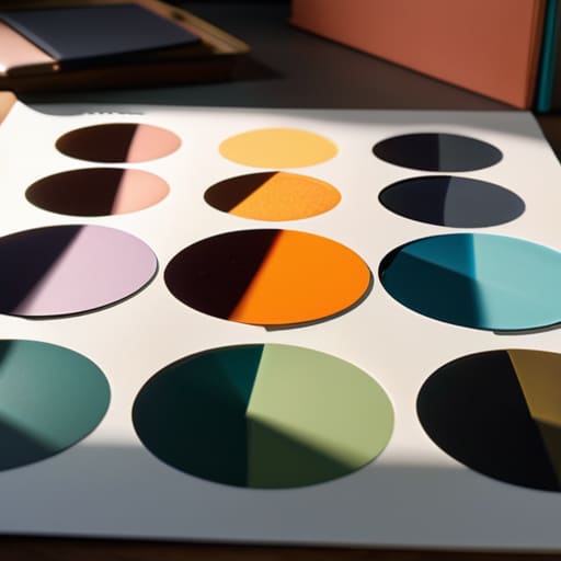
How can we integrate digital-first elements into an identity system without losing the tactile soul of the original concept?

We lose the soul when we treat digital assets as mere translations of print. To keep that tactile feeling, don’t just shrink your logo; think about how your brand moves and breathes. I advocate for “digital grain”—incorporating subtle imperfections, organic motion curves, and typography that respects the weight of ink. If your digital identity feels too frictionless, it feels hollow. Build in enough intentional “grit” to remind the user there is a human behind the screen.

Designing effective color palettes for brands.

Crafting Effective Color Palettes

I remember sitting in a dimly lit studio back in the late nineties, surrounded by the sharp, chemical scent of spray adhesive and the tactile weight of physical Pantone chips. There was a certain gravity to choosing a hue back then; you didn’t just click a hex code and hope for the best, you felt the weight of the decision in your hands. Today, I see so many designers drowning in endless, auto-generated color palettes that look beautiful in a vacuum but feel completely hollow once they hit a real screen. We’ve traded intentionality for infinite scrolling, and in the process, we’ve lost the soul of the craft.

I’m not here to give you a list of trendy combinations pulled from a curated algorithm. Instead, I want to talk about how to build a foundation that actually serves a purpose. I’m going to share what I’ve learned from two decades of moving between ink and pixels: how to select colors that respect the user’s eye and honor the human experience. We’re going to strip away the fluff and focus on how to use color as a tool for clarity, not just decoration.

Table of Contents

The Psychology of Color Building Emotional Resonance

The Psychology of Color Building Emotional Resonance

When we talk about the psychology of color, we aren’t just discussing how a specific hue looks on a high-resolution display; we are discussing how it lands in the gut of the person viewing it. In my years of refining visual branding colors for boutique firms, I’ve learned that color is a silent language. If you use a jarring, high-saturation red for a wellness app, you aren’t just making a design choice—you are creating cognitive dissonance. You have to respect the emotional weight that every shade carries before you ever touch a slider in Figma.

Instead of reaching for the most trendy gradients, I find myself leaning back into foundational color theory principles. There is a quiet, intentional power in using analogous color schemes to create a sense of continuity and calm, or employing carefully weighed complementary color combinations to guide a user’s eye toward a single, vital action. It’s about creating a sense of place. When we choose a palette, we are setting the temperature of the room. We aren’t just picking hex codes; we are architecting an atmosphere.

Mastering Color Theory Principles for Meaningful Design

Mastering Color Theory Principles for Meaningful Design

When we talk about color theory principles, I often see designers get lost in the math of the color wheel, treating it like a puzzle to be solved rather than a language to be spoken. It’s easy to lean on complementary color combinations because they provide instant, high-contrast excitement, but there is a risk of creating visual noise that lacks soul. I prefer to approach a project by looking for the quiet tension between hues. Sometimes, a sophisticated monochromatic palette design does more to establish authority than a loud, multi-colored explosion ever could.

The real work happens when you move past the initial excitement of a bright shade and start considering how colors interact within a functional system. When I’m refining visual branding colors for a client, I don’t just look for what looks “good” on a high-res monitor; I look for how they hold up under scrutiny. It’s about finding that balance where analogous color schemes provide a sense of cohesion and calm, ensuring the interface feels like a curated environment rather than a digital afterthought.

Beyond the Swatch: Five Ways to Approach Color with Intent

  • Stop chasing trends and start looking at the context. A vibrant neon palette might look stunning on a high-res monitor in your portfolio, but if it causes eye strain for a user trying to read a long-form article, you’ve failed the most basic test of functional design.
  • Respect the hierarchy of neutrals. Most designers spend far too much time obsessing over their primary brand colors and not nearly enough time refining their grays, off-whites, and muted tones. These are the quiet workers that allow your primary colors to actually breathe.
  • Test for accessibility before you fall in love. It’s easy to get swept up in a sophisticated, low-contrast aesthetic, but if your text disappears into your background, your design is broken. True craftsmanship means ensuring your work is legible for everyone, regardless of how they view it.
  • Limit your palette to create focus. When everything is shouting for attention, nothing is heard. I find that choosing two or three core colors and letting the rest of the interface exist in a state of intentional restraint creates a much more powerful visual narrative.
  • Remember that color lives in a physical world. Even though we design for screens, we are designing for humans who experience light and shadow. Think about how your palette will feel under different lighting conditions—don’t just pick colors that look good in a controlled, backlit environment.

The Intentional Palette: Moving Beyond Aesthetics

Stop treating color as a decorative afterthought; use it as a functional tool to guide the eye and dictate the emotional rhythm of your interface.

Prioritize accessibility and legibility over trends, ensuring your color choices respect the user’s ability to navigate without friction.

Build palettes with purpose by grounding your digital choices in the same intentionality used in physical craftsmanship—every hue should earn its place on the screen.

The Weight of a Hue

A color palette shouldn’t just be a collection of aesthetically pleasing hex codes; it should be a deliberate set of tools that respect the mood of the user and the integrity of the brand. If you aren’t choosing a color because of the way it anchors a composition or directs a human eye, you aren’t designing—you’re just decorating.

Ingrid Bellamy

Beyond the Hex Code

Strategic color theory Beyond the Hex Code.

At the end of the day, choosing a color palette isn’t about finding the most trending combination on a mood board or chasing what’s popular on Dribbble. It’s about the rigorous application of color theory to support a specific intention. We’ve looked at how psychology anchors our emotional responses and how the fundamental principles of harmony and contrast provide the necessary structure for usability. When you move past the superficial desire to simply “make things look nice” and instead focus on how color directs the eye and communicates meaning, you stop being a decorator and start being a strategist. Remember, every hue you select carries a weight; make sure it’s a weight your design can actually support.

As you return to your canvas—whether that’s a digital tablet or a physical sketchbook—I encourage you to resist the urge to let automation make these decisions for you. There is a certain magic in the intentional friction of selecting a shade that feels slightly off-kilter but perfectly right for the human experience. Don’t let the infinite possibilities of a digital color picker paralyze your intuition. Instead, trust your eye and your understanding of how light and pigment interact with the soul. Build palettes that don’t just fill a screen, but rather, create a space where human connection can actually breathe.

Frequently Asked Questions

How do I maintain a sense of intentionality when a client insists on a palette that clashes with the brand's core values?

It’s a frustrating tightrope to walk. When a client pushes for colors that feel “off,” don’t just argue aesthetics; pivot back to the brand’s core purpose. I find it helps to create a side-by-side comparison. Show them their requested palette next to a mood board of their own brand values. Frame it as a functional risk: “This palette might look trendy, but it undermines the trust we’re trying to build.” Design is about stewardship, not just compliance.

At what point does a color scheme become too "noisy" and start distracting from the actual functional purpose of the design?

It becomes too noisy the moment the color stops supporting the hierarchy and starts competing with it. If a user has to squint or pause to figure out where to click because a bright accent is fighting a primary call-to-action, you’ve lost the battle. Color should be a guide, not a distraction. When the palette begins to scream rather than whisper, you’ve traded functional clarity for mere decoration. Strip it back.

How can I balance the trend of high-saturation digital palettes with the need for accessibility and long-term legibility?

It’s easy to get seduced by those neon, high-saturation palettes that pop on an OLED screen, but we have to remember that eyes tire. If we chase trends that ignore contrast ratios, we aren’t designing; we’re just decorating. I always suggest anchoring those vibrant “hero” colors with grounded, neutral tones. Use the saturation for emphasis, not for the entire heavy lifting. Design for the person reading in low light, not just for the trend cycle.