I remember sitting in a dim studio at RISD, the smell of developer chemicals sharp in the air, waiting for a single frame to reveal its soul. Back then, you couldn’t just slap an “enhance” button on a file and call it a day; every adjustment was a physical, intentional choice. Today, the industry has become obsessed with the idea that image processing is a magic wand—a series of automated, heavy-handed algorithms that promise perfection but often deliver nothing more than a soulless, plastic sheen. We’ve traded the nuance of light and shadow for the convenience of a preset, and in the process, we’ve lost the very thing that makes a visual tell a story.
I’m not here to sell you on the latest AI-driven hype or a subscription to a tool that does the thinking for you. Instead, I want to talk about how we can reclaim the craft. I’m going to share my perspective on how to use image processing as a deliberate extension of your intent, rather than a replacement for it. We’ll look at how to refine your digital workflow without stripping away the grit and texture that makes a piece of work feel human.
Table of Contents
Beyond Pixels Restoring Intent Through Noise Reduction Methods
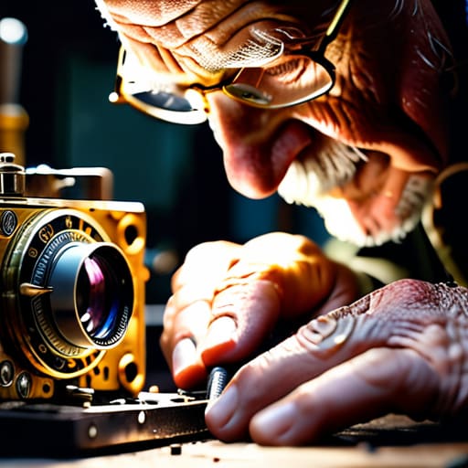
When I’m hunched over my workbench, cleaning the internal elements of a Leica, I’m reminded that imperfection is often where the character lives. In the digital realm, we tend to treat grain like a mistake to be erased, but there is a fine line between cleaning an image and stripping away its soul. Most modern noise reduction methods are designed to hunt for “errors,” smoothing out textures until the subject looks less like a person and more like a polished piece of plastic. We have to be careful that our pursuit of clarity doesn’t result in a loss of tactile truth.
The technical heavy lifting usually happens through digital signal processing, where we attempt to separate the meaningful signal from the unwanted interference. While it’s tempting to let a black box handle everything, I find that the most successful results come from understanding how these tools interact with the original intent. Whether you are working in the spatial domain or leaning on more complex mathematical models, the goal shouldn’t be a sterile, “perfect” output. Instead, we should use these tools to reveal the structure that was always there, hidden beneath the static.
The Art of Seeing via Computer Vision Algorithms
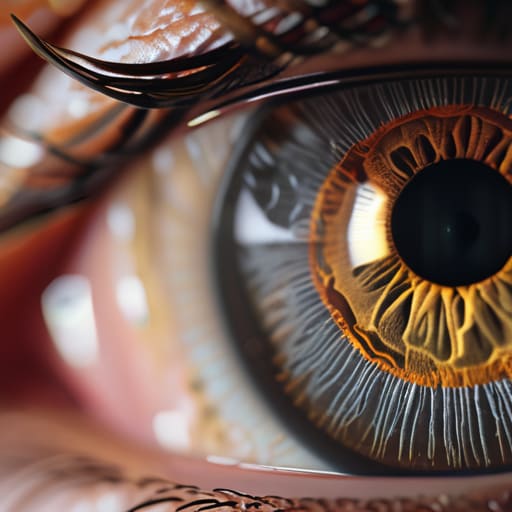
When we talk about computer vision algorithms, it’s easy to get lost in the mathematics of it all—the cold, hard logic of how a machine “sees.” But as someone who spent years squinting through a Leica viewfinder, I see it differently. To me, these algorithms aren’t just math; they are a digital attempt to replicate the way our own eyes interpret light, shadow, and edge. Whether we are using convolutional neural networks to identify a subject or simply refining a texture, we are essentially teaching a machine to understand the visual hierarchy that we, as humans, take for granted.
The challenge lies in ensuring this technology doesn’t flatten the nuance of a scene. When we employ image segmentation techniques, the goal shouldn’t be to isolate objects with surgical, sterile precision that strips away the atmosphere. Instead, we should use these tools to better understand the relationship between the subject and its environment. We need to treat these processes not as a way to bypass our own judgment, but as a way to sharpen our perception, allowing us to see the underlying structure of a composition more clearly before we ever pick up our stylus.
The Tactile Approach: 5 Ways to Keep Your Process Human
- Stop chasing the “perfect” zero-noise aesthetic. Sometimes, a little bit of grain is what gives a frame its weight and presence; learn to distinguish between digital artifacts and intentional texture.
- Use algorithms as a starting point, not a finish line. Treat automated sharpening or color correction like a rough sketch—it’s the foundation, but the final nuance must come from your own eye.
- Respect the histogram over the preset. Don’t let a single click dictate your mood; look at the actual data of the light to ensure you aren’t crushing the shadows that hold the soul of the image.
- Maintain a sense of color theory in your digital workflows. Automated color grading can be efficient, but it often lacks the specific emotional resonance that a human designer applies through deliberate chromatic shifts.
- Work with intention, not just speed. Before applying a filter or a batch process, ask yourself if the manipulation serves the story you’re trying to tell, or if you’re just trying to clear a queue.
The Designer’s Intent in an Automated World
Image processing shouldn’t be a “set and forget” workflow; treat these algorithms as extensions of your eye, not replacements for your judgment.
True quality lies in the balance between clarity and character—don’t let aggressive noise reduction strip away the organic texture that makes an image feel real.
Use technology to handle the heavy lifting of technical correction so you can spend more time on the actual craft of visual storytelling.
The Ghost in the Machine
We often mistake image processing for a way to scrub away the “imperfections,” but in our rush to achieve digital perfection, we risk erasing the very textures that tell a story. True craft isn’t about removing the noise; it’s about using technology to clarify the signal without losing the soul of the moment.
Ingrid Bellamy
The Human Element in the Machine
We’ve traced the journey from the technical mechanics of noise reduction to the complex ways computer vision attempts to mimic the human eye. While it is easy to get lost in the sheer mathematical power of modern image processing, we must remember that these algorithms are merely extensions of our own perception. Whether we are cleaning up a grain-heavy scan or teaching a machine to recognize a silhouette, the goal remains the same: to bridge the gap between raw data and meaningful visual storytelling. If we use these tools only to erase every imperfection, we risk losing the very textures that make an image feel alive. We must use them to amplify our intent, not to bypass it.
As I sit here with my sketchbook, watching the light shift across my desk, I’m reminded that the most profound images aren’t the ones that are mathematically perfect. They are the ones that capture a feeling, a moment of tension, or a specific nuance of light. Digital tools should act like a well-weighted fountain pen—they should offer control and precision, but they should never dictate the hand of the artist. Let us approach image processing not as a way to automate the soul out of our work, but as a way to refine our vision. In the end, the most important part of any digital process is the human eye that decides when the work is truly finished.
Frequently Asked Questions
How do we balance the efficiency of automated sharpening with the need to maintain the organic texture of a grain?
It’s a delicate tension. When we lean too hard on automated sharpening, we end up with that sterile, “crunchy” digital look that feels utterly soulless. To me, the secret lies in subtlety. I treat sharpening as a way to define edges, not to manufacture detail that wasn’t there. Use the algorithm to find the structure, then step back and manually layer in or preserve the grain. If the texture feels lost, you’ve gone too far.
At what point does computational enhancement stop being a tool and start becoming a distortion of the original subject?
It happens the moment the algorithm begins making decisions you didn’t authorize. When we use tools to clarify a shadow or sharpen a texture, we’re enhancing our vision. But when the software starts “hallucinating” detail—inventing a skin texture that wasn’t there or smoothing out the very grit that gave a moment its character—it’s no longer a tool. It’s a replacement. We lose the truth of the subject to a polished, hollow lie.
How can designers use these algorithms to augment their creative vision rather than letting the software make the final aesthetic decisions?
Think of these algorithms as high-end lenses, not final prints. I treat computer vision like a sophisticated darkroom assistant; it can handle the tedious heavy lifting—like isolating a subject or balancing exposure—but it shouldn’t dictate the mood. Use the software to expand your technical range, but always step back to ask: “Does this serve the story?” Let the math handle the precision, while you reserve the final, messy, beautiful aesthetic judgment for yourself.