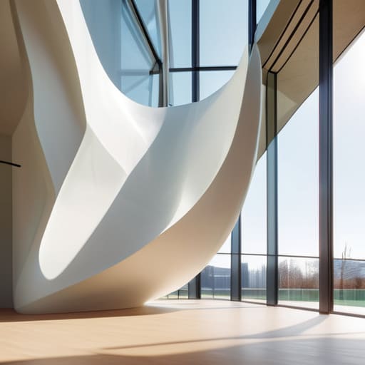
Modern architecture featuring minimalist design.

The Role of Minimalism in Modern Design

I remember sitting in a cramped studio back in the late nineties, surrounded by the sharp scent of X-Acto blades and the tactile grit of Letraset sheets. We didn’t have “auto-layout” or infinite undo buttons back then; every line we drew had weight, and every millimeter of white space was a hard-won decision. Today, I see so many designers treating minimalist design as a convenient excuse for laziness—a way to hide a lack of conceptual depth behind a thin veil of “cleanliness.” There is a massive difference between a layout that breathes and one that is simply empty.

I’m not here to sell you on the aesthetic trends you see scrolling through your feed every morning. Instead, I want to talk about the discipline required to strip away the noise without losing the soul of the work. I’m going to share what I’ve learned from decades of navigating the shift from physical paste-ups to digital pixels, focusing on how to use minimalist design to actually amplify your message. We’re going to move past the superficiality and look at how intentionality and restraint can create work that truly resonates with the human eye.

Table of Contents

Reducing Visual Clutter to Honor the Human Touch
Reducing Visual Clutter to Honor the Human Touch

When we talk about reducing visual clutter, we aren’t just talking about clearing out the junk; we’re talking about creating space for the user to actually think. In my years moving from tactile layouts to digital screens, I’ve noticed that we often feel an impulse to fill every pixel, as if emptiness is a failure of productivity. But true essentialism in design requires the courage to leave a void. When you strip away the unnecessary ornaments and the loud, competing elements, you aren’t just simplifying a layout—you are directing the eye with purpose.

I often look toward minimalist interior design principles when I’m stuck on a digital interface. Just as a well-curated room uses light and shadow to define a space, a digital canvas needs breathing room to prevent cognitive overload. By embracing a more disciplined approach, we respect the viewer’s attention. It’s about finding that sweet spot where the interface disappears, leaving only the content and the human connection intact. If every element is shouting for attention, the user ends up hearing nothing at all.

Essentialism in Design Crafting Tools for Real Creators
Essentialism in Design Crafting Tools for Real Creators

When I look at the current landscape of digital tools, I see a lot of noise masquerading as “features.” We’ve become obsessed with adding more buttons, more layers, and more complexity, thinking that utility is measured by volume. But true essentialism in design isn’t about what you can add; it’s about what you have the courage to strip away. For a creator, a tool should feel like a well-balanced fountain pen—it should disappear into your hand so that the focus remains entirely on the work being produced.

If we apply a less is more philosophy to our software and interfaces, we stop fighting the user and start supporting them. This means moving away from the frantic, multi-colored chaos of modern dashboards and leaning into more intentional choices, perhaps utilizing monochromatic color palettes to guide the eye without shouting. We need to build environments that respect the cognitive load of the person behind the screen. When we stop cluttering the workspace, we finally give the designer the room to actually think.

Practical Steps Toward Intentional Simplicity

  • Prioritize negative space as a structural element, not just “empty” room; treat it with the same respect you’d give a primary typeface.
  • Audit your color palette to ensure every hue earns its place, opting for high-contrast combinations that guide the eye without shouting.
  • Choose typography that carries weight and character, favoring legibility and purpose over trendy, decorative flourishes that distract from the message.
  • Eliminate any element that doesn’t serve a functional role, remembering that every extra line or shadow adds cognitive load to your user.
  • Build in “intentional friction” by allowing the user to pause and engage with key moments, rather than rushing them through a seamless, soulless flow.

The Intentionality Checklist

Stop treating white space as empty territory to be filled; treat it as the breathing room that allows your core message to actually land.

Audit your tools and interfaces for friction—not the frustrating kind, but the purposeful kind that forces a creator to pause and think before they click.

Prioritize function over decoration by asking if every single element on the screen serves a user’s need or if it’s just digital noise.

The Weight of Empty Space

Minimalism isn’t about the absence of things; it’s about the presence of purpose. We shouldn’t be stripping design down just to make it look clean, but rather clearing away the noise so the actual intent of the work can finally be heard.

Ingrid Bellamy

The Lasting Weight of Less

The Lasting Weight of Less in minimalism.

Ultimately, minimalism isn’t about stripping away everything until the screen feels hollow or clinical. It is about the deliberate removal of the unnecessary so that the intentional can finally take center stage. We’ve talked about clearing the visual noise and building tools that actually respect the creative process, but the core of it all comes down to a single principle: respect for the user. When we stop trying to fill every pixel with a frantic call to action or a distracting animation, we create a space where meaningful connection can actually happen. We move away from design that shouts and toward design that speaks.

As I sit here with my sketchbook, watching the light shift across my desk, I’m reminded that the most profound things often exist in the quiet spaces. In an industry that is increasingly obsessed with automation and infinite scale, I urge you to hold onto the friction. Don’t be afraid of the white space, and never fear the silence of a well-placed margin. Our job isn’t to build louder machines; it’s to design thoughtful ecosystems that honor the human hand. Let’s build things that don’t just occupy space, but actually serve a purpose.

Frequently Asked Questions

How do you find the balance between true minimalism and a design that feels too sterile or empty?

It’s a fine line. When minimalism turns sterile, it’s usually because you’ve stripped away the soul along with the clutter. I always look for “intentional friction.” That might mean a subtle texture in a background, a typeface with a bit of character, or a layout that isn’t mathematically perfect. Don’t just aim for empty space; aim for breathing room. If a design feels cold, it’s because it lacks the warmth of human decision-making.

At what point does stripping away elements start to hurt the usability or accessibility of a digital tool?

It’s a delicate line. You hit that wall when you start sacrificing clarity for the sake of “aesthetic purity.” If a user has to hunt for a navigation menu or struggle to distinguish a button from a decorative element, you haven’t achieved minimalism—you’ve just created friction. Design should be invisible, but it shouldn’t be a riddle. When the removal of an element compromises wayfinding or excludes someone with accessibility needs, you’ve lost the intention.

How can we maintain a sense of brand personality and "soul" when we are strictly adhering to a minimalist aesthetic?

It’s a common misconception that minimalism requires stripping away everything that makes a brand feel alive. To me, soul isn’t found in decoration; it’s found in the nuances. It’s the specific weight of a typeface, the intentionality of a single, well-placed stroke, or the tactile quality of a color palette. When you remove the noise, the tiny, deliberate choices—the “friction” of craftsmanship—actually become louder. Minimalism isn’t an absence of character; it’s the refinement of it.


Visual guide explaining key compositional rules.

Core Rules of Visual Composition

I remember sitting in a dimly lit studio at RISD, the air thick with the scent of spray adhesive and the rhythmic snip-snip of X-Acto blades against heavy cardstock. Back then, we didn’t have auto-layout engines to fix our mistakes; if your balance was off, the entire physical piece felt heavy, leaning toward a failure you couldn’t just “undo.” Today, I see so many designers treating compositional rules like mere checkboxes in a software settings menu—mathematical formulas applied to fill a digital void. We’ve traded the intentionality of the hand for the convenience of the grid, often losing the soul of the work in the process.

I’m not here to give you a dry lecture on the Golden Ratio or a list of geometric platitudes you could find in any entry-level textbook. Instead, I want to talk about how we can use these principles to create digital spaces that actually feel human. I promise to share the hard-won, practical ways I approach layout to ensure every element has a reason to exist. We are going to move past the “correct” way of doing things and focus on how to build work that respects the viewer’s eye.

Table of Contents

Mastering Visual Storytelling Techniques Through Intention

Mastering Visual Storytelling Techniques Through Intention.

When we talk about visual storytelling techniques, we aren’t just discussing how to arrange shapes; we are discussing how to direct a person’s focus and emotion. In my early days working with physical layouts, you couldn’t just hit “undo” if the eye wandered aimlessly across the page. You had to be deliberate. Today, that same intentionality applies to the digital canvas. I often find myself returning to the concept of negative space usage to create breathing room. It isn’t “empty” space; it is a functional tool that allows the subject to exist without being suffocated by noise.

True mastery comes when you stop decorating and start guiding. Whether you are applying the golden ratio composition to a brand identity or simply balancing a landing page, every element must earn its place. I like to think about visual weight principles—how a heavy, dark block of color can anchor a layout, or how a delicate line can pull a viewer toward a call to action. When you respect these invisible forces, you aren’t just designing a screen; you are choreographing a human experience.

The Golden Ratio Composition Finding Natural Balance

The Golden Ratio Composition Finding Natural Balance

I often find myself returning to my old film cameras when I’m stuck on a digital layout. There is a mathematical elegance in how nature organizes itself, and the golden ratio composition is perhaps the most profound example of this. It isn’t just a rigid formula to be applied like a filter; it is a way of understanding how the human eye seeks harmony. When I’m working on a brand identity, I try to move beyond simple grids and instead look for those organic proportions that feel inherently “right.”

The danger in modern UI design is the tendency to default to perfect, sterile symmetry. While there is a place for that, relying solely on it can make a digital space feel lifeless. Instead, I use the ratio to create a sense of unspoken equilibrium. By placing focal points according to these natural proportions, you can master visual weight principles to guide a user through a journey without them even realizing they are being led. It’s about creating a flow that feels less like a programmed sequence and more like a natural progression.

Beyond the Grid: Five Ways to Breathe Life into Your Layouts

  • Embrace Negative Space as a Tool, Not an Empty Void. In my early days with physical paste-ups, we understood that the white space was just as active as the ink. Don’t feel the need to crowd every corner of the screen; let your elements breathe so the viewer’s eye has a place to rest.
  • Prioritize Visual Hierarchy to Guide the Human Eye. A design without a clear path is just noise. Use scale, weight, and contrast to tell the user exactly where to look first, second, and last. You are directing a journey, not just presenting information.
  • Break the Rules with Purposeful Tension. Once you understand the grid, learn when to step outside of it. A slight misalignment or an unexpected placement can create a sense of movement and energy that a perfectly centered layout often lacks.
  • Use Leading Lines to Create a Natural Flow. Whether it’s the edge of a photograph or the slant of a serif, use existing visual cues to pull the viewer through your composition. It’s about creating a subconscious rhythm that feels intuitive rather than forced.
  • Anchor Your Composition with Weight and Balance. Every element carries a certain visual “heaviness.” Whether you’re aiming for formal symmetry or a more dynamic asymmetrical balance, ensure that no single part of your design feels like it’s about to tip the whole frame over.

Bringing Intention Back to the Grid

Stop treating your layout like a checklist of elements; instead, use composition to create a deliberate path for the eye to follow.

Balance isn’t about perfect symmetry—it’s about the tension between weight and space that makes a design feel alive rather than static.

Always design with the human at the center, ensuring every structural choice serves a functional purpose rather than just filling a void.

The Soul of the Grid

Rules aren’t cages; they are the scaffolding that allows meaning to stand upright. If you use composition merely to organize pixels, you’re just a technician. But if you use it to direct the eye and honor the silence between elements, you become a designer.

Ingrid Bellamy

Beyond the Grid

Mastering composition Beyond the Grid.

At the end of the day, mastering compositional rules isn’t about memorizing a set of rigid laws to constrain your creativity. It’s about understanding the underlying rhythm of how we see. We’ve explored how intention drives storytelling and how the Golden Ratio can provide a sense of organic stability, but these are merely tools in your kit. The goal is to move past the mechanical application of “rules” and toward a deeper understanding of visual weight and balance. When you stop treating composition as a checklist and start seeing it as a way to direct the human gaze, you move from simply arranging pixels to crafting an experience.

As you head back to your desk—or your sketchbook—I encourage you to resist the urge to let software make these decisions for you. It is easy to let an algorithm snap everything into a perfect, sterile alignment, but there is a profound beauty in the slight deviations that feel human. True mastery lies in knowing when to follow the grid and when to break it with purpose. Design should never feel accidental; it should feel inevitable. So, take a breath, look closely at the frame, and remember that your greatest asset isn’t your software, but your intentionality.

Frequently Asked Questions

How do I balance mathematical rules like the Golden Ratio with the need for organic, intentional imperfection?

Think of the Golden Ratio as a scaffold, not a cage. I use it to establish a foundational rhythm, but if the math is too perfect, the design feels sterile—it lacks breath. To bring back that human element, I intentionally nudge elements off the grid. A slight asymmetry or a hand-drawn stroke breaks the digital tension. We use the rules to find order, then we break them to find soul.

At what point does following compositional guidelines start to feel too rigid or formulaic for a brand's unique voice?

It starts to feel rigid the moment you prioritize the math over the message. Rules like the rule of thirds or the golden ratio are meant to be scaffolding, not the building itself. If you’re adjusting a layout just to satisfy a geometric ratio while losing the brand’s grit or personality, you’ve missed the point. Use the guidelines to find your footing, then have the courage to break them to find the soul.

How can I use composition to guide a user's attention without making the interface feel manipulative or overly engineered?

The trick is to stop thinking about “directing” users and start thinking about “inviting” them. Manipulation feels like a trap; good composition feels like a clear path. Instead of using aggressive, high-contrast gimmicks to force an eye toward a button, use negative space and subtle typographic hierarchy to create a natural resting place. When you respect the rhythm of the page, you aren’t engineering behavior—you’re simply making the most important elements easy to find.

Organizing layouts using grid systems in design.

Using Grid Systems to Organize Layouts

I remember the smell of spray mount and the tactile resistance of X-Acto blades back when we were still doing physical paste-ups at RISD. Back then, you couldn’t just “undo” a mistake or toggle a layer visibility; you had to think through the spatial logic of your layout before the blade ever touched the paper. Today, I see so many designers treating grid systems in design as a mathematical chore or a rigid cage that stifles their “vision.” They lean on heavy, automated software presets that do the thinking for them, resulting in interfaces that feel technically perfect but entirely soulless.

I’m not here to teach you how to follow a textbook or recite the geometry of a column. Instead, I want to share how you can use these structures to create a sense of rhythm and intentionality that actually respects the person on the other side of the screen. We are going to move past the rigid rules and look at how a well-placed framework can act as a quiet, supporting hand. My goal is to help you master the intentionality of the layout, ensuring your work feels built by a human, for humans.

Table of Contents

Mastering Spatial Organization Principles for Purposeful Layouts

Mastering Spatial Organization Principles for Purposeful Layouts

When we talk about spatial organization principles, we aren’t just talking about where things sit on a screen; we are talking about how a user feels while moving through a space. If a layout is too crowded, the eye panics. If it’s too sparse, the connection is lost. I’ve always found that the most successful compositions rely on a rhythmic tension between elements. This is where visual hierarchy in layout becomes your most vital tool. It’s not about making the most important thing the biggest, necessarily, but about guiding the eye through a sequence of intentional pauses and movements.

To achieve this, I often return to the fundamentals of structure that many modern designers overlook in their rush to be “fluid.” For instance, setting strict baseline grids for typography ensures that your text doesn’t just sit on the page, but breathes in unison with the surrounding imagery. It’s that subtle alignment—the kind you almost don’t notice until it’s gone—that creates a sense of professional calm. We have to stop treating white space as “empty” and start treating it as a structural component that gives our work room to exist.

Using the Golden Ratio in Layout Design to Respect Rhythm

Using the Golden Ratio in Layout Design to Respect Rhythm.

I’ve always felt that the Golden Ratio is less of a mathematical rule and more of a natural pulse. When I was working with physical paste-ups, you could feel the weight of a composition; it had a certain gravity. Today, in the rush toward pixel-perfect precision, we often lose that sense of organic flow. By applying the golden ratio in layout design, we aren’t just following an old formula; we are tapping into a mathematical rhythm that the human eye finds inherently comforting. It allows us to move beyond arbitrary spacing and instead create a sense of intentional equilibrium that guides the viewer through a story.

This isn’t about forcing every element into a strict spiral, but rather using those proportions to inform your visual hierarchy in layout. It helps you decide which elements deserve the most breath and which should sit in the periphery. When you balance your primary focal points against the mathematical progression of the ratio, the layout stops feeling like a collection of boxes and starts feeling like a cohesive, breathing organism. It’s about finding that sweet spot where the math disappears and only the feeling of harmony remains.

Five Ways to Keep Your Grids From Feeling Like a Cage

  • Don’t be afraid to break the line. A grid is meant to be a foundation, not a prison; occasionally letting an element bleed across a column or float slightly off-axis creates the kind of visual tension that makes a layout feel alive rather than mechanical.
  • Prioritize the gutter over the column. In my experience, the space between your elements—the breathing room—is far more important than the elements themselves. If your gutters are too tight, the design feels claustrophobic; if they’re intentional, the layout feels composed.
  • Use a baseline grid to respect the rhythm of reading. Just as I carefully align the mechanics in a vintage Leica, you should align your typography to a consistent baseline. It’s a subtle, almost invisible way to ensure the eye moves smoothly across the page without unnecessary friction.
  • Build for hierarchy, not just alignment. It’s easy to get lost in the math of a twelve-column grid, but always ask yourself if the structure is actually guiding the viewer toward the most important information. If the grid is so dominant that it competes with the message, you’ve lost the purpose.
  • Embrace modularity for digital flexibility. Since we aren’t working with static paste-ups anymore, design your grid systems as a series of repeatable, scalable modules. This allows your layouts to breathe and adapt across different screen sizes without losing that sense of intentional craftsmanship.

The Intentionality of the Grid

A grid is not a set of restrictive rules, but a foundation for intentionality; use it to guide the eye rather than just to align pixels.

True rhythm in a layout comes from understanding the tension between structure and white space, allowing the design to breathe instead of feeling crowded.

Digital tools should enhance your spatial reasoning, not replace it—always step back from the screen to ensure your proportions feel human and purposeful.

The Illusion of Rigidity

A grid is not a set of bars meant to imprison your ideas; it is the quiet, structural breathing room that allows a composition to feel intentional rather than accidental.

Ingrid Bellamy

Beyond the Lines

Mastering design Beyond the Lines.

At the end of the day, mastering grid systems isn’t about learning how to follow a set of rigid, mathematical rules to prevent your elements from drifting. It is about understanding the subtle interplay between spatial organization, the rhythmic pulse of the golden ratio, and the intentionality of your white space. When we use these frameworks correctly, we aren’t just organizing pixels; we are building a predictable visual language that allows the user to navigate without cognitive friction. A well-executed grid acts as the quiet scaffolding that holds your creative vision together, ensuring that the hierarchy remains clear and the purpose of the design is never lost in the noise.

As you move forward into your next project, I encourage you to view the grid not as a cage, but as a collaborator. Don’t let the software dictate your movements; instead, use these structures to reclaim the intentionality of craftsmanship that so often gets stripped away in the rush toward automation. Whether you are working on a complex digital interface or a simple typographic layout, remember that the most impactful designs are those that respect the human eye. Build your structures with care, leave room for the unexpected, and always design with the human touch in mind.

Frequently Asked Questions

How do I know when a layout has become too rigid and needs to break the grid to feel human again?

You’ll feel it in your gut before you see it on the screen. If the layout starts to feel like a spreadsheet—sterile, predictable, and devoid of any tension—you’ve over-engineered it. When the eye slides across the page without ever pausing to “land,” the grid has become a cage. Break it when the rhythm feels mechanical. A slight overlap or a deliberate misalignment reintroduces that necessary friction, reminding the viewer there’s a human hand behind the work.

In a world of fluid, responsive web design, how can we maintain a sense of intentional structure without the grid feeling broken?

We have to stop thinking of the grid as a static cage and start seeing it as a set of relationships. In responsive design, the grid shouldn’t break; it should breathe. I rely on modularity—defining consistent rhythms and proportions rather than fixed pixel widths. When you design for the relationship between elements rather than their exact coordinates, the structure remains intentional, even when the screen shifts. It’s about maintaining the underlying logic, not the rigid lines.

How do you balance the mathematical precision of a grid with the organic, "imperfect" feel of hand-drawn elements or custom typography?

I think of the grid as the skeleton, not the skin. The math provides the stability, but the soul comes from where you choose to break the rules. I often lay down a rigid underlying structure to anchor the composition, then allow my custom type or hand-drawn flourishes to drift slightly off-axis. It’s about intentional tension—using that mathematical precision to highlight the beautiful, human imperfection of the organic elements.

Efficient motion graphics workflow management process.

Managing a Motion Graphics Workflow

I remember sitting in a cramped studio in Providence, the air thick with the smell of ozone and stale coffee, staring at a lightbox that felt more reliable than any software I use today. Back then, every move was deliberate because you couldn’t just undo a physical cut. Today, I watch designers get swallowed whole by bloated software suites and endless plugin loops, losing themselves in a motion graphics workflow that prioritizes sheer speed over actual soul. We’ve traded the intentionality of the hand for the frantic clicking of a mouse, and honestly, it’s making the work feel hollow.

I’m not here to sell you on a new subscription service or a “magic” automation tool that promises to do your thinking for you. Instead, I want to talk about building a process that actually respects your time and your craft. I’m going to share how to structure a motion graphics workflow that strips away the digital noise, allowing you to focus on the rhythm and weight of your movement. We’ll look at practical, grounded ways to organize your files and your thoughts so that the technology serves your vision, rather than the other way around.

Table of Contents

Honoring Intent Through Storyboarding for Motion Graphics

Honoring Intent Through Storyboarding for Motion Graphics

Before you even touch a keyframe, you need to find the rhythm of the piece on paper. I’ve found that jumping straight into software is a trap; it invites a frantic kind of tinkering that often lacks soul. Effective storyboarding for motion graphics isn’t about drawing perfect illustrations; it’s about mapping the emotional arc and the spatial logic of the movement. When I sit down with my sketchbook, I’m not just planning layouts—I’m deciding where the viewer’s eye should rest and where it should dance.

This stage is where you define the skeleton of your animatic creation process. By sketching out these transitions early, you avoid the “pixel-pushing” fatigue that happens when you realize halfway through a project that your pacing is fundamentally broken. A solid storyboard acts as a North Star, ensuring that every movement serves a narrative purpose rather than just being “eye candy.” It allows you to solve the structural problems while the stakes are low, leaving you the mental bandwidth to focus on the nuance of motion once you finally move into the digital space.

The Animatic Creation Process Finding Rhythm in Friction

The Animatic Creation Process Finding Rhythm in Friction

Once the storyboards are laid out, it’s tempting to jump straight into the software and start keyframing. I’ve seen too many designers skip this step, only to realize halfway through that their pacing is completely off. This is where the animatic creation process becomes vital. An animatic isn’t just a rough sketch set to audio; it’s the heartbeat of your project. It’s where you feel the resistance of the timing and realize that a three-second pause might carry more weight than a frantic transition. By forcing yourself to work with low-fidelity placeholders, you’re actually protecting the soul of the movement before the technical heavy lifting begins.

Treating this phase as a structural blueprint prevents the chaos that often plagues a messy motion design production pipeline. When you nail the rhythm here, you aren’t just guessing in the final software; you’re executing a proven plan. It allows you to solve the “feel” of the piece while your brain is still in a conceptual headspace, rather than getting bogged down in the weeds of technical execution. Don’t rush the rhythm—if the timing feels hollow in a simple sketch, no amount of high-end rendering will save it.

Guarding the Creative Spark: Five Ways to Protect Your Process

  • Build in “Analog Buffer” zones. Before you touch a keyframe or open After Effects, step away from the screen. Use that sketchbook of mine to map out movement with a pen; if a concept doesn’t work in a static, hand-drawn sketch, a thousand layers of motion won’t save it.
  • Respect the hierarchy of assets. Don’t let your project files become a digital junk drawer. Organize your layers and compositions with the same intentionality you’d use for a type specimen sheet—if you can’t find a vector shape in ten seconds, your workflow is already failing you.
  • Avoid the trap of “Perpetual Tweaking.” It’s easy to get lost in the micro-adjustments of an easing curve, but don’t let the pursuit of perfection paralyze your momentum. Set hard boundaries for when a motion pass is “done” so you can actually move on to the next phase of the story.
  • Optimize for the human hand, not just the CPU. Automating the tedious parts of a workflow is fine, but don’t let your tools strip away the nuance. Keep your keyframes purposeful; every movement should feel like it was placed there by a hand, not just calculated by an algorithm.
  • Master the art of the “Modular Build.” Design your motion elements as independent, reusable components rather than monolithic files. This gives you the flexibility to pivot when a client’s feedback shifts, without having to tear down the entire structural foundation of your project.

The Intentional Motion Framework

Stop treating motion as an afterthought; a workflow only succeeds when the rhythm is established during the storyboard phase, long before you touch a keyframe.

Embrace the friction of the animatic stage to find the soul of your piece, rather than rushing toward a polished render that lacks a human pulse.

Protect your creative agency by building processes that prioritize structural clarity over sheer technical speed.

The Trap of Seamlessness

We often mistake a frictionless workflow for a productive one, but if you strip away the pauses—the moments where you actually sit with a frame and question its necessity—you aren’t designing anymore; you’re just executing a sequence.

Ingrid Bellamy

Returning to the Source

Returning to the Source: Motion graphics workflow.

At the end of the day, a motion graphics workflow shouldn’t be a race toward a finished render; it should be a structured way to protect your best ideas. We’ve looked at how intentional storyboarding provides the skeletal structure for your vision and how the animatic allows you to find that crucial, human rhythm before you ever touch a keyframe. By embracing these stages—the friction of sketching, the pacing of the timeline, and the deliberate pauses for refinement—you ensure that your work isn’t just a series of smooth transitions, but a meaningful sequence of movements. When we prioritize these foundational steps, we move away from mindless automation and toward a process that actually respects the craft.

As you move back into your software, I encourage you to resist the urge to jump straight into the polish. It is easy to get lost in the glow of high-fidelity effects and complex expressions, but remember that the soul of your animation lives in the intention behind the motion. Treat your digital canvas with the same reverence you would a physical sketchbook or a vintage Leica. If you build a workflow that honors the human hand, your final output will possess a depth that no algorithm can replicate. Build something that actually breathes.

Frequently Asked Questions

How do I prevent the technical constraints of software from dictating my creative direction during the animation phase?

It’s easy to let the software become the architect of your design, but don’t let the tool dictate the movement. I always go back to my sketchbook first. If you can’t map out the weight and timing of a motion path with a fountain pen, the software shouldn’t be touching it yet. Define the physics and the feeling manually; once the intent is solid on paper, the technical constraints become hurdles to clear rather than boundaries that stifle your vision.

At what point in the workflow should I step away from the screen to ensure I haven't lost the human element to automation?

Step away the moment the software starts making decisions for you. When you find yourself clicking through presets or letting an automated keyframe tool dictate the weight of a movement, you’ve drifted. I usually pull my sketchbook out right after the animatic phase. Before you dive into the heavy lifting of software, get back to the tactile—the messy, unpolished sketches. If you can’t feel the rhythm in your hand, you won’t find it on the screen.

How can I build a structured process that allows for spontaneous creative pivots without completely derailing my project timeline?

Build “buffer zones” into your timeline—think of them as intentional gaps between your rigid milestones. Instead of a seamless, unbroken schedule, treat your production phases like a sketch: allow for a dedicated period of “controlled chaos” after the initial layout. If you bake in a few days of unstructured experimentation after the animatic stage, you can follow a sudden creative spark without the panic of a collapsing deadline. Structure provides the safety net; spontaneity provides the soul.

Creative process guide for navigating projects.

Navigating the Creative Process From Start to Finish

I remember sitting in a cramped studio in Providence, the air thick with the scent of spray adhesive and the rhythmic thwack of an X-Acto blade hitting a cutting mat. Back then, there was no “undo” button; you lived or died by the precision of your physical movements. Today, I see so many designers drowning in bloated, automated workflows that promise magic but deliver nothing but hollow, pixel-perfect emptiness. Most people will hand you a creative process guide that reads like a corporate manual, full of buzzwords about “synergy” and “agile optimization” that completely ignore the actual soul of making something.

I’m not here to give you a checklist of software shortcuts or a way to automate your intuition out of existence. Instead, I want to share a framework built on decades of moving from ink to pixels—one that prioritizes intentionality over speed. This isn’t about following a rigid script; it’s about building a repeatable structure that protects your headspace and honors the messy, necessary friction of true craftsmanship. We’re going to look at how to structure your work without losing the human touch that makes design worth doing in the first place.

Table of Contents

Navigating the Essential Stages of Creativity.

I’ve always found that the most productive work happens when we stop treating the creative process as a straight line and start seeing it as a series of intentional shifts. We often rush toward the “doing” phase, but if you skip the heavy lifting of the early stages of creativity, you end up building on sand. For me, this starts with a period of deep observation—the kind where I put the stylus down and just look at how light hits a surface or how a letterform holds its weight. It’s about moving from the abstract fog of an idea toward something tangible, without losing that initial spark of intuition.

Once the concept begins to take shape, the real work lies in the tension between the initial vision and the technical reality. This is where an iterative design workflow becomes your best friend. You have to be willing to tear things apart. I often find myself stuck in a loop of perfectionism, but I’ve learned that the best way of overcoming creative blocks is to embrace the mess. Instead of fighting the friction, lean into it. Let the sketches be ugly; let the first drafts be flawed. That’s where the soul of the work actually lives.

Mastering an Iterative Design Workflow

Mastering an Iterative Design Workflow with sketches.

In my experience, the biggest mistake young designers make is treating a project like a straight line. They rush from a sketch to a high-fidelity mockup, hoping the first version is the final one. But true mastery lies in embracing an iterative design workflow. It’s about the willingness to break what you’ve built so you can rebuild it better. I often find myself circling back to my physical sketchbook when a digital layout feels too sterile; there is something about the resistance of paper that forces you to refine your thinking before you ever touch a mouse.

This cycle isn’t about indecision; it’s about rigor. By applying a disciplined design thinking methodology, you move away from “guessing” and toward “verifying.” You test a concept, observe where it fails to communicate, and then pivot. This process is often where we face our most frustrating moments, but it is also the most effective way of overcoming creative blocks. If you find yourself stuck, stop trying to force a solution. Instead, step back and look at the friction points. The solution is rarely in the first iteration—it’s buried in the third or fourth.

Five Ways to Reclaim Intentionality in Your Workflow

  • Step away from the backlit glow. I’ve found that my best breakthroughs never happen while staring at a high-resolution monitor; they happen when I’m working with a fountain pen and a heavy grain of paper. If you’re stuck, give your eyes a break from the pixels and find some tactile friction.
  • Stop chasing “efficiency” at the expense of thought. There is a dangerous tendency in modern design to rush toward the final render. Instead, build in intentional pauses. A moment of quiet observation is often more productive than an hour of clicking through UI kits.
  • Treat your mistakes as data, not failures. In the old days of physical paste-ups, a slip of the blade was part of the process. In digital design, we tend to obsess over the ‘undo’ button. Learn to look at your errors as subtle redirections rather than mistakes to be erased.
  • Curate your inputs with discipline. If your inspiration is limited to what’s trending on a single social platform, your work will inevitably look like everyone else’s. Look toward architecture, vintage typography, or even the way light hits a film negative to find a visual language that actually has depth.
  • Design for the person, not the device. It’s easy to get lost in optimizing for screen real estate or technical specs, but remember that there is a human being on the other side of that glass. Ask yourself: Does this interaction feel seamless, or does it feel like it’s just filling space?

The Core Lessons

Don’t mistake speed for progress; true design requires the patience to sit with a problem before reaching for your mouse.

Protect the “messy middle” of your workflow—the sketches, the failed iterations, and the analog friction—because that is where the real soul of a project lives.

Build systems that serve your intuition rather than letting your tools dictate your creative boundaries.

The Soul of the System

A creative process guide shouldn’t be a rigid cage of checkboxes; it should be a scaffolding that holds your ideas steady while leaving enough room for the beautiful, unpredictable friction of human intuition to breathe.

Ingrid Bellamy

Finding the Rhythm in the Work

Finding the Rhythm in the Work.

We’ve walked through the architecture of a solid creative process, from the initial spark of an idea to the grueling, necessary cycles of iteration. It is easy to get lost in the software, chasing the latest plugin or trying to automate the soul out of a project just to hit a deadline. But as we’ve discussed, a truly effective workflow isn’t about speed alone; it’s about building a structure that allows for intentionality and discovery. By respecting the stages of research, drafting, and refining, you aren’t just managing tasks—you are protecting the integrity of your vision from the noise of pure production.

Ultimately, remember that no guide can replace the instinct you develop through years of making mistakes. A process is a scaffold, not a cage. Use these frameworks to steady your hand, but don’t be afraid to step off the path when a moment of true, messy inspiration strikes. The most profound work often happens in the spaces between the steps, in that quiet friction where the digital tool meets the human spirit. Trust your eye, honor the craft, and never forget that the goal is to create something that feels deeply, undeniably human.

Frequently Asked Questions

How do I maintain the integrity of my original concept when the iterative process starts feeling more like compromise than refinement?

It’s a fine line between refinement and erosion. When you feel that shift, stop iterating on the screen. Step away from the pixels and go back to your sketchbook. Re-examine your original sketches—the ones made before the client feedback or the software’s constraints took hold. If the core intent is lost, you aren’t refining anymore; you’re just negotiating. Hold onto the “why” of the piece, even when the “how” gets messy.

At what point does "productive friction" turn into mere procrastination or analysis paralysis?

It turns into paralysis the moment you stop looking for solutions and start looking for certainty. Productive friction feels like a struggle to refine a concept; procrastination feels like a struggle to avoid starting it. If you’re staring at a blank canvas, obsessing over whether a typeface is “perfect” before you’ve even laid down a grid, you aren’t designing. You’re hiding. If the friction isn’t moving the work forward, put the pen down and walk away.

How can I integrate tactile, analog sketching into a workflow that is increasingly dominated by high-speed digital tools?

Don’t view your sketchbook as a separate task, but as the necessary friction before the speed of the mouse takes over. I start every project by stepping away from the screen entirely. Use that fountain pen to map out the messy, non-linear ideas that a grid-based software would prematurely constrain. By the time I move to the digital canvas, the heavy lifting of conceptual thinking is already done, leaving the tools to refine, not dictate.

Mastering various digital illustration techniques.

Improving Your Digital Illustration Techniques

I was sitting at my desk last night, cleaning the lens of my old Leica, when I realized how much we’ve lost in the rush toward perfection. There is this pervasive, exhausting myth in our industry that mastering digital illustration techniques is all about discovering the most expensive brush sets or layering a hundred different Gaussian blurs to hide a lack of intent. We’ve become obsessed with the sheen of the software rather than the soul of the mark. We treat the tablet like a magic wand that fixes bad fundamentals, forgetting that a tool is only as meaningful as the hand guiding it.

I’m not here to sell you on a new plugin or a way to automate your creativity into oblivion. Instead, I want to talk about how we can use these tools to reclaim that sense of deliberate friction that makes a piece of art feel tactile and alive. I’m going to share the specific, grounded methods I use to bridge the gap between the sterile screen and the warmth of a physical sketch. This isn’t about chasing every fleeting trend; it’s about intentional craftsmanship in a digital landscape.

Table of Contents

Mastering Digital Sketching Fundamentals to Find Your Rhythm

Mastering Digital Sketching Fundamentals to Find Your Rhythm

Before you even touch a stylus to a tablet, you have to address the sensory gap between paper and glass. When I first transitioned from my sketchbook to a Cintiq, I felt a profound sense of loss—the lack of resistance made every stroke feel clinical and hollow. To fix this, you must prioritize pressure sensitivity optimization. It isn’t just about how hard you press; it’s about calibrating your tool to mimic the subtle nuances of a heavy graphite stroke or a light watercolor wash. If your settings aren’t dialed in, you’ll find yourself fighting the hardware rather than flowing with your ideas.

Once you’ve bridged that tactile gap, the goal is to establish a repeatable digital sketching fundamentals practice that doesn’t feel like a chore. I find that the most effective way to find a rhythm is to stop worrying about the final render and focus on the weight of the line. Experiment with different brush textures to see how they respond to your hand’s natural tremors. By treating your initial marks as a way to explore form rather than perfection, you allow for the kind of intentional imperfection that makes a piece feel human.

Optimizing Pressure Sensitivity for a More Human Touch

Optimizing Pressure Sensitivity for a More Human Touch

One of the most common mistakes I see in modern digital painting workflow is treating the stylus like a mouse. When you first sit down with a tablet, there is a tendency to rely on the software to do the heavy lifting, but that’s where the soul of the work gets lost. To truly bridge the gap between the screen and the page, you need to focus on pressure sensitivity optimization. It isn’t just about how hard you press; it’s about how the software interprets that intent. If your lines feel clinical or robotic, your settings are likely too linear.

I always recommend experimenting with the pressure curves in your tablet settings to find a custom “sweet spot” that mimics the resistance of a real nib on paper. You want a setting that rewards a light touch with subtle, translucent strokes, but allows for deep, decisive marks when you commit to a line. By fine-tuning this, you can integrate opacity and blending modes more naturally, allowing colors to layer with the same intuitive unpredictability you’d find in a physical medium. It’s about reclaiming that sense of intentional friction.

Beyond the Smooth Surface: Five Ways to Reclaim Intentionality

  • Embrace the Imperfection of the Line. Don’t obsess over the mathematical perfection of a vector path. Sometimes, a slightly wobbly stroke or a line that doesn’t quite close is exactly what gives a piece its soul. Let the digital tool mimic the slight tremor of a hand on paper.
  • Layering with Purpose, Not Just Convenience. It’s easy to get lost in an infinite stack of layers, but try working with restraint. Treat your digital canvas like a physical one; decide early on what is structural and what is atmospheric. Too many layers can lead to a lack of cohesion.
  • Curate Your Digital Palette. Software loves to give you millions of colors, but that’s a trap. I find my best work comes from limiting myself to a tight, intentional color story. Pick your hues with the same gravity you would use when mixing physical pigments on a palette.
  • Integrate Analog Textures. The biggest giveaway of “sterile” digital art is the lack of grain. Don’t just use a generic noise filter. Import scans of actual watercolor paper, charcoal dust, or linen textures to break up the digital smoothness and add a sense of tactile depth.
  • Respect the Negative Space. In our rush to fill every pixel, we often forget that what we leave out is just as important as what we put in. Use your composition to let the work breathe. A well-placed void can be more powerful than the most intricate detail.

Bringing Intentionality Back to the Digital Canvas

Stop fighting your tools and start calibrating them; fine-tuning your pressure sensitivity and brush dynamics isn’t a technical chore, it’s how you reclaim the tactile soul of your work.

Use digital sketching not as a shortcut to a finished product, but as a way to find your natural rhythm and preserve the “happy accidents” that happen when a hand meets a surface.

Resist the urge to over-polish every pixel; true craftsmanship in a digital space comes from knowing when to lean into the friction and leave the human mark visible.

## The Fallacy of the Perfect Pixel

We often mistake technical precision for artistic skill, forgetting that the most compelling digital illustrations aren’t the ones that are mathematically perfect, but the ones that retain the beautiful, imperfect friction of a hand moving across a surface.

Ingrid Bellamy

Finding the Soul in the Machine

Finding the Soul in the Machine illustration.

At the end of the day, mastering digital illustration isn’t about memorizing every shortcut in your software or finding the perfect brush preset. It’s about the foundational work we’ve discussed: returning to the rhythm of sketching to find your flow and fine-tuning your pressure sensitivity so the stylus feels like an extension of your hand rather than a plastic barrier. When you bridge the gap between your initial sketch and the final digital render, you aren’t just moving pixels; you are translating intention into a visual language. By focusing on these core elements, you ensure that your technical proficiency serves your vision, rather than letting the software dictate the outcome.

As we move further into an era where automation is becoming the default, I urge you to hold onto the intentionality of your craft. Don’t be afraid of the slight imperfections or the “noise” that makes a piece feel real. Those small, human irregularities are exactly what prevent a design from feeling hollow or manufactured. Use these digital tools to amplify your voice, not to drown it out in a sea of algorithmic perfection. Keep your sketchbook close, keep your eyes observant, and remember that the most powerful thing you can bring to a digital canvas is your own unmistakable human perspective.

Frequently Asked Questions

How do I stop my digital work from looking too "perfect" or sterile when I’m working with vector-based tools?

The problem with vectors is their mathematical obsession with perfection. To break that sterility, you have to introduce intentional imperfection. I always suggest avoiding the “perfect” anchor point. Instead of letting the software snap everything to a rigid grid, nudge your paths slightly off-axis. Try adding subtle, irregular variations to your stroke weights or using grain textures to break up those clinical gradients. If it looks too clean, it’s probably because you haven’t let the human element breathe.

Is there a way to replicate the physical resistance of paper and ink when using a glass tablet surface?

It’s the classic struggle: that slick, sliding feeling of a stylus on glass can feel more like skating on ice than drawing. To reclaim that tactile friction, I always suggest a matte screen protector—something with a paper-like texture. It adds just enough resistance to ground your hand. If you can’t go that route, try adjusting your software’s stabilizer settings. It won’t replace the physical grit, but it helps mimic the intentionality of ink.

At what point does digital automation stop being a helpful tool and start stripping away the intentionality of my brushwork?

It happens the moment you stop making decisions and start letting the software make them for you. Automation becomes a crutch when you use a “perfect” stabilizer or a smoothing algorithm to mask a lack of confidence in your stroke. If you aren’t consciously choosing where the line breaks or how the texture settles, you aren’t designing; you’re just supervising a process. Use the tools to amplify your intent, not to bypass the struggle.

Latest graphic design trends overview.

Current Trends in Graphic Design

I was sitting at my desk last night, the smell of ink and old paper from my latest Leica restoration filling the air, when I scrolled past yet another “definitive guide” to the latest graphic design trends. It’s the same tired cycle: a sudden explosion of neon gradients or hyper-minimalist sans-serifs that look identical to everything else on our feeds. We’ve become obsessed with chasing these fleeting aesthetics just to stay relevant, but in the process, we’re losing the soul of the work. Most of these trends aren’t actually design breakthroughs; they are just algorithmic echoes designed to fill space and capture a fleeting second of attention.

I’m not here to give you a checklist of what will be “in” next month. Instead, I want to talk about how we can navigate graphic design trends without losing our sense of purpose. I promise to share a perspective rooted in intentionality and craft, helping you distinguish between a meaningful evolution in visual language and mere digital noise. We’re going to look at how to use these shifts to empower your creative voice, rather than letting them dictate it.

Table of Contents

The Soul of Minimalist Design Aesthetics

The Soul of Minimalist Design Aesthetics.

When people talk about minimalist design aesthetics, they often mistake emptiness for simplicity. I’ve seen too many junior designers treat a canvas like a vacuum that needs to be filled, rather than a space that needs to breathe. To me, true minimalism isn’t about what you strip away; it’s about the deliberate selection of what remains. It’s the difference between a void and a curated experience. When we lean into this approach, we aren’t just following a trend; we are making room for the user to actually think.

This intentionality is becoming even more vital as we navigate current typography trends 2024. We are seeing a shift away from the loud, chaotic maximalism of recent years toward a more disciplined use of type. A single, well-kerned typeface can carry more emotional weight than a dozen competing textures. In my practice, I always remind my clients that white space is a functional tool, not a lack of content. It provides the necessary friction—the pause—that allows a brand’s message to actually land before the next digital stimulus hits.

Typography Trends 2024 Giving Letters Human Weight

Lately, I’ve been watching how we treat letterforms in a world dominated by sterile, geometric sans-serifs. While those clean lines have their place in functional user interface design patterns, there is a growing fatigue with perfection. In my recent work, I’ve found myself leaning back into the imperfections—the slight irregularities that suggest a human hand actually guided the pen. This is a core part of the typography trends 2024 is currently embracing: a return to “humanist” weight. We are seeing a shift away from the mathematically perfect toward typefaces that possess a certain structural soul.

It isn’t just about picking a pretty font; it’s about how those characters occupy space and command attention. I’m seeing more designers experiment with high-contrast serifs that feel almost sculptural, providing a necessary anchor against the weightlessness of digital screens. When we pair these expressive typefaces with thoughtful minimalist design aesthetics, we create a tension that feels intentional rather than accidental. We aren’t just displaying information anymore; we are giving the words a physical presence that demands a moment of genuine connection.

Designing for Substance, Not Just Sightlines

  • Resist the urge to follow every micro-trend that pops up on a social feed; if a visual style doesn’t serve the core message of the brand, it’s just noise.
  • Prioritize tactile textures in your digital layouts to bridge the gap between the coldness of a screen and the warmth of physical media.
  • Use whitespace as a functional tool rather than an empty void; it gives the viewer’s eyes a place to rest and actually process your message.
  • When experimenting with new tools or AI-assisted workflows, always reintroduce a layer of manual refinement to ensure the work doesn’t lose its unique, human edge.
  • Focus on accessibility as a design principle rather than an afterthought; true intentionality means creating work that is usable by everyone, regardless of how they interact with a screen.

Finding the Signal in the Noise

Stop chasing every fleeting visual trend; instead, focus on design that possesses enough intentionality to remain relevant long after the algorithm moves on.

Prioritize the “friction” of human touch—whether through expressive typography or tactile textures—to prevent your digital work from feeling sterile or automated.

Use white space as a functional tool for clarity rather than just an empty container, ensuring your design respects the user’s cognitive load.

## The Trap of the Temporary

Trends are often just noise masquerading as progress; if a design doesn’t hold its weight once the hype cycle ends, it wasn’t a design—it was just a decoration.

Ingrid Bellamy

Design for purpose, Beyond the Trends.

As we look at the landscape of 2024, it’s easy to get lost in the noise of what’s “new” or what’s currently trending on social feeds. We’ve discussed how minimalism isn’t just about stripping things away, but about finding clarity, and how typography is shifting back toward a sense of tactile weight and character. Whether you are experimenting with bold, expressive type or refining a stripped-back interface, the goal shouldn’t be to mimic a fleeting aesthetic. Instead, use these movements as a way to anchor your work in something more substantial—aiming for a design language that prioritizes purpose over decoration.

At the end of the day, trends will always come and go, much like the various software iterations I’ve seen pass through my studio over the last twenty years. What remains constant is the need for intention. Don’t let the speed of digital production rob you of your craft; instead, use these tools to amplify the human element that only you can bring to the table. Build things that feel like they were made by hand, even when they live entirely on a screen. When we design with that level of respect for the viewer, we move past mere decoration and begin to create something truly enduring.

Frequently Asked Questions

How can I balance these modern digital trends without losing the tactile, artisanal feel that makes a brand memorable?

It comes down to intentional friction. Don’t let the smoothness of digital interfaces erase the “imperfections” that signal human craft. I find balance by layering textures—think subtle grain or organic, slightly irregular line weights—into otherwise clean, modern layouts. Use digital tools to scale your vision, but look to analog sources for your soul. If a design feels too sterile, ask yourself: where is the evidence of a human hand?

As automation and AI tools become more prevalent, how do I ensure my design process remains intentional rather than just efficient?

Efficiency is a trap if it strips away the “why” behind your choices. To stay intentional, I always return to my sketchbook before I touch a mouse. Use the tools to handle the heavy lifting—the resizing, the repetitive layouts—but don’t let them dictate the soul of the work. Ask yourself: Does this pixel serve a purpose, or am I just letting the software suggest a path of least resistance? Keep the friction.

When a trend feels like it's just "filling space," what are the practical ways to pivot back toward purpose-driven design?

When a trend starts feeling like empty filler, I go back to my sketchbook. I ask: “If I stripped this element away, would the message break?” If the answer is no, it’s just noise. Start by prioritizing hierarchy over decoration. Use negative space to create breathing room rather than just padding, and ensure every color choice or serif weight serves a functional role in guiding the eye. Design for the user’s intent, not the algorithm’s appetite.

Managing efficient responsive design workflows.

Managing Responsive Design Workflows

I remember sitting in a cramped studio in Providence, surrounded by the smell of spray mount and the rhythmic thwack of X-Acto blades on cutting mats. Back then, if you messed up a layout, you didn’t just hit undo; you felt the physical weight of the error. Today, we’ve traded that tactile precision for a chaotic obsession with “fluidity,” where we throw every possible breakpoint at a screen and pray it doesn’t break. We’ve become so preoccupied with making things stretch that we’ve completely lost sight of how a human actually interacts with a digital space. Most modern responsive design workflows are nothing more than a frantic game of whack-a-mole, trying to fix broken elements instead of designing with intentionality from the very first sketch.

I’m not here to sell you on another complex software suite or a way to automate your creativity into oblivion. Instead, I want to share how to build a workflow that respects the friction of real-world use. We are going to strip away the bloat and focus on purposeful adaptability—creating systems that feel as sturdy and reliable as a well-built Leica.

Table of Contents

The Nuance of Adaptive vs Responsive Design

The Nuance of Adaptive vs Responsive Design.

In my early days of layout work, we thought in fixed dimensions—static, unyielding, and certain. Today, the conversation often gets bogged down in the technical debate of adaptive vs responsive design, but I find that distinction matters less than the intention behind it. Adaptive design feels a bit like building several different rooms for different guests, while responsive design is more like a living space that breathes and expands with whoever enters. When we rely solely on rigid breakpoints, we risk creating a digital experience that feels fractured rather than fluid.

To get this right, we have to move beyond just making things “fit.” It’s about how elements behave when the space changes. I’ve found that mastering CSS grid and flexbox layouts allows us to create structures that feel organic, rather than forced. It isn’t just about technical math; it’s about ensuring that the visual hierarchy remains intact whether someone is viewing your work on a massive desktop monitor or a handheld device. We aren’t just rearranging pixels; we are preserving the soul of the composition across every possible viewport.

Mastering Css Grid and Flexbox Layouts

Mastering Css Grid and Flexbox Layouts guide.

When we talk about building layouts that actually breathe, we have to move past the rigid containers of the past. I’ve always felt that a layout shouldn’t feel like a mathematical equation solved by a machine, but rather a fluid arrangement that responds to the space it inhabits. This is where CSS grid and flexbox layouts become more than just technical tools; they become the scaffolding for intentionality. Grid allows us to define the structural skeleton of a page with precision, while Flexbox gives us the ability to distribute content with a sense of organic ease.

The real trick isn’t just making things move; it’s about maintaining the hierarchy of the design as the screen shrinks. If you rely solely on fixed dimensions, you lose the soul of the composition. Instead, I focus on creating containers that allow elements to shift and reflow without losing their visual weight. It’s about finding that sweet spot where the content feels anchored, regardless of whether it’s being viewed on a massive desktop monitor or a handheld device. We aren’t just rearranging boxes; we are preserving the user experience for mobile devices by ensuring the design remains legible and purposeful.

Beyond the Breakpoint: Five Ways to Build with Intention

  • Stop designing for specific devices and start designing for content. A phone isn’t just a smaller screen; it’s a different way of holding information. Focus on how your typography and imagery scale relative to the message, rather than trying to hit a specific pixel width for an iPhone or a Pixel.
  • Embrace the “Mobile-First” philosophy as a constraint, not a chore. When you start with the smallest screen, you’re forced to prioritize what actually matters. It strips away the fluff and forces you to make the hard decisions about hierarchy before you have the luxury of extra white space.
  • Respect the tactile reality of touch. A mouse cursor is precise, but a thumb is blunt. Ensure your interactive elements—buttons, links, even form fields—have enough breathing room to be used comfortably without accidental clicks. If a user feels frustrated by a “fat finger” error, your design has failed the human test.
  • Audit your assets for more than just file size. Responsive design isn’t just about layout; it’s about the weight of the experience. Use modern formats like WebP and implement responsive image sets so you aren’t forcing a mobile user to download a massive, high-resolution hero image meant for a 27-inch monitor.
  • Test on real hardware, not just browser emulators. There is a specific kind of friction—a lag, a weird scroll behavior, or a color shift—that you simply cannot feel in a Chrome DevTools window. Grab an actual device, walk away from your desk, and see how the design lives in the hands of a person.

Beyond the Grid: Three Principles for Intentional Responsive Workflows

Stop designing for every possible screen size and start designing for the intent behind the device. A workflow that prioritizes how a user actually holds a phone or rests their hands on a keyboard will always outperform a layout that simply stretches to fit a viewport.

Embrace the friction of human interaction rather than trying to smooth it away with mindless automation. Use your breakpoints to solve real usability problems—like touch target size or readability—rather than just checking a box for “mobile compatibility.”

Maintain the integrity of your typography and brand identity across all scales. A responsive workflow isn’t just about moving boxes around; it’s about ensuring the soul of your design, from the weight of your type to the balance of your white space, remains intact whether it’s on a handheld screen or a wide monitor.

Beyond the Fluid Grid

A truly responsive workflow isn’t about making elements stretch to fit a viewport; it’s about understanding the rhythm of how a person actually moves through a digital space and ensuring our layouts respect that human intent.

Ingrid Bellamy

Beyond the Breakpoints

Responsive design mastery: Beyond the Breakpoints.

At the end of the day, mastering responsive design isn’t just about knowing when to trigger a media query or how to nest a Flexbox container. It’s about the synthesis of technical precision and empathy. We’ve looked at how adaptive strategies can offer tailored experiences and how the structural integrity of CSS Grid provides the backbone for modern layouts. But the real work lies in the intentionality of the transition. A truly successful workflow ensures that as the screen shrinks or expands, the core message and the integrity of the brand remain unshakable. We aren’t just rearranging boxes on a grid; we are managing the flow of information through varying physical contexts.

As you return to your workstations, I encourage you to resist the urge to let automation dictate your layouts. It is easy to let a framework do the heavy lifting, but there is a profound difference between a site that simply functions and one that feels crafted. Don’t lose sight of the human on the other side of the glass—the person navigating your work with a thumb, a stylus, or a mouse. If we approach our workflows with the same care I give to a vintage Leica lens, we will build digital spaces that don’t just occupy screen real estate, but actually respect the user’s presence.

Frequently Asked Questions

How do I maintain a sense of typographic hierarchy and intentionality when a layout shifts from a wide desktop view to a cramped mobile screen?

Don’t just scale your type down; rethink its purpose. On a desktop, white space allows a headline to breathe, creating a specific rhythm. When you hit mobile, that breathing room disappears. Instead of shrinking everything proportionally, prioritize the visual weight. Use scale to guide the eye through the new, tighter hierarchy. Sometimes, a smaller, heavier weight carries more intention than a large, spindly one. Design for the eye, not just the viewport.

At what point in the design process should I stop designing for specific breakpoints and start designing for fluid content?

Stop thinking in fixed breakpoints the moment you move from your sketchbook to the canvas. If you’re still tethered to “iPhone size” or “Desktop size,” you’re designing for devices, not for content. I prefer to design for the content’s natural boundaries. Once you’ve established your core typographic scales and spatial systems, let the fluid math take over. Design the logic of the movement, not the specific snapshots of the transition.

How can we integrate these responsive workflows into a team's creative process without losing the tactile, human-centric details that make a brand feel authentic?

The trick is to stop treating “responsiveness” as a technical hand-off and start treating it as a creative constraint. I suggest bringing your developers into the sketching phase. Instead of handing over a static, perfect mockup, show them the intentionality behind your margins and type scales. When the team understands that a shift in layout isn’t just a resizing task, but a preservation of brand rhythm, the tactile soul of the design survives the transition to code.

Analyzing current design trends.

Observing Shifts in Design Trends

I remember the smell of spray mount and the tactile resistance of X-Acto blades cutting through heavy cardstock back when my world was measured in millimeters, not pixels. Lately, scrolling through digital feeds feels less like finding inspiration and more like watching a repetitive, automated loop of the same three aesthetic movements being recycled by algorithms. We’ve become obsessed with chasing fleeting design trends that prioritize “the look” over the actual utility of the work, treating creativity like a fast-fashion cycle rather than a disciplined craft. It’s exhausting to see so much beautiful effort spent on things that are designed to expire the moment the next shiny object arrives.

I’m not here to give you a list of colorful gradients or trendy fonts to copy-paste into your next project. Instead, I want to talk about how we can filter the noise to find what actually matters. I promise to share a perspective rooted in intentionality and substance, helping you distinguish between a passing fad and a meaningful shift in how we interact with digital spaces. Let’s stop decorating screens and start building tools that actually respect the human hand.

Table of Contents

The Minimalist Aesthetic Evolution Finding Soul in Simplicity

The Minimalist Aesthetic Evolution Finding Soul in Simplicity

For years, we’ve been told that minimalism is about stripping things away until there’s nothing left but a sterile, white void. But as I watch the current minimalist aesthetic evolution, I’m seeing something far more interesting than mere subtraction. We are moving away from that “empty” feeling toward a version of simplicity that actually has a pulse. It isn’t about being hollow; it’s about intentionality. In my own practice, I find that the most effective work doesn’t just clear the clutter—it creates a deliberate space where the core message can finally breathe.

This shift is deeply tied to how we approach typography trends and spatial hierarchy. Instead of using decoration to hide weak concepts, we are leaning into the weight of a well-crafted typeface and the subtle tension of negative space. We aren’t just following a checklist of rules; we are looking for the soul in the simplicity. It’s about finding that sweet spot where a layout feels incredibly clean, yet retains a sense of human warmth and tactile purpose.

Decoding Color Theory Forecasting for Meaningful Connection

Decoding Color Theory Forecasting for Meaningful Connection.

We often treat color forecasting like a weather report—something to be observed and then blindly applied to a layout. But as I look at the shift in digital design patterns this year, I see something deeper happening. We are moving away from the sterile, hyper-saturated palettes that dominated the early mobile era. Instead, there is a palpable pull toward tones that feel grounded and tactile. It’s not just about what looks good on an OLED screen; it’s about how a specific shade of ochre or a muted slate can evoke a sense of stability in an increasingly chaotic digital landscape.

When we engage in color theory forecasting, we shouldn’t just be looking for what’s “in.” We should be asking what a color does for the human on the other side of the interface. A palette shouldn’t just be a decorative layer; it should be a functional tool that guides the eye and sets an emotional tempo. If we lose that intentionality, we aren’t designing anymore—we’re just decorating. True connection happens when the color serves the message, creating a seamless bridge between brand identity and human emotion.

Beyond the Hype: Five Ways to Anchor Your Work in Intentionality

  • Stop chasing micro-trends that expire in six months; instead, focus on foundational principles like hierarchy and legibility that will still hold weight when the next aesthetic wave breaks.
  • Use color to communicate, not just to decorate—if a palette doesn’t serve the emotional weight of the brand or the clarity of the interface, it’s just visual noise.
  • Respect the “friction” of the user experience; don’t try to smooth out every interaction with mindless automation, but rather design moments that feel deliberate and tactile.
  • Treat typography as a structural element rather than an afterthought; a well-chosen typeface does more heavy lifting for a brand’s soul than any flashy animation ever could.
  • Audit your work for “empty space” to ensure it’s actually functional breathing room, not just a lack of content—white space should feel like a choice, not a void.

Beyond the Surface: Integrating Intent into Your Workflow

Stop treating trends as a checklist; instead, ask whether a new aesthetic actually serves the core function of the brand or if it’s just digital noise.

Prioritize the “human friction” in your designs—meaningful interaction often requires more intentionality than the frictionless, mindless scrolling we see everywhere today.

Use color and minimalism as tools for clarity rather than decoration, ensuring every visual choice respects the user’s cognitive load and purpose.

The Peril of the Pattern

Trends are often just a collective reflex to what’s easy, but true design isn’t about catching a wave; it’s about building something sturdy enough to remain relevant long after the aesthetic noise has settled.

Ingrid Bellamy

Beyond the Surface: Designing for Longevity

Beyond the Surface: Designing for Longevity.

We have looked at how minimalism has shifted from mere emptiness to a search for soul, and how color theory has moved beyond decoration to become a language of genuine connection. But as we navigate these shifting trends, it is easy to get lost in the pursuit of what looks “current.” If we focus solely on the visual output—the pixels, the gradients, and the trendy palettes—we risk losing the very thing that makes design impactful. Trends are merely the weather; they change with the seasons. Our job is to build the architecture that remains standing long after the aesthetic fog has cleared. We must ensure that every choice we make, from a stroke of color to a whitespace margin, serves a functional purpose rather than just following a fleeting digital whim.

Ultimately, the most successful design doesn’t just occupy space on a screen; it respects the person on the other side of it. As we move forward into an increasingly automated landscape, I urge you to hold onto that sense of intentionality. Don’t let the tools dictate your hand; instead, use them to amplify your unique perspective. Let us strive to create work that honors the friction of human touch and the messy, beautiful reality of how we actually live and work. When we design with empathy and craftsmanship, we aren’t just following trends—we are building a legacy of meaning.
Frequently Asked Questions

How do we distinguish between a genuine aesthetic shift and a fleeting trend that will eventually just become digital clutter?

To tell the difference, look at the “why” behind the visual. A fleeting trend is usually a reaction to a specific software update or a viral aesthetic—it’s skin deep and designed to grab attention in a scroll. A genuine shift, however, usually responds to how we actually interact with technology. If a change makes a tool more intuitive or respects our cognitive load, it’s an evolution. If it’s just decorative noise, it’s clutter.

In an era of rapid automation, how can we use these design trends to enhance human creativity rather than letting them flatten our unique styles?

Automation should be the scaffolding, not the architect. I see these trends as new sets of brushes, not replacements for the hand. To avoid that flattening effect, we have to use these tools to handle the repetitive heavy lifting—the grids, the resizing, the tedious math—so we can reclaim the headspace for the messy, intuitive parts of design. Use the tech to clear the clutter, then lean back into the intentional friction that makes a piece feel human.

Where is the line between following a successful visual language and losing the intentionality that makes a brand feel authentic?

The line is crossed the moment you stop asking “why” and start asking “what’s trending.” When you adopt a visual language purely because it works for someone else, you’re just borrowing a costume. Authenticity lives in the friction—the small, intentional choices, like a specific typeface weight or a deliberate use of negative space, that reflect a brand’s actual DNA. If the design doesn’t serve a specific purpose, it’s just noise.

Minimalist web design concept for modern websites.

The Role of Minimalism in Web Design

I remember sitting in a cramped studio back in the late nineties, the air thick with the smell of ozone and permanent marker, manually adjusting paste-ups for a client who thought “more” always meant “better.” Fast forward to today, and I see the same mistake being rebranded as a trend: people mistake empty space for a lack of effort. There is a massive difference between a layout that is thoughtfully curated and one that is just lazy. True minimalist web design isn’t about stripping a site down until it’s a sterile, lifeless void; it’s about the discipline of removing every single element that doesn’t serve a specific, human purpose.

I’m not here to sell you on aesthetic emptiness or some hollow, trend-driven template. Instead, I want to talk about the intentionality behind the void. In this piece, I’m going to share what I’ve learned from two decades of moving pixels and ink to help you build digital spaces that actually respect your user’s attention. We’ll look past the superficial “clean look” and focus on how to use purposeful restraint to create interfaces that feel as tactile and grounded as a well-made typeface.

Table of Contents

Mastering Visual Hierarchy Principles to Respect the Human Touch

Mastering Visual Hierarchy Principles to Respect the Human Touch

When we talk about visual hierarchy, we aren’t just rearranging elements to look “clean.” We are essentially mapping out a conversation between the interface and the person using it. If everything is shouting for attention, nothing gets heard. I’ve found that the most effective way to guide a visitor is through the deliberate use of negative space in UI. It’s not “empty” space; it is a structural tool that allows the eye to rest and the most important information to land with purpose. By creating these pockets of stillness, we respect the user’s focus rather than demanding it through clutter.
This intentionality is what truly drives reducing cognitive load. When we lean into minimalist typography trends—choosing a single, well-crafted typeface with varying weights rather than a dozen decorative fonts—we create a predictable rhythm. A user should never have to work to find the “Next” button or understand a headline. My goal is always to ensure that the design feels like a quiet, steady hand guiding them through the experience, rather than a chaotic digital landscape fighting for their every second of attention.

Reducing Cognitive Load Through Purposeful Negative Space in Ui

Reducing Cognitive Load Through Purposeful Negative Space in Ui

We often treat white space as if it were a void waiting to be filled, a vacuum that needs to be patched with a call-to-action button or a decorative icon. But in my experience, treating negative space in UI as “empty” is a fundamental misunderstanding of how we process information. True minimalism isn’t about the absence of content; it’s about providing the breathing room necessary for reducing cognitive load. When we crowd a layout, we aren’t being efficient—we are forcing the user to work harder just to find their footing.

I’ve seen too many interfaces suffer from “feature creep,” where every pixel is fighting for dominance. By intentionally leveraging negative space, we create a natural rhythm that guides the eye without the need for aggressive arrows or flashing alerts. It’s about respecting the user’s mental bandwidth. When you allow elements to sit in isolation, you aren’t just making things look “clean”; you are performing a vital piece of user experience optimization. You are giving the most important information the stage it deserves, ensuring that the intent of the design remains the hero.

Five Ways to Guard Against Decorative Excess

  • Prioritize typography as a structural element, not just a stylistic choice. In a minimalist layout, your typeface carries the weight of the brand; choose a font that communicates character through its anatomy rather than relying on heavy shadows or gradients to do the work.
  • Treat color as a functional tool for wayfinding. Instead of a sprawling palette, use a restrained set of hues to signal importance—let a single, intentional accent color guide the eye toward a call to action, rather than drowning the user in a sea of competing tones.
  • Embrace the “friction of intent” by making every interactive element earned. If a button or a link doesn’t serve a clear, navigational purpose, it’s just digital clutter. Ask yourself: Does this element help the user reach their goal, or is it just there to fill a void?
  • Design for legibility over cleverness. It is easy to get lost in experimental layouts, but true craftsmanship lies in ensuring the content remains the hero. High contrast and generous line heights aren’t just aesthetic preferences; they are acts of respect for the reader’s time and focus.
  • Avoid the trap of “empty” minimalism. There is a profound difference between a design that feels unfinished and one that feels intentional. Every piece of negative space should feel like it was placed there with the same precision I use when calibrating a vintage Leica lens.

The Essence of Intentional Minimalism

Minimalism isn’t a stylistic choice to make things look “clean”; it is a functional commitment to stripping away anything that doesn’t serve the user’s primary goal.

True craftsmanship in digital spaces means treating negative space as a structural element rather than just empty territory, allowing the core content to actually breathe.

We must design with the friction of human interaction in mind, ensuring that every visual cue guides the eye without overwhelming the senses or the intellect.

The Illusion of Emptiness

Minimalism in digital spaces isn’t about the absence of content; it’s about the presence of clarity. We shouldn’t be designing for empty screens, but for minds that are already too crowded.

Ingrid Bellamy

The Intentional Path Forward

The Intentional Path Forward in minimalist design.

At its core, minimalist web design is far more than a stylistic choice or a trend pulled from a mood board. It is a disciplined approach to digital architecture. By mastering visual hierarchy and leveraging negative space to reduce cognitive load, we aren’t just making things look “cleaner”—we are actively respecting the user’s limited attention. We have moved from an era of digital clutter to one where every pixel must justify its existence. When we strip away the non-essential, we allow the true purpose of the interface to emerge, creating a seamless bridge between human intent and digital response.

As I sit here with my sketchbook, watching the light change on my desk, I am reminded that the most enduring designs are those that feel human. In our rush toward total automation and algorithmic perfection, let us not lose the intentionality of craftsmanship. Minimalism isn’t about what you take away; it’s about what you leave behind to let the soul of the work breathe. I challenge you to stop designing for the screen and start designing for the person behind it. Build something that doesn’t just fill a void, but serves a meaningful purpose.

Frequently Asked Questions

How do you maintain a sense of brand personality and "soul" without relying on heavy decorative elements or complex textures?

It comes down to the micro-decisions: the weight of a typeface, the specific tension in a line, or the way a single, well-chosen serif carries more character than a dozen stock textures. I find soul in the rhythm of the layout. When you strip away the decoration, you aren’t left with nothing; you’re left with the intentionality of your choices. Personality lives in the subtle friction of a perfectly tuned typographic scale.

At what point does a minimalist layout cross the line from being "clean" to being functionally sparse or even frustrating for the user?

It crosses the line the moment you prioritize your aesthetic ego over the user’s intuition. Minimalism becomes frustration when you strip away the “affordances”—those subtle visual cues that tell a person, this is a button or this is a link. If a user has to hunt for a way to navigate your beautiful, empty canvas, you haven’t designed a clean interface; you’ve designed a riddle. Purpose must always precede the void.

In an era of rapid AI-generated layouts, how can we ensure that intentionality remains at the center of a minimalist design process?

We have to stop treating AI as a shortcut and start treating it as a draft. Intentionality lives in the “why” behind every pixel—a decision an algorithm can’t make because it doesn’t understand human friction. To keep design soulful, we must step away from the screen and return to the sketchpad. If you can’t justify a layout with a pencil and a clear purpose, it doesn’t matter how polished the AI makes it.