I remember sitting in a dimly lit studio back in the late nineties, the air thick with the scent of spray mount and ozone from the early Macintoshes. I was hunched over a drafting table, meticulously refining a set of symbols for a boutique client, feeling every millimeter of the intentionality required to make a shape communicate without words. Today, I see designers treating iconography design like a mindless task of pulling pre-made assets from a massive, soul-less library just to satisfy a grid. We’ve traded the weight of meaning for the convenience of speed, and it shows in every cluttered, over-designed interface that fails to actually guide the user.
I’m not here to give you a checklist of trendy aesthetic rules or tell you how to manipulate engagement metrics. Instead, I want to talk about how we can bring the human touch back to our digital symbols. I’m going to share what I’ve learned from twenty years of navigating the shift from ink to pixels, focusing on how to build icon sets that respect the user’s cognitive load. We’ll move past the fluff and focus on crafting icons that serve a purpose, honoring the friction of real interaction rather than just filling up empty screen real estate.
Table of Contents
Honoring Semantic Meaning in Icon Design
When we talk about semantic meaning in icon design, we aren’t just discussing aesthetics; we are discussing the silent contract between a creator and a user. An icon is a shorthand for an action or a concept, and if that shorthand is broken, the user loses their sense of agency. I’ve seen too many projects where a designer chooses a symbol because it looks “clean” in a grid, completely ignoring whether the metaphor actually holds weight. If a glyph doesn’t intuitively map to its function, you aren’t designing a tool—you’re creating a puzzle.
To respect the user, we have to adhere to certain pictogram design standards that prioritize clarity over cleverness. It is tempting to get experimental, but true craftsmanship lies in the nuance of the metaphor. Whether you are deciding between glyph vs outline icons to establish visual hierarchy, or trying to find the right weight for a navigation bar, the goal remains the same: clarity through intention. We must ensure that every stroke serves a purpose, grounding the digital experience in a logic that feels as reliable as a well-weighted fountain pen on heavy paper.
Mastering User Interface Iconography Principles

When we move from the conceptual meaning of a symbol to its actual execution, we have to confront the technical rigor required by modern screens. Mastering user interface iconography principles isn’t just about making things look “clean”; it’s about managing visual weight and cognitive load. I often find that designers get lost in the aesthetic of a single beautiful glyph, forgetting that an icon only succeeds when it functions as part of a cohesive system. You have to decide early on whether you are building with glyph vs outline icons, because that choice dictates the entire optical rhythm of your interface.
Consistency is where most digital products fail. If one icon in your set uses rounded terminals while its neighbor is sharp and geometric, you’ve introduced a micro-friction that signals unprofessionalism to the user’s subconscious. True icon set consistency requires a disciplined approach to stroke weights, corner radii, and internal padding. I treat my icon grids much like I treat my typefaces: every pixel must have a reason for existing, ensuring that the visual language remains stable, predictable, and, above all, purposeful.
Five Ways to Infuse Intent into Your Icon Sets
- Prioritize visual weight over aesthetic trends. A line weight that feels too thin can vanish on a high-resolution screen, losing its ability to communicate. I always check if my icons hold their integrity when scaled down to a mere 16 pixels; if they lose their soul, they aren’t ready for production.
- Respect the concept of “negative space” as an active design element. An icon isn’t just the lines you draw, but the shapes created by the gaps between them. If you crowd the internal geometry, the icon becomes a muddy blotch rather than a clear signpost.
- Build for consistency, not just similarity. It’s easy to make icons that look like they belong to the same family, but true cohesion comes from a shared mathematical logic—the same corner radii, the same stroke terminations, and the same optical corrections.
- Design for the “friction” of the human eye. We don’t scan icons like we read text; we recognize them through pattern and silhouette. If your icons rely too heavily on intricate detail, you’re forcing the user to work harder than they should have to.
- Test your icons in the “chaos” of real-world interfaces. A beautiful icon in a sterile Figma file is a lie. Put them next to real text, varying background colors, and different device brightness levels to see if they actually guide the user or just add decorative noise.
The Intentional Iconographer’s Checklist
Prioritize clarity over cleverness; if an icon requires a tooltip to be understood, it has failed its primary job of providing instant, intuitive direction.
Respect the scale and weight of your symbols to ensure they feel like a natural extension of the interface rather than decorative afterthoughts.
Build for longevity by designing icons that honor semantic meaning, ensuring they remain functional even as digital trends and visual styles shift.
The Weight of a Symbol
An icon shouldn’t just be a visual shorthand for a function; it should be a silent guide that respects the user’s intuition. If a symbol requires a manual to understand, you haven’t designed a tool—you’ve designed a barrier.
Ingrid Bellamy
The Weight of a Single Line
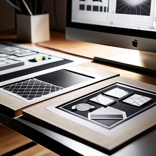
Ultimately, designing iconography is about far more than selecting a cohesive set of glyphs from a library or ensuring they fit within a strict pixel grid. It is a disciplined exercise in balancing semantic clarity with visual restraint. We have discussed the necessity of honoring meaning, the technical rigor required for interface scalability, and the subtle ways that small visual cues can either facilitate or frustrate a user’s journey. When we treat icons as mere decorations, we fail the user. But when we approach them as functional signposts—carefully crafted to respect the cognitive load of the person on the other side of the screen—we move from simple decoration to true digital craftsmanship.
As you move back to your canvas or your code, I encourage you to resist the urge to over-simplify to the point of emptiness. In our rush toward hyper-minimalism, we often strip away the very character that makes a tool feel intuitive and human. Don’t be afraid of a little intentionality, even if it feels like it adds a layer of complexity to your workflow. The most impactful designs are rarely the loudest; they are the ones that respect the friction of human touch and guide us through the digital landscape with grace. Build icons that don’t just occupy space, but actually serve a purpose.
Frequently Asked Questions
How do I maintain visual consistency when I'm forced to pull icons from different open-source libraries?
It’s a messy reality of the job, isn’t it? When you’re forced to mix libraries, you have to act as the unifying thread. I start by normalizing the weight. If one library feels heavy and another spindly, I’ll manually adjust stroke widths or use a subtle overlay to harmonize them. Most importantly, I create a strict “bounding box” system. By forcing every disparate icon into a consistent geometric container, you create a rhythmic visual logic that masks the underlying chaos.
At what point does an icon become too abstract to be useful, and how do I find that balance between minimalism and clarity?
An icon loses its soul—and its utility—the moment it requires a manual to decipher. If I have to pause for more than a heartbeat to translate a shape into a function, the design has failed. I find the balance by testing against the “glance test”: can a user identify the intent without cognitive friction? Minimalism should strip away the noise, not the meaning. If you’re sacrificing clarity for a clean aesthetic, you aren’t designing; you’re just decorating.
How can I ensure my icon sets remain accessible and legible for users with visual impairments without sacrificing the brand's aesthetic?
It’s a tension I face constantly: the pull between a refined, minimal aesthetic and the hard necessity of legibility. Don’t let a “thin” stroke become an invisible one. I always advocate for testing your icons at small scales and in grayscale; if the silhouette collapses, the brand’s elegance is irrelevant because the utility is gone. Prioritize high contrast and generous optical spacing. True craftsmanship isn’t about being clever; it’s about being clear.