
I remember sitting in a dimly lit studio back in the late nineties, the smell of spray adhesive and fresh ink heavy in the air, manually adjusting the kerning on a physical paste-up. There was a weight to every decision, a tactile resistance that forced you to think before you acted. Today, I watch designers chase the latest “seamless” trends, creating interfaces that are so frictionless they feel entirely hollow. We’ve become obsessed with making interface design invisible, but in our rush to eliminate every bit of resistance, we’ve accidentally stripped away the humanity of the tool.
I’m not here to feed you another list of trendy UI kits or buzzwords that will be obsolete by next Tuesday. Instead, I want to talk about how we can reclaim intentionality in our digital craft. I’m going to share what I’ve learned from twenty years of watching the medium shift from paper to pixels, focusing on how to build tools that actually respect the user’s rhythm. We aren’t just moving pixels around a screen; we are designing the space where human creativity happens, and it’s time we started treating it with that level of deliberate care.
Table of Contents
Honoring Human Computer Interaction Through Intentionality
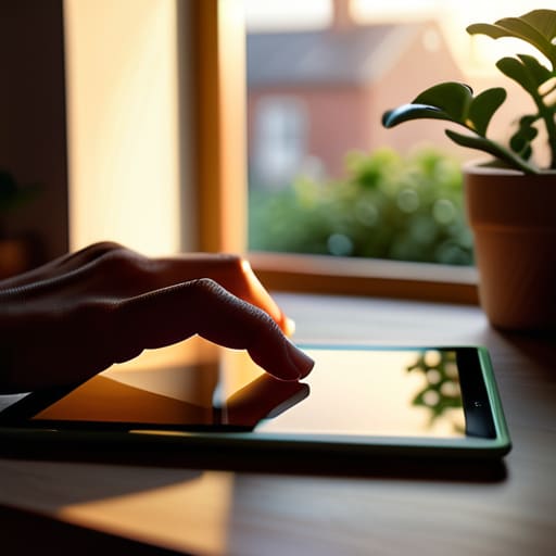
When we talk about human-computer interaction, we often get lost in the technical minutiae of latency and pixel density. But we forget that there is a person on the other side of that glass, someone with a specific rhythm and a finite amount of cognitive energy. To design with intent is to recognize that every click, swipe, and hover is a micro-decision that contributes to a larger sense of agency. We shouldn’t be building digital environments that demand constant attention; we should be crafting spaces that respect the user’s flow.
This requires a shift in how we apply user experience principles. It isn’t enough to simply check off a list of accessibility requirements or ensure that our interactive design elements are visually pleasing. We have to ask if these elements actually serve a purpose or if they are merely digital noise. True intentionality means building interfaces that feel like an extension of the hand rather than a barrier to the mind. When we prioritize this level of craftsmanship, we move away from mindless automation and back toward meaningful digital utility.
Using Interactive Design Elements to Respect the Creator

When we talk about interactive design elements, we often get caught up in the spectacle of what a tool can do rather than what it should do. I see so many modern applications packed with features that feel like they’re shouting for attention. For a designer in the middle of a flow state, a sudden, unprompted animation or a cluttered sidebar isn’t a “feature”—it’s a distraction. We need to treat these elements as quiet assistants. A well-placed slider or a subtle haptic response should feel like a natural extension of the hand, much like the weight of a well-balanced brush or the mechanical click of a Leica shutter.
True respect for the creator comes from building tools that prioritize cognitive ease. This means applying core user experience principles to ensure that the interface recedes into the background when the work gets intense. Instead of forcing a user to navigate through layers of unnecessary menus, we should aim for a streamlined environment that anticipates their next move without overstepping. It’s about creating a sense of rhythmic continuity where the software supports the creative impulse rather than interrupting it with digital noise.
Five Ways to Bring Craft Back to the Interface
- Prioritize negative space over density. A cluttered screen is a noisy one, and noise kills focus. Give your elements room to breathe so the user can actually process what they are looking at.
- Design for the “friction” of thought. Not every transition needs to be instantaneous or frictionless; sometimes, a deliberate, paced interaction helps a creator feel the weight and importance of their decisions.
- Treat typography as a functional pillar, not an afterthought. As a type designer, I see too many interfaces where legibility is sacrificed for a “trend.” If the user has to struggle to read your labels, the interface has failed.
- Build affordances that feel tactile. Even in a digital space, elements should hint at their function through subtle shadows or depth, mimicking the physical intuition we carry from the analog world.
- Avoid the trap of “feature creep.” Every new button or slider you add is a new cognitive burden for your user. If a tool doesn’t serve a clear, purposeful intent, leave it out of the layout entirely.
The Essentials of Intentional Interface Design
Prioritize purposeful interaction over decorative clutter; every element on the screen must earn its place by serving the user’s immediate creative or functional need.
Respect the user’s cognitive rhythm by designing interfaces that accommodate human friction rather than trying to bypass it with mindless automation.
Build tools that act as extensions of the creator’s hand, focusing on tactile responsiveness and clarity to preserve the sense of craftsmanship in a digital space.
The Ghost in the Machine
A truly great interface shouldn’t feel like a command center; it should feel like a well-worn tool—something that stays out of your way just enough to let your intuition take the lead.
Ingrid Bellamy
The Craft Beyond the Pixel

At the end of the day, interface design isn’t about mastering the latest software or stacking features like a game of digital Tetris. It is about the delicate balance between efficiency and humanity. We’ve discussed how intentionality dictates the flow of interaction and how we must build elements that respect the user’s rhythm rather than demanding their constant attention. When we prioritize purpose over mere presence, we move away from the noise of “optimized” clutter and toward a workspace that feels like an extension of the mind. We must remember that every button, every margin, and every micro-interaction is a choice to either facilitate or frustrate the creative spirit.
As I sit here with my sketchbook, watching the light change on my desk, I’m reminded that the most profound tools are often the ones that feel most invisible. Our goal shouldn’t be to build interfaces that scream for attention, but to craft digital environments that honor the friction of real work. Technology should never be a barrier between the idea and its execution; it should be the steady hand that guides the pen. Let’s commit to designing with a sense of stewardship, building digital landscapes that don’t just fill a screen, but actually empower the person standing behind it.
Frequently Asked Questions
How do we find the balance between seamless automation and maintaining that necessary "friction" that keeps a designer's hand in the work?
We find that balance by treating automation as a scaffold, not a replacement. Automation should handle the heavy lifting—the repetitive, soul-crushing tasks like resizing assets or organizing layers—to clear the path for decision-making. But the critical choices, the subtle adjustments in kerning or the weight of a stroke, must remain manual. If a tool makes every decision for you, it isn’t helping you design; it’s just designing for you.
In an age of rapid prototyping, how can we ensure we aren't sacrificing long-term typographic intentionality for short-term speed?
We’ve become so obsessed with the speed of the prototype that we treat type as an afterthought—a placeholder to be swapped in later. But typography isn’t a layer you apply; it’s the foundation. To fight this, I treat type as a structural constraint from day one. Don’t just pick a font that “looks fine” for a mockup. Choose a typeface that carries the weight of your intent, even when the layout is still messy.
What are the practical ways to design interfaces that adapt to a creator's unique workflow rather than forcing them into a standardized grid?
Stop trying to force every designer into a rigid, one-size-fits-all dashboard. Instead, think in modules. Build interfaces that allow for “progressive disclosure”—showing only the tools needed for the current task to avoid cognitive overload. Implement customizable workspaces where users can pin their most-used palettes or typography tools. When we design for flexibility rather than strict standardization, we stop building cages and start building environments that actually breathe with the person using them.
