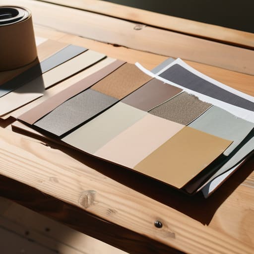
I remember sitting on the floor of a studio in Providence back in the nineties, surrounded by the sharp scent of spray adhesive and the heavy weight of oversized paper stock. We didn’t have infinite scrolling or instant digital libraries; we had physical scraps, textured swatches, and the slow, deliberate process of arranging mood boards by hand. Today, I see designers rushing through Pinterest boards like they’re checking items off a grocery list, creating nothing more than a shallow collection of pretty pixels that lacks any real connective tissue. When you treat a mood board as a mere aesthetic checklist rather than a conceptual foundation, you lose the very soul of the work before you’ve even opened your design software.
I’m not here to teach you how to make a collage that looks good on Instagram. Instead, I want to share how to use these tools to build a rigorous visual logic that actually survives the transition from concept to final execution. We are going to move past the surface-level fluff and focus on how to curate imagery that honors the intentionality of craftsmanship. My goal is to help you build a roadmap that respects the friction of the creative process, ensuring your work is grounded in purpose rather than just filling a screen.
Table of Contents
- Curating Visual Assets With Purposeful Human Friction
- Mastering Visual Storytelling Techniques Through Intentionality
- Five Ways to Keep Your Mood Board from Becoming Just Another Pinterest Rabbit Hole
- The Intentionality Checklist
- The Soul of the Board
- The Soul in the System
- Frequently Asked Questions
Curating Visual Assets With Purposeful Human Friction
When I sit down with a new client, my first instinct isn’t to open a browser and start scraping Pinterest for whatever is trending. That’s a shortcut to a hollow result. Instead, I focus on curating visual assets that possess a certain weight—images that feel like they have a history. Whether it’s the grain in a scanned film photograph or the specific way light hits a brutalist concrete wall, these elements provide the necessary friction to ground a project. Without that intentionality, you aren’t building a brand; you’re just decorating a slide deck.
The real magic happens during design concept development, where we move past surface-level beauty. I find that the most successful projects emerge when we treat our collection of references as a dialogue rather than a checklist. It’s about finding the tension between a muted, earthy color palette development and a sharp, modern typeface. We aren’t just looking for things that “match”; we are looking for the visual echoes that will eventually form the backbone of the entire brand identity.
Mastering Visual Storytelling Techniques Through Intentionality
When we move from gathering images to actually building a narrative, we enter the realm of true design concept development. It isn’t enough to simply place a texture next to a typeface; you have to ask why they belong in the same room. I often find that the most compelling visual storytelling techniques emerge when you stop looking for “perfection” and start looking for tension. Maybe it’s the way a grainy, high-contrast photograph disrupts a clean, Swiss-inspired grid, or how a muted, desaturated color palette development can evoke a sense of nostalgia that a bright, saturated set of swatches never could.
The goal is to create a visual logic that feels inevitable rather than accidental. As you refine your board, lean into aesthetic composition principles that guide the eye—think about weight, rhythm, and the negative space between your references. If a piece of imagery feels like it’s just “filling space,” strip it away. A successful board shouldn’t just show what the project looks like; it should articulate how the project feels to inhabit.
Five Ways to Keep Your Mood Board from Becoming Just Another Pinterest Rabbit Hole
- Prioritize texture over color alone. A digital palette is fine, but a mood board needs the grit of a scanned linen paper or the way light hits a matte surface to truly communicate a feeling.
- Curate for tension, not just harmony. If every image is “perfect,” your board will be stagnant. Introduce a bit of visual friction—a rough charcoal sketch next to a clean sans-serif—to find where the real energy lives.
- Limit your visual vocabulary. It’s tempting to hoard every beautiful thing you see, but a board with fifty disparate images is just noise. Aim for a tight, disciplined selection that forces you to make decisions.
- Incorporate the non-digital. I often find that a scrap of fabric or a quick ink wash in my physical sketchbook provides more direction than a thousand high-res stock photos ever could. Don’t be afraid to bridge the gap between the tactile and the screen.
- Ask “Why?” for every single asset. If you can’t articulate exactly how a specific image serves the project’s core intention, it doesn’t belong on the board. Every piece must earn its place.
The Intentionality Checklist
Stop collecting for the sake of density; a mood board is a curated argument, not a junk drawer of pretty images.
Prioritize the “why” behind every texture and typeface to ensure your visual direction has a functional backbone.
Respect the friction of the process by stepping away from the screen to find real-world inspiration that digital algorithms can’t replicate.
The Soul of the Board
A mood board shouldn’t be a mindless grab for whatever is trending on a feed; it’s a way to capture the quiet, intentional friction between an idea and the textures that make it feel real.
Ingrid Bellamy
The Soul in the System
At the end of the day, a mood board is more than just a digital collage or a convenient way to organize a Pinterest board. It is a rigorous exercise in decision-making. By focusing on purposeful curation and mastering the nuances of visual storytelling, you move away from mindless scrolling and toward true intentionality. We have discussed how to introduce that necessary human friction into your process—the kind of friction that stops you from choosing a trend just because it’s loud, and instead pushes you to choose a texture, a color, or a typeface because it actually speaks to the project’s core.
As you move back to your canvas, I encourage you to remember that the tools we use are merely extensions of our own hands. Whether you are dragging assets across a screen or pinning physical scraps of paper to a wall, never lose sight of the why behind the aesthetic. The goal isn’t to create something that looks perfect on a high-resolution monitor; it is to create something that feels deeply human. Don’t be afraid to let the process be a little messy. That’s usually where the most honest design lives.
Frequently Asked Questions
How do I prevent a mood board from becoming just another superficial collection of Pinterest trends?
Stop looking for “vibes” and start looking for evidence. When I’m curating, I ask myself: Why does this specific texture or serif belong here? If you can’t articulate the functional reason behind a choice, it’s just noise. To avoid the Pinterest trap, anchor your board in core principles—materiality, lighting, or rhythm—rather than fleeting aesthetics. A good mood board isn’t a gallery of what’s popular; it’s a blueprint of what’s necessary.
At what point in the design process does a mood board stop being a guide and start becoming a constraint?
It happens the moment you stop using the board to find a direction and start using it to police your decisions. A mood board should be a compass, not a cage. If you find yourself rejecting a brilliant, unexpected idea simply because it doesn’t “fit the board,” you’ve crossed the line. When the initial inspiration turns into a rigid checklist that stifles evolution, your guide has become a constraint.
How can I effectively communicate the "feeling" of a mood board to a client who only cares about the final digital output?
Stop selling them pixels and start selling them a way of being. When a client is fixated on the final digital output, they’re looking at the destination while ignoring the atmosphere. I find it helpful to translate visual cues into sensory language. Don’t just show a color palette; describe the weight of the shadows or the grain of the texture. If you can articulate how a specific tension or rhythm will guide their brand’s soul, they’ll stop worrying about the screen and start feeling the vision.
