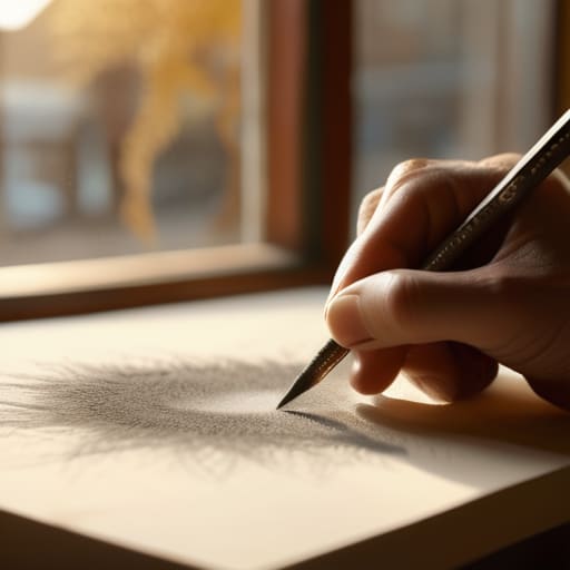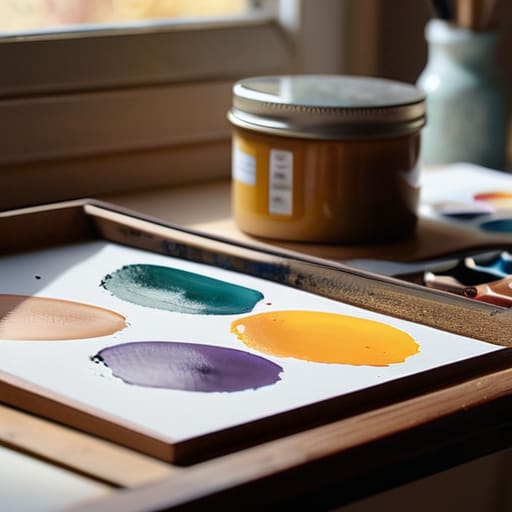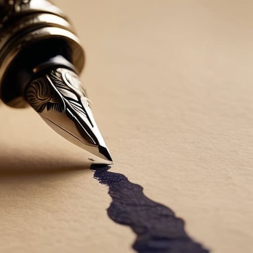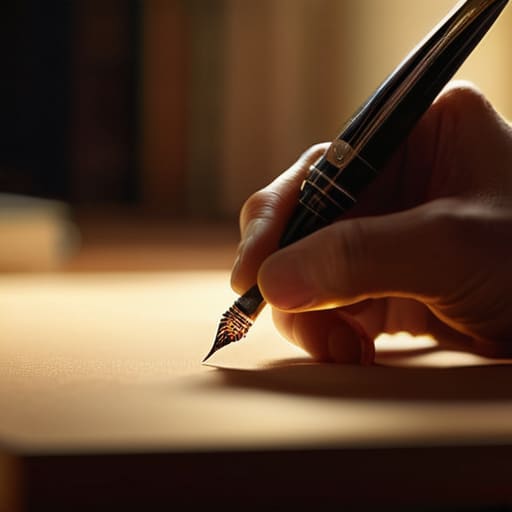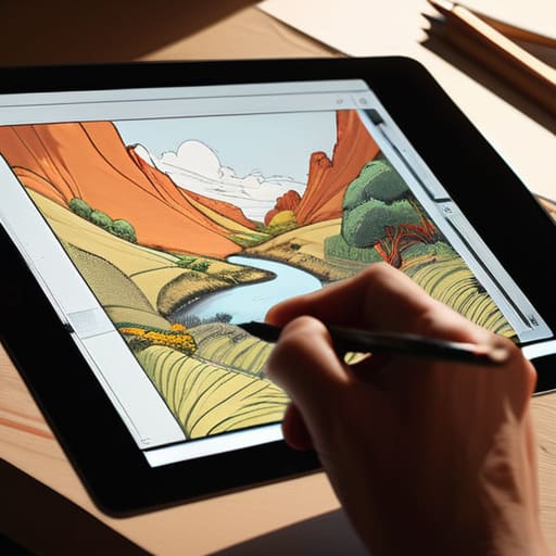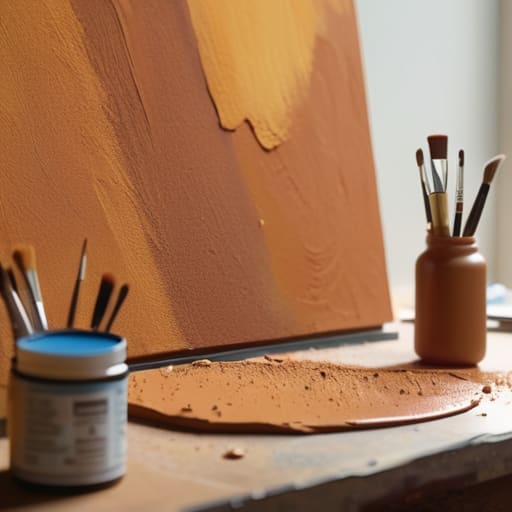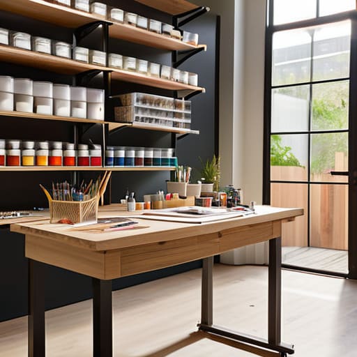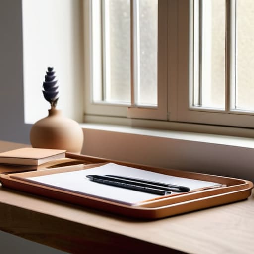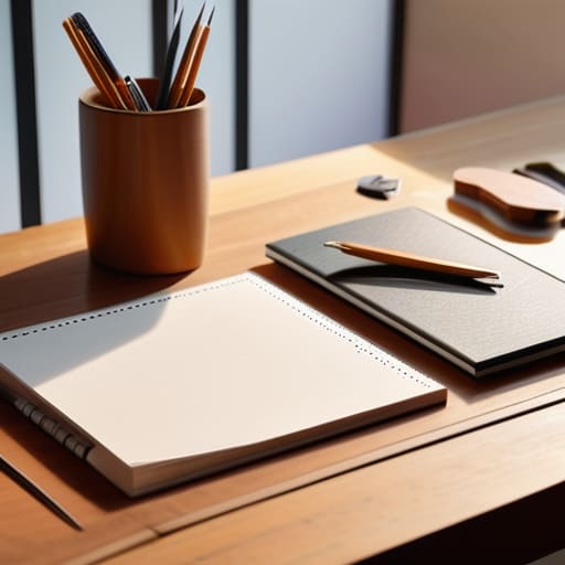
Efficient studio organization for creative productivity.

Organizing a Productive Creative Studio

I remember sitting in a cramped studio back in the late nineties, surrounded by the heavy scent of spray adhesive and the tactile chaos of physical paste-ups. There was a specific kind of magic in that clutter, but there was also a limit to how much friction a creative mind could handle before the process simply broke. Today, I see people chasing “aesthetic” productivity setups—rows of identical white organizers and overpriced tech gadgets—as if perfect studio organization is a magic pill for talent. It isn’t. If you’re organizing just to satisfy an Instagram feed rather than to clear a path for your thoughts, you aren’t building a workspace; you’re building a museum.

I’m not here to sell you on a lifestyle or a specific brand of modular shelving. Instead, I want to talk about how to curate your environment so that your tools stay out of the way of your creative flow. I’ll be sharing the practical, slightly unpolished ways I manage my own hybrid space—balancing the digital precision of type design with the physical mess of sketching and film restoration. We are going to focus on intentionality over aesthetics, ensuring your setup actually serves the work you do.

Table of Contents

Minimizing Creative Friction Through Mindful Creative Workspace Declutterin

Minimizing Creative Friction Through Mindful Creative Workspace Declutterin

When I sit down at my desk, I don’t want to spend the first twenty minutes hunting for a specific nib or a particular swatch of Pantone paper. There is a specific kind of mental fatigue that sets in when your physical environment is fighting your intent. True creative workspace decluttering isn’t about achieving a sterile, museum-like emptiness; it’s about removing the visual noise that competes for your attention. If your desk is a graveyard of half-finished sketches and tangled cables, your brain is subconsciously processing that chaos instead of focusing on the typeface you’re refining.

I’ve learned that the goal is to create a seamless transition between thought and execution. This means investing in thoughtful art supply organization systems that keep your most tactile tools within arm’s reach, while tucking away the distractions. When you curate your surroundings, you aren’t just tidying up; you are minimizing creative friction so that the distance between a spark of inspiration and the first stroke of a pen feels as short as possible. Your space should act as a silent partner in your process, not an obstacle to it.

Optimizing Small Studio Layouts to Honor the Human Touch

Optimizing Small Studio Layouts to Honor the Human Touch

When you’re working in a tight corner or a shared apartment nook, the temptation is to treat your desk like a storage unit. But a desk should be a staging ground, not a warehouse. Optimizing small studio layouts isn’t about squeezing every possible inch of utility out of a square foot; it’s about ensuring that your primary tools—the ones that actually facilitate thought—are within a natural reach. I’ve found that if I have to stand up or lean awkwardly to grab a specific Pantone book or my sketchbook, the mental momentum breaks.

Instead of sprawling across the surface, look toward verticality. Implementing smart studio storage solutions, like pegboards or slim rolling carts, allows you to keep your immediate field of vision clear while keeping your tactile tools close at hand. This isn’t just about tidiness; it’s a fundamental part of ergonomic studio design. By keeping the physical clutter below eye level and the essential tools within arm’s length, you create a sanctuary where the focus remains on the craft, rather than the struggle of navigating your own environment.

Tactile Systems for Digital Minds: 5 Ways to Anchor Your Workspace

  • Curate your physical tools by frequency of use. If you reach for your sketchbook or your favorite fountain pen every hour, they shouldn’t be tucked away in a drawer; they should live within your immediate reach, acting as an extension of your hand.
  • Implement a “digital clearing” ritual at the end of every session. Just as I wipe down my vintage Leica after a shoot, close your unnecessary browser tabs and clear your desktop files. A cluttered screen is just as draining as a cluttered desk.
  • Designate specific zones for different modes of thinking. Keep your high-focus digital workstation separate from your analog sketching area. This physical boundary helps your brain transition from the precision of pixel-pushing to the loose exploration of a draft.
  • Invest in analog storage for your most meaningful inspirations. A digital mood board is efficient, but a physical folder of paper swatches, printed typography specimens, or textured proofs provides a sensory depth that a screen simply cannot replicate.
  • Audit your hardware to eliminate “phantom clutter.” We often accumulate cables, dongles, and half-dead peripherals that serve no purpose but to occupy mental space. If a piece of tech doesn’t actively support your current workflow, let it go.

The Intentionality of a Curated Workspace

Don’t mistake a clean desk for a productive one; organize your tools based on the rhythm of your actual workflow rather than an idealized aesthetic.

Protect your creative friction by keeping physical touchpoints—like your sketchbook or a reliable pen—within immediate reach, ensuring digital tools don’t become a barrier to thought.

View your studio layout as a functional extension of your process, where every object serves a purpose in supporting, rather than distracting from, the craft.

The Soul of the Workspace

A well-organized studio isn’t about achieving a sterile, picture-perfect aesthetic; it’s about arranging your environment so that the distance between a sudden thought and its physical execution is as short as possible.

Ingrid Bellamy

The Intentional Workspace

Organizing The Intentional Workspace for creativity.

At the end of the day, organizing your studio isn’t about achieving a sterile, Pinterest-perfect aesthetic; it’s about managing the physicality of your process. We’ve talked about decluttering to reduce mental noise and tailoring your layout to respect the natural movements of your hands. Whether you are arranging your digital peripherals or clearing a dedicated spot for your sketchbook and fountain pen, every decision should serve a single purpose: to keep your focus where it belongs. When we curate our environment with intention, we aren’t just tidying up—we are protecting our creative capacity from the chaos of a disorganized life.

As you move back to your desk, I encourage you to look at your tools not as mere objects, but as extensions of your own vision. Don’t let the pursuit of a “perfect” system become another chore that drains your energy. Instead, allow your space to evolve alongside your work, creating a sanctuary that honors both the precision of digital design and the beautiful friction of the human touch. Build a workspace that doesn’t just house your equipment, but actively empowers your craft.

Frequently Asked Questions

How do I balance the need for a clean, minimalist aesthetic with the practical necessity of keeping my tactile tools—like my sketchbooks and pens—within arm's reach?

Don’t mistake minimalism for emptiness. A sterile desk isn’t a productive one; it’s just a lonely one. I treat my tools like an extension of my hands. Use trays or dedicated modular organizers to group your sketchbooks and pens. This creates “visual boundaries”—the tools are contained and tidy, but they remain immediate. You aren’t hiding your craft; you’re framing it so it’s ready the moment inspiration strikes.

When working in a hybrid environment, how can I create a physical organization system that translates seamlessly between my analog drafting space and my digital workstation?

The trick is to stop treating your analog and digital worlds as separate silos. I rely on a “unified tactile system.” Use the same modular tray or color-coded labeling for your physical pens and sketchbooks as you do for your digital asset folders. When your physical tools follow the same organizational logic as your desktop, the mental shift between sketching a typeface and refining its vectors becomes fluid, rather than a jarring disruption to your flow.

How much "creative clutter" is actually healthy for the process, and how do I distinguish between inspiring chaos and genuine distraction?

There is a fine line between a workspace that breathes and one that suffocates. I call it “curated chaos.” Healthy clutter consists of tactile references—swatches, sketches, or a stray typeface specimen—that spark unexpected connections. If a pile of papers serves as a visual anchor for an idea, keep it. But if you’re staring at a tangled mess of cables or old receipts and feeling a sense of dread rather than inspiration, that’s not creative friction; it’s just noise.

Creative work using impactful visual metaphors.

Using Visual Metaphors in Creative Work

I was sitting at my drafting table last night, cleaning the grit out of a vintage Leica, when I realized how much we’ve lost in the rush to make everything “seamless.” We’ve become obsessed with hyper-efficient, sterile interfaces that strip away any sense of place or meaning. Somewhere along the way, people started treating visual metaphors like mere window dressing—little decorative icons tossed onto a layout to satisfy a client’s whim. But when a metaphor is used just to fill space, it doesn’t guide the user; it just creates digital noise that obscures the actual purpose of the design.

I’m not interested in teaching you how to make your interfaces look “trendy” or how to use stock imagery to mask a lack of substance. Instead, I want to talk about how we can use visual metaphors to restore a sense of tactile intentionality to our digital work. Over the next few minutes, I’ll share what I’ve learned from twenty years of navigating the shift from ink to pixels, focusing on how to build bridges between the user and the screen that feel honest, functional, and—most importantly—human.

Table of Contents

The Semiotics in Graphic Design of Meaningful Connection

The Semiotics in Graphic Design of Meaningful Connection

When we talk about semiotics in graphic design, we aren’t just discussing how an icon looks, but how it lands in the mind of the viewer. It’s the difference between a symbol that merely points to a function and one that evokes a feeling. If I’m designing a brand identity for a sustainable apothecary, I’m not looking for a generic leaf icon. I’m looking for a shape that captures the organic weight of a seed or the delicate tension of a sprout. This level of nuance relies on the cognitive processing of imagery, where the brain bypasses the literal and moves straight to the emotional truth of the mark.

True connection happens when we move beyond the obvious. Using symbolism in visual communication allows us to tap into a shared cultural vocabulary, creating a sense of familiarity without being cliché. It’s about finding that sweet spot where an image feels both inevitable and surprising. When we lean into intentional abstraction, we invite the user to participate in the meaning-making process. They aren’t just consuming a layout; they are decoding a story, which makes the digital interaction feel significantly more profound.

Visual Storytelling Techniques That Respect the Users Journey

Visual Storytelling Techniques That Respect the Users Journey

When we talk about visual storytelling techniques, we often fall into the trap of trying to explain everything at once. We treat the user like a passive observer who needs every single detail spelled out. But real connection happens in the gaps—the quiet moments where a user’s own intuition fills in the blanks. I’ve found that the most effective interfaces don’t shout; they whisper. By using subtle symbolism in visual communication, we can guide a person through a digital flow without the jarring interruption of heavy-handed instructional text. It’s about creating a sense of momentum that feels earned, not forced.

This requires a deep respect for the cognitive processing of imagery. If we lean too heavily on literalism, we strip the experience of its soul. However, if we lean too far into abstraction, we risk losing the user in a fog of confusion. The goal is to find that sweet spot where a shape or a movement acts as a gentle nudge. We aren’t just moving pixels; we are honoring the user’s rhythm and providing them with the agency to navigate their own way through the design.

The Craft of Meaning: Five Ways to Use Metaphor Without Losing the Thread

  • Prioritize clarity over cleverness. A metaphor is a bridge, not a riddle; if your user has to pause for more than a second to decode what an icon or visual represents, you haven’t built a bridge—you’ve built an obstacle.
  • Respect the tactile memory. We carry physical intuition into digital spaces. Using subtle shadows or textures that mimic the way light hits paper or glass helps ground abstract concepts in a reality the human brain already understands.
  • Avoid the cliché trap. The magnifying glass for “search” or the floppy disk for “save” are functional, but they are becoming ghosts of a dead era. Try to find metaphors that speak to the action or the feeling of the task rather than just repeating tired iconography.
  • Context is your North Star. A metaphor that works in a high-end editorial layout will fail in a dense data dashboard. Ensure your visual language matches the weight and the tempo of the environment you are designing for.
  • Leave room for the user to breathe. Don’t over-index on metaphor to the point where the interface becomes a decorative illustration. The best metaphors are felt, not just seen; they should support the function, never compete with it.

The Intentionality of the Interface

A visual metaphor is only as strong as the cognitive load it reduces; if a symbol requires a manual to understand, it has failed the user and become mere noise.

Avoid the temptation to use metaphors for aesthetic flair alone—every icon and metaphor must act as a functional bridge between a user’s intent and the digital action.

Respect the tactile memory of your audience by choosing metaphors that feel grounded in physical reality, creating a sense of familiarity that eases the friction of digital navigation.

The Weight of Intent

A visual metaphor shouldn’t be a decorative afterthought used to fill empty space; it should be a quiet, tactile bridge that connects a user’s intuition to a digital action, honoring the human need for meaning over mere stimulation.

Ingrid Bellamy

The Intentionality of the Image

The Intentionality of the Image through symbolism.

At its core, the use of visual metaphors is not about adding more weight to a layout; it is about finding the right weight. We have explored how semiotics can bridge the gap between a cold interface and a human emotion, and how storytelling techniques allow us to respect the user’s cognitive journey rather than overwhelming it. When we move away from decorative clutter and toward purposeful symbolism, we stop designing for the eye and start designing for the mind. It is the difference between a surface-level distraction and a meaningful connection that lingers long after the screen goes dark.

As we move further into an era of automated, generative design, I find myself returning to the tactile lessons of my early years in the studio. Machines can replicate patterns, but they struggle to understand the nuance of a metaphor that requires a human soul to decode. My hope is that you approach your next project not as a series of pixels to be filled, but as a space for intentional communication. Let us commit to building digital worlds that honor the complexity of human thought, ensuring that every metaphor we choose serves to empower the creator and the user alike.

Frequently Asked Questions

How do we balance the use of metaphors without falling into the trap of visual clichés that feel hollow or lazy?

To avoid the cliché, we have to stop looking for the “obvious” icon and start looking for the underlying feeling. A lightbulb for an idea is lazy; it’s a shortcut that bypasses actual thought. Instead, I try to find metaphors that respect the user’s intelligence. We should lean into subtle, tactile cues—the way a shadow suggests depth or a specific weight of line suggests stability. If the metaphor feels too easy, it’s probably hollow.

At what point does a metaphor become too abstract, causing more cognitive friction than actual clarity?

It becomes a problem the moment the user has to stop and think, “Wait, what does this represent?” If the metaphor requires a manual to decode, you’ve failed. In my experience, clarity should always take precedence over cleverness. A metaphor is meant to be a bridge, not a riddle. Once the cognitive load of deciphering the symbol outweighs the ease of the task at hand, you aren’t designing; you’re just decorating with confusion.

How can we ensure these metaphors remain culturally inclusive and don't inadvertently alienate users from different backgrounds?

To avoid accidental exclusion, we have to stop treating metaphors as universal truths. A symbol that feels intuitive to me might feel opaque, or even offensive, to someone halfway across the world. We must move past our own cultural bubbles by testing our visual language against diverse lived experiences. Don’t just design for the “average” user; design with the awareness that meaning is deeply contextual. If a metaphor requires a specific cultural shorthand to work, it isn’t a bridge—it’s a barrier.

Artistic analog collage composition.

The Art of Analog Collage

I still remember the smell of a studio in Providence during my sophomore year—a heavy, intoxicating mix of spray adhesive, old newsprint, and the metallic tang of X-Acto blades. I was hunched over a light table, my fingers stained with ink, trying to force a sense of cohesion out of a chaotic pile of discarded magazines. There was a specific, beautiful tension in that process; you couldn’t just hit `Cmd+Z` when a tear went too deep or a glue smudge ruined the grain. That physical struggle is exactly what’s missing from our perfectly polished, pixel-perfect interfaces today. We’ve traded the tactile friction of analog collage for a sterile, frictionless convenience that often leaves our work feeling hollow and uninspired.

In this piece, I’m not going to sell you on some expensive, curated “aesthetic” or tell you that you need a specialized kit to get started. Instead, I want to share the practical, messy reality of how to actually use analog collage to inject genuine soul back into your digital compositions. We’ll talk about the intentionality of texture, the value of the “happy accident,” and how to bridge the gap between the physical scrap and the digital canvas without losing the human touch that makes design worth doing.

Table of Contents

The Soul of Vintage Magazine Cutouts and Found Ephemera

The Soul of Vintage Magazine Cutouts and Found Ephemera.

There is a specific kind of magic found in the weight of a mid-century periodical. When I’m hunting through old archives, I’m not just looking for imagery; I’m looking for the ghosts of previous owners. A coffee stain on a page from 1964 or the slight yellowing of a corner tells a story that a high-resolution stock photo never could. Using vintage magazine cutouts allows you to tap into a pre-digital color palette—those slightly muted, offset lithography tones that feel grounded and intentional.

When you start gathering your ephemera for collage, you aren’t just collecting scraps; you are collecting fragments of time. I often find myself drawn to old transit maps or weathered postcards because they provide a structural depth that digital vectors lack. The goal isn’t to create something “perfect.” Instead, I look for pieces that invite tactile tension. By integrating these physical artifacts, you introduce a layer of history that forces the viewer to slow down and actually look at the work, rather than just scrolling past it.

Building Intentionality With Essential Collage Art Supplies

Building Intentionality With Essential Collage Art Supplies

When you sit down to create, the tools you choose dictate the rhythm of your work. I’ve found that the friction of a heavy-weight paper or the specific resistance of a glue stick changes how I approach a piece. It isn’t about having an expensive studio; it’s about selecting collage art supplies that invite experimentation rather than perfection. I tend to gravitate toward archival-quality adhesives and a curated selection of ephemera for collage—things like old botanical prints or weathered postcards—that have a history written into their fibers.

The magic happens when you stop treating materials as mere assets and start treating them as collaborators. Instead of reaching for a digital brush to simulate depth, I find myself layering paper textures to build a physical topography. A piece of torn linen or a scrap of handmade washi paper adds a dimension of light and shadow that a screen simply cannot replicate. By choosing materials with inherent character, you aren’t just decorating a surface; you are building a foundation of intentionality that carries through to the final composition.

Five Ways to Keep Your Process From Becoming Too Polished

  • Embrace the tear. Don’t reach for the precision scissors every time you want to move a piece; a jagged, hand-torn edge introduces a physical weight and a shadow that a digital vector can never replicate.
  • Layer with purpose, not just density. It’s tempting to stack scraps until the composition feels heavy, but true depth comes from leaving “breathing room”—letting the paper grain or the background texture speak through the gaps.
  • Respect the history of your materials. If you’re using a cutting from a 1960s travel brochure, let that specific halftone pattern or aged paper tone dictate your color palette rather than forcing it to match a modern hex code.
  • Fight the urge to over-glue. I’ve seen too many beautiful compositions turn into a muddy mess because of excess adhesive. Use just enough to hold the vision, keeping the paper’s natural tension intact.
  • Step away from the screen to evaluate. Once you’ve assembled a piece, move it to a different light source or look at it from a distance. Digital perfection often hides the very “friction” that makes a collage feel alive and human.

Finding the Friction

Stop chasing pixel-perfect smoothness; the real magic lives in the ragged edges and the slight misalignment of a hand-cut piece of paper.

Treat your physical supplies as extensions of your intent, not just tools, by selecting textures that carry their own history and weight.

Use analog collage not as a decorative layer, but as a way to inject deliberate, human imperfection back into an increasingly sanitized digital landscape.

The Friction of the Physical

“Digital tools offer us endless perfection, but perfection is often where creativity goes to die. Analog collage isn’t about being messy; it’s about embracing the resistance of the paper and the unpredictable grain of a vintage cutout to find a truth that a pixel simply cannot replicate.”

Ingrid Bellamy

Finding the Rhythm in the Imperfection

Finding the Rhythm in the Imperfection collage.

At the end of the day, analog collage isn’t about achieving a polished, pixel-perfect finish. It’s about the intentionality we bring to the table when we choose a weathered magazine clipping over a stock photo or a physical glue stick over a digital layer. By curating our own ephemera and investing in tools that actually respond to our hands, we move away from the mindless scrolling of digital assets and toward a deliberate act of construction. We’ve explored how the texture of found objects and the right set of tactile supplies can transform a simple composition into something that feels alive, grounded, and deeply personal.

As I sit here with my sketchbook, watching the light shift across my desk, I’m reminded that our best work often happens in the spaces between the lines. In an industry that is increasingly obsessed with speed and automation, I encourage you to slow down. Don’t be afraid of the tear in the paper or the slight smudge of ink; those are the fingerprints of your humanity. Use these methods to reclaim your creative agency and to build something that resists the frictionless void of the screen. Let your work be a testament to the beauty of the human touch.

Frequently Asked Questions

How do you balance the messy, physical nature of collage with the need for precision when transitioning a piece into a digital workflow?

It’s a delicate dance. I never try to “fix” the mess in Photoshop; that’s where the soul dies. Instead, I scan my work at the highest possible DPI to preserve every fiber and ink bleed. I treat the digital stage as a way to refine the composition and color balance, not to smooth out the edges. Let the scan be imperfect. The precision should come from your layout and typography, not from erasing the grit.

What are the best ways to preserve the delicate textures of old paper and ephemera when scanning them for high-resolution design work?

Don’t just scan and walk away. If you want to keep that toothy, tactile soul, you have to treat the scanner like a darkroom. Use a flatbed, not a feeder, and keep the glass pristine—even a fingerprint can kill the illusion of age. I always scan at a minimum of 600 DPI, often higher, to capture the micro-shadows in the paper grain. Most importantly, avoid the temptation to “auto-correct” the brightness; let the scanner capture the actual, imperfect tonal range.

How can I avoid the cliché "scrapbook" look and ensure my collage feels like a deliberate piece of brand storytelling rather than just a collection of random clippings?

The difference lies in restraint. A scrapbook is an accumulation; a brand story is a curation. To avoid that cluttered, accidental feel, you need a unifying visual thread—think a consistent color palette, a specific typographic scale, or a recurring geometric motif. Don’t just layer things because they look interesting. Ask yourself: how does this texture support the narrative? If a clipping doesn’t serve the core message, leave it on the cutting room floor.

Implementing sustainable design practices in architecture.

Integrating Sustainable Design Practices

I was sitting at my desk yesterday, cleaning the internal gears of a 1970s Leica, when I realized how much we’ve lost in our rush to make everything “efficient.” In the digital world, we’ve been sold this glossy lie that sustainable design practices are just about adding a “green” badge to a UI or optimizing a few lines of code to save a milligram of server energy. It’s become a checkbox exercise, a way for big tech to perform virtue while the digital landscape becomes increasingly bloated, heavy, and disposable. We’re building massive, high-resolution monuments to nothing, ignoring the fact that true sustainability is rooted in how long a tool remains useful to the human hand.

I’m not here to give you a list of trendy plugins or performative metrics that look good in a quarterly report. Instead, I want to talk about the grit of it: how to strip away the digital noise, respect the hardware limitations of our users, and create work that actually lasts. I’m going to share what I’ve learned from twenty years of watching trends burn out, focusing on how to build interfaces that prioritize intentionality over excess. Let’s get back to making things that serve a purpose.

Table of Contents

Embracing the Circular Economy in Design

Embracing the Circular Economy in Design.

When we talk about the circular economy in design, we aren’t just talking about recycling bins or better packaging. To me, it’s about a fundamental shift in how we conceptualize the “end” of a project. In my early days of print, we thought about the life of a poster in terms of its shelf life; today, we have to think about the life of a digital interface or a physical product in terms of its entire existence. It requires us to move away from the “take-make-waste” mentality and instead focus on renewable resource integration from the very first sketch.

This means performing a rigorous life cycle assessment design before a single pixel is placed or a prototype is cast. We have to ask: where does this material go when the user is finished with it? If we aren’t designing for disassembly or digital longevity, we are just contributing to the noise. True intentionality means choosing paths that prioritize carbon footprint reduction strategies over the convenience of cheap, disposable components. It’s about building things that are meant to be repaired, repurposed, or returned to the earth, rather than simply discarded.

Carbon Footprint Reduction Strategies for Creators

Carbon Footprint Reduction Strategies for Creators.

When we talk about carbon footprint reduction strategies, we often default to thinking about physical waste, but for those of us in the digital and branding space, the impact is often invisible. It lives in the weight of our files, the energy required to power massive server farms, and the complexity of our code. I’ve learned that a “heavy” website—one bloated with unoptimized high-res assets and endless scripts—is essentially a digital pollutant. We need to start viewing digital efficiency as a form of craftsmanship.

This means moving toward a leaner aesthetic that prioritizes performance. Instead of chasing every new high-fidelity animation that drains a user’s battery, we should be looking at how we can achieve impact through intentionality and restraint. It’s about making choices that respect the energy lifecycle of the device on the other end. Whether it’s optimizing image delivery or choosing hosting providers that lean into renewable energy, these small, disciplined shifts allow us to create work that is both beautiful and respectful of the planet’s finite resources.

Five Ways to Practice Intentional, Low-Impact Design

  • Audit your assets before you deploy. We often fall into the trap of using massive, high-resolution files when a more compressed, purposeful version would serve the user just as well. Every unnecessary kilobyte is just digital noise that drains energy.
  • Prioritize system fonts over custom typefaces when possible. I love a beautiful, bespoke typeface as much as anyone, but forcing a user’s device to download a heavy font file just to render a headline is a luxury we can’t always afford if we’re thinking about efficiency.
  • Design for dark mode from the start. It’s not just a trend; it’s a functional choice. On OLED screens, dark interfaces actually consume less power, making your design more respectful of the hardware it lives on.
  • Simplify your color palettes. High-contrast, minimal color schemes aren’t just aesthetically cleaner; they reduce the complexity of the data being processed. Aim for utility over decoration.
  • Build for longevity, not the next refresh cycle. Avoid the urge to chase every fleeting micro-interaction trend. A design that stays relevant and functional for years is far more sustainable than one that requires a total overhaul every six months.

The Intentional Designer's Checklist

Stop designing for the “wow” factor and start designing for permanence; true sustainability means building digital assets that don’t need a complete overhaul every eighteen months.

Treat your digital weight with the same scrutiny you would a physical print run—every unnecessary pixel and heavy script is a tax on both the planet and the user’s experience.

Prioritize tools and workflows that favor longevity over novelty, ensuring that the craftsmanship we put into our work survives the rapid cycle of software obsolescence.

The Weight of Intentionality

Sustainability in our field isn’t a checklist of eco-friendly assets; it’s a commitment to intentionality. It’s about refusing to design the disposable, and instead, building digital experiences that are lean, purposeful, and built to endure the friction of real life.

Ingrid Bellamy

The Intentional Path Forward

The Intentional Path Forward: sustainable design.

At the end of the day, sustainable design isn’t a checklist of technical optimizations or a trendy buzzword to slap onto a brand deck. It is a fundamental shift in how we approach our craft. We’ve looked at how circular economy principles can keep digital assets from becoming instant landfill, and how reducing our carbon footprint requires us to be more disciplined with the code and assets we deploy. It’s about moving away from the “more is more” mentality and realizing that true efficiency lies in restraint. When we stop designing for the sake of novelty and start designing for longevity, we create work that actually survives the rapid churn of the digital age.

As I sit here with my sketchbook, I’m reminded that the most enduring things I’ve ever encountered—from a well-balanced typeface to a heavy brass camera body—were built with a sense of permanence in mind. We have a responsibility to carry that same intentionality into the pixels we arrange every day. Don’t let the pressure of the “new” push you toward the disposable. Instead, strive to build tools and interfaces that respect the user and the planet in equal measure. If we can learn to value the friction of quality over the ease of automation, we won’t just be making better design; we’ll be making a better future for the next generation of creators.

Frequently Asked Questions

How do we balance the need for high-fidelity, beautiful design with the actual technical weight that code and heavy assets place on a user's device?

It’s the classic tension: the desire for visual richness versus the reality of hardware limitations. I’ve always believed that “high-fidelity” shouldn’t be a synonym for “heavy.” We often mistake density for quality, but true sophistication lies in restraint. Instead of layering massive assets, we should lean into clever typography, purposeful whitespace, and optimized SVG paths. If a design requires a supercomputer to render smoothly, it’s not a masterpiece—it’s a technical failure.

Is there a way to measure the "sustainability" of a brand's visual identity beyond just the digital footprint of their website?

We have to look at the lifespan of the assets themselves. A truly sustainable identity isn’t just low-carbon; it’s resilient. I ask: how often will this brand need a total overhaul because it’s chasing a fleeting trend? If a visual system is so rigid that it breaks the moment the medium shifts, it’s wasteful. True longevity lies in modularity and timelessness—designing systems that evolve gracefully rather than requiring a complete digital purge every three years.

How can small boutique agencies implement these practices without the massive budgets that larger corporations use to fund their CSR initiatives?

You don’t need a massive CSR budget to make an impact; you just need intentionality. For a boutique agency, sustainability starts with the choices we make in our daily workflow. Audit your digital assets. Are you over-delivering heavy, unoptimized files that demand more energy to host? Simplify your type choices and prune unnecessary code. It’s about making better decisions in the design phase, not buying your way into a green certification.

Exploring the importance of sensory design.

Understanding the Role of Sensory Design

I was sitting at my desk last night, cleaning the internal gears of a 1970s Leica, when I realized how much we’ve lost in the transition to the glass slab. There is a specific, heavy click when a manual shutter engages—a tactile confirmation that the world has been captured. Compare that to the sterile, frictionless swipe of a modern interface, and you’ll see why so much digital work feels hollow. We talk about sensory design as if it’s a luxury feature or a collection of flashy animations, but that’s a lie. Real sensory design isn’t about adding “flair” to a UI; it’s about reclaiming the intentionality of touch in a medium that feels increasingly ghostly and detached.

I’m not here to sell you on more haptic buzzes or neon gradients that serve no purpose other than to grab attention. Instead, I want to walk you through how we can build digital environments that respect the human experience. We are going to move past the superficial hype and look at how rhythm, weight, and subtle resistance can create a sense of meaningful presence. I’ll share what I’ve learned from decades of moving between physical ink and digital pixels, focusing on how to design with purposeful friction.

Table of Contents

The Weight of Interaction Haptic Feedback in Product Design

The Weight of Interaction Haptic Feedback in Product Design

When I’m working on a new typeface, I think about the physical resistance of a pen against heavy-weight paper. That tiny bit of pushback is what makes the act of creation feel real. We’ve lost so much of that in the digital realm, where everything feels eerily frictionless and weightless. This is where haptic feedback in product design becomes vital. It isn’t about adding unnecessary buzzes or vibrations; it’s about providing a digital equivalent to the “click” of a well-made Leica shutter or the heavy turn of a volume knob.

If we want to move away from sterile, glass-slab interfaces, we have to design with intention. When a user interacts with a digital element, there should be a subtle, tactile response that confirms their action. By integrating these micro-interactions, we tap into neuroaesthetic design principles that make a device feel less like a cold machine and more like a crafted tool. We aren’t just moving pixels; we are trying to simulate the gravity and texture of the physical world to ground the user in the moment.

Neuroaesthetic Design Principles for Meaningful Digital Spaces

Neuroaesthetic Design Principles for Meaningful Digital Spaces

When we talk about neuroaesthetics, we aren’t just discussing how something looks; we are discussing how a digital interface resonates with the brain’s innate desire for order and beauty. In my years of type design, I’ve learned that the human eye seeks a specific kind of rhythm—a balance between complexity and clarity. By applying neuroaesthetic design principles, we can move beyond mere usability and begin to cultivate spaces that actually lower cognitive load. It’s about creating a sense of “visual ease” that feels less like a task and more like a natural extension of thought.

This isn’t about decorating a screen with pretty gradients; it’s about understanding the biological response to symmetry, proportion, and even the subtle tension of white space. We should look toward sensory design in architecture for inspiration here. Just as a well-designed room uses light and shadow to guide a person’s movement, a digital environment should use visual hierarchy to guide the mind. When we respect these deep-seated neurological patterns, we create digital tools that feel inherently right, fostering a sense of calm rather than the frantic, dopamine-chasing clutter we see everywhere else.

Five Ways to Bring Intentionality Back to the Interface

  • Respect the rhythm of the user. Avoid the temptation to make every interaction instant and hyper-responsive; sometimes, a slight, intentional delay or a weighted animation can provide the necessary “gravity” that makes a digital action feel consequential.
  • Design for cognitive ease, not just visual stimulation. Use white space and typographic hierarchy to create a sense of “breath” within your layouts, allowing the eye to rest rather than forcing it to scan a cluttered, high-decibel interface.
  • Prioritize micro-textures over flat perfection. Even in a digital space, subtle gradients or grain can mimic the tactile familiarity of physical media, grounding the user in a way that sterile, mathematically perfect vectors never will.
  • Audit your soundscapes for utility, not just flair. If you use audio cues, ensure they serve a functional purpose—like a soft, low-frequency click to confirm a successful task—rather than acting as digital clutter that breaks a user’s flow.
  • Build for the “human friction” of error. Instead of harsh, jarring error states, design corrective feedback that feels like a gentle nudge, maintaining the user’s sense of agency rather than making them feel punished by the machine.

The Intentionality of the Interface

Move beyond visual polish; true sensory design requires a rhythmic balance of haptic feedback and neuroaesthetic principles that mimic the natural friction of the physical world.

Stop designing for passive consumption and start designing for active engagement by respecting the cognitive load and sensory expectations of the human user.

Use sensory cues not as decorative flourishes, but as functional anchors that guide the user through a digital space with the same intuition they would use when handling a vintage Leica.

## The Ghost in the Machine

We’ve become so obsessed with making interfaces seamless that we’ve accidentally stripped them of their soul. True sensory design isn’t about removing friction; it’s about introducing the right kind of resistance—the digital equivalent of a heavy paper stock or the satisfying click of a mechanical shutter—so the user actually feels the intention behind the interaction.

Ingrid Bellamy

Beyond the Pixel

Sensory design goes Beyond the Pixel.

We’ve looked at how haptic feedback provides the physical weight necessary for digital confidence and how neuroaesthetics can ground a user in a space that feels intuitively “right.” Sensory design isn’t about adding decorative layers or flashy animations to fill a void; it is about bridging the gap between the cold efficiency of a processor and the warmth of human perception. When we integrate rhythm, texture, and tactile feedback, we aren’t just optimizing a user interface—we are honoring the biological reality of the person on the other side of the glass.

As we move further into an era of increasingly seamless, automated experiences, my fear is that we will lose the very friction that makes design feel human. I don’t want a digital world that is so smooth it becomes frictionless and forgettable. I want tools that demand a certain level of presence, much like the mechanical click of a Leica or the drag of a fountain pen across heavy paper. Let’s commit to building digital environments that don’t just occupy our attention, but respect our senses. We must design with the intention to leave a mark, ensuring that even in a virtual space, the human touch remains felt.

Frequently Asked Questions

How do we implement sensory design without it becoming a distracting gimmick that breaks the user's flow?

The trick is to treat sensory cues like a well-designed typeface: they should support the legibility of the experience, not compete with it. If a haptic pulse or a subtle sound effect doesn’t serve a functional purpose—like confirming a delicate action or signaling a shift in hierarchy—it’s just noise. I always ask myself: does this element reduce cognitive load, or am I just adding decoration? If it breaks the rhythm, strip it back.

Is there a way to balance these tactile digital experiences with the need for strict accessibility standards, especially for users with sensory sensitivities?

It’s a delicate tension, isn’t it? We want texture, but we can’t create noise. I approach this by designing for “sensory agency.” Instead of forcing a haptic pulse or a specific visual rhythm on everyone, we build controls that let the user dial the intensity up or down. Accessibility isn’t a constraint to design around; it’s the framework that ensures our craftsmanship remains inclusive rather than overwhelming. Respect the user’s threshold.

As we move further into AI-driven interfaces, how can designers ensure that "sensory intent" isn't lost to automated, generic patterns?

We have to stop treating AI as a replacement for intuition and start using it as a high-fidelity brush. The danger isn’t the tool; it’s the temptation to let the algorithm smooth out all the meaningful “grit.” To keep sensory intent alive, we must intentionally inject intentional imperfection—variable rhythms, organic textures, and micro-interactions that don’t follow a mathematical average. Design with a specific human friction in mind, or you’ll just be producing digital wallpaper.

Exploring various digital painting methods.

Different Methods for Digital Painting

I still remember the tactile resistance of a heavy Moleskine page and the way a fountain pen would catch slightly on the grain of the paper. There was a certain necessary friction in physical art that we’ve been told to abandon in favor of seamless efficiency. Lately, I’ve been watching the industry rush toward automated brushes and “smart” textures that promise to do the heavy lifting for you, but I find it deeply unsettling. We are being sold the idea that the best digital painting methods are the ones that require the least amount of human struggle, as if the goal of art is to eliminate the artist entirely.

I’m not here to sell you on a new software subscription or a “magic” brush pack that promises perfection at the click of a button. Instead, I want to talk about how we can reclaim that lost intentionality by using digital painting methods that actually honor the hand behind the stylus. My goal is to share a few grounded, experience-based approaches that prioritize purposeful mark-making over mindless automation. We aren’t looking for shortcuts; we are looking for ways to make the digital canvas feel just as alive as the paper on my desk.

Table of Contents

Mastering Tablet Pressure Sensitivity Settings for Organic Lines

Mastering Tablet Pressure Sensitivity Settings for Organic Lines

I’ve spent countless hours at my desk, sometimes losing track of the daylight, trying to reconcile the sterile perfection of a stylus with the messy, tactile reality of a graphite pencil. Most people treat their hardware as a set-and-forget tool, but if you want to avoid that “plastic” look, you have to dive into your tablet pressure sensitivity settings. It isn’t just about how hard you press; it’s about the curve of the response. I prefer a steeper curve that requires a deliberate, intentional stroke to achieve full opacity. This forces a certain level of discipline, preventing those accidental, heavy-handed marks that often plague a rushed concept art workflow.

When you find that sweet spot, the digital line begins to breathe. It stops feeling like a mathematical calculation and starts feeling like a gesture. I often find myself tweaking my digital brush settings tutorial notes, reminding myself that the goal is to mimic the subtle depletion of ink or the varying grit of charcoal. By fine-tuning how pressure affects not just size, but also flow and tilt, you reclaim that lost sense of physical resistance that makes a piece feel truly alive.

Intuitive Color Blending in Digital Art to Mimic Life

Intuitive Color Blending in Digital Art to Mimic Life

There is a specific kind of frustration that comes with the “perfect” digital gradient. In the physical world, color doesn’t just snap from one value to another; it bleeds, it muddies, and it settles into the tooth of the paper. When I’m working on a piece, I find myself fighting against the overly polished defaults of most digital art software techniques. If the transition is too seamless, it loses its heartbeat. To combat this, I treat my digital canvas more like a workspace of physical pigments rather than a collection of mathematical hex codes.

I’ve learned that true color blending in digital art requires a bit of intentional messiness. Instead of relying on a single automated smudge tool, I prefer a more tactile approach: layering low-opacity strokes and adjusting the flow settings to mimic the way oil paint builds up on a palette. It’s about managing the tension between the software’s precision and the unpredictable nature of light. By focusing on how colors actually interact—rather than just how they look side-by-side—you can achieve a sense of depth that feels genuinely alive.

Reclaiming the Tactile: Five Ways to Infuse Intent into Your Digital Workflow

  • Stop relying on the “Undo” command as a crutch. I’ve found that limiting my ability to backtrack forces me to commit to a stroke, much like the permanence of ink on paper, which ultimately builds more confidence in my linework.
  • Build custom brush textures that aren’t “perfect.” Digital brushes often feel too clinical; I spend a lot of time layering grain and subtle imperfections into my presets to mimic the way pigment actually sits on a physical canvas.
  • Work with limited color palettes to avoid the digital “mud.” Instead of scrolling through a million hex codes, I pick five or six intentional tones and learn to find the nuance within them, respecting the way light actually interacts with surface.
  • Integrate your sketchbook into the process. I never start a digital piece without first working out the core composition with my fountain pen; that initial friction of physical media provides a structural soul that a stylus can’t replicate on its own.
  • Treat your layers like a physical stack of vellum. Instead of creating fifty separate layers for every tiny detail, try grouping your thoughts and working more broadly, which encourages a more cohesive, painterly approach rather than a fragmented, surgical one.

The Intentionality of the Digital Stroke

Stop fighting your tools; instead, calibrate your hardware to mirror the physical resistance you’d expect from a real brush or pencil.

True color depth comes from understanding how light interacts with pigment, not from letting an algorithm pick your palette for you.

Use digital methods to enhance your unique hand, not to mask it—the goal is to find the soul in the software, not to let the software find it for you.

The Illusion of Ease

We have to stop confusing efficiency with artistry; a digital brush that smooths out every tremor and corrects every wobble isn’t a tool for creation, it’s a tool for erasure. Real craft lives in the slight imperfections—the grit and the resistance that remind us a human hand was actually there.

Ingrid Bellamy

The Intentional Mark

Digital painting with The Intentional Mark.

At the end of the day, mastering digital painting isn’t about finding a magic brush or a perfect software preset; it’s about reclaiming the agency we often lose to automation. We’ve looked at how fine-tuning pressure sensitivity can restore the weight of a stroke and how thoughtful color blending can bridge the gap between a sterile screen and the messy, vibrant reality of the physical world. When we stop treating our tablets like mere input devices and start treating them as extensions of our own hands, we move past simple mimicry. We begin to use these digital methods to cultivate a sense of presence that makes the work feel undeniably alive, rather than just mathematically correct.

As you close your sketchbook and return to the glow of your monitor, I urge you to resist the temptation of the “undo” button as a crutch for perfectionism. Perfection is often the enemy of character. Instead, embrace the slight wobbles in your lines and the unexpected shifts in your palette. Use these tools to amplify your unique perspective, not to smooth it away into a generic, polished sheen. The goal isn’t to make digital art look exactly like oil on canvas, but to find a way to honor the friction of the human touch within the digital medium. That is where the soul of your work truly resides.

Frequently Asked Questions

How can I prevent my digital brushwork from looking too "perfect" or clinical when I'm working on a high-resolution canvas?

The trap of high resolution is that it offers a sterile, infinite clarity that kills character. To fight that clinical feel, I suggest introducing intentional imperfection. Stop relying on the “perfect” stabilizer; turn it down. Use custom brushes with slight jitter in the opacity or flow settings to mimic the uneven ink distribution of a real nib. If a stroke feels too clean, layer in a subtle, low-opacity texture overlay to break up the digital smoothness.

Are there specific hardware setups that better replicate the tactile resistance of traditional media, like oils or charcoal?

It’s a common frustration. To get that grit back, I always suggest looking beyond the screen. A high-end tablet with a textured screen protector—something that mimics the tooth of heavy-weight paper—is essential. If you’re chasing charcoal, pair a stylus with a matte, friction-heavy surface. For oils, some artists use specialized “paper-feel” films. It’s about creating that necessary resistance; without a bit of drag, your strokes will always feel too slippery and unmoored.

How do I balance the efficiency of digital layers with the need to maintain the organic, messy flow of a physical painting?

The temptation to hide behind a hundred layers is real, but perfection is often the enemy of soul. I try to limit myself to a few core layers—one for structure, one for color, one for texture—and treat them like sheets of heavy-weight paper. If you find yourself over-organizing, step back. Force yourself to paint directly into the mess. Sometimes, the most beautiful moments happen when you can’t simply “undo” the mistake.

Developing effective creative rituals for success.

Developing Effective Creative Rituals

I remember the smell of acetate and the rhythmic, mechanical click of a X-Acto blade cutting through heavy cardstock back when we were still doing physical paste-ups. There was a tactile weight to the work then, a sense that every movement mattered. Today, I see so many designers chasing “productivity hacks” or expensive, automated software suites, convinced that the secret to flow is found in a perfectly optimized digital dashboard. They treat creative rituals like a series of checkboxes to be cleared, turning the sacred act of making into a sterile, algorithmic task. But you can’t automate intuition, and you certainly can’t find soul in a workflow that lacks a bit of human friction.

I’m not here to sell you on a new app or a ten-step morning routine that requires a subscription. Instead, I want to talk about how we can reclaim the intentionality of our craft through much simpler, more grounded practices. I’ll be sharing the specific, low-tech creative rituals I use to protect my focus and honor the messy, beautiful process of design. This isn’t about efficiency for the sake of speed; it’s about building meaningful boundaries that allow your best work to actually breathe.

Table of Contents

Morning Creative Routines to Anchor Your Intent

Morning Creative Routines to Anchor Your Intent.

Before the blue light of a monitor hits my eyes, I make a point of engaging with the physical world. I’ve found that my most effective morning creative routine begins not with a keyboard, but with the weight of a fountain pen and the slight resistance of heavy-weight paper. I spend fifteen minutes sketching—not for a client, and certainly not for social media—but simply to calibrate my hand-eye coordination. This tactile engagement serves as one of my primary sensory cues for creativity, grounding my focus before the digital noise of emails and Slack notifications begins to pull at my attention.

Once I finally sit down at my desk, I don’t dive straight into complex layouts. Instead, I use a specific sequence of small, analog tasks to act as flow state triggers. This might mean organizing my physical swatch books or even just cleaning a lens for one of my vintage Leicas. By honoring these small, deliberate movements, I create a buffer between sleep and high-level strategy. It’s a way of telling my brain that we are moving from a state of consumption to a state of intentional production.

Sensory Cues for Creativity Beyond the Screen

Sensory Cues for Creativity Beyond the Screen

We spend so much of our professional lives trapped in the glow of a backlit monitor, losing our connection to the physical world in the process. When I feel myself stalling, I don’t reach for a new plugin; I reach for something tactile. Sometimes it’s the specific weight of my Lamy fountain pen or the way a certain heavy-stock paper feels under my palm. These aren’t just distractions; they are sensory cues for creativity that remind my brain that design is a physical act, not just a series of clicks.

If you find yourself struggling with overcoming creative blocks, try stepping away from the keyboard to engage a different sense entirely. I’ve found that the scent of cedarwood or the rhythmic sound of a mechanical timer can act as powerful flow state triggers. By intentionally curating your environment—the texture of your desk, the lighting in your studio, even the temperature of your coffee—you create a sensory perimeter. This helps insulate your focus, allowing you to move from a state of digital fatigue into a space of genuine, intentional making.

Protecting the Process: Five Ways to Reclaim Your Creative Intent

  • Curate your physical workspace to act as a psychological trigger. Whether it’s the specific weight of a fountain pen or the way light hits your desk at 10:00 AM, these small, tactile anchors signal to your brain that the time for consumption is over and the time for creation has begun.
  • Embrace the “analog buffer.” Before you touch a mouse or open a heavy software suite, spend fifteen minutes with a sketchbook. Let the lines be messy and the proportions be wrong; you need to bridge the gap between thought and digital precision through something imperfect.
  • Implement a strict “single-tasking” window. The myth of the multi-tasking designer is a recipe for shallow work. Set a timer, close your browser tabs, and commit to one specific problem—be it kerning a headline or mapping a user flow—until the bell rings.
  • Schedule intentional friction. We often try to automate everything to make design “easier,” but ease can lead to complacency. Force yourself to step away from the shortcuts and the auto-layout tools occasionally to manually work through a problem, ensuring you remain the driver of the craft.
  • Build a ritual of closure. At the end of a session, don’t just shut the lid of your laptop. Clean your desk, close your sketchbook, and physically mark the transition from “maker” to “human.” This prevents the digital noise from bleeding into your rest.

The Intentionality Checklist

Protect the transition from rest to work by building a physical bridge—whether it’s the weight of a fountain pen or the ritual of a fresh sketchbook—to signal to your brain that it’s time to create, not just consume.

Guard your sensory environment against digital saturation; if your eyes are tired of pixels, move to paper or tactile materials to rediscover the friction that sparks genuine intuition.

View your rituals not as rigid productivity hacks, but as necessary anchors that preserve your human perspective in an increasingly automated design landscape.

The Purpose of Friction

A ritual isn’t about optimizing your output or squeezing more efficiency out of your day; it’s about creating a sacred, intentional pause that allows your human intuition to catch up with your digital tools.

Ingrid Bellamy

Protecting the Craft

Protecting the Craft through intentional morning rituals.

We’ve talked about everything from the quiet intentionality of a morning routine to the way a specific scent or a tactile sketchbook can pull us out of a digital trance. These rituals aren’t just productivity hacks or ways to squeeze more output from your brain; they are necessary safeguards. By anchoring ourselves in morning intentions and engaging our physical senses, we create a buffer against the relentless, frictionless speed of the digital world. We are essentially building a fortress around our focus, ensuring that our design decisions are driven by deliberate thought rather than the automated impulses of a software interface.

At the end of the day, the goal isn’t to become a more efficient machine, but to remain a more capable human. The industry will continue to chase the next seamless, automated miracle, but I hope you choose to lean into the beautiful friction of the process instead. Hold onto your fountain pens, respect your need for silence, and never be afraid to step away from the glow of the monitor to find your center. When we protect our creative rituals, we aren’t just protecting our work—we are protecting the very soul of what it means to create with purpose.

Frequently Asked Questions

How do I maintain these rituals when my workflow is constantly interrupted by client demands and digital notifications?

It’s the oldest battle in the industry: the tension between deep work and the relentless ping of a client’s “urgent” email. I’ve learned that you can’t fight the tide, but you can build a breakwater. Don’t try to achieve perfect silence; instead, create micro-rituals. Even five minutes of sketching in your physical notebook before opening Slack can act as a psychological anchor, reclaiming your agency before the digital noise takes over.

Is there a way to integrate these tactile, analog habits into a purely digital design process without losing momentum?

It’s a delicate balance, but it’s entirely possible. I don’t view digital and analog as enemies; I view them as different stages of a single breath. Start your heavy lifting in the physical realm—sketching, note-taking, or even just feeling the weight of a pen—to find your direction. Once that intent is set, carry it into the software. Use the digital tools to refine and scale, but never let the speed of the mouse outpace the thoughtfulness of your initial, messy, analog spark.

How do I know when a ritual has become a mindless habit rather than a meaningful way to spark intentionality?

You’ll know it’s gone stale when the ritual feels like a checkbox on a to-do list rather than a doorway. If you’re performing the motions—grinding the coffee, opening the sketchbook—without actually feeling the shift in your headspace, you’ve drifted into automation. A ritual should create a sense of arrival. If you’re just going through the motions to “get it over with,” it’s time to break the pattern and find a new way to stir the soul.

Exploring various hand lettering styles.

Exploring Different Hand Lettering Styles

I was sitting at my desk last Tuesday, staring at a perfectly rendered, mathematically flawless vector script that some designer had spent hours “perfecting,” and I felt nothing. It was sterile. It was dead. We’ve reached this strange point in digital design where we use software to mimic the organic, yet we strip away the very soul that makes hand lettering styles worth pursuing in the first place. People think they need the most expensive tablet or a complex set of brushes to achieve character, but they’re missing the point: character isn’t a filter you apply; it’s the intentionality behind the stroke.

I’m not here to sell you on a new plugin or a way to automate your creativity. Instead, I want to pull back the curtain on how to actually use different hand lettering styles to communicate something real. We’re going to look at the grit, the weight, and the specific tension of various forms—not as aesthetic trends to be copied, but as tools for expression. My goal is to help you move past the digital perfectionism that kills good design and get you back to a place where every line feels like it carries the weight of a human hand.

Table of Contents

Mastering Modern Script Styles With Intentionality

Mastering Modern Script Styles With Intentionality.

When we talk about modern script styles, there is a tendency to lean into the overly polished, the kind of “perfect” cursive that feels surgically applied to a digital canvas. But true script isn’t about achieving a flawless line; it’s about the rhythm of the stroke. If you are just starting out, I often suggest experimenting with brush lettering for beginners to understand how pressure dictates weight. It’s that physical push and pull—the way a nib bites into the paper—that creates a sense of movement. When you master that tension, the script stops looking like a decorative afterthought and starts feeling like a living, breathing element of the composition.

However, don’t let the lack of a professional brush stop your momentum. I’ve spent many afternoons in my studio using faux calligraphy methods to build out letterforms with a simple fine-liner. This approach forces you to slow down and actually observe the structural logic of each character. By manually adding weight to the downstrokes, you begin to internalize the foundational principles of how script actually functions. It’s a slower, more deliberate way to work, but that friction is exactly where the soul of the design is found.

Building Your Essential Lettering Tool Kit

Building Your Essential Lettering Tool Kit.

Before you dive into the nuance of stroke weight or rhythm, you need to curate your physical space. I’ve learned through years of shifting between tactile ink and digital vectors that your tools dictate your mindset. You don’t need a studio full of expensive equipment to start, but you do need items that allow for uninterrupted flow. For me, that means a heavy-weight sketchbook that won’t bleed and a set of varying nibs. If you are just starting out, don’t feel pressured to jump straight into professional brush pens; mastering brush lettering for beginners often starts with much simpler tools, like a standard felt-tip or even a pencil, to help you understand how pressure translates to line width.

As you build your lettering tool kit, remember that the goal isn’t just to collect gear, but to understand the mechanics of your medium. If you find yourself struggling with the fluidity of a real brush, experimenting with faux calligraphy methods using a fine-liner can be a brilliant way to internalize the logic of thick and thin strokes without the technical barrier of ink control. It’s about building that muscle memory first.

Finding the Soul in the Stroke

  • Stop chasing perfection. In my years of type design, I’ve learned that the slight tremor in a line or a tiny ink bleed isn’t a mistake—it’s the “human trace” that prevents a design from feeling sterile and machine-made.
  • Respect the rhythm of the letterform. Whether you’re working on a heavy block serif or a delicate monoline script, every style has a heartbeat; if you ignore the natural cadence of the strokes, the lettering will feel forced and disjointed.
  • Match your style to the weight of the message. Don’t use a whimsical, bouncy script for a brand that needs to feel grounded and authoritative; the style must carry the emotional gravity of the words it’s forming.
  • Study the anatomy of traditional calligraphy. Even when you’re working digitally, understanding how a physical nib interacts with paper will give your digital lettering a sense of structural integrity that “click-and-drag” styles often lack.
  • Embrace intentional friction. Don’t be afraid to let your strokes overlap or vary in thickness; that resistance between the tool and the surface is exactly what gives a hand-lettered piece its tactile, lived-in quality.

The Intentionality of the Mark

Stop treating lettering as a mere decorative layer; every stroke should carry a specific weight and rhythm that serves the core message of your brand.

Embrace the imperfections—the slight wobble in a line or the unevenness of ink—as these are the very elements that breathe life and human connection into a digital space.

Prioritize the relationship between your tool and your hand, ensuring that the medium you choose actually enhances the tactile character of your design rather than flattening it.

The Weight of the Line

A hand-lettered stroke isn’t just a shape; it’s a record of a moment. When we choose a style, we aren’t just selecting a visual aesthetic—we are deciding how much of our own human friction we want to invite into the digital void.

Ingrid Bellamy

The Weight of the Mark

The Weight of the Mark in lettering.

At the end of the day, mastering different hand lettering styles isn’t about accumulating a massive library of techniques or owning every high-end nib on the market. It is about understanding how a heavy, rhythmic serif communicates stability, or how a fluid, gestural script can evoke a sense of immediate, human connection. We’ve looked at the precision required for modern scripts and the foundational necessity of a well-curated toolkit, but the most important element remains your ability to choose the right tool for the right intention. Whether you are working digitally or with a physical fountain pen, every stroke should serve the underlying purpose of the design rather than just adding decorative noise to the page.

As we move further into an era of seamless automation, I find myself craving the small imperfections that only a human hand can produce. Don’t be afraid of the slight wobble in a line or the way ink bleeds into a specific paper grain; those are not mistakes, they are the fingerprints of your creativity. My advice is to step away from the perfection of the grid every once in a while. Pick up a pen, embrace the friction of the process, and remember that the most impactful designs are often the ones that feel most alive.

Frequently Asked Questions

How do I maintain a sense of visual hierarchy when mixing different lettering styles in a single layout?

The trick is to establish a clear “anchor” style. Don’t let every letterform fight for the spotlight; it creates visual noise that exhausts the eye. Pick one dominant style—perhaps a bold, structured serif or a heavy display face—to carry your primary information. Use your more expressive, fluid lettering as a secondary accent to guide the viewer’s gaze. If everything is shouting, nothing is being heard. Control the tension through scale and contrast.

Is it possible to capture the soul of a hand-drawn style in digital lettering without it feeling sterile or overly polished?

It’s the most common struggle in our current landscape. To avoid that sterile, “perfect” digital sheen, you have to stop fighting the imperfections. Don’t try to clean up every stray stroke or even out every baseline. Instead, lean into the slight tremors and the inconsistent pressure. It’s the “errors”—the way a line thins unexpectedly or a curve breaks—that signal a human was actually there. Respect the friction; that’s where the soul lives.

At what point does a lettering style stop feeling intentional and start looking like a gimmick?

It becomes a gimmick the moment the style starts dictating the message instead of supporting it. When you choose a high-contrast brush script just because it’s “on-trend,” but it obscures the legibility or clashes with the brand’s core values, you’ve lost the thread. Intentionality requires friction; it requires you to justify every stroke. If you can’t explain why that specific weight or texture serves the specific word you’re writing, you’re just decorating.

Exploring how typefaces and personality connect.

How Typefaces Convey Personality

I remember sitting in a dimly lit studio back in the late nineties, the air thick with the scent of spray mount and fresh ink, staring at a lightbox until my eyes burned. We weren’t just “selecting fonts” back then; we were wrestling with physical shapes, feeling the weight of every letterform as if it had its own heartbeat. Today, that tactile connection feels lost in a sea of endless, automated font libraries that promise everything but deliver nothing. People treat typefaces and personality like a checkbox on a branding checklist, picking a trendy sans-serif because it’s “clean,” without realizing they’ve just stripped the soul right out of their message.

I’m not here to sell you on expensive font pairings or the latest design trends that will be obsolete by next Tuesday. Instead, I want to talk about the intentionality behind the stroke. I’m going to share what I’ve learned from two decades of moving from the drafting table to the digital screen, focusing on how to choose letterforms that actually carry weight. We’re going to look past the superficial aesthetics to find the human friction that makes a brand feel real, ensuring your design speaks with a voice that is both distinct and deeply felt.

Table of Contents

Visual Communication Through Fonts and Human Connection

Visual Communication Through Fonts and Human Connection

When we talk about visual communication through fonts, we aren’t just discussing legibility or technical specs; we are talking about a silent dialogue. I’ve always felt that every character carries a certain weight, a specific pulse that hits the reader before they’ve even processed a single word. It’s the difference between a brand that feels like a sterile, automated response and one that feels like a conversation. If you choose a typeface that contradicts your mission, you create a cognitive dissonance that users feel instinctively, even if they can’t name it.

This is where the emotional impact of typography becomes our most potent tool. Think about the subtle tension in a high-contrast serif—it suggests heritage and a certain level of intellectual rigor. Contrast that with the open, breathing space of a geometric sans serif, which leans into modernism and transparency. We aren’t just arranging letters on a grid; we are conveying tone with letterforms to build a bridge of trust. When the weight of a stroke feels intentional, it signals to the viewer that there is a human being behind the screen, someone who cares about the nuances of the experience.

The Emotional Impact of Typography in Every Curve

The Emotional Impact of Typography in Every Curve

When I’m hunched over my sketchbook, I find myself obsessing over the way a single terminal or a subtle swell in a stroke can shift the entire energy of a word. It’s not just about legibility; it’s about the unspoken dialogue between the designer and the viewer. We often talk about technical specifications, but we forget that every curve carries a psychological weight. A sharp, geometric angle can feel clinical and efficient, while a soft, humanist stroke feels like a hand-drawn invitation. This is the true emotional impact of typography—the ability to make someone feel a sense of stability or a flash of rebellion before they’ve even read a single sentence.

I’ve seen too many brands chase “clean” aesthetics by defaulting to the same sterile, mid-century sans-serifs, losing their soul in the process. They forget that conveying tone with letterforms is what prevents a brand from feeling like a hollow shell. Whether you are leaning into the historical authority of a high-contrast serif or the approachable warmth of a rounded typeface, you are setting a mood. You aren’t just arranging characters; you are sculpting an atmosphere.

Five Ways to Infuse Intention into Your Type Selection

  • Stop chasing trends. A typeface might be “on-trend” for a specific season, but if it doesn’t possess a core structural integrity, it will feel hollow. Look for fonts with a sense of history or a unique architectural logic that can stand the test of time.
  • Respect the hierarchy of the human eye. Personality isn’t just about the hero typeface; it’s about how the supporting weights and scales guide a reader through a story. If your subheads are shouting as loud as your headlines, you’ve lost the conversation.
  • Test for friction, not just smoothness. Digital perfection can often feel sterile and unapproachable. Sometimes, a typeface with a bit of character—a slight irregularity in a terminal or a unique ink trap—is exactly what’s needed to make a brand feel human and grounded.
  • Read the room before you pick the pen. A high-contrast serif carries a completely different social weight than a geometric sans-serif. Before you commit, ask yourself: “If this typeface were a person standing in the room, how would they be dressed, and how would they speak?”
  • Consider the medium’s limitations. Whether it’s a tiny mobile screen or a tactile printed menu, a typeface’s personality changes based on its environment. A font that looks soulful in print might become an illegible mess in a digital interface; choose for the reality of the user’s experience.

The Intentionality of the Stroke

Stop treating type as a utility; start treating it as a voice. A typeface isn’t just a way to deliver information—it’s the subtle inflection in a person’s tone that tells the reader whether to trust, lean in, or keep scrolling.

Respect the friction of the design process. When you choose a font, look for the traces of human intention in its construction—the way a terminal curves or how a weight shifts—rather than settling for the most convenient, sterile option.

Design for connection, not just legibility. High-contrast, purposeful typography bridges the gap between the cold glass of a screen and the warmth of human emotion, turning a digital interface into a shared experience.

The Ghost in the Glyphs

A typeface isn’t just a collection of characters; it’s a silent tone of voice. If you choose a font without considering its weight, its rhythm, or its history, you aren’t designing—you’re just decorating. True brand personality lives in those tiny, intentional imperfections that remind us a human being was actually there.

Ingrid Bellamy

The Lasting Impression of the Letterform

The Lasting Impression of the Letterform.

At the end of the day, typography is much more than a technical choice made within a software interface; it is the silent heartbeat of a brand’s identity. We have explored how the subtle weight of a serif or the deliberate spacing of a sans-serif can shift a viewer’s entire emotional state, moving them from a sense of clinical efficiency to one of warm, human connection. When we treat type as a mere utility, we lose the nuance that makes communication feel authentic. By understanding the psychological weight of every stroke and curve, we ensure that our digital presence doesn’t just occupy space, but actually speaks with intention to the person on the other side of the glass.

As you move forward into your next project, I encourage you to step away from the endless scrolling of font libraries and reconnect with the tactile nature of design. Don’t be afraid of a little friction or the imperfect charm of a typeface that feels lived-in. In a world increasingly dominated by sterile, automated aesthetics, there is a profound power in choosing characters that honor the human hand. Let your typographic choices be a testament to your craftsmanship, remembering that the most impactful designs are those that respect the soul of the reader. Build something that feels as real as the ink on a page.

Frequently Asked Questions

How do I find the balance between a typeface that feels "on brand" and one that actually feels human and approachable?

The trap is aiming for “perfectly brand-aligned” and landing on “sterile.” When a typeface is too mathematically precise, it loses its pulse. I look for what I call “intentional imperfections”—a slight irregularity in a terminal or a subtle warmth in the x-height. Don’t hunt for a font that checks every corporate box; hunt for one that breathes. If the letterforms feel like they were drawn rather than calculated, you’ve found your balance.

Can a font choice actually undermine a brand's credibility if the personality feels too forced or trendy?

Absolutely. I’ve seen it happen more times than I’d like to admit. When a brand chases a fleeting trend—like that hyper-minimalist sans-serif everyone is using right now—it loses its soul. It starts to feel like a costume rather than a character. If the typeface doesn’t feel earned, the audience senses the disconnect immediately. You end up with a brand that looks like everyone else, but feels like no one at all.

When working with digital interfaces, how much of that typographic "soul" is lost when we prioritize legibility and speed over character?

We lose a lot, but it doesn’t have to be total. When we optimize strictly for speed, we tend to default to these sterile, “invisible” sans-serifs that function perfectly but feel hollow. It’s the difference between a well-built machine and a hand-carved tool. The trick is finding that middle ground—using type that maintains its structural integrity for the eye while retaining enough idiosyncratic warmth to remind the user that a human was actually behind the design.

Impact of minimalist branding concept.

The Impact of Minimalist Branding

I remember sitting in a dimly lit studio in Providence, my fingers stained with ink, staring at a physical paste-up that actually had soul. There was a weight to the decisions we made back then—a sense that every line served a purpose. Fast forward to today, and I see “minimalist branding” being used as a convenient excuse for laziness. Too many designers are simply stripping away the character of a brand and calling it “clean,” when in reality, they’re just delivering hollow aesthetics that lack any real substance. Minimalism shouldn’t be a shortcut to avoid the hard work of conceptual thinking; it should be the ultimate expression of it.

I’m not here to sell you on the latest trend or give you a checklist of empty white space. Instead, I want to share what twenty years of refining visual identities has taught me about intentionality. We are going to move past the superficiality and look at how to build a visual language that actually breathes. My goal is to help you use minimalist branding to create something that doesn’t just fill a screen, but commands attention through its very restraint.

Table of Contents

Mastering Minimalist Logo Design Principles Through Human Touch

Mastering Minimalist Logo Design Principles Through Human Touch

When we talk about minimalist logo design principles, there is a tendency to mistake subtraction for simplicity. I see so many junior designers stripping away elements until the mark loses its soul, leaving behind something that feels sterile rather than intentional. True minimalism requires a deep understanding of negative space in branding. It isn’t just about what you draw; it’s about how the absence of a line creates a shape that the viewer’s mind has to complete. That slight cognitive friction—that tiny moment where the eye connects the dots—is where the human connection actually lives.

I often find myself returning to my sketchbook when a digital mark feels too “perfect” or mathematically soulless. There is a weight to a well-chosen typeface that a standard sans-serif library simply cannot replicate. Mastering typography in minimalist design means treating every serif and kerning pair as a structural decision, not an afterthought. We aren’t just arranging letters to be legible; we are setting a tone. If the type doesn’t carry the weight of the brand’s intent, the entire identity will eventually feel hollow, no matter how clean the lines look on a high-resolution Retina display.

The Quiet Power of Negative Space in Branding

The Quiet Power of Negative Space in Branding

I often find myself staring at a layout, feeling that itch of “not enough.” In a world that demands constant stimulation, our instinct is to fill every pixel with information. But there is a profound difference between emptiness and intention. When we talk about negative space in branding, we aren’t just discussing “white space” as a buffer; we are discussing the structural rhythm of the design itself. It is the silence between notes that allows the melody to actually make sense.

If you crowd your canvas, you suffocate the message. I’ve seen countless projects fail because they lacked the courage to let a concept breathe. True mastery lies in brand decluttering strategies—the disciplined act of deciding what stays and, more importantly, what goes. When you give an element room to exist, you aren’t losing real estate; you are granting the viewer the mental clarity required to truly see your work. It’s about creating a visual sanctuary where the core identity can stand unburdened by the noise.

Five Ways to Keep Minimalism from Feeling Empty

  • Prioritize Typographic Character. When you strip away icons and flourishes, your typeface becomes your voice. Don’t just pick a clean sans-serif because it’s safe; choose a font with enough soul and intentionality to carry the weight of the brand on its own.
  • Embrace the Friction of Texture. Digital perfection can feel sterile and, frankly, a bit lifeless. Introducing subtle, organic textures—the grain of paper or the slight bleed of ink—adds a layer of human warmth that prevents a minimalist brand from feeling cold.
  • Design for Scalability, Not Just Resolution. A truly minimalist mark should feel just as intentional on a tiny, embossed business card as it does on a high-resolution Retina display. If your design relies on fine lines that vanish when shrunk, it isn’t minimalist; it’s fragile.
  • Curate a Restrained Color Palette. Minimalism isn’t a lack of color; it’s a mastery of it. Instead of a dozen shades, find two or three that possess deep emotional resonance. Let the colors do the heavy lifting so the composition doesn’t have to.
  • Focus on the “Why” Before the “What.” Before you delete an element, ask yourself if it’s serving a purpose or just filling space. If an element doesn’t contribute to the brand’s core story, it’s just noise. True minimalism is the result of relentless editing, not a lack of ideas.

The Intentionality of Less

Minimalism is a discipline of subtraction, not a lack of effort; it requires you to identify the single most vital truth of a brand and strip away everything that contradicts it.

True brand depth comes from the tension between what is shown and what is felt, using negative space to create room for the audience’s own intuition.

Avoid the trap of “automated minimalism” by ensuring your design decisions feel deliberate and tactile, rather than just following a trend of empty white space.

The Soul of Less

Minimalism in branding isn’t an exercise in subtraction for the sake of aesthetics; it’s a commitment to clarity. It’s about finding the singular, honest line that holds the weight of a brand’s entire story, without needing to shout to be heard.

Ingrid Bellamy

The Intentional Path Forward

The Intentional Path Forward in minimalist design.

We’ve looked at how a logo can become a vessel for meaning through the human touch, and how negative space acts as the silent conductor of a brand’s visual symphony. Minimalism, when done correctly, isn’t a lack of effort or a shortcut to a quick turnaround; it is a rigorous exercise in curating meaning. It requires us to move past the impulse to decorate and instead focus on the core essence of what a brand actually stands for. By stripping away the superficial, we aren’t losing anything—we are simply ensuring that every line, every curve, and every bit of breathing room serves a deliberate, functional purpose.

As you move back into your design software or pick up your sketchbook, I encourage you to resist the easy allure of the “more is more” era. The digital world is loud enough as it is. Our job as creators isn’t to add to that noise, but to provide the clarity that allows a brand to truly be heard. Design with a sense of restraint, and remember that the most profound impact often comes from the quietest gestures. Build something that doesn’t just grab attention for a second, but something that respects the viewer’s intelligence and leaves a lasting, quiet impression.

Frequently Asked Questions

How do I prevent a minimalist brand from feeling cold or clinical and actually maintain a sense of warmth?

The trap of minimalism is mistaking emptiness for sterility. To avoid that clinical chill, you have to reintroduce intentional friction. I often lean into organic textures—think the subtle grain of high-quality paper or the slight irregularity of a hand-drawn serif. Don’t just use a hex code; choose a palette that feels lived-in. When you pair clean lines with warmth—like a soft, humanistic typeface or a tactile material choice—you create space that invites people in rather than shutting them out.

At what point does "minimalism" cross the line into being forgettable or lacking a distinct personality?

It crosses the line when you stop designing with intent and start designing with fear. We often mistake “empty” for “clean,” but if you strip away every nuance just to avoid making a choice, you aren’t being minimalist—you’re being invisible. Minimalism should be a reduction of noise, not a reduction of soul. If your brand lacks a single point of friction or a unique typographic quirk, it isn’t elegant; it’s just wallpaper.

How can I ensure my brand identity remains cohesive when moving from a high-resolution screen to tactile, physical materials like letterpress or textured paper?

The trick is to design for the material, not just the pixel. A screen is perfect and backlit; paper is imperfect and absorbs light. When moving to letterpress or textured stock, I stop thinking about color hex codes and start thinking about ink density and tooth. Choose a typeface with enough character to survive a physical impression, and don’t be afraid to let the paper’s texture do some of the heavy lifting for you.