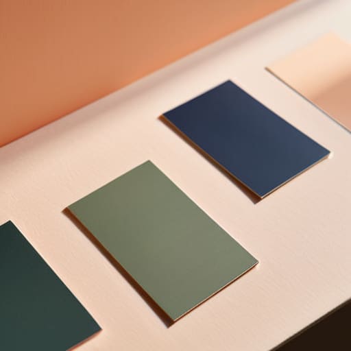
I remember sitting in a dimly lit studio back in the late nineties, surrounded by the sharp, chemical scent of spray adhesive and the tactile weight of physical Pantone chips. There was a certain gravity to choosing a hue back then; you didn’t just click a hex code and hope for the best, you felt the weight of the decision in your hands. Today, I see so many designers drowning in endless, auto-generated color palettes that look beautiful in a vacuum but feel completely hollow once they hit a real screen. We’ve traded intentionality for infinite scrolling, and in the process, we’ve lost the soul of the craft.
I’m not here to give you a list of trendy combinations pulled from a curated algorithm. Instead, I want to talk about how to build a foundation that actually serves a purpose. I’m going to share what I’ve learned from two decades of moving between ink and pixels: how to select colors that respect the user’s eye and honor the human experience. We’re going to strip away the fluff and focus on how to use color as a tool for clarity, not just decoration.
Table of Contents
The Psychology of Color Building Emotional Resonance
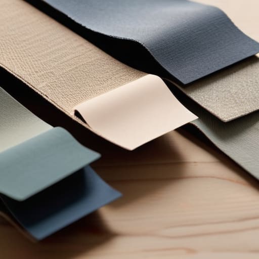
When we talk about the psychology of color, we aren’t just discussing how a specific hue looks on a high-resolution display; we are discussing how it lands in the gut of the person viewing it. In my years of refining visual branding colors for boutique firms, I’ve learned that color is a silent language. If you use a jarring, high-saturation red for a wellness app, you aren’t just making a design choice—you are creating cognitive dissonance. You have to respect the emotional weight that every shade carries before you ever touch a slider in Figma.
Instead of reaching for the most trendy gradients, I find myself leaning back into foundational color theory principles. There is a quiet, intentional power in using analogous color schemes to create a sense of continuity and calm, or employing carefully weighed complementary color combinations to guide a user’s eye toward a single, vital action. It’s about creating a sense of place. When we choose a palette, we are setting the temperature of the room. We aren’t just picking hex codes; we are architecting an atmosphere.
Mastering Color Theory Principles for Meaningful Design
When we talk about color theory principles, I often see designers get lost in the math of the color wheel, treating it like a puzzle to be solved rather than a language to be spoken. It’s easy to lean on complementary color combinations because they provide instant, high-contrast excitement, but there is a risk of creating visual noise that lacks soul. I prefer to approach a project by looking for the quiet tension between hues. Sometimes, a sophisticated monochromatic palette design does more to establish authority than a loud, multi-colored explosion ever could.
The real work happens when you move past the initial excitement of a bright shade and start considering how colors interact within a functional system. When I’m refining visual branding colors for a client, I don’t just look for what looks “good” on a high-res monitor; I look for how they hold up under scrutiny. It’s about finding that balance where analogous color schemes provide a sense of cohesion and calm, ensuring the interface feels like a curated environment rather than a digital afterthought.
Beyond the Swatch: Five Ways to Approach Color with Intent
- Stop chasing trends and start looking at the context. A vibrant neon palette might look stunning on a high-res monitor in your portfolio, but if it causes eye strain for a user trying to read a long-form article, you’ve failed the most basic test of functional design.
- Respect the hierarchy of neutrals. Most designers spend far too much time obsessing over their primary brand colors and not nearly enough time refining their grays, off-whites, and muted tones. These are the quiet workers that allow your primary colors to actually breathe.
- Test for accessibility before you fall in love. It’s easy to get swept up in a sophisticated, low-contrast aesthetic, but if your text disappears into your background, your design is broken. True craftsmanship means ensuring your work is legible for everyone, regardless of how they view it.
- Limit your palette to create focus. When everything is shouting for attention, nothing is heard. I find that choosing two or three core colors and letting the rest of the interface exist in a state of intentional restraint creates a much more powerful visual narrative.
- Remember that color lives in a physical world. Even though we design for screens, we are designing for humans who experience light and shadow. Think about how your palette will feel under different lighting conditions—don’t just pick colors that look good in a controlled, backlit environment.
The Intentional Palette: Moving Beyond Aesthetics
Stop treating color as a decorative afterthought; use it as a functional tool to guide the eye and dictate the emotional rhythm of your interface.
Prioritize accessibility and legibility over trends, ensuring your color choices respect the user’s ability to navigate without friction.
Build palettes with purpose by grounding your digital choices in the same intentionality used in physical craftsmanship—every hue should earn its place on the screen.
The Weight of a Hue
A color palette shouldn’t just be a collection of aesthetically pleasing hex codes; it should be a deliberate set of tools that respect the mood of the user and the integrity of the brand. If you aren’t choosing a color because of the way it anchors a composition or directs a human eye, you aren’t designing—you’re just decorating.
Ingrid Bellamy
Beyond the Hex Code
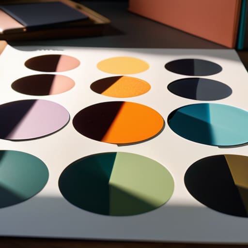
At the end of the day, choosing a color palette isn’t about finding the most trending combination on a mood board or chasing what’s popular on Dribbble. It’s about the rigorous application of color theory to support a specific intention. We’ve looked at how psychology anchors our emotional responses and how the fundamental principles of harmony and contrast provide the necessary structure for usability. When you move past the superficial desire to simply “make things look nice” and instead focus on how color directs the eye and communicates meaning, you stop being a decorator and start being a strategist. Remember, every hue you select carries a weight; make sure it’s a weight your design can actually support.
As you return to your canvas—whether that’s a digital tablet or a physical sketchbook—I encourage you to resist the urge to let automation make these decisions for you. There is a certain magic in the intentional friction of selecting a shade that feels slightly off-kilter but perfectly right for the human experience. Don’t let the infinite possibilities of a digital color picker paralyze your intuition. Instead, trust your eye and your understanding of how light and pigment interact with the soul. Build palettes that don’t just fill a screen, but rather, create a space where human connection can actually breathe.
Frequently Asked Questions
How do I maintain a sense of intentionality when a client insists on a palette that clashes with the brand's core values?
It’s a frustrating tightrope to walk. When a client pushes for colors that feel “off,” don’t just argue aesthetics; pivot back to the brand’s core purpose. I find it helps to create a side-by-side comparison. Show them their requested palette next to a mood board of their own brand values. Frame it as a functional risk: “This palette might look trendy, but it undermines the trust we’re trying to build.” Design is about stewardship, not just compliance.
At what point does a color scheme become too "noisy" and start distracting from the actual functional purpose of the design?
It becomes too noisy the moment the color stops supporting the hierarchy and starts competing with it. If a user has to squint or pause to figure out where to click because a bright accent is fighting a primary call-to-action, you’ve lost the battle. Color should be a guide, not a distraction. When the palette begins to scream rather than whisper, you’ve traded functional clarity for mere decoration. Strip it back.
How can I balance the trend of high-saturation digital palettes with the need for accessibility and long-term legibility?
It’s easy to get seduced by those neon, high-saturation palettes that pop on an OLED screen, but we have to remember that eyes tire. If we chase trends that ignore contrast ratios, we aren’t designing; we’re just decorating. I always suggest anchoring those vibrant “hero” colors with grounded, neutral tones. Use the saturation for emphasis, not for the entire heavy lifting. Design for the person reading in low light, not just for the trend cycle.
