Principles of designing for web.

Core Principles of Web Design

I was sitting at my drafting table last night, the smell of old paper and ink heavy in the air, cleaning the shutter mechanism of a 1970s Leica. It struck me how much we’ve lost in the rush toward digital perfection. Nowadays, everyone talks about designing for web as if it’s a race to see who can automate the most pixels or cram the most “engagement-driving” widgets into a single viewport. We’ve traded the tactile, deliberate rhythm of layout for a frantic pursuit of screen real estate, forgetting that there is a breathing, thinking human being on the other side of that glass.

I’m not here to sell you on the latest flashy framework or a list of trends that will be obsolete by next Tuesday. Instead, I want to talk about how we bring intentionality back to the digital canvas. I’m going to share what I’ve learned from twenty years of moving between physical paste-ups and digital interfaces, focusing on how to create spaces that respect the user’s attention rather than demanding it. We’re going to look at how to build with purpose, ensuring your work feels less like a machine-generated void and more like a crafted experience.

Table of Contents

Respecting the Human Touch Through User Experience Design Principles

Respecting the Human Touch Through User Experience Design Principles.

When we talk about UX, we often get lost in the technicalities of clicks and conversion rates, but I prefer to think of it as managing the rhythm of a conversation. A well-designed interface shouldn’t feel like a relentless demand for attention; it should feel like a well-placed pause in a book. This starts with a solid understanding of visual hierarchy in web design. If every element is screaming for notice, the user ends up exhausted. We have to guide the eye with intention, using scale and negative space to signal what truly matters, rather than just cluttering the viewport.

The friction we encounter in digital spaces shouldn’t be an obstacle, but a way to ground the user. This is where a mobile-first design approach becomes more than just a technical requirement; it becomes a philosophy of restraint. By designing for the smallest, most constrained screen first, we are forced to strip away the fluff and focus on the core utility. It forces us to respect the user’s context—whether they are navigating a crowded subway or sitting quietly in a studio—ensuring the digital experience feels deliberate and human rather than just automated and loud.

Mastering Visual Hierarchy in Web Design to Empower Creators

Mastering Visual Hierarchy in Web Design to Empower Creators

When we talk about visual hierarchy in web design, we aren’t just talking about making a headline bigger so it catches the eye. It’s about directing the soul of the user through a digital space. I’ve seen too many interfaces that feel like a loud, cluttered room where everyone is shouting at once. To avoid this, we have to use scale, weight, and negative space to create a deliberate path for the eye. If everything is screaming for attention, nothing is actually being heard.

This becomes even more vital when you consider the shift toward a mobile-first design approach. On a smaller screen, your hierarchy isn’t just a suggestion; it’s the structural integrity of the entire experience. You can’t rely on sprawling layouts to guide a user; you have to be surgical with your typography and spacing. By establishing a clear order of importance, we respect the viewer’s cognitive load. We aren’t just arranging pixels; we are building a framework that allows the creator’s message to breathe and the user to navigate with quiet confidence.

Five Ways to Bring Intentionality Back to the Screen

  • Prioritize Type Legibility Over Trendiness. It’s easy to get seduced by a beautiful, thin-stroked display face, but if your users are squinting to parse your content, the design has failed. Choose typefaces that respect the rhythm of reading and provide enough breathing room for the eye to rest.
  • Embrace Negative Space as a Tool, Not a Void. In my early days of paste-ups, we knew that what we left out was just as important as what we put in. Don’t feel the need to clutter every pixel; use white space to guide the viewer’s focus and give your core message room to breathe.
  • Design for Micro-Interactions that Feel Tactile. Digital interfaces can often feel cold and frictionless. By adding subtle, thoughtful transitions or hover states that mimic a sense of weight or resistance, you create a digital experience that feels more grounded and responsive to human input.
  • Audit Your Color Contrast for Clarity, Not Just Aesthetics. A palette might look stunning on a high-end studio monitor, but it needs to work in the real world—under sunlight, on older screens, or for users with visual impairments. High contrast isn’t just a technical requirement; it’s a mark of respect for your audience.
  • Build Modular Systems, Not Just Static Pages. Instead of designing rigid, one-off layouts, think in terms of components and systems. This approach allows for a more cohesive brand identity and gives creators the flexibility to build meaningful experiences without sacrificing the integrity of the original design intent.

The Intentionality Checklist

Stop designing for the screen and start designing for the person; every element you place must earn its keep by serving a specific, functional purpose.

Embrace the friction; don’t strive for a frictionless experience that feels hollow, but rather one that respects the user’s pace and cognitive rhythm.

Prioritize craft over automation; use digital tools to enhance your creative intent, not to bypass the thoughtful decision-making that defines good design.

The Illusion of Seamlessness

We’ve become so obsessed with removing every ounce of friction from the digital experience that we’ve forgotten how to design for the soul. A website shouldn’t just be a frictionless slide from point A to point B; it should be a space that invites a moment of pause, where the intentionality of the layout respects the person on the other side of the glass.

Ingrid Bellamy

The Intentional Path Forward

The Intentional Path Forward in web design.

As we wrap up this exploration, it’s clear that designing for the web isn’t merely a technical exercise in arranging pixels or optimizing for speed. It is a delicate balancing act between the rigid logic of code and the fluid, often messy reality of human interaction. By prioritizing meaningful user experiences and establishing a visual hierarchy that guides rather than overwhelms, we move away from the noise of modern digital clutter. We have discussed how respecting the natural rhythm of a user’s journey and empowering the creator through thoughtful structure are the pillars of a sustainable digital presence. Ultimately, the goal is to ensure that every element on the screen serves a specific, deliberate purpose rather than simply existing to fill a void.

As you move back to your own canvas—whether that is a high-resolution monitor or a well-worn sketchbook—I encourage you to resist the urge for easy automation. It is tempting to let algorithms dictate our layouts, but true craft lives in the nuances that a machine cannot yet replicate: the tension of a well-placed margin or the intentional friction that forces a user to actually pause and think. Let your work be a testament to the human hand. We aren’t just building websites; we are building the digital environments where people live, work, and connect. Design with soul, and never forget that there is a person on the other side of that glass.

Frequently Asked Questions

How do I maintain a sense of tactile craftsmanship when working within the rigid constraints of a grid system?

Think of the grid as a skeleton, not a cage. It provides structure, but it shouldn’t dictate the soul of the work. I find that introducing subtle, intentional irregularities—a slightly offset image, a typeface that breathes outside its container, or varying the weight of your lines—breaks that digital sterility. Use the grid to ground your layout, then use your intuition to introduce the “friction” that makes a design feel lived-in and human.

Where is the line between a clean, minimalist interface and one that feels too sterile or devoid of personality?

The line is drawn at intentionality. Minimalism becomes sterility when you strip away the soul of the brand just to achieve a “clean” look. To avoid that vacuum, I lean into the small, tactile details: a specific typographic weight, a subtle grain in a background, or a layout that breathes with purposeful white space rather than just empty space. If the design doesn’t evoke a feeling or guide a movement, it’s not minimalist—it’s just hollow.

How can we balance the need for rapid, automated design workflows with the slow, intentional process of true type and layout design?

We treat automation as a scaffold, not the building itself. I use tools to handle the repetitive heavy lifting—the grid alignments and resizing—so I can reclaim the mental space needed for the nuances. Speed is for production; slowness is for decision-making. If a tool automates your layout, use that saved time to obsess over the kerning or the white space. Don’t let the efficiency of the software dictate the soul of the work.

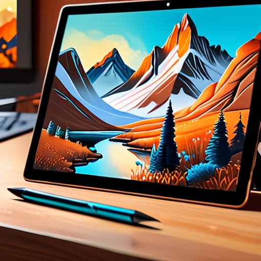
Selecting the best digital art tools.

Choosing Tools for Digital Art

I remember sitting in a cramped studio at RISD, my fingers stained with India ink and the air thick with the scent of solvent and old paper. Back then, every line had a consequence; there was no “undo” button to bail you out of a shaky hand. Today, I watch designers get swallowed whole by a dizzying array of digital art tools that promise infinite perfection but often deliver nothing but sterile, soulless output. We’ve traded the grit of intentionality for the convenience of automation, and in the process, we’re losing the very friction that makes art feel alive.

I’m not here to sell you on the latest subscription-based miracle or a flashy AI plugin that does the thinking for you. Instead, I want to talk about finding instruments that actually respect your agency. I’m going to share my perspective on which digital art tools serve as true extensions of your hand and which ones are just expensive distractions designed to automate your creativity away. My goal is to help you find that sweet spot where technology empowers your intent rather than dictating it.

Table of Contents

A Digital Illustration Software Comparison for Intentional Creators

A Digital Illustration Software Comparison for Intentional Creators

When I sit down to evaluate a new suite of software, I’m not looking at a checklist of features or how many “AI-generated” brushes they’ve stuffed into the sidebar. I’m looking for how the tool handles the nuance of a stroke. In this digital illustration software comparison, the divide usually falls between software that tries to predict your next move and software that simply listens. Procreate, for instance, has mastered a certain kind of tactile immediacy that feels almost organic, whereas Adobe’s ecosystem often feels like it’s fighting your natural rhythm with layers of heavy processing.

The real magic, however, happens at the intersection of software and hardware. You can have the most sophisticated engine in the world, but if the pressure sensitivity technology feels stepped or artificial, the connection to the work is lost. I find myself gravitating toward tools that allow for a messy, expressive line—the kind of imperfection that makes a piece feel alive. We shouldn’t be looking for software that smooths out our humanity; we should be looking for the tools that amplify our intent.

The Best Drawing Tablets for Beginners Seeking Tactile Connection

The Best Drawing Tablets for Beginners Seeking Tactile Connection

When you’re first starting out, the temptation is to chase the most expensive, feature-heavy hardware on the market. But after years of seeing designers get lost in the specs, I’ve learned that the real magic lies in the interface between your hand and the surface. If you are looking for the best drawing tablets for beginners, don’t just look at the resolution; look at the resistance. There is a profound difference between sliding a plastic tip over glass and feeling a slight, intentional friction that mimics paper.

This is where the debate of graphics tablet vs pen display becomes more than just a technicality—it becomes a question of how you want to work. A traditional tablet, paired with a keyboard, forces a certain level of spatial awareness that can actually sharpen your focus. However, if you crave that immediate visual feedback, a pen display can bridge the gap between your eyes and your hand. Regardless of which path you choose, prioritize stylus pen ergonomics. If the tool feels like an extension of your nervous system rather than a cumbersome peripheral, you’ll find yourself spending more time creating and less time fighting the hardware.

Reclaiming the Craft: Five Ways to Stay Grounded in a Digital Workflow

  • Stop chasing the latest feature updates. A tool is only as good as your ability to master its core mechanics; learn the physics of your digital brush before you start hunting for complex textures.
  • Build a digital-to-analog bridge. I never start a complex piece directly on the screen; I sketch the bones in my physical notebook first to ensure the composition has a human soul before the pixels take over.
  • Curate your workspace to reduce friction. If your software interface is a cluttered mess of icons, you aren’t designing—you’re navigating. Customize your toolbars to show only what serves your current intention.
  • Embrace the “mistake” rather than the undo button. It’s easy to get caught in a loop of infinite corrections, but sometimes the most interesting design moments come from a stroke you didn’t quite intend.
  • Respect the hardware’s limitations. Don’t let a high-resolution screen trick you into losing sight of scale and proportion. Periodically step back from the monitor to see if your work actually holds up to the human eye.

Finding Your Digital Rhythm

Prioritize tools that offer resistance and texture over those that promise effortless perfection; the friction is where your unique style actually lives.

Don’t get seduced by feature bloat; choose software and hardware that stay out of your way so you can focus on the intent behind the stroke.

Remember that a tablet is just an instrument, not a shortcut—the goal is to use technology to amplify your hand, not to let the algorithm decide for you.

The Illusion of Efficiency

We’ve spent so much time optimizing for speed that we’ve accidentally engineered the soul out of the process; a tool shouldn’t just execute a command, it should invite your intuition into the work.

Ingrid Bellamy

The Intentional Path Forward

The Intentional Path Forward for creative tools.

Choosing your toolkit shouldn’t feel like a race to own the most expensive piece of hardware or the most feature-heavy software suite. We’ve looked at how the right illustration programs can streamline your vision and how the right tablet can bridge that frustrating gap between a stylus and a soul. Ultimately, the goal isn’t to find a tool that does the work for you, but one that allows you to reclaim the friction of creation. Whether you are leaning into the precision of a high-end display or the simplicity of a beginner-friendly tablet, ensure that every setting and every stroke serves a specific, deliberate purpose in your process.

As we move further into an era where automation feels inevitable, I urge you to hold onto your agency. Technology is a wonderful servant but a hollow master; use these digital instruments to extend your reach, not to replace your intuition. Don’t be afraid to occasionally step away from the screen to find inspiration in the grain of a photograph or the weight of a fountain pen on paper. The most profound digital work always carries the ghost of the human hand. Build your workflow around your own unique rhythm, and let your tools honor the craftsmanship you bring to the screen.

Frequently Asked Questions

How can I bridge the gap between the tactile feeling of my physical sketchbook and the sterile precision of a digital stylus?

It’s a frustration I feel every time I pick up my stylus. To bridge that gap, stop fighting the precision and start embracing the friction. Look for software that mimics organic grain and paper tooth rather than perfect gradients. More importantly, change your workflow: don’t start on the screen. Sketch in your physical book first, then scan it. Use the digital tool to refine, not to originate. Let the digital layer serve the analog soul.

Is it possible to build a digital workflow that prioritizes creative intuition over the speed of automated shortcuts?

It’s not only possible; it’s necessary. We’ve become so obsessed with “efficiency” that we’ve accidentally optimized the soul right out of our work. To reclaim intuition, you have to intentionally reintroduce friction. Stop relying on one-click filters and auto-smoothing. Instead, choose tools that require a deliberate stroke—software that mimics the resistance of paper or the unpredictability of ink. When you slow down the process, you give your instincts a chance to catch up.

Which hardware setups actually minimize the "frictionless" trap of software that makes everything look too polished and artificial?

The trap is thinking “seamless” means “better.” When software removes every bit of resistance, you lose the happy accidents that define character. To fight that artificial polish, I lean into hardware that demands a bit of struggle. Use a high-quality screen protector with a paper-like tooth, or better yet, a dedicated pen display that mimics the slight drag of graphite on vellum. You need that tactile feedback to remind you that you’re making choices, not just clicking presets.

Applying color psychology to graphic design.

How Color Psychology Affects Design

I remember sitting in a cramped studio at RISD, my fingers stained with India ink, staring at a series of Pantone swatches that felt more like a math equation than art. Back then, we didn’t talk about “optimizing conversion rates” through color psychology; we talked about how a specific shade of ochre could make a page feel heavy or how a sharp cobalt could cut through the noise. Nowadays, I see so many designers treating color like a cheat code—slapping a “trustworthy” blue onto a landing page and expecting it to do all the heavy lifting for their mediocre UX. It’s lazy, and frankly, it ignores the actual human on the other side of the glass.

I’m not here to give you a list of arbitrary associations or tell you that red always means “danger.” Instead, I want to share what I’ve learned from two decades of moving pixels and ink. We are going to look at how to use color psychology as a tool for intentionality, focusing on how hue and saturation can respect a user’s cognitive load rather than just shouting for attention. This is about purposeful craft, not just making things look pretty.

Table of Contents

Visual Perception and Emotion Honoring the Human Eye

Visual Perception and Emotion Honoring the Human Eye

When we talk about how a user interacts with a brand, we often focus too much on the click and not enough on the gaze. Our eyes don’t just record data; they react to light and shade with a biological immediacy that we can’t simply code away. This is where the intersection of visual perception and emotion becomes vital. If you choose a high-vibrancy neon for a meditation app, you aren’t just making a design choice; you are creating a sensory mismatch that disrupts the user’s natural rhythm.

I’ve always believed that a designer’s job is to act as a steward of the user’s attention. We have to account for the subconscious color associations that people carry with them—the way a certain deep navy feels like stability or how a muted ochre suggests something weathered and real. When we respect these innate responses, we aren’t just decorating a layout; we are building a bridge between the digital interface and the human nervous system. It’s about creating a space where the eye feels at home rather than constantly on guard.

Subconscious Color Associations and the Intentional Creator

Subconscious Color Associations and the Intentional Creator

We often talk about color as if it’s a conscious choice, but for the person on the other side of the screen, the reaction is often visceral and immediate. Long before they’ve read a single line of copy, their nervous system has already reacted to the palette you’ve laid out. These subconscious color associations act as a silent language; they are the invisible cues that tell a user whether a space feels safe, urgent, or perhaps even overwhelming. When we ignore this, we aren’t just making a design mistake—we are failing to respect the user’s internal state.

As a designer, your job isn’t to chase trends, but to understand the psychological impact of hues and how they anchor a brand’s identity. If you’re building a tool meant for deep focus, flooding the interface with high-saturation yellows is essentially digital noise. Instead, we should be looking at how specific tones can settle a user into a flow state. Intentionality means choosing a shade not because it looks “modern,” but because it aligns with the human intent behind the interaction.

Practical Intent: Applying Color with Purpose

  • Stop chasing trends. A palette might look sophisticated on a curated mood board, but if those muted tones fail to provide enough contrast for a user to actually navigate your interface, you haven’t designed a brand—you’ve designed a barrier.
  • Respect the hierarchy of information. Use your most high-contrast colors for the actions that matter most, like a primary button or a critical alert. Color should act as a silent guide, not a loud distraction that competes for attention.
  • Context is everything. A shade of blue might feel serene in a wellness app but sterile and cold in a fintech interface. Always test your colors against the specific emotional weight of the service you are building.
  • Build for accessibility, not just aesthetics. True craftsmanship means ensuring your color choices work for everyone, including those with visual impairments. If your design relies on color alone to convey meaning, you’ve missed the mark on functional design.
  • Limit your palette to maintain clarity. It’s tempting to introduce a dozen shades to add depth, but a disciplined, restrained use of color creates a much stronger sense of intentionality and prevents the user from feeling overwhelmed.

Bringing Intent Back to the Palette

Stop treating color as a decorative layer applied at the end of a project; instead, treat it as a foundational tool that must be woven into the initial strategy to respect the user’s emotional journey.

Avoid the trap of chasing fleeting digital trends that prioritize “screen pop” over long-term usability, and instead focus on palettes that provide clarity and reduce cognitive fatigue.

Remember that every shade carries an invisible weight—use your color choices to guide the user’s eye with purpose, ensuring the interface serves their intent rather than just demanding their attention.

The Weight of a Hue

Color isn’t just a stylistic choice or a way to make a layout pop; it’s a silent dialogue with the user. If we aren’t choosing our palette with the intention to respect their emotional state, we aren’t designing—we’re just decorating.

Ingrid Bellamy

The Intentional Palette

Designing with The Intentional Palette.

At the end of the day, color psychology isn’t a cheat sheet for manipulation or a way to trick a user into clicking a button. It is about understanding the deep, biological, and cultural threads that connect a person to what they see on a screen. We’ve discussed how our eyes perceive light and how our subconscious minds attach meaning to a specific shade of navy or a muted ochre. When we respect these connections, we move away from superficial decoration and toward a design language that actually speaks to the user’s needs. It’s about choosing a palette that aligns with the integrity of the brand and the reality of the human experience.

As you move back to your canvas or your digital workspace, I encourage you to slow down. Don’t just grab the most vibrant hex code from a trending library; instead, ask yourself if that color honors the purpose of your work. We are living in an era of rapid automation, but the nuance of a perfectly balanced color scheme is something that still requires a human touch. Use color to create clarity, to provide comfort, and to guide the eye with intention. Let’s stop designing for algorithms and start designing for people.

Frequently Asked Questions

How do I balance brand-specific color palettes with the universal psychological triggers that users expect?

It’s a delicate tension, isn’t it? You don’t want to sacrifice your brand’s soul just to follow a manual, but you also can’t ignore how humans are wired. I usually approach this by treating my brand colors as the “personality” and universal triggers as the “grammar.” Use your unique palette for storytelling and brand identity, but lean on those established psychological cues for functional elements like buttons or warnings. Respect the user’s intuition first; then, surprise them with your brand.

In an era of high-brightness OLED screens, how can we use color without causing digital fatigue for the viewer?

We’ve moved from matte paper to these aggressive, high-brightness OLED panels that practically punch you in the retina. To fight digital fatigue, stop relying on pure #000000 blacks or neon saturations. Instead, embrace “soft” dark modes—think deep charcoals or midnight blues—and use desaturated mid-tones. We need to design for the eye’s comfort, not just the screen’s capability. If your palette feels like it’s vibrating, it’s failing the human on the other side.

How much weight should I actually give to cultural color differences when designing for a global, digital-first audience?

It’s a heavy weight, but not in the way you might think. Don’t treat cultural color theory like a checklist of “do’s and don’ts”—that leads to sterile, safe design. Instead, treat it as a study of context. A red button might signal danger in one market and prosperity in another. If you’re designing for a global audience, your job isn’t to pick a “neutral” palette, but to ensure your color choices respect the local rhythm of the user.

Implementing user centered design principles.

Implementing User Centered Design

I remember sitting in a dimly lit studio back in the late nineties, the air thick with the scent of spray mount adhesive and the rhythmic thwack of a X-Acto blade hitting a cutting mat. We weren’t chasing algorithms then; we were chasing the way a human eye naturally rests on a page. Today, I see “user centered design” being treated like some high-priced, mystical ritual performed by agencies charging six figures to move a button three pixels to the left. It has become a sterile, corporate buzzword that often ignores the very thing it claims to protect: the unpredictable, messy reality of how people actually live and work.

I’m not here to give you a polished lecture on theoretical frameworks or a checklist of industry jargon. Instead, I want to pull back the curtain on what it actually means to build with intention. We are going to strip away the hype and look at how to apply user centered design through the lens of craftsmanship and empathy. I promise to share the hard-won lessons I’ve gathered from decades of moving between ink and pixels, focusing on how we can create digital tools that respect the human hand rather than just filling up empty space.

Table of Contents

Honoring the Human Touch Through User Centric Interface Design

Honoring the Human Touch Through User Centric Interface Design

When we talk about user-centric interface design, we aren’t just talking about moving buttons around until they look “clean.” We are talking about acknowledging the physical and cognitive reality of the person on the other side of the glass. In my years of moving from the tactile world of Letraset to the seamlessness of Figma, I’ve noticed a dangerous trend: we are designing for perfection rather than for human imperfection. A truly intuitive interface doesn’t just follow a checklist; it anticipates the slight hesitation of a cursor or the fatigue of a user navigating a complex workflow.

To achieve this, we have to embrace a rigorous iterative design process. This means moving beyond the initial polished mockup and actually testing how a human interacts with the friction of the tool. It’s about prototyping and validation that prioritizes real-world behavior over theoretical ease. If we rely solely on automated layouts, we lose the soul of the craft. We must build interfaces that feel like an extension of the creator’s intent, ensuring that every interaction feels earned rather than accidental.

Applying Design Thinking Methodology to Empower the Creator

Applying Design Thinking Methodology to Empower the Creator

When we talk about the design thinking methodology, it’s easy to get lost in the abstract frameworks and sticky-note sessions. But for me, it has always been about the transition from theory to the tactile reality of how a person actually interacts with a tool. It isn’t about following a rigid checklist; it’s about using that structure to empathize with the person on the other side of the screen. We need to move past the “perfect” initial concept and embrace the messy, necessary reality of an iterative design process.

True empowerment happens when we stop treating the user as a data point to be optimized and start treating them as a craftsman to be supported. This means prioritizing prototyping and validation not just to catch bugs, but to understand the rhythm of a creator’s workflow. If a tool feels too slick, too frictionless, or too automated, it often loses the very soul of the work. We aren’t just building interfaces; we are building the digital equivalent of a well-balanced fountain pen—something that feels like an extension of the hand, rather than a barrier to it.

Five Ways to Bring Intentionality Back to the Interface

  • Stop designing for “users” and start designing for people. When I’m sketching out a new typeface or a brand system, I don’t think about clicks; I think about the person sitting in a dimly lit room at 2 AM. Build for their context, their fatigue, and their actual environment, not for a perfect, sterile laboratory setting.
  • Respect the friction. We’ve become obsessed with “frictionless” design, but sometimes a little resistance is necessary to ensure intentionality. A confirmation step or a deliberate transition can prevent mistakes and give a creator the moment they need to breathe and think before committing to an action.
  • Prioritize legibility over aesthetic trends. I see too many boutique agencies chasing high-contrast, ultra-thin typefaces that look stunning in a portfolio but are impossible to read on a mobile screen in direct sunlight. If your design requires a magnifying glass to be functional, it isn’t user-centered; it’s self-indulgent.
  • Build tools, not cages. True user-centered design provides a framework that empowers a creator to make their own choices. Don’t use rigid design systems that strip away the soul of the work; instead, create modular, flexible structures that allow for the “human error” that often leads to genuine creativity.
  • Listen to the silence between the data points. Analytics will tell you where people click, but they won’t tell you why they felt frustrated or why they hesitated. Supplement your quantitative data with real, qualitative observation—watch how a person actually interacts with your interface, and pay attention to the moments where they struggle.

The Intentionality Checklist

Prioritize functional friction over seamless automation; sometimes, a user needs a moment to pause and think rather than being rushed through a frictionless, mindless interface.

Design for the hand, not just the eye, by ensuring digital tools respect the tactile, rhythmic ways that real people actually work and create.

Measure success by how much agency a tool gives back to the creator, rather than how much time it saves through mindless, automated shortcuts.

## Beyond the Interface

“User-centered design isn’t about smoothing out every bit of resistance until the experience becomes frictionless and mindless; it’s about building intentional spaces where a person actually feels their own agency in the process.”

Ingrid Bellamy

Beyond the Interface

Human-centered design: Beyond the Interface.

At its core, user-centered design isn’t about perfecting a set of pixels or checking off a list of usability metrics to satisfy a stakeholder. It is about the intentionality behind every decision we make. We’ve discussed the importance of honoring the human touch and how applying a rigorous design thinking methodology can actually serve to empower the creator rather than automate them into irrelevance. When we stop designing for the sake of efficiency alone and start designing for the way people actually live, think, and create, we move away from sterile interfaces and toward tools that feel like an extension of the self. It is about finding that delicate balance between functional precision and human friction.

As we move further into an era of rapid automation, my challenge to you is this: do not let the tools dictate the craft. Use the technology to handle the heavy lifting, but never let it strip away the soul of your work. The most impactful digital experiences will always be the ones that respect the intentionality of craftsmanship. Let’s commit to building a digital landscape that doesn’t just fill a screen, but actually serves a purpose. Keep your sketchbook close, keep your eyes on the user, and never forget that behind every click is a human being looking for connection and clarity.

Frequently Asked Questions

How do we prevent user-centered design from becoming a checklist of usability metrics that strips away the soul of a brand?

We fall into this trap when we mistake efficiency for empathy. If you only optimize for click-through rates and reduced friction, you aren’t designing an experience; you’re designing a conveyor belt. To keep the soul intact, treat your brand’s idiosyncrasies as intentional friction. Don’t just ask if a user can complete a task—ask if the way they complete it feels like them. Metrics measure movement, but they rarely measure meaning.

In an era of rapid AI integration, how can we ensure our design processes still prioritize the friction and intentionality of human intuition?

We have to stop treating “efficiency” as the ultimate metric. When we automate every micro-decision, we lose the productive friction that leads to breakthroughs. To protect intuition, we must treat AI as a high-fidelity tool, not a replacement for the messy, non-linear thinking that happens in a sketchbook. Guard your process by intentionally carving out space for analog exploration—where the goal isn’t speed, but the deliberate, slow work of making something meaningful.

Where is the line between designing for ease of use and designing something so frictionless that it loses its sense of craftsmanship?

The line is found in intentional friction. If a tool is so seamless that the user forgets they are actually doing something, you haven’t designed a masterpiece; you’ve designed a vacuum. True craftsmanship lives in those subtle moments where a user has to pause, think, and commit. We should aim for efficiency in workflow, but never at the expense of the agency that makes a creator feel the weight of their own decisions.

Principles of effective icon design.

Principles of Effective Icon Design

I remember sitting in a cramped studio in Providence, the air thick with the scent of spray adhesive and the rhythmic thwack of X-Acto blades hitting cutting mats. Back then, every single element had to be earned; you couldn’t just pull a generic set from a library and call it a day. Today, I see so many designers treating icon design like a checkbox exercise, slapping on trendy, overly complex vectors that look beautiful in a portfolio but fail miserably in a real-world interface. We’ve traded meaningful semiotics for aesthetic fluff, and it’s making our digital landscapes noisier and harder to navigate.

I’m not here to teach you how to follow the latest Dribbble trend or how to use a specific software plugin. Instead, I want to talk about the intentionality behind the mark. I’m going to share what I’ve learned from two decades of moving between physical craft and digital systems, focusing on how to build icon sets that actually respect the user’s cognitive load. We are going to strip away the clutter and get back to the core principle: designing symbols that act as clear, functional touchpoints rather than mere digital decoration.

Table of Contents

Mastering Vector Graphics Principles for Purposeful Creation

Mastering Vector Graphics Principles for Purposeful Creation.

When we sit down at the terminal, it is easy to get lost in the infinite zoom of a vector path. But true mastery of vector graphics principles isn’t about how many anchor points you can manipulate; it’s about knowing which ones to discard. I’ve seen too many junior designers clutter the geometry of a symbol, creating a visual noise that breaks the clarity of the interface. A clean icon should feel like a well-constructed typeface—balanced, intentional, and stripped of any unnecessary weight.

As you build out your iconography design systems, you have to decide early on whether you are leaning into the solidity of glyph vs outline icons. This isn’t just a stylistic choice; it dictates how the icon breathes within the layout. If you’re aiming for a sophisticated, high-contrast look, you need to prioritize mathematical harmony over mere decoration. Aim for a sense of structural integrity where every curve feels earned. When the geometry is sound, the icon doesn’t just sit on the screen—it commands the space with a quiet, functional confidence.

Embracing Minimalist Icon Styles to Respect User Focus

Embracing Minimalist Icon Styles to Respect User Focus

When we strip away the excess, we aren’t just simplifying; we are clarifying. In my years of working with brand identities, I’ve seen too many designers fall into the trap of “decorative clutter,” thinking more detail equals more value. In reality, minimalist icon styles serve as a visual shorthand that allows the brain to process information without fatigue. If an icon requires a manual to understand, it has failed its primary function. We need to design for the peripheral vision, creating shapes that are instantly recognizable even when they are small and understated.

Choosing between glyph vs outline icons is more than just an aesthetic preference; it is a decision about visual weight and hierarchy. Outlines offer a sense of lightness and air, perfect for secondary navigation, while solid glyphs provide the necessary gravity for primary actions. My rule of thumb is to always prioritize clarity over cleverness. By focusing on essential geometry and avoiding unnecessary flourishes, we create a user interface that respects the user’s cognitive load, ensuring the digital experience feels intentional rather than overwhelming.

Five Ways to Infuse Intent Into Your Iconography

  • Stop designing for the grid and start designing for the eye; ensure your optical weights are balanced manually, because a mathematically perfect center often feels visually broken.
  • Treat your icon set as a cohesive typeface; if your line weights or corner radii shift between symbols, you aren’t building a system, you’re just making a collection of random shapes.
  • Respect the concept of “visual affordance” by ensuring the metaphor is immediate; if a user has to pause for even a millisecond to decode what a symbol means, the design has failed its primary purpose.
  • Build in enough breathing room around your glyphs to prevent visual noise; an icon that crowds its container loses its ability to act as a clear, calm signpost.
  • Test your designs at their smallest intended scale; if the character of the icon dissolves into a smudge on a mobile screen, it’s a signal that you’ve prioritized aesthetic flourish over functional clarity.

Designing with Intention: Three Pillars of Meaningful Iconography

Stop designing for decoration; every icon must earn its place on the grid by serving a specific, functional purpose that guides the user without cluttering their mental space.

Prioritize visual consistency over trendy flourishes, ensuring that line weights and corner radii remain disciplined so the iconography feels like a cohesive language rather than a collection of random shapes.

Respect the user’s cognitive load by choosing metaphors that are intuitive and grounded, avoiding overly abstract symbols that force a person to stop and think about what a button actually does.

The Weight of a Single Glyph

An icon shouldn’t just be a shorthand for a function; it should be a quiet, intentional anchor in a sea of digital noise. If it doesn’t carry the weight of meaning, it’s just more visual clutter competing for a user’s attention.

Ingrid Bellamy

The Weight of a Single Pixel

The Weight of a Single Pixel icon.

Ultimately, icon design isn’t about decorating a digital canvas; it is about building a language of subtle cues that guide a user through an experience. We have looked at how the precision of vector mathematics provides the necessary foundation, and how a commitment to minimalism prevents visual noise from overwhelming the senses. When we strip away the unnecessary, we aren’t just making things “cleaner”—we are ensuring that every stroke and every curve serves a specific, functional purpose. If an icon doesn’t clarify the path or provide a moment of intuitive recognition, it shouldn’t be there in the first place.

As we move further into an era dominated by rapid-fire automation, I find myself returning to the same principle that guided my early days with physical paste-ups: intentionality is everything. Don’t let the ease of modern software tempt you into mindless production. Instead, approach every symbol as a piece of digital craftsmanship that respects the person on the other side of the glass. When we design with this level of care, we move beyond mere decoration and begin to create tools that feel truly human. Build with purpose, and the clarity will follow.

Frequently Asked Questions

How do I maintain visual consistency across an icon set when I'm working with different stroke weights and complexities?

The trick isn’t in the strokes themselves, but in the optical weight. When complexity shifts, your eye often perceives one icon as “heavier” than another, even if the math says they’re identical. I always go back to a master grid and a single reference icon. If one icon feels dense, I don’t just thin the lines; I increase the negative space. Consistency is about how the eye perceives balance, not just matching pixel counts.

At what point does simplifying an icon for minimalism start to strip away its essential meaning?

It happens the moment you sacrifice recognition for the sake of a clean grid. Minimalism isn’t about subtraction for its own sake; it’s about distilling an idea to its core. If you strip away a detail that provides the necessary context for a user to understand the function, you haven’t simplified the icon—you’ve broken it. When the visual shorthand no longer communicates the action, you’ve lost the craft to a sterile aesthetic.

How can I ensure my icon designs remain legible and functional when they are scaled down to tiny, high-density mobile interfaces?

When you scale down, complexity is your enemy. I always tell my clients to test their icons at 16px or even 12px before they even think about the desktop version. If the silhouette loses its character or the details turn into a muddy blur, you’ve overdesigned. Simplify the geometry, increase the negative space, and prioritize optical weight over mathematical perfection. If it doesn’t work at a tiny scale, it isn’t a functional tool.

Minimalist typography design approach.

Approaching Typography Through Minimalism

I remember sitting in a dimly lit studio back in the late nineties, the air thick with the scent of spray adhesive and the rhythmic thwack of X-Acto blades hitting cutting mats. We didn’t have infinite font libraries or auto-kerning plugins; we had physical lead type and a desperate need for precision. Today, I see designers treating minimalist typography like a magic eraser, thinking that if they just strip away the “clutter,” they’ve achieved sophistication. It’s a lie. True minimalism isn’t about what you remove to make a screen look clean; it’s about the intentionality of what remains when there is nowhere left to hide.

I’m not here to sell you on a trendy aesthetic or give you a checklist of “rules” that strip the soul out of your work. Instead, I want to talk about the friction of the human eye and how we use type to guide it. I’m going to share what I’ve learned from twenty years of moving between the physical and the digital, focusing on how to use minimalist typography to respect the reader’s focus rather than just filling empty space. We are going to build layouts that feel felt, not just seen.

Table of Contents

Finding Purpose Through Strategic White Space in Design

Finding Purpose Through Strategic White Space in Design

We often treat empty space as a void that needs to be filled, a mistake I see far too often in modern digital layouts. But in my practice, I view negative space utilization as a deliberate tool for pacing. When we crowd a screen, we aren’t just making it look cluttered; we are actively taxing the reader’s cognitive load. True intentionality comes from knowing when to step back. By allowing elements to sit in isolation, we give the viewer permission to actually process what they are seeing.

This isn’t about being empty; it’s about creating a structure where the eye knows exactly where to land. This is where the core typographic hierarchy principles come into play. When you pair a well-chosen typeface with generous margins, you aren’t just following a trend; you are respecting the user’s focus. I’ve found that the most impactful work doesn’t shout for attention through sheer volume, but rather through the quiet confidence of a layout that knows how to breathe. If the composition feels suffocated, your message will be too.

The Quiet Power of Sans Serif Font Selection

The Quiet Power of Sans Serif Font Selection

When I sit down with a new brand identity, I often find myself stripping away the ornamental flourishes to see what remains. This is where the nuance of sans serif font selection becomes critical. It’s a common misconception that choosing a sans serif is an easy way out—a way to avoid the “work” of complex styling. In reality, when you remove the serifs, you remove the safety net. Every stroke weight, every terminal, and every aperture is suddenly exposed to the light. You aren’t just picking a font; you are choosing the very skeleton of the communication.

To do this well, you have to look beyond mere aesthetics and focus on the mechanics of legibility and readability. A typeface shouldn’t just look “clean”; it needs to function with intention across different scales. I’ve seen too many designers chase fleeting minimalist graphic design trends by picking ultra-light weights that vanish the moment they hit a mobile screen. True craftsmanship lies in finding that perfect balance where the typeface feels sturdy and purposeful, providing a clear structure without demanding unnecessary attention from the reader.

Five Ways to Stop Overdesigning and Start Communicating

  • Respect the hierarchy. Don’t let every headline scream for attention; use weight and scale to guide the eye naturally through the content, rather than forcing it.
  • Limit your palette. A design loses its soul when it’s cluttered with too many typefaces. Pick two—maybe three if you’re feeling daring—and make them work harder.
  • Watch your leading. Tight tracking and cramped line heights feel claustrophobic. Give your letters room to breathe so the reader doesn’t feel the friction of a cluttered page.
  • Prioritize legibility over novelty. A beautiful typeface is useless if it’s a struggle to read. If the character is fighting the content, it’s not good design.
  • Embrace the intentional pause. Sometimes the most powerful typographic choice is knowing when to stop adding elements and let the empty space do the heavy lifting.

The Intentionality of Less

Treat white space not as empty territory to be conquered, but as a functional tool that directs the eye and grants the reader permission to breathe.

Select your typefaces based on their structural integrity and how they facilitate reading, rather than chasing fleeting trends that prioritize decoration over clarity.

Remember that every typographic choice is a decision about how much friction you are willing to introduce; aim for a balance that respects the user’s focus without stripping away the soul of the message.

The Weight of What Isn't There

Minimalist typography isn’t about the absence of decoration; it’s about the presence of intention. When we strip away the noise, we aren’t just making things ‘cleaner’—we are creating the necessary friction-free space for a human reader to actually connect with an idea.

Ingrid Bellamy

The Discipline of Less

Minimalist design embodies The Discipline of Less.

We have navigated through the strategic use of white space and the deliberate selection of sans serif typefaces, but the core takeaway remains the same: minimalism is not about the absence of design; it is about the presence of intention. When we strip away the decorative noise, we aren’t just making things look “clean”—we are creating a hierarchy that honors the reader’s cognitive load. By balancing purposeful spacing with typography that respects the eye, we move away from mere decoration and toward a functional, human-centric architecture that allows the message to stand on its own merit.

As I sit here with my sketchbook, watching the light shift across my desk, I am reminded that the most impactful design often feels like it was always meant to be there. In a digital landscape that is increasingly loud, cluttered, and automated, your greatest strength lies in your ability to be quiet. Don’t be afraid of the empty space or the simple stroke; instead, lean into the friction of thoughtful choices. Build something that doesn’t just demand attention, but earns it through restraint and craftsmanship.

Frequently Asked Questions

How do I maintain brand personality when I'm stripping away most of the decorative elements?

When you strip away the ornament, you aren’t losing personality; you’re exposing the skeleton. To keep the soul intact, focus on the micro-decisions: the specific weight of a typeface, the rhythm of your kerning, or the intentional tension in your layout. Personality lives in the nuance of the execution. If the foundation is strong and the typographic choices are deliberate, the brand won’t feel empty—it will feel essential.

At what point does minimalist typography stop being "clean" and start feeling "empty" or unfinished?

It stops being clean the moment you lose the thread of intention. When I look at a layout, I ask myself: Is this space serving the message, or am I just afraid of the content? If the scale is so diminished that the reader has to hunt for the hierarchy, or if the lack of detail feels like a lack of thought, you’ve crossed into emptiness. Minimalism requires more rigor, not less; it needs a backbone of purpose.

How can I ensure accessibility and readability for users while still adhering to a strict, minimal typographic hierarchy?

It’s a delicate balance. When you strip away the visual noise, you risk losing the roadmap. To maintain a strict hierarchy without sacrificing accessibility, focus on weight and scale rather than decorative flourishes. Use high-contrast ratios—never compromise on legibility for the sake of a “clean” look. I always tell my clients: if a user has to squint to find the heading, the design has failed its primary purpose. Intentionality is your best tool here.

Creative problem solving through design.

Using Design to Solve Problems

I remember sitting in a dim studio back in the late nineties, the air thick with the scent of rubber cement and the rhythmic snip-snip of X-Acto blades against heavy cardstock. We didn’t have infinite undo buttons or generative algorithms to bail us out; we had physical constraints that forced us to actually think. Today, I see too many designers treating creative problem solving like a software update—something you just download or automate away with a new plugin. We’ve traded the messy, necessary friction of deep thought for a polished, hollow efficiency that leaves the actual soul of the work feeling strangely thin.

I’m not here to sell you on a new productivity hack or a complex, multi-step framework that requires a dozen colorful sticky notes to function. Instead, I want to talk about how we can reclaim the intentionality of our craft. I’m going to share what I’ve learned from twenty years of navigating the shift from ink to pixels, focusing on how to approach challenges with a sense of purposeful restraint. We’ll look at how to strip away the digital noise and find solutions that actually respect the human hand and the mind behind the screen.

Table of Contents

Mastering Divergent Thinking Techniques for Deeper Insight

Mastering Divergent Thinking Techniques for Deeper Insight

When we talk about getting unstuck, we often mistake movement for progress. We rush to the first viable solution because the pressure to deliver is relentless. But true depth requires us to lean into the discomfort of the unknown. This is where divergent thinking techniques become more than just a buzzword in a design thinking methodology; they become a way to widen the aperture of our perception. I’ve found that when I’m staring at a blank grid or a stubborn typeface, the best way forward isn’t to push harder, but to pull apart the problem.

I often use lateral thinking exercises to break the habitual patterns my brain tries to impose on a project. Instead of asking “How do I fix this layout?”, I might ask, “What if this brand had no color at all?” or “How would this function if it were a physical object?” By intentionally introducing these constraints, you aren’t just playing games—you are actively overcoming mental blocks that stem from over-familiarity. It’s about training yourself to see the negative space, not just the lines we’ve already drawn.

Using Design Thinking Methodology to Respect Human Friction

Using Design Thinking Methodology to Respect Human Friction.

When we lean into a formal design thinking methodology, it’s easy to get lost in the sterile cadence of post-it notes and digital whiteboards. But for me, the real value isn’t in the framework itself; it’s in how that framework forces us to pause. We often rush to bridge the gap between a problem and a solution, trying to smooth out every wrinkle before we’ve even understood the texture of the issue. True empathy requires us to stop treating users like frictionless data points and start seeing them as people who move, stumble, and hesitate.

Instead of chasing a seamless, invisible interface, we should be looking for the moments where a user actually engages with the task. This is where ideation and prototyping become vital. It’s not about building the “perfect” flow on the first try; it’s about building something tactile enough to fail gracefully. By embracing that initial resistance, we learn where the human element needs more support. We aren’t just solving a puzzle; we are designing a space where intentionality can actually breathe.

Five Ways to Reclaim Intentionality in Your Process

  • Stop chasing the “perfect” solution immediately. In my experience, the best ideas usually emerge only after you’ve sat with the messiness of the problem long enough to feel uncomfortable. Give yourself permission to fail in the sketch phase.
  • Step away from the pixel-perfect grid. If you’re stuck, put the mouse down and grab a physical notebook. There is a specific kind of cognitive connection that happens when a fountain pen hits paper that a digital stylus simply cannot replicate.
  • Question the “standard” way of doing things. When a client or a stakeholder asks for a specific feature, ask why it needs to exist. Often, we solve problems by adding more noise when the real solution is a thoughtful reduction of complexity.
  • Look for inspiration outside of your immediate field. I find that studying the mechanics of a vintage Leica or the layout of a mid-century typeface teaches me more about problem-solving than scrolling through endless UI kits on Dribbble.
  • Embrace the friction. Don’t try to make every interaction seamless to the point of invisibility. Sometimes, a bit of intentional resistance in a workflow forces a user to slow down and actually engage with the craft of what they are doing.

The Intentionality of the Outcome

Stop chasing the frictionless path; sometimes the most effective solutions require us to slow down and acknowledge the natural constraints of the human experience.

Prioritize depth over breadth by ensuring every creative decision serves a specific, functional purpose rather than merely filling digital space.

Build processes that act as scaffolding for your intuition, using structured methodologies to support your craft rather than letting them automate your thinking.

The Soul in the Solution

Creative problem solving isn’t about finding the fastest way to clear a hurdle; it’s about pausing long enough to understand why the hurdle exists in the first place, and then building a path that respects the person walking it.

Ingrid Bellamy

The Intentional Path Forward

The Intentional Path Forward through creative problem-solving.

We’ve moved through the mechanics of divergent thinking and the structured empathy of design methodology, but the real work isn’t about following a checklist. It’s about recognizing that creative problem solving is a constant negotiation between logic and intuition. When we lean into the friction of a problem rather than rushing to smooth it over with a quick digital fix, we uncover the nuances that automated tools simply overlook. By integrating these frameworks, we aren’t just solving for efficiency; we are honoring the complexity of the human experience and ensuring our solutions have a foundation of true intentionality.

As you step away from your screen and back into your process, I encourage you to hold onto that sense of tactile curiosity. Whether you are sketching a new type specimen or mapping out a brand architecture, remember that the most profound breakthroughs rarely happen in a vacuum of perfect optimization. They happen in the messy, unscripted moments where we allow ourselves to think, fail, and refine. Don’t be afraid of the struggle; it is often the very thing that gives your work its soul and substance. Build things that matter by trusting the human hand behind the tool.

Frequently Asked Questions

How do I keep the creative process from becoming too messy or inefficient when I'm trying to embrace that necessary human friction?

The trick is to build guardrails, not cages. I find that setting “intentional boundaries”—like a time-boxed sketching session or a strict limit on how many directions we explore—keeps the chaos from turning into aimless wandering. You need enough structure to prevent paralysis, but enough breathing room to let a good idea stumble into view. Think of it like a grid: it provides the discipline, but it’s there to support the hand, not restrict it.

When working with clients who only want quick, automated solutions, how do I advocate for a more intentional, slower design approach?

I’ve been there. When a client pushes for a “plug-and-play” fix, they aren’t usually being difficult; they’re just afraid of the unknown cost of time. I stop talking about “process” and start talking about “risk.” I explain that automation often smooths over the very nuances that build brand trust. I frame intentionality not as a luxury, but as insurance against a generic solution that fails to actually connect with their audience.

How can I apply these divergent thinking techniques to type design or branding without losing the core constraints of the project?

The trick is to treat constraints not as walls, but as the very grain of the wood you’re carving. When I’m working on a new typeface, I use divergent exercises to explore radical forms—extreme weights or eccentric terminals—but I always anchor them back to the typeface’s utility. If a stylistic flourish breaks the rhythm of the kerning or ruins legibility, it’s gone. Use the exploration to find the soul, then use the constraints to give it discipline.

The importance of digital craft concept.

The Importance of Digital Craft

I still remember the smell of rubber cement and the tactile resistance of X-Acto blades cutting through heavy cardstock back in my RISD days. There was a specific, heavy weight to making a decision; you couldn’t just hit `Cmd+Z` to undo a physical mistake. Today, we’ve traded that beautiful, deliberate friction for a world of frictionless, instant, and frankly soulless automation. We call it efficiency, but I call it a loss of identity. True digital craft isn’t about how fast you can deploy a component library or how many plugins you have installed; it’s about reclaiming that sense of intentionality within the pixels.

I’m not here to sell you on the latest trendy software or promise that a new AI tool will make you a master designer overnight. Instead, I want to talk about how we can inject humanity back into our workflows. I’m going to share the hard-won lessons I’ve gathered from two decades of moving between physical paste-ups and digital interfaces, focusing on how to build tools and interfaces that respect the user. We’re going to explore how to move past mere decoration and toward a practice that honors the maker and the person on the other side of the screen.

Table of Contents

Mastering Creative Software With Intention

Mastering Creative Software With Intention at workstation.

We often treat our tools like magic wands, expecting a single click to solve a conceptual problem. But there is a profound difference between knowing which buttons to press and actually mastering creative software with a sense of purpose. When I sit down at my workstation, I try to view my tablet or mouse not as a shortcut, but as an extension of my hand. It requires a certain level of technical proficiency in digital media to ensure the software doesn’t dictate the outcome. If you aren’t careful, the presets and the “auto-everything” features will start making your decisions for you, stripping away the very nuance that makes a brand feel alive.

True precision in digital design comes from understanding the mechanics behind the interface. It’s about knowing when to lean into a tool’s automation and when to fight against it to maintain a sense of human imperfection. I’ve found that the most rewarding digital artistry workflows are those where the designer remains the pilot, using the software to amplify a specific intent rather than letting the algorithm smooth out the edges of their vision.

Blending Technology and Creativity Through Human Friction

Blending Technology and Creativity Through Human Friction

There is a specific kind of magic that happens when you stop fighting your tools and start listening to them. In my early days of paste-ups, the physical resistance of the paper and the drying time of the ink dictated the pace. Today, we have the opposite problem: everything is too easy, too instant. We often mistake speed for progress, but true precision in digital design requires us to reintroduce a sense of deliberate pacing. It’s about finding that sweet spot where the software acts as an extension of your hand rather than a replacement for your judgment.

When we talk about blending technology and creativity, we aren’t looking for seamless automation that removes all thought from the process. Instead, I look for the “productive struggle”—the moments where a tool forces you to make a choice, to refine a curve, or to rethink a layout. It is within this friction that we move away from cookie-cutter templates and toward something that feels lived-in. We must treat our digital interfaces not as magic wands, but as instruments that require tuning to truly sing.

Five Ways to Bring Soul Back to Your Digital Workflow

  • Stop defaulting to presets. Whether it’s a typeface weight or a color palette, fight the urge to click the first option the software suggests. Take a moment to manually adjust the kerning or the saturation; that slight, intentional imperfection is where the character lives.
  • Reintroduce the sketchbook. Before you touch a mouse, use your pen. There is a cognitive connection between the hand and the brain that a digital canvas simply cannot replicate. Let your rough, messy ideas exist on paper before you try to clean them up in pixels.
  • Respect the grid, but don’t live in it. Grids are meant to be scaffolding, not a cage. Use them to create order, but learn when to break a rule to create tension. A perfect layout is often a boring one; it’s the subtle deviation that catches the eye.
  • Curate your digital toolkit. Just because a new plugin or an AI-driven tool exists doesn’t mean it belongs in your process. Only adopt technology that expands your ability to express an idea, rather than tools that aim to bypass the actual thinking.
  • Design for the tactile. Even in a purely digital medium, think about how a user’s interaction feels. Does a transition feel snappy and purposeful, or is it just visual noise? Aim for a sense of “digital weight” that honors the person navigating your work.

The Essentials of Intentional Digital Craft

Stop treating your software like a magic wand; treat it like a precision tool. Every click, shortcut, and layer should be a deliberate choice that serves the final composition, not a way to automate away your thinking.

Embrace the “productive friction” of the process. Don’t be afraid to step away from the digital grid to sketch a concept by hand or test a typeface in a physical space—that tactile disconnect is often where the most soulful design decisions are born.

Prioritize purpose over decoration. Digital craft isn’t about how many effects you can stack on a layout, but about how much respect you show for the user’s attention and the clarity of your brand’s message.

The Soul in the Machine

Digital craft isn’t about how much software you can master; it’s about knowing when to step away from the automation to let a bit of human imperfection breathe life into the work.

Ingrid Bellamy

The Path Forward

The Path Forward through intentional digital design.

At the end of the day, digital craft isn’t about mastering the latest software update or chasing the trendiest aesthetic. It’s about the quiet, deliberate choices we make between the clicks—the decision to use a typeface because of its historical weight rather than its popularity, or the choice to leave a margin wide enough to let a composition breathe. We’ve discussed how intention in our tools and the embrace of meaningful human friction are what separate mere production from true design. When we stop treating our digital interfaces as frictionless voids and start treating them as extensions of our own hands, we move away from being mere operators and toward becoming true makers.

As I sit here with my fountain pen and my sketchbook, I’m reminded that the most profound work often comes from the tension between the old ways and the new. Don’t let the speed of automation rob you of your perspective. Use the technology to amplify your voice, not to muffle it. The goal isn’t to create something that looks perfect; it’s to create something that feels intentional. Keep your eyes sharp, your hands steady, and never forget that behind every pixel is a human intention waiting to be expressed. Go out and build something that actually honors the craft.

Frequently Asked Questions

How do I stop relying on presets and actually develop my own visual intuition?

Stop treating presets like a finish line. When you click a filter, you’re essentially outsourcing your judgment to an algorithm. To find your own rhythm, start by breaking things. Take a preset, then pull it apart—tweak the grain, shift the curves, or kill the saturation until it feels uncomfortable. Use your sketchbook to map out compositions before you touch a mouse. Intuition isn’t found in a menu; it’s built through the friction of trial and error.

Where is the line between using AI as a tool and letting it strip the intentionality out of my work?

The line is drawn at the moment you stop asking “why.” If you’re using AI to handle the heavy lifting—the tedious resizing or the initial color explorations—you’re still the architect. But the second you let it make the final call on a typeface’s weight or a layout’s rhythm, you’ve handed over the keys. Use it to expand your range, not to bypass the struggle. If there’s no friction, there’s no soul.

How can I maintain a sense of tactile craftsmanship when my entire workflow is confined to a screen?

You have to build bridges between the physical and the digital. I never start a project on a screen; I start with my sketchbook and a heavy fountain pen. That initial friction—the resistance of paper, the slight bleed of ink—anchors the idea. When you eventually move to the mouse, don’t aim for frictionless perfection. Seek out tools that allow for organic variation. Treat your digital layers like physical media, layering with purpose rather than just clicking buttons.

Developing comprehensive brand guidelines document.

Developing Comprehensive Brand Guidelines

I remember sitting in a cramped studio in the late nineties, the air thick with the scent of spray mount and ozone from a heavy-duty plotter, staring at a hundred-page binder of “rules” that felt more like a legal deposition than a creative resource. We were told that brand guidelines were the holy grail of consistency, but in reality, they were often just massive, dusty volumes designed to stifle any spark of intuition. Most modern versions I see today are the same: bloated, rigid, and utterly devoid of soul, serving only to ensure that no one accidentally does anything interesting.

I’m not here to help you build a digital cage for your creative team. Instead, I want to show you how to develop a framework that actually breathes—a set of living principles that prioritize intent over mere repetition. We are going to strip away the corporate fluff and focus on building functional toolkits that respect the designer’s craft while protecting the brand’s integrity. My goal is to help you create something that doesn’t just look consistent on a screen, but feels meaningful in the hands of the people using it.

Table of Contents

Nurturing Soulful Visual Identity Systems

Nurturing Soulful Visual Identity Systems design.

When we talk about building visual identity systems, it’s easy to get lost in the mechanics of hex codes and grid systems. But a system without a heartbeat is just a set of rules for a machine. I’ve seen too many projects where the technical specifications are flawless, yet the final output feels hollow. To avoid this, we have to treat the framework as a living thing. Instead of just listing logo usage requirements to prevent errors, we should be defining the spirit behind the mark. A truly soulful system provides enough structure to keep the brand recognizable, but leaves enough breathable space for a designer to actually feel something when they work.

This requires a delicate balance between rigid control and creative intuition. If your documentation feels like a clinical autopsy, your team will likely follow it with a sense of dread rather than enthusiasm. I prefer to think of these frameworks as a way to protect the brand’s essence while encouraging its evolution. When we prioritize intentionality over automation, we ensure that every touchpoint—whether it’s a digital interface or a printed tactile piece—carries the same weight and purpose.

Defining a Brand Voice and Tone That Resonates

Defining a Brand Voice and Tone That Resonates

When we talk about a brand, we often default to the visual—the kerning of a typeface or the specific hex code of a primary color. But if the visuals are the body, the brand voice and tone are the breath. I’ve seen too many beautiful visual identity systems fail because the language used to support them felt hollow, or worse, robotic. A brand shouldn’t just look a certain way; it needs to speak with a consistent intention. Whether you are writing a micro-copy snippet for a mobile app or a long-form manifesto, that voice acts as the connective tissue that makes a brand feel human.

The mistake most people make is treating voice as a static set of rules in a corporate identity manual. Instead, I view it as a spectrum. You need to define the boundaries—the “always” and the “never”—without stripping away the personality that makes the brand relatable. It’s about finding that sweet spot where brand consistency across platforms doesn’t feel like a script, but rather a coherent way of being in the world. When the tone is right, it bridges the gap between a cold digital interface and a genuine human connection.

Five Ways to Build Frameworks, Not Cages

  • Prioritize flexibility over rigid enforcement. A great guideline shouldn’t be a set of handcuffs that kills creativity; it should be a compass that keeps a designer moving in the right direction when they hit a fork in the road.
  • Document the “Why,” not just the “What.” Don’t just tell a junior designer to use 24pt Helvetica; explain the sense of space and clarity that font is meant to evoke. When people understand the intent, they can make better decisions on their own.
  • Account for the friction of real-world application. A color palette might look stunning on a high-end Retina display, but if it disappears when printed on recycled stock or viewed under harsh office lighting, it has failed. Design for the medium, not just the pixel.
  • Curate a sensory library. Beyond hex codes and logo placements, include examples of texture, motion, and even the “weight” of your brand. A brand is a feeling, and your guidelines should provide the vocabulary to describe that feeling across different formats.
  • Treat your guidelines as a living document. The digital landscape shifts faster than we can print manuals. Instead of a static PDF that gathers dust in a shared folder, build a modular system that can evolve alongside the brand’s natural growth.

The Essence of Intentional Frameworks

Treat your guidelines as a living toolkit, not a static rulebook; they should provide enough structure to maintain integrity while leaving room for creative intuition.

Prioritize the “why” behind your visual choices—if a color or typeface doesn’t serve a specific purpose in your brand story, it’s just digital noise.

Aim for consistency that feels human rather than mechanical, ensuring your brand voice and visuals work together to build genuine connection rather than just repetition.

The Fallacy of the Rigid Rulebook

A brand guideline shouldn’t be a set of handcuffs designed to prevent error; it should be a shared language that allows a team to speak with one voice without losing their individual ability to breathe life into the work.

Ingrid Bellamy

Beyond the PDF

Building a living brand Beyond the PDF.

At the end of the day, a set of brand guidelines is more than just a collection of hex codes and logo clearance rules. It is the synthesis of your visual soul, your unique voice, and the intentionality behind every pixel. We’ve looked at how to nurture a visual identity that breathes, how to find a tone that actually sounds human, and how to ensure these elements work in harmony. Remember, the goal isn’t to create a rigid manual that stifles creativity, but to build a living framework that provides the necessary guardrails for meaningful expression. When we treat these guidelines as a toolkit rather than a cage, we allow the brand to grow without losing its core essence.

As you move forward, I encourage you to resist the urge to over-automate or over-sanitize your brand’s presence. In a digital landscape that often feels increasingly polished and hollow, there is a profound power in the intentional friction of human design. Let your guidelines be the foundation upon which you build something that feels real, tactile, and deeply resonant. Don’t just aim for consistency; aim for connection. After all, the most enduring brands aren’t the ones that look the most perfect, but the ones that feel the most human.

Frequently Asked Questions

How do I prevent my brand guidelines from becoming a rigid set of rules that stifles my creative team's intuition?

Think of your guidelines as a compass, not a map. A map tells you exactly which turns to take, leaving no room for discovery; a compass simply gives you a sense of direction. Instead of prescribing every pixel, define the core principles and the “why” behind your choices. When you provide the logic rather than just the law, you give your team the permission to use their intuition to solve problems within a shared intention.

At what point does a brand identity transition from a collection of assets into a cohesive, living system?

It happens the moment you stop thinking about individual files and start thinking about relationships. A collection of assets is just a drawer full of disconnected parts—a logo here, a typeface there. A living system emerges when those elements begin to interact predictably yet flexibly. It’s when the tension between your color palette and your typography creates a specific, recognizable feeling that persists, even when you aren’t looking at a finished design.

How can we maintain a sense of human warmth and texture in our visual language when everything is being scaled across digital interfaces?

It’s easy to let scalability strip the life out of a brand. When we optimize for every screen size, we often default to sterile, mathematical perfection. To counter this, I advocate for “intentional imperfection.” Integrate organic textures, subtle grain, or variable typefaces that respond to the medium. Don’t just scale assets; scale the feeling. Build a system that allows for slight, human variations—the digital equivalent of a hand-drawn line—so the brand feels lived-in, not just rendered.

Effective principles of layout composition.

Principles of Effective Layout Composition

I still remember the smell of rubber cement and the tactile resistance of heavy cardstock back in my RISD days, long before we traded physical paste-ups for the sterile precision of pixels. There was a certain weight to a well-executed layout composition back then; you couldn’t just hit undo if you misjudged the tension between an image and its caption. Today, I see so many designers treating layout composition like a mathematical puzzle to be solved by an algorithm, obsessing over pixel-perfect alignment while completely losing the soul of the work. We’ve become so focused on filling every available millimeter of a screen that we’ve forgotten how to let a design actually breathe.

I’m not here to give you a lecture on the latest trendy grid systems or how to chase engagement metrics through visual clutter. Instead, I want to share what I’ve learned from twenty years of navigating the shift from ink to interface. We are going to look at how to build layouts that respect the human eye and the natural friction of how we actually process information. My goal is to help you move past mindless arrangement and toward a way of designing that honors intentionality over automation.

Table of Contents

Mastering Visual Hierarchy Principles for Human Connection

Mastering Visual Hierarchy Principles for Human Connection

We often get so caught up in the technicality of a grid system usage that we forget we are designing for eyes, not just for pixels. When I look at a screen, I’m not looking for mathematical perfection; I’m looking for a path. Mastering visual hierarchy principles isn’t about making the biggest element the most important; it’s about guiding the viewer through a narrative. If everything is shouting for attention, the user ends up hearing nothing but noise.

To create a sense of calm, we have to lean into the tension between weight and space. I find that true balance and contrast in design come from knowing when to let a piece of typography breathe and when to let it anchor a composition. It’s the difference between a cluttered interface that feels frantic and a thoughtful layout that feels intentional. We should use scale and color to signal importance, but we must do so with a sense of restraint. The goal is to create a visual rhythm that feels natural, almost like the way a hand moves across a page in a sketchbook—predictable enough to be comfortable, but varied enough to remain engaging.

Beyond Rigid Grid System Usage to Honor Intuition

Beyond Rigid Grid System Usage to Honor Intuition

We often treat the grid as a set of handcuffs rather than a scaffolding. In my early days of manual paste-ups, the grid was a guide, but the magic always happened in the slight deviations—the way a line might pull just a millimeter away from the margin to create tension. When we lean too heavily on rigid grid system usage, we risk producing work that feels mathematically perfect but emotionally vacant. The goal isn’t to follow a template; it’s to use those underlying structures to support a sense of intentional movement.

To move beyond the mechanical, you have to start trusting your eye to find the equilibrium that a software preset cannot calculate. This is where the true application of graphic design fundamentals meets instinct. Sometimes, breaking a column or allowing an image to bleed into the white space is what creates the necessary friction to keep a viewer engaged. It’s about finding that sweet spot where the structure provides stability, but the human intuition provides the soul. Don’t be afraid to let a design breathe outside the lines; that’s often where the most compelling stories are told.

The Tactile Nuances of Composition

  • Embrace negative space as a structural element, not just empty air. In my early days of paste-ups, we understood that the “white” was just as active as the ink. Don’t fear the void; use it to give your focal points the room they need to breathe and command attention.
  • Vary your scale to create a rhythmic pulse. A layout that stays at a single level of visual weight feels stagnant, like a flat recording. Introduce tension by pairing oversized, intentional type with delicate, fine-lined elements to guide the eye through a meaningful journey.
  • Respect the “optical” over the “mathematical.” Grids are excellent scaffolding, but they can be deceptive. Sometimes a perfectly centered element looks slightly off-kilter to the human eye. Trust your intuition—and your sketchbook—to make those micro-adjustments that feel right, even if the math says otherwise.
  • Build with a sense of directional flow. Every composition should have a silent current that pulls the viewer from one thought to the next. Avoid creating “dead ends” where the eye hits a wall; instead, use subtle lines, gaze directions, or weight shifts to keep the visual momentum moving.
  • Layer with intention to mimic physical depth. Digital design often feels too sterile because it lacks dimension. By subtly playing with overlapping elements or varying levels of contrast, you can recreate the tactile richness of a physical collage, making the interface feel less like a flat screen and more like a crafted object.

The Intentionality of Space

Stop treating white space as a void to be conquered; treat it as a structural element that gives your typography and imagery the room they need to actually speak.

Composition is a dialogue between order and intuition, so use your grids as a foundation rather than a cage that stifles the natural rhythm of the eye.

True hierarchy isn’t just about scale; it’s about guiding a user through a story with enough visual friction to make them feel present in the experience.

The Soul of the Space

A layout isn’t just a collection of containers and assets; it is a choreographed sequence of glances. If you design without considering the rhythm of how a person actually breathes and moves through a page, you aren’t composing—you’re just occupying space.

Ingrid Bellamy

The Intentionality of the Final Frame

The Intentionality of the Final Frame.

As we step back from the screen, it’s important to remember that layout composition isn’t a mathematical problem to be solved, but a conversation to be facilitated. We have explored how mastering visual hierarchy allows us to guide the eye with empathy, and how breaking the strictures of a rigid grid can actually breathe life into a digital interface. By prioritizing intentionality over mere efficiency, we move away from the sterile, automated layouts that plague much of the modern web. We aren’t just arranging pixels; we are constructing a path for human attention, ensuring that every element serves a purpose and every bit of white space offers a moment of clarity.

Ultimately, my hope is that you approach your next project with the same care I give to my vintage Leica—valuing the nuances, the slight imperfections, and the weight of the process. Technology will continue to evolve, offering us faster tools and more complex algorithms, but it can never replace the human intuition required to know when a composition feels “right.” Don’t let the software dictate your boundaries. Instead, use these principles as a foundation to build something that feels tactile, thoughtful, and deeply resonant. Design with purpose, and let the work speak for itself.

Frequently Asked Questions

How do I find the balance between a structured grid and the "intentional friction" needed to make a layout feel human?

Think of the grid as the skeleton, not the skin. If the grid is too rigid, the design feels clinical—devoid of life. To find that balance, I use the grid to establish a baseline of order, then I deliberately break it. Let an image bleed off the edge or allow a line of type to drift slightly off-axis. That “friction” is where the soul lives; it’s the visual equivalent of a hand-drawn line.

When does negative space stop being a design choice and start feeling like an unfinished thought?

Negative space becomes an “unfinished thought” the moment it loses its tension. White space isn’t just an absence; it’s a structural element that must actively frame what remains. If the void doesn’t feel like a deliberate breath—a way to guide the eye or emphasize a specific typographic choice—it’s just emptiness. When you can’t explain why a gap exists, you haven’t designed a layout; you’ve simply left a page incomplete.

How can I maintain a sense of tactile craftsmanship when I'm working within the constraints of a rigid digital interface?

It’s easy to feel like the software is driving the car, but you have to reclaim the driver’s seat. I find it helps to step away from the pixel-perfect precision for a moment. Sketch your ideas by hand first; let the ink bleed and the lines wobble. When you return to the screen, don’t aim for mathematical perfection. Introduce subtle, intentional irregularities—a slight shift in kerning or a non-standard margin—to invite that human friction back in.