
I remember sitting in a cramped studio back in the late nineties, my fingers stained with India ink and my eyes aching from trying to match a physical swatch to a glowing CRT monitor. There was a specific, heavy tension in that room—the fear that a single wrong choice in a palette would break the entire soul of a brand. Today, we’ve traded ink stains for infinite digital sliders, but the fundamental struggle remains the same. Too many people treat color theory for designers like a math problem to be solved with a plugin or a trendy generator, forgetting that color isn’t just a set of hex codes; it is a visceral, emotional language that dictates how a human being feels when they encounter your work.
I’m not here to lecture you on the sterile geometry of the color wheel or give you a list of “trending” palettes that will look dated by next Tuesday. Instead, I want to talk about intentionality. I’m going to share how to use chromatic logic to guide the eye, respect accessibility, and build visual hierarchies that actually mean something. We’re going to strip away the fluff and focus on how to make color work for you, rather than just filling up empty space on a screen.
Table of Contents
The Psychology of Color in Design Honoring Human Emotion
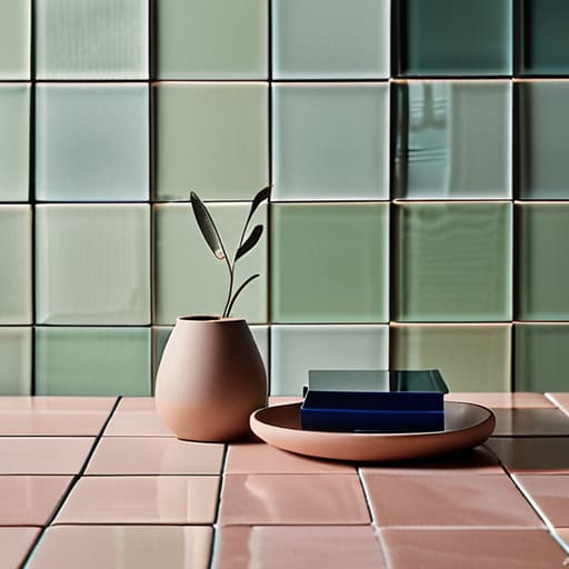
When we talk about the psychology of color in design, we aren’t just discussing how to make a brand look “energetic” or “calm.” We are discussing how to respect the physiological response of the person on the other side of the screen. Colors carry an inherent weight; they can soothe an anxious user through soft, desaturated tones or demand immediate attention through high-contrast shifts. If you ignore this, you aren’t just making a stylistic error—you are creating a disconnect between the intent of the message and the emotional state of the viewer.
I’ve always found that the most sophisticated work relies on subtle cues rather than loud declarations. Instead of forcing a mood, I look to visual hierarchy through color to guide the eye naturally. By understanding how different hues interact, we can use tension and relief to tell a story. Whether you are leaning into the stability of analogous color combinations or the sudden spark of complementary color schemes, the goal remains the same: use color to anchor the human experience, ensuring that every digital interaction feels intentional rather than accidental.
Establishing Visual Hierarchy Through Color With Purposeful Contrast

Contrast isn’t just about making things pop; it’s about creating a map for the eye to follow. When we talk about visual hierarchy through color, we are really discussing how to direct attention without shouting. If everything on your canvas is fighting for dominance, nothing wins. I’ve seen too many interfaces where every button is a vibrant primary color, leaving the user feeling overwhelmed and lost. Instead, use color to establish a clear path. A single, high-contrast element can act as a lighthouse, guiding the user toward a specific action while the rest of the interface recedes into a supportive, quiet background.
To achieve this balance, you need to look beyond just the hue. Understanding saturation and value explained is where the real craftsmanship happens. You can use a muted, low-saturation palette to create a sense of calm and structure, then introduce a single burst of saturation to signal importance. It’s this intentional use of weight—the heavy versus the light—that prevents a design from feeling flat. When you respect these subtle shifts, you aren’t just decorating a screen; you are building a functional experience that feels intuitive and grounded.
Beyond the Swatch: Five Ways to Apply Color with Intent
- Stop chasing trends and start testing for legibility. A palette might look stunning on a high-end Retina display, but if your contrast ratios fail to respect the way the human eye actually processes light, you’ve failed the most basic rule of functional design.
- Build your palettes around a single anchor. Instead of grabbing a handful of random hues, pick one color that carries the emotional weight of your brand and let the others exist as supporting characters—neutrals, accents, or subtle shifts—to prevent visual noise.
- Respect the medium’s limitations. Whether you are designing for a screen or preparing something for print, remember that color lives in different worlds. Don’t just rely on digital presets; understand how light and pigment behave so your intent remains consistent across every touchpoint.
- Use color to create “productive friction.” Not every element should scream for attention. Use muted tones for secondary information to guide the user’s eye, saving your most vibrant hues for the moments that truly require human action or decision-making.
- Test your work in grayscale. If your hierarchy collapses the moment you strip away the color, your design is leaning too heavily on aesthetics and not enough on structure. A truly purposeful layout should communicate its logic through value and contrast alone.
The Intentional Palette: Moving Beyond Aesthetics
Stop treating color as a decorative afterthought; treat it as a functional layer of communication that dictates how a user feels and moves through your work.
Use contrast not just to create “pop,” but to respect the user’s cognitive load by clearly defining what matters most on the screen.
Always ground your color choices in human context—a palette that looks stunning in a digital mockup means nothing if it fails to resonate with the actual emotional reality of the person using it.
Beyond the Hex Code
Color shouldn’t be a decorative afterthought or a way to mask a lack of structure; it is a functional tool used to guide the eye and respect the emotional weight of the space we inhabit.
Ingrid Bellamy
Beyond the Palette

At the end of the day, color theory isn’t a set of rigid laws to be memorized; it is a language of intention. We’ve looked at how psychological triggers can anchor an emotion and how purposeful contrast can dictate the flow of a user’s journey through a digital space. When you stop treating color as a decorative layer and start treating it as a functional tool, your work shifts. It moves from being something that merely fills a screen to something that actively communicates. Remember that every hue you select carries a weight, and every saturation level you adjust changes the way a person feels about the brand you are building.
As we move further into an era of rapid automation and algorithmic aesthetics, I urge you to hold onto the intentionality of your choices. Don’t let the software make the decisions for you. Use your tools to create depth, to respect the human eye, and to build interfaces that feel grounded in reality. The most impactful designs aren’t the ones that scream for attention with every neon shade available; they are the ones that respect the friction of human touch and use color to guide, rather than overwhelm. Design with purpose, and let your palette be a reflection of that clarity.
Frequently Asked Questions
How do I maintain a sense of intentionality in color choice when working with limited accessibility requirements?
Accessibility shouldn’t feel like a set of handcuffs; think of it as a structural constraint that forces better decision-making. When you’re limited by contrast ratios, stop looking for the “perfect” hue and start looking for the right relationship between values. Use your sketchbook to map out tonal weights before you ever touch a hex code. If the palette feels thin, lean into texture or subtle shifts in saturation to maintain depth without breaking the rules.
At what point does a color palette transition from being functional to just being decorative noise?
It transitions the moment color stops telling a story and starts competing for attention. When you add a hue that doesn’t serve a hierarchy or a psychological cue, you aren’t designing; you’re decorating. If a user can’t intuitively understand what is clickable, what is urgent, or what is secondary because your palette is shouting at them from every corner, you’ve crossed the line into noise. Design with intent, or don’t use the color at all.
How can I balance my personal aesthetic preferences with the practical need for brand consistency across different digital mediums?
It’s a tension I feel every day. You have to separate your “taste” from your “toolkit.” Your personal aesthetic is your compass, but the brand’s guidelines are the map. I try to view constraints not as cages, but as the framework that allows the work to function. Use your eye for nuance in the small details—the weight of a stroke or a subtle gradient—while letting the core palette do its heavy lifting across platforms.
