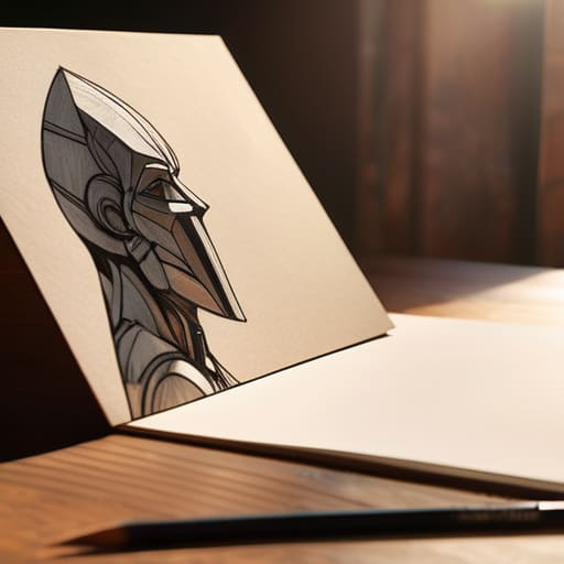
Digital work simulating shallow depth of field.

Simulating Depth of Field in Digital Work

I remember sitting in a dim studio back in the late nineties, surrounded by the smell of ozone and chemical developer, staring at a contact sheet that felt utterly lifeless. I had spent hours meticulously composing a shot, only to realize that my lack of control over the depth of field had rendered the entire frame a muddy, indistinct mess. It wasn’t a lack of expensive gear that failed me; it was a failure to understand how to direct the eye. We often treat focus like a binary switch—either everything is sharp or everything is a blur—but that’s a lazy way to look at visual storytelling.

In this piece, I’m not going to bore you with a mathematical lecture on aperture diameters or sensor physics. Instead, I want to talk about the intentionality behind the lens. I’m going to share how you can use focus to create a hierarchy of information, ensuring your subject doesn’t just sit in a frame, but actually commands it. We’re going to move past the technical jargon and focus on how to use depth of field as a tool for meaningful, human-centered composition.

Table of Contents

The Aperture and Depth of Field Relationship as Creative Choice

The Aperture and Depth of Field Relationship as Creative Choice.

When I’m hunched over my workbench, cleaning the internal gears of an old Leica, I’m reminded that every mechanical adjustment is a deliberate decision. The same applies to your lens. Understanding the aperture and depth of field relationship isn’t just about memorizing numbers on a dial; it’s about deciding how much of the world you want to allow into the frame. When you dial in a wide aperture, you aren’t just “blurring the background”—you are stripping away the noise to force a confrontation between the viewer and your subject.

Choosing between a shallow vs deep depth of field is where your narrative intent takes shape. A wide-open aperture creates that creamy, isolated look that feels intimate, almost tactile, but it demands precision. If your focus is off by a fraction, the entire emotional weight of the shot collapses. Conversely, stopping down to a smaller aperture allows for a more expansive, environmental context. It’s about finding that sweet spot where the technical settings serve the story, rather than letting the gear dictate the composition.

Shallow vs Deep Depth of Field Choosing Purposeful Focus

Shallow vs Deep Depth of Field Choosing Purposeful Focus

When I’m out with my Leica, I find myself constantly weighing the emotional weight of what I’m looking at. Choosing between shallow vs deep depth of field isn’t just a technical checkbox; it’s a decision about where you want the viewer to live within the frame. A shallow field—that creamy, isolated look—is incredibly powerful for portraiture or capturing the minute textures of a weathered object. It forces a sense of intimacy, stripping away the noise of the world to leave only the subject. However, there is a danger in overusing it; if everything is blurred, you risk losing the contextual soul of the image.

On the other hand, a deep field demands a different kind of discipline. When I want to document a landscape or a complex architectural space, I lean into a wider range of clarity. This isn’t about making everything sharp just for the sake of it; it’s about controlling background blur to ensure the environment tells a story alongside the subject. Whether you are navigating f-stop settings for photography or considering how your sensor size and depth of field interact, remember that clarity should always serve the narrative, not just the resolution.

Five Ways to Use Focus as a Design Tool

  • Stop treating bokeh like a filter. Instead of using a shallow depth of field just to mask a cluttered background, use it to create a visual hierarchy that tells the viewer exactly where to look first.
  • Mind the transition zones. A common mistake is a focus jump that feels jarring. I always look for a gradual fall-off; the way the sharpness dissolves into softness is where the actual soul of the image lives.
  • Respect the context of the subject. If you’re shooting a textured object—something with its own tactile history, like an old Leica or a weathered book—don’t blur away the very details that give it character.
  • Use deep focus to establish a sense of place. Sometimes, the environment is just as much a character as the subject. Don’t be afraid to stop down and let the surroundings breathe, providing the narrative weight the shot needs.
  • Watch your plane of focus. It isn’t always a flat line. When working with macro or close-up subjects, remember that the depth is thin; if your intention is to honor the craftsmanship of a detail, ensure your focus is surgically precise.

The Intentionality of Focus

Stop treating depth of field as a technical setting to be “fixed” and start treating it as a compositional tool that dictates where your viewer’s eye is allowed to rest.

Mastery lies in the tension between the subject and its environment; a shallow depth of field should isolate a moment, while a deep one should contextualize it.

Before you reach for your aperture ring, ask yourself what part of the story deserves the clarity and what parts are meant to remain a soft, supporting memory.

The Intent Behind the Focus

Depth of field isn’t just a technical setting on a lens; it’s a way of deciding what deserves our attention. When we blur a background, we aren’t just obscuring detail—we are making a deliberate choice to honor the subject and guide the viewer’s eye with intention.

Ingrid Bellamy

Beyond the Technicalities

Mastering depth of field Beyond the Technicalities.

At the end of the day, mastering depth of field isn’t about memorizing the math behind your aperture or knowing which f-stop yields the sharpest edge. It is about understanding the narrative weight of what you choose to reveal and what you choose to obscure. Whether you are opting for a razor-thin slice of focus to isolate a single, poignant detail or embracing a deep plane of clarity to document an entire environment, your decision should be a deliberate one. Don’t let the gear make the choice for you; instead, use these optical tools to anchor the viewer’s attention exactly where the story demands it to be.

As I sit here with my sketchbook, I’m often reminded that the most impactful designs—and photographs—are those that respect the viewer’s eye. We live in an era of digital perfection where everything can be artificially sharpened or smoothed with a single click, but there is a profound beauty in the intentionality of imperfection. Use depth of field to honor the subject’s true intent, not just to mask a lack of composition. When you stop treating focus as a setting and start treating it as a form of visual dialogue, you move from merely capturing an image to actually composing a moment.

Frequently Asked Questions

How do I maintain a sense of intentionality when the depth of field feels accidental or messy?

When the focus feels accidental, it’s usually because you’ve lost control of the plane of sharpness. To fix this, stop treating aperture as a setting and start treating it as a compositional tool. Check your distance to the subject and your focal length; sometimes a wider lens is actually your friend for maintaining clarity. If the blur feels “messy,” it’s likely because it’s competing with your subject rather than cradling it. Refine your placement to ensure the transition from sharp to soft feels earned.

Is there a way to balance sharp focus with a soft background without losing the tactile texture of the subject?

It comes down to managing your light and your distance. If you’re chasing that creamy bokeh but the subject feels “plastic,” you’re likely overcompensating with a wide aperture. Try stopping down just a hair—move from f/1.8 to f/2.8 or f/4. This keeps the micro-contrast of the textures intact. Also, watch your lighting; side-lighting emphasizes the physical grit and tactile details that a flat, bright light tends to wash away.

At what point does a shallow depth of field stop being a creative tool and start becoming a distraction from the composition?

It becomes a distraction the moment the blur starts fighting the subject rather than supporting it. If you’re using a wide aperture to isolate a detail, but the bokeh is so aggressive it swallows the context or creates distracting shapes in the background, you’ve lost the narrative. A shallow depth of field should feel like a spotlight, not a veil. If the eye can’t find a clear place to rest because the “artistic” blur is too loud, you’ve prioritized technique over intent.

Managing digital painting with Procreate layering.

Managing Layers in Digital Painting Apps

I remember sitting in a dimly lit studio back in the late nineties, the air thick with the scent of spray adhesive and the rhythmic snip-snip of X-Acto blades against heavy cardstock. Back then, every physical layer was a commitment; if you messed up a cut, you couldn’t just hit “undo.” Transitioning into the digital realm felt like losing that tactile weight, and I’ve noticed a similar drift in how people approach procreate layering today. Too many artists treat layers like a digital safety net that encourages messy, thoughtless execution, rather than using them as a way to structure intention.

I’m not here to give you a sterile tutorial on which buttons to press or how to navigate a menu. Instead, I want to show you how to use these digital planes to preserve the soul of your work. We are going to move past the mindless stacking of files and instead focus on using procreate layering to build depth, protect your most authentic strokes, and maintain the creative control that separates a designer from a mere user.

Table of Contents

Organizing Digital Art Layers to Protect Your Creative Flow

Organizing Digital Art Layers to Protect Your Creative Flow

When the canvas gets crowded, your creative momentum doesn’t just slow down—it hits a wall. I’ve seen so many illustrators lose their rhythm because they’re digging through a chaotic stack of fifty unnamed layers just to find one specific brushstroke. To maintain a sense of flow, you have to treat your layer stack like a well-organized studio. I prefer grouping elements by function—sketch, line art, base color, and texture—rather than just letting them accumulate. This isn’t about being precious or rigid; it’s about organizing digital art layers so that your brain can stay in the “making” phase instead of the “searching” phase.

One of the most effective ways to keep your work clean is to embrace non-destructive editing Procreate techniques early on. Instead of painting directly onto your base colors, I rely heavily on clipping masks in Procreate to add shadows and highlights. This allows you to experiment with light and form without the fear of permanently altering your foundational shapes. It mimics the way we might work with physical glazes in traditional media—adding depth while retaining the ability to pull back if the direction feels wrong.

Non Destructive Editing Procreate Tools That Respect Your Process

Non Destructive Editing Procreate Tools That Respect Your Process

When we talk about non-destructive editing Procreate, we aren’t just talking about saving time; we are talking about preserving the freedom to change your mind. In my studio, I treat every stroke as a potential pivot point. This is where mastering clipping masks in Procreate becomes essential. Instead of permanently painting color into a shape, a mask allows you to layer texture or shadow while keeping the original form untouched. It creates a safety net that encourages experimentation rather than fear of the “undo” button.

There is a common tendency to lean on Alpha Lock when you want to restrict your brushwork, but I find that understanding the nuance of alpha lock vs clipping mask is what separates a cluttered workflow from a professional one. Alpha Lock is excellent for quick, localized adjustments, but it is essentially a “permanent” commitment to that layer’s pixels. If you want to maintain that sense of craftsmanship—where you can tweak the weight of a shadow or the intensity of a hue without destroying the base layer—reach for the mask. It keeps your digital canvas as flexible and forgiving as a physical sheet of vellum.

The Intentional Stack: Five Ways to Treat Your Layers with Respect

  • Name your layers immediately. It sounds tedious, but there is a profound mental friction that occurs when you’re hunting through “Layer 47” during a critical flow state. Giving a layer a name is an act of respect for your future self.
  • Use Clipping Masks to define boundaries without losing soul. Instead of erasing edges and destroying your original linework, use a clipping mask to keep your color within the lines. It allows you to experiment with texture while keeping the underlying structure pristine.
  • Group layers by function, not just by proximity. I like to group my “underpainting,” my “linework,” and my “texture overlays” into folders. This mimics the way we used to organize physical media on a drafting table—it keeps the workspace clean and the mind focused.
  • Reserve a dedicated layer for “happy accidents.” Sometimes a brush stroke goes wrong in a way that actually improves the piece. Instead of undoing it into oblivion, move it to its own layer. It preserves the human element of the work rather than forcing a digital perfection that feels sterile.
  • Leverage Alpha Lock for controlled depth. When you want to add grit or shading to a specific shape, Alpha Lock is your best friend. It lets you work within the existing silhouette, ensuring your additions feel like they belong to the form rather than just sitting on top of it.

The Intentional Layer: Three Principles to Carry Forward

Treat your layer stack as a roadmap of your decisions, not just a filing system; clear organization preserves the mental energy you need for the actual craft.

Prioritize non-destructive workflows to keep your original marks safe, allowing you to experiment without the fear of losing that initial, raw intuition.

Use layers to build depth and texture rather than just complexity, ensuring every digital stroke serves a specific, purposeful role in the final composition.

The Soul in the Stack

A layer shouldn’t just be a way to tidy up your workspace; it should be a way to protect the evolution of a thought, allowing you to peel back the digital veneer and find the raw, intentional mark underneath.

Ingrid Bellamy

Finding the Rhythm in the Layers

Finding the Rhythm in the Layers.

At the end of the day, mastering Procreate layering isn’t about learning a complex software hierarchy; it’s about building a framework that supports your intuition rather than stifling it. By organizing your stack with intention and utilizing non-destructive tools, you aren’t just managing files—you are protecting your creative momentum. When you move away from the chaos of a cluttered canvas and toward a structured, purposeful workflow, you stop fighting the interface and start focusing on the work itself. Remember, every layer should serve a specific function, acting as a deliberate step in your visual narrative rather than just another digital artifact.

As you return to your canvas, I encourage you to view these digital layers not as mere technical requirements, but as the modern equivalent of a well-kept sketchbook. There is a profound beauty in the intentionality of the process, even when that process happens on a glass screen. Don’t let the efficiency of the tool strip away the soul of your work. Use these layers to experiment, to fail safely, and to eventually find that perfect, human moment of clarity that no algorithm can replicate. Design with purpose, and let your layers be the quiet foundation that allows your vision to breathe.

Frequently Asked Questions

How do I balance using complex layer masks without losing the tactile, spontaneous feel of my original sketch?

The trick is to treat your masks like a window, not a wall. I often find myself over-refining, trying to make every edge surgically perfect, but that’s where the soul escapes. Instead of using a hard eraser or a precise selection, use a textured, low-opacity brush on your mask. Let the edges breathe. By layering subtle, imperfect textures into the mask itself, you preserve the grit and spontaneity of that initial sketch.

When does a heavy layer count start to compromise the performance and "fluidity" of my digital canvas?

You’ll feel it the moment the brush stroke lags behind your hand. That micro-second of latency is where the connection between intention and execution breaks. It usually happens when you’re pushing high-resolution canvases with dozens of heavy, high-opacity layers. Once the software starts struggling to calculate those intersections, you lose the rhythm. If you’re fighting the stylus rather than guiding it, it’s time to merge, flatten, or move to a fresh canvas.

Is there a way to use clipping masks to refine details without feeling like I'm over-polishing the raw edges of my work?

Think of clipping masks as a way to add nuance without erasing the soul of your initial sketch. Instead of painting directly onto your base layer, create a new one clipped to your shape. This allows you to layer in texture or subtle shading while keeping your original, raw edges untouched underneath. It gives you the freedom to refine the details without the fear of smoothing away that beautiful, human imperfection that makes your work feel real.

Guide to custom brush making process.

How to Create Custom Digital Brushes

I remember sitting in a cramped studio in Providence, my fingers stained with India ink, trying to coax a specific, bleeding texture out of a physical brush that just wouldn’t cooperate. There was a weight to that struggle—a tactile resistance that felt like actual progress. Fast forward to today, and I see designers drowning in massive, bloated brush packs that promise “infinite creativity” but actually deliver nothing but sterile, repetitive digital noise. Most people treat custom brush making like a technical checkbox, a way to automate the soul out of their work, when it should be about reclaiming that lost friction.

I’m not here to sell you on a complex software workaround or a way to “hack” your productivity. Instead, I want to talk about how we can use custom brush making to build tools that actually respond to the nuances of your hand. I’ll be sharing the honest, unvarnished methods I use to bridge the gap between the digital screen and the intentionality of craftsmanship. We aren’t just making presets; we are building digital extensions of our own creative instincts.

Table of Contents

Mastering Digital Painting Brush Settings for Human Expression

Mastering Digital Painting Brush Settings for Human Expression

When you sit down to work, the goal isn’t to achieve perfection through a mathematical algorithm; it’s to find that elusive sense of movement. This is where most people stumble, getting lost in a sea of sliders without understanding the why behind them. To move beyond the sterile look of standard software, you have to dive into digital painting brush settings with an eye for imperfection. I often find myself tweaking the pressure sensitivity not to make the line smoother, but to ensure the stroke responds to the specific weight of my hand, much like how a nib reacts to paper.

The real magic happens when you play with brush dynamics and jitter. If every stroke is identical, the work feels dead. By introducing subtle, controlled randomness into your opacity or size settings, you mimic the organic inconsistencies of charcoal or ink. It shouldn’t look “glitchy,” but rather like it has a soul. You aren’t just configuring software; you are sculpting a digital tool that respects the natural rhythm of your creative process.

Creating Custom Texture Brushes That Mimic Physical Friction

Creating Custom Texture Brushes That Mimic Physical Friction

When I’m working on a brand identity, I find myself missing the resistance of heavy-tooth paper or the way a dry ink brush catches on a linen canvas. Digital surfaces are often too perfect, too smooth—they lack the “soul” of a physical mistake. To fix this, you have to stop thinking about brushes as mere stamps and start thinking about them as surfaces. Creating custom texture brushes isn’t just about importing a grainy photo; it’s about how that grain reacts to your movement. I spend a lot of time tweaking brush dynamics and jitter to ensure that no two strokes are ever identical, mimicking the way a real pigment settles unevenly into a substrate.

If you want to move beyond the sterile look of default presets, you need to lean into the imperfection. Whether you are deep in a photoshop brush tip customization session or exploring the nuances of a Procreate engine, focus on the “drag.” I try to build layers of micro-textures into my settings so that as I increase pressure, the brush doesn’t just get darker—it gets tactile. It should feel as though you are fighting the medium just a little bit, because that subtle friction is where the character lives.

The Intentional Toolkit: Five Principles for Better Brush Building

  • Stop chasing perfection in your brush tips. Real graphite and charcoal have imperfections—tiny gaps, uneven edges, and organic irregularities. When you’re building your custom stamps, add a bit of jitter or noise so the stroke doesn’t feel like a repetitive, clinical loop.
  • Respect the pressure curve. A brush that feels “on” or “off” is a chore to use. Spend time calibrating your settings so the transition from a whisper-light line to a heavy, weighted stroke feels as intuitive as a fountain pen hitting paper.
  • Build for the “middle ground.” We often focus on extreme textures, but the most useful brushes are the ones that sit in that quiet space between a hard edge and a soft blur. Aim for versatility; a brush should be able to lay down a base layer just as easily as it defines a highlight.
  • Don’t forget the “drag.” In the physical world, the paper resists the tool. Try simulating this by adjusting your dual brush settings or adding a subtle texture overlay that reacts to your speed. It adds that necessary friction that keeps your hand from sliding too predictably across the tablet.
  • Test against the clock, not just the canvas. A good tool shouldn’t require constant menu-diving. If you find yourself stopping every thirty seconds to tweak a setting, the brush isn’t finished. It needs to disappear into your workflow so you can stay in the flow of creating.

The Intentional Toolkit: Three Lessons in Digital Craft

Stop chasing perfection through presets; the most expressive brushes are the ones you build to reflect the specific resistance and unpredictability of your own hand.

Digital tools should mimic the friction of the physical world, not erase it—use texture and pressure sensitivity to ensure your work feels lived-in rather than sterile.

Treat your brush library like a curated set of vintage lenses: every stroke should serve a specific purpose in the composition rather than just filling space.

The Soul in the Stroke

A preset brush is a shortcut, but a custom brush is a signature; we aren’t just choosing a tool, we are deciding how much of our own human friction we are willing to let bleed into the digital canvas.

Ingrid Bellamy

The Intentional Stroke

Mastering digital art with The Intentional Stroke.

At the end of the day, custom brush making isn’t about collecting a thousand different presets to clutter your digital library. It is about the deliberate marriage of technical settings—jitter, pressure sensitivity, and dual textures—with the intuitive movement of your hand. By mastering how these digital parameters respond to your touch, you move away from the sterile, predictable output of standard software and toward a workflow that feels earned. Whether you are mimicking the grit of charcoal or the fluid bleed of an ink wash, the goal is to bridge the gap between the screen and the tactile reality of traditional media.

As you step away from the screen and pick up your stylus, remember that the tool is merely an extension of your intent. Technology will continue to automate more of our processes, but it can never replicate the unpredictable beauty of a human error or the specific way a person leans into a stroke. Don’t let the perfection of digital tools flatten your voice. Instead, use these custom creations to reclaim the friction, the resistance, and the soul that makes your work uniquely yours. Build your tools with purpose, and let them serve your vision, not the other way around.

Frequently Asked Questions

How do I prevent my custom brushes from feeling too "perfect" or clinical when I'm trying to replicate the grit of charcoal or ink?

The problem is usually that your settings are too predictable. Digital perfection is the enemy of grit. To break that clinical feel, you need to introduce controlled chaos. Crank up the “Jitter” settings—specifically for size and angle—and play with the “Transfer” settings to mimic how ink actually pools or fades. If the stroke is identical every single time, it’s not a tool; it’s a stamp. Aim for irregularity.

Is it better to build a single, complex brush with dozens of settings, or a small kit of simpler tools that allow for more intuitive movement?

Go with the kit. I’ve seen too many designers get lost in a labyrinth of sliders, trying to find one “perfect” brush that actually ends up feeling clinical and stiff. A single, complex brush is a trap; it dictates your movement rather than following it. Build a small, versatile kit instead. You want tools that respond to your hand, allowing you to layer textures and strokes intuitively, much like picking up different pens from a real kit.

When am I over-engineering my brushes—at what point does technical tweaking start to get in the way of the actual creative flow?

You’re over-engineering when you spend more time adjusting jitter percentages than actually making marks. If you find yourself staring at a settings panel instead of the canvas, you’ve crossed the line from tool-building to procrastination. A brush should be a means to an end, not the end itself. If the technical tweaking feels like a barrier to your intuition, stop. Close the menu, pick a “good enough” setting, and just start drawing.

Digital painting light study tutorial photograph

Understanding Light in Digital Painting

I was sitting in my studio last Tuesday, hunched over a half-finished portrait, when I realized I was doing exactly what I hate: clicking through a dozen “lighting effect” presets in an attempt to find a shortcut. There is this pervasive, exhausting myth in our industry that mastering digital painting light is about finding the right layer blend mode or a flashy new brush pack. We’ve become so obsessed with the software’s ability to simulate luminosity that we’ve forgotten how to actually see. We aren’t painting light; we are just slapping glow effects onto a canvas and calling it a day, losing that essential sense of depth and intention in the process.

I’m not here to sell you on a new plugin or a complicated workflow that requires a PhD in mathematics. Instead, I want to talk about the intentionality of shadow and how to use light to guide the viewer’s eye with purpose. I’m going to share the fundamental principles I’ve gathered from decades of moving between physical ink and digital pixels—the kind of knowledge that focuses on observing reality rather than mimicking a filter. We are going to reclaim the craft, one thoughtful stroke at a time.

Table of Contents

Directional Light Sources to Honor the Human Touch

Directional Light Sources to Honor the Human Touch

When we talk about directional light sources, we aren’t just discussing where the sun sits in a scene; we are discussing the narrative weight of a shadow. In my early days of physical drafting, you couldn’t just “undo” a heavy shadow. You had to understand how light traveled across a surface. In the digital realm, it is far too easy to default to a generic, flat illumination that strips a character of its soul. To avoid this, I suggest focusing on how light interacts with the edges of your forms. Implementing subtle rim lighting techniques can do more than just separate a subject from the background; it can define the very silhouette that gives your work its structural integrity.

Don’t treat light as a secondary layer applied at the end. Instead, think about the way light carves volume. When you establish a clear direction, you naturally invite the viewer to understand the physics of your world. This is where you must respect the value scale for artists, ensuring that your transitions from highlight to core shadow feel earned rather than slapped on. By being intentional with your light’s path, you bridge the gap between a sterile digital render and a piece that feels like it was touched by a human hand.

Using Value Scale for Artists to Find Depth

Using Value Scale for Artists to Find Depth.

When I first transitioned from physical media to the screen, I felt a profound loss of weight. In traditional oil painting, the thickness of the pigment creates its own subtle shadows, but in a digital workspace, everything can feel dangerously flat. To combat this, I rely heavily on a disciplined value scale for artists. It isn’t just about making things darker or lighter; it’s about understanding the structural hierarchy of your composition. If your values are too close together, your subject loses its presence and begins to bleed into the background, becoming a mere ghost on the canvas.

True depth is found in the quiet transitions. I often find myself obsessing over ambient occlusion in digital art—those tiny, soft shadows where surfaces meet and light struggles to reach. These aren’t just technical checkboxes; they are the anchors that ground an object in reality. By carefully mapping out your light logic through a strict value range, you ensure that the viewer’s eye doesn’t just wander, but actually feels the volume of the form you’ve built. Don’t let your work become a wash of mid-tones; embrace the extremes to give your art its soul.

Beyond the Glow: Five Ways to Infuse Light with Intent

  • Stop chasing the “brightest” color. In the physical world, light is often about what it obscures; in digital painting, try using desaturated, cooler tones for your highlights to prevent that plastic, over-saturated look that plagues amateur work.
  • Respect the ambient occlusion. Light doesn’t just hit a surface and stop; it dances in the crevices. Pay attention to those tiny, dark pockets where surfaces meet—that’s where the weight of your object lives.
  • Use light to dictate the narrative, not just the visibility. Ask yourself: is this light a harsh interrogator or a soft companion? The way you wrap light around a form tells the viewer how to feel before they even process the subject.
  • Avoid the “airbrush trap.” It’s tempting to use a soft large brush for every gradient, but true depth comes from varied edges. Mix crisp, hard-edged shadows with soft transitions to mimic how light actually interacts with different textures.
  • Remember that light is a relationship between two things. You cannot define a highlight without understanding the shadow it creates elsewhere. If you change your light source, you must commit to the ripple effect it has across the entire composition.

Bringing Intention to the Digital Canvas

Stop treating light as a mere filter; instead, use it as a tool for storytelling that guides the viewer’s eye through the composition.

Master your value scales to ensure depth is built through structural integrity rather than just adding more color.

Embrace the “friction” of your medium by prioritizing intentional lighting choices that mimic the subtle complexities of the physical world.

The Soul of the Shadow

Digital light shouldn’t feel like a mathematical calculation of lumens; it should feel like an intention. If you aren’t using light to guide the eye and respect the weight of your forms, you aren’t painting—you’re just adjusting brightness.

Ingrid Bellamy

Finding the Light in the Digital Void

Finding the Light in the Digital Void.

Mastering light in a digital environment isn’t about discovering a new plugin or finding the perfect preset; it’s about understanding how luminosity interacts with form. We’ve looked at how intentional directional sources can ground your subject in a physical reality and how a disciplined approach to the value scale prevents your work from flattening into a mere collection of pixels. When you treat light as a structural element rather than a decorative layer, you move away from the sterile perfection of the machine and toward something much more visceral and alive. It is the difference between simply filling a canvas and actually sculpting with light.

As you close your sketchbook and turn back to the screen, I want you to remember that the tools are secondary to your intent. The digital medium offers us infinite control, but that control can easily become a trap of over-polishing that strips away the soul of the work. Don’t be afraid of a little shadow or the slight imperfection of a soft edge. Use the light to tell a story, to guide the viewer’s gaze, and to honor the inherent friction of the human experience. At the end of the day, our goal isn’t to create a perfect image, but to create a meaningful one.

Frequently Asked Questions

How can I prevent digital lighting from looking too "perfect" or plastic when I'm trying to maintain a painterly feel?

The problem is that digital tools love a perfect gradient, but perfection is the enemy of soul. To break that plastic sheen, stop relying on soft airbrushes for everything. Introduce intentional imperfection. Use textured brushes that mimic the resistance of physical media, and allow your edges to stay slightly “lost.” Don’t be afraid of a little grit or a stray, unblended stroke; that’s where the life lives. Let the light feel felt, not just calculated.

Is there a way to simulate the way light interacts with physical textures, like paper grain or heavy impasto, in a digital environment?

You can’t just use a “grain” filter and call it a day; that’s just noise. To truly mimic impasto or paper tooth, you have to think about how light catches the physical peaks and valleys of a surface. I usually layer subtle, high-contrast textures using blend modes like Overlay or Soft Light, then manually paint in the tiny highlights where the “paint” would catch the light. It’s extra work, but it restores that necessary friction.

How do I balance using high-contrast lighting with the need to keep my color palette cohesive and intentional?

It’s a delicate tension, isn’t it? When you push the contrast, you risk shattering the harmony you’ve worked so hard to build. My approach is to treat light as a color itself, rather than just a white overlay. Instead of using pure white for your highlights, pull a desaturated version of your most luminous local color. This keeps the light tethered to your palette, ensuring the drama serves the composition rather than fighting it.

Guide to non destructive editing workflows.

How to Use Non Destructive Editing Workflows

I still remember the tactile, terrifying permanence of the early days—the smell of spray mount and the high stakes of a single misplaced X-Acto cut on a physical paste-up. Back then, a mistake wasn’t something you could just “undo”; it was a scar on the work. Today, we have endless layers and infinite history states, yet I see so many designers treating non destructive editing as if it were a magic wand that absolves them of the need to think. We’ve traded the discipline of the physical craft for a digital safety net that often encourages reckless experimentation rather than intentionality.

I’m not here to give you a technical manual or a list of software shortcuts you could find in a five-minute tutorial. Instead, I want to talk about how we can use these tools to actually protect the integrity of our vision. I’m going to share how to build a workflow that respects your original intent while giving you the breathing room to evolve. My goal is to help you master non destructive editing as a way to honor your creative process, ensuring that every digital choice feels as deliberate as a stroke of ink on paper.

Table of Contents

Preserving Original Pixel Data to Protect the Creators Vision

Preserving Original Pixel Data to Protect the Creators Vision

When I first started working with physical film, there was a certain weight to every decision. You couldn’t just “undo” a chemical reaction in a darkroom. Today, we have a luxury that can easily become a crutch: the ability to manipulate pixels without consequence. However, true professional image retouching workflows require us to maintain that same sense of reverence for the source material. By preserving original pixel data, we aren’t just being cautious; we are protecting the integrity of the initial capture.

If you bake your adjustments directly into the base layer, you are essentially burning the bridge behind you. I’ve seen too many junior designers realize halfway through a project that they’ve pushed a highlight too far, only to find the data is gone—replaced by flat, digital gray. Utilizing adjustment layers or smart objects ensures reversibility in digital art, allowing you to pivot your creative direction without the panic of having destroyed your foundation. It’s about maintaining a safety net so that your experimentation can be fearless rather than reckless.

The Grace of Reversibility in Digital Art

The Grace of Reversibility in Digital Art.

There is a specific kind of anxiety that sets in when you realize a single, irreversible stroke has altered a composition beyond repair. I remember the days of physical paste-ups, where a slip of the X-Acto blade meant a project was fundamentally broken. In the digital realm, we often forget that we can—and should—embrace a similar level of caution. True reversibility in digital art isn’t just a technical safety net; it is a psychological permission slip. It allows us to take risks, to push a color grade into the extreme, or to experiment with aggressive textures, knowing that we haven’t permanently scarred the foundation of the piece.

When I consult with boutique agencies, I always emphasize that the goal is to build a workflow that breathes. By utilizing adjustment layers and smart objects, you aren’t just following editing software best practices; you are creating a living document. This approach ensures that your creative decisions remain fluid. If a client asks to pivot the mood of a campaign three days after the initial draft, you won’t be starting from scratch. You’ll simply be adjusting the parameters of a vision that remains intact, untouched by the heavy hand of permanent change.

Five Ways to Keep Your Creative Process Fluid

  • Master the Layer Mask. Stop erasing pixels like you’re working with a permanent marker; use masks instead so you can dial back the intensity or adjust the boundaries whenever the composition demands it.
  • Lean on Smart Objects. When you scale a vector or a high-res image, don’t let the software bake in those transformations; keep them as Smart Objects so you can resize and refine without losing that initial crispness.
  • Build Adjustment Layers, Not Direct Edits. Never bake color corrections directly into your base layers. By using adjustment layers, you keep the “recipe” of your look separate from the “ingredients” of your image.
  • Use Non-Destructive Brushes and Textures. Instead of stamping a texture directly onto your canvas, apply it to a new layer set to a specific blend mode. This lets you control the grit and weight of the texture without permanently scarring your work.
  • Document Your Workflow with Notes. Treat your layer stack like a well-organized sketchbook. Label your groups and keep your adjustment layers organized so that when you return to a file weeks later, the intent behind your choices is still legible.

The Intentionality of the Undo

Embracing The Intentionality of the Undo.

Non-destructive editing isn’t a safety net for indecision; it’s a way to protect the integrity of your initial vision while allowing for the inevitable evolution of a project.

By keeping your original layers and data intact, you maintain a direct lineage between your first thought and your final execution, ensuring nothing is lost to the void of a permanent change.

True craftsmanship in a digital space requires the freedom to experiment without fear, transforming the workflow from a series of high-stakes gambles into a thoughtful, reversible dialogue with your work.

The Safety Net of Intentionality

Non-destructive editing isn’t just a technical safety net; it’s the psychological freedom to be brave. When you know you haven’t burned the bridge behind you, you’re finally willing to walk toward the more difficult, experimental paths that actually lead to something meaningful.

Ingrid Bellamy

The Intentionality of the Undo

At its core, non-destructive editing is more than just a technical safety net or a way to manage layers; it is a commitment to the evolution of an idea. By protecting our original data and embracing the grace of reversibility, we stop treating our digital canvas as a series of permanent, high-stakes gambles. Instead, we treat it as a living space where we can experiment, fail, and pivot without ever losing the foundation of what we initially set out to build. It allows us to maintain the integrity of our vision while remaining agile enough to respond to the shifting needs of a project.

As we move further into an era defined by rapid automation, I urge you to hold onto the intentionality of your process. Use these tools not to bypass the hard work of decision-making, but to deepen it. When you work non-destructively, you aren’t just saving files; you are preserving the humanity of your creative journey. Don’t let the fear of a wrong move paralyze your hand. Build your workflows so that you have the freedom to wander, to explore the edges of your craft, and to always find your way back to the soul of the work.

Frequently Asked Questions

How do I manage the inevitable file size bloat that comes with keeping all those layers and history states intact?

It’s the inevitable tax we pay for creative freedom. When you refuse to flatten your work, your storage fills up fast. I’ve learned to treat my working files like a studio: keep the “active” project heavy with all its history, but once a milestone is reached, archive a flattened version for reference and prune the history states. Use smart objects and external assets where possible. It’s about balancing the weight of your process with the reality of your hardware.

At what point does a non-destructive workflow stop being a safety net and start becoming a way to avoid making definitive design decisions?

It becomes a trap when you use layers and masks as a shield against commitment. If you’re endlessly tweaking parameters instead of deciding on a direction, you aren’t exploring; you’re procrastinating. A non-destructive workflow should be a playground for iteration, not a hiding place. The moment you find yourself afraid to “flatten” a decision because you’re terrified of being wrong, you’ve stopped designing and started merely managing variables.

Are there specific limitations to this approach when I need to export my work for high-fidelity print production versus digital interfaces?

The friction usually shows up at the final handoff. When you’re moving from a flexible digital canvas to a rigid print spec, your non-destructive layers can become a liability if they aren’t flattened or optimized for high-resolution output. You can’t send a “live” file to a press; you have to commit. The trick is to treat your non-destructive workflow as the laboratory, but recognize that the final export requires a deliberate, decisive moment of intention.

Advanced 3D sculpting techniques for digital models.

Techniques for Sculpting Digital Models

I remember sitting in a dimly lit studio back at RISD, the smell of linseed oil and turpentine thick in the air, feeling the actual resistance of clay against my palms. There was a specific, heavy intention in every thumbprint I left behind. Now, when I watch beginners struggle with digital sculpting techniques, I see them chasing a sterile, mathematical perfection that feels entirely hollow. They spend hours fighting with complex sub-division levels and hyper-realistic brush presets, yet the end result often looks like something pulled from a vacuum—smooth, lifeless, and utterly devoid of soul.

I’m not here to sell you on a more expensive tablet or a flashy new plugin that promises to do the thinking for you. Instead, I want to talk about how we can reclaim that lost sense of tactile purpose. I’m going to share a few practical, experience-based approaches to digital sculpting techniques that prioritize human imperfection over algorithmic precision. We’re going to focus on how to use your digital tools to capture the grit, the weight, and the deliberate friction that makes a form feel truly alive.

Table of Contents

Honoring Anatomical Accuracy in 3d

Honoring Anatomical Accuracy in 3d modeling.

When we talk about anatomical accuracy in 3D, it is easy to get lost in the technicality of bone structure and muscle groups. But for me, it’s not just about getting the proportions right; it’s about understanding the tension beneath the surface. I often find that beginners focus too much on the silhouette and forget that a character’s weight is determined by how the anatomy reacts to gravity. If you don’t respect the underlying skeletal framework, your model will always feel like an empty shell, no matter how many polygons you throw at it.

As you refine your digital sculpting workflow, pay close attention to how skin stretches over a joint or bunches during a movement. This is where the magic happens. Instead of just clicking through presets, I recommend experimenting with specific brush settings for organic modeling to mimic the way real tissue behaves. It’s about finding that delicate balance between mathematical precision and the subtle, imperfect irregularities that make a living being feel truly alive. Don’t let the software do all the thinking for you; use it to translate your understanding of life into digital form.

Mastering High Poly Mesh Sculpting With Purpose

Mastering High Poly Mesh Sculpting With Purpose.

When you move into high-poly mesh sculpting, it’s easy to get lost in the sheer density of the geometry. It’s tempting to let the software do the heavy lifting, pushing millions of polygons just to see how much detail you can cram into a single frame. But I’ve learned that more isn’t always better; it’s about intentionality. If you aren’t careful, you end up with a “noise” problem where every surface looks equally busy, stripping the piece of its soul.

Instead of chasing mindless complexity, focus your digital sculpting workflow on where the light actually hits. I find that the most impactful work comes from mastering specific brush settings for organic modeling to create subtle transitions rather than harsh, jagged edges. You want to use that high density to layer depth—starting with the broad masses and only moving into sculpting texture and skin details once the underlying form feels inevitable. It’s about building a hierarchy of detail that guides the eye, rather than overwhelming it. Treat your mesh like a physical medium; every stroke should feel like a deliberate choice.

Finding the Soul in the Mesh: 5 Ways to Sculpt with Intention

  • Stop chasing the “perfect” surface. In my experience, digital perfection is the quickest way to kill a character’s life. Instead, use your brushes to introduce subtle irregularities—a slight asymmetry in a cheekbone or a micro-texture in the skin—that mimic the beautiful imperfections of physical clay.
  • Respect your topology from the start. It’s tempting to dive straight into high-frequency details, but if your underlying structure is a mess, your sculpt will eventually feel hollow. Build a foundation that allows for organic movement; think of it like prepping a canvas before you ever touch a brush.
  • Use reference as a dialogue, not a blueprint. I often keep my sketchbook open to anatomical studies while I work. Don’t just copy a photo; try to understand the tension of the muscle underneath. When you understand the why behind a form, the sculpt becomes much more convincing.
  • Embrace the friction of the process. Sometimes, the best shapes come from a “mistake” or an aggressive stroke that you didn’t intend. Don’t immediately reach for the smooth tool to fix it. Step back, look at the silhouette, and see if that raw energy actually serves the character’s story.
  • Control your digital scale. It is incredibly easy to get lost in a microscopic view of a single pore, losing sight of the overall gesture. Periodically zoom out to the widest view possible. If the silhouette doesn’t communicate the character’s weight and presence, no amount of fine detail will save it.

The Intentional Sculptor’s Checklist

Prioritize structural integrity over surface detail; a sculpt that lacks a solid anatomical foundation will always feel hollow, no matter how much micro-texture you add.

Embrace the “digital friction” by using varied brush pressures and strokes to avoid the sterile, overly smoothed look that plagues automated renders.

Maintain a clear hierarchy of form, ensuring that the primary silhouettes are legible and purposeful before getting lost in the weeds of high-poly complexity.

The Ghost in the Mesh

A perfect digital sculpt is often a sterile one; the real mastery lies in knowing exactly where to break the symmetry and introduce the subtle, imperfect rhythms that signal a human hand was actually there.

Ingrid Bellamy

Beyond the Digital Surface

Beyond the Digital Surface of 3D sculpting.

Ultimately, mastering 3D sculpting isn’t about memorizing every slider in your software or chasing the highest polygon count imaginable. It is about the synthesis of technical discipline and creative intuition. We’ve looked at how anatomical accuracy provides the necessary foundation, and how high-poly sculpting allows us to layer in the nuance that defines a character. When you combine these approaches, you move past mere imitation and begin to build something with structural integrity. Remember, the goal is never just to fill a viewport with detail; it is to use your tools to articulate a specific, intentional vision that feels grounded in reality.

As you return to your workstation, I encourage you to step away from the perfection of the grid every once in a while. Digital tools are incredibly efficient, but they can also be sterile if we let them. Don’t be afraid to let your sculpts carry a bit of human imperfection—the slight asymmetry, the subtle texture of skin, or the weight of a heavy limb. We are more than just operators of software; we are craftsmen using a new kind of chisel. Let your digital work reflect the same intentionality and grit that you would find in a physical medium. That is where the soul of the art truly lives.

Frequently Asked Questions

How do I prevent my digital sculpts from looking too "perfect" or sterile while still maintaining technical accuracy?

The trap is thinking that technical accuracy equals perfection. It doesn’t. To break that sterile, “uncanny valley” feel, you have to introduce controlled imperfection. I always tell my clients to look for the micro-deviations—the slight asymmetry in a jawline or the subtle unevenness of skin texture. Don’t smooth everything out. Instead, use your brushes to layer in the grit and the “errors” that nature provides. Accuracy is the foundation; character lives in the friction.

When should I prioritize a high-poly workflow over a more efficient, low-poly approach for a specific project?

If you’re aiming for a cinematic close-up or a hero asset where the viewer can linger on every pore and crease, go high-poly. That’s where you capture the intentionality of the form. But if you’re building for a real-time engine or a massive crowd, don’t fight the hardware. Efficiency isn’t a compromise; it’s a design choice. Use high-poly for the soul of the piece, and low-poly for its performance.

How can I translate the tactile feeling of working with physical clay into my digital sculpting process?

Stop treating your stylus like a mouse and start treating it like a tool of resistance. In the studio, clay fights you back; it has weight and memory. To replicate that, don’t just glide over the surface. Vary your pressure sensitivity and lean into the “imperfections” of your stroke. Use brushes that mimic the drag of a real rib tool or a thumb, rather than seeking a sterile, mathematical smoothness. Seek the grit.

Applying noise overlays to digital compositions.

Using Noise Overlays in Digital Compositions

I was sitting at my drafting table last night, cleaning the internal gears of a 1970s Leica, when I realized how much we’ve lost in the rush toward digital perfection. There is a specific, tactile soul in the grain of a film photograph that modern software tries—and often fails—to mimic with a single click. Lately, I see so many designers treating noise overlays like a cheap cosmetic fix, slapping a generic grain filter over a layout just to satisfy some fleeting trend. It’s lazy. When you use texture without intention, you aren’t adding depth; you’re just adding clutter that obscures the very work you’re trying to elevate.

I’m not here to teach you how to follow a trend or download a preset pack. Instead, I want to talk about how to use noise overlays to actually restore a sense of weight and presence to your digital canvases. My goal is to show you how to integrate subtle, purposeful textures that respect the composition rather than fighting it. We’re going to move past the superficial and look at how to build a visual language that feels grounded, intentional, and—most importantly—human.

Table of Contents

Embracing Imperfection With Film Grain Texture Overlays

Embracing Imperfection With Film Grain Texture Overlays

When I’m hunched over my workbench, cleaning the internal components of an old Leica, I’m reminded that perfection is often the enemy of character. In the digital realm, we tend to over-correct, scrubbing away every trace of irregularity until our designs feel sterile and soulless. This is why I’ve become so fond of using film grain texture overlays to bridge that gap. By introducing a subtle layer of organic grit, we aren’t just decorating a layout; we are simulating the way light actually interacts with a physical medium.

It’s a delicate balance, though. If you lean too hard into analog film emulation techniques, you risk making the work look like a tired cliché rather than a deliberate choice. The goal isn’t to mask a lack of skill with a heavy filter, but to use texture to create a sense of depth and tactile presence. When we add a hint of grain, we invite the eye to linger on the nuances of the composition, giving the viewer a way to connect with the work on a much more visceral, human level.

Beyond Smoothness Why We Need Analog Film Emulation Techniques

Beyond Smoothness Why We Need Analog Film Emulation Techniques

We’ve become far too accustomed to the sterile perfection of modern rendering. In my years of transitioning from the drafting table to the workstation, I’ve noticed a growing trend toward a “sanitized” digital look—everything is mathematically precise, perfectly smooth, and ultimately, quite hollow. When we lean too heavily on digital noise reduction, we often strip away the very soul of an image, leaving behind a plastic-like sheen that feels disconnected from reality.

This is why I find myself returning to analog film emulation techniques when a project feels too clinical. It isn’t about being nostalgic for the sake of a trend; it’s about reintroducing a sense of depth and weight. By layering in subtle imperfections, we mimic the way light actually interacts with physical matter. We aren’t just adding “glitches”; we are creating a visual language that acknowledges the organic unpredictability of the world. When we embrace these slight deviations from perfection, we move away from mere pixel-pushing and back toward true craftsmanship.

Practical Intent: How to Apply Texture Without Losing the Design

  • Stop treating noise like a filter. Instead, treat it like a material. Before you add a single pixel of grain, ask yourself if the texture is serving the brand’s weight or if it’s just masking a lack of depth in your color palette.
  • Watch your contrast ratios. It is easy to get carried away with heavy overlays, but if your noise eats into the legibility of your typography, you’ve failed the primary job of a designer. Keep the texture in the background, not in the way of the message.
  • Scale your grain to the medium. A heavy, chunky noise overlay might look intentional on a bold poster design, but it will feel like digital error on a mobile interface. Match the granularity to the screen density of your intended user.
  • Layer with subtlety. I find that blending noise using ‘Overlay’ or ‘Soft Light’ modes at low opacities (often under 10%) creates a much more organic feel than simply slapping a high-contrast pattern on top of a flat color.
  • Avoid the “algorithmic” look. If your noise looks too uniform or mathematically perfect, it will feel synthetic. True analog texture has a certain randomness; try layering different grain patterns to break up that digital predictability.

The Intentionality of Texture

Avoid using noise as a decorative afterthought; instead, treat it as a deliberate layer of grit that provides depth and breaks the sterile perfection of digital rendering.

Use grain and texture to mimic the tactile history of analog media, creating a visual language that feels lived-in rather than manufactured.

Remember that the goal isn’t to make things look “old,” but to introduce enough human-like friction to make a digital interface feel approachable and grounded.

The Soul in the Static

Digital perfection is often just a polite way of saying something is hollow. When we introduce noise, we aren’t just adding visual clutter; we are reclaiming the tactile friction that makes a design feel like it was actually touched by human hands.

Ingrid Bellamy

The Intentional Grain

Embracing tactile texture with The Intentional Grain.

At its core, integrating noise overlays isn’t about adding a filter or following a trend; it’s about reclaiming the depth that often gets lost in the pursuit of digital perfection. We’ve discussed how film grain can ground a composition and why emulating analog textures provides a necessary counterweight to the sterile, mathematical smoothness of modern displays. When we use these techniques, we aren’t just “decorating” a layout—we are introducing a sense of scale and weight that helps the eye settle. By choosing where to apply texture and where to let the light breathe, we move away from mindless automation and back toward a discipline of deliberate, tactile craftsmanship.

As you move back to your own canvases, I challenge you to look past the “cleanliness” of your software. Don’t be afraid of a little grit or a subtle break in the gradient. The most resonant designs are often the ones that feel like they were touched by a human hand rather than rendered by an algorithm. Let your work breathe with the beautiful friction of imperfection. In an increasingly polished digital landscape, it is our responsibility to ensure that the soul of the maker—that slight, wonderful irregularity—is never completely smoothed away.

Frequently Asked Questions

How do I balance adding texture without making the UI feel cluttered or difficult to read?

It’s a fine line between character and chaos. I always tell my clients: texture should be felt, not necessarily seen. Think of it like a subtle linen paper under a print; it adds depth without demanding attention. Keep your overlays at a very low opacity—often below 5%—and ensure they don’t interfere with your type’s legibility. If the grain starts competing with your hierarchy, you’ve gone too far. Let the texture support the design, not drive it.

Is there a way to use noise overlays that doesn't just mimic film, but actually serves a functional purpose in digital branding?

Absolutely. Beyond the nostalgia of film grain, noise can be a functional tool for visual hierarchy. I often use subtle, micro-textures to define boundaries between interactive elements and static backgrounds without relying on heavy borders or harsh lines. It’s about creating depth and separation through tactile difference rather than just color. When used with intention, noise can guide a user’s eye and provide a sense of structural weight that keeps a flat interface from feeling unmoored.

When working with high-resolution displays, how do I ensure the grain doesn't just look like digital artifacts or compression errors?

It’s a delicate balance. On high-density Retina displays, low-res grain just looks like a broken file or a bad JPEG. To avoid that “digital error” look, you have to scale your textures. Don’t use a single, heavy overlay; instead, layer subtle, high-frequency grain at a lower opacity. Think of it like adjusting the ISO on one of my Leica M3s—you want a fine, organic shimmer that feels part of the light, not a layer of digital dust sitting on top of the glass.

Creating realistic texture in digital art.

How to Create Realistic Digital Textures

I remember sitting in a dimly lit studio at RISD, my fingers stained with India ink and the air thick with the scent of solvent. Back then, if you wanted grit, you had to earn it through physical layering, sanding, and the unpredictable dance of real materials. Today, I see so many designers trying to bypass that struggle by slapping a generic, high-resolution overlay onto a canvas and calling it a day. They treat texture in digital art like a checkbox on a creative brief rather than a way to honor the soul of a piece. It’s lazy, and frankly, it’s why so much modern design feels devoid of life.

I’m not here to sell you a pack of expensive, “pro-level” brushes or promise you a magical shortcut to realism. Instead, I want to talk about how we can intentionally reintroduce the friction of the human hand into our digital workflows. We’re going to look at how to build depth through purposeful imperfection and how to use tactile elements to guide the eye, rather than just filling empty space. This isn’t about mimicking a photograph; it’s about reclaiming the craft in a way that feels honest.

Table of Contents

Simulating Traditional Media to Honor the Human Hand

Simulating Traditional Media to Honor the Human Hand

When we talk about simulating traditional media, we aren’t just trying to trick the eye; we are trying to recapture a sense of presence. In my early days with physical paste-ups, the paper had a tooth, and the ink had a weight. In a purely digital environment, everything can feel unnervingly sterile—too perfect, too smooth. To fight that clinical perfection, I often find myself tinkering with brush engine settings to introduce a bit of unpredictability. It’s about breaking the mathematical precision of a stylus stroke so it feels less like a coordinate and more like a gesture.

If you want to move beyond flat color, stop looking for a “perfect” texture preset. Instead, think about how light interacts with a physical surface. I’ve found that adding depth to digital illustrations requires a layered approach, often using subtle noise and grain overlays to mimic the way light scatters across a canvas or a piece of heavy-weight watercolor paper. It shouldn’t look like a heavy-handed filter; it should feel like the very foundation of the work. We aren’t just making pictures; we are building tactile worlds.

Adding Depth to Digital Illustrations Through Intentional Imperfection

Adding Depth to Digital Illustrations Through Intentional Imperfection

When we talk about adding depth to digital illustrations, the temptation is to lean on the mathematical perfection of the software. We use a stabilizer, a perfect gradient, and a clean vector line, only to find the result feels sterile—like looking at a piece of polished plastic. To combat this, I find myself digging back into my old sketchbook logic. I look for where the light shouldn’t be perfectly even. Instead of relying on a standard airbrush, I spend time tweaking my brush engine settings to introduce slight jitters or pressure inconsistencies. It’s about inviting a controlled chaos into the workflow that mimics how ink actually bleeds into paper.

The real magic happens in the layering. I never consider a piece finished until I’ve experimented with noise and grain overlays to break up those unnaturally smooth digital planes. It isn’t about obscuring your work; it’s about creating a sense of atmosphere. By layering subtle, organic imperfections, you provide the eye with something to hold onto. You aren’t just rendering a shape; you are simulating the weight and history of a physical object.

Small Acts of Resistance: Five Ways to Infuse Intentionality

  • Stop hunting for the “perfect” preset. Instead, layer subtle noise or grain manually to break up those unnervingly smooth digital gradients. It’s about creating a visual rhythm that feels lived-in, not polished to death.
  • Respect the physics of the medium. If you’re simulating charcoal, remember that it responds to pressure and the tooth of the paper. Digital brushes shouldn’t just be different shapes; they should mimic the way a physical tool resists the surface.
  • Use texture as a wayfinding tool, not just decoration. A slight change in grit or a shift in tactile quality can guide the viewer’s eye toward a focal point, much like how a physical print uses embossing to create hierarchy.
  • Embrace the “happy accident.” In my analog days, a stray ink blot or a slight misalignment was a character builder. In your digital workflow, don’t be so quick to hit undo when a texture overlay creates an unexpected, beautiful tension.
  • Curate your assets with a discerning eye. Avoid those generic, high-contrast texture packs that look like they were scraped from a stock site. Seek out scans of actual handmade paper or weathered stone—textures that carry the weight of real history.

The Intentionality of Imperfection

Avoid using texture as a decorative afterthought; instead, treat it as a functional layer that provides the tactile weight digital pixels often lack.

True depth comes from understanding the “why” behind a stroke—mimic the resistance of paper or the bleed of ink to ground your work in a sense of physical reality.

Use imperfection to break the sterile perfection of digital tools, ensuring your designs respect the messy, beautiful friction of human craftsmanship.

The Soul in the Static

“Digital perfection is a sterile vacuum. If we want our work to actually breathe, we have to stop chasing the clean vector and start inviting the grit, the grain, and the beautiful, messy friction of the real world back into our pixels.”

Ingrid Bellamy

The Intentionality of the Imperfect

The Intentionality of the Imperfect in texture.

At the end of the day, texture isn’t just another layer to stack in your Photoshop file; it is the bridge between a sterile interface and a piece of art that feels alive. We’ve explored how simulating traditional media can ground your work, and how embracing those small, intentional imperfections provides the depth that a mathematically perfect vector simply cannot achieve. If we treat texture as a mere decorative afterthought, we lose the very thing that makes digital art resonant. Instead, we must use it to honor the friction of the physical world, ensuring our digital compositions possess a sense of weight, history, and human presence.

As we move further into an era of increasingly automated design, the temptation to let an algorithm smooth out every edge will only grow. Resist that urge. I encourage you to pick up your stylus—or better yet, your sketchbook—and remember that the most profound beauty often lives in the slight tremor of a hand or the grain of a paper. Don’t aim for perfection; aim for connection. Use your tools to build something that doesn’t just occupy space on a screen, but actually speaks to the soul of the person viewing it. Keep creating with purpose.

Frequently Asked Questions

How do I balance adding tactile texture without making the digital interface feel cluttered or heavy?

The key is restraint. Texture shouldn’t be a layer you spread like butter; it should be a subtle grain that lives in the shadows or the transitions. I treat it like a fine-grit sandpaper—just enough to break the digital sheen without disrupting the flow. If the texture competes with your typography or navigation, it’s too heavy. Aim for micro-textures that reward a close look rather than overwhelming the initial glance.

At what point does intentional imperfection cross the line from "character" into looking like a technical error?

It’s a fine line, and it comes down to intentionality versus accident. Character lives in the nuance—a slight wobble in a line or a subtle grain that mimics a physical substrate. A technical error, however, breaks the logic of the piece. If the “imperfection” disrupts the hierarchy or makes the viewer question if your software glitched, you’ve missed the mark. Texture should support the soul of the work, not sabotage its legibility.

Are there specific ways to use texture to guide a user's eye through a layout rather than just using it for decoration?

Texture isn’t just a finish; it’s a directional tool. I often use high-contrast grain to pull focus toward a specific focal point, effectively creating a visual weight that demands attention. Think of it as a way to create a hierarchy of tactile importance. By increasing the grit in a primary area and smoothing out the periphery, you’re not just decorating—you’re guiding the viewer’s eye through the composition with intentional, rhythmic friction.

Creating digital art with generative ai tools.

Using Generative Ai in Digital Art

I was sitting at my desk yesterday, cleaning the lens of a 1970s Leica, when I realized how much we’ve lost the sense of deliberate friction in our work. Lately, my inbox is nothing but noise about how generative ai tools are going to “revolutionize” the creative industry by making us faster, better, and—most importantly—more efficient. It’s a hollow promise. The industry is being sold this myth that speed is the same thing as quality, as if a prompt can ever replace the muscle memory of a designer who understands how a single kerning adjustment changes the entire soul of a typeface.

I’m not here to sell you on the magic or the fear-mongering; I’m here to talk about intentionality. In this piece, I want to move past the shiny marketing fluff and look at how we can actually use these generative ai tools as a way to amplify our own agency rather than surrendering it. I’ll be sharing my honest, no-nonsense perspective on which technologies actually respect the craft and which ones are just shortcuts that lead to a sea of visual mediocrity.

Table of Contents

Large Language Models Explained Through a Human Lens

Large Language Models Explained Through a Human Lens

When we talk about large language models explained in technical terms, the conversation usually gets lost in a sea of tokens, parameters, and neural weights. It feels cold, like reading a manual for a machine that has no soul. But if I look at it through the lens of a designer, I see something different. I see a massive, digital library of human expression—a vast, interconnected web of how we structure thought and rhythm. It isn’t just math; it is a reflection of our collective patterns of communication.

To me, these models function less like a calculator and more like a highly sophisticated apprentice. They don’t “know” things in the way we do, but they have observed the way we weave ideas together. When we explore different generative ai use cases, we shouldn’t be looking for a way to outsource our thinking. Instead, we should treat the model as a sounding board—a way to test the tension of a concept or to find a new way to phrase a brand’s core values before we ever touch a pen to paper. It is about finding that creative friction that leads to something better.

Beyond Automation Ethical Implications of Generative Ai

Beyond Automation Ethical Implications of Generative Ai.

When we talk about the ethical implications of generative AI, we often get lost in the technicalities of data scraping and copyright. But for those of us who have spent our lives building visual languages, the concern runs deeper than just legalities; it’s about the sanctity of the creative impulse. As I sit here with my sketchbook, I can’t help but wonder if we are trading our unique perspectives for a polished, mathematical average. If we lean too heavily on ai image generation software to solve every aesthetic problem, we risk a future of visual stagnation where everything looks “perfect” yet feels entirely hollow.

The real challenge isn’t just avoiding theft, but avoiding the erosion of intent. We have to ask ourselves if we are using these systems to expand our horizons or if we are simply automating workflows with ai to the point where the designer becomes a mere curator of machine-made choices. We must ensure that as these tools evolve, they remain a scaffold for human expression rather than a substitute for the deliberate friction that makes art meaningful.

Reclaiming Intentionality: Five Ways to Work With AI Without Losing Your Soul

  • Treat the prompt as a sketch, not a final directive. Just as I wouldn’t expect a single charcoal stroke to define a complete composition, don’t expect a single prompt to deliver a finished brand identity. Use AI to generate the “roughs,” then bring your own hand back in to refine the edges.
  • Curate the output with a designer’s eye for friction. AI tends to smooth everything out into a generic, frictionless sheen that lacks character. Your job is to reintroduce the “human error”—the slight asymmetry or the unexpected color tension—that makes a design feel alive.
  • Use LLMs as a sounding board for logic, not just a generator for copy. Instead of asking it to “write a brand story,” ask it to “critique the emotional resonance of this mission statement.” Use it to stress-test your strategic thinking rather than letting it do the thinking for you.
  • Maintain a physical paper trail. When the digital tools feel too overwhelming or the AI-generated suggestions feel too hollow, step away from the screen. Revert to your sketchbook and fountain pen to map out the core concepts. This ensures the foundation of your work is built on human intuition, not an algorithm’s probability.
  • Audit your tools for “creative drift.” It is easy to become lazy when a tool can mimic a style in seconds. Periodically review your recent work to ensure you aren’t accidentally adopting the aesthetic biases of the models you use. If your work is starting to look like everyone else’s, it’s time to pivot back to manual craftsmanship.

The Intentionality Checklist

Treat AI as a high-fidelity sketchbook, not a finished product; use it to explore the breadth of an idea without letting it dictate the finality of your vision.

Guard the “friction” in your process, ensuring that the soul of your work—the subtle, human imperfections—isn’t smoothed away by an algorithm seeking optimization.

Prioritize tool-building that augments your specific craft, focusing on technologies that handle the repetitive heavy lifting so you can return your focus to the core principles of design.

The Ghost in the Machine

“We shouldn’t be looking for tools that can mimic the final result; we should be looking for tools that respect the messy, beautiful friction of the process—the kind of tools that act as a digital extension of our own intent, rather than a substitute for our own judgment.”

Ingrid Bellamy

The Intentional Path Forward

The Intentional Path Forward through AI technology.

We’ve spent much of this discussion dissecting the mechanics of LLMs and the heavy ethical weight they carry. It is easy to get lost in the technical noise or the fear of being rendered obsolete, but the core of our conversation remains the same: these tools are neither gods nor replacements. They are mirrors of our own data and, if we use them correctly, extensions of our own curiosity. As we navigate this shift, we must remember that efficiency is not the same as excellence. We can use generative tools to handle the heavy lifting of pattern recognition or initial ideation, but the responsibility for the soul of the work—the nuance, the empathy, and the strategic “why”—remains firmly in our hands.

As I sit here with my sketchbook and a half-empty cup of coffee, I am reminded that the most beautiful things often come from the struggle of the process. Technology will continue to accelerate, and the friction we once felt in physical paste-ups has been replaced by the seamlessness of digital pixels, yet the human intention must remain the constant. Don’t let the speed of the tool dictate the depth of your vision. Instead, use these new capabilities to push past the mundane and reach for something more profound. Let us build a future where we don’t just automate the craft, but use every tool at our disposal to elevate the human touch.

Frequently Asked Questions

How do we maintain a sense of personal style and "human friction" when the tools we use are trained on such massive, homogenized datasets?

We have to lean into the “imperfections” that the algorithms are trained to smooth away. The datasets are built on averages, which is the enemy of character. To find your voice, you must intentionally introduce friction—use the tool to generate a foundation, but then break it. Bring in your hand-drawn sketches, your idiosyncratic kerning, or that specific, non-linear way you compose a frame. Style lives in the deviations from the mean.

Where is the line between using AI as a productive assistant and letting it dilute the intentionality of the design process?

The line is drawn at the point of decision-making. When I use a tool to automate a repetitive task—like resizing a grid or organizing layers—I’m reclaiming time for thought. But when I let an algorithm dictate the soul of a typeface or the tension in a layout, I’ve lost the thread. If you aren’t the one making the final, difficult choice about why a specific element exists, you aren’t designing; you’re just supervising.

As these tools become more integrated into our workflows, how can we ensure they remain instruments for creators rather than just engines for mass production?

We have to treat these tools like a new kind of lens, not a replacement for the eye. To keep them from becoming engines of mindless mass production, we must maintain our role as the ultimate curators of intent. It’s about using AI to handle the heavy lifting of iteration while we guard the nuance, the texture, and the “why” behind every decision. If we stop questioning the output, we stop designing.

Principles of designing typography for effectiveness.

Principles of Designing Effective Typography

I remember sitting in a dimly lit studio at RISD, the smell of rubber cement and stale coffee hanging heavy in the air, as I spent six hours meticulously adjusting the kerning on a single headline. Back then, we didn’t have algorithms to “auto-fix” our mistakes; we had X-Acto knives, physical paste-ups, and the weight of intentionality. Today, I see so many designers treating designing typography like a checkbox in a software menu—just picking a trendy sans-serif and letting the machine handle the rest. We’ve traded the soul of the letterform for the convenience of a dropdown menu, and in the process, we’ve lost the ability to actually speak through our type.

I’m not here to give you a lecture on software shortcuts or the latest fleeting design trends. Instead, I want to talk about the discipline of the craft. I’m going to share the practical, hard-won principles of designing typography that prioritize the reader’s experience over the designer’s ego. We will focus on how to build layouts that respect the human friction of reading, ensuring your work doesn’t just fill a screen, but actually commands attention through clarity and purpose.

Table of Contents

The Soul of Typeface Selection Principles

The Soul of Typeface Selection Principles.

When I sit down with a fresh sketchbook, I’m not looking for a font that simply “looks good.” I’m looking for a font that carries a specific weight of intention. True typeface selection principles aren’t about following a trend cycle; they are about understanding the emotional resonance of a letterform. A geometric sans-serif might offer clarity, but a humanist serif provides a sense of history and warmth that a machine can’t easily replicate. You have to ask yourself: does this typeface respect the silence between the letters, or is it shouting over the content?

This choice dictates how a user breathes through your layout. If you ignore the nuances of legibility vs readability, you might create something that looks stunning in a static portfolio shot but becomes an exhausting chore to navigate on a backlit screen. It’s a delicate balance. You aren’t just picking characters; you are setting the pace of the reader’s journey. When we choose type with purpose, we aren’t just decorating a page—we are building a bridge between the idea and the human eye.

Mastering Visual Hierarchy in Type

Mastering Visual Hierarchy in Type through leading.

Once you’ve settled on a typeface that carries the right weight, the real work begins in how you direct the eye. Visual hierarchy in type isn’t about making the headline as loud as possible; it’s about creating a rhythmic path for the reader to follow. If everything is shouting, nothing is heard. I’ve spent many afternoons in my studio adjusting line height and leading to ensure a block of text feels like it has room to breathe, rather than feeling like a claustrophobic wall of ink. It’s that subtle tension between the characters that dictates whether a user feels invited into the content or pushed away by it.

True mastery lies in the nuance of the small things—the spaces between the letters and the intentionality of the scale. I often find myself leaning on specific kerning and tracking techniques to correct those tiny optical illusions that can break a layout’s elegance. When you respect the geometry of the letterforms, you aren’t just arranging characters; you are choreographing a visual experience. It is the difference between a layout that simply functions and one that truly resonates with the human eye.

The Tactile Details: Five Ways to Respect Your Type

  • Stop treating kerning as an afterthought. When you’re working digitally, it’s easy to let the software do the heavy lifting, but you have to look at the actual negative space between characters. If the rhythm feels off, the whole composition loses its heartbeat.
  • Build a hierarchy that breathes. I see too many layouts where every line of text is fighting for the same level of attention. Give your headings room to exist and your body copy enough leading to settle into. If everything is loud, nothing is heard.
  • Honor the medium’s constraints. Whether you’re designing for a high-resolution retina display or a printed broadsheet, your type must respect its environment. A typeface that looks elegant on a screen might collapse into illegibility when it hits paper—test for that friction early.
  • Limit your palette to maintain intent. It’s tempting to pull from every beautiful foundry you find on Behance, but a cluttered type system is just visual noise. Stick to a disciplined selection of weights and styles that serve a specific purpose.
  • Read it aloud to find the cadence. Typography isn’t just about how letters look; it’s about how they guide the eye through a thought. If you find yourself stumbling over a paragraph, the typographic structure is failing the content. Fix the flow, not just the font.

The Intentionality of the Final Mark

Stop treating type as a decorative layer; treat it as the structural skeleton of your message. Every weight and kerning adjustment should serve a specific communicative purpose, not just an aesthetic whim.

Respect the friction of the reader. Good typography doesn’t shout for attention; it creates a smooth, almost invisible path for the eye to follow, honoring the way humans actually process information.

Prioritize craftsmanship over convenience. In a world of endless font libraries, the real skill lies in knowing when to stop—choosing the one typeface that carries the right weight of intention rather than cycling through every trendy option available.

## The Friction of Intent

“Typography isn’t a layer of decoration to be applied once the layout is finished; it is the very architecture of thought. When we choose a typeface, we aren’t just picking a style—we are deciding how much respect we owe to the reader’s attention.”

Ingrid Bellamy

The Intentionality of the Final Stroke

The Intentionality of the Final Stroke.

We have traveled from the initial selection of a typeface’s soul to the meticulous construction of visual hierarchy. Designing typography isn’t about finding the most decorative font or the trendiest variable weight; it is about the careful orchestration of rhythm, scale, and white space. When we respect the mechanics of how a human eye moves across a page, we move away from mere decoration and toward true communication. Remember that every choice—from the leading between lines to the subtle weight of a kerning pair—is a decision to either honor the reader’s attention or to distract them with unnecessary noise.

As you close your laptop and step away from the screen, I hope you carry this perspective with you: typography is the invisible architecture of meaning. In a world increasingly dominated by automated layouts and algorithmically generated aesthetics, your greatest asset is your human intentionality. Don’t be afraid of the friction that comes with craftsmanship; embrace the slow, deliberate process of refining a layout until it feels right. Design with purpose, treat every character with respect, and always remember that the best type doesn’t just fill a space—it creates a connection.

Frequently Asked Questions

How do I maintain typographic consistency when moving between a minimalist brand identity and a content-heavy digital interface?

The trick isn’t to force the minimalist aesthetic into the heavy lifting; it’s to establish a clear hierarchy of intent. I usually lean on a robust typographic system where the brand’s “soul”—that high-contrast, expressive typeface—is reserved for headers and moments of impact. For the content-heavy sections, I pivot to a highly legible, utilitarian sans-serif. You maintain consistency through spacing, scale, and rhythm rather than forcing one typeface to do two different jobs.

At what point does adding "character" to a typeface start to compromise its functional readability?

It’s a delicate tension. Character becomes a liability the moment the letterforms demand more cognitive energy than the words themselves. If a reader has to pause to “decode” a stylized terminal or an exaggerated ascender, you’ve lost them. I always tell my clients: personality should live in the nuance—the subtle weight or a unique curve—not in the destruction of legibility. If the ornament obscures the intent, it isn’t design; it’s just noise.

How can I balance the desire for expressive, experimental type with the need for accessible, user-centered design?

It’s a tension I feel every time I open my sketchbook. The impulse to push boundaries is what keeps design alive, but if the user can’t navigate the message, the expression is just noise. I treat it as a hierarchy of intent: use your experimental, high-character type for the “soul”—the headlines and emotional anchors—but keep your functional, body copy grounded in legibility. Let the flair be the accent, not the obstacle.