I remember sitting in a dimly lit studio in Providence, the air thick with the scent of spray adhesive and ozone from a heavy-duty plotter. Back then, we weren’t obsessed with “personal branding” or optimizing algorithms; we were obsessed with the weight of a single line and the way a typeface sat on a page. Today, I see so many young designers getting lost in the digital noise, treating portfolio development like a frantic race to stack as many flashy, high-fidelity mockups as possible onto a scrolling page. It’s a hollow pursuit that favors visual gymnastics over actual substance, and frankly, it’s exhausting to watch.
I’m not here to teach you how to trick an algorithm or build a landing page that looks like a template from a Silicon Valley startup. Instead, I want to talk about how to build a body of work that actually carries weight. I’m going to share my framework for portfolio development rooted in intentionality—showing you how to document your process, justify your decisions, and demonstrate the human friction that makes a design successful. We’re going to move past the pretty pictures and focus on the craft.
Table of Contents
Curating Creative Work With Purposeful Friction
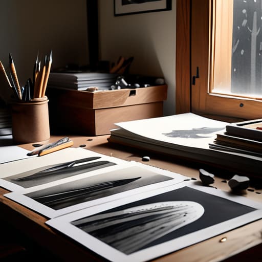
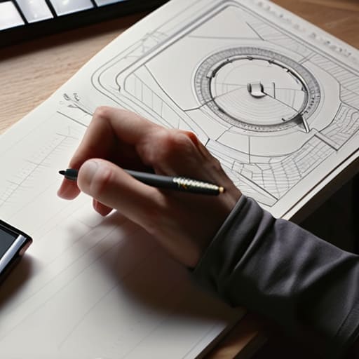
Curating creative work is often treated like a scavenger hunt for your greatest hits, but I’ve always viewed it more like an edit in a darkroom. It isn’t about how much you can fit into a grid; it’s about the intentionality of what you leave out. When I look through professional portfolio examples, the ones that actually stop my breath aren’t the ones with the most polished renders. They are the ones that use portfolio storytelling techniques to reveal the messy, necessary middle—the failed iterations, the discarded sketches, and the logic that led to the final decision.
We have become too accustomed to the frictionless scroll, where everything is presented as a seamless, perfect surface. But perfection is sterile. To truly stand out, you need to introduce a bit of purposeful friction. Don’t just show the final logo; show the way the kerning felt wrong in the first draft and how you fixed it. By showcasing work achievements through the lens of problem-solving rather than just aesthetic victory, you invite the viewer to participate in your process rather than just consume your output.
Visual Storytelling for Professionals and Human Connection
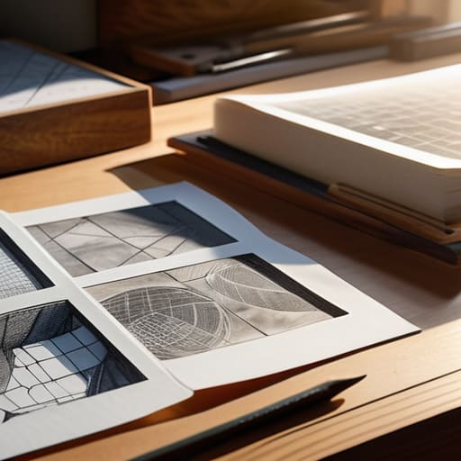
When we talk about visual storytelling for professionals, we often fall into the trap of thinking it’s just about high-resolution hero images. But a true connection happens in the gaps between the polished renders. It’s about showing the messy sketches, the failed iterations, and the logic that led you from a blank page to a finished product. If you want to move beyond being just another name in a database, you have to treat your presentation as a narrative arc. Instead of just displaying a final logo, show the evolution of the idea.
I often see people getting lost in the technical bells and whistles of various digital portfolio platforms, forgetting that the platform is just the vessel. The real magic lies in your ability to weave a thread through your projects. Effective portfolio storytelling techniques aren’t about decoration; they are about providing context. When you focus on showcasing work achievements through the lens of problem-solving rather than just aesthetic output, you invite the viewer to understand how you think. You aren’t just showing them what you made; you are showing them how you see the world.
The Anatomy of an Intentional Portfolio
- Stop treating your portfolio like a trophy case. Instead of dumping every project you’ve ever finished into a grid, select only the pieces that reflect the work you actually want to do tomorrow. If you want to design typography, don’t bury it under a mountain of mediocre social media banners.
- Show the messy middle. Clients don’t just buy the final, polished export; they buy your ability to solve problems. Include your rough sketches, your failed iterations, and those mid-process pivots. That’s where the real intelligence lives.
- Write for humans, not algorithms. Avoid the temptation to use hollow industry buzzwords like “synergy” or “disruptive.” Tell me why a specific design choice was made and how it served the user. Use your voice—the one you use when you’re explaining a concept over a cup of coffee.
- Respect the user’s time through functional hierarchy. A portfolio is a tool, not just a gallery. Ensure your navigation is intuitive and your most impactful work is accessible within two clicks. If a creative director has to hunt for your contact info, you’ve already lost them.
- Treat your digital presence as a living artifact. A portfolio is never truly “done.” It should evolve as your craft deepens. Periodically audit your work to ensure it still holds the weight of your current standards and reflects the intentionality you bring to your practice.
The Intentional Portfolio: Three Pillars of Craft
Stop treating your portfolio like a gallery of finished objects; instead, treat it as a record of your decision-making process. Show the messy, iterative sketches and the failed directions—that’s where your actual value lives.
Prioritize clarity over decoration. A beautiful interface that obscures the core problem you solved is just digital noise. Every pixel in your presentation should serve the narrative of how you navigated a challenge.
Design for the human on the other side of the screen. Remember that a creative director isn’t just looking for technical proficiency; they are looking for a collaborator who understands how to balance aesthetic intention with functional purpose.
The Fallacy of the Infinite Scroll
A portfolio isn’t a landfill for every file you’ve ever exported; it’s a curated exhibition of your decision-making. If you show everything, you end up explaining nothing. Stop trying to prove you can do everything, and start proving you know exactly why you chose to do one thing.
Ingrid Bellamy
Beyond the Digital Surface

At its core, building a portfolio isn’t about accumulating a high volume of polished assets; it is about the deliberate curation of your professional identity. We have discussed the necessity of introducing purposeful friction to slow the viewer down, ensuring they engage with your process rather than just skimming your final renders. By weaving visual storytelling into your case studies and prioritizing human connection over mere technical bravado, you transform a static gallery into a living document of your expertise. Remember, a portfolio should not just be a collection of what you did, but a testament to how you think and how you solve problems within the messy, beautiful reality of design.
As you move forward, I encourage you to treat your portfolio as a working artifact rather than a finished monument. Much like the vintage Leica I spend my weekends restoring, your digital presence requires regular calibration and a keen eye for detail. Don’t let the pressure of perfectionism turn your work into something sterile or automated. Instead, aim to build something that reflects your unique perspective and honors the intentionality of your craft. In a world increasingly saturated by the frictionless and the synthetic, let your work stand as a reminder that true design is, and always will be, a deeply human endeavor.
Frequently Asked Questions
How do I decide which projects to cut when my portfolio feels too crowded with work that I'm proud of but doesn't fit my current direction?
It’s a painful kind of curation, isn’t it? You’re essentially performing an autopsy on your own growth. When your portfolio feels bloated, stop looking at what you did and start looking at where you’re going. If a project is beautiful but belongs to a version of you that no longer exists, let it go. Your portfolio isn’t an archive; it’s a compass. Only keep the work that points toward your future.
In an era of rapid-fire scrolling, how can I introduce enough "friction" to make a viewer actually stop and engage with my process rather than just skimming my final renders?
Stop treating your portfolio like a gallery of finished trophies. To force a pause, you have to expose the scars of the process. Show me the discarded sketches, the failed color palettes, and the messy logic that led to the final decision. When you document the “why” through raw, unpolished artifacts, you invite the viewer to slow down and think alongside you. Friction isn’t an obstacle; it’s the bridge to genuine understanding.
How much of the "messy" part of design—the failed sketches, the rejected concepts, and the pivots—should I actually show to prove my thinking?
Don’t dump your entire sketchbook on the page, but don’t hide the scars, either. I’ve always felt that a polished final render without the “why” is just decoration. Show the pivots—the specific moment a concept failed and forced you to rethink the typography or the grid. That’s where the real intelligence lives. Select two or three meaningful iterations that prove you can navigate friction; that’s how you demonstrate mastery over the process.