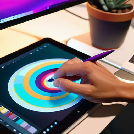
I remember sitting in a dimly lit studio back in the late nineties, my fingers stained with ink and my eyes aching from squinting at physical color swatches under a flickering fluorescent light. There was a certain weight to choosing a palette back then—a tactile, almost heavy sense of responsibility. Today, I see designers scrolling through infinite, auto-generated hex code libraries, clicking “randomize” until something looks vaguely trendy. We’ve traded that intentionality for convenience, and in the process, we’ve turned color theory into a shallow game of picking what looks “aesthetic” on a high-resolution screen. It’s become a way to decorate a void rather than a way to build a connection.
I’m not here to lecture you on the math of the color wheel or give you a list of “trending” palettes that will feel dated by next Tuesday. Instead, I want to talk about how to use color as a functional tool to guide the eye and respect the human experience. We are going to move past the superficiality of digital presets and focus on how color can provide meaningful structure to your work. My goal is to help you reclaim that sense of craftsmanship, ensuring every hue you choose serves a purpose rather than just filling empty space.
Table of Contents
- Mastering Color Wheel Fundamentals to Empower Your Vision
- Navigating Hue Saturation and Value With Intentionality
- Five Ways to Bring Intention to Your Palette
- Moving Beyond the Palette: Intentional Color Application
- ## Beyond the Palette
- Beyond the Palette: Color as a Tool for Connection
- Frequently Asked Questions
Mastering Color Wheel Fundamentals to Empower Your Vision
When I first sat at a drafting table in Providence, the color wheel wasn’t just a diagram; it was a map of emotional possibilities. To truly master color wheel fundamentals, you have to look past the simple arrangement of hues and start thinking about how they interact to create tension or harmony. It isn’t about picking colors that “look nice” together; it’s about understanding how complementary color schemes can create a focal point that commands attention without shouting.
I often tell my clients that color is a tool for guidance, not just decoration. This requires a deep dive into hue, saturation, and value. If you ignore the weight of a color—its lightness or its intensity—you lose control over the hierarchy of your design. A high-saturation red might grab the eye, but without the right tonal balance, it will simply exhaust the viewer. We have to respect the eye’s ability to process light and shadow, ensuring our digital choices feel as intentional as a stroke of ink on heavy paper.
Navigating Hue Saturation and Value With Intentionality
When we strip away the distractions, we’re left with the three pillars that actually dictate how a user feels when they land on a page: hue, saturation, and value. I often tell my clients that hue is just the starting point—it’s the identity of the color. But if you don’t master the interplay of hue, saturation, and value, your work will lack the structural integrity needed to guide an eye. Saturation provides the energy, while value dictates the weight and hierarchy. If everything is high-chroma and screaming for attention, nothing stands out. You have to learn when to pull back and let a desaturated tone provide the necessary breathing room.
This is where the visual perception of color becomes a tool for intentionality rather than just decoration. Think about the way light hits a physical object; it’s never just a flat hex code. By manipulating value, you create depth and a sense of place, even in a digital vacuum. It’s about understanding how a shift in brightness can change the entire gravity of a layout, ensuring your design doesn’t just fill the screen, but actually commands it with purpose.
Five Ways to Bring Intention to Your Palette
- Stop chasing trends and start looking for tension. A perfectly harmonious palette is easy to build, but sometimes the most impactful design comes from a single, calculated disruption—a color that doesn’t quite belong, used to pull the eye exactly where it needs to go.
- Respect the hierarchy of light. Before you commit to a vibrant hue, check how it behaves in grayscale. If your color choices collapse into a muddy mess without saturation, your accessibility is compromised. Design for clarity first, decoration second.
- Use color to create digital friction. We often try to make everything smooth and seamless, but a well-placed, high-contrast color can act as a tactile cue, signaling to a user that an element is interactive. It’s the digital equivalent of a raised edge on a page.
- Limit your heavy hitters. One of the biggest mistakes I see in modern interfaces is a lack of restraint. Choose one dominant color to carry the emotional weight and use the others as supporting actors. If everyone is shouting, no one is being heard.
- Test your colors in the real world, not just on a backlit screen. A color that looks electric in Figma might feel sterile or jarring when viewed on a standard mobile display. Always consider how ambient light and hardware limitations will change the way your work is actually experienced.
Moving Beyond the Palette: Intentional Color Application
Stop treating color as a decorative afterthought; instead, use it as a functional tool to direct attention and respect the user’s cognitive load.
Mastery lies in the nuance of value and saturation—it’s not about finding the “right” color, but about understanding how light and depth create hierarchy.
Always ground your digital choices in human experience by testing how color interacts with real-world accessibility and the tactile expectations of your audience.
## Beyond the Palette
Color isn’t just a decorative layer we slap onto a layout once the structure is finished; it is a functional tool. If you aren’t using hue and value to guide the eye or respect the user’s emotional rhythm, you aren’t designing—you’re just decorating.
Ingrid Bellamy
Beyond the Palette: Color as a Tool for Connection
We’ve moved through the mechanics of the color wheel and the technical nuances of saturation and value, but the goal was never to turn you into a walking textbook. The real work lies in how you synthesize these elements to create a cohesive visual language. When you master the relationship between hue and light, you aren’t just picking colors that look good together; you are building a framework that directs attention and communicates meaning without saying a word. Remember that color is a functional component of your strategy, not a decorative afterthought. Use it to anchor your hierarchy and ensure that every shade serves the intentionality of your design.
As you head back to your canvas or your digital workspace, I encourage you to resist the urge to let automation make these decisions for you. A software preset might suggest a harmonious scheme, but it cannot feel the weight of the emotion you want to evoke. True craftsmanship comes from the deliberate friction of making a choice—even when that choice defies a standard algorithm. Whether you are working on a high-fidelity interface or sketching in your notebook, treat color as a way to honor the human experience. Design with purpose, and let your palette be the bridge between your vision and the person on the other side of the screen.
Frequently Asked Questions
How do I maintain color consistency when transitioning a brand from a tactile, printed medium to a digital interface?
It’s a common heartbreak: a brand looks perfect on a matte cardstock but feels sickly on a backlit screen. To bridge the gap, stop treating CMYK and RGB as separate silos. Start by defining your “anchor” colors—those core hues that must remain sacred. Use a bridge like Pantone to establish a baseline, then manually calibrate your digital values to match the feeling of the print, rather than just chasing a mathematical conversion. Aim for soul, not just hex codes.
Is there a way to use color to create meaningful friction rather than just making everything as high-contrast and "loud" as possible?
We often mistake high contrast for clarity, but constant visual noise is just exhaustion in disguise. To create meaningful friction, try using subtle tonal shifts or low-chroma palettes that force a user to slow down and actually look. Instead of shouting for attention with neon, use color to signal hierarchy and pause. It’s about creating a rhythm—moments of visual rest that make the intentional, high-contrast moments feel earned rather than expected.
How can I avoid the trap of relying on preset digital palettes that feel sterile and disconnected from human emotion?
Stop treating your color picker like a vending machine. When we rely solely on preset palettes, we lose the “grit” that makes design feel alive. I find my best inspiration away from the screen—looking at the oxidation on a vintage Leica or the way light hits a textured paper in my sketchbook. Bring those organic imperfections back. Use color to evoke a physical sensation, not just to satisfy an algorithm.
