I remember sitting in a cramped studio back in the late nineties, the smell of spray mount and fresh ink heavy in the air, manually cutting out letterforms for a layout that would eventually live on a physical page. There was a certain rhythm to that friction—a tactile certainty that we were making something real. Today, when I see the frantic, over-engineered chaos surrounding portfolio website building, I feel like we’ve lost that connection. Everyone is chasing the latest high-octane site builder or trying to automate their entire presence with tools that strip away the soul of the work. We’ve traded intentionality for sheer speed, and it shows.
I’m not here to sell you on a flashy new plugin or a way to trick an algorithm into noticing you. Instead, I want to talk about how to approach portfolio website building as an extension of your actual craft. I promise to share the honest, unvarnished lessons I’ve learned from two decades of moving between the physical and digital worlds. We are going to focus on creating a digital space that honors your process and gives your best work the room it actually needs to breathe.
Table of Contents
Choosing Platforms That Empower Your Creative Agency
When I sit down to advise a boutique agency, the first thing I do is ask them to look past the shiny marketing of various portfolio website platforms. It is easy to get seduced by the sheer speed of a drag-and-drop builder, but speed often comes at the cost of soul. If you are building a site that feels like a cookie-cutter template, you aren’t actually showcasing creative work; you are just occupying space. You need a tool that offers enough structural integrity to support your specific aesthetic without forcing you into a rigid, pre-defined box.
The goal isn’t just to host images; it is about mastering visual storytelling in web design. I tend to steer my clients toward platforms that allow for granular control over typography and negative space. Whether you choose a highly customized CMS or a more streamlined site builder, the choice should be dictated by how much friction you are willing to tolerate in exchange for true creative agency. Your platform should act as a quiet, sturdy frame for your art, not a loud, distracting centerpiece that competes with the very work it is meant to protect.
Visual Storytelling in Web Design Over Mere Decoration
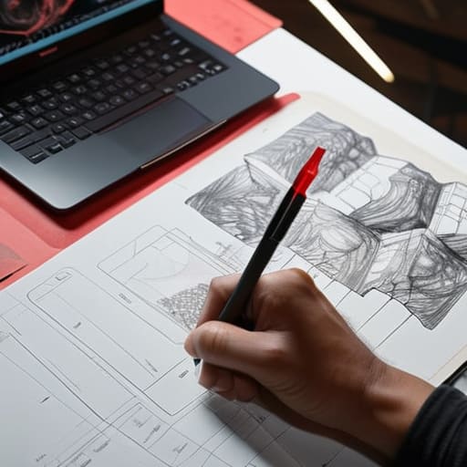
We often fall into the trap of thinking a portfolio is just a gallery of finished assets, a digital filing cabinet of “what I did.” But if you want to build a truly professional digital presence, you have to move beyond the static grid. Visual storytelling in web design isn’t about adding flashy animations or heavy parallax effects that slow everything down; it’s about the narrative arc of your process. I want to see the messy sketches in the margins and the failed iterations that led to the final solution. When you show the “why” behind the “what,” you aren’t just showcasing creative work—you are demonstrating your thinking.
The goal is to create a cohesive flow where the layout itself acts as a silent guide. Instead of treating every project as an isolated island, use typography, white space, and intentional pacing to direct the eye. When you prioritize the user experience for portfolios, you respect the viewer’s time. You aren’t just filling space; you are curating an experience that allows your craft to breathe and your methodology to speak for itself.
The Architecture of Intent: Five Principles for a Meaningful Portfolio
- Curate with restraint. It is tempting to show every project you’ve ever touched, but a portfolio is a curated exhibition, not an archive. If a piece doesn’t represent the work you want to do tomorrow, leave it in the drawer.
- Respect the white space. In my early days of paste-ups, we understood that the space between elements was just as vital as the elements themselves. On a screen, white space isn’t “empty”—it’s the breath that allows your work to be seen without suffocating it.
- Show the friction, not just the finish. A polished mockup is easy to produce, but clients hire you for your thinking. Include sketches, failed iterations, or the messy logic behind a typeface. Let them see the human hand in the process.
- Prioritize legible hierarchy over trendy typography. I see too many designers choosing “vibe” over function. If a visitor has to struggle to navigate your site or read your case studies, you haven’t designed a portfolio; you’ve designed an obstacle course.
- Build for longevity, not for the algorithm. Trends in web animation and UI kits move with a frantic, exhausting speed. Build your site on a foundation of solid principles and clean structure so it feels as intentional three years from now as it does today.
The Intentionality of the Digital Portfolio
Treat your website as a living extension of your studio, not just a digital filing cabinet for finished files.
Prioritize clarity and white space over complex animations; give your best work the room it needs to breathe and command attention.
Select tools that act as an extension of your hand rather than a barrier to your process, ensuring the technology serves your vision instead of dictating it.
The Architecture of Intent
A portfolio shouldn’t be a cluttered digital warehouse of everything you’ve ever touched; it should be a curated space that respects the rhythm of your process and gives your most meaningful work the room to actually breathe.
Ingrid Bellamy
The Final Composition
Building a portfolio isn’t about checking off a technical requirement or satisfying an algorithm; it is about creating a digital home for your ideas. We’ve talked about selecting platforms that don’t stifle your agency’s unique voice and the importance of ensuring your visual storytelling serves a functional purpose rather than just adding digital noise. When you strip away the trends and the flashy, unnecessary animations, what remains is the core of your practice. Remember that every choice—from the typeface you select to the white space you leave untouched—is a deliberate act of curation that tells the world how much you respect your own craftsmanship.
As you move from the planning stage to the actual execution, try to hold onto that sense of intentionality. It is easy to get lost in the endless sea of templates and automated tools, but your value lies in the nuances that a machine cannot replicate. Let your website be a reflection of the friction, the thought, and the human touch that goes into everything you create. Don’t just build a site that looks professional; build one that honors the way you think. In a world increasingly dominated by the seamless and the synthetic, let your digital presence be a grounded testament to the beauty of human design.
Frequently Asked Questions
How do I balance showing my final, polished results with the messy, intentional process that actually defines my craft?
Don’t treat your process like a secret to be guarded; treat it like the backbone of your value. I always include a “behind the scenes” layer—maybe a scanned sketch from my notebook or a messy grid system—next to the final render. The polish proves you can finish, but the friction of the process proves you actually thought through the problem. Show the struggle. That’s where the real craft lives.
Is it better to build a custom site from scratch to maintain total control, or will a template-based platform hinder my ability to express my brand's identity?
It’s the classic tension between autonomy and efficiency. If you build from scratch, you own every pixel, but you also own every bug and maintenance headache. Templates aren’t inherently “soul-less,” but they can become cages if you don’t know how to break their rhythm. My advice? Choose a flexible framework that allows for deep typographic and spatial customization. Don’t sacrifice your agency for the sake of a shortcut; find the tool that lets you bend the rules.
How much "friction" is too much—at what point does a highly stylized, experimental interface start to get in the way of a potential client actually seeing my work?
Friction becomes a barrier the moment your interface demands more cognitive effort than the work itself. If a client has to “learn” how to navigate your site just to find your case studies, you’ve failed. Experimentation should be the seasoning, not the main course. Use those stylized elements to set a mood, but ensure the path to your portfolio remains intuitive. If the design obscures the craft, it’s no longer art—it’s just noise.
