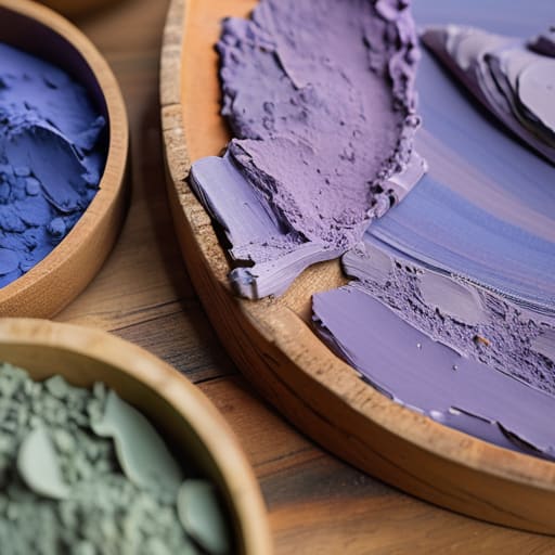
I remember sitting in a cramped studio at RISD, the air thick with the scent of turpentine and linseed oil, staring at a palette that felt completely wrong. I had followed every textbook rule to the letter, yet the canvas looked sterile, like it had been rendered by a machine rather than a human hand. We often treat color theory in art as this rigid, mathematical formula—a series of sterile equations meant to be solved—but that’s where we lose the soul of the work. When you rely solely on a digital color wheel to dictate your decisions, you aren’t designing; you’re just calculating.
I’m not here to give you a lecture on hex codes or a list of “trending” palettes that will be obsolete by next season. Instead, I want to talk about the intentionality behind the pigment. I’m going to share how you can use color to guide the eye and evoke genuine emotion without stripping away the grit and character of your creative process. We’re going to move past the superficial rules and focus on how to build a visual language that respects the human touch.
Table of Contents
Mastering Color Wheel Fundamentals to Empower the Artist
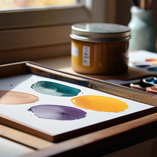
When I first sat in a studio at RISD, I learned that the color wheel isn’t just a tool for decoration; it’s a map of relationships. To truly master color wheel fundamentals, you have to stop viewing colors as isolated entities and start seeing them as a conversation. Whether you are working with analogous color palettes to create a sense of calm or using high-contrast pairings to command attention, every choice should be a deliberate act of intention.
I often tell my clients that the most common mistake in modern digital design is a lack of depth. It’s easy to pick a vibrant hue, but it’s much harder to manage the subtle shifts in value and saturation in painting or digital layering. If you rely solely on pure hue, your work will feel flat—like it’s just filling space rather than breathing. Instead, try to lean into the tension between warm and cool color temperature. By introducing those slight temperature shifts, you add a layer of tactile reality that makes a digital composition feel as grounded and substantial as a physical ink wash on heavy paper.
The Emotional Weight of Psychology of Color in Design
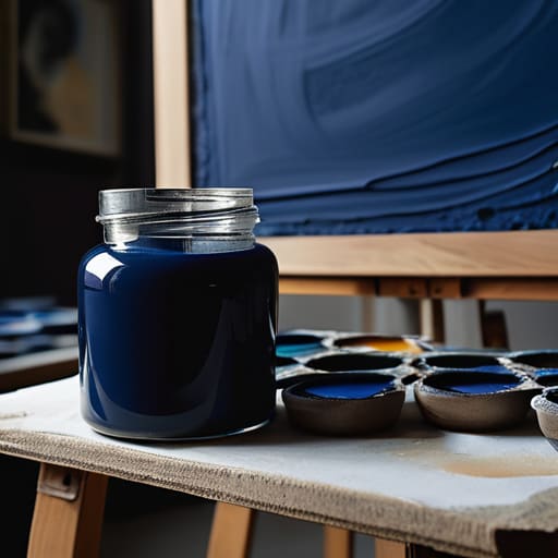
When we talk about the psychology of color in design, we aren’t just discussing how a hue looks on a backlit screen; we are discussing how it settles in the gut. I’ve spent years watching designers lean on the same tired palettes because they feel “safe,” but safety can often lead to sterility. A deep, desaturated navy doesn’t just signify professionalism—it carries a certain gravitas and quietude that a bright, electric blue simply cannot replicate.
The real craft lies in how you manipulate warm and cool color temperature to dictate the rhythm of a viewer’s experience. If you’re building a brand identity that needs to feel grounded, you might lean into earthier tones, but if you introduce a sudden, sharp pop of warmth, you create a moment of tension. That tension is where the human connection happens. It’s about moving beyond the mechanics of the color wheel and understanding that every shade we choose acts as a silent conductor, guiding the viewer’s emotional response before they’ve even processed the actual imagery.
Five Ways to Bring Intentionality to Your Palette
- Stop chasing trends and start studying the physics of light; understanding how pigments actually interact in the real world will save you from making muddy, digital-only mistakes.
- Embrace the power of limited palettes to create cohesion, because an overabundance of choice often leads to visual noise that drowns out your core message.
- Use color to dictate a hierarchy of attention, guiding the viewer’s eye through your composition with the same precision you’d use to place a single line of type.
- Respect the tension between warm and cool tones; don’t just use them for decoration, but use that temperature shift to create depth and a sense of physical space.
- Test your color relationships in grayscale to ensure your work relies on structural value rather than just the “crutch” of high-saturation hues.
The Intentionality of the Palette
Stop treating color as a decorative afterthought; instead, use it as a structural tool to guide the viewer’s eye and reinforce the core message of your composition.
Respect the psychological weight of your choices by ensuring the emotional resonance of your palette aligns with the human experience you are trying to evoke.
Embrace the friction of manual experimentation—whether through physical mixing or careful digital layering—to avoid the sterile, “perfect” look of automated color presets.
## Beyond the Palette
Color isn’t just a selection of hex codes or a way to make a layout look finished; it is a language of intention. When we use color theory, we aren’t just decorating a surface—we are guiding the human eye and honoring the emotional weight of the space we create.
Ingrid Bellamy
Beyond the Palette: Making Color Meaningful
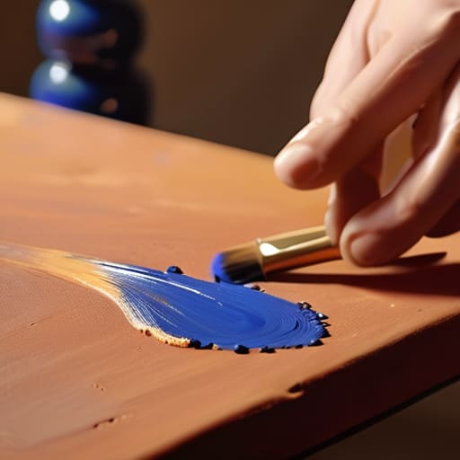
At its core, mastering color theory isn’t about memorizing the technicalities of a color wheel or checking off boxes on a psychological checklist. It is about understanding how those hues interact to create a cohesive narrative. We’ve explored how the fundamentals of harmony provide structure, and how the emotional weight of color can shift a viewer’s entire perception of a piece. When you move past the surface level, you realize that color is a tool for intentionality. It allows you to guide the eye, establish hierarchy, and—most importantly—communicate a feeling that words often fail to capture. Don’t let your palette become a series of random choices; let it be a deliberate extension of your voice.
As you move forward with your next project, I encourage you to resist the urge to rely solely on digital presets or automated color generators. There is a certain magic, a bit of necessary friction, that comes from experimenting with how light and pigment actually behave. Whether you are working on a digital interface or a physical canvas, remember that color should never exist just to fill space. It should exist to honor the human experience. Use it to breathe life into your work, to create depth, and to build connections. Design with purpose, and let your colors tell a story that is uniquely and authentically yours.
Frequently Asked Questions
How can I maintain a sense of intentionality in my color choices when digital tools make it so easy to rely on automated palettes?
The danger of the “generate” button is that it removes the struggle, and without struggle, there is no soul. To fight this, I always step away from the screen first. I grab my sketchbook and mix physical pigments or hunt for references in old film photography. By establishing your palette through tactile observation rather than an algorithm, you ensure your colors are born from a specific intent, not just a mathematical convenience.
Is there a way to balance high-contrast color schemes without sacrificing the subtle, tactile warmth that makes a piece feel human?
It’s a delicate tension, isn’t it? When we push contrast too far, the work can feel clinical—like it was rendered by a machine rather than felt by a hand. To keep that warmth, I often look to “imperfect” neutrals. Instead of using a harsh, digital black, try a deep, desaturated charcoal or a burnt umber. Softening those extreme edges with slightly off-white or cream tones preserves the visual impact while honoring the tactile soul of the piece.
How do I transition from using color purely for aesthetic impact to using it as a functional tool for guiding the viewer's eye?
Stop treating color like a finishing coat of varnish. To make it functional, you have to start thinking about visual hierarchy. Use high-contrast pairings to create “anchor points”—places where you want the eye to land first. If everything is vibrant, nothing is important. I like to lean on desaturated neutrals to create a quiet background, allowing a single, intentional pop of color to act as a directional cue. Guide the eye; don’t just overwhelm it.
