I remember sitting in a dimly lit studio back in the late nineties, the smell of adhesive and fresh ink thick in the air, manually adjusting the kerning on a physical paste-up. There was a tactile weight to every decision; you couldn’t just hit ‘undo’ if you lacked intention. Today, I see designers rushing through digital workflows, leaning on bloated component libraries and trendy aesthetics that feel hollow. We’ve become so obsessed with how things look that we’ve forgotten the fundamental ui design principles that actually make a tool feel human. Too often, “modern” design is just a mask for a lack of substance, prioritizing flashy micro-interactions over the actual friction of human touch.
I’m not here to give you a checklist of buzzwords or a lecture on the latest software updates. Instead, I want to strip away the noise and talk about how we build interfaces that respect the user’s intelligence. I’m going to share the hard-won, experience-based lessons I’ve gathered from two decades of navigating the shift from analog to digital. We are going to focus on creating work that is purposeful, functional, and—above all—deeply intentional.
Table of Contents
Mastering User Experience Design Fundamentals Through Purposeful Friction

We’ve become obsessed with “seamlessness,” as if the goal of every digital product is to remove every ounce of thought from the user’s journey. But in our rush to eliminate all resistance, we often sacrifice meaning. When we focus solely on frictionless paths, we risk increasing the cognitive load in interface design by forcing users to process information too quickly, without the necessary pauses to actually comprehend it. True mastery of user experience design fundamentals isn’t about making things invisible; it’s about knowing when to introduce a moment of pause.
Sometimes, a user needs to feel the weight of a decision. Think of a destructive action like deleting a project or a permanent change to a brand’s visual identity. If that action is too easy, too fluid, we lose the sense of consequence. By introducing a deliberate, thoughtful interaction—a slight hesitation in the motion or a clear, unmistakable confirmation—we respect the user’s agency. We aren’t just building interfaces; we are building digital environments that demand a certain level of presence and intentionality.
Reducing Cognitive Load in Interface Design to Empower Creators
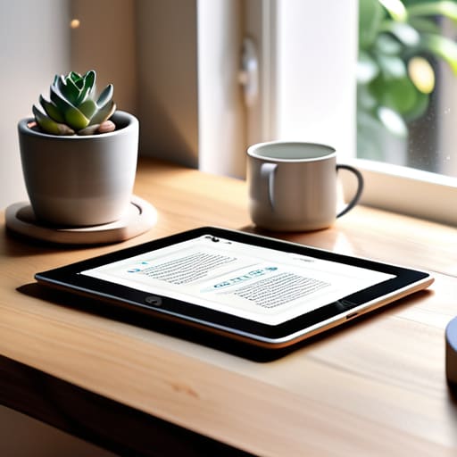
When we talk about reducing cognitive load in interface design, we aren’t just talking about “cleaning up” a layout. We are talking about protecting the user’s mental energy. I’ve seen too many interfaces that try to do everything at once, bombarding the eye with competing hierarchies and unnecessary motion. Every extra button or flashing notification is a tax on the brain. To build tools that truly empower, we have to prioritize clarity over cleverness. If a creator has to stop and think about how to navigate your tool, you’ve already lost them.
This is where the marriage of typography and readability in UI becomes essential. It isn’t just about picking a beautiful typeface; it’s about ensuring the eye can glide across the screen without hitting invisible speed bumps. When we respect the way people process information, we create space for them to do their actual work. By streamlining our interaction design patterns and stripping away the digital noise, we allow the user to enter a state of flow. Design should be a silent partner, providing exactly what is needed at the precise moment it is required, and nothing more.
Five Ways to Bring Intentionality Back to Your Interface
- Prioritize visual hierarchy through scale and weight, not just color. A well-designed interface should guide the eye naturally, using the tension between typography and negative space to tell the user what matters most without needing a neon “click here” button.
- Respect the physics of the human hand. When designing touch targets or interactive elements, remember that digital surfaces lack the tactile feedback of a physical medium; ensure your hit areas are generous enough to accommodate the slight imperfections of human movement.
- Use whitespace as a structural element, not just empty space. In my studio, I see many designers fear the void, but true clarity comes from giving your elements room to breathe, allowing the user’s focus to settle rather than forcing them to fight through clutter.
- Design for legibility over trendiness. It is tempting to chase the latest micro-interaction or ultra-thin typeface, but if your user has to squint to navigate your system, you have failed the most basic requirement of functional design.
- Implement subtle, meaningful motion. Animation shouldn’t be decorative flair; it should serve as a functional bridge that explains how an element arrived on the screen or where it went, providing a sense of continuity that mimics the physical world.
The Intentionality Checklist
Stop optimizing for speed alone; true usability means designing moments of “purposeful friction” that force a user to pause, think, and engage with the craft.
Treat whitespace not as empty real estate to be filled, but as a functional tool to protect the user’s mental bandwidth and focus.
Prioritize accessibility as a design requirement rather than an afterthought, ensuring your interface respects the diverse ways humans actually interact with the digital world.
The Fallacy of Seamlessness
We’ve become obsessed with making interfaces so frictionless that they become invisible, but in doing so, we risk stripping away the very intentionality that makes a tool feel human. True UI design isn’t about removing every obstacle; it’s about placing the right ones in the right places to ensure the creator is actually present in the process.
Ingrid Bellamy
Beyond the Pixel

At its core, effective UI design isn’t about how many features you can cram into a single viewport, but about how much clarity you can provide through restraint. We’ve discussed the necessity of purposeful friction and the vital importance of reducing cognitive load, but these aren’t just checkboxes for a design sprint. They are commitments to the person on the other side of the glass. When we prioritize intentionality over automation, we move away from the hollow convenience of “seamless” interfaces that actually strip away user agency. Instead, we build systems that respect the user’s mental energy and honor the deliberate rhythm of human interaction.
As you move forward with your next project, I encourage you to step away from the screen for a moment. Pick up your sketchbook, find a fountain pen, and ask yourself if the layout you’re building actually serves a human purpose or if it’s just filling space. The digital landscape is becoming increasingly crowded with noise, but there is still immense room for work that feels grounded and tactile. Don’t be afraid to let your designs breathe or to introduce a moment of thoughtful pause. Our goal shouldn’t be to create interfaces that demand attention, but to design tools that empower the creator to do their best work.
Frequently Asked Questions
How do we find the right balance between seamless automation and the "purposeful friction" needed to maintain a sense of craftsmanship?
We find that balance by identifying where automation serves the user and where it erodes their agency. Automation should handle the tedious, invisible lifting—like aligning grids or managing file formats—so we can focus on the soul of the work. But when a tool automates a creative decision, like color theory or kerning, it strips away the intention. We must design “speed bumps” that force a moment of human reflection before a permanent action is taken.
In an era of rapid prototyping, how can we ensure that our pursuit of efficiency doesn't strip away the intentionality of the user's journey?
We’ve become so obsessed with removing every ounce of friction that we’ve accidentally removed the soul of the experience. Speed isn’t always a virtue. If a user glides through an interface without ever feeling the weight of their decisions, they aren’t engaging; they’re just reacting. To preserve intentionality, we must design “meaningful pauses”—moments where the interface asks for a breath, a confirmation, or a deliberate choice. Efficiency should serve the user, not just the metric.
When designing for high-density information, how do we reduce cognitive load without making the interface feel sterile or devoid of character?
The trick is to stop treating white space as an absence of content and start treating it as a structural element. When you’re dealing with dense data, don’t just strip everything away until it looks like a clinical spreadsheet. Instead, use subtle typographic hierarchies and intentional grouping to create rhythm. A well-placed serif or a slight variation in weight can provide the soul the interface needs, guiding the eye without cluttering the mind.