I remember the smell of spray mount and the tactile resistance of X-Acto blades back when we were still doing physical paste-ups at RISD. Back then, you couldn’t just “undo” a mistake or toggle a layer visibility; you had to think through the spatial logic of your layout before the blade ever touched the paper. Today, I see so many designers treating grid systems in design as a mathematical chore or a rigid cage that stifles their “vision.” They lean on heavy, automated software presets that do the thinking for them, resulting in interfaces that feel technically perfect but entirely soulless.
I’m not here to teach you how to follow a textbook or recite the geometry of a column. Instead, I want to share how you can use these structures to create a sense of rhythm and intentionality that actually respects the person on the other side of the screen. We are going to move past the rigid rules and look at how a well-placed framework can act as a quiet, supporting hand. My goal is to help you master the intentionality of the layout, ensuring your work feels built by a human, for humans.
Table of Contents
Mastering Spatial Organization Principles for Purposeful Layouts
When we talk about spatial organization principles, we aren’t just talking about where things sit on a screen; we are talking about how a user feels while moving through a space. If a layout is too crowded, the eye panics. If it’s too sparse, the connection is lost. I’ve always found that the most successful compositions rely on a rhythmic tension between elements. This is where visual hierarchy in layout becomes your most vital tool. It’s not about making the most important thing the biggest, necessarily, but about guiding the eye through a sequence of intentional pauses and movements.
To achieve this, I often return to the fundamentals of structure that many modern designers overlook in their rush to be “fluid.” For instance, setting strict baseline grids for typography ensures that your text doesn’t just sit on the page, but breathes in unison with the surrounding imagery. It’s that subtle alignment—the kind you almost don’t notice until it’s gone—that creates a sense of professional calm. We have to stop treating white space as “empty” and start treating it as a structural component that gives our work room to exist.
Using the Golden Ratio in Layout Design to Respect Rhythm
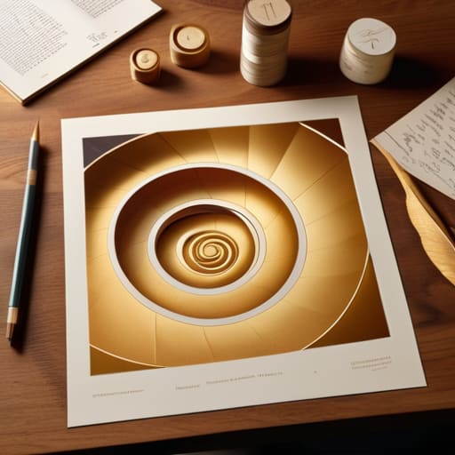
I’ve always felt that the Golden Ratio is less of a mathematical rule and more of a natural pulse. When I was working with physical paste-ups, you could feel the weight of a composition; it had a certain gravity. Today, in the rush toward pixel-perfect precision, we often lose that sense of organic flow. By applying the golden ratio in layout design, we aren’t just following an old formula; we are tapping into a mathematical rhythm that the human eye finds inherently comforting. It allows us to move beyond arbitrary spacing and instead create a sense of intentional equilibrium that guides the viewer through a story.
This isn’t about forcing every element into a strict spiral, but rather using those proportions to inform your visual hierarchy in layout. It helps you decide which elements deserve the most breath and which should sit in the periphery. When you balance your primary focal points against the mathematical progression of the ratio, the layout stops feeling like a collection of boxes and starts feeling like a cohesive, breathing organism. It’s about finding that sweet spot where the math disappears and only the feeling of harmony remains.
Five Ways to Keep Your Grids From Feeling Like a Cage
- Don’t be afraid to break the line. A grid is meant to be a foundation, not a prison; occasionally letting an element bleed across a column or float slightly off-axis creates the kind of visual tension that makes a layout feel alive rather than mechanical.
- Prioritize the gutter over the column. In my experience, the space between your elements—the breathing room—is far more important than the elements themselves. If your gutters are too tight, the design feels claustrophobic; if they’re intentional, the layout feels composed.
- Use a baseline grid to respect the rhythm of reading. Just as I carefully align the mechanics in a vintage Leica, you should align your typography to a consistent baseline. It’s a subtle, almost invisible way to ensure the eye moves smoothly across the page without unnecessary friction.
- Build for hierarchy, not just alignment. It’s easy to get lost in the math of a twelve-column grid, but always ask yourself if the structure is actually guiding the viewer toward the most important information. If the grid is so dominant that it competes with the message, you’ve lost the purpose.
- Embrace modularity for digital flexibility. Since we aren’t working with static paste-ups anymore, design your grid systems as a series of repeatable, scalable modules. This allows your layouts to breathe and adapt across different screen sizes without losing that sense of intentional craftsmanship.
The Intentionality of the Grid
A grid is not a set of restrictive rules, but a foundation for intentionality; use it to guide the eye rather than just to align pixels.
True rhythm in a layout comes from understanding the tension between structure and white space, allowing the design to breathe instead of feeling crowded.
Digital tools should enhance your spatial reasoning, not replace it—always step back from the screen to ensure your proportions feel human and purposeful.
The Illusion of Rigidity
A grid is not a set of bars meant to imprison your ideas; it is the quiet, structural breathing room that allows a composition to feel intentional rather than accidental.
Ingrid Bellamy
Beyond the Lines
At the end of the day, mastering grid systems isn’t about learning how to follow a set of rigid, mathematical rules to prevent your elements from drifting. It is about understanding the subtle interplay between spatial organization, the rhythmic pulse of the golden ratio, and the intentionality of your white space. When we use these frameworks correctly, we aren’t just organizing pixels; we are building a predictable visual language that allows the user to navigate without cognitive friction. A well-executed grid acts as the quiet scaffolding that holds your creative vision together, ensuring that the hierarchy remains clear and the purpose of the design is never lost in the noise.
As you move forward into your next project, I encourage you to view the grid not as a cage, but as a collaborator. Don’t let the software dictate your movements; instead, use these structures to reclaim the intentionality of craftsmanship that so often gets stripped away in the rush toward automation. Whether you are working on a complex digital interface or a simple typographic layout, remember that the most impactful designs are those that respect the human eye. Build your structures with care, leave room for the unexpected, and always design with the human touch in mind.
Frequently Asked Questions
How do I know when a layout has become too rigid and needs to break the grid to feel human again?
You’ll feel it in your gut before you see it on the screen. If the layout starts to feel like a spreadsheet—sterile, predictable, and devoid of any tension—you’ve over-engineered it. When the eye slides across the page without ever pausing to “land,” the grid has become a cage. Break it when the rhythm feels mechanical. A slight overlap or a deliberate misalignment reintroduces that necessary friction, reminding the viewer there’s a human hand behind the work.
In a world of fluid, responsive web design, how can we maintain a sense of intentional structure without the grid feeling broken?
We have to stop thinking of the grid as a static cage and start seeing it as a set of relationships. In responsive design, the grid shouldn’t break; it should breathe. I rely on modularity—defining consistent rhythms and proportions rather than fixed pixel widths. When you design for the relationship between elements rather than their exact coordinates, the structure remains intentional, even when the screen shifts. It’s about maintaining the underlying logic, not the rigid lines.
How do you balance the mathematical precision of a grid with the organic, "imperfect" feel of hand-drawn elements or custom typography?
I think of the grid as the skeleton, not the skin. The math provides the stability, but the soul comes from where you choose to break the rules. I often lay down a rigid underlying structure to anchor the composition, then allow my custom type or hand-drawn flourishes to drift slightly off-axis. It’s about intentional tension—using that mathematical precision to highlight the beautiful, human imperfection of the organic elements.
