Learning typography basics for better design.

Understanding the Fundamentals of Typography

I still remember the smell of acetate and rubber cement in the RISD studios, back when “undo” wasn’t a keystroke but a physical struggle with a razor blade. We didn’t have infinite font libraries at our fingertips; we had to earn every millimeter of kerning through sheer, manual persistence. Today, I see so many designers treating typography basics like a checklist of software settings rather than a study of human rhythm. There is this pervasive myth that if you just pick a trendy variable font and crank up the weight, you’ve “done” design. It’s nonsense. You aren’t just decorating a digital surface; you are building a vessel for thought.

I’m not here to teach you how to navigate a menu or which expensive typeface subscription will make you look “pro.” Instead, I want to strip away the digital noise and get back to the intentionality of the craft. I’m going to share the fundamental principles of scale, hierarchy, and white space—the kind of knowledge that actually holds up when the trends shift. We are going to focus on how to use type to guide the eye and respect the reader, ensuring your work feels less like a collection of pixels and more like a deliberate conversation.

Table of Contents

The Soul of Type Deciding Serif vs Sans Serif
The Soul of Type Deciding Serif vs Sans Serif

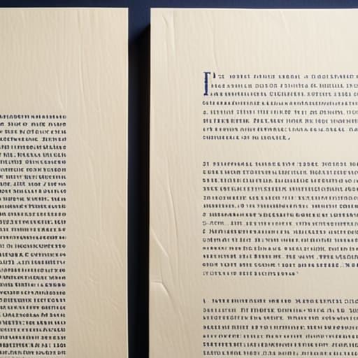
I often find myself staring at a blank canvas, weighing the emotional gravity of a typeface before I even think about layout. Choosing between serif vs sans serif isn’t just a technical decision about stroke endings; it’s about deciding what kind of conversation you want to have with your reader. Serifs carry a certain historical weight—they feel anchored, like the ink on a well-pressed page. They lend themselves to long-form storytelling where the reader needs a steady, rhythmic guide. On the other hand, sans serifs offer a clean, stripped-back clarity that feels immediate and modern, stripping away the “noise” to focus on pure information.

However, the real craft lies in understanding the tension between legibility vs readability. A typeface might look stunning in a large-scale headline, but if it loses its character when scaled down for a mobile screen, it has failed its primary purpose. You have to consider how the letterforms interact with the white space around them. It’s not about picking a font because it’s trendy; it’s about selecting a tool that respects the human eye and the context of the medium.

Intentional Rhythm Leading and Tracking Explained for Humans

Intentional Rhythm Leading and Tracking Explained for Humans

If you look closely at a well-designed page, you’ll notice it breathes. That breath comes from the space between the letters and the space between the lines. When we talk about leading and tracking explained, we aren’t just discussing mathematical adjustments in a software menu; we are managing the white space that allows a reader’s eye to rest. If your tracking is too tight, the words feel claustrophobic, like a crowded subway car at rush hour. If your leading is too shallow, the lines bleed into one another, destroying the visual hierarchy in design and forcing the brain to work harder than it should.

I often see junior designers overcompensate by cranking up the font size when they feel a layout is “unreadable.” But true mastery lies in the subtle tension of the spacing. Tightening the tracking slightly on a bold headline can give it a sense of structural integrity, while opening up the leading in a long-form body paragraph creates a sense of calm. We have to move beyond mere legibility vs readability and start thinking about rhythm. You aren’t just placing characters on a grid; you are composing a cadence that respects the human pace of consumption.

Five Ways to Stop Treating Type Like Decoration

  • Establish a hierarchy that actually works. Don’t just make a headline bigger because it looks “bold”; use scale and weight to tell the reader’s eye exactly where to land first, second, and third.
  • Respect the white space. If you crowd your letters, you’re forcing the reader to work too hard. Give your glyphs room to breathe so the meaning can actually sink in.
  • Limit your palette. I see too many designers trying to use five different typefaces in one layout. Stick to two—maybe three if you’re feeling brave—and let the contrast come from weight and size rather than a collection of mismatched fonts.
  • Test for legibility, not just aesthetics. A font might look beautiful in a static mockup, but if it becomes a blur when scaled down on a mobile screen, it has failed its primary job.
  • Watch your line length. If a line of text stretches too wide across a monitor, the eye loses its place when jumping back to the start of the next one. Keep your measure tight enough to maintain a natural reading rhythm.

The Designer’s Checklist: Intent Over Automation

Stop treating type as decoration; every weight and style should serve a specific functional purpose in your visual hierarchy.

Prioritize legibility over trends by respecting the natural rhythms of human reading, rather than forcing a “look” that creates friction.

Use whitespace and letter spacing as active tools to give your characters room to breathe, ensuring the interface feels intentional, not cluttered.

The Weight of Intent

Typography isn’t about picking a pretty font from a dropdown menu; it’s about deciding how much respect you want to show the reader. Every choice—the weight of a stroke, the breath between letters—is a silent conversation between the designer and the human eye.

Ingrid Bellamy

Beyond the Grid
Typography design mastery Beyond the Grid.

At its core, mastering typography isn’t about memorizing a list of rules or picking the trendiest typeface from a digital library. It’s about understanding how your choices—from the structural weight of a serif to the breathing room provided by your leading—impact the person on the other side of the glass. When we balance these elements with intention, we stop merely “arranging text” and start curating an experience. Whether you are navigating the subtle tension between kerning and tracking or deciding if a typeface possesses the right emotional gravity, remember that every adjustment is a choice to either respect or ignore the reader’s cognitive load.

As you move forward into your next project, I encourage you to step away from the screen for a moment. Pick up a pen, grab a sketchbook, and feel the physical rhythm of the characters you are trying to build. We live in an era of rapid-fire automation, but the most impactful design still requires a human touch that no algorithm can truly replicate. Don’t let the tools dictate your vision; instead, use them to amplify your intent. Design with purpose, respect the friction of the human eye, and always strive to create something that feels deliberate.

Frequently Asked Questions

How do I know when a typeface is becoming a distraction rather than a tool for communication?

It’s a fine line. You know you’ve crossed it when you stop reading the words and start looking at the letters. If your eye is snagging on a decorative terminal or a strange x-height instead of flowing through the sentence, the typeface has become the protagonist. A typeface should be the invisible infrastructure of your message. If the “style” is shouting louder than the content, it isn’t design anymore—it’s just noise.

Is there a practical way to balance brand personality with the strict necessity of legibility on small mobile screens?

It’s a constant tug-of-war. I always tell my clients: don’t sacrifice clarity for character. If your brand relies on a high-personality display face, use it sparingly—think headers or short accents. For the heavy lifting, the body copy, lean into a highly legible, neutral typeface. On a mobile screen, the user’s cognitive load is already high; don’t make them fight your font choice just to understand your message. Design for the eyes first.

When working with limited budgets, how can I choose a font pairing that feels intentional rather than accidental?

When the budget is tight, stop hunting for “perfect” pairs and start looking for contrast in purpose. Don’t try to find two fonts that dance together; find two that perform different roles. Pair a high-character display face for your headers with a quiet, workhorse sans-serif for the body. If the relationship feels accidental, it’s usually because they’re competing for the same attention. Let one lead, and let the other serve.
Essential typography principles displayed in text.

Fundamental Principles of Typography

I remember the smell of rubber cement and the tactile resistance of heavy cardstock back in my RISD days, long before every designer thought a “vibe” could be achieved with a single click of a font picker. There was a physical weight to every decision we made; you couldn’t just undo a mistake without feeling the consequence. Today, I see so many digital interfaces where typography principles are treated as an afterthought—or worse, as a way to simply fill space with trendy, illegible grotesques that prioritize aesthetic ego over actual human utility. We’ve traded the intentionality of the craft for a hollow, automated convenience that ignores how the eye actually moves across a screen.

I’m not here to give you a checklist of academic rules that look good in a textbook but fail in the wild. Instead, I want to talk about the intentionality of scale, the rhythm of whitespace, and how to use type to respect the reader’s cognitive load. I’m going to share the hard-won lessons I’ve gathered from two decades of moving from ink to pixels, focusing on how you can build digital experiences that feel grounded and purposeful. Let’s stop decorating screens and start designing with real intent.

Table of Contents

The Nuance of Readability and Legibility

The Nuance of Readability and Legibility.

We often use these terms interchangeably, but in my experience, conflating them is a quick way to ruin a layout. Legibility is about the individual character—the way a lowercase ‘a’ or a capital ‘G’ stands apart from its neighbors. It’s a technical requirement, a matter of clear anatomy. Readability, however, is much more soulful; it’s about the rhythm of the reading experience. You can have a perfectly legible typeface that becomes a chore to read because the leading and line spacing are suffocating the text.

When I’m auditing a brand’s digital presence, I look for that friction where the eye starts to tire. If your typographic scale is too erratic, the reader loses their place. If it’s too uniform, they lose interest. It’s about creating a predictable, comfortable path for the eye to follow. I’ve always believed that good design should feel invisible; the reader should be so immersed in the content that they never once pause to wonder why a certain weight feels heavy or why a line feels cramped.

Finding Compositional Balance in Type

Finding Compositional Balance in Type layout.

When I sit down with my sketchbook to map out a layout, I’m not just looking for where the words fit; I’m looking for where they breathe. Compositional balance in type isn’t about perfect symmetry—that often feels clinical and lifeless. Instead, it’s about managing the tension between different elements. If you have a heavy, commanding headline, you need to counterbalance that visual weight with enough white space or a lighter body copy to prevent the design from feeling top-heavy. It’s a delicate dance of visual gravity.

One of the most effective ways I guide my clients through this is by establishing a disciplined typographic scale. Without a clear hierarchy, the eye wanders aimlessly, unsure of where to land. I often find that people focus too much on the typeface itself and forget about the structural rhythm. By paying close attention to leading and line spacing, you create a sense of order that feels intentional rather than accidental. You aren’t just placing characters on a grid; you are choreographing the way a human being moves through a space.

Five Ways to Bring Intent Back to Your Type

  • Stop treating line height as a mathematical afterthought. If your leading is too tight, you’re suffocating the words; if it’s too loose, the reader loses the thread. Give your sentences room to breathe, much like the margins on a well-laid out page.
  • Respect the hierarchy of information. Not every piece of text deserves to be loud. Use weight and scale to guide the eye through a natural progression, rather than making everything compete for attention in a cluttered visual shout.
  • Choose your typefaces based on their character, not just their popularity. A typeface carries a certain weight and history; ensure the personality of the font aligns with the soul of the brand instead of just picking what looks “clean” on a grid.
  • Mind the micro-typography. The small details—the kerning between specific letter pairs, the way a comma sits, the subtle rhythm of the baseline—are where the craftsmanship lives. It’s the difference between a digital template and a piece of design.
  • Design for the context of the human eye, not the perfection of the screen. Remember that people read on moving trains, in dim light, and while distracted. Build your typographic systems to be resilient enough to handle the friction of real life.

The Intentionality of Type

Stop treating typeface selection as a decorative afterthought; every font choice should be a deliberate decision that honors the content’s voice and the reader’s cognitive load.

Respect the space between characters and lines—white space isn’t “empty” room, it’s the breath that allows your typography to actually function.

Prioritize the human experience over technical perfection; a layout that follows every rule but feels sterile or robotic has failed its primary purpose of connection.

The Soul in the Spacing

“Typography isn’t a collection of rules to be obeyed; it’s the architecture of thought. When we obsess over kerning and rhythm, we aren’t just making things look ‘clean’—we are honoring the reader’s time and ensuring the message doesn’t get lost in the noise of a poorly constructed interface.”

Ingrid Bellamy

Beyond the Grid

Mastering typography Beyond the Grid.

At the end of the day, mastering typography isn’t about memorizing a checklist of rules or perfectly aligning every glyph to a pixel-perfect grid. It’s about understanding the delicate tension between legibility and emotion. We’ve discussed how to navigate the nuances of readability, how to find balance in a crowded layout, and how to ensure your hierarchy actually serves the reader. When you stop treating type as a mere vessel for information and start treating it as a structural element of communication, the work changes. You move away from simply filling space and toward creating an intentional experience where every weight, leading, and kerning choice feels deliberate and earned.

As we move further into an era of automated, generative design, I urge you to hold onto the intentionality of the human hand. Software can suggest a pairing, but it cannot feel the rhythm of a sentence or the quiet gravity of a well-placed serif. Don’t let the ease of digital tools strip the soul out of your craft. Instead, use them to amplify your voice. Treat your typography as a way to respect the friction of human attention, building something that doesn’t just catch the eye, but truly resonates with the person on the other side of the screen.

Frequently Asked Questions

How do I maintain typographic integrity when designing for responsive interfaces that constantly shift scale?

Stop thinking in pixels and start thinking in relationships. When a layout shifts, the scale changes, but the hierarchy shouldn’t break. I rely on fluid type scales—mathematical ratios that grow and shrink proportionally rather than jumping between arbitrary font sizes. It’s about preserving the tension between your headings and body copy. If the visual rhythm collapses because a screen got smaller, you haven’t designed a system; you’ve just designed a static image.

Where is the line between intentional white space and just leaving a layout feeling unfinished?

It comes down to tension. Intentional white space feels like it’s holding the elements in place, creating a deliberate relationship between the type and the margin. It’s a choice that directs the eye. An unfinished layout, however, feels accidental—like you simply ran out of ideas or stopped halfway through a thought. If the void feels like it’s serving the content, it’s breathing room. If it feels like a vacuum, you’ve missed the mark.

How can I balance the desire for expressive, high-character typefaces with the practical need for long-form legibility?

Think of it as a hierarchy of roles. Use your expressive, high-character typefaces for the “handshake”—the headlines and pull quotes that set the mood and grab attention. But once the reader settles in, step back. Switch to a workhorse typeface for the body text—something with generous x-heights and open counters. You want the personality to frame the conversation, not drown out the actual words. Let the flair be the accent, not the noise.

Typography in web design selection process.

Choosing Typography for Web Projects

I remember sitting in a cramped studio in Providence, the air thick with the scent of spray adhesive and the rhythmic snip-snip of X-Acto blades against heavy cardstock. Back then, every letterform was a physical commitment; you couldn’t just hit “undo” if your kerning was off. Today, I see designers treating typography in web design like an afterthought, a mere byproduct of a CSS framework or a way to fill white space. We’ve traded that tactile intentionality for a mindless reliance on massive font libraries, forgetting that a typeface isn’t just a decoration—it is the voice of the interface.

I’m not here to sell you on the latest trendy variable fonts or some overpriced subscription service that promises to “revolutionize” your workflow. Instead, I want to talk about the soul of the letterform and how to use it to respect your reader’s rhythm. I’m going to share what I’ve learned from twenty years of moving from ink to pixels, focusing on how to build digital spaces that honor human friction rather than smoothing it away. We’re going to get back to the craft.

Table of Contents

Crafting Visual Hierarchy to Empower the Human Eye

Crafting Visual Hierarchy to Empower the Human Eye.

When we talk about visual hierarchy in web design, we aren’t just talking about making the headline bigger than the body copy. That’s the bare minimum, and frankly, it’s lazy. True hierarchy is about guiding a person through a narrative without them even realizing they are being led. It’s about creating a path for the eye to follow, using scale, weight, and negative space to signal what matters most. If everything is shouting for attention, the reader ends up exhausted, staring at a wall of noise rather than a coherent message.

I often find myself returning to my sketchbook to map out these relationships manually. There is a specific rhythm to how we consume information. By mastering font pairing strategies, we can create a deliberate tension between a bold, structural heading and a more breathable, legible body face. We also have to consider the quiet mechanics of the page—adjusting line height and leading isn’t just a technical checkbox; it’s about providing the reader with enough “air” to process the thought before moving to the next. We design for the eyes, but we must also design for the mind’s need for order.

The Tension Between Web Safe Fonts vs Custom Fonts

The Tension Between Web Safe Fonts vs Custom Fonts

There is a persistent, quiet tug-of-war in our industry: the desire for a unique brand voice versus the pragmatic need for performance. When I’m auditing a new project, the debate over web-safe fonts vs custom fonts usually boils down to a conflict between soul and speed. We all crave that bespoke, hand-crafted feel that a custom typeface provides—the kind of character that tells a story before a single word is even read. But there is a certain integrity in the classics, like Arial or Georgia, that ensures a layout remains stable and predictable across every device.

However, we can’t let technical caution stifle intentionality. The goal isn’t to choose one over the other, but to find a way to balance them through thoughtful font pairing strategies. I often advise my clients to invest in a high-quality custom typeface for headings to establish that immediate emotional connection, while leaning on reliable, highly legible system fonts for the body text. This approach honors the user’s experience by reducing load times while still ensuring the design doesn’t feel like a generic, uninspired template.

Five Ways to Restore Intentionality to Your Digital Type

  • Respect the white space. Don’t feel the need to crowd your characters; give your letterforms room to breathe so the reader’s eye doesn’t feel fatigued by the density.
  • Prioritize legibility over aesthetic ego. A beautiful typeface is a failure if it forces the user to squint or struggle to decipher a single sentence.
  • Match your scale to the medium. Just because a typeface looks striking on a printed poster doesn’t mean it will translate gracefully to a mobile viewport.
  • Use weight to guide, not to shout. Instead of using all caps or heavy bolds to grab attention, use subtle weight shifts to create a natural, quiet hierarchy.
  • Test for the “human friction.” Always view your type in real-world lighting and on various devices to ensure the digital experience feels as grounded as a physical page.

Finding the Balance Between Precision and Soul

Stop treating type as a decorative layer; treat it as the structural backbone that dictates how a human being breathes through your content.

Respect the constraints of the medium, but never let a grid or a web-safe limitation strip the intentionality from your brand’s visual voice.

Prioritize legibility and rhythm over aesthetic trends to ensure your design serves the user’s needs rather than just demanding their attention.

The Soul of the Interface

“A web font shouldn’t just occupy pixels; it should command a cadence. When we treat typography as mere decoration instead of a rhythmic guide, we lose the intentionality that makes a digital space feel human.”

Ingrid Bellamy

Beyond the Pixels

Typography design goes Beyond the Pixels.

Ultimately, typography in web design isn’t about selecting the most aesthetically pleasing typeface from a dropdown menu; it is about the strategic orchestration of space, weight, and rhythm. We have explored how visual hierarchy guides the eye through the noise, and how the delicate tension between web-safe reliability and custom character defines the soul of a brand. When we stop treating type as a mere way to display information and start treating it as a structural foundation, we move away from mindless decoration. By prioritizing readability and intentionality, we ensure that our digital interfaces don’t just occupy space, but actually respect the reader’s cognitive load and the nuances of human perception.

As we move further into an era of rapid automation and generative design, I urge you to hold onto the friction of craftsmanship. Don’t let the ease of a standardized grid strip away the personality that makes a digital experience feel alive. Whether you are fine-tuning the kerning of a hero headline or carefully selecting a typeface that honors a client’s legacy, remember that your choices are what bridge the gap between a cold screen and a meaningful connection. Build your layouts with purpose, design with restraint, and always leave room for the intentionality of the human touch to shine through.

Frequently Asked Questions

How do I balance the desire for expressive, custom typefaces with the practical need for fast loading speeds and performance?

It’s a constant tug-of-war. I tell my clients: don’t let a heavy font file kill the very experience you’re trying to build. I lean on a “surgical” approach. Use your expressive, custom type sparingly—perhaps only for headings where the character truly matters. For the long-form body text, stick to highly optimized system fonts or lean web fonts. It’s about intentionality; if a typeface doesn’t earn its weight in bytes, it doesn’t belong on the page.

When does a layout stop being "minimalist" and start becoming illegible due to a lack of typographic scale?

Minimalism isn’t a lack of elements; it’s the presence of intention. A layout crosses the line into illegibility the moment you sacrifice the reader’s cognitive ease for the sake of a “clean” aesthetic. If I can’t intuitively sense the relationship between a heading and its body text because the scale is too compressed, the design has failed. True minimalism respects the rhythm of reading; it uses scale to guide the eye, not to hide the information.

How can we maintain a sense of intentionality and "human friction" in web design when everything is being dictated by rigid, responsive grids?

We have to stop treating the grid as a cage and start seeing it as a scaffold. To find that human friction, look for the intentional breaks—the slight asymmetry, the oversized whitespace, or the way a single line of type refuses to align perfectly with the column. It’s about knowing when to lean into the math and when to introduce a purposeful imperfection that forces the eye to actually stop and look.

Visual branding for creatives and identities.

Building a Visual Identity for Creative Brands

I was sitting at my desk last Tuesday, cleaning the internal gears of a 1970s Leica, when I realized how much the industry has lost its grip on substance. Lately, when I talk to designers about branding for creatives, they all seem to be chasing the same hollow, algorithm-friendly aesthetic—a polished, frictionless veneer that looks great on a high-res monitor but has absolutely no soul. We’ve been sold this lie that a brand is just a collection of curated Instagram grids and expensive sans-serif typefaces. It’s not. If your brand doesn’t have a bit of grit, a bit of intentional imperfection, then you aren’t building an identity; you’re just decorating a digital void.

I’m not here to give you a checklist of trendy color palettes or tell you which software will magically solve your identity crisis. Instead, I want to talk about building a foundation that actually lasts. I’m going to share what I’ve learned from two decades of moving ink on paper to pixels on screens: how to craft a brand that honors your specific way of working. We are going to move past the superficial fluff and focus on purposeful storytelling and the kind of intentionality that makes a client stop scrolling and actually listen.

Table of Contents

Defining Your Creative Professional Identity Through Purpose

Defining Your Creative Professional Identity Through Purpose

Before you ever touch a vector tool or pick a color palette, you have to sit with the “why” of your work. Too often, I see designers rushing into logo construction before they’ve actually interrogated their own values. Developing a true creative professional identity isn’t about selecting a trendy typeface; it’s about identifying the specific friction you bring to the table. Are you the strategist who finds order in chaos, or the artist who embraces the raw, unpolished edge? When you define that purpose, you stop being a commodity and start being a specialist.

This clarity is the bedrock of a successful personal brand strategy for freelancers. Without it, you’re just chasing every lead that comes your way, which is a fast track to burnout and diluted work. Instead, aim to build an identity that acts as a filter—one that attracts clients who value your specific way of seeing the world. When your intention is clear, your decisions become easier, and your work begins to carry a sense of unmistakable weight that no automated tool can replicate.

Visual Storytelling for Artists Who Value Human Connection

Visual Storytelling for Artists Who Value Human Connection

When we talk about visual storytelling for artists, we often fall into the trap of chasing the latest aesthetic trend. We see a polished, hyper-saturated look on a curated feed and think, that is what success looks like. But true visual storytelling isn’t about mimicry; it’s about translating your internal rhythm into a tangible language. If your work is tactile and gritty, your visual identity shouldn’t feel like a sanitized vector illustration. It needs to reflect that same intentional friction that makes your art worth looking at in the first place.

As you move through building a creative portfolio brand, remember that every choice—from the weight of a typeface to the grain in a photograph—acts as a silent ambassador for your craft. Consistency shouldn’t mean being a carbon copy of yourself across every platform; it should mean maintaining a coherent soul. Whether you are choosing a muted palette or a stark, high-contrast layout, ensure these elements serve a specific purpose. You aren’t just decorating a digital space; you are curating an atmosphere that invites your ideal collaborators to step inside and see how you actually work.

Five Ways to Anchor Your Brand in Intentionality

  • Stop chasing trends that expire in six months. A brand built on the latest aesthetic gimmick is a house built on sand; instead, look for the timeless principles of typography and composition that reflect your actual way of working.
  • Let your imperfections be part of the texture. In an age of hyper-polished, AI-generated perfection, showing the subtle “friction”—the hand-drawn line, the grain of the paper, the slight irregularity of a letterform—is what proves you are a human behind the screen.
  • Treat your brand guidelines like a sketchbook, not a cage. Your visual identity should be a living system that allows for movement and evolution, rather than a rigid set of rules that stifles your creative intuition.
  • Curate your digital presence with the same care you’d use for a physical gallery. It is better to show three deeply meaningful projects that reveal your process than twenty polished pieces that tell us nothing about how you think.
  • Build a bridge between your craft and your client’s needs. Your brand shouldn’t just scream “look at my art”; it should communicate how your specific way of seeing the world solves a problem or adds value to their specific journey.

The Core Principles of Intentional Branding

Move beyond aesthetics; your brand isn’t a collection of pretty colors, but a reflection of the specific friction and intentionality you bring to your craft.

Prioritize authenticity over polish by letting the “human” elements of your process—the sketches, the mistakes, the tactile reality—inform your visual identity.

Build a brand that serves as a tool for connection rather than a barrier of perfection, ensuring your identity empowers your audience to see the person behind the work.

The Trap of Polished Perfection

A brand isn’t a sanitized collection of vectors designed to hide your flaws; it is the intentional curation of your unique friction. If your visual identity feels too seamless, you’ve likely stripped away the very humanity that makes your work worth following.

Ingrid Bellamy

Beyond the Digital Veneer

Beyond the Digital Veneer: authentic branding.

At the end of the day, branding isn’t about curating a flawless, sterile gallery of your work to satisfy an algorithm. It is the cumulative result of how you define your purpose, how you translate your unique perspective into visual language, and how you maintain intentionality amidst the noise. We have discussed the need to anchor your identity in core values and to use visual storytelling as a bridge rather than a barrier. When you stop treating your brand as a marketing checklist and start treating it as a reflection of your craft, you move from merely being visible to being truly resonant.

As you move forward, I encourage you to embrace the imperfections. Don’t be afraid of the “messy” parts of your process—the ink stains on your sketchbook or the trial and error of a new typeface. Those are the very things that prove a human being is behind the screen. In a world increasingly obsessed with seamless automation, your greatest competitive advantage is your unapologetic humanity. Build something that doesn’t just fill space, but respects the friction of the real world. Go create something that matters.

Frequently Asked Questions

How do I maintain a consistent brand identity without making my work feel rigid or overly curated?

Think of your brand as a typeface rather than a template. A good typeface has a core structure, but it breathes through its kerning and weight. To avoid that sterile, “over-curated” feeling, establish a set of foundational principles—your core colors, your primary type, your tonal voice—but leave room for the “happy accidents.” Let your process show. A bit of grit or a hand-drawn element prevents the brand from feeling like a cold, digital mask.

Is there a way to build a professional brand that doesn't strip away the "messy" authenticity of my creative process?

The mistake most people make is treating their brand like a polished museum exhibit rather than a living studio. To keep that messiness, stop trying to curate a “perfect” version of yourself. Instead, document the friction. Show the ink-stained sketches, the failed type specimens, and the decision-making process behind the final product. A brand shouldn’t be a mask; it should be the window through which people see how you actually work.

How much of my personal life and analog hobbies should actually be integrated into my digital professional presence?

Don’t feel pressured to perform your entire life for an audience. I’m not talking about oversharing your breakfast, but rather about weaving in those textures that make you, you. If you spend your weekends restoring vintage Leica cameras, let that intentionality bleed into your brand. It shouldn’t be a loud spectacle; it should be a subtle, quiet layer of depth. Those analog touches provide the human friction that distinguishes a real person from an algorithm.