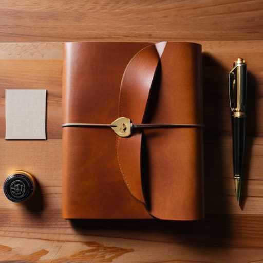
Effective branding storytelling through brand identity.

Building a Story Through Brand Identity

I remember sitting in a dimly lit studio in Providence, the smell of spray adhesive and fresh ink thick in the air, staring at a physical paste-up that felt more alive than any digital mockup I’ve seen in years. Back then, we didn’t have algorithms to tell us what resonated; we had intuition and the tactile weight of the medium. Today, I see so many agencies treating branding storytelling like a checklist of buzzwords—an endless stream of “authentic” content that feels as hollow as a stock photo. We’ve traded the intentionality of craft for a relentless, automated noise that serves the algorithm instead of the person.

I’m not here to sell you on some expensive, high-concept framework that requires a dozen workshops to implement. Instead, I want to pull back the curtain on how to build narratives that actually hold weight. I’m going to share my perspective on how to use branding storytelling to create a genuine connection—one that respects the human on the other side of the screen. We aren’t just filling space; we are building something meant to endure.

Table of Contents

Crafting a Brand Narrative Strategy With Purpose

Crafting a Brand Narrative Strategy With Purpose.

When I sit down with a client, I often find they are trying to solve a design problem with a marketing solution. They want more content, more noise, more pixels. But a true brand narrative strategy isn’t about increasing the volume; it’s about refining the signal. It starts with deciding what you actually stand for before you ever touch a typeface or a color palette. If your story is just a collection of curated adjectives, it will feel hollow. You have to find the tension—the specific problem your craft solves or the unique way you view the world—and anchor everything to that.

This requires moving away from vanity metrics and toward customer-centric storytelling. Instead of shouting about your features, look at how your work fits into the actual, messy lives of your audience. When we use visual storytelling for brands, we aren’t just picking pretty imagery; we are creating a visual language that echoes the values we’ve established. It’s about building a cohesive thread that connects the tactile feel of your packaging to the digital flow of your website, ensuring that every touchpoint feels like a continuation of a single, honest conversation.

Using Brand Archetypes and Storytelling to Honor Connection

Using Brand Archetypes and Storytelling to Honor Connection.

When we talk about brand archetypes and storytelling, it’s easy to get lost in the academic definitions of “The Hero” or “The Sage.” But for me, archetypes aren’t just marketing shortcuts; they are the skeletal structures that hold a brand’s soul in place. If you treat an archetype like a costume you put on for a campaign, your audience will feel the hollow space behind the mask. True connection happens when you use these patterns to create a sense of predictable humanity. People don’t bond with a logo, but they do bond with a consistent way of seeing the world.

Integrating these archetypes into your visual storytelling for brands requires a delicate touch. It’s about choosing a typeface or a color palette that doesn’t just look “modern,” but actually speaks the language of the character you’ve built. When your visual language and your narrative voice are in sync, you stop shouting at customers and start inviting them into a conversation. That is where the real work begins—moving away from mere transactions and toward something that feels earned.

The Tactile Truth: Five Ways to Keep Your Brand Story Human

  • Stop chasing perfection. In a world of hyper-polished, AI-generated imagery, there is a profound strength in showing the “seams.” Don’t be afraid of a little texture, a slight imperfection, or a voice that sounds like a person rather than a marketing department.
  • Design for the pause. Real storytelling requires breathing room. If your brand narrative is constantly shouting for attention through aggressive pop-ups and frantic layouts, you aren’t telling a story; you’re just creating noise. Respect the white space.
  • Focus on the friction. We often try to make user experiences too seamless, stripping away the very moments that make an interaction memorable. Use your brand’s narrative to create meaningful touchpoints that require a moment of genuine thought or engagement.
  • Ditch the buzzwords. If I see the word “synergy” or “optimized” in a brand manifesto, I immediately tune out. Use language that has weight and intention—words that you would actually use if you were sitting across from someone in a studio with a cup of coffee.
  • Build for longevity, not trends. A good brand story shouldn’t feel like it was designed to fit a specific social media algorithm of the month. Think about how your narrative will hold up in five years, not just how it performs in the next five minutes.

Moving Beyond the Surface: Three Essentials for Intentional Storytelling

Stop chasing trends and start building foundations; a brand story isn’t a collection of aesthetic assets, but a cohesive philosophy that dictates how you behave when no one is looking.

Respect the human on the other side of the screen by trading polished perfection for genuine resonance—people don’t connect with flawless algorithms, they connect with intentionality and shared values.

Use your narrative to create friction where it matters; don’t let your brand story be a frictionless slide toward a sale, but a meaningful interaction that invites the audience to actually participate in your world.

The Soul in the System

Branding isn’t about stacking adjectives or perfecting a color palette; it’s about finding the tension between what a company does and why it matters. If your story doesn’t have a bit of human friction, it’s just noise.

Ingrid Bellamy

Moving Beyond the Screen

Moving Beyond the Screen with meaningful storytelling.

At the end of the day, branding storytelling isn’t about finding a clever way to fill a grid or optimizing a sequence of pixels for an algorithm. It’s about the strategic marriage of purpose and archetype—ensuring that every narrative choice we make serves to deepen the bond between the creator and the audience. We have discussed the importance of intentional strategy and the power of archetypes to foster genuine connection, but the real work lies in the execution. We must move past the superficiality of “content” and return to the core of meaningful communication, ensuring that our brand stories are built on a foundation of structural integrity and human empathy.

As we navigate an increasingly automated landscape, I find myself returning to my sketchbook more often, reminded that the most resonant stories are those that embrace a bit of imperfection. Don’t let the speed of digital tools strip away the soul of your work. Instead, use them as the scaffolding for something deeper. Use your brand story to build something that actually feels human and respects the person on the other side of the interface. If we approach our craft with the same reverence a photographer gives to a single frame of film, we won’t just be making noise; we will be creating legacies that endure long after the screen goes dark.

Frequently Asked Questions

How do I maintain a consistent brand narrative when moving from a tactile, physical brand identity to a purely digital experience?

Don’t mistake “digital” for “weightless.” When you move from paper to pixels, you aren’t losing your identity; you’re translating its texture. To keep that narrative consistent, focus on the sensory equivalents. If your physical brand relied on heavy, uncoated stock, don’t switch to thin, neon gradients. Instead, use intentional typography, generous whitespace, and a micro-interaction palette that feels deliberate. Maintain the same rhythmic friction that made your physical brand feel tactile.

At what point does a brand story start to feel performative or "manufactured" rather than authentic?

It starts to feel manufactured the moment the story detaches from the actual work. When a brand uses “human-centric” language to mask a cold, automated process, the friction is immediate. If your narrative promises craftsmanship but your delivery is a generic, templated experience, you’ve lost the thread. Authenticity isn’t a marketing layer you apply; it’s the residue of intentionality. If the story isn’t backed by the substance of your daily decisions, it’s just noise.

How can we use storytelling to create meaningful friction that slows a user down, rather than just optimizing for mindless scrolling?

We need to stop designing for the “infinite scroll” and start designing for the pause. Meaningful friction happens when you break the predictable pattern. Instead of a seamless, frictionless glide through content, use intentional typography shifts, unexpected white space, or a narrative beat that demands a moment of reflection. It’s about creating a digital “haptic” experience—where the user feels the weight of the words, forcing them to actually read rather than just scan.

Mastering analog photography techniques with film.

Practicing Film Photography in a Digital Age

I remember the first time I sat in a darkroom at RISD, the air thick with the sharp, vinegar scent of developer and the low hum of a ventilation fan. There was no “undo” button, no instant preview, and certainly no algorithm to fix my mistakes. It was just me, the mechanical click of a shutter, and the terrifying, beautiful weight of intentionality. In our current era of instant gratification, I see so many people treating analog photography techniques like a mere aesthetic filter—a way to slap a grain preset on a digital file to make it look “vintage.” But if you aren’t willing to embrace the physical limitations of the medium, you aren’t actually practicing the craft; you’re just chasing a ghost.

I’m not here to sell you on expensive, niche gear or peddle the myth that you need a master’s degree to shoot film. Instead, I want to share the practical, hard-won lessons I’ve gathered from years of working with both light and shadow. We are going to strip away the pretension and focus on the actual mechanics of light, exposure, and patience. My goal is to help you master the tactile friction of the process so that every frame you capture feels earned, rather than accidental.

Table of Contents

Mastering Manual Camera Controls for Intentionality

Mastering Manual Camera Controls for Intentionality.

There is a specific kind of tension that exists between your fingers and the dials of a mechanical camera. When you move away from the safety of auto-mode, you aren’t just adjusting light; you are making a series of deliberate choices that define the soul of the frame. Mastering manual camera controls requires you to stop reacting to the scene and start interpreting it. It’s about understanding how a slight shift in your shutter speed can transform a moment from a frozen instant into a purposeful blur.

I find that most beginners fear the mistake, but in the world of 35mm film aesthetics, the “error” is often where the character lives. Instead of chasing a mathematically perfect exposure, I encourage you to experiment with your film exposure settings to see how much shadow you can afford to lose. Sometimes, underexposing a shot by a half-stop is exactly what you need to let the natural texture of the grain breathe. It’s not about technical perfection; it’s about the intentionality of the friction you create between the lens and the light.

Decoding the Soul of 35mm Film Aesthetics

Decoding the Soul of 35mm Film Aesthetics

When we talk about 35mm film aesthetics, we aren’t just discussing a visual style; we are discussing a way of seeing. In my design work, I often find myself fighting against the clinical perfection of digital sensors. Digital is often too “correct,” whereas film possesses a beautiful, inherent imperfection. It’s in the way light bleeds into the shadows and how the film grain characteristics provide a texture that feels alive, rather than just a layer of digital noise applied as an afterthought.

This texture is what gives a photograph its weight. Unlike a pixel, which is a mathematical coordinate, a grain of silver halide is a physical reaction to light. When you lean into this, you stop trying to capture a perfect image and start trying to capture a feeling. Whether it’s the subtle color shifts in the highlights or the way a certain stock handles high-contrast scenes, these elements create a sense of depth that digital struggle to replicate. It’s that specific, organic friction that makes a print feel like it has a history before you’ve even held it in your hands.

The Ritual of the Frame: Five Ways to Slow Down

  • Stop treating your shutter like a trigger; treat it like a decision. Before you press down, check your composition one last time. Is the light hitting the subject with purpose, or are you just capturing a moment because it happened?
  • Lean into the light rather than fighting it. In the digital world, we overexpose to save the shadows, but with film, let the highlights breathe. Sometimes a slightly underexposed frame holds more mood and intention than a perfectly “correct” one.
  • Embrace the physical feedback of your gear. I find that actually feeling the tension in a manual focus ring or the mechanical click of a shutter helps me connect with the scene. If you aren’t feeling the camera, you aren’t really present in the shot.
  • Don’t fear the grain. We spend so much time in design trying to smooth out every pixel, but in film, grain is the texture of reality. It’s the visual equivalent of a heavy paper stock—it gives the image weight and a sense of place.
  • Practice the art of the “discarded” frame. Not every roll needs to be a masterpiece. Allow yourself the luxury of making mistakes—blown-out skies or motion blur—to learn where the boundaries of your medium actually lie.

The Intentionality of the Frame

Stop viewing manual settings as a technical hurdle and start seeing them as a creative choice; every adjustment to your aperture or shutter speed is a deliberate decision that shapes the final narrative.

Embrace the unpredictability of film grain and light leaks as essential textures rather than errors, allowing the medium’s inherent imperfections to provide the human warmth that digital perfection lacks.

Slow down your process to respect the scarcity of the roll, treating each shot not as a disposable data point, but as a physical artifact that requires your full presence and focus.

The Value of the Wait

In a world obsessed with instant gratification and pixel-perfect clarity, there is a profound, quiet power in the delay. Analog photography isn’t about the final image; it’s about the discipline of the process—the way manual settings force you to actually look, to feel the weight of your decisions, and to accept that beauty often lives in the imperfections we can’t simply undo with a click.

Ingrid Bellamy

The Beauty of the Slow Build

The Beauty of the Slow Build photography.

Ultimately, moving away from the instant gratification of digital sensors isn’t about being a Luddite; it’s about reclaiming the intentionality of the creative process. By mastering manual controls and learning to read the unique language of 35mm grain, you stop merely capturing light and start composing a narrative. We’ve discussed how the mechanical friction of a manual shutter and the chemical unpredictability of film create a depth that an algorithm simply cannot replicate. It is in these technical nuances—the slight overexposure, the deliberate choice of ISO, the physical act of winding the film—that we find the true soul of the image.

As I sit here at my desk, looking between my latest typeface specimen and the Leica I spent all morning cleaning, I’m reminded that the best tools don’t do the work for us; they demand more of us. Analog photography is a discipline of patience in a world that has become far too fast. Don’t be afraid of the mistakes or the wasted frames. Those “errors” are often the most honest parts of your work. I encourage you to step away from the screen, pick up something mechanical, and embrace the friction of making something real.

Frequently Asked Questions

How do I balance the technical learning curve of manual settings without losing the creative flow of the moment?

The trick is to stop treating your camera like a math problem and start treating it like an extension of your hand. Don’t try to master every dial in one afternoon. Instead, pick one variable—maybe just aperture—and let it become muscle memory. Once the technicality moves from your head to your fingertips, the friction disappears. You aren’t calculating light anymore; you’re simply feeling it. That’s when the flow returns.

Is it worth investing in high-end vintage glass, or can I achieve a soulful look with more affordable, entry-level lenses?

Look, I’ll be honest: you don’t need a Leica lens to find soul. High-end vintage glass offers predictable perfection and micro-contrast, but there’s a specific magic in the “imperfections” of cheaper, older optics. Those entry-level lenses often have a softer fall-off and a bit more character in the flares. If you’re chasing a feeling rather than clinical sharpness, start with the affordable stuff. Let the lens’s quirks become part of your visual language.

How can I translate the tactile, imperfect qualities of film into my digital design workflow without it looking like a cheap filter?

Stop looking for a “grain” slider. To truly translate film into digital, you have to replicate the physics, not just the surface. Instead of slapping a texture over a finished layout, build imperfection into the foundation. Use organic color palettes derived from actual film stocks, introduce subtle chromatic aberration in your typography, and embrace slight, intentional misalignments. It’s about recreating the way light actually hits a medium, rather than just masking a digital perfection.

Graphic designer designing for print.

Preparing Digital Designs for Print

I can still smell the sharp, chemical tang of the darkroom and the heavy scent of fresh ink from the offset presses at my first studio job. There was a specific, heavy tension in the air back then—a realization that once you hit “print,” there is no undo button. In our current era of endless digital iterations, I see too many designers treating designing for print as an afterthought, a mere export of a web file that somehow survives the transition to a physical medium. They forget that you aren’t just arranging pixels; you are negotiating with paper weight, ink absorption, and the unforgiving physics of light and shadow.

I’m not here to give you a sanitized checklist of technical specs that you could find in any software manual. Instead, I want to share the intentionality that comes from decades of seeing how design lives in the real world. We are going to strip away the fluff and focus on the tactile reality of the craft. I’ll show you how to respect the medium so that your work doesn’t just occupy space on a desk, but actually commands attention through its physical presence.

Table of Contents

Mastering Margin and Safe Zone Setup

Mastering Margin and Safe Zone Setup guide.

When I first started working with physical paste-ups, there was no “undo” button for a misaligned margin. That sense of consequence stays with me, even now that everything is digital. In your margin and safe zone setup, you have to account for the mechanical reality of the guillotine. I always tell my clients: don’t just design to the edge. You need to build in a generous buffer—the safe zone—to ensure that your critical typography and logos don’t get swallowed by the trim. It’s about creating a visual breathing room that protects the integrity of the composition.

Beyond just avoiding the cut, you have to consider how the paper actually behaves. A margin that looks spacious on a backlit monitor can feel suffocating once it’s pressed onto a heavy, textured stock. I tend to push my margins slightly wider than “standard” because intentional white space provides a structural anchor for the eye. If you’re rushing through your print production workflow, it’s tempting to ignore these gutters, but a mistake here isn’t just a digital error; it’s a physical waste of material.

The Nuance of Paper Stock Selection Guide

The Nuance of Paper Stock Selection Guide.

Choosing a substrate is where your digital vision finally meets the physical world, and it’s often where the most profound mistakes happen. You can’t treat a heavy, uncoated cotton stock the same way you treat a slick, coated gloss. When I’m consulting for agencies, I always remind them that the paper isn’t just a background; it’s a participant in the design. A porous, uncoated paper will drink up your ink, leading to significant dot gain and color profiles shifting away from what you saw on your calibrated monitor. If you’re working with deep, moody blacks, a high-absorbency stock might turn your crisp typography into something muddy and indistinct.

I tend to approach this by thinking about the “hand-feel” of the final piece. A heavy, textured cardstock demands a certain level of restraint in your layout—it asks you to respect its presence. Conversely, a lightweight, smooth stock allows for more intricate, fine-lined details. Before you finalize your files, consult a detailed paper stock selection guide tailored to your specific printer. You need to understand how the weight and tooth of the material will interact with your ink density, because once that press runs, the tactile reality is permanent.

The Final Layer: Small Details That Make a Big Difference

  • Stop relying on your monitor’s glow to judge color. RGB is a trick of light; CMYK is a reality of ink. Always run a physical test print on a low-end inkjet before committing to a massive production run, because what looks like a soft charcoal on my screen might end up looking like a muddy sludge on heavy cardstock.
  • Respect the ink trap. When you’re working with fine serifs or tight kerning, remember that ink spreads slightly as it hits the fibers of the paper—a phenomenon called dot gain. If your type is too delicate, the physical reality of the ink will swallow your hard work, turning elegant strokes into illegible blobs.
  • Design with the grain in mind. Paper isn’t a flat, digital plane; it has a direction. If you’re planning a fold or a heavy bind, consider how the grain of the stock will affect the crispness of your layout. Folding against the grain is a quick way to end up with cracked, amateurish edges that ruin the tactile experience.
  • Check your resolution, but don’t obsess over “more.” We need 300 DPI for a reason, but more isn’t always better—it’s just more data. Focus instead on the clarity of your vector paths and the intentionality of your raster images. A high-res file with poor composition is still just a loud, messy mistake.
  • The “Human Touch” test. Before you hit send to the printer, hold your sketchbook or a piece of heavy stationery. Imagine your design living in that physical space. If the layout feels like it’s fighting the weight of the page rather than sitting comfortably within it, go back to the drawing board. Design should feel held, not just printed.

The Intentionality of the Final Object

Treat your digital file as a blueprint for a physical reality, not just a collection of pixels; every decision you make on screen must account for how ink interacts with fiber.

Respect the limits of the medium by designing with margins that allow the paper to breathe, ensuring the layout feels grounded rather than crowded.

Never underestimate the tactile weight of your choices, because the success of a print piece lies in the sensory connection between the reader’s hand and the material itself.

The Soul of the Tangible

Digital design is about pixels that vanish the moment a screen goes dark, but print is a commitment to physical reality; you aren’t just arranging colors, you are negotiating with the grain of the paper and the way light hits a finished surface.

Ingrid Bellamy

The Final Impression

Creating The Final Impression through print design.

Designing for print is a discipline of patience and precision. We have moved from the technicalities of margins and safe zones to the sensory decision of paper weight and texture, but the core principle remains the same: you are creating something that exists in the physical world. It isn’t enough to simply export a high-resolution PDF and hope for the best. You have to account for the mechanical realities of the press, the way ink bleeds into fibers, and how light hits a specific finish. When we respect these constraints, we stop fighting the medium and start working with it to create something that feels intentional rather than accidental.

As we continue to navigate an increasingly ephemeral digital landscape, I find myself returning to my sketchbook more often than my tablet. There is a weight to a well-designed physical object that a screen can never replicate. My hope is that you approach your next print project not as a chore of technical specifications, but as an opportunity to honor the human touch. Whether it is a minimalist brand identity or a complex editorial layout, remember that your work is destined to be held, felt, and kept. Let that tactile responsibility guide every choice you make.

Frequently Asked Questions

How do I effectively balance the tension between high-contrast digital colors and the more muted reality of physical ink absorption?

This is where most designers lose the thread. Digital screens use light to create vibrancy, but ink relies on absorption and physical spread. To bridge that gap, stop designing for the monitor and start designing for the substrate. I always build in a “dullness buffer.” I intentionally desaturate my digital palette by about 10-15% and check my values against physical proofs. If it looks too clinical on screen, it’ll likely feel lifeless once it hits the paper.

When choosing a paper weight, how much does the intended tactile "feel" of the brand influence the technical decision of stock selection?

It’s everything. In my experience, the weight of the paper is the silent ambassador of your brand. If you’re designing for a high-end boutique, a flimsy 80lb text stock will undermine even the most sophisticated typography. You aren’t just choosing a technical specification; you’re choosing a sensory handshake. I always tell my clients: don’t let the digital mockup fool you. You have to account for that physical gravity—the way a heavy, uncoated stock commands respect before a single word is read.

Beyond the standard bleed settings, how can I better prepare my files to respect the physical limitations of traditional binding methods?

Think beyond the bleed and consider the gutter. When you’re working with perfect binding or even a simple saddle stitch, the inner margin—the gutter—is where the design goes to die if you aren’t careful. I always tell my clients to add extra breathing room near the spine. If your text sits too deep in that fold, it becomes a physical struggle to read. Respect that tension; give your content space to exist without being swallowed by the binding.

Creative research for impactful design.

The Importance of Research in Design

I remember sitting in a cramped studio back in the late nineties, the air thick with the scent of spray adhesive and stale coffee, surrounded by literal mountains of physical paper clippings. We weren’t just scrolling through a curated feed of aesthetic perfection; we were digging through the grit of real-world textures and forgotten typography. Today, I see so many designers mistake a quick Pinterest scroll for actual creative research, treating it like a superficial hunt for “vibes” rather than a deep, intentional investigation. They’re chasing a polished, frictionless illusion that ultimately leaves their work feeling hollow and utterly devoid of soul.

I’m not here to give you a checklist of expensive software or a lecture on data analytics that feels disconnected from the actual act of making. Instead, I want to talk about how we can reclaim the intentionality of our process. I’m going to share the practical, unvarnished methods I use to bridge the gap between raw inspiration and meaningful execution. We’re going to look at how to conduct creative research that respects the friction of human touch, ensuring your next project isn’t just another beautiful screen, but a piece of work with actual substance.

Table of Contents

Sharpening Sensory Observation Skills for Deeper Meaning

Sharpening Sensory Observation Skills for Deeper Meaning

To truly move beyond the superficial, we have to stop looking at screens and start looking at the world. When I’m stuck on a typeface or a brand identity, I step away from the monitor and pick up my Leica. There is a specific kind of intelligence found in the way light hits a weathered brick wall or how a shadow stretches across a matte surface. Developing your sensory observation skills isn’t about collecting more data; it’s about training your eyes to notice the intentionality of texture. If you only rely on what’s already been digitized, your work will inevitably feel like a copy of a copy.

This level of artistic investigation methods requires a certain kind of patience that our current software often discourages. Instead of rushing to a mood board, try sitting with a physical object. Feel the weight of the paper, the resistance of the ink, or the grain of a photograph. By grounding your ideation through visual research in these tactile realities, you bring a layer of soul back into the digital space. We aren’t just arranging pixels; we are translating the physical world into a digital language that still feels human.

Artistic Investigation Methods That Honor the Maker

Artistic Investigation Methods That Honor the Maker

When I sit down with a new client, I find that the most profound breakthroughs rarely come from scrolling through endless Pinterest feeds. Instead, I lean into more rigorous artistic investigation methods that require actual presence. One approach I swear by is the “analog detour.” Before I ever touch a vector point in Illustrator, I spend time sketching the weight of a letterform or the way light hits a textured paper stock. This isn’t just a nostalgic habit; it’s a way to ground my creative process methodology in something tactile. By forcing myself to translate a concept through a fountain pen first, I avoid the trap of settling for the first “clean” digital solution the software suggests.

I also advocate for a more disciplined approach to ideation through visual research. Rather than just collecting images that “look cool,” I focus on dissecting why a specific composition works. I look for the tension in a layout or the specific way a color palette evokes a sense of history. It’s about moving beyond mere decoration and toward a deeper understanding of how visual elements communicate intent. When we treat our research as a form of study rather than a quick search, we build work that actually has something to say.

Practical Anchors for Your Research Process

  • Step away from the screen to find your baseline. If you spend your entire research phase looking at Pinterest or Behance, you aren’t researching; you’re just participating in a feedback loop of existing trends. Go to a library, a museum, or even a hardware store. Look at how things are physically constructed.
  • Document the “why,” not just the “what.” When you find a typeface or a color palette that works, don’t just save the screenshot. Write down why it hits you. Is it the tension between the strokes? The way the weight shifts? Capture the feeling so you can replicate the intent, not just the aesthetic.
  • Embrace the messy middle. Your sketchbook shouldn’t look like a finished brand identity; it should look like a struggle. Use your fountain pen to map out connections between disparate ideas. The friction of physical sketching often reveals connections that a clean digital canvas hides.
  • Treat your archives as a living resource. Don’t let your past inspirations die in a forgotten folder. Periodically revisit your old research notes and see how they intersect with your current projects. Often, the most profound breakthroughs come from combining an old observation with a new problem.
  • Test for tactile resonance. Even in digital design, ask yourself how a concept would feel if it were made of paper, wood, or metal. If a design concept only works because of a specific digital gradient and fails the “materiality test,” it probably lacks the structural integrity needed to stand the test of time.

The Intentionality of the Process

Stop treating research as a checkbox for a client presentation; treat it as the tactile foundation that prevents your work from feeling hollow or derivative.

Lean into the friction of physical sketching and analog observation to find the nuances that a digital search engine will always overlook.

Use your findings not to automate your decisions, but to ground your creative intuition in something human, messy, and real.

Beyond the Moodboard

Creative research isn’t about collecting a buffet of aesthetics to mimic; it’s about digging into the texture of why things work, so we can build something with actual weight instead of just more digital noise.

Ingrid Bellamy

The Intentional Path Forward

The Intentional Path Forward through creative research.

Ultimately, creative research isn’t about amassing a digital library of mood boards or scrolling through endless feeds of “inspiration” that all look the same. It is about the discipline of looking closer—using sensory observation and tactile investigation to find the soul within a concept. When we move beyond the surface level, we stop designing for algorithms and start designing for people. By integrating these methods, we ensure that our work isn’t just a collection of polished assets, but a deliberate response to the world around us, grounded in something much deeper than a trending color palette.

As you step away from your screen and back into your process, I encourage you to embrace the messiness of the search. Don’t be afraid of the slow, sometimes frustrating moments where nothing seems to click; that is often where the most meaningful breakthroughs are hiding. We are more than just operators of software; we are curators of meaning. Let your research be the bridge that connects your technical skill to your human intuition. Build something that doesn’t just fill a screen, but actually demands to be felt.

Frequently Asked Questions

How do I balance the need for structured research with the messy, unpredictable nature of actual creative intuition?

Think of structure as the armature, not the sculpture. I use research to build a reliable skeleton—the typography rules, the user constraints, the color theory. But once that frame is set, you have to step away from the grid. Let the research sit in the back of your mind while you sketch aimlessly or tinker with a lens. The magic happens in the tension between the data you’ve gathered and the gut feeling that tells you the data is wrong.

In a world obsessed with data and user metrics, how can I justify spending time on sensory or analog research methods?

Data tells you what people did, but it rarely tells you why it felt meaningful. Metrics are a rearview mirror; they track behavior, not intention. When I advocate for analog research, I’m not being nostalgic—I’m being rigorous. Sensory exploration uncovers the nuances that a heat map misses: the weight of a texture, the rhythm of a typeface, the “soul” of a brand. We use these methods to build depth that data simply cannot quantify.

How do I prevent my research from becoming a mere collection of references that ends up diluting my own original voice?

The trap is thinking that a mood board is a destination. It isn’t. If you’re just collecting “vibes,” you’re just curating, not creating. To protect your voice, treat every reference as a question rather than an answer. Ask why a specific typeface or color palette works, then strip it down to its core principle. Use the reference to understand the mechanics, but leave the aesthetic to your own hand.

Designing effective color palettes for brands.

Crafting Effective Color Palettes

I remember sitting in a dimly lit studio back in the late nineties, surrounded by the sharp, chemical scent of spray adhesive and the tactile weight of physical Pantone chips. There was a certain gravity to choosing a hue back then; you didn’t just click a hex code and hope for the best, you felt the weight of the decision in your hands. Today, I see so many designers drowning in endless, auto-generated color palettes that look beautiful in a vacuum but feel completely hollow once they hit a real screen. We’ve traded intentionality for infinite scrolling, and in the process, we’ve lost the soul of the craft.

I’m not here to give you a list of trendy combinations pulled from a curated algorithm. Instead, I want to talk about how to build a foundation that actually serves a purpose. I’m going to share what I’ve learned from two decades of moving between ink and pixels: how to select colors that respect the user’s eye and honor the human experience. We’re going to strip away the fluff and focus on how to use color as a tool for clarity, not just decoration.

Table of Contents

The Psychology of Color Building Emotional Resonance

The Psychology of Color Building Emotional Resonance

When we talk about the psychology of color, we aren’t just discussing how a specific hue looks on a high-resolution display; we are discussing how it lands in the gut of the person viewing it. In my years of refining visual branding colors for boutique firms, I’ve learned that color is a silent language. If you use a jarring, high-saturation red for a wellness app, you aren’t just making a design choice—you are creating cognitive dissonance. You have to respect the emotional weight that every shade carries before you ever touch a slider in Figma.

Instead of reaching for the most trendy gradients, I find myself leaning back into foundational color theory principles. There is a quiet, intentional power in using analogous color schemes to create a sense of continuity and calm, or employing carefully weighed complementary color combinations to guide a user’s eye toward a single, vital action. It’s about creating a sense of place. When we choose a palette, we are setting the temperature of the room. We aren’t just picking hex codes; we are architecting an atmosphere.

Mastering Color Theory Principles for Meaningful Design

Mastering Color Theory Principles for Meaningful Design

When we talk about color theory principles, I often see designers get lost in the math of the color wheel, treating it like a puzzle to be solved rather than a language to be spoken. It’s easy to lean on complementary color combinations because they provide instant, high-contrast excitement, but there is a risk of creating visual noise that lacks soul. I prefer to approach a project by looking for the quiet tension between hues. Sometimes, a sophisticated monochromatic palette design does more to establish authority than a loud, multi-colored explosion ever could.

The real work happens when you move past the initial excitement of a bright shade and start considering how colors interact within a functional system. When I’m refining visual branding colors for a client, I don’t just look for what looks “good” on a high-res monitor; I look for how they hold up under scrutiny. It’s about finding that balance where analogous color schemes provide a sense of cohesion and calm, ensuring the interface feels like a curated environment rather than a digital afterthought.

Beyond the Swatch: Five Ways to Approach Color with Intent

  • Stop chasing trends and start looking at the context. A vibrant neon palette might look stunning on a high-res monitor in your portfolio, but if it causes eye strain for a user trying to read a long-form article, you’ve failed the most basic test of functional design.
  • Respect the hierarchy of neutrals. Most designers spend far too much time obsessing over their primary brand colors and not nearly enough time refining their grays, off-whites, and muted tones. These are the quiet workers that allow your primary colors to actually breathe.
  • Test for accessibility before you fall in love. It’s easy to get swept up in a sophisticated, low-contrast aesthetic, but if your text disappears into your background, your design is broken. True craftsmanship means ensuring your work is legible for everyone, regardless of how they view it.
  • Limit your palette to create focus. When everything is shouting for attention, nothing is heard. I find that choosing two or three core colors and letting the rest of the interface exist in a state of intentional restraint creates a much more powerful visual narrative.
  • Remember that color lives in a physical world. Even though we design for screens, we are designing for humans who experience light and shadow. Think about how your palette will feel under different lighting conditions—don’t just pick colors that look good in a controlled, backlit environment.

The Intentional Palette: Moving Beyond Aesthetics

Stop treating color as a decorative afterthought; use it as a functional tool to guide the eye and dictate the emotional rhythm of your interface.

Prioritize accessibility and legibility over trends, ensuring your color choices respect the user’s ability to navigate without friction.

Build palettes with purpose by grounding your digital choices in the same intentionality used in physical craftsmanship—every hue should earn its place on the screen.

The Weight of a Hue

A color palette shouldn’t just be a collection of aesthetically pleasing hex codes; it should be a deliberate set of tools that respect the mood of the user and the integrity of the brand. If you aren’t choosing a color because of the way it anchors a composition or directs a human eye, you aren’t designing—you’re just decorating.

Ingrid Bellamy

Beyond the Hex Code

Strategic color theory Beyond the Hex Code.

At the end of the day, choosing a color palette isn’t about finding the most trending combination on a mood board or chasing what’s popular on Dribbble. It’s about the rigorous application of color theory to support a specific intention. We’ve looked at how psychology anchors our emotional responses and how the fundamental principles of harmony and contrast provide the necessary structure for usability. When you move past the superficial desire to simply “make things look nice” and instead focus on how color directs the eye and communicates meaning, you stop being a decorator and start being a strategist. Remember, every hue you select carries a weight; make sure it’s a weight your design can actually support.

As you return to your canvas—whether that’s a digital tablet or a physical sketchbook—I encourage you to resist the urge to let automation make these decisions for you. There is a certain magic in the intentional friction of selecting a shade that feels slightly off-kilter but perfectly right for the human experience. Don’t let the infinite possibilities of a digital color picker paralyze your intuition. Instead, trust your eye and your understanding of how light and pigment interact with the soul. Build palettes that don’t just fill a screen, but rather, create a space where human connection can actually breathe.

Frequently Asked Questions

How do I maintain a sense of intentionality when a client insists on a palette that clashes with the brand's core values?

It’s a frustrating tightrope to walk. When a client pushes for colors that feel “off,” don’t just argue aesthetics; pivot back to the brand’s core purpose. I find it helps to create a side-by-side comparison. Show them their requested palette next to a mood board of their own brand values. Frame it as a functional risk: “This palette might look trendy, but it undermines the trust we’re trying to build.” Design is about stewardship, not just compliance.

At what point does a color scheme become too "noisy" and start distracting from the actual functional purpose of the design?

It becomes too noisy the moment the color stops supporting the hierarchy and starts competing with it. If a user has to squint or pause to figure out where to click because a bright accent is fighting a primary call-to-action, you’ve lost the battle. Color should be a guide, not a distraction. When the palette begins to scream rather than whisper, you’ve traded functional clarity for mere decoration. Strip it back.

How can I balance the trend of high-saturation digital palettes with the need for accessibility and long-term legibility?

It’s easy to get seduced by those neon, high-saturation palettes that pop on an OLED screen, but we have to remember that eyes tire. If we chase trends that ignore contrast ratios, we aren’t designing; we’re just decorating. I always suggest anchoring those vibrant “hero” colors with grounded, neutral tones. Use the saturation for emphasis, not for the entire heavy lifting. Design for the person reading in low light, not just for the trend cycle.

Exploring the principles of design ethics.

Exploring Ethics in Design

I remember sitting in a dimly lit studio back in the late nineties, the smell of rubber cement and fresh ink thick in the air, working on a physical paste-up that required absolute, agonizing precision. There was a weight to every decision; you couldn’t just hit “undo” if you accidentally manipulated a user into a corner. Today, we talk about design ethics as if it’s some lofty, academic concept or a checkbox for a compliance department, but that feels fundamentally wrong. We’ve traded that tactile responsibility for slick, frictionless interfaces that often feel more like traps than tools, and frankly, I’m tired of seeing “ethical design” sold as a luxury add-on rather than the foundation of the craft.

I’m not here to give you a lecture on theoretical frameworks or industry jargon that sounds good in a boardroom but fails in the real world. Instead, I want to talk about how we reclaim our agency as creators. I’m going to share what I’ve learned from two decades of navigating the shift from ink to pixels, focusing on how we can build digital experiences that respect human intention rather than exploiting it. This isn’t about following a manual; it’s about restoring the integrity of the work.

Table of Contents

Exposing the Deception of Dark Patterns in Ux

Exposing the Deception of Dark Patterns in Ux.

We’ve all been there: trying to cancel a subscription only to find yourself trapped in a labyrinth of “Are you sure?” pop-ups and hidden checkboxes. These aren’t accidental oversights; they are deliberate, calculated instances of dark patterns in UX designed to exploit our cognitive shortcuts. It’s a predatory way to build “engagement,” but it’s actually just a way to manufacture growth through frustration. When we use design to trick a user into a choice they didn’t intend to make, we aren’t just failing a usability test—we are breaking a fundamental contract of trust.

As someone who spent years obsessing over the precise weight of a serif, it pains me to see such craft used for manipulation. True human-centered design ethics should prioritize clarity over conversion hacks. If a product requires deception to keep a user from leaving, the product itself is fundamentally broken. We need to shift our metrics away from mere clicks and toward something more meaningful, like long-term user respect. We should be building interfaces that feel like a clean, well-organized studio, not a high-pressure sales floor.

Protecting Digital Wellbeing and Design Harmony

Protecting Digital Wellbeing and Design Harmony.

We need to stop treating user attention like an infinite natural resource to be strip-mined. For too long, the industry has leaned into dopamine loops and infinite scrolls, masquerading “engagement” as success while quietly eroding our collective focus. When we prioritize time-on-site over the actual utility of a tool, we aren’t designing; we’re engineering addiction. True digital wellbeing and design require us to build interfaces that allow for intentionality, giving users the agency to enter a space, complete a task, and leave without feeling psychologically drained.

This shift demands a move toward more sustainable design practices that value the user’s mental health as much as the stakeholder’s conversion rate. It means resisting the urge to use red notification badges or aggressive pop-ups that trigger a sense of false urgency. Instead, we should be leaning into human-centered design ethics by creating calm, predictable environments. If a piece of software feels like it’s constantly shouting for your attention, it has failed its most basic duty: to serve the human, not the metric.

Small Acts of Resistance: Five Ways to Design with Intent

  • Prioritize clarity over conversion. It’s tempting to hide a cancellation button or bury terms in a wall of text to hit a KPI, but true craftsmanship means being honest about what the user is actually doing. If your design relies on a user being confused, you haven’t designed a solution; you’ve designed a trap.
  • Respect the friction. We’ve become obsessed with “frictionless” experiences, but sometimes a little resistance is a good thing. Adding a confirmation step before a permanent action—like deleting a file or making a purchase—gives the human on the other side a moment to breathe and think.
  • Design for the edges, not just the center. Accessibility isn’t a checklist to complete at the end of a project; it’s the foundation. If your typography is too thin to read in sunlight or your color palette lacks contrast, you aren’t designing for the world—you’re designing for a narrow, privileged subset of it.
  • Audit your algorithms for bias. As someone who watched the transition from manual layouts to automated tools, I know how easily “efficiency” can mask systemic errors. Always ask: who is being excluded by this logic? If the data feeding your design is skewed, your output will be too.
  • Protect the creator’s agency. We should be building tools that act like a fine-tuned fountain pen—extending our reach and intention—rather than tools that try to make every creative decision for us. Aim to empower the user’s intuition, not to automate their soul away.

Reclaiming Intentionality in a Frictionless World

Stop designing for seamlessness at any cost; true ethical design acknowledges that a little bit of meaningful friction can actually protect a user’s autonomy and focus.

Move beyond mere compliance with industry standards and start treating design ethics as a foundational element of craftsmanship, much like the integrity of a well-drawn typeface.

Prioritize tools that augment human creativity rather than those that use psychological loopholes to manipulate engagement metrics.

The Cost of Frictionless Design

We’ve become so obsessed with removing every ounce of friction from the user experience that we’ve accidentally stripped away the user’s agency. True design ethics isn’t about making things seamless; it’s about creating enough intentional pause for a person to actually think before they click.

Ingrid Bellamy

The Path Toward Intentionality

The Path Toward Intentionality in UX design.

We have spent enough time dissecting the mechanics of manipulation and the erosion of user focus. From the predatory nature of dark patterns to the subtle ways we fracture digital wellbeing, it is clear that the current trajectory of UX is often at odds with the people it claims to serve. Reclaiming design ethics isn’t just about avoiding legal pitfalls or checking a compliance box; it is about a fundamental shift in how we value the human on the other side of the glass. We must move away from metrics that prioritize attention at any cost and return to a framework where clarity and respect are the primary benchmarks of success.

As I sit here with my sketchbook, watching the light change on my desk, I am reminded that the most enduring things we create are those that honor the user’s agency. We are not just moving pixels or optimizing conversion funnels; we are architects of human experience. Let us stop building digital labyrinths designed to trap people, and start building intentional spaces that offer genuine utility. Our legacy shouldn’t be how much time we managed to steal from a user, but how much meaningful value we added to their lives through thoughtful, disciplined craft.

Frequently Asked Questions

How do we actually measure the "human friction" we're trying to protect when every KPI is built around seamlessness and speed?

It’s the ultimate tension, isn’t it? We’re trained to chase “frictionless” experiences, but seamlessness often just means mindless consumption. To measure true human friction, we have to look past click-through rates and dwell time. I look for “intentionality markers”: Are users pausing to reflect, or are they just scrolling in a trance? We need to track the quality of engagement—the difference between a user who completes a task with purpose and one who is merely lost in a loop.

Where is the line between a nudge that helps a user and a nudge that subtly manipulates their intent?

The line is drawn at intent. A helpful nudge acts as a guide—it anticipates a need and smooths the path, like a well-placed kerning adjustment that makes a word legible. Manipulation, however, hijacks the user’s agency to serve a metric. If the nudge prioritizes the business’s bottom line over the person’s original goal, you’ve crossed it. Design should be a compass, not a trap. We must respect the user’s autonomy, not exploit their impulses.

How can smaller agencies advocate for ethical design when their clients are primarily focused on immediate conversion metrics?

It’s the classic tension: the client wants the click, but you want the integrity. I’ve found that the best way to push back is to reframe ethics as long-term brand equity. Don’t just talk about “doing the right thing”—talk about trust. Show them how dark patterns erode customer lifetime value. If we frame ethical design as a way to build sustainable, high-quality relationships rather than just a quick spike in data, we turn a moral argument into a business strategy.

Fundamentals of user interface design principles.

Fundamentals of User Interface Design

I remember sitting in a cramped studio back in the late nineties, the smell of spray adhesive and ozone from a heavy plotter hanging thick in the air. Back then, we didn’t have “seamless” everything; we had physical layouts that required a steady hand and a real sense of scale. Today, I look at modern user interface design and often feel like we’ve traded that tactile soul for a polished, frictionless void. We’ve become so obsessed with making everything “invisible” and “effortless” that we’ve forgotten that meaningful interaction requires a bit of intentional weight.

I’m not here to feed you the usual industry jargon or tell you how to chase the latest trend in micro-interactions. Instead, I want to talk about how we can bring purpose back to the screen. I’m going to share what I’ve learned from two decades of moving between physical and digital craft, focusing on how to build interfaces that actually respect the user’s intelligence. We’ll skip the hype and look at how to design with a sense of humanity and restraint, ensuring your work serves a function rather than just filling up empty pixels.

Table of Contents

Navigating the Nuance of Ux vs Ui Design Principles

I often find myself in conversations with junior designers who treat the distinction between UX and UI as a mere technicality, but to me, it’s the difference between the skeleton of a building and the way the light hits the windows. When we talk about ux vs ui design principles, we aren’t just discussing different stages of a checklist; we are discussing the relationship between logic and emotion. UX is the structural integrity—the way a user moves through a space without tripping over invisible hurdles. UI is the tactile grace that makes that movement feel intentional.

If the user experience design workflow is flawed, no amount of beautiful typography or polished buttons will save the product. You can have a stunningly aesthetic interface, but if the user feels lost or frustrated, the design has failed its primary purpose. I always tell my clients that true craftsmanship requires a balance: you need the rigorous, invisible logic of UX to guide the way, paired with a strong sense of visual hierarchy in interface design to ensure the eye knows exactly where to rest. It’s about creating a cohesive language where the function and the form are finally in conversation.

Visual Hierarchy in Interface Design Guiding the Creative Eye

Visual Hierarchy in Interface Design Guiding the Creative Eye

When I sit down with my sketchbook to map out a new layout, I’m not thinking about where to put the prettiest elements. I’m thinking about where the eye needs to land first. Effective visual hierarchy in interface design isn’t about shouting for attention; it’s about a quiet, structured conversation between the screen and the user. If everything is bold, nothing is bold. We often fall into the trap of trying to make every call-to-action pop, but true craftsmanship lies in knowing what to leave in the shadows to let the primary intention breathe.

I’ve found that the most successful interfaces respect the natural scanning patterns of the human eye. By playing with scale, weight, and even the subtle use of negative space, we create a path that feels intuitive rather than forced. It’s a delicate balance—using design system components to maintain consistency while ensuring that the most vital information doesn’t get lost in the noise. We aren’t just arranging pixels; we are curating a sequence of discovery that respects the user’s cognitive load.

Five Principles for Designing with Intention

  • Respect the negative space. It’s tempting to fill every pixel to prove your productivity, but white space isn’t “empty”—it’s a functional tool that gives the user’s eyes a place to rest and process information.
  • Prioritize legibility over trendiness. I’ve seen too many beautiful, experimental typefaces fail because they ignored the basic human need to read without strain. If the typography isn’t functional, the design has failed its primary mission.
  • Design for the “fat finger” and the distracted mind. We often design for perfect, idealized users on high-resolution monitors, but real life is messy. Ensure your touch targets are generous and your interactive elements are forgiving of human error.
  • Maintain a consistent visual language. Don’t reinvent the wheel with every new screen. Use a disciplined system of buttons, icons, and spacing so that the user learns your interface intuitively rather than having to solve a puzzle every time they click.
  • Embrace purposeful friction. Not every interaction should be instantaneous and frictionless. Sometimes, a deliberate pause or a confirmation step is necessary to signal that a meaningful action has occurred, honoring the weight of the user’s intent.

The Intentionality of the Interface

Prioritize purpose over decoration; every element on the screen must earn its place by serving a specific function or guiding a user’s intent.

Respect the user’s cognitive load by using visual hierarchy to create breathing room, rather than overwhelming them with endless, frictionless choices.

Design for the human on the other side of the glass, ensuring the interface feels like a tool that empowers them rather than a system that merely manages them.

The Soul in the System

A great interface shouldn’t feel like a frictionless void; it should feel like a well-weighted tool in a craftsman’s hand—intentional, responsive, and deeply respectful of the person holding it.

Ingrid Bellamy

The Intentional Interface

Mastering design with The Intentional Interface.

At its core, mastering user interface design isn’t about mastering the latest software suite or chasing every fleeting aesthetic trend. It is about the delicate balance between the structural logic of UX and the visual clarity of UI, ensuring that hierarchy and function work in tandem rather than in competition. When we stop treating pixels as mere decoration and start viewing them as tools for communication, we move away from clutter and toward meaningful interaction. We must remember that every shadow, every typeface choice, and every margin is a decision that either invites the user in or pushes them away.

As we move further into an era of automated generation and frictionless automation, I urge you to hold onto the intentionality of the craft. Don’t be afraid of a little friction if it means creating a more thoughtful, human experience. The most successful interfaces aren’t the ones that disappear entirely, but the ones that respect the user’s presence and honor their agency. Let your work be a testament to the idea that technology should serve us, not just distract us. Build with purpose, design with restraint, and never lose sight of the human hand behind the screen.

Frequently Asked Questions

How do I maintain a sense of tactile craftsmanship when working within the constraints of a standardized design system?

It’s a tension I feel every day. Standardized systems are built for efficiency, but efficiency can often feel sterile. To find the soul in the system, look at the micro-interactions. Don’t just use the default corner radius; think about the weight of a shadow or the specific, intentional timing of a transition. It’s about finding the “human” in the margins—using those rigid components to build something that feels considered, rather than just assembled.

Where is the line between making an interface "seamless" and stripping away the intentional friction that helps a user actually process information?

The line is drawn at cognitive engagement. “Seamless” shouldn’t mean “thoughtless.” When we remove every micro-moment of friction, we risk creating a passive experience where the user glides right past the substance. If a user can complete a task without a single moment of reflection, they haven’t actually processed the information—they’ve just followed a path of least resistance. Real design uses subtle friction to signal importance, forcing the eye to pause and truly see.

How can I ensure that my pursuit of minimalist aesthetics doesn't accidentally compromise the functional accessibility of the interface?

Minimalism shouldn’t mean subtraction for the sake of emptiness; it should mean clarity. I often see designers strip away too much, leaving users guessing. To avoid this, treat accessibility as a core design constraint, not an afterthought. Check your color contrasts, ensure your typography remains legible at small scales, and never sacrifice intuitive affordance for a “clean” look. If a user has to hunt for a way forward, your minimalism has failed.

Artist performing concept sketching for design.

The Value of Concept Sketching

I remember sitting in a cramped studio at RISD, the air thick with the smell of graphite and stale coffee, staring at a blank sheet of heavy-weight paper. Back then, there was no “undo” button or infinite layers; there was just the terrifying, beautiful friction of a lead pencil meeting grain. Today, I see so many designers rushing straight to the software, trying to force a polished, pixel-perfect solution before they’ve even understood the core problem. We’ve traded the vital, messy discovery of concept sketching for the hollow efficiency of dragging and dropping pre-made assets, and in the process, we are losing the intentionality that makes design actually work.

I’m not here to teach you how to draw like an illustrator or how to master a new digital brush set. My goal is to help you reclaim the cognitive benefits of getting your hands dirty. I want to show you how to use concept sketching as a way to think, not just a way to decorate, ensuring your ideas are rooted in logic rather than just aesthetics. We’re going to focus on meaningful exploration—the kind that respects the process and builds a foundation that no algorithm can replicate.

Table of Contents

Mastering Rapid Visualization Techniques to Fuel Intuition

Mastering Rapid Visualization Techniques to Fuel Intuition

The mistake I see most often in modern workflows is the rush to move from a blank screen to a high-fidelity vector. We try to skip the middle step, but that’s where the magic—and the mistakes—live. To truly lean into the design thinking process, you have to embrace the speed of thumbnail sketching basics. This isn’t about creating art; it’s about clearing the mental fog. When I sit down with my sketchbook, I’m not looking for a masterpiece. I’m looking for the ghost of an idea, using rapid visualization techniques to see if a composition actually holds weight before I waste an hour nudging anchor points in Illustrator.

These iterative drawing methods act as a pressure valve for your brain. By forcing yourself to produce ten tiny, messy versions of a single concept, you bypass the inner critic that demands perfection too early. It’s about developing visual intuition through sheer volume. If you can communicate the soul of a brand or the ergonomics of a product through a few crude lines and shapes, you’ve done the heavy lifting. Once that intent is solidified on paper, the digital execution becomes a matter of refinement rather than a desperate search for direction.

Thumbnail Sketching Basics Finding Form in the Friction

Thumbnail Sketching Basics Finding Form in the Friction

When I sit down with my sketchbook, I’m not looking for a masterpiece; I’m looking for a way out of a mental rut. This is where thumbnail sketching basics become less about art and more about survival. The goal isn’t precision—it’s volume. I treat these tiny, often messy frames as a way to bypass the internal critic that demands perfection too early. By shrinking the canvas, you strip away the distraction of detail and force yourself to focus solely on composition and silhouette.

In my experience, these small studies are the backbone of a robust design thinking process. They allow you to fail fast and fail cheaply. If a layout doesn’t work at two inches wide, no amount of high-fidelity rendering or pixel-pushing will save it later. You have to embrace the deliberate messiness of these marks. It’s about capturing the raw energy of an idea before the digital tools begin to smooth out all the interesting edges. Don’t be afraid to let the ink bleed or the lines wobble; that’s where the real discovery happens.

Five Ways to Keep the Human Trace in Your Sketches

  • Stop reaching for the stylus immediately. There is a specific kind of cognitive resistance that happens when a nib hits paper; use that friction to slow your brain down and actually think about the form before you commit to a pixel.
  • Embrace the mess. A perfect line is often a lie told by a computer; a shaky, uncertain stroke in a sketchbook reveals where your intuition is still wrestling with the concept. Let those mistakes stay visible.
  • Limit your palette to the essentials. Don’t get distracted by color theory too early. Stick to a single fountain pen or a graphite pencil to ensure you are solving for structure and silhouette rather than decoration.
  • Work in bursts, not marathons. Concept sketching isn’t about producing a finished illustration; it’s about rapid-fire exploration. Set a timer for ten minutes and force yourself to exhaust a single idea through sheer volume.
  • Document the “why,” not just the “what.” Use the margins of your sketchbook to jot down quick, handwritten notes about why a specific curve works or why a composition feels off. These annotations are the connective tissue between a doodle and a design.

The Intentionality of the Unfinished

Treat your sketches as a way to find the soul of a concept, not as a way to create a final product; the goal is to capture the raw energy of an idea before the software tries to sanitize it.

Lean into the messiness of the hand-to-paper connection to bypass the “perfectionism trap” that often stalls digital workflows.

Use the physical friction of sketching to slow your brain down, allowing you to think through structural problems rather than just decorating a layout.

The Value of the Unpolished Line

“A digital canvas is too forgiving, too easy to perfect before you’ve actually found the soul of the idea. Concept sketching isn’t about the final image; it’s about embracing that initial, messy friction where the hand and the mind actually meet.”

Ingrid Bellamy

The Intentional Path Forward

Sketching The Intentional Path Forward.

At its core, concept sketching isn’t about producing a masterpiece that you can frame; it is about the relentless pursuit of clarity. We’ve looked at how rapid visualization can bypass the ego to tap into pure intuition, and how the humble thumbnail sketch allows us to find structural integrity before we ever touch a pixel. By embracing these methods, you aren’t just “drawing”—you are building a bridge between a nebulous idea and a functional reality. Remember that the goal is to strip away the noise and find the essential skeleton of your design through the honest, unpolished friction of your own hand.

As you move from your sketchbook back to your digital canvas, try not to lose that sense of tactile discovery. It is easy to let the perfectionism of software swallow the soul of a project, but I urge you to protect the original intent that was born in those messy, ink-stained margins. The most impactful designs are rarely the ones that started with a perfect vector; they are the ones that carried the weight and warmth of a human thought from the very first stroke. Keep your pens ready, keep your sketches loose, and never let the machine dictate your vision.

Frequently Asked Questions

How do I stop myself from getting precious about a sketch and actually move on to the next iteration?

The moment you start obsessing over a single line, you’ve stopped designing and started decorating. To break that cycle, set a timer. Give yourself exactly three minutes per iteration. When the bell rings, the pen moves, regardless of whether that curve feels “perfect.” Remember, a sketch isn’t a finished piece of art; it’s a way of thinking. If you cling to one idea too tightly, you lose the freedom to discover the better one hiding in the next sketch.

At what point does a sketch transition from a tool for exploration to a distraction from the actual design work?

It becomes a distraction the moment you stop searching for an idea and start decorating it. When you find yourself obsessing over line weight or perfecting a curve instead of testing the structural integrity of the concept, you’ve drifted. A sketch is a compass, not the destination. If you’re spending more time refining the tool than refining the intent, put the pen down. Move to the next stage before the polish kills the progress.

How can I maintain the integrity of my hand-drawn ideas when I eventually have to translate them into digital software?

The transition from paper to pixels is where most soul gets lost. To keep that integrity, don’t aim for immediate perfection in your software. Instead of trying to “clean up” your sketches into sterile vectors right away, use your digital tools to trace the actual weight and jitter of your pen strokes. Treat your software as a way to document your intent, not a way to sanitize it. Let the digital version retain the rhythm of the hand.

Minimalist composition utilizing effective negative space.

The Importance of Negative Space

I remember sitting in a cramped studio back in the late nineties, surrounded by the scent of spray adhesive and the tactile grit of physical X-Acto blades. We didn’t have “auto-layout” to hide our mistakes; if you didn’t respect the margins on your paste-up, the entire composition collapsed under its own weight. Today, I see so many designers treating negative space like it’s some wasted, expensive real estate that needs to be filled with more “content” or flashy UI elements just to justify a client’s budget. It’s a fundamental misunderstanding of what makes a design work. We’ve traded intentional breathing room for a digital clutter that leaves the viewer feeling suffocated and exhausted.

I’m not here to give you a textbook definition or a list of arbitrary rules you can find in any mediocre tutorial. Instead, I want to share how you can use emptiness as a strategic tool to guide the eye and anchor your intent. We’re going to look at how to stop fearing the void and start using it to give your work the dignity it deserves.

Table of Contents

Mastering Visual Hierarchy Through Purposeful Absence

Mastering Visual Hierarchy Through Purposeful Absence

Mastering Visual Hierarchy Through Purposeful Absence

When we talk about visual hierarchy in design, we often focus on what we are adding—the bold typeface, the vibrant accent color, or the high-resolution imagery. But I’ve learned that true control comes from what you choose to leave out. By strategically placing emptiness around a single element, you aren’t just creating “empty space”; you are actively directing the eye. It is the difference between a cluttered workshop where you can’t find your tools and a well-organized studio where every instrument has its place.

This isn’t about a lack of content; it’s about focal point creation. When you allow a layout to breathe, you give the viewer permission to focus. Without that buffer, the eye wanders aimlessly, exhausted by the constant visual noise. I always tell my clients that the goal is to achieve a sense of compositional balance where the silence is just as loud as the message itself. If every element is fighting for attention, nothing actually gets heard.

Finding Compositional Balance Without the Noise

Finding Compositional Balance Without the Noise

When we talk about compositional balance, there is a common misconception that it requires a mathematical distribution of weight—a perfect, mirrored symmetry that feels sterile. In my experience, true equilibrium comes from understanding how elements interact with the void around them. It isn’t about filling the gaps; it’s about ensuring that the weight of a heavy typeface or a bold image is countered by enough breathing room to prevent the layout from feeling claustrophobic. When you lean into minimalist design aesthetics, you aren’t stripping away meaning; you are actually defining the boundaries of what matters.

I often find that designers struggle when they try to force a sense of stability through sheer density. Instead, look toward the effective use of whitespace to anchor your elements. Think of it as the silence between notes in a piece of music. Without that silence, the melody becomes noise. By strategically placing empty areas, you guide the eye toward a specific focal point creation, allowing the viewer to process information in a logical, calm sequence rather than feeling overwhelmed by a digital onslaught of competing textures.

Five Ways to Let Your Design Breathe

  • Stop treating empty space like a void to be filled; treat it as a structural element that holds your composition together.
  • Use whitespace to create a physical sense of distance between elements, guiding the viewer’s eye toward what actually matters.
  • Don’t be afraid of the “unoccupied” corner; sometimes the most powerful way to signal importance is to give a single element its own quiet room.
  • Watch your margins closely—tight, cramped edges create a sense of anxiety, while generous breathing room invites contemplation.
  • Use negative space to define boundaries without drawing lines; let the absence of color do the heavy lifting of separation.

The Intentionality of the Void

Stop treating white space as a “gap” to be filled; treat it as a structural element that dictates how a viewer’s eye moves through your work.

Use negative space to create friction where it matters—force the user to pause and actually process a single, meaningful idea rather than overwhelming them with a digital landslide.

Remember that restraint is a skill, not a lack of resources. The most powerful part of a composition is often what you choose to leave out.

The Weight of What Isn't There

“We often treat empty space as a void that needs filling, but in true design, that space is a structural element. It’s the silence between notes that gives the melody its meaning; without it, you aren’t creating a composition, you’re just making noise.”

Ingrid Bellamy

The Quiet Power of What Remains

The Quiet Power of What Remains.

Ultimately, negative space isn’t just a void or a lack of content; it is a deliberate tool for clarity. We’ve looked at how it establishes a visual hierarchy that guides the eye and how it provides the compositional balance necessary to prevent a layout from feeling claustrophobic. When we stop viewing empty space as “wasted real estate” and start seeing it as a structural element, our work shifts. We move away from the frantic urge to fill every corner and toward a practice of intentional restraint. By mastering the art of what we leave out, we ensure that the elements we choose to keep actually carry the weight they were meant to hold.

As you return to your canvases or your digital artboards, I encourage you to resist the pull of the “more is more” era. In a world of endless scrolling and sensory overload, there is a profound, almost radical dignity in simplicity. Don’t be afraid to let your designs breathe. Let the silence between the notes be as meaningful as the melody itself. When we design with the courage to leave space, we aren’t just making things look cleaner; we are honoring the viewer’s attention and preserving the soul of the craft.

Frequently Asked Questions

How do I know when a layout is actually breathing versus when it just looks unfinished or empty?

It comes down to tension. An unfinished layout feels accidental—like you simply ran out of ideas or forgot a component. A layout that is breathing, however, feels intentional. You’ll know you’ve hit it when the space feels like it’s actively holding the elements in place rather than just being a void between them. If the white space feels like a structural choice that directs the eye, it’s breathing. If it feels like a gap, it’s empty.

In a world of high-density mobile interfaces, how can we maintain intentional negative space without sacrificing too much real estate?

It’s the eternal tension of mobile design: the fight between utility and breathing room. When screen real estate is at a premium, don’t mistake “empty space” for “wasted space.” Think of it as structural scaffolding. Instead of wide margins, use subtle typographic scaling and intentional grouping to create pockets of stillness. You aren’t losing space; you’re organizing it so the user’s eye knows exactly where to land without feeling claustrophobic.

How can I use white space to guide a user's eye toward a specific call to action without it feeling forced or artificial?

Stop thinking of white space as an empty void and start seeing it as a spotlight. If you want a call to action to land, you have to clear the path. Don’t just surround the button with padding; strip away the competing elements that are fighting for attention in its periphery. When you create a pocket of stillness around a single focal point, the eye doesn’t just wander there—it arrives there naturally.

Modern design featuring colorful gradient trends.

Working With Modern Gradients

I remember sitting in a dimly lit studio back in the late nineties, surrounded by the smell of spray mount and the tactile grit of physical typeboards, wondering if the digital revolution would eventually strip the soul out of everything we build. Fast forward to today, and I see the same pattern repeating with the current obsession over gradient trends. We’ve reached a point where designers are slapping vibrant, multi-stop color bleeds onto every interface like they’re trying to mask a lack of structural depth. It’s become a way to fill the void where intentionality used to live, turning thoughtful composition into a mere search for the next “aesthetic” blur.

I’m not here to give you a list of trendy hex codes or tell you which colors are “in” for the next quarter. Instead, I want to talk about how to use light and color to actually guide a user’s eye through a digital space. I promise to share my perspective on how to approach gradient trends with a sense of purposeful restraint, ensuring they serve your brand’s hierarchy rather than just acting as expensive digital wallpaper. Let’s get back to designing with intention.

Table of Contents

Embracing Minimalist Color Transitions to Honor User Focus

Embracing Minimalist Color Transitions to Honor User Focus

When we talk about modern UI design aesthetics, there is a growing temptation to lean into the loud, chaotic energy of aurora background styles that demand immediate attention. But as a designer, I’ve learned that attention is a finite resource. If your interface is constantly screaming for notice with high-octane shifts, the user loses their sense of place. Instead, I advocate for minimalist color transitions that act as a soft exhale rather than a shout. These subtle shifts should feel like a natural progression of light, guiding the eye toward a call to action without causing visual fatigue.

The goal isn’t to create a spectacle, but to support the user’s journey. When we integrate glassmorphism and gradients, we should use them to create depth and hierarchy, not just decoration. A gentle transition between two closely related hues can define a container or suggest a sense of movement, providing a tactile quality that makes a flat screen feel more intentional. By stripping away the noise, we allow the core content to breathe, ensuring that the design serves the purpose of the interaction rather than competing with it.

Finding Depth Through Modern Ui Design Aesthetics

Finding Depth Through Modern Ui Design Aesthetics

There is a tendency in current digital spaces to mistake luminosity for depth. We see it everywhere—those sweeping, ethereal aurora background styles that seem to float aimlessly behind content. While these can be visually arresting, they often lack the structural integrity required for a truly functional interface. When I look at modern UI design aesthetics, I’m searching for more than just a pretty glow; I’m looking for how light interacts with perceived weight.

The most successful applications of depth don’t rely on heavy shadows, but rather on the subtle interplay of glassmorphism and gradients. By layering translucent surfaces over soft, diffused color shifts, we can create a sense of hierarchy that feels organic rather than forced. It’s about mimicking how light actually behaves when it hits a physical object. If we use these tools to define boundaries and guide the user’s gaze, we move away from mere decoration and toward purposeful spatial storytelling. We aren’t just filling a canvas; we are building a digital environment that respects the viewer’s sense of space.

The Intentionality of Light: Five Ways to Use Gradients Without Losing Your Soul

  • Stop chasing the rainbow. Instead of using a dozen colors to create a “vibrant” look, try using two closely related hues. A subtle shift from a deep navy to a slightly warmer midnight blue creates a sense of atmosphere and depth that feels expensive rather than loud.
  • Respect the hierarchy of the eye. A gradient shouldn’t be a distraction; it should be a directional tool. Use a soft light-to-dark transition to lead a user’s gaze toward a call-to-action button, effectively using color to guide human intuition.
  • Avoid the “plastic” look of poorly executed digital blends. When you’re working with high-contrast transitions, ensure the mid-tones don’t turn muddy or gray. If a digital gradient feels too sterile, try adding a tiny bit of grain or noise to mimic the organic texture of physical media.
  • Treat your gradients like lighting, not just color. Think about where the “sun” is in your interface. If your light source is coming from the top left, your gradients should reflect that logic. Consistency in light creates a world that feels coherent and grounded.
  • Test for legibility before you commit to the aesthetic. It’s easy to get lost in a beautiful color transition and forget that a human actually has to read the text on top of it. If your gradient is fighting your typography, the design has failed its primary purpose.

The Intentionality of Light and Shadow

The Intentionality of Light and Shadow.

Treat a gradient as a structural tool rather than a decorative layer; use subtle shifts in tone to guide the user’s eye toward what actually matters on the screen.

Resist the urge to over-saturate; the most effective transitions are those that mimic the soft, natural way light hits a physical object, respecting the viewer’s visual comfort.

Avoid “digital noise” by ensuring every color transition serves a functional purpose, whether it’s defining hierarchy or creating a sense of tactile depth in a flat interface.

The Intentionality of Light

A gradient shouldn’t feel like a digital skin applied to a surface; it should feel like light moving through a physical space. If you aren’t using color transitions to guide the eye or create a sense of tactility, you aren’t designing—you’re just decorating.

Ingrid Bellamy

The Intentionality of Light and Shadow

As we navigate these shifting aesthetic tides, it is easy to get lost in the sheer technical capability of modern design software. We have moved from the rigid constraints of physical media to a world where color can bleed and morph with a single click. However, whether you are employing subtle, minimalist transitions to protect user focus or leveraging complex depth to create a sense of digital tactility, the principle remains the same: every pixel must have a reason for existing. Gradients should never be treated as mere decoration or a way to mask a lack of structural clarity. Instead, they should serve as a tool to guide the eye, establish hierarchy, and honor the way we perceive light in the physical world.

Ultimately, the trend cycle will always move, but the core of good design is timeless. As you experiment with these new ways of layering color and light, I encourage you to step away from the screen and look at how light actually hits a surface in your studio or through the lens of one of my vintage cameras. Don’t let the automation of these tools strip the soul out of your work. Use them to build interfaces that feel alive, but always ensure that your human intentionality is the strongest element in the composition. Design is not just about filling a space; it is about making that space feel meaningful.

Frequently Asked Questions

How do I ensure these gradients remain accessible and don't compromise legibility for users with visual impairments?

It’s a valid concern, and honestly, it’s where too many designers lose their way. To keep things accessible, you have to prioritize contrast ratios above all else. I always test my gradients against WCAG standards—don’t just eyeball it. If a color transition makes text feel like it’s floating or vibrating, it’s a failure of intent. Use subtle, low-contrast shifts for background depth, but ensure your typography remains anchored by sharp, high-contrast luminance.

At what point does a complex color transition stop being a design element and start becoming mere visual noise?

It becomes noise the moment it stops serving the hierarchy. If I can’t tell where the element ends and the background begins, or if the transition pulls my eye away from the actual content, it’s failed. A gradient should feel like a gentle nudge, guiding the user through a flow. Once it starts competing for attention rather than facilitating it, you haven’t designed a feature; you’ve just added clutter.

How can I maintain a sense of tactile, intentional craftsmanship when working with purely digital, algorithmic color blends?

It’s easy to let the math do the work, but that’s where the soul gets lost. To keep it tactile, stop treating gradients as mathematical interpolations and start treating them like pigment. Instead of letting an algorithm pick the mid-tones, manually intervene. Introduce subtle, intentional “imperfections”—a slight shift in hue or a controlled grain—that mimic how light actually hits a physical surface. Design with the friction of a brushstroke in mind, even in a digital space.