I was sitting at my drafting table last Tuesday, cleaning the internal gears of a 1974 Nikon, when I realized how much we’ve lost in the rush to automate everything. We’ve become obsessed with high-fidelity, polished perfection, treating illustration storytelling like a math problem to be solved with the right software preset or a perfectly scaled vector. But when you strip away the technical gloss, most digital narratives feel hollow—they lack the intentional friction that makes a story actually stick to a person’s ribs. We are drowning in beautiful, empty imagery that says absolutely nothing about the human condition.
I’m not here to teach you how to master a new plugin or how to chase the latest aesthetic trend just to keep your portfolio looking “current.” Instead, I want to talk about how we can use illustration storytelling to build genuine, soulful connections between a brand and its audience. I’m going to share what I’ve learned from twenty years of moving ink to paper and pixels to screens: how to find the narrative weight in your visuals so they serve a purpose rather than just filling up a void.
Table of Contents
Harnessing Sequential Art Principles for Deeper Meaning
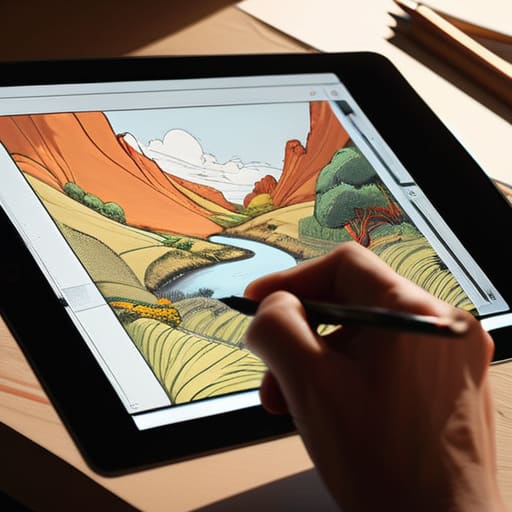
When we talk about moving beyond static imagery, we have to look at the bones of the medium. I often find myself returning to sequential art principles when I’m advising agencies on how to move a viewer through a digital experience. It isn’t enough to have a beautiful hero image; you need to consider how the eye travels from one moment to the next. By applying basic storyboarding for illustrators to a web interface or a brand campaign, you create a sense of progression. You aren’t just showing a product; you are guiding the user through a lived experience, one frame at a time.
This requires a disciplined approach to how we layer information. Instead of cluttering the interface, use compositional storytelling to direct focus. Think about the negative space between your elements as much as the elements themselves—that “breath” is where the meaning settles. When we master the rhythm of the sequence, we stop merely decorating a layout and start building a cohesive visual narrative that respects the user’s intelligence and their time.
Conveying Mood Through Color and Human Emotion

Color isn’t just a decorative choice; it’s the silent pulse of a piece. When I’m working through a brand identity or a complex visual sequence, I think about how certain hues can bypass the intellect and hit the gut immediately. You can use the most technically perfect linework in the world, but if your palette is emotionally hollow, the connection is lost. Conveying mood through color requires an understanding of how light and shadow interact with our collective memory. A desaturated, dusty blue might evoke a sense of quiet nostalgia, while a sudden, sharp jolt of ochre can signal tension or even a flicker of hope.
It’s about more than just picking a pretty scheme from a digital library. To truly master the emotional impact in art, you have to treat color as a way to guide the viewer’s internal temperature. I often find myself sketching out color studies in my physical notebook before even touching a stylus, trying to see if the warmth of a sunset can actually ground a character’s journey. When we align our palette with the underlying tension of the scene, we stop just showing a picture and start evoking a feeling.
The Craft of the Narrative: Five Ways to Ground Your Illustration
- Stop aiming for perfection. In my years of type design, I’ve learned that a perfectly sterile line often lacks soul. When you’re illustrating a story, leave in the slight wobbles or the organic textures; those “imperfections” are the visual equivalent of a heartbeat, reminding the viewer that a human hand was behind the work.
- Respect the silence between the frames. Good storytelling isn’t about cramming every detail into a single image. It’s about knowing when to pull back and let the viewer’s imagination do the heavy lifting. Use negative space to create a sense of breath, allowing the narrative to settle rather than rushing to overwhelm the eye.
- Prioritize character over ornament. It’s easy to get lost in beautiful textures or trendy color palettes, but if the character’s intent isn’t clear, the story fails. Focus on the small, kinetic details—the slump of a shoulder or the way a hand grips a tool—to communicate more than a thousand words of descriptive copy ever could.
- Use visual rhythm to guide the gaze. Just as I approach the spacing of a typeface, you must approach the flow of your illustrations. Create a visual path that leads the eye naturally from one focal point to the next, ensuring the viewer experiences the narrative arc in the order you intended, rather than getting lost in the noise.
- Design for the friction of the medium. Whether you are working on a high-res retina display or a printed zine, consider how the viewer interacts with the work. Don’t just create an image; create an experience that acknowledges the way humans actually look at things—slowly, thoughtfully, and often with a sense of curiosity.
The Intentionality of the Mark
Stop treating illustration as mere decoration; use it as a deliberate layer of communication that guides the eye and provides the emotional context that a sterile UI often lacks.
Embrace the “human friction” in your visual narratives by allowing for subtle imperfections and organic textures that remind the user there is a creator behind the screen.
Prioritize narrative cohesion over visual flash, ensuring that every stroke and color choice serves the broader story of the brand rather than just chasing a fleeting aesthetic trend.
The Soul in the Sequence
“An illustration shouldn’t just act as a visual placeholder; it should function like a well-placed beat in a song, creating the necessary tension and release that allows a user to actually feel the narrative moving beneath their fingertips.”
Ingrid Bellamy
The Human Thread in a Digital World

We’ve looked at how sequential art provides the structure for a narrative and how color acts as the emotional shorthand for the viewer. But at its core, illustration storytelling isn’t about mastering a specific software or following the latest trend in vector aesthetics. It is about the intentional marriage of visual rhythm and emotional resonance. When we stop treating illustrations as mere decorative filler and start treating them as essential vessels for meaning, we bridge the gap between a cold interface and a living experience. We move from simply showing a user something to actually making them feel something.
As we move further into an era of rapid automation and algorithmic generation, my hope is that we don’t lose our grip on the friction that makes art meaningful. Don’t be afraid of the slight imperfection or the hand-drawn line that breaks the digital grid; those are the very things that signal a human presence on the other side of the glass. Use your tools to amplify your perspective, not to mask it. Ultimately, our job is to ensure that every stroke serves a purpose and every image honors the complexity of the human spirit. Keep drawing, keep thinking, and never let the machine dictate the soul of your story.
Frequently Asked Questions
How do I maintain a consistent visual narrative without letting the illustrations overwhelm the core brand typography?
Think of your typography as the structural bones and your illustrations as the skin. To keep the balance, let the type do the heavy lifting for legibility and hierarchy. Use illustration to provide texture or emotional resonance, but avoid competing for the same visual weight. I often use generous white space to give both elements room to breathe; if the illustration is loud, let the typeface be quiet, steady, and intentional.
Where is the line between intentional visual storytelling and just adding decorative noise to a digital interface?
The line is drawn at purpose. If an illustration exists only to fill a void or satisfy a trend, it’s noise—it’s visual clutter that competes with the user’s focus. Intentional storytelling, however, acts as a bridge. It should guide the eye, clarify a complex concept, or evoke a specific, necessary feeling. If you can remove the graphic without losing the soul or the clarity of the message, it probably shouldn’t have been there in the first place.
How can we use illustration to guide a user through a complex flow without sacrificing the speed and efficiency of the UX?
The trick is to treat illustration as a wayfinding tool, not decoration. Think of it like a well-designed typeface: it should guide the eye without shouting. Use subtle, directional cues—a soft gaze in a character’s eyes or a gentle line of motion—to nudge users toward the next logical step. Keep the visual weight light. If the illustration competes with the CTA for attention, you’ve lost the rhythm of the flow.
