I still remember the tactile resistance of a heavy Moleskine page and the way a fountain pen would catch slightly on the grain of the paper. There was a certain necessary friction in physical art that we’ve been told to abandon in favor of seamless efficiency. Lately, I’ve been watching the industry rush toward automated brushes and “smart” textures that promise to do the heavy lifting for you, but I find it deeply unsettling. We are being sold the idea that the best digital painting methods are the ones that require the least amount of human struggle, as if the goal of art is to eliminate the artist entirely.
I’m not here to sell you on a new software subscription or a “magic” brush pack that promises perfection at the click of a button. Instead, I want to talk about how we can reclaim that lost intentionality by using digital painting methods that actually honor the hand behind the stylus. My goal is to share a few grounded, experience-based approaches that prioritize purposeful mark-making over mindless automation. We aren’t looking for shortcuts; we are looking for ways to make the digital canvas feel just as alive as the paper on my desk.
Table of Contents
- Mastering Tablet Pressure Sensitivity Settings for Organic Lines
- Intuitive Color Blending in Digital Art to Mimic Life
- Reclaiming the Tactile: Five Ways to Infuse Intent into Your Digital Workflow
- The Intentionality of the Digital Stroke
- The Illusion of Ease
- The Intentional Mark
- Frequently Asked Questions
Mastering Tablet Pressure Sensitivity Settings for Organic Lines
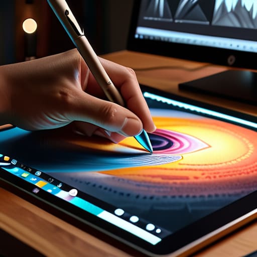
I’ve spent countless hours at my desk, sometimes losing track of the daylight, trying to reconcile the sterile perfection of a stylus with the messy, tactile reality of a graphite pencil. Most people treat their hardware as a set-and-forget tool, but if you want to avoid that “plastic” look, you have to dive into your tablet pressure sensitivity settings. It isn’t just about how hard you press; it’s about the curve of the response. I prefer a steeper curve that requires a deliberate, intentional stroke to achieve full opacity. This forces a certain level of discipline, preventing those accidental, heavy-handed marks that often plague a rushed concept art workflow.
When you find that sweet spot, the digital line begins to breathe. It stops feeling like a mathematical calculation and starts feeling like a gesture. I often find myself tweaking my digital brush settings tutorial notes, reminding myself that the goal is to mimic the subtle depletion of ink or the varying grit of charcoal. By fine-tuning how pressure affects not just size, but also flow and tilt, you reclaim that lost sense of physical resistance that makes a piece feel truly alive.
Intuitive Color Blending in Digital Art to Mimic Life
There is a specific kind of frustration that comes with the “perfect” digital gradient. In the physical world, color doesn’t just snap from one value to another; it bleeds, it muddies, and it settles into the tooth of the paper. When I’m working on a piece, I find myself fighting against the overly polished defaults of most digital art software techniques. If the transition is too seamless, it loses its heartbeat. To combat this, I treat my digital canvas more like a workspace of physical pigments rather than a collection of mathematical hex codes.
I’ve learned that true color blending in digital art requires a bit of intentional messiness. Instead of relying on a single automated smudge tool, I prefer a more tactile approach: layering low-opacity strokes and adjusting the flow settings to mimic the way oil paint builds up on a palette. It’s about managing the tension between the software’s precision and the unpredictable nature of light. By focusing on how colors actually interact—rather than just how they look side-by-side—you can achieve a sense of depth that feels genuinely alive.
Reclaiming the Tactile: Five Ways to Infuse Intent into Your Digital Workflow
- Stop relying on the “Undo” command as a crutch. I’ve found that limiting my ability to backtrack forces me to commit to a stroke, much like the permanence of ink on paper, which ultimately builds more confidence in my linework.
- Build custom brush textures that aren’t “perfect.” Digital brushes often feel too clinical; I spend a lot of time layering grain and subtle imperfections into my presets to mimic the way pigment actually sits on a physical canvas.
- Work with limited color palettes to avoid the digital “mud.” Instead of scrolling through a million hex codes, I pick five or six intentional tones and learn to find the nuance within them, respecting the way light actually interacts with surface.
- Integrate your sketchbook into the process. I never start a digital piece without first working out the core composition with my fountain pen; that initial friction of physical media provides a structural soul that a stylus can’t replicate on its own.
- Treat your layers like a physical stack of vellum. Instead of creating fifty separate layers for every tiny detail, try grouping your thoughts and working more broadly, which encourages a more cohesive, painterly approach rather than a fragmented, surgical one.
The Intentionality of the Digital Stroke
Stop fighting your tools; instead, calibrate your hardware to mirror the physical resistance you’d expect from a real brush or pencil.
True color depth comes from understanding how light interacts with pigment, not from letting an algorithm pick your palette for you.
Use digital methods to enhance your unique hand, not to mask it—the goal is to find the soul in the software, not to let the software find it for you.
The Illusion of Ease
We have to stop confusing efficiency with artistry; a digital brush that smooths out every tremor and corrects every wobble isn’t a tool for creation, it’s a tool for erasure. Real craft lives in the slight imperfections—the grit and the resistance that remind us a human hand was actually there.
Ingrid Bellamy
The Intentional Mark
At the end of the day, mastering digital painting isn’t about finding a magic brush or a perfect software preset; it’s about reclaiming the agency we often lose to automation. We’ve looked at how fine-tuning pressure sensitivity can restore the weight of a stroke and how thoughtful color blending can bridge the gap between a sterile screen and the messy, vibrant reality of the physical world. When we stop treating our tablets like mere input devices and start treating them as extensions of our own hands, we move past simple mimicry. We begin to use these digital methods to cultivate a sense of presence that makes the work feel undeniably alive, rather than just mathematically correct.
As you close your sketchbook and return to the glow of your monitor, I urge you to resist the temptation of the “undo” button as a crutch for perfectionism. Perfection is often the enemy of character. Instead, embrace the slight wobbles in your lines and the unexpected shifts in your palette. Use these tools to amplify your unique perspective, not to smooth it away into a generic, polished sheen. The goal isn’t to make digital art look exactly like oil on canvas, but to find a way to honor the friction of the human touch within the digital medium. That is where the soul of your work truly resides.
Frequently Asked Questions
How can I prevent my digital brushwork from looking too "perfect" or clinical when I'm working on a high-resolution canvas?
The trap of high resolution is that it offers a sterile, infinite clarity that kills character. To fight that clinical feel, I suggest introducing intentional imperfection. Stop relying on the “perfect” stabilizer; turn it down. Use custom brushes with slight jitter in the opacity or flow settings to mimic the uneven ink distribution of a real nib. If a stroke feels too clean, layer in a subtle, low-opacity texture overlay to break up the digital smoothness.
Are there specific hardware setups that better replicate the tactile resistance of traditional media, like oils or charcoal?
It’s a common frustration. To get that grit back, I always suggest looking beyond the screen. A high-end tablet with a textured screen protector—something that mimics the tooth of heavy-weight paper—is essential. If you’re chasing charcoal, pair a stylus with a matte, friction-heavy surface. For oils, some artists use specialized “paper-feel” films. It’s about creating that necessary resistance; without a bit of drag, your strokes will always feel too slippery and unmoored.
How do I balance the efficiency of digital layers with the need to maintain the organic, messy flow of a physical painting?
The temptation to hide behind a hundred layers is real, but perfection is often the enemy of soul. I try to limit myself to a few core layers—one for structure, one for color, one for texture—and treat them like sheets of heavy-weight paper. If you find yourself over-organizing, step back. Force yourself to paint directly into the mess. Sometimes, the most beautiful moments happen when you can’t simply “undo” the mistake.