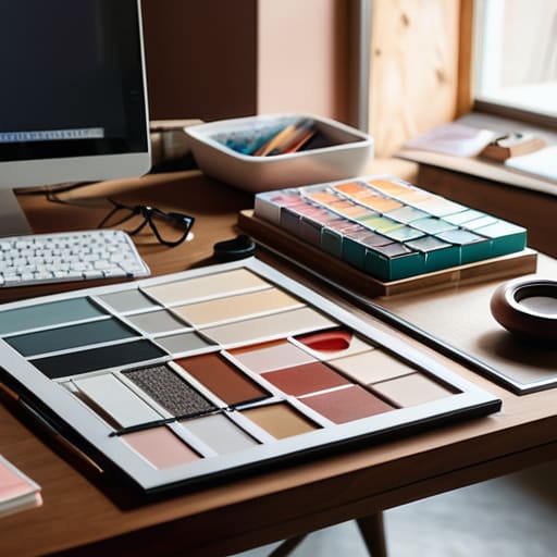
I remember sitting in a dimly lit studio back in the late nineties, the air thick with the scent of spray adhesive and the rhythmic snip-snip of X-Acto blades against heavy cardstock. We didn’t have algorithms to tell us if a composition felt “balanced”; we had our eyes, our hands, and a deep, physical understanding of how weight lived on a page. Today, I see so many designers treating art direction basics like a checklist of trendy filters or a prompt for a generative tool, as if style is something you simply apply to a finished product. It’s a mistake. True direction isn’t about decorating a layout; it’s about the intentionality of every single choice you make before the first pixel is even placed.
I’m not here to give you a glossy, superficial manual on how to make things look “pretty” for a portfolio. Instead, I want to share the hard-won principles that have guided me from the era of physical paste-ups to the digital frontier. We are going to strip away the hype and focus on the foundational mechanics of visual storytelling—the kind of knowledge that empowers you to lead a creative vision rather than just following a trend.
Table of Contents
Visual Storytelling Principles Over Mere Decoration

When I look at a layout, I’m not looking for what’s “pretty.” I’m looking for the narrative thread. There is a massive difference between decorating a page and employing true visual storytelling principles to guide a viewer’s eye. Decoration is noise; it’s the digital equivalent of cluttering a desk with trinkets that serve no purpose. Real art direction, however, uses every element—the weight of a stroke, the tension in a margin, the way light hits a subject—to whisper a specific truth about the brand.
This requires a deep understanding of design hierarchy and composition. You aren’t just placing an image next to a block of text; you are orchestrating a sequence of glances. If the eye doesn’t know where to land first, the story is lost in the shuffle. I often find myself sketching out these paths in my notebook before I ever touch a mouse. We have to move past the idea that art direction is just “making things look good” and start seeing it as the intentional architecture of human emotion and meaning.
Design Hierarchy and Composition With Purpose
When we talk about design hierarchy and composition, it is easy to get lost in the mechanics of grids and golden ratios. But if you treat composition as a mathematical problem to be solved, you’ve already lost the soul of the work. True art direction isn’t about balancing weights on a canvas; it’s about guiding the viewer’s eye through a narrative. I often find that junior designers try to make everything scream for attention at once. When every element is loud, the result is just noise. Instead, you have to decide what matters most. You need to create a path—a deliberate sequence of visual cues that tells the viewer where to look, what to feel, and when to move on.
This is where typography and visual language become your most vital tools. A typeface isn’t just a way to convey information; it is a structural element that dictates the rhythm of the page. I tell my clients that a well-composed layout should feel like a conversation, not a lecture. By using scale, negative space, and intentional contrast, you aren’t just organizing content—you are building a framework that respects the user’s attention. When you master this, you move beyond mere decoration and start creating work that actually commands presence.
Five Ways to Bring Intentionality Back to the Canvas
- Stop treating color as a mood board afterthought. Choose your palette with the same rigor you’d use to select a typeface; every hue should serve a functional role in directing the eye or conveying a specific, unshakeable brand truth.
- Respect the white space. In my early days of paste-ups, we knew that breathing room wasn’t “empty”—it was structural. In digital design, don’t be afraid of the void; use it to give your core message the gravity it deserves.
- Audit your imagery for authenticity. If a photograph looks like it was plucked from a generic stock library, it’s diluting your brand’s soul. Seek out visuals that possess a bit of grit, a bit of imperfection, and a lot of human connection.
- Master the tension between type and image. Art direction is often found in the relationship between the two. Don’t just layer text on top of a photo; let them interact, overlap, or push against one another to create a sense of depth and movement.
- Design for the friction of the real world. Remember that your work isn’t just viewed on a pristine, high-resolution monitor in a controlled studio. It lives in the hands of people on subway rides and in bright sunlight. Test how your direction holds up under the messy reality of human use.
The Core Essentials of Intentional Art Direction
Stop treating art direction as a cosmetic layer; treat it as the structural soul of your work that dictates how a user feels, not just how they look.
Prioritize the “why” behind every visual choice—if a color, typeface, or layout element doesn’t serve the underlying narrative, it’s just digital noise.
Respect the friction of the human experience by building compositions that guide the eye naturally rather than forcing engagement through aggressive, hollow aesthetics.
The Soul of the System
Art direction isn’t about deciding which colors look pretty; it’s about deciding how a brand breathes. If your visual choices don’t create a sense of intentionality—the kind of friction that makes a person pause and actually feel something—then you aren’t directing; you’re just decorating.
Ingrid Bellamy
The Intentional Path Forward
At its core, effective art direction isn’t about mastering a specific software or chasing the latest aesthetic trend that popped up on a mood board this morning. It is about the synthesis of storytelling, purposeful hierarchy, and a deep respect for how a human eye actually navigates a space. We have discussed how to move beyond mere decoration to find the narrative thread in a composition, and how to use layout not just to organize information, but to guide the viewer’s intuition. When we stop treating design as a collection of assets and start treating it as a cohesive language, we move away from the noise and toward something that actually carries weight.
As you move back to your desks—or your sketchbooks—I challenge you to look for the friction. In an age where automation can generate a thousand “perfect” layouts in seconds, your value lies in the intentionality of your choices. Don’t be afraid to let a design breathe, or to let a single, well-placed element command the room. True art direction is the act of protecting the soul of a project from the vacuum of mindless efficiency. Build things that demand to be felt, not just seen, and always remember that the most powerful tool you possess is your own perspective.
Frequently Asked Questions
How do I maintain a consistent visual voice when I'm collaborating with multiple designers or contributors?
The trap is relying on a static PDF of brand guidelines that no one actually reads. To maintain a true visual voice, you need a shared vocabulary, not just a shared folder. I always advocate for creating a “living” style guide—one that focuses on the intent behind the decisions. Instead of just saying “use this typeface,” explain the weight and rhythm it should carry. When everyone understands the soul of the work, the consistency follows naturally.
Where is the line between effective art direction and over-designing a project until the original intent is lost?
The line is found in the intent. If you’re adding a texture or a typeface because it feels “cool,” but it’s obscuring the message, you’ve crossed it. I always ask myself: Does this element serve the core concept, or am I just decorating a void? Effective art direction acts as a lens, focusing the viewer’s eye on the truth of the brand. Over-designing is just noise—it’s the ego of the designer drowning out the purpose of the work.
How can I apply these principles to digital interfaces without losing the tactile, intentional feel of traditional design?
It starts with embracing friction. In digital spaces, we often default to frictionless, “perfect” smoothness, but that’s where soul goes to die. To keep that tactile feel, I look for micro-interactions that mimic physical weight—think subtle easing in a transition or a typeface that feels like it has actual ink bleed. Don’t aim for sterile perfection; aim for intentionality. Use negative space not just as a void, but as a breathing room that honors the user’s focus.
