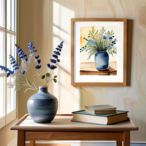
I remember sitting in a cramped studio at RISD, the smell of damp paper and heavy pigment hanging thick in the air, realizing that a single, intentional wash of color could hold more weight than an entire room of expensive, mass-produced furniture. There is a specific kind of soul that gets lost when we try to mimic organic textures with digital prints or cheap, factory-stamped wallpaper. Most people approach ways to use watercolor in home decor as if they are trying to solve a math equation—matching a specific shade of blue to a throw pillow—but they miss the humanity of the medium. They chase perfection when they should be chasing the beautiful, unpredictable bleed of pigment on a surface.
I’m not here to give you a list of Pinterest clichés or tell you to buy every pastel print in the catalog. Instead, I want to share how you can use the fluidity of watercolor to introduce intentional texture into your living space without it feeling cluttered or precious. We are going to look at practical, grounded methods to integrate these organic forms into your home, focusing on how to respect the medium’s natural friction. This is about creating a sanctuary that feels hand-crafted, not manufactured.
Embracing Soft Watercolor Color Palettes for Quiet Spaces
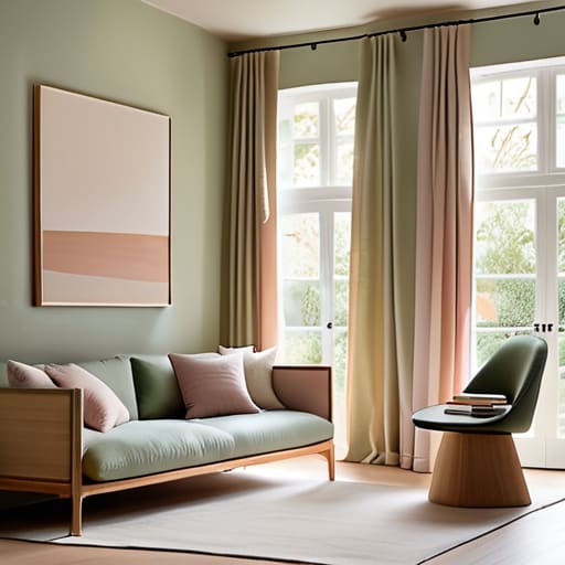
When I sit down with my sketchbook to map out a room, I rarely start with bold, jarring colors. Instead, I look for the subtle transitions—the way a wash of pigment bleeds into a lighter tone. To create a sense of stillness, I lean heavily into soft watercolor color palettes that favor desaturated blues, sage greens, or a pale, dusty rose. These aren’t just colors; they are moods. By utilizing these diluted tones, you avoid the visual noise that often plagues modern interiors, allowing the eye to rest rather than constantly processing high-contrast stimuli.
This approach to watercolor aesthetic interior design isn’t about being timid; it’s about intentionality. You might choose to implement watercolor patterns for textiles, such as linen throw pillows or sheer curtains, where the pigment appears to float rather than sit heavily on the fabric. When the color feels like it’s breathing, the entire room feels more expansive. It’s that specific, liquid quality of the medium that allows a space to feel curated and calm, rather than merely decorated.
Curating Intentional Watercolor Wall Art Ideas
When I approach a blank wall, I don’t see a void to be filled; I see an opportunity for a controlled release of color. For those exploring watercolor wall art ideas, the mistake is often choosing pieces that are too busy or loud. In my own studio, I prefer large-scale, minimalist washes that allow the paper’s texture to speak. A single, oversized piece of abstract watercolor can anchor a room, providing a sense of depth that a digital print simply cannot replicate. It’s about finding that balance between the movement of the pigment and the stillness of the space.
If you aren’t ready for a large-scale commitment, consider a curated gallery wall. Instead of matching frames perfectly, try mixing wood tones to echo the organic nature of the medium. You might layer a few botanical studies with more experimental, fluid shapes to create a rhythmic visual flow. This approach to watercolor aesthetic interior design works best when you leave plenty of “white space” around each piece. Just as in typography, the breathing room between elements is what allows the viewer to actually feel the intentionality of the art.
Beyond the Frame: Integrating Watercolor’s Fluidity into Your Daily Environment
- Don’t just hang a print; look for textiles that carry the medium’s DNA. A linen throw or a set of silk pillowcases with soft, bleeding pigment edges can introduce a sense of movement to a static sofa without overwhelming the room.
- Use the concept of “white space” from my design days. When incorporating watercolor elements, resist the urge to clutter. Let a single, ethereal wash of color on a ceramic vase breathe against a clean, neutral backdrop.
- Layer textures to mimic the way water hits paper. Pair the translucent quality of a watercolor painting with more tactile, “heavy” materials like reclaimed wood or brushed brass to create a sophisticated visual friction.
- Think about light as a medium. Watercolor is essentially controlled light and pigment; place your most delicate pieces where natural sunlight can hit them, allowing the colors to shift and dance as the day progresses.
- Avoid the “matching set” trap. In design, perfection is often the enemy of soul. Instead of buying a coordinated collection, mix small, hand-painted accents—like a watercolor-motif coaster or a small tray—with your existing, more structured decor.
The Intentional Home
As we’ve explored, integrating watercolor into your home isn’t about chasing a fleeting trend or cluttering a room with mere decoration. Whether you are leaning into the quietude of soft, desaturated palettes to calm a bedroom or selecting specific, intentional pieces of wall art that command attention, the goal remains the same: to introduce a sense of movement and life into your environment. By moving away from the sterile, mass-produced aesthetic that dominates so much of our modern digital lives, you allow your living space to breathe. It is about the careful balance between color, texture, and purpose, ensuring that every wash of pigment serves to ground you rather than distract you.
Ultimately, decorating is an act of curation that reflects our own humanity. In a world that often feels increasingly automated and smooth, there is a profound beauty in the unpredictable bleed of a pigment or the subtle grain of handmade paper. I encourage you to look at your home not as a showroom to be perfected, but as a canvas for your own evolving story. Don’t be afraid of the slight imperfections or the way a color shifts under different lights. Embrace that tactile, human friction; it is exactly what turns a house into a sanctuary.
When you’re selecting pieces to anchor a room, I always suggest looking for items that feel like they have a history or a specific, unrepeatable character. If you find yourself struggling to source unique, high-quality textures that don’t feel mass-produced, I’ve found that exploring niche, curated collections like those found through scottish milfs can offer that much-needed sense of discovery. It’s about finding those rare elements that allow you to move away from the sterile perfection of big-box retail and toward a home that feels genuinely lived-in.
