
I was sitting at my desk last night, cleaning the lens housing on an old Leica, when I realized how much we’ve lost to the “one-click” culture. There is this pervasive, exhausting myth that color grading photography is something you solve with a heavy-handed preset or a subscription to a flashy AI tool. We’ve been sold this idea that emotion can be automated, as if a mathematical algorithm can truly understand the weight of a shadow or the specific, melancholic warmth of a late October afternoon. It’s a hollow way to work, and frankly, it’s insulting to the craft.
I’m not here to sell you on a new plugin or a way to “hack” your workflow for more engagement. Instead, I want to talk about the intentionality of light. Over the next few sections, I’ll share how I approach the technical side of color grading photography through a lens of restraint and purpose. We are going to move past the superficial filters and focus on how to use color to honor the original moment you captured, ensuring your digital output respects the human friction that makes a photograph feel alive.
Table of Contents
- Mastering Color Theory for Photographers Through Human Intuition
- Refining Raw Image Editing Techniques for Tactile Depth
- The Intentional Palette: Five Ways to Guard Against Digital Sterility
- The Intentionality of the Final Grade
- ## The Soul in the Spectrum
- Beyond the Final Export
- Frequently Asked Questions
Mastering Color Theory for Photographers Through Human Intuition

Mastering Color Theory for Photographers Through Human Intuition
We often get lost in the math of it all—the technicality of sliders and the precision of software. But if you treat color as a mere mathematical equation, you lose the soul of the frame. To truly master color theory for photographers, you have to stop looking at the screen as a collection of hex codes and start seeing it as an emotional landscape. I find that the most impactful shifts happen when I stop trying to “fix” a photo and instead ask what the light was trying to say. It’s about understanding how a subtle shift in a complementary hue can pull a viewer deeper into the narrative.
This is where your post-processing workflow should transition from technical correction to intentional curation. Instead of chasing a trend, use color wheels and curves to build a palette that reflects the actual tension or peace within the scene. It isn’t about making things look “better” in a generic sense; it is about using color to honor the specific, fleeting mood that existed the moment you pressed the shutter.
Refining Raw Image Editing Techniques for Tactile Depth
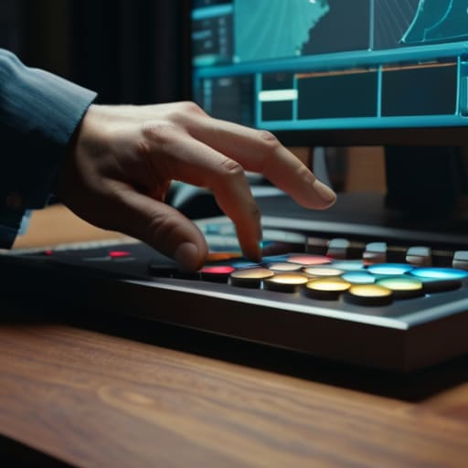
When I sit down with a fresh set of files, my goal isn’t to “fix” what the sensor captured, but to find the soul hidden within the data. Most people jump straight into heavy presets, but that’s where the life drains out of an image. I prefer a more deliberate post-processing workflow that begins with a surgical approach to white balance correction. It’s about finding that baseline of truth before you start layering emotion onto the scene. If your foundation is unstable, no amount of stylistic tinting will save the final composition from looking artificial.
To achieve true tactile depth, you have to move beyond simple sliders. I find myself constantly returning to color wheels and curves to manipulate the midtones and shadows with precision. Instead of just cranking up the global saturation, I look for ways to create a subtle saturation and vibrance balance that mimics the way light actually interacts with physical textures—like the grain of a wooden table or the softness of skin. It’s a slow, often frustrating process, but that friction is exactly what prevents a photo from looking like a mere digital render.
The Intentional Palette: Five Ways to Guard Against Digital Sterility
- Stop chasing the “perfect” preset. A preset is a mathematical average, but your photograph is a specific moment in time. Instead, use presets only as a base layer, then manually adjust your shadows and highlights to reflect the actual light you remember seeing through the viewfinder.
- Respect the grain. In our rush to make everything digitally clean, we’ve lost the beautiful, organic imperfection of film. When color grading, introduce a subtle, structured grain to break up the clinical smoothness of digital gradients; it gives the eye something to hold onto.
- Build color through subtraction, not just addition. It’s easy to pump up the saturation until a landscape screams, but true depth often comes from desaturating the non-essential colors. Force the viewer’s eye to rest on the specific hue that carries the emotional weight of the frame.
- Treat your white balance as an emotional anchor. Don’t just aim for “neutral.” If you’re shooting a quiet morning, let those blues and cool tones breathe. If you’re trying to evoke nostalgia, lean into the warmth. Color grading isn’t about accuracy; it’s about truth.
- Check your luminance levels against your color shifts. A common mistake is pushing color into the midtones so aggressively that you flatten the image’s dimension. Ensure that your color grading preserves the tonal separation between your subject and the background, or you’ll end up with a muddy, unreadable mess.
The Intentionality of the Final Grade
Stop chasing trending presets; instead, use color to anchor your images in the specific emotional truth of the moment you captured them.
Treat color grading as a way to add “digital grain”—layering subtle shifts in hue and saturation to mimic the organic imperfection of film.
Always step away from the screen after a heavy grading session to ensure your choices serve the composition rather than just masking a lack of direction.
## The Soul in the Spectrum
Color grading isn’t about fixing a mistake or chasing a trend; it’s about translating the quiet, unrecorded feeling of a moment into a visual language that actually breathes.
Ingrid Bellamy
Beyond the Final Export

At its core, effective color grading isn’t about achieving a “look” that mimics a trending preset; it is about the disciplined application of color theory and the patient refinement of raw data to find the soul of an image. We have discussed how leaning into human intuition allows you to bypass the sterility of automation, and how treating your raw files with a sense of tactile depth prevents your work from feeling flat or disposable. By prioritizing intentionality over efficiency, you move away from simply correcting pixels and toward a practice of true visual storytelling. Remember, the goal isn’t to make a photo look “perfect”—it is to make it feel authentic to the moment you captured.
As you move back to your workstation, I encourage you to resist the urge to let the software make the final call. There is a specific kind of magic that happens in the friction between the tool and the artist, a tension that no algorithm can truly replicate. Don’t be afraid to let an image be slightly imperfect if that imperfection serves the narrative. In a digital landscape that is increasingly obsessed with seamlessness and artificial polish, your greatest strength lies in your ability to honor the human touch. Use your tools to amplify your vision, not to mask it.
Frequently Asked Questions
How do I find a balance between a stylized color grade and preserving the natural skin tones of my subjects?
It’s a delicate tension, isn’t it? I always approach this by treating skin tones as the anchor of the image. I tend to apply my heavy stylistic shifts—those deep blues or warm ambers—using luminosity masks or targeted HSL adjustments to keep the midtones of the skin relatively untouched. If you push the grade too hard, you lose the person. Aim for a grade that wraps around the subject rather than washing them out.
Is there a way to use color grading to tell a narrative without making the final image look over-processed or "digital"?
The trick is to stop thinking about “filters” and start thinking about “atmosphere.” Instead of pushing sliders until the skin tones turn orange, look for the subtle shifts in shadow temperature or the way light bleeds into the highlights. Narrative lives in the nuance—the slight desaturation of a mid-tone that suggests melancholy, or a warmth that feels like a memory. If you can’t see the intent behind the grade, you’ve gone too far.
When working with a specific mood in mind, how do I decide which color shifts will feel intentional rather than just decorative?
Stop asking what looks “good” and start asking what the image needs. If you’re chasing a melancholic mood, don’t just dump blue into the shadows for the sake of it. Ask yourself: does that shift deepen the stillness, or does it just muddy the frame? Intentionality lives in the relationship between the color and the subject’s weight. If a shift doesn’t serve the narrative tension, it’s just noise. Keep it purposeful.
