Core concepts of user experience design.

Core Concepts of User Experience Design

I was sitting at my desk last night, the smell of machine oil from a half-disassembled Leica lingering in the air, when I realized how much we’ve lost in the rush toward “seamlessness.” We’ve become obsessed with removing every ounce of resistance from our digital lives, treating user experience design as if its only job is to make everything disappear into a frictionless void. But when you strip away the weight and the texture, you aren’t making things easier; you’re making them hollow. We’ve traded the satisfying click of a well-built tool for a series of ghostly, weightless swipes that leave the user feeling strangely disconnected from their own work.

I’m not here to sell you on the latest trend or a suite of automated shortcuts that promise to do your thinking for you. Instead, I want to talk about how we can bring intentionality back to the screen. Over the next few sections, I’m going to share what I’ve learned from twenty years of shifting from physical paste-ups to digital pixels: how to design interfaces that respect the human hand and empower the creator rather than just automating them into submission.

Table of Contents

Honoring the Human Touch Through User Research Methodologies

Honoring the Human Touch Through User Research Methodologies.

When we talk about user research methodologies, it’s easy to get lost in the data—the heatmaps, the click rates, and the endless spreadsheets. But if we treat people as mere data points, we’ve already lost the essence of what we’re trying to build. I’ve found that the most profound insights don’t come from a dashboard; they come from watching a person struggle with a menu or seeing the hesitation in their eyes when a layout feels cluttered. We need to move beyond mere observation and toward true empathy.

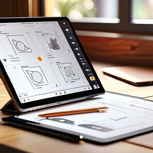
To do this, we must integrate a more tactile approach into our user-centered design process. Instead of rushing toward high-fidelity screens, I often find value in returning to paper. There is a specific kind of clarity that comes from sketching out a flow by hand. This stage of prototyping and wireframing allows us to test the logic of an interaction before we ever worry about the polish. By slowing down and focusing on the human intent behind the action, we ensure that our digital tools feel less like obstacles and more like natural extensions of the creator’s hand.

Reducing Cognitive Load in Interface Design to Respect Intent
Reducing Cognitive Load in Interface Design to Respect Intent

When we talk about efficiency, we often fall into the trap of thinking “faster is better.” But in my experience, a high-speed interface that leaves a user feeling frantic isn’t a success; it’s a failure of empathy. To truly respect a creator’s intent, we have to address cognitive load in interface design by stripping away the non-essential. It’s about creating breathing room. Just as I wouldn’t crowd a page with too many typefaces, we shouldn’t crowd a workspace with too many competing calls to action.

Every unnecessary icon or redundant notification acts as a micro-distraction, pulling the user away from their actual flow. During my time in prototyping and wireframing, I’ve learned that the most elegant solutions are often the ones that disappear. We aren’t just building layouts; we are managing the user’s mental energy. By prioritizing clarity over cleverness, we ensure that the tool remains a quiet partner in their process, rather than a loud, demanding presence that demands constant attention.

Five Ways to Protect the Craft in Your UX Workflow

  • Prioritize meaningful friction. Not every interaction should be a frictionless slide toward a conversion; sometimes, a deliberate pause—a confirmation or a moment of reflection—respects the user’s agency and prevents mindless clicking.
  • Design for the periphery. A good interface doesn’t just command the center of the screen; it acknowledges the context of the person using it, whether they are working in a quiet studio or a chaotic transit hub.
  • Treat typography as a structural element, not an afterthought. Type carries the weight of your brand’s voice; if the hierarchy is broken, the user’s mental model of the task will collapse along with it.
  • Build for longevity, not just for the current trend cycle. Avoid the temptation to chase every new aesthetic whim; instead, lean into principles of clarity and utility that will remain legible long after the current design trend has faded.
  • Validate through observation, not just data. A heat map can tell you where a cursor hovered, but it won’t tell you the frustration in a user’s eyes or the hesitation in their hands. Get back to watching how real people actually struggle with your work.

Designing for Intent, Not Just Interaction

True UX isn’t about removing every ounce of resistance; it’s about ensuring that the friction a user encounters is meaningful and serves to ground their intentions.

We must move beyond optimizing for sheer engagement metrics and start designing for the quality of the human experience, prioritizing clarity over clutter.

The most successful interfaces act as quiet companions to the creator, providing the necessary tools to execute a vision without getting in the way of the craft.

The Illusion of Seamlessness

We often mistake frictionless design for good design, but true user experience isn’t about removing every moment of thought; it’s about ensuring that when a user pauses, they are pausing to create or decide, not because they are lost in a digital maze.

Ingrid Bellamy

The Path Forward: Designing with Intention

The Path Forward: Designing with Intention.

Ultimately, great user experience design isn’t about how many features we can cram into a single viewport or how quickly we can automate a user’s journey. It’s about the quiet strength found in intentionality. By grounding our work in deep human research and being disciplined enough to reduce cognitive load, we move away from mere digital decoration and toward true utility. We must remember that every pixel we place and every interaction we engineer should serve a specific purpose, honoring the way people actually think and move through their digital lives rather than forcing them to adapt to our shortcuts.

As we look toward an increasingly automated future, my hope is that we don’t lose the soul of the craft in the pursuit of seamlessness. Technology should act as a bridge, not a barrier, between a person and their creative goals. Let’s commit to building interfaces that don’t just work, but actually respect the user’s agency and dignity. When we design with empathy and a respect for human friction, we aren’t just making tools; we are building a digital landscape that feels as meaningful and tactile as a well-worn sketchbook.

Frequently Asked Questions

How can we balance the push for seamless, frictionless automation with the need to maintain a sense of human agency in our interfaces?

We’ve become obsessed with “frictionless” design, but total smoothness often leads to a loss of control. When an interface anticipates every move, the user becomes a passenger rather than a pilot. To maintain agency, we must design “meaningful friction”—moments where the system pauses to ask for intent. Don’t automate the soul out of the process; instead, build tools that act as sophisticated extensions of the hand, leaving the final, decisive stroke to the human.

In an era of rapid prototyping, what are the practical ways to ensure that deep, qualitative research doesn't get sacrificed for speed?

We’ve become addicted to the “fail fast” mantra, but speed shouldn’t mean shallow. To keep depth in the mix, I integrate small, focused ethnographic observations into the prototyping cycle itself. Instead of massive, sweeping studies, I look for “micro-moments” of friction during testing. It’s about slowing down just enough to ask why a user hesitated, rather than just noting that they did. Don’t let the sprint outpace the soul of the work.

How do we design digital systems that feel intentional and crafted rather than just being another collection of optimized, algorithmically driven patterns?

We have to stop designing for “engagement metrics” and start designing for agency. To move beyond algorithmic patterns, we must reintroduce purposeful friction—those small, intentional moments that allow a user to pause and think rather than just react. This means prioritizing bespoke typography, thoughtful spacing, and micro-interactions that feel tactile. When we design with the same care I use to calibrate a vintage Leica, we create systems that feel humanly crafted, not just mathematically solved.


Digital design application using color theory.

Applying Color Theory to Digital Design

I remember sitting in a dimly lit studio back in the late nineties, my fingers stained with ink and my eyes aching from squinting at physical color swatches under a flickering fluorescent light. There was a certain weight to choosing a palette back then—a tactile, almost heavy sense of responsibility. Today, I see designers scrolling through infinite, auto-generated hex code libraries, clicking “randomize” until something looks vaguely trendy. We’ve traded that intentionality for convenience, and in the process, we’ve turned color theory into a shallow game of picking what looks “aesthetic” on a high-resolution screen. It’s become a way to decorate a void rather than a way to build a connection.

I’m not here to lecture you on the math of the color wheel or give you a list of “trending” palettes that will feel dated by next Tuesday. Instead, I want to talk about how to use color as a functional tool to guide the eye and respect the human experience. We are going to move past the superficiality of digital presets and focus on how color can provide meaningful structure to your work. My goal is to help you reclaim that sense of craftsmanship, ensuring every hue you choose serves a purpose rather than just filling empty space.

Table of Contents

Mastering Color Wheel Fundamentals to Empower Your Vision

Mastering Color Wheel Fundamentals to Empower Your Vision

When I first sat at a drafting table in Providence, the color wheel wasn’t just a diagram; it was a map of emotional possibilities. To truly master color wheel fundamentals, you have to look past the simple arrangement of hues and start thinking about how they interact to create tension or harmony. It isn’t about picking colors that “look nice” together; it’s about understanding how complementary color schemes can create a focal point that commands attention without shouting.

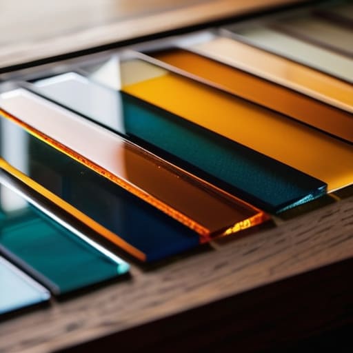
I often tell my clients that color is a tool for guidance, not just decoration. This requires a deep dive into hue, saturation, and value. If you ignore the weight of a color—its lightness or its intensity—you lose control over the hierarchy of your design. A high-saturation red might grab the eye, but without the right tonal balance, it will simply exhaust the viewer. We have to respect the eye’s ability to process light and shadow, ensuring our digital choices feel as intentional as a stroke of ink on heavy paper.

Navigating Hue Saturation and Value With Intentionality

When we strip away the distractions, we’re left with the three pillars that actually dictate how a user feels when they land on a page: hue, saturation, and value. I often tell my clients that hue is just the starting point—it’s the identity of the color. But if you don’t master the interplay of hue, saturation, and value, your work will lack the structural integrity needed to guide an eye. Saturation provides the energy, while value dictates the weight and hierarchy. If everything is high-chroma and screaming for attention, nothing stands out. You have to learn when to pull back and let a desaturated tone provide the necessary breathing room.

This is where the visual perception of color becomes a tool for intentionality rather than just decoration. Think about the way light hits a physical object; it’s never just a flat hex code. By manipulating value, you create depth and a sense of place, even in a digital vacuum. It’s about understanding how a shift in brightness can change the entire gravity of a layout, ensuring your design doesn’t just fill the screen, but actually commands it with purpose.

Five Ways to Bring Intention to Your Palette

  • Stop chasing trends and start looking for tension. A perfectly harmonious palette is easy to build, but sometimes the most impactful design comes from a single, calculated disruption—a color that doesn’t quite belong, used to pull the eye exactly where it needs to go.
  • Respect the hierarchy of light. Before you commit to a vibrant hue, check how it behaves in grayscale. If your color choices collapse into a muddy mess without saturation, your accessibility is compromised. Design for clarity first, decoration second.
  • Use color to create digital friction. We often try to make everything smooth and seamless, but a well-placed, high-contrast color can act as a tactile cue, signaling to a user that an element is interactive. It’s the digital equivalent of a raised edge on a page.
  • Limit your heavy hitters. One of the biggest mistakes I see in modern interfaces is a lack of restraint. Choose one dominant color to carry the emotional weight and use the others as supporting actors. If everyone is shouting, no one is being heard.
  • Test your colors in the real world, not just on a backlit screen. A color that looks electric in Figma might feel sterile or jarring when viewed on a standard mobile display. Always consider how ambient light and hardware limitations will change the way your work is actually experienced.

Moving Beyond the Palette: Intentional Color Application

Stop treating color as a decorative afterthought; instead, use it as a functional tool to direct attention and respect the user’s cognitive load.

Mastery lies in the nuance of value and saturation—it’s not about finding the “right” color, but about understanding how light and depth create hierarchy.

Always ground your digital choices in human experience by testing how color interacts with real-world accessibility and the tactile expectations of your audience.

## Beyond the Palette

Color isn’t just a decorative layer we slap onto a layout once the structure is finished; it is a functional tool. If you aren’t using hue and value to guide the eye or respect the user’s emotional rhythm, you aren’t designing—you’re just decorating.

Ingrid Bellamy

Beyond the Palette: Color as a Tool for Connection

Beyond the Palette: Color as a Tool for Connection

We’ve moved through the mechanics of the color wheel and the technical nuances of saturation and value, but the goal was never to turn you into a walking textbook. The real work lies in how you synthesize these elements to create a cohesive visual language. When you master the relationship between hue and light, you aren’t just picking colors that look good together; you are building a framework that directs attention and communicates meaning without saying a word. Remember that color is a functional component of your strategy, not a decorative afterthought. Use it to anchor your hierarchy and ensure that every shade serves the intentionality of your design.

As you head back to your canvas or your digital workspace, I encourage you to resist the urge to let automation make these decisions for you. A software preset might suggest a harmonious scheme, but it cannot feel the weight of the emotion you want to evoke. True craftsmanship comes from the deliberate friction of making a choice—even when that choice defies a standard algorithm. Whether you are working on a high-fidelity interface or sketching in your notebook, treat color as a way to honor the human experience. Design with purpose, and let your palette be the bridge between your vision and the person on the other side of the screen.

Frequently Asked Questions

How do I maintain color consistency when transitioning a brand from a tactile, printed medium to a digital interface?

It’s a common heartbreak: a brand looks perfect on a matte cardstock but feels sickly on a backlit screen. To bridge the gap, stop treating CMYK and RGB as separate silos. Start by defining your “anchor” colors—those core hues that must remain sacred. Use a bridge like Pantone to establish a baseline, then manually calibrate your digital values to match the feeling of the print, rather than just chasing a mathematical conversion. Aim for soul, not just hex codes.

Is there a way to use color to create meaningful friction rather than just making everything as high-contrast and "loud" as possible?

We often mistake high contrast for clarity, but constant visual noise is just exhaustion in disguise. To create meaningful friction, try using subtle tonal shifts or low-chroma palettes that force a user to slow down and actually look. Instead of shouting for attention with neon, use color to signal hierarchy and pause. It’s about creating a rhythm—moments of visual rest that make the intentional, high-contrast moments feel earned rather than expected.

How can I avoid the trap of relying on preset digital palettes that feel sterile and disconnected from human emotion?

Stop treating your color picker like a vending machine. When we rely solely on preset palettes, we lose the “grit” that makes design feel alive. I find my best inspiration away from the screen—looking at the oxidation on a vintage Leica or the way light hits a textured paper in my sketchbook. Bring those organic imperfections back. Use color to evoke a physical sensation, not just to satisfy an algorithm.

Essential typography principles displayed in text.

Fundamental Principles of Typography

I remember the smell of rubber cement and the tactile resistance of heavy cardstock back in my RISD days, long before every designer thought a “vibe” could be achieved with a single click of a font picker. There was a physical weight to every decision we made; you couldn’t just undo a mistake without feeling the consequence. Today, I see so many digital interfaces where typography principles are treated as an afterthought—or worse, as a way to simply fill space with trendy, illegible grotesques that prioritize aesthetic ego over actual human utility. We’ve traded the intentionality of the craft for a hollow, automated convenience that ignores how the eye actually moves across a screen.

I’m not here to give you a checklist of academic rules that look good in a textbook but fail in the wild. Instead, I want to talk about the intentionality of scale, the rhythm of whitespace, and how to use type to respect the reader’s cognitive load. I’m going to share the hard-won lessons I’ve gathered from two decades of moving from ink to pixels, focusing on how you can build digital experiences that feel grounded and purposeful. Let’s stop decorating screens and start designing with real intent.

Table of Contents

The Nuance of Readability and Legibility

The Nuance of Readability and Legibility.

We often use these terms interchangeably, but in my experience, conflating them is a quick way to ruin a layout. Legibility is about the individual character—the way a lowercase ‘a’ or a capital ‘G’ stands apart from its neighbors. It’s a technical requirement, a matter of clear anatomy. Readability, however, is much more soulful; it’s about the rhythm of the reading experience. You can have a perfectly legible typeface that becomes a chore to read because the leading and line spacing are suffocating the text.

When I’m auditing a brand’s digital presence, I look for that friction where the eye starts to tire. If your typographic scale is too erratic, the reader loses their place. If it’s too uniform, they lose interest. It’s about creating a predictable, comfortable path for the eye to follow. I’ve always believed that good design should feel invisible; the reader should be so immersed in the content that they never once pause to wonder why a certain weight feels heavy or why a line feels cramped.

Finding Compositional Balance in Type

Finding Compositional Balance in Type layout.

When I sit down with my sketchbook to map out a layout, I’m not just looking for where the words fit; I’m looking for where they breathe. Compositional balance in type isn’t about perfect symmetry—that often feels clinical and lifeless. Instead, it’s about managing the tension between different elements. If you have a heavy, commanding headline, you need to counterbalance that visual weight with enough white space or a lighter body copy to prevent the design from feeling top-heavy. It’s a delicate dance of visual gravity.

One of the most effective ways I guide my clients through this is by establishing a disciplined typographic scale. Without a clear hierarchy, the eye wanders aimlessly, unsure of where to land. I often find that people focus too much on the typeface itself and forget about the structural rhythm. By paying close attention to leading and line spacing, you create a sense of order that feels intentional rather than accidental. You aren’t just placing characters on a grid; you are choreographing the way a human being moves through a space.

Five Ways to Bring Intent Back to Your Type

  • Stop treating line height as a mathematical afterthought. If your leading is too tight, you’re suffocating the words; if it’s too loose, the reader loses the thread. Give your sentences room to breathe, much like the margins on a well-laid out page.
  • Respect the hierarchy of information. Not every piece of text deserves to be loud. Use weight and scale to guide the eye through a natural progression, rather than making everything compete for attention in a cluttered visual shout.
  • Choose your typefaces based on their character, not just their popularity. A typeface carries a certain weight and history; ensure the personality of the font aligns with the soul of the brand instead of just picking what looks “clean” on a grid.
  • Mind the micro-typography. The small details—the kerning between specific letter pairs, the way a comma sits, the subtle rhythm of the baseline—are where the craftsmanship lives. It’s the difference between a digital template and a piece of design.
  • Design for the context of the human eye, not the perfection of the screen. Remember that people read on moving trains, in dim light, and while distracted. Build your typographic systems to be resilient enough to handle the friction of real life.

The Intentionality of Type

Stop treating typeface selection as a decorative afterthought; every font choice should be a deliberate decision that honors the content’s voice and the reader’s cognitive load.

Respect the space between characters and lines—white space isn’t “empty” room, it’s the breath that allows your typography to actually function.

Prioritize the human experience over technical perfection; a layout that follows every rule but feels sterile or robotic has failed its primary purpose of connection.

The Soul in the Spacing

“Typography isn’t a collection of rules to be obeyed; it’s the architecture of thought. When we obsess over kerning and rhythm, we aren’t just making things look ‘clean’—we are honoring the reader’s time and ensuring the message doesn’t get lost in the noise of a poorly constructed interface.”

Ingrid Bellamy

Beyond the Grid

Mastering typography Beyond the Grid.

At the end of the day, mastering typography isn’t about memorizing a checklist of rules or perfectly aligning every glyph to a pixel-perfect grid. It’s about understanding the delicate tension between legibility and emotion. We’ve discussed how to navigate the nuances of readability, how to find balance in a crowded layout, and how to ensure your hierarchy actually serves the reader. When you stop treating type as a mere vessel for information and start treating it as a structural element of communication, the work changes. You move away from simply filling space and toward creating an intentional experience where every weight, leading, and kerning choice feels deliberate and earned.

As we move further into an era of automated, generative design, I urge you to hold onto the intentionality of the human hand. Software can suggest a pairing, but it cannot feel the rhythm of a sentence or the quiet gravity of a well-placed serif. Don’t let the ease of digital tools strip the soul out of your craft. Instead, use them to amplify your voice. Treat your typography as a way to respect the friction of human attention, building something that doesn’t just catch the eye, but truly resonates with the person on the other side of the screen.

Frequently Asked Questions

How do I maintain typographic integrity when designing for responsive interfaces that constantly shift scale?

Stop thinking in pixels and start thinking in relationships. When a layout shifts, the scale changes, but the hierarchy shouldn’t break. I rely on fluid type scales—mathematical ratios that grow and shrink proportionally rather than jumping between arbitrary font sizes. It’s about preserving the tension between your headings and body copy. If the visual rhythm collapses because a screen got smaller, you haven’t designed a system; you’ve just designed a static image.

Where is the line between intentional white space and just leaving a layout feeling unfinished?

It comes down to tension. Intentional white space feels like it’s holding the elements in place, creating a deliberate relationship between the type and the margin. It’s a choice that directs the eye. An unfinished layout, however, feels accidental—like you simply ran out of ideas or stopped halfway through a thought. If the void feels like it’s serving the content, it’s breathing room. If it feels like a vacuum, you’ve missed the mark.

How can I balance the desire for expressive, high-character typefaces with the practical need for long-form legibility?

Think of it as a hierarchy of roles. Use your expressive, high-character typefaces for the “handshake”—the headlines and pull quotes that set the mood and grab attention. But once the reader settles in, step back. Switch to a workhorse typeface for the body text—something with generous x-heights and open counters. You want the personality to frame the conversation, not drown out the actual words. Let the flair be the accent, not the noise.