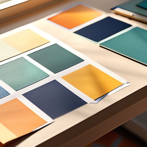
I remember sitting in a cramped studio at RISD, my fingers stained with India ink, staring at a series of Pantone swatches that felt more like a math equation than art. Back then, we didn’t talk about “optimizing conversion rates” through color psychology; we talked about how a specific shade of ochre could make a page feel heavy or how a sharp cobalt could cut through the noise. Nowadays, I see so many designers treating color like a cheat code—slapping a “trustworthy” blue onto a landing page and expecting it to do all the heavy lifting for their mediocre UX. It’s lazy, and frankly, it ignores the actual human on the other side of the glass.
I’m not here to give you a list of arbitrary associations or tell you that red always means “danger.” Instead, I want to share what I’ve learned from two decades of moving pixels and ink. We are going to look at how to use color psychology as a tool for intentionality, focusing on how hue and saturation can respect a user’s cognitive load rather than just shouting for attention. This is about purposeful craft, not just making things look pretty.
Table of Contents
Visual Perception and Emotion Honoring the Human Eye

When we talk about how a user interacts with a brand, we often focus too much on the click and not enough on the gaze. Our eyes don’t just record data; they react to light and shade with a biological immediacy that we can’t simply code away. This is where the intersection of visual perception and emotion becomes vital. If you choose a high-vibrancy neon for a meditation app, you aren’t just making a design choice; you are creating a sensory mismatch that disrupts the user’s natural rhythm.
I’ve always believed that a designer’s job is to act as a steward of the user’s attention. We have to account for the subconscious color associations that people carry with them—the way a certain deep navy feels like stability or how a muted ochre suggests something weathered and real. When we respect these innate responses, we aren’t just decorating a layout; we are building a bridge between the digital interface and the human nervous system. It’s about creating a space where the eye feels at home rather than constantly on guard.
Subconscious Color Associations and the Intentional Creator
We often talk about color as if it’s a conscious choice, but for the person on the other side of the screen, the reaction is often visceral and immediate. Long before they’ve read a single line of copy, their nervous system has already reacted to the palette you’ve laid out. These subconscious color associations act as a silent language; they are the invisible cues that tell a user whether a space feels safe, urgent, or perhaps even overwhelming. When we ignore this, we aren’t just making a design mistake—we are failing to respect the user’s internal state.
As a designer, your job isn’t to chase trends, but to understand the psychological impact of hues and how they anchor a brand’s identity. If you’re building a tool meant for deep focus, flooding the interface with high-saturation yellows is essentially digital noise. Instead, we should be looking at how specific tones can settle a user into a flow state. Intentionality means choosing a shade not because it looks “modern,” but because it aligns with the human intent behind the interaction.
Practical Intent: Applying Color with Purpose
- Stop chasing trends. A palette might look sophisticated on a curated mood board, but if those muted tones fail to provide enough contrast for a user to actually navigate your interface, you haven’t designed a brand—you’ve designed a barrier.
- Respect the hierarchy of information. Use your most high-contrast colors for the actions that matter most, like a primary button or a critical alert. Color should act as a silent guide, not a loud distraction that competes for attention.
- Context is everything. A shade of blue might feel serene in a wellness app but sterile and cold in a fintech interface. Always test your colors against the specific emotional weight of the service you are building.
- Build for accessibility, not just aesthetics. True craftsmanship means ensuring your color choices work for everyone, including those with visual impairments. If your design relies on color alone to convey meaning, you’ve missed the mark on functional design.
- Limit your palette to maintain clarity. It’s tempting to introduce a dozen shades to add depth, but a disciplined, restrained use of color creates a much stronger sense of intentionality and prevents the user from feeling overwhelmed.
Bringing Intent Back to the Palette
Stop treating color as a decorative layer applied at the end of a project; instead, treat it as a foundational tool that must be woven into the initial strategy to respect the user’s emotional journey.
Avoid the trap of chasing fleeting digital trends that prioritize “screen pop” over long-term usability, and instead focus on palettes that provide clarity and reduce cognitive fatigue.
Remember that every shade carries an invisible weight—use your color choices to guide the user’s eye with purpose, ensuring the interface serves their intent rather than just demanding their attention.
The Weight of a Hue
Color isn’t just a stylistic choice or a way to make a layout pop; it’s a silent dialogue with the user. If we aren’t choosing our palette with the intention to respect their emotional state, we aren’t designing—we’re just decorating.
Ingrid Bellamy
The Intentional Palette

At the end of the day, color psychology isn’t a cheat sheet for manipulation or a way to trick a user into clicking a button. It is about understanding the deep, biological, and cultural threads that connect a person to what they see on a screen. We’ve discussed how our eyes perceive light and how our subconscious minds attach meaning to a specific shade of navy or a muted ochre. When we respect these connections, we move away from superficial decoration and toward a design language that actually speaks to the user’s needs. It’s about choosing a palette that aligns with the integrity of the brand and the reality of the human experience.
As you move back to your canvas or your digital workspace, I encourage you to slow down. Don’t just grab the most vibrant hex code from a trending library; instead, ask yourself if that color honors the purpose of your work. We are living in an era of rapid automation, but the nuance of a perfectly balanced color scheme is something that still requires a human touch. Use color to create clarity, to provide comfort, and to guide the eye with intention. Let’s stop designing for algorithms and start designing for people.
Frequently Asked Questions
How do I balance brand-specific color palettes with the universal psychological triggers that users expect?
It’s a delicate tension, isn’t it? You don’t want to sacrifice your brand’s soul just to follow a manual, but you also can’t ignore how humans are wired. I usually approach this by treating my brand colors as the “personality” and universal triggers as the “grammar.” Use your unique palette for storytelling and brand identity, but lean on those established psychological cues for functional elements like buttons or warnings. Respect the user’s intuition first; then, surprise them with your brand.
In an era of high-brightness OLED screens, how can we use color without causing digital fatigue for the viewer?
We’ve moved from matte paper to these aggressive, high-brightness OLED panels that practically punch you in the retina. To fight digital fatigue, stop relying on pure #000000 blacks or neon saturations. Instead, embrace “soft” dark modes—think deep charcoals or midnight blues—and use desaturated mid-tones. We need to design for the eye’s comfort, not just the screen’s capability. If your palette feels like it’s vibrating, it’s failing the human on the other side.
How much weight should I actually give to cultural color differences when designing for a global, digital-first audience?
It’s a heavy weight, but not in the way you might think. Don’t treat cultural color theory like a checklist of “do’s and don’ts”—that leads to sterile, safe design. Instead, treat it as a study of context. A red button might signal danger in one market and prosperity in another. If you’re designing for a global audience, your job isn’t to pick a “neutral” palette, but to ensure your color choices respect the local rhythm of the user.
