I was sitting at my drafting table last night, the smell of linseed oil from my latest camera restoration project still hanging in the air, when I scrolled through my feed and felt that familiar, hollow ache. Everything looks like it was spat out by the same high-speed algorithm—a relentless, neon-soaked blur of templates that prioritize instant attention over actual substance. We’ve fallen into this trap where social media design has become nothing more than a race to see who can be the loudest, most visually aggressive, and ultimately, the most forgettable. It’s a digital landfill of polished perfection that lacks a single ounce of soul.
I’m not here to teach you how to hack an algorithm or chase the latest fleeting aesthetic trend. Instead, I want to talk about how we can reclaim our agency and bring intentionality back to the screen. I’m going to share what I’ve learned from twenty years of navigating the shift from ink to pixels, focusing on how to create work that respects the viewer. We will explore how to build a visual language that doesn’t just fill space, but actually empowers the human on the other side of the glass.
Table of Contents
- Cultivating Brand Identity in Social Media Through Purposeful Art
- Using Color Psychology in Social Posts to Spark Real Connection
- Five Ways to Bring Intentionality Back to the Feed
- Moving Beyond the Scroll: Three Principles for Intentional Design
- The Trap of the Infinite Scroll
- The Human Element in a Digital Stream
- Frequently Asked Questions
Cultivating Brand Identity in Social Media Through Purposeful Art
When we talk about brand identity in social media, we often fall into the trap of thinking it’s just about a consistent logo or a specific hex code. But true identity is felt in the rhythm of the visual language you deploy. It’s the difference between a brand that feels like a loud, repetitive advertisement and one that feels like a coherent, living entity. I’ve seen too many teams sacrifice their soul for the sake of an algorithm, producing content that looks technically perfect but lacks any sense of weight or intention.
To avoid this, you have to treat every post as a deliberate extension of your core values. This means moving beyond mere aesthetics and leaning into things like color psychology in social posts to evoke genuine emotion rather than just grabbing attention. If your brand is built on stability and heritage, your visual choices should reflect that through structured layouts and grounded tones, rather than chasing every fleeting, high-contrast trend. We aren’t just filling feeds; we are building a visual vocabulary that tells a story, one purposeful frame at a time.
Using Color Psychology in Social Posts to Spark Real Connection
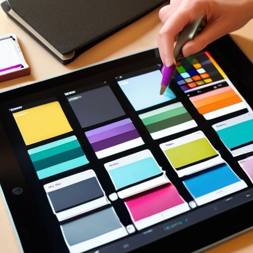
When we talk about color, it’s easy to get lost in the trend cycle—the neon gradients or the muted pastels that seem to dominate every feed. But if we want to move beyond mere decoration, we have to look at how color actually functions as a psychological bridge. In my work, I treat color not as a stylistic choice, but as a silent communicator. When applying color psychology in social posts, the goal isn’t just to catch an eye; it’s to settle a mood. A deep, desaturated navy can evoke a sense of stability and trust that a bright, jarring yellow simply cannot, regardless of how “on-trend” that yellow might be.
The real challenge lies in maintaining consistency within your broader social media branding elements. If your palette shifts wildly from post to post just to chase a seasonal aesthetic, you lose the visual anchor that tells your audience who you are. I always tell my clients to think about the emotional residue their work leaves behind. Are you trying to spark urgency, or are you trying to provide a moment of calm in a chaotic scroll? By choosing hues that align with your core values, you create a sense of continuity that fosters genuine, long-term connection rather than a fleeting click.
Five Ways to Bring Intentionality Back to the Feed
- Prioritize legibility over “aesthetic” trends. If your typeface is so experimental that it forces the viewer to squint, you haven’t designed a message; you’ve designed an obstacle.
- Design for the pause, not the scroll. Instead of chasing rapid-fire visual noise, create compositions that offer a moment of stillness—something that actually rewards a person for stopping.
- Stop treating templates like a safety net. While tools are helpful, a grid that lacks any sense of organic tension eventually feels hollow. Leave room for the “human friction” that makes a brand feel alive.
- Use negative space as a structural element, not an empty void. In the rush to fill every pixel of a social tile, we often forget that what you leave out is just as communicative as what you put in.
- Respect the medium’s constraints. Don’t try to force a high-fidelity, complex brand experience into a tiny, low-resolution mobile window; design specifically for the tactile reality of how people actually hold their phones.
Moving Beyond the Scroll: Three Principles for Intentional Design
Stop designing for algorithms and start designing for eyes; every pixel should serve a functional purpose that respects the viewer’s attention rather than just fighting for it.
Use visual hierarchy to create a sense of rhythm in your posts, ensuring that your brand’s core message isn’t lost in a sea of digital noise.
Embrace the “human friction” of imperfection—small, intentional details in your typography or layout can signal craftsmanship in a way that sterile, automated templates never will.
The Trap of the Infinite Scroll
“Social media design shouldn’t be about winning a race against the thumb; it should be about creating a moment of stillness in a digital flood, where the work actually demands to be seen rather than just being scrolled past.”
Ingrid Bellamy
The Human Element in a Digital Stream

At the end of the day, social media design isn’t about mastering an algorithm or chasing every fleeting aesthetic trend that pops up on a feed. It is about the synthesis of everything we’ve discussed: building a cohesive brand identity that feels lived-in, and using color not just to catch an eye, but to evoke a genuine emotional response. When we stop treating social platforms as mere broadcasting tools and start seeing them as spaces for meaningful interaction, our work shifts from noise to signal. We move away from the hollow pursuit of engagement metrics and toward the intentional creation of digital landmarks that actually mean something to the people scrolling past them.
As you head back to your canvas—or your screen—I want to challenge you to resist the urge to automate your soul away. It is easy to let software dictate your rhythm, but the most impactful designs are the ones that retain a sense of intentional friction. Whether you are adjusting a kerning pair or selecting a palette, remember that there is a human being on the other side of that glass. Design with the respect that craftsmanship deserves, and focus on building tools and visuals that empower rather than replace the human connection. That is where the real magic happens.
Frequently Asked Questions
How do I maintain a sense of tactile, high-end craftsmanship when I'm forced to work within the rigid, fast-paced templates of Instagram or TikTok?
You have to find the “seams” in the digital fabric. Templates feel rigid because they lack texture, so I lean into intentionality. I use subtle grain, organic kerning, and layered compositions that mimic physical depth. Don’t let the grid dictate your soul; use it as a foundation, then break it slightly with hand-drawn elements or high-contrast typography. It’s about injecting that human friction back into the scroll so the work feels felt, not just seen.
At what point does a consistent brand visual language become a repetitive cage that stifles genuine creative expression?
It happens the moment you start designing for the grid instead of the message. Consistency is a compass, not a cage; it should guide your aesthetic, not dictate every pixel. When you find yourself choosing a layout or a typeface simply because “that’s how we do it,” rather than because it serves the specific story you’re telling, you’ve lost the thread. True brand strength lies in a flexible system that allows for human spontaneity.
How can we design social assets that actually invite human interaction rather than just optimizing for a mindless scroll?
Stop designing for the algorithm and start designing for the pause. To break a mindless scroll, you have to introduce intentional friction. Instead of high-octane, flashy graphics that demand attention, try using negative space or a composition that feels tactile—something that mimics the weight of a physical object. When a design feels like it was crafted with a human hand rather than spat out by a template, it invites the viewer to actually look, rather than just react.