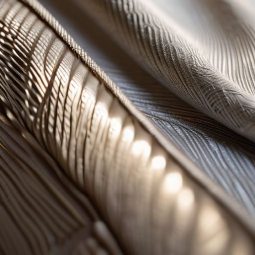
I remember sitting in my studio back in the late nineties, surrounded by the scent of spray mount and the literal grit of paper stock under my fingertips. There was a weight to things then—a physical resistance that told you exactly where a design succeeded or failed. Today, as I watch designers chase high-resolution grain overlays just to mask a lack of depth, I can’t help but feel we’ve lost the plot. Too many people treat designing with texture like a superficial coat of paint applied to a flat, lifeless surface. We’ve traded intentionality for mere decoration, forgetting that true texture should evoke a sense of presence, not just act as digital noise to fill empty space.
I’m not here to give you a list of trendy asset packs or tell you how to make your UI look “vintage” by slapping a noise filter on it. Instead, I want to talk about the purposeful application of tactile elements to create meaningful digital experiences. I’ll be sharing what I’ve learned from decades of moving between the physical and the digital, focusing on how you can use grit, grain, and depth to honor the human touch. We are going to move past the fluff and get back to craftsmanship.
Table of Contents
Materiality in Graphic Design Restoring the Weight of Digital Objects
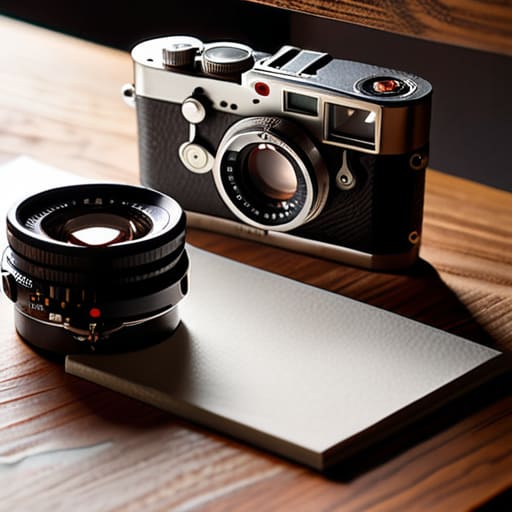
When I sit at my desk, I often find myself looking at my vintage Leica, thinking about how its weight informs the way I shoot. There is a physical consequence to every movement. In the digital realm, however, we’ve drifted toward a sterile, frictionless vacuum where everything feels weightless and, frankly, disposable. We need to bring back a sense of materiality in graphic design to combat this. It’s not about making a screen look like paper; it’s about acknowledging that digital objects should have a perceived presence, a sense of gravity that tells the eye where to land.
By integrating subtle grain or paper tooth, we can establish a clearer visual hierarchy through texture. Instead of relying solely on size or color to command attention, a change in surface quality can signal a shift in importance or a change in context. When we use these layers thoughtfully, we aren’t just decorating; we are providing the user with navigational anchors. We are giving them something to hold onto in a medium that often feels far too slippery.
Digital Texture Application Moving From Filling Space to Creating Purpose
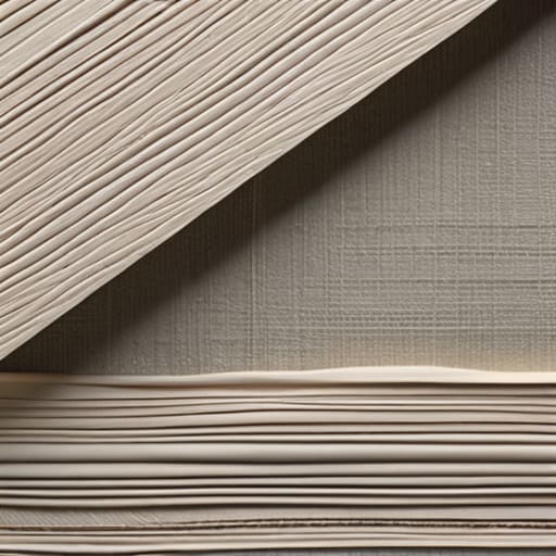
When we talk about digital texture application, I want us to move past the idea of using grain just to hide a flat gradient. That’s lazy. Instead, think about how a subtle paper tooth or a slight linen weave can guide the eye. Texture shouldn’t just be a decorative layer; it should be a tool for establishing visual hierarchy through texture. By varying the grit or the density of a pattern, you can signal to a user what is interactive and what is merely foundational. It’s about creating a roadmap for the eyes using tactile cues rather than just bigger fonts.
I often find myself looking at my old Leica cameras to remind myself how light interacts with physical surfaces. In a digital layout, we can mimic that depth by adding organic elements to design that break up the sterile perfection of a vector line. If everything is mathematically perfect, nothing feels real. When you introduce a controlled amount of imperfection, you aren’t just filling space—you are creating a sense of presence. The goal is to use these elements to ground the user, making the interface feel less like a math equation and more like a workspace.
Five Ways to Infuse Intentional Friction
- Stop chasing “noise” and start looking for grit. Texture shouldn’t just be a decorative overlay that obscures your content; it should act as a subtle layer of resistance that gives the eye a place to rest and the mind a sense of place.
- Respect the hierarchy of the grain. If your texture is fighting your typography for attention, you’ve failed. The grain should sit behind the message, providing a foundation of character without compromising the legibility of your type.
- Think in terms of light, not just patterns. Real-world materials—the tooth of a heavy watercolor paper or the brushed surface of aluminum—react to light. When you design digitally, simulate how a texture might catch a shadow or a highlight to give it a sense of three-dimensional weight.
- Avoid the “filter trap.” There is a massive difference between a carefully constructed grain and a generic, low-resolution brush stroke slapped onto a vector. If you can’t explain why a specific texture is there, it’s probably just digital clutter.
- Use texture to signal transition. Just as a physical designer might switch from a smooth silk to a rough linen to change the mood of a brand, use subtle shifts in tactile qualities to guide a user through different emotional stages of a digital experience.
The Intentionality of Friction
Texture is not a decorative layer to be applied at the end; it is a functional tool used to give digital elements weight, presence, and a sense of place within a composition.
Avoid the trap of “digital noise”—if a texture doesn’t serve to ground the user or provide tactile feedback, it’s just visual clutter that obscures your core message.
Respect the friction of the human hand by designing interfaces that feel like they were crafted with intention, rather than generated by an algorithm seeking perfection.
The Soul in the Grain
Texture isn’t a decorative layer we apply to hide a lack of depth; it’s the digital equivalent of a thumbprint—a necessary, imperfect friction that reminds us there is a human on the other side of the glass.
Ingrid Bellamy
The Intentional Interface
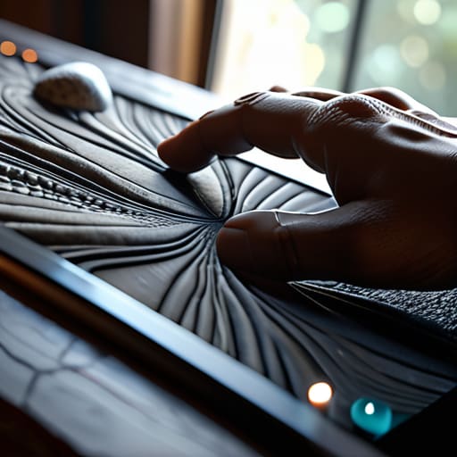
Ultimately, designing with texture isn’t about adding decorative noise or masking a lack of concept. It is about the deliberate reintegration of materiality into our digital workflows. We’ve spent too long chasing a sterile, frictionless perfection that leaves the user feeling disconnected from the medium. By focusing on the weight of our digital objects and applying texture with specific, functional intent, we bridge the gap between the cold pixels of a screen and the tactile intuition of the human hand. When we treat texture as a structural element rather than a superficial layer, we create work that feels grounded, purposeful, and truly resonant.
As I sit here at my desk, moving between my sketchbook and my monitor, I am constantly reminded that our tools should never strip away our humanity. The goal isn’t to mimic the physical world perfectly, but to honor the sensory logic that makes us feel alive. As you move forward with your next project, I challenge you to look past the smoothness of the interface. Ask yourself where the friction belongs. Don’t just design for the eye; design for the soul of the person behind the glass. Let’s build a digital landscape that values the craft as much as the code.
Frequently Asked Questions
How do I introduce subtle texture without compromising the legibility or accessibility of my typography?
Treat texture like a background hum, not a solo performance. I often tell my clients to think of it as a grain in a film photograph—it should enrich the atmosphere without obscuring the subject. If you’re working with type, keep your textures in the neutral, low-contrast ranges. Use subtle noise or paper grains on the canvas itself, but never overlay them directly onto the letterforms. If the texture competes with the stroke, you’ve lost the purpose.
At what point does adding tactile elements cross the line from "intentional craftsmanship" into mere visual clutter?
It crosses the line the moment the texture begins to compete with the information. If I have to squint through a layer of digital grain just to read a headline, the craftsmanship has failed. Texture should act like the tooth of a high-quality paper—it supports the ink, it doesn’t obscure it. If the element isn’t reinforcing the hierarchy or providing a sense of weight, it’s just noise. Don’t decorate; communicate.
How can I maintain a sense of material weight in a design system that needs to remain scalable across different screen resolutions?
Scalability often becomes an excuse for sterilization. To keep that sense of weight, stop thinking in static pixels and start thinking in ratios. Instead of fixed textures, use mathematical relationships—like subtle grain overlays or noise levels—that scale proportionally with your container size. It’s about preserving the feeling of a surface rather than the exact density of the dots. If the texture feels like it’s fighting the resolution, you’ve lost the intentionality.
