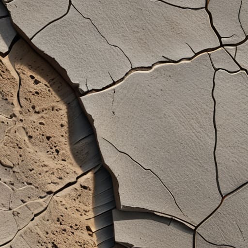
I remember sitting in my studio back in the late nineties, the air thick with the scent of spray adhesive and the tactile grit of physical paper stocks. I spent hours selecting the perfect matte finish, knowing that the way light hit a surface changed everything about the brand’s soul. Today, everything feels too sanitized, too mathematically perfect. We’ve become obsessed with clinical, vector-sharp precision that leaves our digital interfaces feeling hollow and sterile. We’ve lost the soul of the work because we’ve forgotten how to use texture and grain to simulate the beautiful imperfections of the real world.
I’m not here to sell you on some expensive, over-processed filter or a trendy plugin that does all the heavy lifting for you. Instead, I want to talk about how we can use these elements with intentionality. I’m going to share what I’ve learned from two decades of moving between the physical and digital realms, focusing on how to introduce subtle grit that respects the user’s eye. We will explore how to build depth without creating clutter, ensuring your work feels humanly felt rather than just digitally rendered.
Table of Contents
Finding Visual Depth in Graphic Design
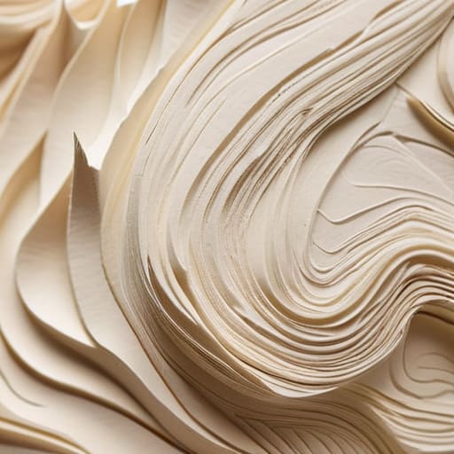
When we talk about adding layers to a composition, we aren’t just talking about stacking effects. I’ve always felt that true visual depth in graphic design comes from the subtle tension between light and shadow, or the way a surface reacts to a simulated environment. In my early days of physical paste-ups, the slight misalignment of a print or the way ink sat on heavy cardstock gave the work a soul. Today, we have to work harder to replicate that feeling. We can’t just slap a filter on a vector and call it a day; we have to understand how perceptual texture in UI design influences how a user actually feels when they navigate a space.
It’s about more than just aesthetics; it’s about breaking the sterile perfection of the pixel. When I’m working with clients on a brand identity, I often suggest adding grit to digital art to ground the concept. This isn’t about making something look “dirty,” but rather about introducing enough micro-variation to prevent the eye from sliding right off the screen. We want to create a sense of weight and presence, making the digital interface feel less like a mathematical calculation and more like a tangible object.
Reclaiming the Analog Aesthetic in Modern Media

There is a certain loneliness in a perfectly smooth vector. When everything is mathematically precise and pixel-perfect, the eye tends to slide right off the screen without ever truly landing. This is why I find myself constantly looking backward to move forward. I’ve spent my afternoons lately tinkering with an old Leica, obsessed with how light hits a physical emulsion. That unpredictable dance of light is what we’re missing in our high-fidelity workflows. By adding grit to digital art, we aren’t just applying a filter; we are injecting a sense of history and presence into a medium that often feels too sterile.
Reclaiming this analog aesthetic in modern media isn’t about being nostalgic for the sake of it. It’s a strategic choice to combat the fatigue of the “ultra-clean” look. When we introduce subtle surface imperfections, we provide the viewer with a way to anchor their attention. It’s the difference between looking at a sterile laboratory and walking into a well-loved studio. We need to stop treating digital surfaces as glass and start treating them as material.
Five Ways to Introduce Meaningful Friction
- Stop treating grain as a filter. Don’t just slap a noise overlay on top of a finished layout like an afterthought; instead, integrate it into your color ramps and gradients so the texture feels like it’s part of the material, not just dust on a lens.
- Respect the hierarchy of tactile detail. Use heavy, grit-like textures to anchor your most important visual elements, but keep your secondary backgrounds subtle. If everything is textured, nothing feels real—it just becomes visual noise.
- Match your grain to your intent. A soft, photographic grain suggests warmth and nostalgia, while a sharper, more geometric stipple can feel architectural and precise. Choose the “weight” of your texture based on the emotion you want the viewer to feel.
- Watch your contrast ratios. It’s easy to get carried away with heavy textures and accidentally kill your legibility. Always step back and ensure that your grain isn’t fighting against your typography; the texture should support the type, not obscure it.
- Embrace the imperfection of the “analog mistake.” Sometimes, a slight misalignment or an uneven distribution of grain makes a digital piece feel human. Don’t aim for mathematical perfection; aim for something that feels like it was made by hand.
The Core Principles of Tactile Design
Avoid the temptation to chase clinical perfection; a bit of digital grit can actually bridge the gap between a cold screen and a human eye.
Use texture as a functional layer rather than a decorative mask—it should guide the user’s focus, not just clutter the composition.
Respect the tool by maintaining intentionality, ensuring that every grain and shadow serves a purpose in the overall brand narrative.
The Soul in the Imperfection
We’ve become so obsessed with pixel perfection that we’ve accidentally engineered the life out of our work; adding grain isn’t about making something look ‘old,’ it’s about adding the necessary friction that reminds a user there is a human heartbeat behind the screen.
Ingrid Bellamy
The Human Element in a Digital Age
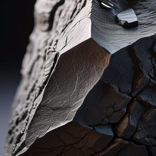
Ultimately, integrating texture and grain isn’t about applying a vintage filter to hide a lack of substance; it is about acknowledging that nothing in the real world is perfectly, sterilely smooth. We’ve spent the last decade chasing a hyper-sanitized version of digital perfection, but in doing so, we’ve stripped away the soul of our interfaces. By intentionally introducing controlled imperfection, we bridge the gap between the cold pixels of a screen and the tactile reality of the physical world. Whether you are working on a brand identity or a complex UI, remember that depth comes from the interplay of light, shadow, and the subtle grit that tells a story of intentional craftsmanship.
As you move forward with your next project, I encourage you to step away from the “undo” button for a moment and embrace the friction. Don’t be afraid to let a design feel lived-in or slightly weathered. Our goal shouldn’t be to create something that looks like it was generated by a machine, but something that feels like it was touched by a human hand. In an era where automation is becoming the default, your greatest competitive advantage is your ability to preserve the warmth of the analog experience. Let your work breathe, let it have texture, and most importantly, let it feel real.
Frequently Asked Questions
How do I balance adding tactile texture without making a digital interface feel cluttered or visually "noisy"?
The key is restraint. Think of texture like salt in a dish—it should enhance the flavor, not become the meal itself. I usually apply grain to the background layers or subtle shadows rather than the interactive elements. If you put heavy grit on a button, you’ve just created visual noise that obscures the function. Keep your primary surfaces clean. Let the texture live in the periphery, providing depth without fighting for the user’s attention.
At what point does intentional grain cross the line from a stylistic choice into a distraction for the user?
It crosses the line when the texture competes with the content rather than supporting it. If I have to squint to read a headline or if the grain creates a visual vibration that makes the eye wander, it’s no longer an aesthetic choice—it’s noise. Grain should feel like the subtle tooth of high-quality paper, not a layer of static. If the texture obscures the hierarchy you’ve worked so hard to build, it has failed its purpose.
When working with high-resolution screens, how can I ensure that subtle grain actually translates effectively instead of just looking like compression artifacts?
The danger with high-res displays is that they’re too good at showing our mistakes. To avoid that “digital smudge” look, don’t rely on heavy, uniform noise filters. Instead, I prefer layering subtle, high-frequency grain at a lower opacity, or better yet, using actual scanned film textures. You want the grain to feel like a physical property of the light, not a mathematical error. If it looks like compression, you’ve gone too far with the math and not enough with the craft.
