I still remember the tactile resistance of X-Acto blades slicing through heavy cardstock in the RISD studios, back when layout design meant actually feeling the weight of every element you placed. There was a physical consequence to every decision; you couldn’t just hit “undo” to fix a lack of intentionality. Today, I see so many digital interfaces that feel strangely hollow, as if the designer simply threw components at a canvas until the white space disappeared. We’ve traded the soul of craftsmanship for a frantic race to fill every pixel, often losing the human rhythm that makes a composition actually readable.
I’m not here to lecture you on the latest trendy software or how to chase engagement metrics through sheer visual noise. Instead, I want to talk about how we can reclaim the purpose behind our work. I’m going to share the practical, grounded principles I’ve honed over two decades to help you master layout design that respects the user’s eye. We will move past the superficial fluff and focus on building structures that honor the friction of real human interaction, ensuring your work serves a function rather than just occupying a screen.
Table of Contents
Mastering White Space Utilization to Breathe

I’ve spent many afternoons staring at a screen, feeling that frantic, modern urge to fill every pixel with content. We’ve been conditioned to think that “empty” means “wasted,” but in my experience, that’s where the real work happens. True white space utilization isn’t about leaving gaps; it’s about creating a stage for your content to perform. When you allow a composition to breathe, you aren’t just adding emptiness—you are actively directing the eye and providing the cognitive rest necessary for a user to actually process what they are seeing.
If you ignore this, your work becomes a wall of noise. To avoid that, I lean heavily on visual weight distribution to guide the viewer through the experience. By strategically placing elements, you can create a sense of intentional stillness that prevents the user from feeling overwhelmed. Think of it like the margins in one of my old RISD sketchbooks; they aren’t just borders, they are the framework that allows the ink to hold its meaning. When you master this, you stop fighting the interface and start designing with a sense of grace.
Visual Weight Distribution Beyond the Screen
When I’m working on a brand identity, I often find myself thinking about how a composition feels when it’s stripped of its digital context. It’s easy to get lost in the pixel-perfect precision of a screen, but true balance requires looking at the tension between elements. I try to approach visual weight distribution much like I do when framing a shot with one of my Leica cameras; it isn’t just about centering the subject, but about how the surrounding negative space pulls the eye toward the focal point.
If you lean too heavily on symmetry, the composition can feel static, almost lifeless. I prefer exploring asymmetrical balance to create a sense of movement that guides the viewer through the narrative. By playing with the scale of a single, bold typeface against a smaller block of body copy, you establish a clear typography hierarchy that feels intentional rather than accidental. It’s about creating a rhythmic ebb and flow—a way to ensure the viewer doesn’t just see the work, but actually feels the structure behind it.
Five Ways to Reclaim Intentionality in Your Layouts
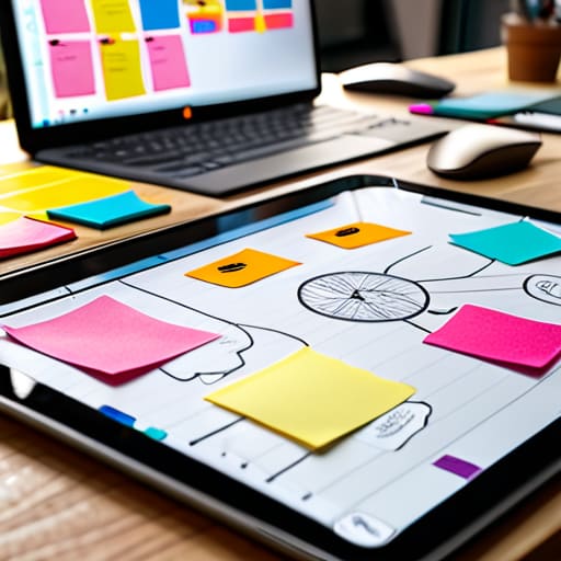
- Stop designing for the pixel and start designing for the eye. Before you touch a single anchor point in Figma, sketch your hierarchy with a pen. If the relationship between your elements doesn’t make sense in a messy, low-fidelity sketch, no amount of high-res imagery or subtle gradients will save it.
- Respect the rhythm of the scan. Users don’t read; they navigate. Create a clear, predictable path for the eye to follow by establishing a strong typographic scale. When your headings, subheads, and body copy have distinct, intentional weights, you’re providing a roadmap rather than a maze.
- Use containment to create focus, not just borders. Sometimes a subtle change in background tone or a soft container is more effective than a heavy line. Use these shifts to group related information, helping the user mentally categorize what they are seeing without adding visual noise.
- Build with a modular mindset. Instead of seeing a page as one monolithic block, think of it as a series of interlocking components. This doesn’t mean being rigid or robotic; it means creating a flexible system where elements can breathe and move while still feeling like they belong to the same family.
- Test for the “glance factor.” A good layout should communicate its most important message in a fraction of a second. If you have to squint or hunt for the call to action, your visual hierarchy has failed. Strip away the decorative fluff until only the essential structure remains.
The Intentionality Checklist
Stop treating layout as a puzzle to be solved and start treating it as a conversation; every element you place should serve a specific purpose or it’s just noise.
Respect the hierarchy of information by using contrast and scale to guide the eye, rather than hoping the user stumbles upon your most important message.
Remember that a layout is never truly finished until it feels balanced to the human eye, not just mathematically aligned to a digital grid.
The Soul of the Grid
A layout isn’t just a collection of containers; it’s a choreographed sequence of breaths and pauses. If you aren’t designing for the way a human eye actually wanders, you aren’t designing—you’re just decorating.
Ingrid Bellamy
The Intentional Layout
At its core, effective layout design isn’t about mastering a specific software or adhering to a rigid set of mathematical rules. It is about the delicate balance between what we show and what we choose to leave out. We’ve discussed how white space provides the necessary room for a user to breathe, and how visual weight directs the eye without forcing it. When we combine these elements with a deep understanding of hierarchy, we move away from mere decoration and toward functional storytelling. Remember, every line, every margin, and every grouping of elements should serve a specific purpose in the user’s journey. If an element doesn’t contribute to the clarity or the intent of the piece, it’s just digital noise that needs to be stripped away.
As you head back to your workstations, I encourage you to step away from the pixels for a moment. Pick up your sketchbook, grab a pen, and feel the friction of the paper. There is a reason we still value the tactile nature of design; it reminds us that there is a human being on the other side of the glass. Don’t let the convenience of automation rob you of your creative intuition. Use the tools available to you, but never let them dictate your decisions. Build layouts that don’t just fill a screen, but instead respect the human touch and create a meaningful space for connection.
Frequently Asked Questions
How do I maintain a sense of intentionality in layout design when working within the rigid constraints of responsive, auto-generated web grids?
The grid shouldn’t be your cage; it should be your scaffolding. When I’m working with rigid, auto-generated frameworks, I stop trying to fight the math and start looking for the “human” breaks. I look for opportunities to introduce subtle asymmetry or to use typography to disrupt a predictable rhythm. Don’t let the automation dictate your soul. Use the grid to provide stability, but use your eye to decide where the tension actually lives.
At what point does a minimalist layout cross the line from "clean and purposeful" to feeling empty or disconnected from the user?
It crosses the line when you start designing for your own ego rather than the user’s needs. Minimalism is a tool for clarity, not an excuse for laziness. If a user lands on a page and feels lost, or if the lack of visual cues makes the interface feel cold and unapproachable, you haven’t achieved “clean”—you’ve just stripped away the soul. Purposeful design uses space to guide; empty design uses space to isolate.
How can we integrate more "human friction" or tactile design elements into digital layouts without sacrificing usability or speed?
It’s about intentionality, not slowing the user down. I think of it like the weight of a heavy paper stock; it doesn’t make reading harder, it just makes the experience feel more significant. In digital layouts, we can achieve this through subtle micro-interactions—think of the slight, organic resistance in a scroll or the way a button feels “pressed” via haptic feedback and soft shadows. Use texture and grain sparingly to break the sterile perfection of pixels.