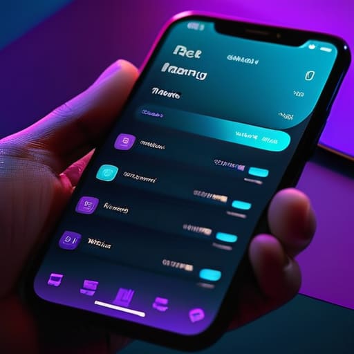
I was hunched over my desk at 2:00 AM, the only light coming from a monitor that felt less like a tool and more like a physical assault on my retinas. I was deep in the weeds of a brand refresh, trying to force a high-contrast palette into a way that wouldn’t leave me with a migraine by sunrise. It’s the great irony of our current era: we’ve obsessed over the aesthetic of dark mode design to the point where we’ve forgotten its actual purpose. Too often, what should be a thoughtful concession to human biology is just a lazy, “black-and-white” toggle that creates more visual noise than it solves.
I’m not interested in giving you a checklist of trendy hex codes or telling you to follow the latest UI hype. Instead, I want to talk about the intentionality behind the shadows. I’m going to share what I’ve learned from twenty years of moving pixels—and physical ink—about how to implement dark mode so it actually respects the user’s flow. We’ll move past the superficiality and look at how to build interfaces that feel calm, legible, and deeply human.
Table of Contents
Crafting Semantic Color Systems for Human Intent

When we sit down to build ui color palettes for dark themes, the temptation is to simply invert the luminance of our light mode files. But color isn’t just a mathematical reversal; it’s about how light behaves in a physical space. In a dark interface, pure blacks can feel cavernous and harsh, while high-saturation colors tend to “vibrate” against dark backgrounds, creating a jarring sensation. To avoid this, I lean heavily on semantic color systems—assigning meaning to colors based on their role (surface, primary, error, or subtle) rather than just their hex code.
By defining colors through their intent, we create a framework that prioritizes reducing visual fatigue over mere stylistic preference. Instead of choosing a color because it looks “cool” in a mockup, I ask how that specific shade of slate or charcoal will interact with text during a midnight reading session. This approach ensures that we aren’t just decorating a screen, but are actually building a predictable, stable environment that respects the user’s biological rhythms and cognitive load.
Optimizing Low Light Viewing to Respect the Eye

When we talk about low light viewing optimization, we aren’t just talking about flipping a switch from white to black. It’s about the physiological reality of how we perceive light. If we simply use a pure, unyielding #000000 black background, we create a jarring high-contrast environment that forces the pupils to work overtime. This often leads to a phenomenon known as halation, where bright text appears to bleed into the dark void, making reading a struggle rather than a flow. To truly respect the user, we need to embrace deep charcoals and soft grays that provide depth without the harshness.
The goal here is reducing visual fatigue by creating a gentle transition for the eyes. This means paying meticulous attention to our UI color palettes for dark themes, ensuring that the luminance levels of our primary content don’t feel like they are piercing through the screen. We want to create an environment that feels intentional and calm, much like the way a well-composed photograph settles into the eye. By softening those edges, we honor the user’s comfort and keep their focus where it belongs: on the craft.
Beyond the Black: Five Principles for Intentional Dark Interfaces
- Stop chasing pure black. Using #000000 creates a harsh, jarring contrast that causes eye strain and “smearing” on OLED screens. Instead, lean into deep, desaturated charcoals or midnight blues. These tones provide depth and allow your typography to breathe without feeling like it’s vibrating against the background.
- Prioritize elevation through light, not just shadows. In light mode, we use drop shadows to show depth. In dark mode, shadows often disappear into the void. Instead, use subtle shifts in surface color—making higher-level elements slightly lighter than the base background—to communicate hierarchy and structure.
- De-saturate your brand palette. A vibrant, high-chroma color that looks sophisticated on a white canvas can feel aggressive and “neon” when flipped into a dark environment. When translating your brand colors for dark mode, dial back the saturation to ensure they remain legible and calm rather than overwhelming the user’s field of vision.
- Test for “Halation” and legibility. White text on a dark background can sometimes appear to bleed or glow, a phenomenon that makes fine details hard to parse. Avoid using pure white (#FFFFFF) for long-form body copy; opt for a soft grey or an off-white to maintain a comfortable reading rhythm.
- Design for the transition, not just the state. Dark mode shouldn’t feel like a sudden light switch being flipped in a dark room. Consider how elements move and how colors bleed into one another during the switch. A thoughtful design respects the user’s immediate sensory experience during that moment of change.
The Intentionality of the Dark Interface
Dark mode is not a stylistic coat of paint; it is a functional shift that requires a complete reimagining of your color hierarchy and semantic logic.
True accessibility in low-light design means prioritizing visual comfort and reducing ocular strain over chasing the latest high-contrast trends.
We must design with the understanding that digital tools should adapt to the human environment, not force the human to adapt to the glow of the screen.
Beyond the Aesthetic Veneer
Dark mode isn’t a stylistic coat of paint we slap onto a light interface to satisfy a trend; it is a fundamental shift in how we respect the user’s biological reality and their cognitive focus.
Ingrid Bellamy
Beyond the Toggle

Ultimately, designing for dark mode is about far more than just inverting a color palette or flipping a switch. It requires a fundamental shift in how we perceive hierarchy and depth. By building semantic color systems that prioritize meaning over mere contrast, and by optimizing our luminance levels to respect the physiological reality of the human eye, we move away from superficial aesthetics. We transition from simply “making things dark” to engineering an environment that supports sustained focus. When we get this right, we aren’t just reducing eye strain; we are reducing the cognitive load that prevents a user from truly engaging with the work.
As we continue to navigate this increasingly backlit world, I hope we don’t lose sight of the intentionality that separates good design from mere decoration. The tools we build should never feel like they are fighting against our biology, but rather working in harmony with it. Let’s strive to create digital spaces that feel as deliberate and tactile as the ink on a page or the grain in a film photograph. If we treat dark mode as a tool for empowerment rather than a checkbox for a feature list, we honor the most important element in the design loop: the human being on the other side of the screen.
Frequently Asked Questions
How do I maintain brand identity and personality when the primary color palette is stripped back for a dark interface?
Don’t let the dark background swallow your brand’s soul. When you strip back the palette, lean into your typography and your “texture.” If your brand is built on a specific weight of serif or a particular rhythmic spacing, let those elements carry the weight. Use subtle shifts in saturation and luminosity to hint at your primary colors rather than forcing them into a high-contrast clash. It’s about nuance, not just a different hex code.
At what point does a dark mode implementation become a distraction rather than a functional tool for the user?
Dark mode becomes a distraction the moment it prioritizes “cool” aesthetics over legibility. When we lean too heavily into pure blacks (#000000) or hyper-saturated neon accents, we create visual vibration that fatigues the eye. If a user has to strain to distinguish a button from its background, or if the contrast feels like it’s shouting at them in a quiet room, you haven’t designed a tool; you’ve designed a spectacle.
How can I ensure that my typographic hierarchy remains legible without relying on high-contrast white text that causes eye strain?
Stop chasing pure white. That #FFFFFF on #000000 combo is a sensory assault, not a design choice. Instead, lean into a layered grayscale. Use a soft, off-white or a very light grey for your primary body text, and pull back the opacity or use a mid-tone grey for secondary hierarchy. By reducing that raw luminance, you create a visual depth that guides the eye through the content without forcing the user to squint against the glare.
