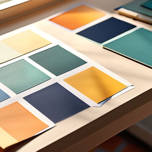
Introduction to art direction basics guide.

An Introduction to Art Direction

I remember sitting in a dimly lit studio back in the late nineties, the air thick with the scent of spray adhesive and the rhythmic snip-snip of X-Acto blades against heavy cardstock. We didn’t have algorithms to tell us if a composition felt “balanced”; we had our eyes, our hands, and a deep, physical understanding of how weight lived on a page. Today, I see so many designers treating art direction basics like a checklist of trendy filters or a prompt for a generative tool, as if style is something you simply apply to a finished product. It’s a mistake. True direction isn’t about decorating a layout; it’s about the intentionality of every single choice you make before the first pixel is even placed.

I’m not here to give you a glossy, superficial manual on how to make things look “pretty” for a portfolio. Instead, I want to share the hard-won principles that have guided me from the era of physical paste-ups to the digital frontier. We are going to strip away the hype and focus on the foundational mechanics of visual storytelling—the kind of knowledge that empowers you to lead a creative vision rather than just following a trend.

Table of Contents

Visual Storytelling Principles Over Mere Decoration

Visual Storytelling Principles Over Mere Decoration.

When I look at a layout, I’m not looking for what’s “pretty.” I’m looking for the narrative thread. There is a massive difference between decorating a page and employing true visual storytelling principles to guide a viewer’s eye. Decoration is noise; it’s the digital equivalent of cluttering a desk with trinkets that serve no purpose. Real art direction, however, uses every element—the weight of a stroke, the tension in a margin, the way light hits a subject—to whisper a specific truth about the brand.

This requires a deep understanding of design hierarchy and composition. You aren’t just placing an image next to a block of text; you are orchestrating a sequence of glances. If the eye doesn’t know where to land first, the story is lost in the shuffle. I often find myself sketching out these paths in my notebook before I ever touch a mouse. We have to move past the idea that art direction is just “making things look good” and start seeing it as the intentional architecture of human emotion and meaning.

Design Hierarchy and Composition With Purpose

Design Hierarchy and Composition With Purpose.

When we talk about design hierarchy and composition, it is easy to get lost in the mechanics of grids and golden ratios. But if you treat composition as a mathematical problem to be solved, you’ve already lost the soul of the work. True art direction isn’t about balancing weights on a canvas; it’s about guiding the viewer’s eye through a narrative. I often find that junior designers try to make everything scream for attention at once. When every element is loud, the result is just noise. Instead, you have to decide what matters most. You need to create a path—a deliberate sequence of visual cues that tells the viewer where to look, what to feel, and when to move on.

This is where typography and visual language become your most vital tools. A typeface isn’t just a way to convey information; it is a structural element that dictates the rhythm of the page. I tell my clients that a well-composed layout should feel like a conversation, not a lecture. By using scale, negative space, and intentional contrast, you aren’t just organizing content—you are building a framework that respects the user’s attention. When you master this, you move beyond mere decoration and start creating work that actually commands presence.

Five Ways to Bring Intentionality Back to the Canvas

  • Stop treating color as a mood board afterthought. Choose your palette with the same rigor you’d use to select a typeface; every hue should serve a functional role in directing the eye or conveying a specific, unshakeable brand truth.
  • Respect the white space. In my early days of paste-ups, we knew that breathing room wasn’t “empty”—it was structural. In digital design, don’t be afraid of the void; use it to give your core message the gravity it deserves.
  • Audit your imagery for authenticity. If a photograph looks like it was plucked from a generic stock library, it’s diluting your brand’s soul. Seek out visuals that possess a bit of grit, a bit of imperfection, and a lot of human connection.
  • Master the tension between type and image. Art direction is often found in the relationship between the two. Don’t just layer text on top of a photo; let them interact, overlap, or push against one another to create a sense of depth and movement.
  • Design for the friction of the real world. Remember that your work isn’t just viewed on a pristine, high-resolution monitor in a controlled studio. It lives in the hands of people on subway rides and in bright sunlight. Test how your direction holds up under the messy reality of human use.

The Core Essentials of Intentional Art Direction

Stop treating art direction as a cosmetic layer; treat it as the structural soul of your work that dictates how a user feels, not just how they look.

Prioritize the “why” behind every visual choice—if a color, typeface, or layout element doesn’t serve the underlying narrative, it’s just digital noise.

Respect the friction of the human experience by building compositions that guide the eye naturally rather than forcing engagement through aggressive, hollow aesthetics.

The Soul of the System

Art direction isn’t about deciding which colors look pretty; it’s about deciding how a brand breathes. If your visual choices don’t create a sense of intentionality—the kind of friction that makes a person pause and actually feel something—then you aren’t directing; you’re just decorating.

Ingrid Bellamy

The Intentional Path Forward

The Intentional Path Forward in art direction.

At its core, effective art direction isn’t about mastering a specific software or chasing the latest aesthetic trend that popped up on a mood board this morning. It is about the synthesis of storytelling, purposeful hierarchy, and a deep respect for how a human eye actually navigates a space. We have discussed how to move beyond mere decoration to find the narrative thread in a composition, and how to use layout not just to organize information, but to guide the viewer’s intuition. When we stop treating design as a collection of assets and start treating it as a cohesive language, we move away from the noise and toward something that actually carries weight.

As you move back to your desks—or your sketchbooks—I challenge you to look for the friction. In an age where automation can generate a thousand “perfect” layouts in seconds, your value lies in the intentionality of your choices. Don’t be afraid to let a design breathe, or to let a single, well-placed element command the room. True art direction is the act of protecting the soul of a project from the vacuum of mindless efficiency. Build things that demand to be felt, not just seen, and always remember that the most powerful tool you possess is your own perspective.

Frequently Asked Questions

How do I maintain a consistent visual voice when I'm collaborating with multiple designers or contributors?

The trap is relying on a static PDF of brand guidelines that no one actually reads. To maintain a true visual voice, you need a shared vocabulary, not just a shared folder. I always advocate for creating a “living” style guide—one that focuses on the intent behind the decisions. Instead of just saying “use this typeface,” explain the weight and rhythm it should carry. When everyone understands the soul of the work, the consistency follows naturally.

Where is the line between effective art direction and over-designing a project until the original intent is lost?

The line is found in the intent. If you’re adding a texture or a typeface because it feels “cool,” but it’s obscuring the message, you’ve crossed it. I always ask myself: Does this element serve the core concept, or am I just decorating a void? Effective art direction acts as a lens, focusing the viewer’s eye on the truth of the brand. Over-designing is just noise—it’s the ego of the designer drowning out the purpose of the work.

How can I apply these principles to digital interfaces without losing the tactile, intentional feel of traditional design?

It starts with embracing friction. In digital spaces, we often default to frictionless, “perfect” smoothness, but that’s where soul goes to die. To keep that tactile feel, I look for micro-interactions that mimic physical weight—think subtle easing in a transition or a typeface that feels like it has actual ink bleed. Don’t aim for sterile perfection; aim for intentionality. Use negative space not just as a void, but as a breathing room that honors the user’s focus.

Visualizing key layout design principles.

Principles of Effective Layout Design

I remember the smell of rubber cement and the tactile weight of heavy cardstock back when we were still physically cutting and pasting every single element by hand. There was a specific, quiet tension in the air when you realized a composition wasn’t working; you couldn’t just hit `Cmd+Z` to undo a mistake. Today, I see so many designers leaning on bloated software and complex grids to hide a lack of fundamental understanding, treating layout design principles like a set of arbitrary rules to be bypassed by flashy effects. We’ve traded the intentionality of craftsmanship for a digital speed that often leaves our work feeling hollow and frantic.

I’m not here to give you a checklist of academic jargon or a lecture on how to chase the latest aesthetic trend. Instead, I want to share what I’ve learned from two decades of moving between the analog and digital worlds. I’m going to walk you through the core layout design principles that actually matter—the ones that respect the user’s eye and honor the human friction of reading. We are going to focus on building structures that serve a purpose, ensuring your work feels grounded, functional, and deeply intentional.

Table of Contents

Mastering Visual Hierarchy in Web Design

Mastering Visual Hierarchy in Web Design guide.

When we talk about visual hierarchy in web design, we aren’t just talking about making the headline bigger than the body text. It’s about orchestrating a sequence of importance that guides a person through a digital space without them even realizing it. I often think about how a well-composed page should feel like a conversation, not a shout. If everything is competing for attention, nothing actually gets heard. You have to decide what the “hero” of your composition is and then step back to let it breathe.

To achieve this, I lean heavily on the proximity principle in design. By grouping related elements together, you create a logical flow that mirrors how our brains naturally categorize information. It’s about creating clusters of meaning that reduce cognitive load. When you respect these spatial relationships, you aren’t just organizing pixels; you are building a roadmap for the user’s eye. It requires a certain level of restraint—knowing when to introduce a pop of color or a heavy weight, and more importantly, knowing when to let the negative space do the heavy lifting.

The Quiet Power of Grid System Fundamentals

The Quiet Power of Grid System Fundamentals

I’ve always felt that a grid shouldn’t be a cage, but rather the invisible skeleton that gives a design its dignity. When I was working with physical paste-ups back in the day, you felt the weight of every margin and column; you couldn’t just “drag and drop” your way out of a structural error. Today, it’s easy to let digital tools do the heavy lifting, but we often lose that sense of structural integrity in the process. Mastering grid system fundamentals isn’t about following a rigid set of rules to make things look “neat”—it’s about creating a predictable rhythm that allows the user to breathe.

When we ignore the underlying structure, we create visual noise that exhausts the viewer. A well-executed grid facilitates compositional balance and alignment, ensuring that no single element feels accidental or adrift. By establishing these mathematical relationships between columns and gutters, we provide a roadmap for the eye. This isn’t just about aesthetics; it’s about reducing cognitive load so the content can actually do its job. When the structure is sound, the design feels intentional, even if the user never consciously notices the lines that hold it together.

Five Ways to Reclaim Intention in Your Layouts

  • Embrace the negative space. In the rush to fill every pixel, we often forget that white space isn’t “empty”—it’s a structural element that gives your content room to breathe and your user room to think.
  • Respect the scan pattern. People don’t read digital interfaces like they read a novel; they scan. Design your layout to guide the eye through a predictable path rather than forcing them to hunt for meaning.
  • Prioritize typographic scale. Don’t just pick font sizes because they look “right” in a preview. Use a mathematical relationship between your headings and body text to create a clear, intuitive sense of importance.
  • Limit your visual noise. Every decorative element you add carries a cognitive cost. If a line, a shadow, or a color isn’t actively helping the user navigate or understand the message, strip it away.
  • Design for the “human friction.” Remember that users interact with screens through tactile devices. Ensure your layout accounts for the physical reality of clicking, scrolling, and tapping, rather than designing for a perfect, frictionless vacuum.

The Intentionality of the Final Layout

Stop designing for the pixel and start designing for the person; every element on your grid should serve a functional purpose rather than merely occupying space.

Respect the friction of the user experience by using hierarchy and whitespace to guide the eye, rather than overwhelming it with visual noise.

Treat your digital layout like a piece of physical craftsmanship, where the tension between structure and spontaneity creates a meaningful connection.

The Fallacy of the Empty Canvas

A layout isn’t a collection of assets competing for attention; it is a controlled conversation. If you aren’t using white space to dictate the rhythm of that conversation, you aren’t designing—you’re just making noise.

Ingrid Bellamy

Beyond the Grid

Mastering layout design Beyond the Grid.

At its core, mastering layout design isn’t about following a rigid checklist of rules; it is about understanding the relationship between space, structure, and the eye. We have looked at how a disciplined grid provides the necessary bones for a composition and how a thoughtful hierarchy guides a user through a digital landscape without overwhelming them. When you combine these elements, you aren’t just arranging pixels—you are orchestrating an experience. By respecting the tension between content and negative space, you ensure that your design remains functional, legible, and, most importantly, purposeful.

As we move further into an era dominated by rapid-fire automation and algorithmic templates, I urge you to hold onto the intentionality of the craft. It is easy to let software make the decisions for you, but the most resonant work always comes from a place of human deliberation. Don’t be afraid to introduce a little bit of “friction” or a slight departure from the norm if it serves the soul of the brand. Use these principles as your foundation, but never let them become your ceiling. Design with the goal of empowering the person on the other side of the screen, and the rest will follow.

Frequently Asked Questions

How do I maintain a sense of intentionality in a layout when I'm forced to work within the rigid constraints of a pre-built responsive template?

Templates often feel like a cage, but I see them more as a scaffolding. To keep your intention intact, stop fighting the grid and start working within its negative space. Use typography—scale, weight, and tracking—to create a rhythm that the template didn’t provide. If the structure is rigid, let your content breathe through deliberate padding and micro-interactions. Don’t just fill the boxes; use the constraints to dictate where the eye is allowed to rest.

At what point does a clean, minimalist grid start to feel clinical and lose that necessary "human friction" that keeps a user engaged?

It happens the moment you prioritize mathematical perfection over visual rhythm. When every margin is identical and every element sits exactly on a pixel-perfect axis, you’ve stopped designing for people and started designing for machines. That sterile predictability kills curiosity. To keep that “human friction,” I often introduce slight, intentional irregularities—a typeface that breaks the baseline or a margin that breathes a little wider. It’s the difference between a sterile hospital corridor and a well-designed studio.

When working with high-contrast typography, how can I balance visual hierarchy without making the layout feel disjointed or overwhelming to the eye?

High contrast is a double-edged sword; it commands attention, but it can easily shatter a composition if you aren’t careful. I find the best way to manage this is through scale and negative space. Don’t just rely on weight or color to create distinction. Use generous whitespace to let your heavy typeforms breathe. If the contrast feels jarring, introduce a subtle, low-contrast typographic element—perhaps a smaller, lighter weight—to act as a visual bridge.

Mastering visual design composition techniques.

Mastering Composition in Visual Design

I remember sitting in a cramped studio at RISD, the air thick with the smell of spray mount and ink, staring at a layout that felt technically “correct” but utterly lifeless. I had followed every textbook rule, yet the page felt hollow, like a house with no soul. We’re still seeing this today in the digital realm—designers obsessing over complex grids and mathematical perfection while completely ignoring how a human eye actually moves across a screen. Most people treat composition techniques like a set of rigid laws to be obeyed, but when you lean too hard into the “rules,” you end up with work that is sterile, predictable, and painfully boring.

I’m not here to give you a lecture on the Golden Ratio or a checklist of academic tropes that only serve to clutter your workflow. Instead, I want to talk about how to use composition techniques to create breathing room and intentionality in your work. I’ll be sharing the practical, battle-tested methods I’ve gathered from two decades of moving between physical paper and digital pixels. My goal is to help you move past mere decoration and start building layouts that actually respect the viewer.

Table of Contents

The Golden Ratio in Art and Human Intuition

The Golden Ratio in Art and Human Intuition.

I’ve always found it fascinating how we search for mathematical perfection in a medium that is inherently messy and organic. When I’m working on a new typeface or a brand identity, I often find myself returning to the golden ratio in art not as a rigid rule to be followed, but as a way to tap into something primal. There is a reason our eyes gravitate toward these proportions; they mirror the growth patterns found in nature, from the spiral of a shell to the arrangement of petals. It’s less about math and more about an innate sense of balance that feels right to the human brain.

In my studio, I try to treat digital layouts with the same reverence I give to my vintage Leica. Just as a photographer uses leading lines in photography to pull a viewer through a scene, a designer uses these natural proportions to guide the eye through a digital experience. If we lean too heavily on perfect symmetry, we risk creating something sterile and lifeless. Instead, I look for that subtle, mathematical tension that creates movement. It’s about finding that sweet spot where structure meets intuition.

Visual Storytelling Principles That Empower Creators

Visual Storytelling Principles That Empower Creators.

When we talk about visual storytelling principles, we aren’t just discussing how to arrange pixels; we are discussing how to direct a human gaze. In my years moving from the tactile world of print to the fluid nature of digital interfaces, I’ve realized that the most effective layouts act like a silent guide. You shouldn’t have to shout for attention. Instead, use intentionality to create a path. Whether you are pulling inspiration from leading lines in photography or the subtle weight of a typeface, every element should serve the narrative you are trying to unfold.

One of the most overlooked tools in a designer’s kit is negative space usage. It is tempting to feel the urge to fill every corner of a canvas, especially when we have the tools to do so instantly. But true craftsmanship lies in knowing when to step back. Leaving room for a composition to breathe isn’t “empty” space—it is the silence between notes that makes the music meaningful. By embracing white space, you give your user the mental room to actually process what they are seeing, rather than just scanning through a cluttered mess.

Five Ways to Reclaim Intentionality in Your Layouts

  • Stop treating white space as “empty.” In my early days of paste-ups, we knew that negative space was just as active as the ink itself. Use it to let your typography breathe and to give the viewer’s eye a place to rest before the next movement.
  • Embrace purposeful tension. You don’t always need perfect, centered symmetry to achieve balance. Sometimes, placing an element slightly off-kilter creates a visual pull that keeps a user engaged rather than letting them glaze over a static screen.
  • Establish a clear hierarchy through scale, not just size. It’s easy to just make a headline bigger, but true composition uses contrast in weight and color to guide the eye. Think about the sequence in which you want a human to consume your information.
  • Respect the grid, but don’t be a slave to it. Grids are essential scaffolding, but if you follow them too rigidly, your work loses its soul. Break the line occasionally to signal importance or to inject a sense of handcrafted character into a digital space.
  • Design for the way eyes actually move. We tend to scan in patterns, but those patterns change based on the weight of your elements. Use leading lines—whether they are literal shapes or the implied direction of a gaze—to shepherd the user through your narrative.

Bringing Intention Back to the Canvas

Composition isn’t about following a rigid set of mathematical rules; it’s about understanding how the human eye moves through a space and using that rhythm to create meaning.

Stop treating white space as “empty” territory to be filled; instead, treat it as a structural element that gives your core ideas the room they need to breathe.

Always prioritize the purpose of the layout over the trend of the moment—if a design choice doesn’t serve the user or the story, it’s just digital noise.

The Weight of Negative Space

Composition isn’t about where you place your elements; it’s about how you manage the silence between them. If you don’t respect the space, you’re just making noise.

Ingrid Bellamy

Beyond the Grid

Intentional design moving Beyond the Grid.

At the end of the day, mastering composition isn’t about memorizing a set of rigid rules or forcing every layout into a perfect mathematical equation. It’s about understanding how the golden ratio taps into our biological intuition and how visual storytelling allows us to guide a viewer through a meaningful experience. Whether you are working with the mathematical precision of a grid or the organic flow of a narrative, the goal remains the same: to create a sense of intentionality that prevents a design from feeling cluttered or accidental. When we apply these techniques thoughtfully, we move away from simply arranging pixels and toward crafting purposeful environments that respect the viewer’s attention.

As you head back to your desk—or your sketchbook—I encourage you to resist the urge to let software make these decisions for you. The tools we use are incredibly powerful, but they lack the ability to feel the weight of a moment or the subtle tension of a well-placed void. Don’t be afraid to break a rule if it serves the soul of the work. True mastery lies in knowing when to follow the structure and when to embrace the friction of a human touch. Use these principles as your foundation, but let your own perspective be the final architect. Design is most alive when it feels like it was made by a person, for a person.

Frequently Asked Questions

How do I balance mathematical rules like the Golden Ratio with the need for organic, intentional imperfection?

Think of mathematical rules as a skeleton, not a cage. The Golden Ratio provides a reliable structure, but if you follow it too rigidly, your work starts to feel sterile—like it was rendered by a machine rather than conceived by a person. I like to use those ratios to establish my initial grid, then I intentionally break them. Shift a weight, soften an edge, or let a line wander. That friction is where the soul lives.

When does following a composition grid start to feel restrictive rather than helpful to the creative process?

It starts to feel restrictive the moment you stop using the grid as a scaffold and start using it as a cage. A grid should provide a sense of underlying order—a way to manage chaos—but it shouldn’t dictate the soul of the piece. If you find yourself moving an element just to satisfy a column rather than to honor the visual tension or the message, you’ve lost the intentionality. Break the grid when the rhythm demands it.

How can I use negative space to create focus without making the design feel empty or unfinished?

Think of negative space not as “nothingness,” but as a structural element. It’s the breathing room that allows your primary subject to actually exist. To avoid that “unfinished” feeling, treat your white space with the same intentionality you’d give a typeface. Use it to create a clear hierarchy; when you pull elements away from each other, you aren’t leaving a void—you’re directing the eye and giving the viewer’s brain a place to rest.

Impact of microinteractions in UI design.

The Impact of Microinteractions on User Experience

I was sitting at my desk last Tuesday, cleaning the internal gears of a 1970s Leica, when I realized how much we’ve lost in the rush toward seamlessness. There is a specific, tactile resistance when you turn a manual focus ring—a tiny, mechanical conversation between the machine and your fingertips. Somewhere in the transition to digital, we traded that soul for “frictionless” speed, but in doing so, we’ve made our interfaces feel hollow. We tend to treat microinteractions in ui as mere eye candy, throwing bouncy, high-velocity animations at a screen just to satisfy a trend report, rather than using them to honor the natural rhythm of a person actually using a tool.

I’m not interested in teaching you how to make your apps look “playful” or trendy. Instead, I want to talk about how we can use these small moments of feedback to restore a sense of intention to our digital craft. I’m going to share what I’ve learned from two decades of design to help you implement microinteractions in ui that serve a purpose, rather than just filling space. We’re going to focus on meaningful feedback that respects the user’s intent, ensuring every digital nudge feels as deliberate as a well-placed ink stroke.

Table of Contents

Using Visual Cues in Digital Products to Honor Intent

Using Visual Cues in Digital Products to Honor Intent.

When we talk about visual cues in digital products, we aren’t just talking about making things move; we are talking about establishing a dialogue. In my early days of print design, a tactile notch or a specific paper weight told you exactly how to handle a piece of media. In the digital realm, we lose that physical weight, which is why we must rely on user interface feedback mechanisms to bridge the gap. A subtle shift in a button’s shadow or a slight change in color when a cursor hovers isn’t just “fluff”—it is a way of acknowledging that the user’s intent has been recognized.

If these cues are too loud, they become a distraction; if they are too quiet, the user feels lost in a void of inaction. The goal is to manage cognitive load and interface feedback so that the technology recedes into the background. I’ve always believed that the most successful digital tools are the ones that feel intuitive, almost as if they are anticipating your next move without demanding your full attention. We should use motion to guide the eye, not to hijack it, ensuring every movement serves a clear, functional purpose.

Mastering Ux Design Motion Principles for Meaningful Connection

Mastering Ux Design Motion Principles for Meaningful Connection

When we talk about movement in a digital space, there is a tendency to treat motion as decoration—a way to make a product feel “premium” or “slick.” But if we look at it through the lens of craftsmanship, motion is actually a language of causality. To truly master ux design motion principles, we have to stop asking “how does this look?” and start asking “how does this explain?” A well-timed transition shouldn’t just be a pretty slide; it should serve as a bridge that helps the user understand where they just were and where they are going.

If motion is too frantic or lacks a clear logic, you aren’t enhancing the product; you are simply increasing the cognitive load and interface feedback loop to a point of frustration. I’ve seen too many interfaces where elements pop in and out without any sense of spatial relationship. Instead, use motion to provide a sense of continuity. When an element expands from a button to a full-screen modal, that movement tells a story of growth and hierarchy. It respects the user’s mental model by providing a logical thread through the interaction, ensuring the digital experience feels as grounded and intentional as a physical one.

Five Ways to Keep Microinteractions Grounded in Craft

  • Prioritize feedback over flourish. A microinteraction should never feel like a decoration; it should act as a quiet confirmation that the user’s intent was understood, much like the tactile click of a well-made Leica shutter.
  • Respect the user’s tempo. Avoid heavy, sweeping animations that force a person to wait for the interface to catch up. The movement should feel like a natural extension of their own rhythm, not an interruption to it.
  • Design for the “frictionless” trap. While we often strive for seamlessness, a tiny moment of intentional resistance—like a slight haptic pulse or a subtle color shift—can prevent errors and give the user a sense of agency.
  • Maintain visual hierarchy through motion. Use subtle shifts in scale or opacity to guide the eye, rather than using loud, distracting transitions that pull attention away from the core task at hand.
  • Test for emotional resonance, not just technical success. Ask yourself: does this interaction feel hollow and automated, or does it possess a sense of intentionality that makes the digital space feel inhabited and human?

The Intentionality of Motion

Microinteractions aren’t decorative flourishes; they are the digital equivalent of tactile feedback, serving to confirm a user’s action and provide a sense of closure.

Avoid the temptation to over-animate; every movement must justify its existence by guiding the eye or reducing the cognitive load of a transition.

Respect the user’s pace by ensuring that motion feels like a natural extension of their intent, rather than a distraction that interrupts their flow.

The Soul in the Small Details

A microinteraction shouldn’t feel like a digital flourish or a piece of visual noise; it should feel like the subtle click of a well-made Leica shutter—a quiet, purposeful confirmation that the tool is listening to the human behind it.

Ingrid Bellamy

The Quiet Power of Intentional Motion

The Quiet Power of Intentional Motion.

At the end of the day, microinteractions aren’t just about adding a bit of polish or making a button bounce; they are about the dialogue between the user and the interface. We’ve explored how visual cues can guide a person through a task without overwhelming them, and how mastering motion principles allows us to create a sense of rhythmic continuity rather than digital chaos. When we get these small moments right, we stop building mere interfaces and start building responsive environments that acknowledge the user’s presence and respect their cognitive load.

As we move further into an era defined by rapid automation and generative tools, I find myself leaning harder into the value of the small, deliberate choice. It is easy to let a machine smooth everything out into a frictionless, characterless void, but true craftsmanship lies in knowing when to introduce a moment of meaningful friction. Let’s commit to designing tools that don’t just occupy space on a screen, but actually honor the human hand behind the click. Design is a service, and our best work will always be the kind that makes a person feel seen, not just processed.

Frequently Asked Questions

How do I know when a microinteraction has crossed the line from being helpful to just being digital clutter?

It’s a fine line, and honestly, it’s one we cross too often. You know you’ve drifted into clutter when the animation begins to compete with the task at hand. If a user has to wait for a flourish to finish before they can proceed, you haven’t designed an interaction; you’ve designed an obstacle. If it doesn’t provide immediate feedback or clarify an action, it’s just noise. If it feels like decoration rather than direction, strip it back.

Is there a way to design these subtle movements without sacrificing the performance or speed of the interface?

It’s a valid fear. We often mistake “fluidity” for “bloat,” but they aren’t the same. To keep things snappy, focus on CSS transitions rather than heavy JavaScript libraries whenever possible; they’re lighter on the browser. Also, keep your easing curves simple. If an animation takes longer than 300ms, it starts feeling like friction rather than grace. Aim for subtle, purposeful motion that complements the interface’s speed instead of competing with it.

How can I ensure that microinteractions feel consistent with a brand's physical identity when moving from print to digital?

Think about the weight of the paper or the tactile resistance of a lever in a vintage Leica. That’s your brand’s physical soul. When moving to digital, don’t just copy colors; translate that sensory experience into motion. If your print identity is heavy and structured, your microinteractions should feel deliberate and grounded, perhaps with a slightly slower, more weighted easing. If it’s airy, let the animations breathe. Consistency isn’t just a hex code; it’s a shared rhythm.

Fundamentals of user interface design principles.

Fundamentals of User Interface Design

I remember sitting in a cramped studio back in the late nineties, the smell of spray adhesive and ozone from a heavy plotter hanging thick in the air. Back then, we didn’t have “seamless” everything; we had physical layouts that required a steady hand and a real sense of scale. Today, I look at modern user interface design and often feel like we’ve traded that tactile soul for a polished, frictionless void. We’ve become so obsessed with making everything “invisible” and “effortless” that we’ve forgotten that meaningful interaction requires a bit of intentional weight.

I’m not here to feed you the usual industry jargon or tell you how to chase the latest trend in micro-interactions. Instead, I want to talk about how we can bring purpose back to the screen. I’m going to share what I’ve learned from two decades of moving between physical and digital craft, focusing on how to build interfaces that actually respect the user’s intelligence. We’ll skip the hype and look at how to design with a sense of humanity and restraint, ensuring your work serves a function rather than just filling up empty pixels.

Table of Contents

Navigating the Nuance of Ux vs Ui Design Principles

I often find myself in conversations with junior designers who treat the distinction between UX and UI as a mere technicality, but to me, it’s the difference between the skeleton of a building and the way the light hits the windows. When we talk about ux vs ui design principles, we aren’t just discussing different stages of a checklist; we are discussing the relationship between logic and emotion. UX is the structural integrity—the way a user moves through a space without tripping over invisible hurdles. UI is the tactile grace that makes that movement feel intentional.

If the user experience design workflow is flawed, no amount of beautiful typography or polished buttons will save the product. You can have a stunningly aesthetic interface, but if the user feels lost or frustrated, the design has failed its primary purpose. I always tell my clients that true craftsmanship requires a balance: you need the rigorous, invisible logic of UX to guide the way, paired with a strong sense of visual hierarchy in interface design to ensure the eye knows exactly where to rest. It’s about creating a cohesive language where the function and the form are finally in conversation.

Visual Hierarchy in Interface Design Guiding the Creative Eye

Visual Hierarchy in Interface Design Guiding the Creative Eye

When I sit down with my sketchbook to map out a new layout, I’m not thinking about where to put the prettiest elements. I’m thinking about where the eye needs to land first. Effective visual hierarchy in interface design isn’t about shouting for attention; it’s about a quiet, structured conversation between the screen and the user. If everything is bold, nothing is bold. We often fall into the trap of trying to make every call-to-action pop, but true craftsmanship lies in knowing what to leave in the shadows to let the primary intention breathe.

I’ve found that the most successful interfaces respect the natural scanning patterns of the human eye. By playing with scale, weight, and even the subtle use of negative space, we create a path that feels intuitive rather than forced. It’s a delicate balance—using design system components to maintain consistency while ensuring that the most vital information doesn’t get lost in the noise. We aren’t just arranging pixels; we are curating a sequence of discovery that respects the user’s cognitive load.

Five Principles for Designing with Intention

  • Respect the negative space. It’s tempting to fill every pixel to prove your productivity, but white space isn’t “empty”—it’s a functional tool that gives the user’s eyes a place to rest and process information.
  • Prioritize legibility over trendiness. I’ve seen too many beautiful, experimental typefaces fail because they ignored the basic human need to read without strain. If the typography isn’t functional, the design has failed its primary mission.
  • Design for the “fat finger” and the distracted mind. We often design for perfect, idealized users on high-resolution monitors, but real life is messy. Ensure your touch targets are generous and your interactive elements are forgiving of human error.
  • Maintain a consistent visual language. Don’t reinvent the wheel with every new screen. Use a disciplined system of buttons, icons, and spacing so that the user learns your interface intuitively rather than having to solve a puzzle every time they click.
  • Embrace purposeful friction. Not every interaction should be instantaneous and frictionless. Sometimes, a deliberate pause or a confirmation step is necessary to signal that a meaningful action has occurred, honoring the weight of the user’s intent.

The Intentionality of the Interface

Prioritize purpose over decoration; every element on the screen must earn its place by serving a specific function or guiding a user’s intent.

Respect the user’s cognitive load by using visual hierarchy to create breathing room, rather than overwhelming them with endless, frictionless choices.

Design for the human on the other side of the glass, ensuring the interface feels like a tool that empowers them rather than a system that merely manages them.

The Soul in the System

A great interface shouldn’t feel like a frictionless void; it should feel like a well-weighted tool in a craftsman’s hand—intentional, responsive, and deeply respectful of the person holding it.

Ingrid Bellamy

The Intentional Interface

Mastering design with The Intentional Interface.

At its core, mastering user interface design isn’t about mastering the latest software suite or chasing every fleeting aesthetic trend. It is about the delicate balance between the structural logic of UX and the visual clarity of UI, ensuring that hierarchy and function work in tandem rather than in competition. When we stop treating pixels as mere decoration and start viewing them as tools for communication, we move away from clutter and toward meaningful interaction. We must remember that every shadow, every typeface choice, and every margin is a decision that either invites the user in or pushes them away.

As we move further into an era of automated generation and frictionless automation, I urge you to hold onto the intentionality of the craft. Don’t be afraid of a little friction if it means creating a more thoughtful, human experience. The most successful interfaces aren’t the ones that disappear entirely, but the ones that respect the user’s presence and honor their agency. Let your work be a testament to the idea that technology should serve us, not just distract us. Build with purpose, design with restraint, and never lose sight of the human hand behind the screen.

Frequently Asked Questions

How do I maintain a sense of tactile craftsmanship when working within the constraints of a standardized design system?

It’s a tension I feel every day. Standardized systems are built for efficiency, but efficiency can often feel sterile. To find the soul in the system, look at the micro-interactions. Don’t just use the default corner radius; think about the weight of a shadow or the specific, intentional timing of a transition. It’s about finding the “human” in the margins—using those rigid components to build something that feels considered, rather than just assembled.

Where is the line between making an interface "seamless" and stripping away the intentional friction that helps a user actually process information?

The line is drawn at cognitive engagement. “Seamless” shouldn’t mean “thoughtless.” When we remove every micro-moment of friction, we risk creating a passive experience where the user glides right past the substance. If a user can complete a task without a single moment of reflection, they haven’t actually processed the information—they’ve just followed a path of least resistance. Real design uses subtle friction to signal importance, forcing the eye to pause and truly see.

How can I ensure that my pursuit of minimalist aesthetics doesn't accidentally compromise the functional accessibility of the interface?

Minimalism shouldn’t mean subtraction for the sake of emptiness; it should mean clarity. I often see designers strip away too much, leaving users guessing. To avoid this, treat accessibility as a core design constraint, not an afterthought. Check your color contrasts, ensure your typography remains legible at small scales, and never sacrifice intuitive affordance for a “clean” look. If a user has to hunt for a way forward, your minimalism has failed.

Improving web design accessibility through design.

Designing Accessible Websites

I was sitting in a dimly lit studio last Tuesday, cleaning the internal gears of a 1970s Leica, when I realized how much we’ve lost in the rush to automate everything. In the design world, we’ve started treating web design accessibility like a legal chore—a tedious checklist of technical requirements that we slap onto a project at the very last minute just to avoid a lawsuit. It has become this sterile, clinical obligation that feels completely disconnected from the actual humanity of the person on the other side of the screen. We’ve traded intentionality for compliance, and frankly, it’s making our digital landscape feel colder and more exclusionary than it needs to be.

I’m not here to lecture you on WCAG guidelines or drown you in jargon that only developers care about. Instead, I want to talk about how we can weave empathy back into our workflows. My goal is to share a practical, no-nonsense approach to building interfaces that respect everyone’s unique way of interacting with the world. We are going to move past the “checkbox” mentality and focus on how thoughtful craftsmanship can turn accessibility from a technical hurdle into a fundamental pillar of great design.

Table of Contents

The Integrity of Semantic Html for Accessibility

The Integrity of Semantic Html for Accessibility

When I was still working with physical layouts, every element had a literal, tactile place on the page. In the digital realm, we often lose that sense of structure by treating code as just a way to make things look “pretty.” But if we want to move beyond mere aesthetics, we have to talk about semantic HTML for accessibility. Using a `

` for everything might look fine on a high-resolution monitor, but to a screen reader, it’s a silent, structureless void. When we use proper tags—like `

Sketching for designers to develop concepts.

Using Sketching to Develop Design Concepts

I remember the distinct, metallic scent of a fresh Leuchtturm notebook and the way a heavy fountain pen felt in my hand during those long nights at RISD. Back then, we weren’t chasing perfect vectors or fighting with software updates; we were fighting to find the core idea through messy, graphite-stained pages. Today, I see too many young creatives jumping straight into Figma, trying to solve structural problems with rounded corners and drop shadows before they’ve even understood the weight of their own concepts. They treat sketching for designers as a chore to be optimized or a “phase” to be bypassed, but they’re actually skipping the most vital part of the process: the moment where the brain and the hand actually talk to each other.

I’m not here to give you a tutorial on how to draw pretty icons or how to use a tablet to mimic a pencil. My goal is to help you reclaim the intentionality that gets lost when we move too fast toward the pixel. I want to share how you can use analog tools to find the friction and the soul behind your work, ensuring your designs are built on a foundation of thought rather than just aesthetic trends.

Table of Contents

Strengthening Visual Communication Skills Through Raw Expression

Strengthening Visual Communication Skills Through Raw Expression

When we move straight to the software, we often fall into the trap of making things look “finished” before they are actually thought through. There is a certain safety in the grid and the pixel-perfect alignment of a digital tool, but that safety can become a cage. By leaning into raw expression, you bypass the urge to polish and instead focus on the core logic of the idea. This is where you truly sharpen your visual communication skills for designers; you aren’t just moving shapes around, you are learning to translate abstract concepts into legible, visual shorthand.

I’ve found that the most profound breakthroughs happen when I stop trying to be precise and start trying to be honest. Using a fountain pen allows for a certain level of messiness that a mouse simply cannot replicate. This tactile feedback is essential when you are low-fidelity prototyping with sketches, as it forces you to prioritize hierarchy and flow over decorative flourishes. When you embrace the smudge of ink or the uneven line, you aren’t failing at precision—you are succeeding at clarity. You are stripping away the noise to find the signal.

Low Fidelity Prototyping With Sketches to Honor Human Friction

Low Fidelity Prototyping With Sketches to Honor Human Friction

There is a specific kind of paralysis that sets in when you open a high-fidelity tool like Figma or Illustrator too early. You start worrying about pixel perfection, hex codes, and corner radii before you’ve even solved the fundamental problem. I’ve found that low-fidelity prototyping with sketches is the only way to bypass that trap. When I use a fountain pen on toothy paper, I’m not trying to build a finished product; I’m trying to map out the logic of a user’s journey. The slight imperfection of a hand-drawn line forces you to focus on the structural integrity of the idea rather than the polish of the interface.

By embracing sketching for wireframing and layout during the earliest stages, you allow yourself the freedom to fail quickly. This is where the real work happens—in the messy, rapid cycles of an iterative design process sketching allows you to test spatial relationships without the heavy lifting of digital assets. It keeps the conversation focused on flow and hierarchy. We need to protect that space where ideas are still fragile, because that is exactly where the most intentional solutions are born.

Five Ways to Reclaim Intentionality at the Drawing Board

  • Put the stylus away and embrace the mess. There is a specific kind of cognitive resistance that happens when a pen meets paper; it forces you to slow down and actually think about the weight of a line rather than just clicking and dragging a vector.
  • Stop aiming for “pretty” and start aiming for “clear.” A sketch isn’t a finished piece of art; it’s a way to map out a hierarchy. If your sketch can’t communicate the core idea through simple shapes and rough strokes, no amount of high-fidelity rendering will save it.
  • Use your sketchbook as a sandbox for failure. The digital canvas often feels too “final,” which leads to preciousness and fear of making mistakes. In your notebook, you can kill a bad idea in three seconds with a single stroke of a fountain pen, freeing you to find the real solution.
  • Document the “why,” not just the “what.” Don’t just draw the layout; jot down notes in the margins about why a certain element needs more breathing room or why a typeface feels too heavy. These annotations are the connective tissue between your intuition and your final execution.
  • Practice the art of the quick iteration. Instead of spending an hour perfecting one single concept, try to sketch ten variations of a single component in ten minutes. This builds the muscle of rapid decision-making and prevents you from getting stuck in the trap of a single, flawed direction.

The Intentionality of the Imperfect

Stop treating your sketchbook as a rehearsal for the final product; use it as a space to embrace the friction of a moving hand, where mistakes actually reveal the core of an idea.

Prioritize the speed of thought over the polish of pixels to ensure your initial concepts are driven by purpose rather than a desire to make things look “clean” too early.

Leverage low-fidelity sketches to bridge the gap between abstract thought and digital execution, ensuring the human soul of the design isn’t lost in the transition to software.

The Resistance of the Page

A pixel is too perfect to be honest; it’s only when you feel the slight drag of a nib against paper that you actually encounter the truth of a concept.

Ingrid Bellamy

Returning to the Page

Sketching while returning to the page.

At the end of the day, sketching isn’t about producing a masterpiece; it’s about the intellectual honesty of a rough line. We’ve discussed how raw expression sharpens our visual language and how low-fidelity sketches allow us to embrace the necessary friction of the human experience. By stepping away from the sterile perfection of a vector point or a pixel-perfect grid, we give ourselves permission to fail quickly and think deeply. It is in that messy, unpolished space between the pen and the paper that the most intentional design decisions are actually born.

As we move further into an era of automated layouts and algorithmic generation, I urge you to hold onto your tools. Don’t let the convenience of the software swallow your intuition. Pick up your sketchbook, feel the weight of the pen, and remember that your value as a designer lies in your ability to curate meaning, not just execute commands. The digital world will always be there, but the soul of your work is found in the deliberate, imperfect marks you make before the screen even turns on. Keep your hands dirty; it’s the only way to keep your vision clear.

Frequently Asked Questions

How do I stop myself from getting precious about a sketch and actually use it to solve a problem?

The moment you start worrying about the line weight or the neatness of your lettering, you’ve stopped designing and started performing. To break that cycle, treat your sketchbook like a sandbox, not a gallery. Use a tool that feels “imperfect”—maybe a thick felt-tip marker or a blunt pencil—so you can’t obsess over detail. If a sketch feels too “precious,” scribble over it. Destroy the beauty to find the logic.

When does a sketch stop being a useful tool and start becoming a distraction from the actual digital execution?

A sketch becomes a distraction the moment you start refining the aesthetics instead of the intent. If you’re obsessing over line weight or perfect curves in your sketchbook, you’ve drifted from problem-solving into decoration. The sketch is a bridge, not the destination. Once the logic of the layout and the hierarchy of information are clear, put the pen down. If you aren’t moving toward digital execution, you aren’t designing; you’re just doodling.

How can I bridge the gap between a messy, analog concept and a high-fidelity interface without losing that initial spark of intentionality?

The mistake most designers make is trying to “clean up” the sketch too quickly. When you move to Figma, don’t aim for perfection; aim for translation. Carry the core logic of your messy lines into your digital grid. If a hand-drawn curve felt right because of its rhythm, don’t flatten it into a sterile, mathematical arc. Keep that tension. Use the digital tool to refine the intent, not to erase the soul.

Artist performing concept sketching for design.

The Value of Concept Sketching

I remember sitting in a cramped studio at RISD, the air thick with the smell of graphite and stale coffee, staring at a blank sheet of heavy-weight paper. Back then, there was no “undo” button or infinite layers; there was just the terrifying, beautiful friction of a lead pencil meeting grain. Today, I see so many designers rushing straight to the software, trying to force a polished, pixel-perfect solution before they’ve even understood the core problem. We’ve traded the vital, messy discovery of concept sketching for the hollow efficiency of dragging and dropping pre-made assets, and in the process, we are losing the intentionality that makes design actually work.

I’m not here to teach you how to draw like an illustrator or how to master a new digital brush set. My goal is to help you reclaim the cognitive benefits of getting your hands dirty. I want to show you how to use concept sketching as a way to think, not just a way to decorate, ensuring your ideas are rooted in logic rather than just aesthetics. We’re going to focus on meaningful exploration—the kind that respects the process and builds a foundation that no algorithm can replicate.

Table of Contents

Mastering Rapid Visualization Techniques to Fuel Intuition

Mastering Rapid Visualization Techniques to Fuel Intuition

The mistake I see most often in modern workflows is the rush to move from a blank screen to a high-fidelity vector. We try to skip the middle step, but that’s where the magic—and the mistakes—live. To truly lean into the design thinking process, you have to embrace the speed of thumbnail sketching basics. This isn’t about creating art; it’s about clearing the mental fog. When I sit down with my sketchbook, I’m not looking for a masterpiece. I’m looking for the ghost of an idea, using rapid visualization techniques to see if a composition actually holds weight before I waste an hour nudging anchor points in Illustrator.

These iterative drawing methods act as a pressure valve for your brain. By forcing yourself to produce ten tiny, messy versions of a single concept, you bypass the inner critic that demands perfection too early. It’s about developing visual intuition through sheer volume. If you can communicate the soul of a brand or the ergonomics of a product through a few crude lines and shapes, you’ve done the heavy lifting. Once that intent is solidified on paper, the digital execution becomes a matter of refinement rather than a desperate search for direction.

Thumbnail Sketching Basics Finding Form in the Friction

Thumbnail Sketching Basics Finding Form in the Friction

When I sit down with my sketchbook, I’m not looking for a masterpiece; I’m looking for a way out of a mental rut. This is where thumbnail sketching basics become less about art and more about survival. The goal isn’t precision—it’s volume. I treat these tiny, often messy frames as a way to bypass the internal critic that demands perfection too early. By shrinking the canvas, you strip away the distraction of detail and force yourself to focus solely on composition and silhouette.

In my experience, these small studies are the backbone of a robust design thinking process. They allow you to fail fast and fail cheaply. If a layout doesn’t work at two inches wide, no amount of high-fidelity rendering or pixel-pushing will save it later. You have to embrace the deliberate messiness of these marks. It’s about capturing the raw energy of an idea before the digital tools begin to smooth out all the interesting edges. Don’t be afraid to let the ink bleed or the lines wobble; that’s where the real discovery happens.

Five Ways to Keep the Human Trace in Your Sketches

  • Stop reaching for the stylus immediately. There is a specific kind of cognitive resistance that happens when a nib hits paper; use that friction to slow your brain down and actually think about the form before you commit to a pixel.
  • Embrace the mess. A perfect line is often a lie told by a computer; a shaky, uncertain stroke in a sketchbook reveals where your intuition is still wrestling with the concept. Let those mistakes stay visible.
  • Limit your palette to the essentials. Don’t get distracted by color theory too early. Stick to a single fountain pen or a graphite pencil to ensure you are solving for structure and silhouette rather than decoration.
  • Work in bursts, not marathons. Concept sketching isn’t about producing a finished illustration; it’s about rapid-fire exploration. Set a timer for ten minutes and force yourself to exhaust a single idea through sheer volume.
  • Document the “why,” not just the “what.” Use the margins of your sketchbook to jot down quick, handwritten notes about why a specific curve works or why a composition feels off. These annotations are the connective tissue between a doodle and a design.

The Intentionality of the Unfinished

Treat your sketches as a way to find the soul of a concept, not as a way to create a final product; the goal is to capture the raw energy of an idea before the software tries to sanitize it.

Lean into the messiness of the hand-to-paper connection to bypass the “perfectionism trap” that often stalls digital workflows.

Use the physical friction of sketching to slow your brain down, allowing you to think through structural problems rather than just decorating a layout.

The Value of the Unpolished Line

“A digital canvas is too forgiving, too easy to perfect before you’ve actually found the soul of the idea. Concept sketching isn’t about the final image; it’s about embracing that initial, messy friction where the hand and the mind actually meet.”

Ingrid Bellamy

The Intentional Path Forward

Sketching The Intentional Path Forward.

At its core, concept sketching isn’t about producing a masterpiece that you can frame; it is about the relentless pursuit of clarity. We’ve looked at how rapid visualization can bypass the ego to tap into pure intuition, and how the humble thumbnail sketch allows us to find structural integrity before we ever touch a pixel. By embracing these methods, you aren’t just “drawing”—you are building a bridge between a nebulous idea and a functional reality. Remember that the goal is to strip away the noise and find the essential skeleton of your design through the honest, unpolished friction of your own hand.

As you move from your sketchbook back to your digital canvas, try not to lose that sense of tactile discovery. It is easy to let the perfectionism of software swallow the soul of a project, but I urge you to protect the original intent that was born in those messy, ink-stained margins. The most impactful designs are rarely the ones that started with a perfect vector; they are the ones that carried the weight and warmth of a human thought from the very first stroke. Keep your pens ready, keep your sketches loose, and never let the machine dictate your vision.

Frequently Asked Questions

How do I stop myself from getting precious about a sketch and actually move on to the next iteration?

The moment you start obsessing over a single line, you’ve stopped designing and started decorating. To break that cycle, set a timer. Give yourself exactly three minutes per iteration. When the bell rings, the pen moves, regardless of whether that curve feels “perfect.” Remember, a sketch isn’t a finished piece of art; it’s a way of thinking. If you cling to one idea too tightly, you lose the freedom to discover the better one hiding in the next sketch.

At what point does a sketch transition from a tool for exploration to a distraction from the actual design work?

It becomes a distraction the moment you stop searching for an idea and start decorating it. When you find yourself obsessing over line weight or perfecting a curve instead of testing the structural integrity of the concept, you’ve drifted. A sketch is a compass, not the destination. If you’re spending more time refining the tool than refining the intent, put the pen down. Move to the next stage before the polish kills the progress.

How can I maintain the integrity of my hand-drawn ideas when I eventually have to translate them into digital software?

The transition from paper to pixels is where most soul gets lost. To keep that integrity, don’t aim for immediate perfection in your software. Instead of trying to “clean up” your sketches into sterile vectors right away, use your digital tools to trace the actual weight and jitter of your pen strokes. Treat your software as a way to document your intent, not a way to sanitize it. Let the digital version retain the rhythm of the hand.

Integrating sustainable design into modern architecture.

Integrating Sustainability Into Design

I was sitting at my drafting table last Tuesday, cleaning the grit out of a 1970s Leica, when I realized how much we’ve lost in the rush toward digital perfection. We’ve been sold this lie that sustainable design is some high-tech, complex metric involving carbon offsets and massive server optimizations. It’s become a buzzword used to justify adding more layers of “green” features that actually just bloat the interface and drain the user’s attention. To me, true sustainability isn’t a plugin or a checklist; it’s about the intentionality of what we choose to leave out.

I’m not here to feed you another list of industry platitudes or performative metrics that look good in a slide deck but mean nothing in practice. Instead, I want to talk about how we can return to a philosophy of purposeful restraint. I’m going to share what I’ve learned from twenty years of navigating the shift from physical to digital, focusing on how we build tools that respect both the environment and the human being behind the screen. We’re going to strip away the noise and look at how meaningful craft can actually drive longevity.

Table of Contents

Integrating Biophilic Design Elements for Human Connection

Integrating Biophilic Design Elements for Human Connection

When we talk about digital interfaces, we often forget that we are biological entities sitting in front of glowing rectangles. We aren’t meant to exist in a vacuum of sterile pixels and harsh, blue-light geometry. This is where integrating biophilic design elements becomes more than just a visual trend; it becomes a way to bridge the gap between our digital habits and our evolutionary need for nature. I’ve always felt that a well-designed layout should breathe. Instead of the frantic, high-density grids that demand our constant attention, we should be looking toward the organic rhythms found in the natural world—soft gradients that mimic light filtering through leaves, or asymmetrical balance that feels more intentional and alive.

By introducing these organic textures and patterns, we reduce the cognitive load that usually comes with heavy digital consumption. It’s about creating a sense of calm rather than a sense of urgency. If we treat our digital environments with the same respect we give to our physical workspaces, we can foster a deeper connection to the work itself. True craftsmanship lies in designing for the human nervous system, ensuring our tools feel like an extension of our natural environment rather than a disruption to it.

Carbon Footprint Reduction Without Sacrificing Creative Agency

Carbon Footprint Reduction Without Sacrificing Creative Agency

There is a lingering misconception in our industry that lowering our carbon footprint reduction efforts means settling for a diluted, “lesser” aesthetic. We often treat environmental responsibility as a set of constraints that stifle our creative agency, as if we are being asked to design in a vacuum. But that is a false dichotomy. True craftsmanship lies in the ability to work within boundaries, much like the physical limitations of a letterpress or the specific chemistry of a darkroom.

Instead of viewing efficiency as a loss, we should see it as a way to refine our intent. This means moving toward circular economy principles—designing digital assets that are lightweight, optimized for performance, and built to last rather than being discarded in the next seasonal refresh. When we strip away the bloated code and the unnecessary high-resolution overhead that serves no functional purpose, we aren’t just saving energy; we are respecting the user’s time and hardware. It is about choosing a lean, purposeful elegance over the mindless excess that has become the default in our hyper-connected era.

Five Ways to Design with Intention and Less Waste

  • Audit your asset weight before you ever hit export. It’s tempting to use high-resolution textures for every layer, but heavy files demand more energy to move across the web. I’ve learned that a well-optimized, crisp SVG often carries more soul—and less weight—than a bloated, uncompressed PNG.
  • Prioritize typography that scales without bloat. Instead of loading five different heavy web fonts to achieve a specific mood, try working within a more restrained, highly legible type system. It respects the user’s bandwidth and keeps the visual hierarchy clean and purposeful.
  • Design for the “long tail” of hardware. We often get caught up in designing for the latest high-spec retina displays, but true sustainability means creating interfaces that remain functional and beautiful on older devices. If your design only works on a $3,000 machine, it isn’t truly inclusive or efficient.
  • Embrace the power of negative space as a functional tool. White space isn’t just a stylistic choice; it reduces cognitive load and prevents the “visual clutter” that leads to endless, energy-draining scrolling. A quiet interface is a sustainable interface.
  • Build modularity into your design systems from day one. Instead of creating one-off components for every new project, develop a library of reusable, robust elements. This doesn’t just speed up your workflow; it prevents the digital equivalent of landfill—thousands of redundant, slightly different code snippets that clutter the ecosystem.

The Intentionality of Less

Sustainability in design isn’t a checklist of green features; it’s a mindset of restraint that favors purposeful, long-lasting utility over the constant, energy-hungry cycle of trend-chasing.

We must design for the long haul by prioritizing performance and accessibility, ensuring our digital artifacts don’t become obsolete—or environmental burdens—the moment a new software update drops.

True creative agency is preserved when we use efficiency as a tool for clarity, stripping away the digital bloat that obscures the human connection between the creator and the user.
The Ethics of Digital Minimalism

True sustainability in design isn’t just about optimizing code for energy efficiency; it’s about resisting the urge to over-engineer. We need to stop designing for the dopamine hit of a new feature and start designing for the quiet endurance of a tool that actually respects a user’s time and attention.

Ingrid Bellamy

The Intentional Path Forward

The Intentional Path Forward in sustainable design.

Ultimately, sustainable design isn’t a checklist of green certifications or a series of technical constraints to be overcome; it is a fundamental shift in how we value our digital environment. We have spent years chasing the dopamine hit of the “new,” often at the expense of the planet and our own mental clarity. By weaving biophilic principles into our interfaces and being ruthless about reducing the unnecessary digital weight that drives up carbon costs, we do more than just save energy. We create a digital landscape that respects the user’s attention and the physical world we all inhabit. It is about choosing purpose over pixels, ensuring that every line we draw and every interaction we engineer serves a lasting function rather than a fleeting trend.

As I sit here with my sketchbook, watching the light shift across my desk, I am reminded that the most enduring things are rarely the loudest. The same applies to our work in the digital realm. We have a profound responsibility to build tools that don’t just fill a screen, but actually empower the human spirit to create something meaningful. Let’s stop designing for the sake of the algorithm and start designing for the sake of the person on the other side of the glass. If we commit to this level of intentionality, we won’t just be making better products; we will be preserving the craft for the generations of creators yet to come.

Frequently Asked Questions

How do we measure the actual environmental impact of a digital brand identity without getting lost in abstract metrics?

Stop chasing vanity metrics like “digital impressions” that don’t tell the real story. To see the actual impact, look at the weight of your assets. I start with the basics: file sizes, server requests, and the energy cost of your brand’s motion design. If a brand identity requires massive, unoptimized video loops just to feel “premium,” it’s costing the planet. Measure the efficiency of your code and the simplicity of your visual assets. True elegance is lightweight.

Is there a way to balance the heavy visual demands of high-end brand storytelling with the need for low-energy, lightweight digital assets?

It’s the designer’s central tension: how to be expressive without being wasteful. I’ve found the answer lies in intentionality, not compromise. We can lean into high-impact typography and clever use of negative space to carry the narrative weight, rather than relying on heavy, unoptimized video loops. Use SVG illustrations for crispness, prioritize variable fonts to reduce file requests, and treat every kilobyte as a deliberate choice. Storytelling thrives in the nuance, not the bloat.

How can small boutique agencies justify the extra time required for sustainable design workflows to clients who are only focused on immediate speed and scale?

You have to stop pitching sustainability as a moral luxury and start pitching it as technical durability. When clients demand speed, they’re usually asking for short-term fixes that break under pressure. I tell them that a sustainable workflow isn’t just about the planet; it’s about building leaner, more intentional assets that don’t require constant, wasteful redesigns. We aren’t just slowing down; we’re building things that actually last.

Selecting branding typography for brand identity.

Choosing Typography for Brand Identity

I remember sitting in a cramped studio in Providence back in the late nineties, the air thick with the smell of spray adhesive and the rhythmic snip-snip of X-Acto blades. We weren’t clicking through font libraries; we were physically wrestling with letterforms, feeling the weight of every serif and the tension in every stroke. Today, I see so many designers treating branding typography like a mindless checkbox—scrolling through endless digital catalogs and picking whatever looks “trendy” or “clean” without a second thought. It’s a hollow way to work, and frankly, it’s why so much modern design feels utterly soulless.

I’m not here to give you a list of the most popular Google Fonts or teach you how to chase the latest aesthetic whim. Instead, I want to pull back the curtain on how to select type that actually carries weight and meaning. I’ll share the practical, battle-tested principles I’ve gathered from two decades in the trenches to help you build a typographic system that respects the reader and honors the craft. We’re going to move past the superficial and learn how to choose type that breathes with intention.

Table of Contents

The Psychology of Typefaces Crafting Emotional Resonance

The Psychology of Typefaces Crafting Emotional Resonance

When we talk about the psychology of typefaces, we aren’t just discussing aesthetics; we are discussing the subconscious dialogue between a brand and its audience. A heavy, geometric sans-serif doesn’t just sit on a page—it commands authority and stability. Conversely, a delicate, high-contrast serif can whisper elegance or even a sense of nostalgia. If you choose a typeface that contradicts your brand’s core values, you create a cognitive dissonance that users feel even if they can’t name it. The weight, the slant, and the terminal shapes all contribute to an emotional frequency that dictates whether a customer trusts you or merely tolerates you.

This emotional resonance is where the technical meets the visceral. It’s not enough to simply select a font that looks modern; you have to consider how legibility and brand recognition work together to build long-term memory. When I consult with agencies, I often see them overlook how much a typeface influences perceived value. A poorly chosen typeface can strip the soul out of even the most meticulously crafted brand identity visual elements. You have to ensure the type breathes with the intent of the message, rather than just filling the empty space.

Legibility and Brand Recognition Respecting the Readers Eye

Legibility and Brand Recognition Respecting the Readers Eye.

We often get so caught up in the “vibe” of a typeface that we forget its primary job: to be read. I’ve seen countless brand identities stumble because they prioritized a trendy, experimental aesthetic over basic function. If a user has to squint to parse your mission statement, you haven’t designed a brand; you’ve designed a puzzle. True legibility and brand recognition aren’t at odds; in fact, they are symbiotic. When a typeface is clear, it builds trust. It tells the reader that you value their time and their cognitive ease.

This is where establishing a clear typography hierarchy in design becomes essential. It’s about guiding the eye through a landscape of information without causing fatigue. I always tell my clients to think about the rhythm of the page—the way a bold header provides an anchor before the eye settles into the steady, predictable flow of body text. When you balance high-impact display type with highly functional secondary fonts, you create a visual language that feels both intentional and effortless. Don’t let your creativity become a barrier to your message.

Five Principles for Typography with Intention

  • Stop collecting fonts like they’re digital trophies. I’ve seen too many brand identities fail because they tried to use five different typefaces to look “diverse.” Choose two, maybe three, and make them work. One for the heavy lifting of headlines, one for the quiet endurance of body copy, and perhaps a third for the occasional accent. Restraint is where the real authority lives.
  • Respect the white space around your letters. In my early days of manual paste-ups, we understood that the space between characters is just as vital as the ink itself. When you’re designing digitally, don’t be afraid to let your type breathe. Tightening your tracking just because you want to fill a gap is a rookie mistake that kills legibility and creates visual tension that feels accidental rather than intentional.
  • Test your type in the real world, not just on a high-resolution Retina display. A typeface might look stunning in a Figma mockup, but how does it hold up on a grainy printed menu or a low-light mobile screen? I always suggest stepping away from the backlit glow and seeing how the letterforms behave in different environments. If it doesn’t work in the “friction” of real life, it isn’t a good typeface.
  • Hierarchy isn’t just about size; it’s about weight and rhythm. You don’t need to jump from 48pt to 12pt to create a distinction. You can create a sophisticated hierarchy using a bold weight versus a light weight, or a condensed version versus an extended one. It’s about guiding the eye through a narrative, ensuring the reader knows exactly where to land first and where to rest.
  • Build a system, not just a selection. When I consult with agencies, I tell them to stop thinking about individual words and start thinking about typographic ecosystems. This means defining your scale, your line heights, and your paragraph spacing before you ever touch a layout. A brand’s typography should feel cohesive whether it’s a massive billboard or a tiny favicon. Consistency is the foundation of trust.

The Intentional Designer’s Checklist

Stop chasing trends and start looking for character; a typeface should feel like a natural extension of the brand’s voice, not a costume it’s wearing.

Prioritize the reader’s comfort over visual ego by ensuring your typographic hierarchy respects the natural rhythm of human eye movement.

Treat every letterform as a functional tool, remembering that true design excellence lies in the balance between aesthetic soul and effortless legibility.

The Soul in the Stroke

A typeface isn’t just a collection of characters; it’s the silent cadence of a brand’s voice. If you choose a font based solely on a trend, you’re just adding noise. But when you select type that respects the rhythm of the human eye and the weight of the message, you create something that actually resonates.

Ingrid Bellamy

The Intentional Typographer

The Intentional Typographer selecting purposeful brand fonts.

At the end of the day, branding typography isn’t about finding the most trendy font on a digital marketplace; it’s about the intersection of psychology, legibility, and soul. We’ve looked at how type carries emotional weight and how respecting the reader’s eye is a fundamental act of empathy. When you choose a typeface, you aren’t just selecting a set of glyphs—you are deciding how a brand speaks without making a sound. Whether you are balancing the delicate weight of a serif or the brutalist efficiency of a grotesque, remember that every choice must serve a functional purpose and a deeper narrative.

As we move further into an era of automated design and generative layouts, I urge you to hold onto the friction of human intention. Don’t let the ease of a single click strip the character away from your work. Treat your type as a living component of your brand’s architecture, one that requires careful curation and a steady hand. If you approach your typography with the same respect you give to the craft of a physical print, you will create something that doesn’t just fill a screen, but actually resonates with the people on the other side of it.

Frequently Asked Questions

How do I balance the desire for a unique, custom typeface with the practical need for cross-platform legibility?

It’s a classic tension. I often tell my clients: don’t let your ego break your user experience. If you’re designing a custom typeface, keep its most distinct personality traits for display headers—where they can breathe. For body copy and interface elements, pair it with a robust, high-legibility system font or a heavily tested geometric sans. Use your custom work to set the mood, but let reliable, functional type do the heavy lifting.

At what point does a brand's typographic system become too complex to manage across different digital touchpoints?

Complexity becomes a liability the moment your design system stops being a guide and starts being a chore. If your team is spending more time troubleshooting font weights or hunting for specific kerning pairs than they are actually creating, you’ve crossed the line. A system should offer enough structure to feel cohesive, but not so much friction that it stifles agility. When the rules prevent you from adapting to a new screen or platform, it’s time to prune.

How can I introduce enough "human friction" or character into my type selection without sacrificing the clean functionality required for modern UI?

The trick is to stop treating your typeface as a monolith. Use a highly legible, neutral sans-serif for your functional UI—the buttons, labels, and data—to keep the friction low where it matters most. Then, introduce character through your display type. Use a typeface with a bit of “soul”—maybe a subtle humanist stroke or a unique terminal—for headlines and brand moments. It’s about layering: utility in the structure, and humanity in the emphasis.