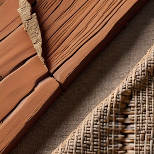
I still remember the heavy, rhythmic thwack of a manual lever press in my first studio, the smell of linseed oil, and the way a single sheet of cotton paper felt like it had a pulse. There was no “undo” button then; you lived with the consequences of every ink stroke. Today, I see designers chasing “tactile materials” by slapping expensive, high-gloss textures over digital interfaces that feel as hollow as a plastic shell. We’ve become obsessed with the aesthetic of touch while completely ignoring the actual soul of the medium. We are decorating the surface instead of honoring the weight of the object.
I’m not here to sell you on a trendy palette of overpriced paper stocks or some superficial “skeuomorphic” gimmick. Instead, I want to talk about how we can reintegrate genuine, purposeful materiality into our work to bridge the gap between the pixel and the palm. I’ll be sharing what I’ve learned from twenty years of navigating this shift—from the physical paste-ups of my youth to the digital tools of today—to help you use tactile materials to create work that actually commands attention through its substance, not just its shine.
Table of Contents
Sensory Texture Exploration in a Digital Age
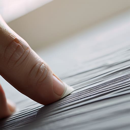
When I sit at my desk, my fingers often wander from the smooth, clinical surface of my trackpad to the heavy, toothy grain of a 300gsm watercolor paper. This isn’t just a habit; it’s a subconscious need for sensory engagement through touch. In a digital landscape that often feels too frictionless, too “perfect,” we lose the nuances that make an experience feel real. True sensory texture exploration isn’t about adding decorative noise to a layout; it’s about understanding how the brain translates visual grit into a felt sensation.
We see this most clearly when we look at how materiality in fine arts informs our digital interfaces. A well-placed grain or a subtle, organic gradient can mimic the imperfections of the physical world, grounding a user in a space that feels inhabited rather than manufactured. Even as we move further into virtual realms, the goal should be to evoke a sense of weight and resistance. We aren’t just moving pixels; we are trying to replicate the soul of craftsmanship in a medium that lacks it by default.
The Vital Role of Haptic Feedback in Design
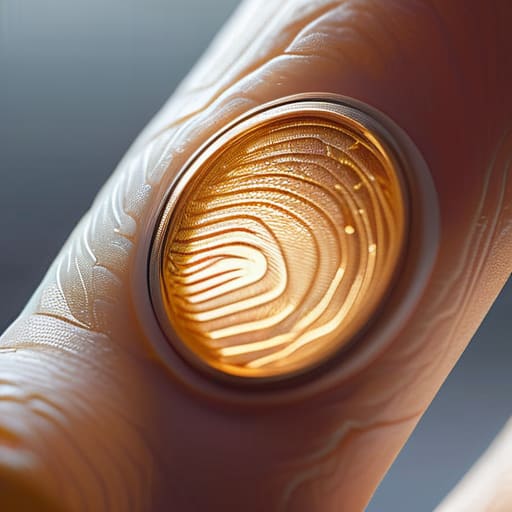
We often forget that our relationship with technology is inherently physical. When we slide a finger across a glass screen, we are met with a sterile, frictionless void that offers nothing back to the nervous system. This is where the conversation around haptic feedback in design becomes so critical. It isn’t just about a vibration motor firing off a notification; it’s about simulating the subtle resistance we expect from the real world. When a digital interface can mimic the click of a mechanical switch or the soft drag of paper, it bridges the gap between the ephemeral code and our physical reality.
To truly respect the user, we have to move beyond mere visual cues and embrace sensory engagement through touch. In my studio, I often think about how the weight of a well-made Leica camera informs the way you interact with it. Digital tools should strive for that same sense of intentionality. By integrating nuanced haptics, we can provide a sense of confirmation and depth that sight alone cannot convey. We aren’t just moving pixels; we are trying to reclaim the soul of the interaction through the subtle language of touch.
Five Ways to Bring Physicality Back to Your Digital Process
- Stop designing for perfection. In the real world, nothing is perfectly smooth or mathematically precise. Introduce subtle, organic irregularities into your digital textures—think of the slight grain in a piece of heavy-stock paper or the way ink bleeds into a fiber—to break that sterile, “too-clean” digital feeling.
- Respect the weight of your elements. When you’re building interfaces, consider the visual “gravity” of your materials. A heavy, dark-textured background should feel anchored, while lighter, more translucent layers should feel like they are floating. If everything feels weightless, nothing feels real.
- Use contrast to define boundaries. In physical print, we often rely on the edge of a material to tell us where one thing ends and another begins. In digital design, don’t just rely on drop shadows; use shifts in texture and grain to create a sense of physical depth and separation.
- Design for the “grip.” Just as a well-made fountain pen feels substantial in your hand, your digital components should feel like they have a surface to hold onto. Use micro-interactions and tactile visual cues that suggest a user is actually interacting with a physical object rather than just tapping glass.
- Limit your palette to avoid sensory overload. When working with rich, tactile textures, less is always more. If every element is fighting for attention with its own complex pattern, you lose the intentionality of the craft. Pick one or two primary “materials” and let them breathe.
Bringing Intentionality Back to the Interface
Stop designing for seamlessness at the expense of soul; embrace the subtle “friction” that makes a digital interaction feel grounded and real.
Prioritize haptic and visual textures that mimic physical craftsmanship to bridge the gap between the cold screen and the human hand.
Use tactile elements not as mere decoration, but as purposeful tools that respect the user’s sensory intelligence.
The Soul in the Grain
We’ve spent so much time smoothing everything out for the sake of efficiency that we’ve accidentally polished away the soul of the work. True design shouldn’t feel like sliding a finger across glass; it should feel like the intentional weight of a letterpress print or the subtle resistance of a well-tuned dial.
Ingrid Bellamy
The Intentionality of Touch
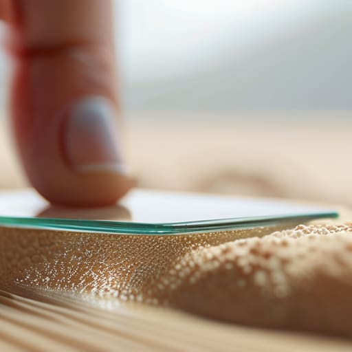
As we’ve explored, integrating tactile considerations—whether through the subtle vibration of haptic engines or the deliberate use of visual texture—isn’t just a stylistic choice; it’s a way to ground our digital experiences. We cannot allow the seamlessness of modern interfaces to become a vacuum that strips away our sensory connection to the work. By prioritizing sensory texture and meaningful feedback, we bridge the gap between the cold efficiency of code and the warmth of human interaction. It is about moving away from the frictionless void and toward a design language that acknowledges the physical reality of the person on the other side of the glass.
Ultimately, my hope is that we stop designing for mere convenience and start designing for connection. As I sit here with my sketchbook and my fountain pen, I am reminded that the most enduring tools are those that respect the nuance of human touch. We aren’t just moving pixels; we are building the environments where people live, work, and create. Let’s commit to building digital spaces that don’t just fill a screen, but actually resonate with the soul. Don’t be afraid to introduce a little friction; it’s often exactly what we need to feel truly present.
Frequently Asked Questions
How do we balance the desire for tactile, high-texture elements with the need for clean, accessible digital interfaces?
It’s a delicate tension, isn’t it? I think of it like a well-composed typeface: the structure must be invisible so the character can breathe. We shouldn’t clutter the UI with literal textures that impede legibility. Instead, use subtle micro-interactions—the slight resistance of a scroll, the weight of a shadow, or a grain that only appears upon closer inspection. Aim for “perceived texture.” It’s about evoking the feeling of materiality without sacrificing the clarity of the function.
Are there specific ways to translate the "weight" of physical materials into digital design without it feeling like a gimmick?
It’s a fine line. To avoid the gimmick, stop thinking about visual “decorations” and start thinking about physics. In my studio, weight is about resistance. Digitally, you translate this through intentionality in motion—not just a bouncy animation, but a subtle deceleration that suggests mass. Use micro-interactions that require a deliberate gesture, mirroring the effort needed to move something heavy. If the interaction feels effortless and “floaty,” you’ve lost the sense of gravity.
As we move further into spatial computing and AR, how does the definition of a "tactile material" evolve when there is no physical surface to touch?
In spatial computing, “tactility” shifts from the physical to the psychological. We aren’t touching surfaces; we are interacting with perceived resistance. When the physical is absent, we have to engineer “digital friction”—the subtle visual cues and haptic pulses that signal weight, grain, or density. It’s about simulating the soul of a material through light and vibration. We must design these digital textures with enough intentionality that the mind fills in the tactile gap.
