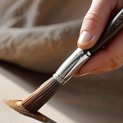
I remember sitting in a cramped studio at RISD, my fingers stained with India ink, feeling the exact moment a nib caught on the tooth of heavy watercolor paper. There was a specific, stubborn resistance there—a physical dialogue between my hand and the medium. Now, when I look at how most digital illustrators approach brush dynamics, I see a tragic loss of that conversation. Everyone is chasing these hyper-complex, expensive software presets that promise “realism,” but they end up creating something that feels unnervingly sterile. They’ve traded the soul of the stroke for a mathematical approximation of pressure, and it shows.
I’m not here to sell you on a new plugin or a convoluted workflow that requires a degree in calculus to master. Instead, I want to talk about how we can reclaim that sense of intention. I’m going to share what I’ve learned about configuring brush dynamics to actually respect the friction of human movement, rather than smoothing it away. We’ll move past the superficial settings and focus on how to build digital tools that feel like an extension of your own hand, ensuring your work retains its essential, tactile character.
Table of Contents
Mastering Stylus Pressure Sensitivity for Intentional Mark Making
When I first transitioned from ink on paper to a Wacom tablet, I felt a profound sense of loss. On paper, the resistance of the grain and the varying amount of ink in my nib provided instant, tactile feedback. In the digital realm, everything can feel frustratingly sterile if you don’t calibrate your tools to mimic that physical resistance. To bridge this gap, you have to move beyond the default settings. Mastering stylus pressure sensitivity isn’t just about making a line thicker when you press harder; it’s about how that pressure dictates the soul of the mark.
I often tell my clients to stop treating the stylus like a mouse. If you want your work to feel lived-in, you need to dive into your brush opacity and flow control settings. By mapping pressure to these specific parameters, you allow for a gradual build-up of pigment, much like layering watercolor or charcoal. It forces you to slow down. Instead of mindless clicking, you’re forced to respect the friction of the stroke, ensuring that every movement feels intentional rather than accidental.
Leveraging Tablet Tilt Recognition to Mimic Real World Friction
When I’m working with my vintage Leica, I’m constantly aware of the angle at which the light hits the lens. Digital tools often forget this physical reality, treating the stylus as a mere pointer rather than a tool with geometry. This is where tablet tilt recognition becomes essential. It isn’t just a technical feature; it’s the bridge between a sterile digital canvas and the tactile unpredictability of charcoal or a wide graphite pencil. By adjusting your angle, you aren’t just changing the shape of the mark—you are introducing a layer of intentional friction that prevents your work from looking overly “computed.”
To truly master this, you have to move beyond default configurations. I often find myself diving into my custom brush engine parameters to ensure that the tilt doesn’t just widen the stroke, but also subtly alters the way the pigment distributes. If you can link the angle of your hand to subtle shifts in brush opacity and flow control, you stop fighting the software and start collaborating with it. The goal is to create a workflow where the digital medium respects the natural, sweeping motions of your wrist, mimicking the way a real brush responds to the pressure and slant of a human hand.
Finding the Soul in the Settings
- Stop chasing the “perfect” smooth stroke. Sometimes, a little jitter or a slight imperfection in the line weight is exactly what prevents your work from looking like a sterile vector file. Embrace the wobble; it’s where the character lives.
- Map your opacity to pressure, but don’t let it do all the heavy lifting. I often find that decoupling opacity from pressure and instead linking it to a subtle flow variation allows for much more nuanced layering, much like how ink behaves on heavy watercolor paper.
- Treat your brush size settings as a physical constraint. Instead of constantly toggling between tiny and massive brushes, set a dynamic range that forces you to work within a certain scale. It mimics the way a real brush holds a limited amount of pigment.
- Pay attention to the “taper.” A brush that simply ends abruptly feels mechanical and dead. Adjust your settings so the stroke tapers off based on your release speed, giving the eye a sense of momentum and a natural conclusion to the movement.
- Test your digital tools against your physical intuition. If a brush feels too “slippery” or lacks the resistance you’d expect from a charcoal stick, don’t just push through it—go back into the settings and add some drag or deceleration. If it doesn’t feel right in your hand, it won’t look right on the screen.
Finding the Soul in the Software
Stop fighting the software’s tendency to smooth everything out; instead, use pressure and tilt to reintroduce the purposeful imperfections that make a stroke feel alive.
Treat your stylus like a physical tool rather than a digital cursor, focusing on the weight and resistance of each movement to ensure your work doesn’t feel hollow.
True digital mastery isn’t about achieving technical perfection, but about using these settings to translate your personal, human intuition into the digital space.
The Ghost in the Machine
Digital tools often try to erase the struggle of creation, but true craft lives in that resistance—in the way a stroke yields or fights back when you apply pressure. If we strip away the friction, we strip away the soul.
Ingrid Bellamy
Finding the Soul in the Software
Ultimately, mastering brush dynamics isn’t about memorizing a technical manual or chasing the most expensive hardware. It’s about understanding how pressure sensitivity and tilt recognition work together to bridge the gap between your hand and the screen. When we stop fighting the digital interface and start leaning into these nuances, we move away from the sterile, “perfect” lines that characterize much of today’s automated design. By intentionally manipulating weight, resistance, and angle, we reclaim the tactile unpredictability that makes a piece of work feel alive. We aren’t just pushing pixels; we are translating physical intent into a digital medium.
As I sit here with my sketchbook and a half-empty cup of tea, I’m reminded that the most profound tools are those that allow for a bit of beautiful imperfection. Technology will continue to advance, and algorithms will undoubtedly get better at mimicking human behavior, but they can never replicate the specific, soulful friction of a human making a choice. Use these digital settings to find your own rhythm. Don’t let the software dictate your style; instead, use these dynamics to ensure your creative fingerprint remains visible in every single stroke you make.
Frequently Asked Questions
How do I find a balance between pressure sensitivity and my own natural hand fatigue during long sessions?
It’s a delicate trade-off. If you set your pressure curves too steep, you’ll find yourself white-knuckling the stylus just to get a decent line, which is a recipe for tendonitis. I usually recommend softening the curve—giving the software a bit more “give”—so you can achieve varied weights with a lighter, more fluid touch. Don’t fight the tool; let the sensitivity do the heavy lifting so your hand can stay relaxed.
Can I replicate the specific resistance of a nib on paper if my tablet feels too slick or "glassy"?
You can, and you absolutely should. That “glassy” sensation is the enemy of intentionality; it makes your marks feel accidental rather than earned. I always suggest a matte screen protector—something with a bit of tooth to it. It mimics that subtle drag of paper against a nib. If you can’t change the surface, try adjusting your software’s stabilization settings to add a slight, artificial resistance. It’s not perfect, but it fights that frictionless drift.
How much of the "soul" in a stroke comes from the hardware settings versus the actual physical movement of my hand?
It’s a bit of a false dichotomy. Think of it like a vintage Leica: the mechanics are brilliant, but they don’t take the photo. The hardware provides the capability—the range of pressure and the response to your tilt—but your hand provides the intent. The “soul” lives in the tension between the two. Good settings don’t create character; they simply stop getting in the way of your physical intuition.
