I still remember the smell of rubber cement and the tactile resistance of X-Acto blades cutting through heavy cardstock back in my RISD days. There was a specific, heavy weight to making a decision; you couldn’t just hit `Cmd+Z` to undo a physical mistake. Today, we’ve traded that beautiful, deliberate friction for a world of frictionless, instant, and frankly soulless automation. We call it efficiency, but I call it a loss of identity. True digital craft isn’t about how fast you can deploy a component library or how many plugins you have installed; it’s about reclaiming that sense of intentionality within the pixels.
I’m not here to sell you on the latest trendy software or promise that a new AI tool will make you a master designer overnight. Instead, I want to talk about how we can inject humanity back into our workflows. I’m going to share the hard-won lessons I’ve gathered from two decades of moving between physical paste-ups and digital interfaces, focusing on how to build tools and interfaces that respect the user. We’re going to explore how to move past mere decoration and toward a practice that honors the maker and the person on the other side of the screen.
Table of Contents
Mastering Creative Software With Intention
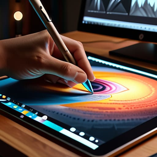
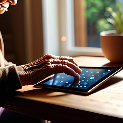
We often treat our tools like magic wands, expecting a single click to solve a conceptual problem. But there is a profound difference between knowing which buttons to press and actually mastering creative software with a sense of purpose. When I sit down at my workstation, I try to view my tablet or mouse not as a shortcut, but as an extension of my hand. It requires a certain level of technical proficiency in digital media to ensure the software doesn’t dictate the outcome. If you aren’t careful, the presets and the “auto-everything” features will start making your decisions for you, stripping away the very nuance that makes a brand feel alive.
True precision in digital design comes from understanding the mechanics behind the interface. It’s about knowing when to lean into a tool’s automation and when to fight against it to maintain a sense of human imperfection. I’ve found that the most rewarding digital artistry workflows are those where the designer remains the pilot, using the software to amplify a specific intent rather than letting the algorithm smooth out the edges of their vision.
Blending Technology and Creativity Through Human Friction
There is a specific kind of magic that happens when you stop fighting your tools and start listening to them. In my early days of paste-ups, the physical resistance of the paper and the drying time of the ink dictated the pace. Today, we have the opposite problem: everything is too easy, too instant. We often mistake speed for progress, but true precision in digital design requires us to reintroduce a sense of deliberate pacing. It’s about finding that sweet spot where the software acts as an extension of your hand rather than a replacement for your judgment.
When we talk about blending technology and creativity, we aren’t looking for seamless automation that removes all thought from the process. Instead, I look for the “productive struggle”—the moments where a tool forces you to make a choice, to refine a curve, or to rethink a layout. It is within this friction that we move away from cookie-cutter templates and toward something that feels lived-in. We must treat our digital interfaces not as magic wands, but as instruments that require tuning to truly sing.
Five Ways to Bring Soul Back to Your Digital Workflow
- Stop defaulting to presets. Whether it’s a typeface weight or a color palette, fight the urge to click the first option the software suggests. Take a moment to manually adjust the kerning or the saturation; that slight, intentional imperfection is where the character lives.
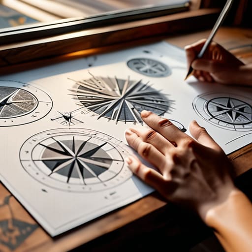
- Reintroduce the sketchbook. Before you touch a mouse, use your pen. There is a cognitive connection between the hand and the brain that a digital canvas simply cannot replicate. Let your rough, messy ideas exist on paper before you try to clean them up in pixels.
- Respect the grid, but don’t live in it. Grids are meant to be scaffolding, not a cage. Use them to create order, but learn when to break a rule to create tension. A perfect layout is often a boring one; it’s the subtle deviation that catches the eye.
- Curate your digital toolkit. Just because a new plugin or an AI-driven tool exists doesn’t mean it belongs in your process. Only adopt technology that expands your ability to express an idea, rather than tools that aim to bypass the actual thinking.
- Design for the tactile. Even in a purely digital medium, think about how a user’s interaction feels. Does a transition feel snappy and purposeful, or is it just visual noise? Aim for a sense of “digital weight” that honors the person navigating your work.
The Essentials of Intentional Digital Craft
Stop treating your software like a magic wand; treat it like a precision tool. Every click, shortcut, and layer should be a deliberate choice that serves the final composition, not a way to automate away your thinking.
Embrace the “productive friction” of the process. Don’t be afraid to step away from the digital grid to sketch a concept by hand or test a typeface in a physical space—that tactile disconnect is often where the most soulful design decisions are born.
Prioritize purpose over decoration. Digital craft isn’t about how many effects you can stack on a layout, but about how much respect you show for the user’s attention and the clarity of your brand’s message.
The Soul in the Machine
Digital craft isn’t about how much software you can master; it’s about knowing when to step away from the automation to let a bit of human imperfection breathe life into the work.
Ingrid Bellamy
The Path Forward
At the end of the day, digital craft isn’t about mastering the latest software update or chasing the trendiest aesthetic. It’s about the quiet, deliberate choices we make between the clicks—the decision to use a typeface because of its historical weight rather than its popularity, or the choice to leave a margin wide enough to let a composition breathe. We’ve discussed how intention in our tools and the embrace of meaningful human friction are what separate mere production from true design. When we stop treating our digital interfaces as frictionless voids and start treating them as extensions of our own hands, we move away from being mere operators and toward becoming true makers.
As I sit here with my fountain pen and my sketchbook, I’m reminded that the most profound work often comes from the tension between the old ways and the new. Don’t let the speed of automation rob you of your perspective. Use the technology to amplify your voice, not to muffle it. The goal isn’t to create something that looks perfect; it’s to create something that feels intentional. Keep your eyes sharp, your hands steady, and never forget that behind every pixel is a human intention waiting to be expressed. Go out and build something that actually honors the craft.
Frequently Asked Questions
How do I stop relying on presets and actually develop my own visual intuition?
Stop treating presets like a finish line. When you click a filter, you’re essentially outsourcing your judgment to an algorithm. To find your own rhythm, start by breaking things. Take a preset, then pull it apart—tweak the grain, shift the curves, or kill the saturation until it feels uncomfortable. Use your sketchbook to map out compositions before you touch a mouse. Intuition isn’t found in a menu; it’s built through the friction of trial and error.
Where is the line between using AI as a tool and letting it strip the intentionality out of my work?
The line is drawn at the moment you stop asking “why.” If you’re using AI to handle the heavy lifting—the tedious resizing or the initial color explorations—you’re still the architect. But the second you let it make the final call on a typeface’s weight or a layout’s rhythm, you’ve handed over the keys. Use it to expand your range, not to bypass the struggle. If there’s no friction, there’s no soul.
How can I maintain a sense of tactile craftsmanship when my entire workflow is confined to a screen?
You have to build bridges between the physical and the digital. I never start a project on a screen; I start with my sketchbook and a heavy fountain pen. That initial friction—the resistance of paper, the slight bleed of ink—anchors the idea. When you eventually move to the mouse, don’t aim for frictionless perfection. Seek out tools that allow for organic variation. Treat your digital layers like physical media, layering with purpose rather than just clicking buttons.