Inspiration found in beautiful natural patterns.

Finding Inspiration in Natural Patterns

I was sitting at my drafting table last Tuesday, cleaning the grit out of a 1970s Leica lens, when I realized how much we’ve lost in our rush to make everything “perfectly” digital. We’ve become obsessed with sterile, mathematical precision, treating design like a math problem to be solved rather than a living thing to be felt. I see it everywhere in modern UI: these lifeless, hyper-symmetrical grids that feel more like a hospital corridor than a human space. We talk about incorporating natural patterns to add “warmth,” but most designers just slap a generic leaf vector on a landing page and call it a day. That isn’t design; it’s decoration, and it’s an insult to the complexity of the real world.

I’m not here to give you a lecture on biomimicry or show you a slideshow of pretty fractals. Instead, I want to talk about how we can actually use the unpredictable rhythm of the organic world to create digital interfaces that feel intuitive and grounded. We are going to look at how to weave true natural patterns into your workflow—not as a stylistic gimmick, but as a way to respect the way humans actually perceive space and movement. This is about bringing back the intentionality of craft in a world that is increasingly obsessed with the shortcut.

Table of Contents

The Quiet Power of Fibonacci Sequence in Plants

The Quiet Power of Fibonacci Sequence in Plants

I often find myself sketching the spiral of a succulent or the arrangement of pinecone scales when I’m stuck on a layout. There is a profound, almost meditative logic to it. We talk a lot about “organic” design in our industry, but we rarely talk about the math that actually drives it. When you look closely at the fibonacci sequence in plants, you aren’t just seeing a pretty arrangement; you are seeing an incredibly efficient solution to the problem of space and light.

In my work, I try to translate this into digital interfaces. It isn’t about copying a leaf, but about understanding how mathematical patterns in biology create a sense of inevitable balance. When we implement these ratios into our grids or typographic scales, we move away from the sterile, “perfect” alignment that often makes digital work feel soulless. Instead, we tap into a rhythm that the human eye is already hardwired to recognize and trust. It’s that subtle tension between precision and growth that makes a design feel truly alive.

Finding Purpose in Biomorphic Design Principles
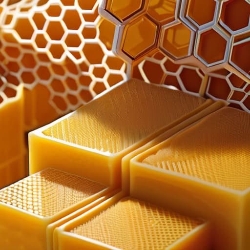
Finding Purpose in Biomorphic Design Principles.

When we talk about biomorphic design principles, we aren’t talking about slapping a leaf icon on a landing page and calling it a day. That’s just decoration, and frankly, it’s lazy. True biomorphism is about understanding the underlying logic of how life organizes itself. It’s about recognizing that the efficiency found in tessellation in natural structures—like the way a honeycomb manages space—can inform how we layer information in a complex interface. When we mimic these biological efficiencies, we aren’t just chasing a trend; we are tapping into a visual language that the human brain is already hardwired to interpret as stable and coherent.

The goal is to move beyond mere “nature-inspired aesthetics” and toward a functional mimicry of growth and rhythm. Think about the way a branch splits or how a shell curves; there is a sense of inevitable logic in those forms. In my work, I try to translate that sense of inevitability into digital layouts. If a grid feels too rigid, it feels clinical and dead. By introducing subtle, organic deviations, we create a sense of movement that feels less like a machine and more like a living system.

Bringing the Human Element Back to the Grid

  • Stop chasing perfect symmetry. Nature rarely works in mirrored perfection; it works in balance. Instead of forcing every element into a rigid, mathematical center, allow for slight, intentional asymmetries that mimic the way a leaf grows or a coastline curves. It creates a visual rhythm that feels lived-in rather than manufactured.
  • Use organic tension to guide the eye. In the wild, patterns aren’t just decorations; they are pathways for survival. In your layouts, use the flow of natural curves to direct a user’s attention toward a call to action, much like the way sunlight filters through a canopy to highlight a specific patch of forest floor.
  • Embrace the beauty of imperfection. Digital design tends toward the sterile, but true craftsmanship lives in the “errors.” Incorporate subtle, non-repeating textures or slightly irregular line weights. If every stroke is mathematically identical, you lose that essential friction that makes a design feel tactile and real.
  • Respect the hierarchy of growth. Just as a tree grows from a central trunk outward into delicate branches, your design should have a clear, organic hierarchy. Don’t just scale elements up or down; let your typography and imagery evolve from a core concept, creating a sense of structural logic that feels intuitive to the viewer.
  • Avoid the “sticker” trap. There is a massive difference between designing with natural patterns and simply slapping a botanical illustration onto a white background. If you use organic shapes, they must be integrated into the very architecture of the interface—the margins, the containers, and the transitions—not just treated as an afterthought.

Moving Beyond Ornamentation

Stop using organic shapes as mere decoration; use the underlying logic of natural patterns to create intuitive hierarchies that feel earned rather than forced.

Respect the “human friction” by designing interfaces that mimic the rhythmic, non-linear way we interact with the physical world, rather than striving for a sterile, frictionless perfection.

Let mathematical naturalism, like the Golden Ratio, act as a structural foundation for your grids to ensure your layouts possess an inherent, quiet stability that the eye recognizes instantly.

## The Friction of the Organic

We often mistake digital perfection for good design, but nature isn’t perfect—it’s intentional. When we integrate natural patterns into our work, we aren’t just adding decoration; we are reintroducing the subtle, rhythmic friction that makes a digital space feel lived-in and human.

Ingrid Bellamy

The Intentional Return

The Intentional Return to natural rhythmic patterns.

We’ve looked at how the Fibonacci sequence provides a hidden architecture to the natural world and how biomorphic principles can breathe life into static interfaces. But the takeaway isn’t that we should simply mimic the shape of a leaf or the curve of a shell to satisfy a trend. It is about recognizing that nature has already solved the problem of efficient, beautiful complexity. When we integrate these patterns, we aren’t just decorating a layout; we are tapping into a fundamental logic that the human eye is already evolved to trust. By moving away from the sterile, perfectly geometric grids that often dominate our digital spaces, we allow for a sense of rhythmic cohesion that feels less like an algorithm and more like an ecosystem.

As I sit here with my sketchbook, watching the way light hits the grain of my wooden desk, I am reminded that our best work often happens when we stop fighting against the “messiness” of life and start designing with it. Technology should never be a barrier between the creator and the soul of the work; it should be the lens that brings our intent into sharper focus. Let’s stop striving for a digital perfection that feels hollow and instead aim for a meaningful resonance. When we design with the patterns of the natural world in mind, we create digital experiences that don’t just occupy space, but actually respect the human spirit.

Frequently Asked Questions

How do I integrate these organic patterns without making the interface feel cluttered or distracting from the core functionality?

The mistake most designers make is treating organic patterns as decoration rather than structure. If you’re layering a Fibonacci spiral or a cellular texture, it shouldn’t sit on top of your UI like a sticker; it should dictate the rhythm of your spacing and the flow of your hierarchy. Use these patterns to inform your grid or your white space. If the pattern isn’t actively guiding the eye toward your CTA, it’s just noise. Keep it structural, not ornamental.

Is there a way to use mathematical patterns like the Golden Ratio to improve typography and layout hierarchy rather than just using them for decoration?

Stop treating the Golden Ratio like a decorative sticker you slap onto a composition. It’s a structural tool, not an ornament. I use it to establish a rhythmic scale between my body copy and headings, ensuring the visual weight feels earned rather than arbitrary. When you apply these proportions to your grid systems and typographic hierarchies, you aren’t just making things “look right”—you’re creating a logical, intuitive flow that respects how the eye naturally scans a page.

Where is the line between intentional biomorphic design and just adding "nature-inspired" fluff that lacks real structural purpose?

The line is drawn at utility. If you’re adding a leaf motif just to soften a sterile interface, you’re just decorating, not designing. Real biomorphic design uses organic logic to solve a problem—like using the branching patterns of a river delta to map a complex information hierarchy. If the shape doesn’t improve navigation, legibility, or the user’s sense of flow, it’s just digital clutter. Don’t mistake aesthetic mimicry for structural integrity.

Principles of effective typography for human readers.

Stop Decorating and Start Communicating: Why the Principles of Effective Typography Must Respect the Human Reader.

I remember sitting in a cramped studio at RISD, the smell of rubber cement and stale coffee thick in the air, staring at a page of letterforms that felt utterly dead. We weren’t just moving pixels back then; we were wrestling with physical space and the weight of every single stroke. Today, I see so many designers treating type like a mere utility, slapping high-contrast sans-serifs onto every layout without a second thought for the reader’s breath. They think they’re being modern, but they’re actually just creating noise. If you want to move beyond the superficial, you have to understand that the principles of effective typography aren’t about following a checklist of trends; they are about respecting the human eye and the rhythm of thought.

When you’re deep in the weeds of a project, it’s easy to lose sight of the broader context and start making decisions in a vacuum. I’ve found that stepping away from the canvas to look at how different elements interact in the real world is vital for maintaining that sense of intentionality. If you find yourself needing a moment to recalibrate your perspective or find fresh inspiration outside of your usual digital loops, I often find myself turning to this platform to ground my thoughts. It’s a simple way to remind myself that good design exists in the details, and sometimes the best way to refine your digital craft is to look toward something more tactile and grounded.

I’m not here to give you a lecture on academic theory or a list of software shortcuts that will be obsolete by next year. Instead, I want to share the hard-won lessons I’ve gathered from two decades of moving from the drafting table to the digital interface. I promise to walk you through the intentionality of craft, focusing on how to use scale, weight, and white space to guide a reader through a story rather than just filling a screen.

Respecting the Reader Through Readability and Legibility

Respecting the Reader Through Readability and Legibility

We often treat digital text as if it exists in a vacuum, forgetting that there is a living, breathing person on the other side of the glass. When we ignore the nuances of readability and legibility, we aren’t just making a design error; we are essentially asking our audience to do extra work just to understand us. I’ve seen too many “trendy” layouts where the letterforms are so tight or the contrast is so low that the reader’s eye simply gives up.

To avoid this, you have to think about the physical sensation of reading. It’s about the space between the lines and the breathability of the characters. Mastering line height and leading isn’t just a technical checkbox; it’s about creating a rhythmic flow that allows the eye to travel effortlessly from one sentence to the next. If the text feels suffocated, the message gets lost. We need to design with a sense of spatial empathy, ensuring that the structure of our type supports the weight of our ideas rather than obscuring them.

Finding Balance in Typeface Selection for Web

Finding Balance in Typeface Selection for Web

When I’m sitting at my desk, sketching out a new brand identity, I often find myself fighting the urge to overcomplicate things. In the digital space, it’s easy to get lost in a sea of endless Google Fonts and variable typefaces, but true elegance lies in restraint. Effective typeface selection for web isn’t about finding the most decorative option; it’s about finding the one that carries the right weight without exhausting the user. I tend to look for a typeface that possesses enough character to feel intentional, yet enough structural integrity to remain stable across different screen resolutions.

The real magic, however, happens when you move beyond a single face and start thinking about font pairing techniques. I always tell my clients to treat type like a conversation: you need a clear voice for your headlines and a steady, reliable one for your body text. If your pairing is too harmonious, the page feels flat; if it’s too dissonant, it creates a jarring friction that pulls the reader away from the content. You’re looking for that sweet spot of contrast—where a bold serif might anchor a heading, while a clean, humanist sans-serif provides the necessary breathing room for the eyes to rest.

The Small Details That Make or Break the Experience

  • Stop treating white space like a void to be filled. In typography, the air between your characters and the margins of your text blocks is just as vital as the ink itself; it gives the eye permission to breathe and prevents the reader from feeling claustrophobic.
  • Watch your hierarchy with a critical eye. A well-designed page shouldn’t force the reader to hunt for the starting point; use scale and weight to create a clear, intuitive path that leads them through your narrative without friction.
  • Embrace the tension of contrast. It isn’t just about big versus small; it’s about the subtle interplay between a sturdy sans-serif and a delicate serif, or a heavy header against a light, airy body font. That tension is what creates visual interest and keeps the brain engaged.
  • Don’t ignore the rhythm of your line lengths. If a line of text stretches too far across a wide monitor, the reader loses their place when they jump back to the next line. Keep your measure tight and intentional to maintain a steady, natural reading cadence.
  • Respect the nuances of micro-typography. Things like kerning, tracking, and even the way a line breaks can change the entire “temperature” of a design. If a word looks awkward or a paragraph feels clunky, don’t just move on—tweak it until it feels human.

The Intentionality of the Final Mark

The Intentionality of the Final Mark.

Ultimately, effective typography isn’t about following a rigid checklist of rules; it’s about understanding the relationship between the message and the person receiving it. We’ve talked about the technical necessity of legibility and the delicate art of balancing typefaces, but those are just the baseline. True mastery lies in how you use these elements to create a sense of hierarchy and rhythm that feels natural, not forced. When we prioritize clarity over decoration and structure over mere aesthetics, we stop fighting the medium and start working with it. Good type shouldn’t shout for attention; it should quietly guide the reader through a meaningful experience.

As you move forward with your next project, I encourage you to step away from the screen for a moment. Pick up your sketchbook, grab a pen, and think about the weight and the breath of the words you are trying to convey. In a digital landscape that is increasingly crowded and automated, there is profound power in intentional craftsmanship. Don’t let the software make the decisions for you. Instead, use your tools to honor the human connection that lies at the heart of every great design. Let your typography be a bridge, not a barrier.

Ways to improve your digital privacy online.

Stop Letting Algorithms Harvest Your Humanity: Intentional Ways to Improve Your Digital Privacy Online.

I was sitting at my desk yesterday, cleaning the lens of a Leica M3, when I realized how much I miss the physical boundaries of the analog world. Back then, if you wanted to see someone’s work, you had to be in the room; there was a certain sanctity of space that didn’t exist in the era of constant data harvesting. Now, we are told that protecting ourselves requires a dozen expensive subscriptions and a degree in cybersecurity, as if privacy is a luxury product rather than a fundamental right. Most of the “expert” advice out there is just more digital noise, cluttering your workflow with complex tools that actually make you less efficient. I’m tired of the hype surrounding complicated ways to improve your digital privacy online that feel more like chores than solutions.

Beyond the technical settings, I’ve found that true privacy often comes down to being more discerning about where we direct our attention and our clicks. It’s easy to let mindless browsing turn into a trail of data points, but I try to treat my digital navigation with the same deliberate intention I apply to a type specimen. If you find yourself navigating more niche or specialized corners of the web, like exploring platforms such as Sexadvertenties, the importance of maintaining a clean, controlled environment becomes even more apparent. It isn’t about hiding; it’s about ensuring that your digital presence remains your own rather than becoming a product for someone else’s algorithm.

I’m not here to sell you a subscription to a bloated VPN or a suite of automated security tools that demand even more of your data to “protect” it. Instead, I want to share a few intentional, low-friction habits that respect your creative flow while reclaiming your digital borders. We are going to focus on practical, human-centric methods that prioritize clarity over complexity.

The Art of Managing Your Digital Footprint

The Art of Managing Your Digital Footprint.

I’ve always believed that a designer’s workspace is defined by what they choose to exclude. We prune the clutter to let the core message breathe, and I think we need to apply that same intentionality to our digital lives. Managing digital footprint isn’t about disappearing entirely—that’s an impossible, almost paranoid goal in our interconnected age—but about curation. It’s about deciding which parts of your identity are public assets and which are private treasures.

Start by auditing the trails you leave behind. We often leave “digital crumbs” through mindless logins and unmonitored profiles, but you can reclaim control by securing social media accounts with more than just a standard password. Think of it as setting boundaries for your digital studio. When you tighten your settings and prune old, abandoned accounts, you aren’t just being cautious; you are practicing a form of digital minimalism. You are ensuring that the version of you that exists online is a deliberate reflection of your intent, rather than a fragmented collection of data points harvested by strangers.

Preventing Online Tracking and Cookies With Intention

Preventing Online Tracking and Cookies With Intention

We’ve become so accustomed to the seamlessness of the modern web that we often forget the invisible scaffolding of trackers following our every click. To me, a cookie shouldn’t be a silent shadow; it should be a deliberate choice. When I sit down to work, I treat my digital environment like my studio—everything has a place, and nothing is left to chance. This starts with preventing online tracking and cookies by moving away from the default settings of mass-market browsers. I’ve found that switching to some of the best privacy-focused browsers—those that treat your data as your own rather than a commodity—creates a much-needed layer of separation between your creative intent and the advertising machines.

It isn’t about retreating into a dark corner of the internet; it’s about reclaiming your agency. I view tools like VPNs or hardened browser extensions not as technical hurdles, but as essential filters that keep the noise at bay. By being intentional about how we interact with these scripts, we aren’t just protecting personal data online; we are preserving the integrity of our own digital space. We deserve a web that respects our boundaries rather than one that constantly tries to map our movements.

Curating Your Digital Presence: Five Intentional Shifts

  • Treat your passwords like your physical archives—don’t leave them lying around in a single, predictable pile. Use a dedicated password manager to create unique, complex strings for every service; it’s the digital equivalent of having a custom key for every studio door you own.
  • Audit your permissions with the same scrutiny I apply to a brand guidelines document. If a flashlight app or a simple photo editor is asking for your location or contact list, deny it. If the tool doesn’t need that data to function, it doesn’t deserve to hold it.
  • Embrace the friction of a VPN when you’re working from public spaces. Much like keeping a physical sketchbook closed when you’re in a crowded cafe, a VPN adds a necessary layer of privacy that prevents local networks from snooping on your creative workflow.
  • Opt for privacy-focused search engines and browsers that don’t treat your curiosity as a commodity. Moving away from the giants that thrive on data harvesting allows you to reclaim your agency and ensures your research remains your own.
  • Enable two-factor authentication on every account that allows it, without exception. It’s a small, momentary pause in your process—a bit of healthy friction—but it provides a vital secondary gate that keeps intruders out of your most personal digital spaces.

Reclaiming Your Digital Sovereignty

Reclaiming Your Digital Sovereignty through intentionality.

We’ve covered a lot of ground, from the granular management of your digital footprint to the intentional way we handle the invisible trail of cookies and trackers. It isn’t about retreating into a dark corner of the internet or living in fear of every algorithm; it is about intentionality. By curating your settings and being mindful of the data you surrender, you are essentially designing your own digital borders. It’s a process of moving away from passive consumption and toward a more disciplined, purposeful presence online. Just as I wouldn’t let a cluttered layout ruin a brand’s visual hierarchy, you shouldn’t let digital clutter and invasive tracking erode your personal autonomy.

Ultimately, privacy is a form of craftsmanship. It is the quiet, daily work of protecting the space where your ideas are born and your life is lived. In an age where everything is being streamlined for maximum data extraction, there is a profound beauty in choosing a bit of friction. Don’t let the convenience of a seamless, tracked experience rob you of your agency. Instead, build a digital environment that respects your boundaries and serves your needs, rather than one that simply harvests your attention. Own your space.

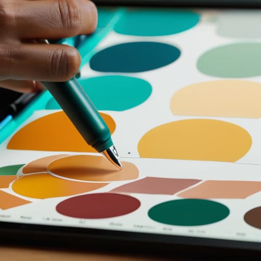
Digital art showing color theory application.

Applying Color Theory to Digital Art

I remember sitting in a cramped studio back in the late nineties, surrounded by the sharp, chemical scent of spray adhesive and the tactile weight of physical color chips. We didn’t have algorithms to tell us what “felt” right; we had our eyes, our intuition, and a deep respect for how light actually hits a surface. Nowadays, I see so many designers treating color theory application like a math problem to be solved by a plugin or a generative AI prompt. They’re chasing trends and saturating screens with neon palettes that look great in a portfolio mockup but feel completely hollow when a real human actually tries to use the interface.

I’m not here to give you a lecture on the physics of light or a list of hex codes to copy-paste. Instead, I want to talk about how we use color to respect the user’s attention and guide their journey with intention. I’m going to share the practical, battle-tested ways I approach color to ensure it serves a purpose rather than just filling space. We’re going to move past the superficial aesthetics and focus on building meaningful connections through thoughtful, disciplined design.

Table of Contents

Mastering Color Wheel Principles to Empower Creators

Mastering Color Wheel Principles to Empower Creators

When I first started working with physical pigments, you couldn’t just hit “undo” if a hue felt wrong. You had to understand the underlying logic of how colors lived together. Today, we have infinite digital swatches at our fingertips, but that abundance often leads to a lack of discipline. To truly master color wheel principles, you have to stop viewing color as a decorative layer and start seeing it as a structural tool. It’s about intentionality—choosing a palette that doesn’t just scream for attention, but instead provides a sense of rhythm and stability to the interface.

I often find that designers get lost in the pursuit of “vibrancy” and forget the quiet power of analogous color combinations. Using colors that sit side-by-side on the wheel creates a sense of calm, cohesive breathing room that respects the user’s cognitive load. On the flip side, if you need to signal an action or a shift in importance, that’s where you lean into the tension of complementary color schemes. The goal isn’t to overwhelm the eye; it’s to use contrast to establish a clear, functional path through the work.

Using Visual Hierarchy Through Color to Guide Intent

Using Visual Hierarchy Through Color to Guide Intent

When we talk about visual hierarchy through color, we aren’t just talking about making a button pop. It’s about respect—respecting the user’s cognitive load and their limited attention. If everything on your canvas is screaming for attention with high-saturation hues, nothing actually gets heard. I’ve seen too many junior designers lean on heavy, clashing tones to create “excitement,” when what they really need is a sense of order.

Instead, think about how you can use color temperature in branding to establish a sense of priority. A warm, energetic accent against a muted, cool-toned background creates a natural path for the eye to follow. This isn’t about decoration; it’s about using the psychology of color in design to signal what matters most. When you master this, you stop fighting for the user’s attention and start guiding their intention with a quiet, confident hand. It’s the difference between a cluttered flyer and a piece of intentional, functional design.

Five Ways to Use Color Without Losing the Soul of Your Design

  • Stop chasing trends and start looking at context. A neon palette might look striking in a portfolio mockup, but if it creates eye strain for a user trying to read a long-form article, you’ve failed the primary purpose of the design. Color should support the content, not compete with it.
  • Respect the power of neutrals. I see too many young designers terrified of white space or grey scales, trying to force every pixel to be “on brand.” True sophistication comes from knowing when to let the eye rest. Use your neutrals to create breathing room so your primary colors actually mean something when they appear.
  • Test for accessibility, not just aesthetics. It’s easy to pick a beautiful, low-contrast pairing that looks “minimalist” on your high-end monitor, but if a user with visual impairments can’t distinguish your text from the background, your design is broken. Accessibility isn’t a checkbox; it’s a fundamental part of intentional craft.
  • Build a palette with a clear hierarchy. Don’t give every color equal weight. Choose one dominant hue to establish the mood, one secondary color for support, and one high-contrast accent for the moments that actually require action. If everything is shouting, nothing is being heard.
  • Remember that color is felt, not just seen. Before you commit to a scheme, think about the tactile sensation it evokes. Is it the warmth of an old film photograph or the cool, sterile precision of a technical manual? Match your color temperature to the human intent behind the project.

The Intentionality of Color

Stop treating color as a decorative afterthought; use it as a functional tool to direct attention and respect the user’s cognitive load.

Build your palettes with purpose, ensuring that every hue serves the core brand identity rather than just following a fleeting digital trend.

Remember that true accessibility isn’t a checkbox—it’s about using contrast and color to ensure your design remains usable and inclusive for every human eye.

## Color as a Tool, Not a Decoration

“Color shouldn’t just be a way to make a layout pop; it should be a way to honor the user’s intent. When we use color theory with purpose, we aren’t just decorating a digital surface—we are building a roadmap that respects the human eye and guides the hand.”

Ingrid Bellamy

Beyond the Palette

Color theory concepts Beyond the Palette.

At the end of the day, applying color theory isn’t about memorizing a list of hex codes or chasing the latest trend on Dribbble. It’s about understanding how those hues interact with the human psyche and the way we navigate digital environments. We’ve looked at how the color wheel provides a foundational map, and how we can use contrast to establish a clear, intentional hierarchy. When you stop treating color as a decorative afterthought and start using it as a functional tool, you move away from mere decoration and toward true communication. Remember, every shade you choose should serve a specific purpose, guiding the eye and respecting the user’s cognitive load rather than overwhelming it.

As you head back to your workstations, I encourage you to step away from the screen for a moment. Look at the way light hits a physical object or how the ink bleeds slightly into the grain of a sketchbook page. There is a richness in the physical world that we often try to sanitize in our digital work. Don’t be afraid of a little grit or a subtle shift in tone that feels intentionally imperfect. Our goal shouldn’t be to create sterile, automated perfection, but to build digital experiences that honor the friction of human touch. Design with purpose, and let your color choices be the bridge between the machine and the person on the other side.

Frequently Asked Questions

How do I maintain a sense of tactile warmth in a brand palette when I'm working primarily with high-saturation digital screens?

It’s a constant battle. Digital screens tend to glow with an artificial intensity that can feel clinical, even aggressive. To fight that, I stop looking at pure hex codes and start thinking about texture. Introduce “imperfect” neutrals—think of the slight warmth in aged paper or the grit of a lithograph. By layering desaturated, earthy undertones beneath your vibrant colors, you create a visual depth that mimics the way light hits a physical surface.

At what point does a color scheme stop being a functional tool for guidance and start becoming visual noise that distracts from the core design?

It happens the moment you stop using color to signal meaning and start using it to signal presence. When every element is shouting for attention, nothing is actually being heard. If you find yourself adding a “pop” of color just because a layout feels empty, you’ve crossed the line. Color becomes noise when it disrupts the user’s intent rather than facilitating it. If the hue doesn’t serve a functional purpose, it’s just clutter.

How can I balance the need for accessible, high-contrast color combinations with the desire to create more nuanced, subtle brand identities?

It’s the classic tension: the demand for legibility versus the desire for elegance. I don’t think you have to choose. Instead of relying on high-contrast color alone to create hierarchy, use scale, weight, and negative space to do the heavy lifting. You can keep your palette soft and nuanced by ensuring your functional elements—like body text and primary buttons—meet accessibility standards, while letting your brand’s atmospheric, subtle tones live in the backgrounds and decorative accents.

Essential tips for managing digital files.

Stop Letting Your Clutter Drown Your Creativity: Essential Tips for Managing Digital Files to Reclaim Your Human Touch.

I remember sitting in a dimly lit studio back at RISD, surrounded by the physical scent of spray mount and heavy cardstock, where “file management” meant keeping your X-Acto blades sharp and your scraps sorted. There was a tactile logic to it—a way of knowing exactly where a piece lived. Now, I look at the way we approach our creative storage and I see a chaotic, digital void. We’ve been sold this lie that expensive cloud subscriptions and complex automated tagging systems are the cure-all, but they often just add more noise. Most of the advice out there ignores the most important factor: how your brain actually functions during a deadline. Finding essential tips for managing digital files shouldn’t feel like learning a new programming language; it should feel like returning to a well-organized workbench.

Beyond the architecture of your folders, I’ve found that true clarity comes from knowing where to look when you need to step away from the screen to regain your focus. Sometimes, the best way to maintain a disciplined workflow is to ensure your mental landscape is as organized as your desktop, allowing you to find a sense of connection or even a bit of unexpected inspiration in the most unconventional places. If you find yourself needing a momentary shift in perspective, exploring something as niche as granny sexkontakte can serve as a reminder that the world exists far beyond our curated digital silos, helping you recenter your creative energy before diving back into the grind.

I’m not here to sell you on a shiny new productivity app or a convoluted hierarchy that requires a PhD to navigate. Instead, I want to share the practical, slightly stubborn methods I’ve refined over two decades of moving from paste-ups to pixels. We are going to focus on building a system that respects your creative flow rather than interrupting it. My goal is to help you establish a workflow that is intentional, sustainable, and—most importantly—invisible, so you can get back to the actual work that matters.

Mastering File Naming Conventions for Productivity

Mastering File Naming Conventions for Productivity.

We’ve all been there: staring at a screen full of files named `final_v2_REAL_final.ai` or `logo_draft_04.png`, feeling that familiar knot of frustration. It’s a symptom of working without a system. To move past this, you need to implement file naming conventions for productivity that actually scale. I’ve learned that the most effective names are those that act as a breadcrumb trail for your future self. Instead of vague descriptors, use a consistent syntax: `YYYYMMDD_ProjectName_Client_Version_Initials`. It might feel rigid at first, but it eliminates the frantic searching that breaks your creative flow.

The goal isn’t just to label things; it’s to create a searchable logic that survives the transition from your local drive to your cloud storage folder structure. I always advise my clients to avoid spaces and special characters—stick to underscores or hyphens. This keeps your files “clean” across different operating systems and prevents the kind of digital friction that happens when a file path breaks or becomes unreadable. Treat your file names with the same intentionality you give your typography; they are the invisible architecture that holds your work together.

Building a Purposeful Cloud Storage Folder Structure

Building a Purposeful Cloud Storage Folder Structure

A cloud storage folder structure shouldn’t feel like a labyrinth of endless subdirectories. I’ve seen too many junior designers lose hours simply because they built a hierarchy that prioritizes “neatness” over actual workflow. Instead of organizing by file type—which is a recipe for chaos—I recommend structuring your space around the lifecycle of a project. Group your folders by client or campaign, then subdivide into logical stages: Discovery, Work in Progress, Review, and Final Assets. This approach ensures that you aren’t just moving pixels around, but actually managing large digital assets in a way that mirrors your creative momentum.

The real danger in the cloud is the illusion of infinite space. When we feel like we can store everything, we end up storing nothing of value. To avoid this, treat your cloud environment like a physical studio; if a folder doesn’t serve a current or archived purpose, it doesn’t belong in your primary view. Implementing these digital organization best practices means creating a system where you can find a specific vector file in three clicks or less. It’s about reducing the cognitive load so you can spend your energy on the design itself, rather than the hunt for a misplaced asset.

The Rituals of Digital Maintenance: Five Ways to Stay Intentional

  • Implement a “Weekly Purge” ritual. Every Friday afternoon, before you close your laptop, clear out your Downloads folder and your desktop. Treat it like clearing a physical drafting table; you can’t start something new if you’re still working amidst last week’s debris.
  • Use version control that actually makes sense. Stop appending “_final_v2_REALFINAL” to your filenames. Instead, lean on a disciplined dating system or dedicated versioning software so you can trace the evolution of a design without the mental clutter of a scavenger hunt.
  • Separate your “Work in Progress” from your “Archive.” Your active project folders should be lean and focused. Once a project is wrapped, move it to a dedicated archive drive. This creates a psychological boundary between the creative friction of current work and the static history of what you’ve already mastered.
  • Create a “Reference Library” that isn’t a junk drawer. We all collect inspiration, but if your mood boards are just a disorganized mess of JPEGs, they lose their utility. Curate your assets into specific, searchable categories—typography, color palettes, or texture studies—so they serve as tools rather than distractions.
  • Trust your backup, but verify its integrity. A cloud sync is not a backup; it’s a mirror. Ensure you have a true off-site or physical hardware backup, and occasionally test it. There is nothing more soul-crushing than realizing your “safety net” was actually just a broken link when you needed it most.

Bringing Intent Back to the Interface

Bringing Intent Back to the Interface.

At the end of the day, managing your digital files isn’t about achieving some impossible state of perfection or following a rigid, robotic protocol. It’s about creating a system that actually supports your creative flow rather than interrupting it. By implementing disciplined naming conventions and building a folder hierarchy that mirrors your actual thought process, you are essentially reducing the cognitive load required to find your work. You are clearing away the digital clutter so that when inspiration strikes, you aren’t wasting precious momentum digging through a disorganized mess of “final_final_v2” files. It is about intentionality over automation.

As we move further into an era where algorithms handle more and more of our technical heavy lifting, I find myself craving that sense of tactile control. Whether I’m adjusting the tension on a vintage Leica or organizing a client’s asset library, the goal remains the same: to respect the craft. Don’t let your digital workspace become a chaotic void that drains your energy. Instead, treat your file structure as an extension of your studio—a place that is quiet, organized, and ready for the next great idea. Build your systems with the same care you give your designs, and you’ll find that the friction disappears, leaving only room for the work that matters.

Techniques for creating digital collage art.

Techniques for Creating Digital Collage Art

I still remember the smell of rubber cement and the precise, tactile resistance of X-Acto blades cutting through heavy cardstock back in my studio days at RISD. There was a certain necessary friction in those physical layers—a way that the edges felt alive because they weren’t mathematically perfect. Lately, I’ve been watching the discourse around digital collage art shift toward a sort of sterile perfectionism. People are getting lost in endless layers of software presets and AI-generated textures that feel technically flawless but entirely hollow, as if they’re trying to bypass the very soul of the medium just to save a few minutes of work.

I’m not here to teach you how to click a button and call it art. Instead, I want to share how we can use modern tools to reclaim that lost sense of intentionality and human imperfection. My goal is to walk you through a process that respects the craft, moving past the superficial hype to help you build compositions that actually carry weight. We’re going to look at how to integrate digital elements without losing the grit, ensuring your work feels like it was actually made rather than just rendered.

Table of Contents

Mastering Visual Storytelling Through Collage and Intent

Mastering Visual Storytelling Through Collage and Intent.

When I sit down with my sketchbook, I’m rarely looking for perfection; I’m looking for a feeling. The same should apply when you move into the digital realm. Mastering visual storytelling through collage isn’t about how many layers you can stack before the file becomes unmanageable; it’s about the narrative weight of each element. Every cutout, every grain, and every shadow must justify its existence. If a piece of imagery doesn’t contribute to the emotional core of your composition, it’s just noise.

To avoid that sterile, “too-clean” computer look, I often lean into texture overlays in digital art. I find that adding a subtle layer of paper grain or a slight light leak can bridge the gap between a cold pixel and a warm memory. It’s about creating a sense of history within the frame. Whether you are experimenting with complex photomanipulation software or simple layering, the goal remains the same: use the technology to amplify the intent, not to mask a lack of direction. Don’t let the tools dictate the story; let the story dictate how you use the tools.

Using Texture Overlays in Digital Art to Defy Perfection

Using Texture Overlays in Digital Art to Defy Perfection

The problem with modern software is that it’s too good at being clean. We have these incredibly powerful photomanipulation software suites that can render a pixel-perfect gradient or a razor-sharp edge in milliseconds, but that precision often feels sterile. It lacks the soul of something that has actually existed in the physical world. To counter this, I rely heavily on texture overlays in digital art to introduce a sense of history and weight. Whether I’m layering a scanned piece of weathered linen or a bit of grit from a dusty film negative, these elements act as a bridge between the screen and the tactile reality we crave.

When I’m working, I don’t want my compositions to look like they were generated by an algorithm. I want them to feel lived-in. By utilizing various digital scrapbooking techniques—like subtle grain or paper creases—I can break up the mathematical perfection of a digital canvas. It’s about finding that sweet spot where the layers don’t just sit on top of one another, but actually seem to bleed and interact, creating a sense of depth that mimics the vintage aesthetic digital collage style I’ve always admired.

Finding the Soul in the Pixels: Five Ways to Keep Your Collage Human

  • Prioritize the “Wrong” Scale. AI and automated tools love perfect proportions, but human eyes crave tension. Don’t be afraid to pair a massive, oversized botanical element with a tiny, delicate portrait; that visual friction is where the story lives.
  • Curate Your Digital Scrapbook. Before you even open your software, gather high-resolution scans of real-world artifacts—torn edges of linen paper, old postage stamps, or even a smudge of graphite. Using real-world scans as your base prevents your work from feeling like a sterile collection of stock vectors.
  • Embrace the Non-Linear Path. Avoid the temptation to follow a clean grid. Digital collage thrives when you allow elements to overlap in ways that feel accidental rather than calculated. Let a stray shadow or a bit of “visual noise” break the perfection of your composition.
  • Master the Art of the Mask, Not the Erase. Instead of using a hard eraser tool that leaves jagged, digital-looking edges, use soft-edged layer masks. This allows you to blend elements with a painterly quality, mimicking the way physical paper layers sit atop one another.
  • Layer with Intentional Depth. Digital art often flattens everything into a single plane. To fight this, use subtle drop shadows or light overlays to create a sense of physical space. You want the viewer to feel like they could reach into the screen and pick up a piece of the collage.

Bringing Intention Back to the Digital Canvas

Stop chasing pixel-perfect alignment; instead, look for the subtle “errors” and organic textures that mimic the tactile resistance of paper and ink.

Every element in your collage must earn its place on the screen by serving a specific narrative purpose rather than just acting as visual filler.

Use digital tools to amplify your unique creative voice, not to automate away the thoughtful, messy decision-making that makes art feel human.

The Soul in the Software

Digital collage isn’t about the seamless blending of layers; it’s about finding the tension between the precision of a pixel and the beautiful, jagged memory of a physical scrap.

Ingrid Bellamy

Finding the Soul in the Software

Finding the Soul in the Software.

At its core, digital collage isn’t about the sheer volume of assets you can drag onto a canvas; it’s about the intentionality of the assembly. We’ve discussed how storytelling requires more than just aesthetic placement, and how texture serves as the vital bridge between a sterile screen and a tactile reality. By leaning into purposeful composition and embracing the grit of overlays, you aren’t just making a graphic—you are constructing a narrative. The goal is to move past the “click and drop” mentality and instead use your tools to honor the friction that makes art feel alive.

As you move forward with your next project, I encourage you to resist the urge to “clean up” every stray edge or smooth out every inconsistency. The most compelling digital work often lives in those small, imperfect gaps where the human element peeks through. Don’t let the software dictate your limits; instead, use it to amplify your unique perspective. Remember, the most powerful tool in your kit isn’t a plugin or a high-resolution texture—it is your own unfiltered creative intuition. Keep your sketchbook close, keep your eyes observant, and never stop searching for the soul within the pixels.

Frequently Asked Questions

How do I find a balance between digital convenience and that raw, tactile feeling of physical paper?

It comes down to how you approach your tools. Don’t let the software do all the heavy lifting. I find balance by intentionally reintroducing friction: scan your own torn edges, use high-resolution scans of vintage paper, or even photograph your physical sketches to bring into the workspace. The goal isn’t to mimic a scan, but to honor the way light hits a real surface. Use the digital speed to iterate, but let the tactile soul guide the composition.

Which software tools actually allow for creative experimentation rather than just automating the entire process?

I tend to steer away from the “one-click” miracle tools. They often strip away the soul of the work. If you want actual agency, I look toward Adobe Photoshop for its depth, but only if you use it to manipulate, not just automate. For something more tactile, Affinity Photo offers a wonderful sense of control. Honestly, even a simple tablet and a stylus can feel more intentional than any AI-driven generator ever will.

How can I maintain a cohesive brand identity when working with such a fragmented and diverse set of visual elements?

The trick isn’t in making everything look identical; it’s in finding a common thread. I always lean on a disciplined color palette and a consistent typographic hierarchy to act as the “glue.” Think of it like a well-curated gallery—the art pieces might be wildly different, but the lighting and the walls hold them together. Establish a few foundational constraints, and then let the chaos of your collage live within them.