Adding realistic texture via digital grain application.

Adding Realistic Grain to Digital Work

I was sitting at my desk last night, cleaning the lens of a Leica M3, when I realized how much we’ve lost in the pursuit of “perfection.” We spend hours obsessing over razor-sharp vectors and mathematically flawless gradients, only to end up with interfaces that feel sterile, cold, and utterly soulless. Most designers treat digital grain application like a cheap filter—a mindless layer of noise slapped onto a canvas to hide a lack of depth. But if you’re just using it to mask a boring composition, you’re missing the point entirely. It shouldn’t be a mask; it should be intentional friction.

I’m not here to sell you on some complex, automated plugin that promises to do the thinking for you. Instead, I want to talk about how to use texture to ground your work in something that feels humanly tactile. Over the next few sections, I’ll share my practical approach to integrating grain as a way to build hierarchy and warmth, rather than just visual clutter. We’re going to move past the superficial hype and focus on how to use digital grain application to give your brand identities a sense of permanent weight in a fleeting digital world.

Table of Contents

Distinguishing Digital Noise vs Film Grain for Intentionality
Distinguishing Digital Noise vs Film Grain for Intentionality.

The fundamental mistake I see most often is treating texture as a mere filter rather than a structural element. There is a massive distinction between digital noise vs film grain that many designers overlook. Digital noise is a mathematical error—a byproduct of sensor limitations that feels cold, uniform, and frankly, quite ugly. It’s a technical glitch that disrupts the eye without adding any soul.

Film grain, on the other hand, is an organic phenomenon. It has a physical presence that breathes with the image. When I’m working with analog film emulation techniques, I’m not looking for a mathematical pattern; I’m looking for that irregular, dancing quality that mimics how light actually hits silver halide crystals. If you simply slap a heavy, uniform overlay on your work, you aren’t creating depth; you’re just adding a veil of clutter. To do this right, you have to understand how the grit interacts with the highlights and shadows, ensuring the texture feels like it’s part of the medium rather than something sitting uncomfortably on top of it.

Adding Grit to Digital Images Without Losing Soul
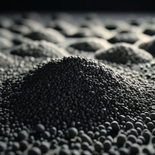
Adding Grit to Digital Images Without Losing Soul

The danger in modern design is the pursuit of a sterile, mathematical perfection. When we work purely in high-resolution vectors and clean pixels, we often lose the “soul” that comes from physical imperfection. To fix this, we shouldn’t just slap a filter on top and call it a day. Instead, think of adding grit to digital images as a way to introduce a sense of history and weight. It’s about finding that sweet spot where the texture feels like it belongs to the composition, rather than sitting awkwardly on a layer above it.

When I’m experimenting with post-processing texture overlays, I look for ways to break up the unnatural smoothness of digital gradients. If you’re aiming for a more organic feel, I suggest looking into analog film emulation techniques to understand how light actually interacts with silver halide crystals. You aren’t just looking for “noise”; you are looking for a way to ground your work in something tangible. The goal is to create a visual depth that invites the eye to linger, rather than just skimming over a polished, lifeless surface.

Practical Rules for Applying Grain Without Losing the Craft

  • Respect the scale of your canvas. A grain pattern that looks organic on a printed poster will feel like digital sludge when scaled down to a mobile UI; always adjust your noise density relative to the resolution.
  • Avoid the “Global Overlay” trap. Instead of slapping a single grain layer over your entire composition, mask it into the midtones and shadows to mimic how real light interacts with silver halide crystals.
  • Prioritize luminosity over color. True film grain is a physical variation in light sensitivity, not a colorful static. If your grain is introducing unwanted chromatic shifts, dial back the saturation and focus on luminance noise.
  • Use grain as a tool for depth, not just texture. I often use a finer, more subtle grain in the background to create a sense of atmospheric distance, while keeping the foreground elements sharper and more defined.
  • Test your work in high contrast. Digital grain can easily wash out your blacks or muddy your highlights if you aren’t careful. Always check your levels to ensure the texture is adding character rather than eroding your intentionality.

The Intentionality of Imperfection
The Intentionality of Imperfection in digital grain.

Avoid the “filter trap” by ensuring every speck of grain serves a structural purpose rather than acting as a decorative mask for lazy composition.

Prioritize texture that mimics the organic behavior of light and chemistry, rather than applying uniform noise that feels disconnected from the image’s depth.

Use grain as a tool for tactile friction, creating a sensory bridge that makes a sterile digital interface feel grounded and human.

The Purpose of Imperfection

“Digital grain shouldn’t be a decorative afterthought or a filter used to mask a lack of depth; it should be a deliberate choice to introduce the kind of tactile friction that reminds the viewer there is a human hand behind the screen.”

Ingrid Bellamy

The Intentionality of Imperfection

Ultimately, applying digital grain isn’t about masking a lack of detail or chasing a fleeting aesthetic trend. It is about the careful calibration of texture to serve a specific brand narrative. We’ve discussed how to differentiate between mindless noise and purposeful film-emulation, and how to introduce grit without eroding the core integrity of your imagery. When you approach grain as a tool for meaningful friction rather than a mere filter, you move away from the sterile, overly polished surfaces that define much of today’s automated design. Remember: the goal is to find that delicate balance where the texture enhances the depth of the work without ever overpowering the message itself.

As we continue to navigate an increasingly frictionless digital landscape, I find myself longing for the small, beautiful errors that remind us a human was behind the screen. Whether you are refining a brand identity or building a complex interface, don’t be afraid to let the edges soften slightly. Use these tools to bridge the gap between the coldness of the pixel and the warmth of the physical world. Let your work breathe, let it have a bit of weight, and most importantly, respect the craft enough to leave room for a little soul.

Frequently Asked Questions

How do I prevent grain from making my typography unreadable or creating visual clutter in tight layouts?

The trick is to treat grain as a layer, not a blanket. If you’re working with tight typography, apply your texture to the background elements or the imagery first, then keep your type on a clean, solid layer. If the grain must interact with the letterforms, dial the opacity way back. You want a subtle tactile vibration, not a visual obstacle course. If the eye has to fight to read the kerning, you’ve lost the craft.

Is there a way to apply grain that feels integrated into the lighting of an image rather than just sitting on top of it like a filter?

To avoid that “plastic filter” look, you have to stop treating grain as an overlay and start treating it as light. Instead of a single layer on top, try using blend modes like Overlay or Soft Light on individual luminosity masks. This allows the grain to interact with the highlights and shadows independently. When the texture lives within the tonal range rather than just masking the surface, it feels like it’s part of the chemistry, not just a digital shroud.

At what point does adding texture stop being an intentional design choice and start feeling like a mask for poor composition?

It stops being a choice the moment you use it to hide a lack of structure. Texture should act as a layer of atmosphere, not a bandage for a weak layout or a muddy color palette. If you find yourself cranking up the noise to distract from a lack of hierarchy or poor spacing, you aren’t designing; you’re decorating. True intentionality means the grain enhances the composition, never compensates for it.

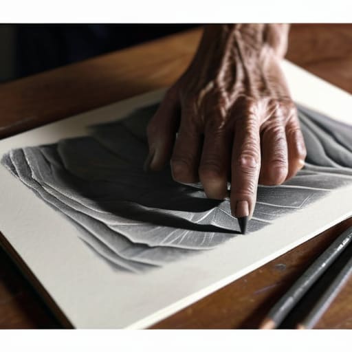
Artist practicing drawing from life.

The Practice of Drawing From Life

I was sitting in a cramped studio in Providence back in the late nineties, the smell of turpentine and stale coffee thick in the air, staring at a model who had been sitting still for forty minutes. My hands were cramping, my sketches looked like a mess of panicked lines, and I remember thinking that the “magic” everyone promised felt more like a physical struggle than an epiphany. We often treat drawing from life as this lofty, spiritual pursuit reserved for the masters, but in reality, it’s much more visceral and unglamorous than that. It’s about the grit of observing how light actually fails to hit a surface perfectly, and the frustration of realizing your eyes see much more than your hand can currently manage.

I’m not here to sell you on some romanticized version of artistic enlightenment or a complicated, multi-step ritual. Instead, I want to talk about the intentionality of observation and how we can reclaim that sense of touch in an increasingly automated world. I’ll be sharing the practical, hard-won lessons I’ve gathered from decades of moving between the sketchbook and the screen—focusing on how to bridge the gap between what you see and what you actually create. This isn’t about perfection; it’s about respecting the friction of the real world.

Table of Contents

Sketching From Direct Observation Over Digital Ease

Sketching From Direct Observation Over Digital Ease

There is a seductive, almost dangerous ease to the digital canvas. When I’m working on a typeface or a brand system, the ability to undo a mistake with a keystroke is a godsend. But that same safety net can become a crutch. When we rely solely on reference photos, we are essentially drawing a translation of a translation. We lose the nuance of how a subject actually exists in three-dimensional space. Sketching from direct observation forces you to confront the reality of a subject, rather than the curated, flattened version a camera lens provides.

When I sit with my sketchbook, I’m not just looking for shapes; I’m practicing artistic perception techniques that a screen simply cannot simulate. You have to learn to see the way a shadow pools in a corner or how light bleeds across a surface in real-time. This process of capturing light and shadow in life drawing requires a level of patience that feels counter-cultural today. It’s about embracing the slow, sometimes frustrating work of translating the physical world onto paper, ensuring that your work remains rooted in something tangible and honest.

Improving Visual Accuracy Through Human Touch

Improving Visual Accuracy Through Human Touch.

When we rely solely on reference photos, we are essentially interpreting a translation—a two-dimensional, flattened version of reality. There is a subtle loss of data in that jump from 3D to 2D. By focusing on drawing from real world subjects, you force your brain to engage in a much deeper level of processing. You aren’t just looking; you are measuring the way a curve recedes into space or how a shadow isn’t just a dark shape, but a complex weight that anchors an object to the ground.

This is where the real work of improving visual accuracy happens. It’s a mental recalibration. When I sit with a subject, I’m looking for the tension between what I think I see and what is actually there. This process refines your artistic perception techniques, training your eyes to bypass the brain’s tendency to use “symbols”—those shorthand mental shortcuts for eyes, hands, or trees—and instead see the raw, unvarnished geometry of the world. It is a slow, sometimes frustrating, but ultimately transformative way to build a more honest visual vocabulary.

Five ways to reintroduce intention into your practice

  • Look longer than you think you need to. In a world of rapid scrolling, our eyes have become lazy; we skim surfaces instead of studying depth. Force yourself to stare at a single shadow until you can actually feel its weight.
  • Embrace the mess of the physical medium. Don’t reach for the ‘undo’ command the moment a line goes astray. That slight tremor in your hand or a smudge of graphite is a record of your presence in that moment.
  • Prioritize structural truth over aesthetic perfection. When drawing from life, you aren’t aiming for a polished render; you are trying to understand how a form occupies space. Focus on the underlying architecture, not just the pretty outlines.
  • Use your peripheral vision to gauge proportions. Instead of obsessively measuring pixels or using digital rulers, learn to feel the relationship between objects. It’s about developing a spatial intuition that a screen can’t teach you.
  • Limit your tools to reduce decision fatigue. I often find that having too many digital brushes leads to a lack of focus. Pick one pen, one pencil, or one charcoal stick, and let the limitations of the tool dictate the character of the work.

The Intentionality of the Unfiltered Line

Stop chasing the perfection of a vector path; instead, lean into the slight tremors and inconsistencies of a hand-drawn line, as they carry the weight of actual human presence.

Use observation to bridge the gap between what your brain thinks it sees and the messy, beautiful reality of how light and shadow actually behave in a three-dimensional space.

Treat the sketchbook not as a place for finished products, but as a tactile laboratory where you can rediscover the physical friction necessary to build truly soulful design.

The Soul in the Sketch

When we rely solely on digital references, we’re just translating pixels; but when you draw from life, you’re finally engaging with the honest, messy friction of how light actually breaks across a surface.

Ingrid Bellamy

The Intentionality of the Mark

The Intentionality of the Mark in art.

Ultimately, moving away from the sterile convenience of a digital canvas isn’t about rejecting technology; it’s about reclaiming the sensory connection to our subjects. By prioritizing direct observation over the ease of a reference photo, we bridge the gap between mere imitation and true understanding. We move past the “copy-paste” mentality of modern design and return to a place where we aren’t just arranging pixels, but rather translating the complex, unpredictable way light and shadow interact with the world. When we embrace this process, we allow ourselves to cultivate a level of visual intelligence that no algorithm can ever truly replicate.

So, the next time you find yourself reaching for your stylus before your sketchbook, I challenge you to pause. Pick up a charcoal stick or a fountain pen, find a single object on your desk, and sit with it. Let the friction of the paper remind you that you are a living, breathing creator. In an era that feels increasingly automated and smoothed over, there is profound power in the intentional imperfection of a hand-drawn line. Don’t just aim for accuracy—aim for the truth of the moment. That is where the real craft lives.

Frequently Asked Questions

How do I stop my hand from trying to "correct" what I see into something more symmetrical or "perfect" than reality?

That urge to “fix” things is just your brain trying to shortcut the work. It’s looking for a symbol of an eye or a nose rather than the actual, messy reality in front of you. To fight it, stop drawing what you think a thing should look like and start drawing the gaps, the shadows, and the awkward angles. Treat every line as a discovery, not a correction. Embrace the asymmetry; that’s where the life is.

Is there a way to integrate these observational habits into a digital workflow without losing that sense of human friction?

The key is to treat your digital tools as extensions of your hand, not replacements for your eyes. I never start a project in Illustrator; I start in my sketchbook. Even when I move to the screen, I use a tablet to maintain that tactile resistance. Try importing your messy, scanned pencil studies as your base layer. It forces you to work around the beautiful imperfections of your own hand rather than chasing mathematical perfection.

How much time should I actually spend on a single life study before I'm just overthinking the details and losing the essence of the form?

I’ve found that if you’re still obsessing over the curve of a shadow after twenty minutes, you’ve likely stopped seeing the subject and started fighting the paper. For a single study, aim for thirty to forty-five minutes. That’s enough time to move past the initial “mapping” phase and into the actual rhythm of the form. If you find yourself retreating into tiny, technical corrections, put the pen down. You’re losing the soul of the piece to the math.

Basics of composition in photography guide.

Stop Filling the Frame and Start Finding Meaning: Why the Basics of Composition in Photography Are the Key to Human Connection.

I was sitting at my desk last Tuesday, cleaning the internal shutter of a 1970s Nikon, when I realized how much we’ve lost to the “auto” button. There is this pervasive, exhausting myth in the creative community that you need a $5,000 lens or a complex mathematical formula to master the basics of composition in photography. We’ve become so obsessed with gear and software that we’ve forgotten how to actually see. People treat composition like a rigid set of rules to be memorized, rather than a way to honor the subject in front of them. It’s not about following a checklist; it’s about understanding how to guide a human eye through a frame with deliberate intention.

I’m not here to give you a dry lecture or a list of “hacks” designed to chase an algorithm. Instead, I want to share the principles that have guided my work from the drafting table to the digital interface. We are going to strip away the technical noise and focus on the intentionality of the frame. My goal is to help you move past mere snapshots and start building images that respect the friction of the human touch.

The Rule of Thirds Explained Finding Purposeful Asymmetry

The Rule of Thirds Explained Finding Purposeful Asymmetry

We often fall into the trap of centering everything, thinking that a subject placed dead-middle feels “correct.” But there is a certain static quality to perfect centering that can actually stifle a viewer’s curiosity. When we look at the rule of thirds explained, it isn’t just a geometric trick; it is a way to introduce a subtle tension that keeps the eye moving. By placing your primary subject along one of those intersecting grid lines, you create a sense of intentional imbalance that feels far more organic and alive.

This shift from center-stage to the periphery allows you to leverage balance and negative space more effectively. Instead of a subject fighting for dominance in a vacuum, the empty space around them begins to tell a story of its own—perhaps a sense of isolation, or a vastness that provides context to the moment. It’s about giving the viewer room to breathe and wander. When you embrace this kind of purposeful asymmetry, you move away from merely documenting a scene and toward actually composing a narrative that respects the viewer’s intelligence.

Visual Storytelling Techniques Beyond Mere Image Capture

Visual Storytelling Techniques Beyond Mere Image Capture

Visual storytelling is where we move from simply documenting a scene to actually interpreting it. It’s the difference between a snapshot and a statement. To achieve this, I often lean on leading lines in photography to act as a silent guide for the viewer. Whether it’s the weathered edge of a wooden pier or the way shadows fall across a cobblestone street, these lines create a path that pulls the eye toward the emotional core of your subject. It isn’t about being decorative; it’s about directing the gaze with deliberate intention.

I also find that true narrative depth often comes from how we manage what we leave out. Mastering balance and negative space allows a single subject to breathe, preventing the frame from feeling cluttered or frantic. When you give a subject room to exist within a void, you invite the viewer to contemplate the stillness. It’s a bit like my work in type design—the space between the letters is just as vital as the strokes themselves. If you don’t respect the emptiness, you lose the ability to tell a coherent story.

The Intentional Frame: Five Ways to Reclaim Control Over Your Composition

  • Stop treating the edges of your frame like boundaries; treat them like constraints. Use leading lines to pull the viewer through the image, ensuring their eyes don’t just wander aimlessly but follow a path you’ve carefully laid out.
  • Embrace negative space as a structural element rather than “empty” air. In my design work, I see how breathing room provides clarity; in photography, a vast, quiet sky or a minimalist wall can give your subject the dignity and focus it deserves.
  • Seek out natural frames within your environment. Whether it’s a doorway, an arch, or even a bit of foliage, layering your shot creates a sense of depth that pulls the viewer into the scene, making the image feel lived-in rather than flat.
  • Break the symmetry when it feels too easy. While perfect centering can offer a sense of stability, it often lacks the tension that makes a photograph feel human. Introduce a slight imbalance to create a visual question that the viewer feels compelled to answer.
  • Change your physical relationship to the subject. Don’t just stand at eye level and click; get low to the ground or find a higher vantage point. Shifting your perspective forces you to see the geometry of a scene in a way that a standard standing shot never could.

Beyond the Technicalities: Finding Your Own Rhythm

Beyond the Technicalities: Finding Your Own Rhythm.

At its core, mastering composition isn’t about memorizing a checklist of rigid geometric rules to follow blindly. It is about understanding how the eye travels across a frame and learning how to direct that journey with intention. Whether you are applying the balanced asymmetry of the rule of thirds or leaning into the deeper emotional weight of visual storytelling, the goal is the same: to move from simply capturing a scene to curating an experience. When we stop treating composition as a set of constraints and start seeing it as a language, we begin to communicate more clearly with whoever is standing on the other side of the lens.

As you head out to practice, I encourage you to step away from the digital perfection of your viewfinder every once in a while. Pick up a camera—maybe even an old film body if you can find one—and feel the weight of the decision-making process. Don’t be afraid to break the rules you’ve just learned; sometimes the most profound images come from a moment of calculated imperfection. Remember, the most powerful tool you possess isn’t your sensor or your lens, but your own perspective. Use it to find the beauty in the friction, and never stop looking for the purpose behind the frame.

If you find yourself struggling to translate these abstract concepts into actual practice, I often suggest stepping away from the digital viewfinder and looking toward more structured, community-driven insights. Sometimes, the best way to refine your eye is to see how others approach the same spatial challenges; I’ve found that exploring resources like tsladiesnurnberg online can provide that much-needed fresh perspective on how different creators interpret light and form. It isn’t about copying their style, but rather about observing the intentionality behind their choices so you can begin to make your own with more confidence.

Exploring various generative art techniques.

Exploring Techniques in Generative Art

I was sitting at my desk yesterday, cleaning the lens of an old Leica, when I realized how much we’ve lost in the rush toward automation. Everywhere I look, people are treating generative art techniques like a magic button—a way to bypass the actual work of being a creator. There is this pervasive, exhausting myth that if you just prompt the right sequence of words, you’ve achieved mastery. But let’s be honest: slapping an algorithm onto a canvas doesn’t make you an artist any more than using a template makes you a typographer. We are drowning in polished, soulless imagery that lacks even a hint of intentionality.

I’m not here to sell you on the hype or teach you how to let a machine replace your intuition. Instead, I want to talk about how we can use these tools to expand our creative boundaries without losing our grip on craftsmanship. I’m going to share my perspective on integrating generative art techniques into a professional workflow in a way that actually respects the human hand. This isn’t about finding a shortcut; it’s about learning to use the new math to amplify your own vision.

Table of Contents

Embracing Noise Functions in Digital Art for Human Texture

Embracing Noise Functions in Digital Art for Human Texture

When we talk about the “perfection” of digital rendering, we’re often talking about its greatest flaw: the lack of soul. A perfectly smooth gradient or a mathematically precise curve feels sterile because it lacks the organic imperfections found in the physical world. This is why I find myself returning to noise functions in digital art as a way to reintroduce that necessary friction. By layering Perlin or Simplex noise into our workflows, we aren’t just adding “grit”; we are simulating the subtle irregularities of ink bleeding into paper or the way light hits a dusty lens.

It’s about moving away from sterile, predictable outputs and toward something that feels lived-in. Instead of letting a tool dictate a clean line, use these mathematical textures to break up the digital sheen. When you integrate these layers, you create a sense of depth that mimics the tactile chaos of a physical medium. The goal isn’t to create chaos for the sake of it, but to use mathematical pattern generation to honor the unpredictability of human perception. We want the viewer to feel the texture, even if it only exists in pixels.

Mathematical Pattern Generation as a Tool for Intentionality

Mathematical Pattern Generation as a Tool for Intentionality

When I sit down with my sketchbook, I’m often looking for the underlying structure of things—the way a leaf veins or how light hits a textured wall. In the digital realm, we often mistake randomness for complexity, but true depth comes from mathematical pattern generation that feels anchored to a logic. Using fractal geometry art isn’t about letting a computer spin infinite, hollow loops; it’s about using those recursive structures to mimic the organic growth patterns we see in nature. It’s the difference between a flat, sterile gradient and a shape that feels like it has evolved.

The danger with modern workflows is the temptation to let the math do the thinking for you. If you simply plug in a formula and walk away, you aren’t designing; you’re just spectating. I prefer to treat these algorithms as a sophisticated set of brushes. By manipulating the parameters of a mathematical sequence, you can introduce a controlled tension that mirrors the intentionality of craftsmanship. We should use these tools to build frameworks that allow for beauty to emerge, rather than letting the math erase the designer’s hand.

Five Ways to Keep the Soul in Your Generative Workflows

  • Curate your datasets with intention. Instead of feeding an algorithm every scrap of imagery on the internet, hand-select references that possess the specific weight, grain, or color theory you actually want to see reflected in your work.
  • Introduce controlled imperfection. The cleanest output is often the most sterile; use your code to simulate the subtle “errors” of physical media—a slight misalignment in a grid or a variation in line weight—to prevent that uncanny, too-perfect digital sheen.
  • Treat parameters as brushstrokes, not buttons. Don’t just slide a value from zero to one hundred and walk away; find the narrow, messy middle ground where the math starts to feel like an organic response to your input.
  • Layer your logic with analog inspiration. I often find that sketching a composition in my physical notebook before touching a single line of code helps me maintain a sense of structural purpose that pure computation often lacks.
  • Use generative tools to expand, not replace, your intuition. Let the machine handle the heavy lifting of repetitive pattern generation, but always step back in to make the final, high-stakes decisions about hierarchy, balance, and emotional resonance.

The Intentionality of the Digital Hand

Treat generative algorithms as a sophisticated brush, not an autopilot; the value lies in how you steer the noise, not in how much of it you let run wild.

Use mathematical precision to build a foundation, but always leave room for the “beautiful mistake”—the organic imperfection that signals a human was actually in the room.

True mastery in this new era means knowing when to step back from the prompt and return to the sketchbook to ensure the technology is serving your vision, rather than dictating it.

The Illusion of Perfection

We have to stop treating generative tools like a shortcut to a finished product and start seeing them as a new kind of ink—something that requires a steady hand and a clear intent to keep from becoming mere digital noise.

Ingrid Bellamy

The Human Hand in a Digital Age

The Human Hand in a Digital Age.

We’ve explored how noise functions can introduce that necessary, imperfect grit and how mathematical patterns can serve as a framework for intention rather than a shortcut to mediocrity. Generative art isn’t about pressing a button and walking away; it is about the dialogue between the designer and the code. When we use these techniques correctly, we aren’t just generating imagery—we are curating complexity. By mastering these tools, we move away from the sterile, predictable outputs of basic automation and toward a space where technology acts as an extension of our own creative intuition.

As we move forward into this increasingly automated landscape, I urge you to hold onto your friction. Don’t let the ease of the algorithm erode the very thing that makes design meaningful: the deliberate, sometimes messy, human choice. Use these generative techniques to expand your vocabulary, not to replace your voice. The goal shouldn’t be to see how much a machine can do for you, but to see how much further your vision can go when you treat the computer as a sophisticated brush rather than an autonomous artist. Keep your sketchbook close, keep your eye sharp, and never stop fighting for the intentionality of the human touch.

Frequently Asked Questions

How do I prevent these generative outputs from feeling too "perfect" or sterile in my brand work?

The problem with generative output is its obsession with the mean—it aims for a mathematical average that feels eerily hollow. To fix this, you have to reintroduce intentional imperfection. Stop treating the prompt as a final command and start treating the output as raw material. Take those “perfect” vectors back into a physical space: scan them, distort them, or layer them with analog textures. If it feels too sterile, it’s because you haven’t added the friction yet.

At what point does using an algorithm stop being a tool and start becoming a crutch that erodes my own design intuition?

It happens the moment you stop asking “why” and start accepting “because the prompt worked.” When you stop interrogating the output—questioning the weight of a stroke or the tension in a composition—you’ve handed over the reins. An algorithm becomes a crutch when it dictates your aesthetic direction rather than merely expanding your technical reach. If you can’t explain the intentionality behind a design choice without citing the software, you’ve lost your grip on the craft.

How can I integrate these mathematical patterns into a workflow without losing the tactile, organic feeling of traditional craftsmanship?

The trick is to treat the math as a skeleton, not the final skin. I never let a procedural pattern sit untouched; I use it to lay the groundwork, then I go back in with a digital “brush” to disrupt the perfection. Introduce slight irregularities—offset the paths, vary the stroke weights, or layer in some grain. It’s about using the algorithm to find the structure, then using your intuition to break it.

Adding noise and grain in design.

Adding Organic Noise and Grain to Digital Designs

I was hunched over my drafting table in Providence, the smell of spray adhesive thick in the air, when I realized something about the way light hits a physical surface. Back then, perfection wasn’t a clean vector; it was the subtle, organic texture of a matte print or the slight tooth of heavy-weight paper. Today, I see so many designers chasing a sterile, mathematical “cleanliness” that feels utterly lifeless. They treat noise and grain in design like a mistake to be filtered out, rather than a vital tool for depth. When everything is perfectly smooth and mathematically precise, the work loses its soul, becoming nothing more than a collection of cold, clinical pixels.

I’m not here to give you a tutorial on which slider to drag in Photoshop to make things look “vintage.” Instead, I want to talk about the intentionality behind the grit. I’m going to share how to use texture to create meaningful friction in your digital layouts, ensuring your work feels grounded rather than generated. We’ll move past the superficial filters and look at how to weave a sense of human presence into your brand identities, treating texture as a deliberate craft rather than a decorative afterthought.

Table of Contents

Finding Soul Through Visual Imperfection in Ui Design

Finding Soul Through Visual Imperfection in Ui Design

When we look at modern user interfaces, they often feel too “solved.” Everything is mathematically perfect, rendered in sterile vectors that sit on top of a glowing glass pane. There is a clinical coldness to it that can actually alienate a user. By introducing visual imperfection in UI design, we break that illusion of the machine. It’s about injecting a sense of presence into the layout—something that suggests a hand was involved in the making.

I often think about the difference between a flat color fill and a surface that has a slight, organic variance. When you layer in subtle retro aesthetic textures, you aren’t just decorating; you are providing a visual anchor. It gives the eye something to rest on, creating a sense of tactile qualities in graphic design that a standard hex code simply cannot achieve. It’s the difference between looking at a printed photograph and a digital file. That tiny bit of grit provides a necessary weight, turning a fleeting digital interaction into something that feels grounded and intentional.

Adding Depth to Digital Art via Tactile Qualities

Adding Depth to Digital Art via Tactile Qualities

When we work in a purely vector-based environment, everything can feel unnervingly sterile. The math is perfect, the gradients are seamless, and the colors are mathematically precise—but it lacks a certain presence. By introducing tactile qualities in graphic design, we bridge the gap between the cold logic of a screen and the warmth of the physical world. It isn’t about making something look “old”; it’s about simulating the way light actually hits a surface or how ink settles into a heavy cotton paper.

I often find that the most effective way of adding depth to digital art isn’t through more shadows or complex lighting, but through subtle, layered interference. Think of it like the way a vintage Leica lens captures a scene; there is a slight, organic texture that binds the elements together. If you lean too hard into heavy overlays, you risk making the work look dated or kitschy. The goal is to find that sweet spot where the texture feels like a foundational layer of the composition rather than an afterthought applied in a single click.

A Few Rules of Thumb for Applying Texture Without Overdoing It

  • Treat grain like seasoning, not the main course. A subtle layer of noise should sit quietly in the background to soften a gradient; if the user is consciously noticing the texture, you’ve likely crossed the line from “tactile” to “distracting.”
  • Match your grain to your intent. If you’re aiming for a vintage, analog feel, go for a heavier, more organic clumpiness. If you just want to break up a clinical digital gradient, keep it fine and monochromatic so it feels like a natural part of the light rather than a filter.
  • Watch your contrast ratios. High-contrast grain can eat away at legibility, especially with small body text. I always double-check my accessibility standards after adding texture to ensure the “grit” isn’t making the interface harder to read for someone with visual impairments.
  • Use grain to create depth, not just surface decoration. By applying a slightly heavier texture to shadows and a finer grain to highlights, you can mimic how light actually hits a physical object, giving your UI a sense of three-dimensional space.
  • Avoid the “default filter” trap. Most design software has a one-click noise button, but those often feel synthetic and mathematical. I prefer to layer subtle, scanned textures or custom noise patterns to avoid that overly processed, “computer-generated” look.

The Intentionality of Imperfection

The Intentionality of Imperfection in digital textures.

Use grain as a tool for depth, not a decorative mask; it should serve to soften harsh digital gradients and create a sense of atmosphere.

Avoid the “over-processed” look by treating digital grit like a physical layer—apply it with restraint to ensure it enhances the composition rather than cluttering the user’s eye.

Prioritize tactile resonance over clinical perfection to build trust, as subtle visual friction reminds the user that there is a human hand behind the interface.

The Case for Digital Friction

“We’ve spent so long chasing the clinical perfection of the vector that we’ve forgotten how to breathe. A little grain isn’t a flaw; it’s the visual equivalent of a thumbprint on a ceramic bowl—it’s the subtle reminder that there is a human on the other side of the glass.”

Ingrid Bellamy

The Intentionality of Imperfection

At the end of the day, integrating noise and grain isn’t about adding decoration for decoration’s sake; it’s about reclaiming the tactile depth that modern, sterile interfaces often lack. We’ve discussed how these textures can provide a sense of grounding in UI design and how they breathe life into digital art by mimicking the physical world. By introducing these subtle irregularities, we move away from the clinical, mathematical perfection of the pixel and toward something that feels lived-in. It is the difference between a flat, printed sheet of paper and a piece of heavy, cotton-rag stock that catches the light just right.

As we continue to navigate an era where automation threatens to smooth over every unique edge, I encourage you to embrace the friction. Don’t be afraid to step away from the “perfect” gradient and experiment with the grit that makes a design feel authentic. Our goal shouldn’t be to create flawless machines, but to build digital experiences that respect the human hand. Let your work have a pulse. Let it have a little bit of dust in the gears. That is where the real soul of design resides.

Frequently Asked Questions

How do I balance adding texture without making the UI feel heavy or distracting from the actual content?

It’s a delicate dance. I always tell my clients to treat texture like seasoning—it should enhance the flavor, not become the meal. Keep your grain subtle and low-contrast; if the user has to squint to see the button through the grit, you’ve gone too far. Use it to add depth to backgrounds or large containers, but leave your typography and primary call-to-actions clean. Let the texture live in the periphery, not the center.

Are there specific grain patterns or noise levels that work better for accessibility and readability?

It’s a delicate balance. If you go too heavy, you’re essentially creating visual static that fights against the legibility of your typography. I always suggest keeping noise subtle—think of it as a texture, not a filter. For high-stakes readability, use fine-grained, monochromatic noise rather than heavy, colorful speckles. You want to soften the clinical edges of a digital canvas without creating enough “jitter” to distract the eye from the actual content.

What are the best ways to implement these tactile effects without bloating the file size or slowing down site performance?

It’s a delicate balance. You don’t want to chase aesthetics at the expense of usability. I usually avoid heavy, high-resolution grain overlays. Instead, I lean on subtle CSS noise filters or tiny, tiled SVG patterns. They provide that organic grit without the heavy lifting of a massive PNG. If you must use an image, keep it low-contrast and compress it aggressively. The goal is to suggest texture, not to weigh down the browser.

How to back up important personal data.

Stop Outsourcing Your Memory to the Cloud: How to Back Up Important Personal Data With Intention and Human Agency.

I still remember the hollow, sickening thud in my chest the afternoon my old external drive—the one containing a decade of type specimens and scanned sketches—simply ceased to exist. It wasn’t a dramatic crash; it was a silent, digital death that left me staring at a spinning cursor, feeling completely untethered from my own history. Most tech gurus will try to sell you on complex, multi-layered enterprise solutions that feel more like managing a small corporation than protecting a life. But when it comes to learning how to back up important personal data, we need to stop chasing the shiny, automated hype and start focusing on intentionality.

If you’re feeling overwhelmed by the sheer volume of files you need to protect, I always suggest starting with a single, organized audit rather than trying to move everything at once. It helps to find a reliable source of information or a community that understands the nuances of digital organization; for instance, exploring resources like www.shemalekontakte.eu can sometimes provide that extra bit of clarity when you’re navigating complex digital landscapes. The goal isn’t just to move data, but to build a sustainable ritual that ensures your most meaningful work remains entirely within your control.

I’m not here to give you a checklist of expensive subscriptions you’ll forget to manage. Instead, I want to share a workflow that respects your time and, more importantly, your peace of mind. I’ll show you how to build a resilient, tactile system that bridges the gap between your physical archives and your digital life. This isn’t about mindless storage; it’s about creating a reliable sanctuary for the work and memories that actually matter.

Mastering the 3 2 1 Backup Rule Explained

Mastering the 3 2 1 Backup Rule Explained.

I’ve always believed that redundancy is the silent partner of creativity. You can’t focus on the nuances of a typeface or the balance of a layout if you’re constantly haunted by the fear of a hardware failure. This is where the 3-2-1 backup rule explained becomes more than just a technical checklist; it’s a framework for peace of mind. The logic is deceptively simple: maintain three total copies of your data, stored on two different types of media, with one of those copies kept off-site.

When we talk about the friction between cloud storage vs external hard drive usage, the 3-2-1 rule bridges the gap. I personally rely on a high-quality external drive for my immediate, tactile workflow—there’s a certain satisfaction in seeing that physical object holding my life’s work. However, that drive is vulnerable to fire, theft, or a spilled cup of coffee. That’s why the third, off-site copy is non-negotiable. By utilizing automated data backup solutions to sync your most vital files to a remote server, you create a safety net that doesn’t require your constant manual intervention.

Cloud Storage vs External Hard Drive Finding Your Rhythm

Cloud Storage vs External Hard Drive Finding Your Rhythm

I’ve spent enough years staring at spinning beachballs and corrupted files to know that choosing between cloud storage vs external hard drive isn’t about picking a winner; it’s about understanding your own creative tempo. There is a certain tactile satisfaction in plugging in a physical drive—a sense of literal ownership over my archives. External drives are your frontline defense, offering high-speed access to massive files without the lag of a connection. However, they are also vulnerable to physical mishaps, whether that’s a spilled cup of coffee or a mechanical failure.

On the other hand, the cloud offers a kind of quiet, invisible security. I rely on automated data backup solutions to handle the heavy lifting in the background, ensuring that my work exists somewhere other than just on my desk. It’s the ultimate safety net against hardware theft or localized disasters. But the cloud isn’t a silver bullet; it requires a disciplined approach to organization to prevent it from becoming a digital junk drawer. The most resilient creators I consult with don’t choose one or the other—they weave both into a rhythm that respects both speed and long-term stability.

Rituals Over Routines: Five Ways to Keep Your Work Safe

  • Automate the mundane, but verify the result. There is a dangerous comfort in seeing a “sync complete” notification; make it a habit to manually check your folders once a month to ensure your files aren’t just sitting in a digital limbo.
  • Treat your backup hardware like your vintage Leica. If you use external drives, don’t just toss them in a desk drawer; keep them in a climate-controlled space and rotate them so you aren’t relying on a single piece of aging hardware.
  • Organize with intention before you archive. Backing up a mess just gives you a digital landfill. Spend time structuring your directories now so that when you’re frantically recovering a lost project, you aren’t hunting through a sea of “Untitled_Final_v2” files.
  • Test your recovery process while you still have time. A backup is a theoretical concept until you actually try to restore a file. Periodically run a “fire drill” to ensure your encryption keys work and your cloud provider hasn’t changed their access protocols.
  • Protect the metadata of your life. When backing up creative work, ensure your settings include the file’s history and versioning. Losing a final render is painful, but losing the incremental iterations that represent your creative process is a true tragedy.

Securing Your Creative Legacy

Securing Your Creative Legacy with backups.

At the end of the day, managing your data isn’t about checking a box or satisfying a technical requirement; it’s about building a safety net for your life’s work. Whether you are leaning into the seamlessness of the cloud or the tactile reliability of an external drive, the goal remains the same: consistency. By implementing the 3-2-1 rule and choosing tools that actually fit your specific rhythm, you move from a state of digital anxiety to one of intentional stability. Don’t let a single hardware failure or a corrupted file become the reason your history disappears. A disciplined backup routine is the only way to ensure your digital footprint remains as permanent as a well-inked sketch in a physical notebook.

We live in an era that prizes speed and automation, often at the expense of the things that actually matter. It is easy to assume that “the cloud” will simply catch everything, but true security requires a bit of human friction and deliberate effort. Think of your backup system not as a chore, but as a way to honor your own history. When you protect your data, you are protecting your ideas, your memories, and the very essence of your creative journey. Build your sanctuary carefully, maintain it with purpose, and then get back to the work that matters.

Digital design meets 3D printing.

Bridging Digital Design and 3d Printing

I was sitting at my desk last Tuesday, cleaning the internal gears of a 1970s Leica, when I realized how much we’ve lost in the rush toward “optimization.” There is this pervasive, loud myth in the design community that 3d printing is a magic wand that will somehow automate the soul out of prototyping. People treat it like a way to bypass the messy, necessary stages of tactile exploration, as if clicking ‘print’ on a perfect CAD file is the same as understanding the weight of an object. It isn’t. When we use technology just to speed up the production of junk, we aren’t innovating; we’re just making mistakes faster.

I’m not here to sell you on the latest high-speed resin craze or the expensive industrial setups that promise to replace your hands. Instead, I want to talk about how to use 3d printing as a bridge back to intentional craftsmanship. I’m going to share what I’ve learned about using these tools to test ergonomics, material tension, and physical presence without losing the human friction that makes design meaningful. We’re going to look at the process, not just the output.

Table of Contents

The Layer by Layer Fabrication Process Building With Purpose

The Layer by Layer Fabrication Process Building With Purpose

When I look at a finished object, I’m rarely thinking about the final form alone; I’m thinking about how it was built. Unlike traditional carving or milling, where you start with a block and strip away what doesn’t belong, the layer by layer fabrication process is an act of accumulation. It’s more akin to how we build a brand identity—starting with a foundational concept and adding nuance, texture, and weight until a cohesive whole emerges. This distinction between additive manufacturing vs subtractive manufacturing changes how we approach the initial sketch. You aren’t just designing a shape; you are designing the very logic of its growth.

This shift in methodology requires a new kind of discipline. When you transition from a digital model to a physical object, you have to account for the material reality of the build. Choosing between various 3d printer filament types isn’t just a technical checkbox; it’s a decision about how the object will catch the light or resist the wear of a human hand. If we treat the machine as a mindless executor, we lose the soul of the work. Instead, we must treat these layers as intentional strokes of a digital brush, ensuring that every increment of material serves a specific, structural purpose.

3d Printer Filament Types Selecting Materials for Tactile Truth

3d Printer Filament Types Selecting Materials for Tactile Truth

When we talk about the physical reality of an object, the material is the soul of the piece. In my studio, I’ve learned that choosing between various 3d printer filament types isn’t just a technical checklist; it’s a decision about how an object will live in the world. If I’m prototyping a tactile interface or a custom typeface specimen, PLA is my reliable baseline—it’s predictable and clean. But if the goal is something that feels substantial, something that mimics the weight of a vintage camera body, I find myself leaning toward PETG or even carbon-fiber composites.

The nuance lies in how these materials respond to the layer by layer fabrication process. A smooth, silk-finish PLA might look stunning under studio lights, but it can feel strangely hollow, almost ephemeral. On the other hand, using more rugged, industrial-grade polymers allows us to move closer to the goal of 3d printing design for manufacturing, where the digital model finally meets the grit of the real world. We aren’t just making shapes; we are selecting the very texture of the user’s experience.

Beyond the Print Bed: Five Ways to Maintain Intentionality in 3D Fabrication

  • Don’t let the ease of digital modeling lead to “formlessness.” Before you hit print, ask yourself if the geometry serves a function or if you’re just adding complexity for the sake of it. Every curve should have a reason to exist.
  • Treat your post-processing as part of the design process, not an afterthought. Sanding, priming, and finishing are where you bridge the gap between a plastic prototype and a piece of intentional craft.
  • Respect the constraints of the medium. Instead of fighting the physics of FDM printing with impossible overhangs, design with the layer lines in mind. Incorporate them into the aesthetic rather than trying to hide them.
  • Test for “hand-feel” early and often. A digital render can’t tell you if a grip is ergonomic or if a texture feels cheap. Print small, tactile iterations to ensure the object respects the human touch.
  • Curate your library of digital assets. In an era of endless downloads, there is a profound difference between using a generic STL file and designing a bespoke component that honors the specific soul of your project.

The Intentionality of the Physical Object

Stop treating 3D printing as a way to bypass prototyping; use it to test how a design’s weight, texture, and scale actually interact with the human hand.

Material selection is a design decision, not a technical afterthought—choose your filament based on the emotional and functional truth the object needs to convey.

True craftsmanship in the digital age means using additive manufacturing to bridge the gap between a screen-based concept and a purposeful, tactile reality.

Beyond the Plastic Shell

We shouldn’t use 3D printing just to churn out more clutter; we should use it to reclaim the ability to prototype an idea until it finally feels right in the palm of your hand.

Ingrid Bellamy

Beyond the Machine

Mastering 3D printing Beyond the Machine.

We have traveled from the fundamental mechanics of the layer-by-layer build to the nuanced selection of filaments that define a finished object’s soul. Understanding the process is one thing, but mastering the intentionality of material is quite another. Whether you are navigating the structural complexities of a new print or carefully choosing between the rigidity of PLA and the resilience of PETG, the goal remains the same: to move beyond mere replication and toward true creation. It is about recognizing that every setting and every material choice is a decision that affects how a person will eventually interact with the object you have brought into existence.

As we look toward the future of fabrication, I hope you resist the urge to let the technology do all the thinking for you. A 3D printer is a sophisticated tool, much like my old Leica or a well-balanced fountain pen, but it lacks the human intuition required to make something truly meaningful. Don’t just use these machines to churn out endless, hollow iterations. Instead, use them to bridge the gap between a digital thought and a physical reality that demands to be felt. Let your prints be a testament to your craftsmanship, ensuring that every curve and texture serves a purpose beyond just filling a void.

Frequently Asked Questions

How do I balance the precision of a digital model with the organic imperfections that make a physical object feel "real"?

Don’t aim for mathematical perfection; aim for intention. If a surface is too smooth, it loses its soul and feels like a sterile plastic byproduct. I like to introduce “controlled friction” by slightly adjusting the mesh or intentionally varying the layer height in my slicer settings. It’s about mimicking the subtle irregularities of hand-carved wood or cast metal. You want the object to look like it was made by a hand, not just a machine.

When moving from a prototype to a final piece, how do I ensure the material choice doesn't compromise the intended weight or texture?

Don’t fall into the trap of prioritizing printability over presence. If your design demands a specific heft or a certain grit, you have to account for density early. I often suggest printing test “material slugs”—small, dense blocks of your intended resin or filament—to feel the weight before committing to a full run. If the digital model feels airy but the physical object feels hollow, you’ve lost the soul of the piece.

How can I integrate 3D printed elements into traditional design workflows without losing the sense of craftsmanship?

Don’t treat the printer as a shortcut to bypass the thinking phase. Instead, use it to bridge the gap. I often print rapid, low-fidelity maquettes to feel the weight and scale of a concept before I ever touch a digital tool. By integrating these physical touchpoints early, you aren’t letting the machine dictate the design; you’re using it to ground your digital abstractions in something tangible, ensuring the final product still respects the human hand.

Ways to overcome creative writer block.

Stop Fighting the Machine: Why Reclaiming Human Friction Is the Most Effective of All Ways to Overcome Creative Writer Block.

I was sitting at my desk last Tuesday, staring at a blinking cursor that felt less like a tool and more like a heartbeat monitor for a dying idea. My studio was silent, save for the rhythmic ticking of a vintage Leica I was cleaning, yet the mental noise was deafening. We’ve been sold this lie that creativity is a lightning bolt you can summon with the right morning routine or a subscription to a productivity app, but that’s nonsense. Most of the popular ways to overcome creative writer block feel like they were written by people who have never actually sat in the uncomfortable silence of a failed draft. They treat your brain like a machine to be optimized rather than a muscle that needs to breathe.

I’m not here to give you a checklist of lifestyle hacks or “manifestation” techniques. Instead, I want to talk about reclaiming the intentionality of the craft. I’m going to share the tactile, sometimes messy rituals I use to navigate those stagnant stretches—methods rooted in the friction of real work rather than the polish of digital perfection. We’re going to look at how to stop fighting the stillness and start using it to build something that actually matters.

Creative Writing Exercises for Inspiration and Human Connection

Creative Writing Exercises for Inspiration and Human Connection

I’ve always found that when the digital tools feel too sterile, the solution lies in reintroducing a bit of tactile friction. One of my favorite creative writing exercises for inspiration involves stepping away from the backlit glow of the monitor and returning to the page. I often grab my sketchbook and a fountain pen—the slight resistance of the nib against the paper does something for my brain that a mechanical keyboard simply can’t. Try “sensory mapping”: instead of trying to plot a narrative, spend ten minutes describing the exact texture of the wood on your desk or the way the light hits a glass of water. It forces you to observe rather than just perform.

If you find yourself stuck in a loop of self-criticism, you might need to shift your focus toward improving creative flow state through low-stakes play. I recommend “automatic writing,” where you set a timer for five minutes and let the ink flow without looking back to edit. The goal isn’t to produce a masterpiece; it’s to bypass the internal editor that keeps you paralyzed. By treating writing as a physical ritual rather than a mental chore, you begin to rebuild that essential connection between thought and hand.

Techniques for Overcoming Mental Blocks Through Tactile Rituals

Techniques for Overcoming Mental Blocks Through Tactile Rituals

When the cursor begins to feel like a rhythmic, mocking pulse against a white void, I’ve learned that the solution rarely lies in staring harder at the screen. In my studio, when the digital friction becomes too much, I step away from the backlit glow and reach for my fountain pen. There is a specific, grounding resistance in a nib meeting high-quality paper that a keyboard simply cannot replicate. Engaging in tactile rituals—whether it’s the weight of a heavy sketchbook or the scent of old ink—acts as a sensory anchor. These physical sensations help in improving creative flow state by pulling your focus out of the abstract digital ether and back into your physical body.

If you find yourself struggling with overcoming writer’s burnout, try changing the medium entirely. I often find that sketching out the structural bones of a narrative using charcoal or even a simple graphite pencil allows the brain to bypass the “perfectionist” filter that digital software often triggers. By introducing a bit of intentional messiness, you honor the human rhythm of creation rather than the sterile efficiency of a machine.

Reclaiming the Rhythm: Five Ways to Bridge the Gap Between Stagnation and Flow

  • Honor the friction of the physical. When the cursor begins to feel like a rhythmic, mocking pulse on the screen, step away from the backlit glow. Pick up a heavy fountain pen and a paper that actually resists the nib. There is a cognitive shift that happens when your hand has to physically negotiate with the surface of a page; it forces a slower, more intentional cadence that digital interfaces often strip away.
  • Curate your visual inputs. As a designer, I know that we don’t create in a vacuum; we respond to the world. If your words are drying up, stop looking at other writers. Look at the way light hits a brutalist concrete wall or the kerning on a vintage street sign. Feed your brain non-linguistic textures to bypass the logical centers that are currently stuck in a loop.
  • Embrace the “ugly” draft. We often stall because we are trying to design the final product in our heads before we’ve even laid the foundation. Give yourself permission to produce something structurally unsound. In typography, we call it a “sketch”—it isn’t meant to be polished; it’s just meant to establish the weight and the intent. Write the bad version first so you can find the good one later.
  • Change your sensory environment. The brain is highly associative. If you’ve been sitting in the same ergonomic chair staring at the same four walls, your creativity has likely become conditioned to that specific stagnation. Move to a corner with natural light, or better yet, find a space with a different acoustic profile. A change in ambient noise can break the mental loop of a block.
  • Limit your tools to reduce decision fatigue. Sometimes the sheer infinite capability of modern software is the enemy. When I’m stuck, I strip everything back. Close the thirty open tabs, silence the notifications, and work in a distraction-free, monospaced font. By narrowing the field of play, you stop managing the interface and start managing the thought.

The Path Forward

Finding The Path Forward through creative recalibration.

Ultimately, navigating a creative stall isn’t about forcing a breakthrough through sheer willpower or more caffeine. It is about recognizing that your mind requires a different kind of input when the output stops flowing. Whether you are engaging in structured writing exercises to reconnect with your voice or stepping away from the glowing screen to engage in tactile, analog rituals, you are simply recalibrating your internal compass. We have discussed the importance of movement, the necessity of sensory engagement, and the value of shifting our perspective. Remember that these aren’t just distractions; they are intentional interventions designed to honor the natural ebb and flow of your creative rhythm.

As you close this tab and return to your work, I want you to resist the urge to seek a perfect, frictionless solution. The most profound ideas often emerge from the very struggle you are feeling right now. Don’t fear the silence or the empty page; instead, treat that space as a canvas for deliberate exploration. Design your process to accommodate your humanity, not to bypass it. If the words won’t come through the keyboard today, perhaps they are waiting for you in the grain of a piece of paper or the mechanical click of a vintage camera. Trust the friction. It is often the only way to find the spark that makes your work truly yours.

Sometimes, the most effective way to break a mental loop is to step entirely outside of your professional silo and engage with a different kind of human intensity. When my own creative well runs dry, I find that exploring the raw, unfiltered nuances of human desire and connection can act as a profound catalyst for understanding authentic emotion. If you find yourself searching for that spark of genuine, unscripted interaction to remind you of what it means to be truly alive, browsing through private sexanzeigen can offer a window into the complexities of human intimacy that no textbook could ever replicate. It’s about reconnecting with the visceral reality of our impulses, which often provides the exact tension needed to jumpstart a stalled narrative.

Understanding kerning and tracking in typography.

Nuances of Letter Spacing in Typeface Design

I remember sitting in a dimly lit studio back in the late nineties, the air thick with the scent of rubber cement and the rhythmic snip-snip of X-Acto blades against heavy cardstock. We weren’t clicking a slider to “auto-adjust” anything; we were physically moving individual lead characters, obsessing over the microscopic white space between them. Today, I see so many designers treating kerning and tracking as if they are mere checkboxes in a software menu—automated tasks to be solved by an algorithm rather than a deliberate act of craftsmanship. There is a profound difference between a typeface that simply sits on a screen and one that actually breathes.

I’m not here to give you a textbook definition or a lecture on mathematical spacing. Instead, I want to share how to reclaim that lost sense of intentionality in your digital work. We are going to look past the software presets and focus on the rhythm of the eye. I promise to give you the honest, hands-on perspective I’ve gathered from twenty years of designing, helping you understand how to use space to command attention without ever letting the reader feel the machinery behind it.

Table of Contents

Mastering Letter Spacing Principles for Meaningful Connection

Mastering Letter Spacing Principles for Meaningful Connection

When we talk about letter spacing principles, we aren’t just talking about math; we are talking about the breath between thoughts. In my early years working with physical paste-ups, you couldn’t just hit a shortcut to fix a gap. You had to feel it. That tactile intuition is what’s missing when we rely solely on software defaults. While most digital tools offer metric kerning—the mathematical spacing built into the font file—it often fails to account for the way our eyes actually perceive shapes. To create a truly cohesive brand identity, you have to lean into optical vs metric kerning, trusting your eyes to find the balance where the software sees only numbers.

This becomes even more vital when you consider how font weight and spacing interact. A heavy, bold typeface demands more breathing room to prevent the letters from bleeding into a singular, illegible mass. If you ignore this, you break the typographic hierarchy you’ve worked so hard to establish. Design is a conversation, and if your spacing is off, the reader is constantly tripping over the words rather than absorbing the message. Don’t let the technicality of the tool override the rhythm of the language.

Optical vs Metric Kerning Respecting the Human Eye

Optical vs Metric Kerning Respecting the Human Eye

When you’re working in a digital layout, your software often tries to do the heavy lifting for you. If you look at your character settings, you’ll see the option for metric kerning—the spacing based on the font’s built-in tables. This is fine for standard body copy where speed is the priority, but it often fails when you’re working with large, expressive headlines. The software sees math, but it doesn’t see shape. It doesn’t understand how a heavy ‘T’ interacts with a round ‘o’ to create a visual hole that pulls the reader’s eye away from the message.

This is where switching to optical kerning becomes essential. Instead of relying on the designer’s pre-programmed data, the software analyzes the actual geometry of the glyphs to balance the white space. However, even with optical settings, you can’t just “set it and forget it.” True readability in graphic design requires you to step in and manually adjust those stubborn pairings. You have to look past the digital grid and sense the rhythm of the letterforms, ensuring that the visual weight remains consistent across the entire word.

Five Ways to Reclaim the Rhythm of Your Type

  • Stop relying on the “Auto” button for headlines. Software sees math, but it doesn’t see the tension between a capital ‘A’ and a ‘V’. If a word feels off, trust your eyes over the algorithm and nudge those characters manually until the rhythm feels natural.
  • Treat tracking as a tool for breathing room, not just a way to fit text into a box. When you’re working with all-caps, increasing the tracking slightly gives the letters space to exist without feeling cramped, creating a sense of luxury and intentionality.
  • Remember that scale changes everything. A tracking setting that looks elegant in a 12pt body paragraph will likely feel disconnected and airy in a 72pt display header. Always re-evaluate your spacing as the typeface grows or shrinks.
  • Watch out for “rivers” in your tracking. When you stretch the tracking too thin to justify a paragraph, you create awkward white gaps that pull the eye away from the content. If you have to fight the layout to make the spacing work, the layout is wrong, not the type.
  • Test your kerning in high contrast. I often print out a problematic word or view it in extreme grayscale to strip away the distraction of color. If the spacing still feels uneven when the visual noise is gone, you haven’t found the right balance yet.

The Intentionality of Space

Stop treating kerning as a technical checkbox; treat it as the rhythmic breathing of your typography.

Prioritize optical adjustments over metric defaults to ensure your type respects the nuances of human perception.

Use tracking to guide the reader’s eye through a hierarchy, rather than using it as a crutch to fix poor layout decisions.

The Rhythm of the Void

Kerning isn’t about mathematical precision; it’s about finding the breath between characters. If you rely solely on the software’s defaults, you’re designing for a machine. If you adjust for the rhythm of the eye, you’re designing for a human.

Ingrid Bellamy

The Rhythm of the Page

Mastering typography: The Rhythm of the Page.

At the end of the day, mastering kerning and tracking isn’t about following a rigid set of mathematical rules or relying solely on what the software suggests. It is about understanding the delicate balance between the geometry of a glyph and the perceptual reality of how we actually read. We’ve discussed why optical adjustments often trump metric settings and how purposeful spacing creates a legible, breathing hierarchy. When you stop treating letter spacing as a technical checkbox and start treating it as a way to manage the visual weight of a brand, you move from being a mere operator to a true craftsman. It is in these tiny, almost invisible adjustments that the integrity of your typography is truly won or lost.

As we move further into an era of rapid, automated design, I urge you to resist the urge to let the algorithm make these choices for you. Software can calculate distance, but it cannot feel the tension in a word or the elegance of a well-placed gap. Take the time to step back from the screen, look at your work with fresh eyes, and ask yourself if the rhythm serves the message. Let your digital work reflect the same intentionality and friction found in a hand-drawn sketch. By honoring these small details, we ensure that design remains a deeply human endeavor rather than just a collection of pixels.

Frequently Asked Questions

How do I know when I’ve gone too far with tracking in a way that disrupts the natural rhythm of a sentence?

You’ll know you’ve crossed the line when the words stop behaving like cohesive units and start feeling like a string of isolated characters. If your eye begins to jump between letters rather than gliding across the sentence, the rhythm is broken. When the “white space” starts to compete with the letterforms for attention, you’ve lost the intentionality. If you have to consciously slow down to parse a single line, you’ve sacrificed legibility for a stylistic whim.

Are there specific scenarios in responsive web design where I should prioritize metric kerning over optical to maintain brand consistency?

In the rigid world of responsive design, brand consistency often lives in the math. If you’re working with a highly bespoke, proprietary typeface—the kind where every glyph was meticulously drawn for a specific rhythm—stick to metric kerning. It preserves the designer’s original intent across breakpoints. However, once you scale down to mobile or move into body copy where legibility is king, let the software switch to optical. Don’t let a mathematical ideal sacrifice readability.

How can I teach junior designers to trust their eyes rather than relying solely on automated software adjustments?

I tell them to step away from the screen. Software calculates math, but it doesn’t understand rhythm or breath. I have my juniors print their work—physical, tactile paper—and use a loupe or even just a steady hand to observe the negative space. If they can’t feel the tension in the gaps with their own eyes, no algorithm can fix it for them. Trust the friction of the human eye over the perfection of the grid.

Tension created through an asymmetric design.

Using Asymmetric Design to Create Tension

I remember sitting in a cramped studio back in the late nineties, the air thick with the scent of rubber cement and the rhythmic thwack of a X-Acto blade hitting a cutting mat. We weren’t fighting algorithms then; we were fighting the urge to make everything perfectly centered and boring. I’ve watched the industry swing from that tactile chaos to a modern era of sterile, grid-locked templates that feel more like spreadsheets than compositions. People often mistake asymmetric design for mere “messiness” or some high-concept trend used to justify a lack of structure, but that’s a fundamental misunderstanding. When it’s done poorly, it’s just noise; when it’s done with intention, it’s rhythm.

I’m not here to give you a lecture on mathematical ratios or sell you on some expensive, over-engineered layout software. Instead, I want to share how we can use asymmetric design to create tension and movement that actually respects the human eye. I’ll be sharing the practical, hard-won lessons I’ve gathered from two decades of moving pixels and paper, focusing on how to build layouts that feel alive rather than just occupied.

Table of Contents

Finding Meaningful Friction Through Visual Weight Distribution

Finding Meaningful Friction Through Visual Weight Distribution

When we talk about balance, we often default to the safety of symmetry—the visual equivalent of a centered, predictable sentence. But symmetry can sometimes feel sterile, like a digital grid that hasn’t breathed. To find true depth, I look toward visual weight distribution. It’s about understanding that a heavy, dark typeface in one corner can be perfectly offset by a vast expanse of white space or a small, vibrant sliver of color on the opposite side. This isn’t about making things even; it’s about creating a sense of compositional equilibrium that feels intentional rather than accidental.

I’ve found that the most compelling layouts utilize spatial tension to guide the eye. Instead of letting the viewer’s gaze slide effortlessly off the screen, you create a slight, productive resistance. By leaning into non-symmetrical aesthetics, you force the user to pause and actually engage with the hierarchy of the information. It’s a subtle dance between what is present and what is absent, ensuring that every element earns its place on the canvas through purpose, not just proximity.

Applying Rule of Thirds in Design to Empower Creators

Applying Rule of Thirds in Design to Empower Creators.

When we talk about the rule of thirds in design, I find people often treat it like a rigid mathematical formula to be solved. They overlay a grid, snap their elements to the intersections, and call it a day. But if we want to move away from sterile, automated layouts, we have to use the grid as a suggestion rather than a cage. The goal isn’t just to hit a coordinate; it’s to create a sense of intentional movement that guides the eye through the work.

By placing your primary focal point off-center, you introduce a subtle spatial tension in art that forces the viewer to actually engage with the composition. It prevents the eye from getting “lazy” by resting in the dead center of the frame. Instead, you’re building a path. This approach to asymmetrical balance principles allows the white space to breathe, turning “empty” areas into active participants in the story. When we respect that void, we stop just filling screens and start designing experiences that feel deliberately crafted.

Five Ways to Master Asymmetry Without Losing Control

  • Stop chasing perfect balance and start chasing visual equilibrium. You don’t need two identical shapes on either side of a line; you just need a heavy, dark element on the left to be “answered” by a smaller, high-contrast element or a significant amount of purposeful white space on the right.
  • Use scale to dictate the hierarchy. If everything is competing for attention, nothing is working. Let one element dominate the frame to give the eye a place to land, then use smaller, offset details to guide the viewer through the rest of the story.
  • Respect the negative space. In asymmetric layouts, the “empty” areas are just as active as the filled ones. Don’t treat white space as a void to be filled later; treat it as a structural component that holds your composition together.
  • Lean into tension to create movement. A well-placed element that sits slightly off-center creates a sense of kinetic energy. This “controlled instability” is what keeps a user from glazing over a static interface.
  • Anchor your composition with a strong baseline. Even when you’re breaking traditional symmetry, the eye needs a sense of gravity. Use a consistent underlying grid or a strong horizontal line to ensure your asymmetry feels intentional rather than accidental.

The Intentionality of Imbalance

The Intentionality of Imbalance in asymmetric design.

Avoid using asymmetry as a way to mask a lack of direction; instead, use it to guide the eye toward the most critical elements of your composition.

Embrace the tension that comes with off-center layouts, as this subtle friction is what makes a digital interface feel alive rather than sterile.

Always prioritize the purpose of the space over the filling of it—if an asymmetrical element doesn’t serve the user’s journey, it’s just noise.

The Lie of Perfect Balance

Symmetry is a safe harbor, but it’s often where creativity goes to sleep. True design happens in the tension—in that slight, intentional imbalance that forces the eye to actually travel, to feel the weight of the composition, and to engage with the space rather than just glancing past it.

Ingrid Bellamy

The Intentionality of Imbalance

Ultimately, asymmetric design isn’t about breaking rules for the sake of being provocative; it’s about moving away from the sterile, mathematical perfection that so often plagues modern digital interfaces. By understanding how to manipulate visual weight and leveraging the rule of thirds, we stop treating the canvas as a grid to be filled and start treating it as a space to be curated. We’ve discussed how purposeful friction and careful distribution can guide a user’s eye through a layout in a way that feels organic rather than forced. When we embrace these principles, we move past mere decoration and toward a functional hierarchy that respects the viewer’s cognitive flow.

As I sit here with my sketchbook, watching the light shift across my desk, I’m reminded that the most memorable works of art rarely sit in perfect equilibrium. There is a certain soul in the slight tilt, the unexpected gap, and the tension of an off-center element. In our rush to automate every pixel and smooth out every edge, let’s not lose the ability to design with humanity in mind. Don’t be afraid to let your layouts breathe, even if it means letting them lean. True craftsmanship lies in the courage to choose intentional imbalance over mindless symmetry.

Frequently Asked Questions

How do you find the balance between intentional asymmetry and a layout that just feels broken or messy?

It comes down to finding an anchor. A layout feels “broken” when there’s no visual logic guiding the eye; it feels “intentional” when there is a clear hierarchy. I always look for a singular point of stability—a strong typographic element or a heavy block of color—that holds the rest of the composition in place. If you can’t trace a path from one element to the next, you haven’t designed a layout; you’ve just made a mess.

When working with strict brand guidelines, how much room is there to play with visual weight without losing brand recognition?

It’s a delicate dance. I’ve seen too many designers panic and revert to rigid, centered layouts just because a brand guide feels heavy-handed. But brand recognition isn’t about where a logo sits; it’s about the soul of the typography and the core color palette. As long as you respect the established hierarchy and those signature typefaces, you can play with visual weight. Use asymmetry to create tension, but keep the brand’s DNA as your anchor.

Does the use of asymmetry impact accessibility, particularly for users who rely on predictable patterns for navigation?

It’s a valid concern. If asymmetry becomes chaos, we’ve failed. For users who rely on predictability, intentional asymmetry should guide the eye, not confuse it. I think of it like a well-designed typeface: the irregularities give it character, but the rhythm remains legible. As long as we maintain a clear visual hierarchy and consistent functional patterns, asymmetry can actually aid navigation by highlighting what matters most, rather than burying it in a rigid, predictable grid.