I was sitting at my desk yesterday, cleaning the brass dials on a 1960s Leica, when I realized how much we’ve lost in the rush toward “flatness.” There is a specific, satisfying weight to a physical knob that tells your brain exactly how much pressure to apply, a sensation that most modern interfaces have completely stripped away in favor of sterile, lifeless rectangles. We’ve been told for years that minimalism is the ultimate goal, but in our pursuit of “clean” aesthetics, we’ve accidentally engineered the soul out of our tools. The conversation around skeuomorphism in modern design has become stuck in a loop of either mocking its old-school clutter or blindly worshiping its return, but both sides are missing the point. We don’t need digital buttons that look like fake leather; we need digital tools that respect the human hand.
I’m not here to sell you on a trend or peddle some superficial design gimmick. Instead, I want to talk about how we can use the principles of tactile feedback to build interfaces that actually feel intentional. I’ll be sharing my perspective on how to weave subtle, meaningful depth back into your work without falling into the trap of visual noise. We are going to explore how to use skeuomorphism in modern design to restore that missing sense of friction and purpose, ensuring our digital craft remains as grounded as the physical world.
Table of Contents
Reclaiming the Evolution of User Interface Design
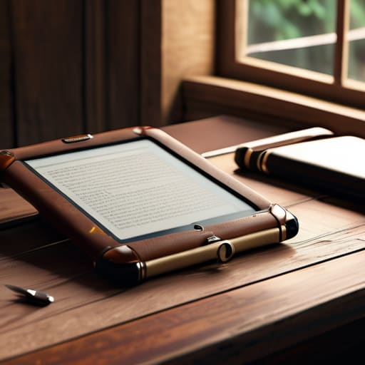
To understand where we’re headed, we have to look at how we got here. We didn’t just stumble into flat design; we retreated into it. When the first smartphones arrived, we needed visual metaphors in UX to bridge the gap between a glass slab and a functional tool. We leaned heavily on shadows, textures, and leather-bound digital notebooks because we needed to know where to press. It was a necessary training wheels phase that helped us map the digital landscape onto our physical intuition.
But then, we overcorrected. We stripped away the soul of the interface in a quest for hyper-minimalism, leaving us with layouts that feel sterile and frictionless. Recently, we’ve seen a pushback through trends like glassmorphism and depth effects, which attempt to reintroduce a sense of hierarchy. I see this as part of the broader evolution of user interface design—a pendulum swinging back toward a middle ground. We aren’t looking for the heavy, literal clutter of the early 2000s, but rather a sophisticated digital interface realism that respects the user’s spatial awareness without sacrificing modern clarity.
Visual Metaphors in Ux Restoring the Human Touch
When we talk about visual metaphors in UX, we aren’t just discussing aesthetic nostalgia; we are talking about the cognitive shorthand that makes a tool feel intuitive. In my early days with physical paste-ups, the weight of a cutter or the texture of a specific paper stock dictated how I worked. Today, we lack that physical resistance. When we use subtle shadows or light play to suggest a button can be pressed, we are providing a bridge between the screen and the hand. It’s about creating a sense of digital interface realism that doesn’t feel like a gimmick, but rather a way to honor the user’s instinctual understanding of the world.
The tension between neumorphism vs skeuomorphism often gets lost in a debate over “flatness,” but the real conversation should be about utility. A well-placed gradient or a soft edge isn’t just decoration—it’s a signal. We need to move past the idea that “modern” must mean “featureless.” By integrating intentional depth, we provide the tactile feedback in digital products that tells a creator, this is a tool you can command.
Beyond the Gimmick: A Strategist’s Guide to Tactile Intent
- Focus on affordance, not just aesthetics. Use subtle shadows and depth to signal how an element should be interacted with, rather than just making it look “old.” If a button doesn’t feel like it can be pressed, the design has failed its primary purpose.
- Embrace “Neumorphism” with caution. The soft, extruded look can be beautiful, but it often sacrifices accessibility. Always ensure your contrast ratios respect the user’s eyes; a design that looks like a smooth pebble is useless if it’s unreadable in sunlight.
- Use texture to convey weight and importance. A slight grain or a paper-like finish can ground a digital interface, giving it a sense of permanence that flat, clinical vectors often lack. It’s about creating a sense of place within the screen.
- Prioritize functional metaphors over literal imitation. You don’t need a digital notebook to look exactly like a Moleskine, but it should respect the way a real page turns or how ink settles on a surface. The goal is to trigger a familiar muscle memory, not to build a museum piece.
- Respect the hierarchy of the digital medium. Skeuomorphism should be the seasoning, not the main course. Use tactile elements to highlight key interactions or to provide emotional resonance, but don’t let the “physicality” clutter the efficiency of the modern workflow.
The Intentionality of Friction
Stop treating skeuomorphism as a decorative relic; use it as a functional bridge to help users intuitively grasp digital complexity through familiar, tactile metaphors.
Prioritize “meaningful friction” over seamlessness, ensuring that digital interactions respect the user’s cognitive rhythm rather than just optimizing for mindless speed.
Design with the soul of a craftsman, choosing elements that honor the physical world’s textures to prevent the digital landscape from becoming a sterile, uninspired void.
The Soul in the Machine
We shouldn’t use skeuomorphism as a nostalgic costume, but as a way to respect the user’s intuition; digital interfaces shouldn’t feel like frictionless glass, but like tools that acknowledge the weight and texture of the real world.
Ingrid Bellamy
Beyond the Surface
Ultimately, revisiting skeuomorphism isn’t about a nostalgic retreat into the past or decorating our screens with faux leather and brushed metal. It is about recognizing that meaningful design requires context. We’ve spent years stripping away the “clutter” in pursuit of a sterile, flat minimalism, but in doing so, we often stripped away the intuitive cues that make a tool feel approachable. By integrating subtle tactile metaphors and honoring the visual logic of the physical world, we bridge the gap between cold code and human intuition. We aren’t just building interfaces; we are building digital environments that respect the user’s sensory history.
As I sit here with my sketchbook, watching the light hit the grain of the paper, I’m reminded that the most enduring tools are those that feel like an extension of the hand. Our challenge as designers in this automated age is to ensure that our pursuit of efficiency doesn’t come at the cost of soulful intentionality. Let’s stop designing for the algorithm and start designing for the person on the other side of the glass. We must strive to create work that doesn’t just occupy space, but invites a sense of touch, even when there is nothing to hold.
Frequently Asked Questions
How do we balance the tactile warmth of skeuomorphism without falling into the trap of cluttered, dated interfaces?
The trick is to stop treating skeuomorphism as a costume and start treating it as a cue. We don’t need hyper-realistic leather textures or heavy bevels that scream 2007; we need the suggestion of depth and resistance. Focus on subtle shadows, micro-interactions, and haptic feedback—the digital equivalent of a pen meeting paper. Use these cues to guide the eye, not to clutter the canvas. It’s about intentionality, not decoration.
Is there a specific threshold where adding texture stops being "humanizing" and starts becoming a distraction to the user's workflow?
It’s a fine line. The threshold is crossed the moment the texture demands more cognitive load than the task itself. If a user has to squint to find a button because the grain is too heavy, or if a subtle paper texture makes text illegible, you’ve failed. Texture should be a quiet resonance—a feeling of depth—not a loud visual noise. If it’s competing with the content, strip it back. Design should guide, not obstruct.
In an age of gesture-based navigation, how can we use visual depth to guide a user without relying on old-school button metaphors?
We shouldn’t mistake “flat” for “functionless.” In a gesture-driven world, depth becomes our most subtle way of communicating hierarchy. Instead of drawing a literal button, use soft, directional shadows or subtle layering to suggest that an element sits on a different plane. It’s about creating a visual weight that tells the user, “this is interactable,” without the clutter of an old-school icon. We’re using light and shadow to mimic physical presence, not to mimic old software.
