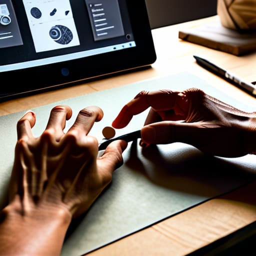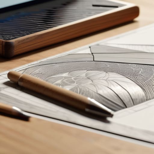
Artistic analog collage composition.

The Art of Analog Collage

I still remember the smell of a studio in Providence during my sophomore year—a heavy, intoxicating mix of spray adhesive, old newsprint, and the metallic tang of X-Acto blades. I was hunched over a light table, my fingers stained with ink, trying to force a sense of cohesion out of a chaotic pile of discarded magazines. There was a specific, beautiful tension in that process; you couldn’t just hit `Cmd+Z` when a tear went too deep or a glue smudge ruined the grain. That physical struggle is exactly what’s missing from our perfectly polished, pixel-perfect interfaces today. We’ve traded the tactile friction of analog collage for a sterile, frictionless convenience that often leaves our work feeling hollow and uninspired.

In this piece, I’m not going to sell you on some expensive, curated “aesthetic” or tell you that you need a specialized kit to get started. Instead, I want to share the practical, messy reality of how to actually use analog collage to inject genuine soul back into your digital compositions. We’ll talk about the intentionality of texture, the value of the “happy accident,” and how to bridge the gap between the physical scrap and the digital canvas without losing the human touch that makes design worth doing.

Table of Contents

The Soul of Vintage Magazine Cutouts and Found Ephemera
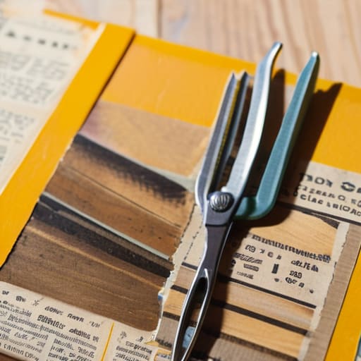
The Soul of Vintage Magazine Cutouts and Found Ephemera.

There is a specific kind of magic found in the weight of a mid-century periodical. When I’m hunting through old archives, I’m not just looking for imagery; I’m looking for the ghosts of previous owners. A coffee stain on a page from 1964 or the slight yellowing of a corner tells a story that a high-resolution stock photo never could. Using vintage magazine cutouts allows you to tap into a pre-digital color palette—those slightly muted, offset lithography tones that feel grounded and intentional.

When you start gathering your ephemera for collage, you aren’t just collecting scraps; you are collecting fragments of time. I often find myself drawn to old transit maps or weathered postcards because they provide a structural depth that digital vectors lack. The goal isn’t to create something “perfect.” Instead, I look for pieces that invite tactile tension. By integrating these physical artifacts, you introduce a layer of history that forces the viewer to slow down and actually look at the work, rather than just scrolling past it.

Building Intentionality With Essential Collage Art Supplies

Building Intentionality With Essential Collage Art Supplies

When you sit down to create, the tools you choose dictate the rhythm of your work. I’ve found that the friction of a heavy-weight paper or the specific resistance of a glue stick changes how I approach a piece. It isn’t about having an expensive studio; it’s about selecting collage art supplies that invite experimentation rather than perfection. I tend to gravitate toward archival-quality adhesives and a curated selection of ephemera for collage—things like old botanical prints or weathered postcards—that have a history written into their fibers.

The magic happens when you stop treating materials as mere assets and start treating them as collaborators. Instead of reaching for a digital brush to simulate depth, I find myself layering paper textures to build a physical topography. A piece of torn linen or a scrap of handmade washi paper adds a dimension of light and shadow that a screen simply cannot replicate. By choosing materials with inherent character, you aren’t just decorating a surface; you are building a foundation of intentionality that carries through to the final composition.

Five Ways to Keep Your Process From Becoming Too Polished

  • Embrace the tear. Don’t reach for the precision scissors every time you want to move a piece; a jagged, hand-torn edge introduces a physical weight and a shadow that a digital vector can never replicate.
  • Layer with purpose, not just density. It’s tempting to stack scraps until the composition feels heavy, but true depth comes from leaving “breathing room”—letting the paper grain or the background texture speak through the gaps.
  • Respect the history of your materials. If you’re using a cutting from a 1960s travel brochure, let that specific halftone pattern or aged paper tone dictate your color palette rather than forcing it to match a modern hex code.
  • Fight the urge to over-glue. I’ve seen too many beautiful compositions turn into a muddy mess because of excess adhesive. Use just enough to hold the vision, keeping the paper’s natural tension intact.
  • Step away from the screen to evaluate. Once you’ve assembled a piece, move it to a different light source or look at it from a distance. Digital perfection often hides the very “friction” that makes a collage feel alive and human.

Finding the Friction

Stop chasing pixel-perfect smoothness; the real magic lives in the ragged edges and the slight misalignment of a hand-cut piece of paper.

Treat your physical supplies as extensions of your intent, not just tools, by selecting textures that carry their own history and weight.

Use analog collage not as a decorative layer, but as a way to inject deliberate, human imperfection back into an increasingly sanitized digital landscape.

The Friction of the Physical

“Digital tools offer us endless perfection, but perfection is often where creativity goes to die. Analog collage isn’t about being messy; it’s about embracing the resistance of the paper and the unpredictable grain of a vintage cutout to find a truth that a pixel simply cannot replicate.”

Ingrid Bellamy

Finding the Rhythm in the Imperfection

Finding the Rhythm in the Imperfection collage.

At the end of the day, analog collage isn’t about achieving a polished, pixel-perfect finish. It’s about the intentionality we bring to the table when we choose a weathered magazine clipping over a stock photo or a physical glue stick over a digital layer. By curating our own ephemera and investing in tools that actually respond to our hands, we move away from the mindless scrolling of digital assets and toward a deliberate act of construction. We’ve explored how the texture of found objects and the right set of tactile supplies can transform a simple composition into something that feels alive, grounded, and deeply personal.

As I sit here with my sketchbook, watching the light shift across my desk, I’m reminded that our best work often happens in the spaces between the lines. In an industry that is increasingly obsessed with speed and automation, I encourage you to slow down. Don’t be afraid of the tear in the paper or the slight smudge of ink; those are the fingerprints of your humanity. Use these methods to reclaim your creative agency and to build something that resists the frictionless void of the screen. Let your work be a testament to the beauty of the human touch.

Frequently Asked Questions

How do you balance the messy, physical nature of collage with the need for precision when transitioning a piece into a digital workflow?

It’s a delicate dance. I never try to “fix” the mess in Photoshop; that’s where the soul dies. Instead, I scan my work at the highest possible DPI to preserve every fiber and ink bleed. I treat the digital stage as a way to refine the composition and color balance, not to smooth out the edges. Let the scan be imperfect. The precision should come from your layout and typography, not from erasing the grit.

What are the best ways to preserve the delicate textures of old paper and ephemera when scanning them for high-resolution design work?

Don’t just scan and walk away. If you want to keep that toothy, tactile soul, you have to treat the scanner like a darkroom. Use a flatbed, not a feeder, and keep the glass pristine—even a fingerprint can kill the illusion of age. I always scan at a minimum of 600 DPI, often higher, to capture the micro-shadows in the paper grain. Most importantly, avoid the temptation to “auto-correct” the brightness; let the scanner capture the actual, imperfect tonal range.

How can I avoid the cliché "scrapbook" look and ensure my collage feels like a deliberate piece of brand storytelling rather than just a collection of random clippings?

The difference lies in restraint. A scrapbook is an accumulation; a brand story is a curation. To avoid that cluttered, accidental feel, you need a unifying visual thread—think a consistent color palette, a specific typographic scale, or a recurring geometric motif. Don’t just layer things because they look interesting. Ask yourself: how does this texture support the narrative? If a clipping doesn’t serve the core message, leave it on the cutting room floor.


The art of visual communication.

The Art of Visual Communication

I remember the smell of isopropyl alcohol and the tactile resistance of a physical X-Acto blade cutting through heavy cardstock in my studio at RISD. Back then, visual communication wasn’t something you “generated” with a prompt; it was something you built, layer by painstaking layer, where every millimeter of negative space mattered. Today, I see so many designers drowning in a sea of automated trends, chasing hollow aesthetics that look polished but feel completely empty. We’ve traded the intentionality of the craft for a frantic race to fill every available pixel, forgetting that true connection requires more than just high-resolution noise.

In this piece, I want to strip away the jargon and the expensive software hype to get back to what actually works. I’m not here to give you a lecture on theory, but to share the hard-won lessons I’ve gathered from two decades of navigating the shift from ink to interface. We are going to explore how to approach visual communication with a sense of purpose, focusing on how to create work that respects the human eye and honors the intentionality of design.

Table of Contents

Mastering Visual Storytelling Techniques to Empower the Creator

Mastering Visual Storytelling Techniques to Empower the Creator

When we talk about empowering the creator, we aren’t talking about giving them more buttons to click. We are talking about teaching them how to guide a viewer’s eye through a composition without saying a single word. This is where visual hierarchy principles become your most vital tool. If everything on a page is shouting for attention, nothing actually gets heard. I’ve seen so many junior designers fall into the trap of “maximalism” when what the project actually requires is a disciplined use of negative space to let the core message breathe.

True mastery comes when you realize that every choice—the weight of a typeface or the tension between two objects—is a form of non-verbal communication in design. It’s about reducing the cognitive load so the audience can actually experience the work rather than fighting to decipher it. When we respect the viewer’s mental energy, we create a bridge between the intent of the artist and the perception of the user. We aren’t just arranging elements; we are crafting a sequence of moments that feel inevitable and intentional.

Reducing Cognitive Load in Design for Human Connection

Reducing Cognitive Load in Design for Human Connection

We often mistake complexity for sophistication, but in my experience, true mastery lies in what you choose to leave out. When we clutter an interface with unnecessary elements, we aren’t being thorough; we are creating noise that drowns out the message. To build a genuine connection, we have to respect the user’s mental energy. By applying strict visual hierarchy principles, we guide the eye naturally through a composition, ensuring the most important information is felt before it is even consciously processed.

It’s about creating a sense of ease. If a user has to fight to find a navigation menu or decipher a cramped typeface, the connection is broken. This is where the marriage of typography and readability becomes essential. It isn’t just about choosing a beautiful serif; it’s about ensuring that the weight, leading, and kerning allow the reader to glide through the content without friction. When we minimize the cognitive load in design, we aren’t just making things “user-friendly”—we are clearing the path so the human on the other side can actually engage with the soul of the work.

The Tactile Checklist: Five Ways to Reclaim Intentionality

  • Prioritize typographic hierarchy over decorative flair. A well-chosen typeface shouldn’t just look “modern”; it should guide the eye through a narrative, creating a logical path that respects the reader’s time and focus.
  • Embrace purposeful whitespace. In our rush to fill every pixel, we often suffocate our ideas. White space isn’t “empty” space—it’s the breathing room that allows your core message to actually land.
  • Design for the friction of reality. Digital interfaces often feel too slick, too frictionless. Introduce subtle, intentional visual cues that mimic the weight and resistance of physical objects to make the experience feel more human and less clinical.
  • Audit your color palettes for emotional utility. Stop choosing colors based on what’s trending on Dribbble. Ask yourself if the palette serves the brand’s soul or if it’s just adding digital noise to an already crowded screen.
  • Test for the “Human Hand” factor. Before finalizing a layout, step away from the screen and sketch the concept in your notebook. If the visual communication doesn’t hold up with a fountain pen and a piece of paper, it’s likely too reliant on digital gimmicks and not enough on solid design principles.

The Intentional Designer’s Checklist

Prioritize clarity over decoration; if an element doesn’t serve a functional purpose or guide the user’s eye, it’s just noise that breaks the connection.

Respect the user’s mental bandwidth by designing interfaces that feel intuitive rather than demanding, allowing the content to breathe.

Guard the human element in your workflow by using digital tools to enhance your unique creative voice, not to automate away the intentionality of your craft.

The Soul in the System

Visual communication isn’t about how much information we can cram into a layout; it’s about how much clarity we can create through restraint. If we lose the intentionality of the human hand in our pursuit of digital perfection, we aren’t designing anymore—we’re just decorating.

Ingrid Bellamy

The Intentional Path Forward

The Intentional Path Forward through visual clarity.

We have looked at how storytelling and cognitive ease serve as the backbone of effective visual communication, but these aren’t just checkboxes for a design audit. They are the ways we respect the person on the other side of the glass. By mastering narrative techniques and consciously stripping away the noise that causes mental fatigue, we move away from mere decoration and toward genuine utility. When we prioritize clarity over clutter, we aren’t just making things look “cleaner”—we are actively protecting the user’s ability to process, understand, and connect with the message we are trying to send.

As we move deeper into an era where automation can generate infinite variations of a layout in seconds, our value as designers lies in our ability to inject meaningful friction back into the process. Don’t be afraid of the slow, thoughtful decisions that a machine might overlook. Use your tools to amplify the human experience, not to bypass it. At the end of the day, the most successful designs aren’t the ones that scream for attention, but the ones that honor the human touch and serve a purpose far beyond the glow of the screen.

Frequently Asked Questions

How do we maintain a sense of tactile, human craftsmanship when our primary tools are increasingly driven by automation and AI?

We maintain it by treating automation as a collaborator, not a replacement. I never start a project with a prompt; I start with my sketchbook and a fountain pen. That physical friction—the resistance of paper, the slight bleed of ink—anchors my intent. Use AI to handle the repetitive, heavy lifting, but keep the decision-making manual. If you outsource the soul of the work to an algorithm, you aren’t designing; you’re just curating.

At what point does a minimalist design transition from being "clean" to being so stripped-back that it loses its communicative soul?

It happens the moment you prioritize the aesthetic of “emptiness” over the necessity of clarity. Minimalism should be a way to focus the eye, not a way to hide the message. When you strip away so much that the user has to work harder to understand the hierarchy or the intent, you haven’t achieved elegance—you’ve just created a vacuum. Design loses its soul when it stops serving the human and starts serving the ego.

How can we balance the need for rapid digital iteration with the slow, intentional process required to build truly meaningful visual systems?

We have to stop treating speed as the only metric of success. I find balance by separating the “sketch” phase from the “pixel” phase. Use your digital tools for the heavy lifting—the iterations, the scaling, the testing—but don’t let them touch your initial thinking. Keep your hands on paper. When you build the foundation with a fountain pen and a slow, deliberate eye, the digital speed that follows becomes a tool for refinement, not a shortcut for thought.

Guide to custom brush making process.

How to Create Custom Digital Brushes

I remember sitting in a cramped studio in Providence, my fingers stained with India ink, trying to coax a specific, bleeding texture out of a physical brush that just wouldn’t cooperate. There was a weight to that struggle—a tactile resistance that felt like actual progress. Fast forward to today, and I see designers drowning in massive, bloated brush packs that promise “infinite creativity” but actually deliver nothing but sterile, repetitive digital noise. Most people treat custom brush making like a technical checkbox, a way to automate the soul out of their work, when it should be about reclaiming that lost friction.

I’m not here to sell you on a complex software workaround or a way to “hack” your productivity. Instead, I want to talk about how we can use custom brush making to build tools that actually respond to the nuances of your hand. I’ll be sharing the honest, unvarnished methods I use to bridge the gap between the digital screen and the intentionality of craftsmanship. We aren’t just making presets; we are building digital extensions of our own creative instincts.

Table of Contents

Mastering Digital Painting Brush Settings for Human Expression

Mastering Digital Painting Brush Settings for Human Expression

When you sit down to work, the goal isn’t to achieve perfection through a mathematical algorithm; it’s to find that elusive sense of movement. This is where most people stumble, getting lost in a sea of sliders without understanding the why behind them. To move beyond the sterile look of standard software, you have to dive into digital painting brush settings with an eye for imperfection. I often find myself tweaking the pressure sensitivity not to make the line smoother, but to ensure the stroke responds to the specific weight of my hand, much like how a nib reacts to paper.

The real magic happens when you play with brush dynamics and jitter. If every stroke is identical, the work feels dead. By introducing subtle, controlled randomness into your opacity or size settings, you mimic the organic inconsistencies of charcoal or ink. It shouldn’t look “glitchy,” but rather like it has a soul. You aren’t just configuring software; you are sculpting a digital tool that respects the natural rhythm of your creative process.

Creating Custom Texture Brushes That Mimic Physical Friction

Creating Custom Texture Brushes That Mimic Physical Friction

When I’m working on a brand identity, I find myself missing the resistance of heavy-tooth paper or the way a dry ink brush catches on a linen canvas. Digital surfaces are often too perfect, too smooth—they lack the “soul” of a physical mistake. To fix this, you have to stop thinking about brushes as mere stamps and start thinking about them as surfaces. Creating custom texture brushes isn’t just about importing a grainy photo; it’s about how that grain reacts to your movement. I spend a lot of time tweaking brush dynamics and jitter to ensure that no two strokes are ever identical, mimicking the way a real pigment settles unevenly into a substrate.

If you want to move beyond the sterile look of default presets, you need to lean into the imperfection. Whether you are deep in a photoshop brush tip customization session or exploring the nuances of a Procreate engine, focus on the “drag.” I try to build layers of micro-textures into my settings so that as I increase pressure, the brush doesn’t just get darker—it gets tactile. It should feel as though you are fighting the medium just a little bit, because that subtle friction is where the character lives.

The Intentional Toolkit: Five Principles for Better Brush Building

  • Stop chasing perfection in your brush tips. Real graphite and charcoal have imperfections—tiny gaps, uneven edges, and organic irregularities. When you’re building your custom stamps, add a bit of jitter or noise so the stroke doesn’t feel like a repetitive, clinical loop.
  • Respect the pressure curve. A brush that feels “on” or “off” is a chore to use. Spend time calibrating your settings so the transition from a whisper-light line to a heavy, weighted stroke feels as intuitive as a fountain pen hitting paper.
  • Build for the “middle ground.” We often focus on extreme textures, but the most useful brushes are the ones that sit in that quiet space between a hard edge and a soft blur. Aim for versatility; a brush should be able to lay down a base layer just as easily as it defines a highlight.
  • Don’t forget the “drag.” In the physical world, the paper resists the tool. Try simulating this by adjusting your dual brush settings or adding a subtle texture overlay that reacts to your speed. It adds that necessary friction that keeps your hand from sliding too predictably across the tablet.
  • Test against the clock, not just the canvas. A good tool shouldn’t require constant menu-diving. If you find yourself stopping every thirty seconds to tweak a setting, the brush isn’t finished. It needs to disappear into your workflow so you can stay in the flow of creating.

The Intentional Toolkit: Three Lessons in Digital Craft

Stop chasing perfection through presets; the most expressive brushes are the ones you build to reflect the specific resistance and unpredictability of your own hand.

Digital tools should mimic the friction of the physical world, not erase it—use texture and pressure sensitivity to ensure your work feels lived-in rather than sterile.

Treat your brush library like a curated set of vintage lenses: every stroke should serve a specific purpose in the composition rather than just filling space.

The Soul in the Stroke

A preset brush is a shortcut, but a custom brush is a signature; we aren’t just choosing a tool, we are deciding how much of our own human friction we are willing to let bleed into the digital canvas.

Ingrid Bellamy

The Intentional Stroke

Mastering digital art with The Intentional Stroke.

At the end of the day, custom brush making isn’t about collecting a thousand different presets to clutter your digital library. It is about the deliberate marriage of technical settings—jitter, pressure sensitivity, and dual textures—with the intuitive movement of your hand. By mastering how these digital parameters respond to your touch, you move away from the sterile, predictable output of standard software and toward a workflow that feels earned. Whether you are mimicking the grit of charcoal or the fluid bleed of an ink wash, the goal is to bridge the gap between the screen and the tactile reality of traditional media.

As you step away from the screen and pick up your stylus, remember that the tool is merely an extension of your intent. Technology will continue to automate more of our processes, but it can never replicate the unpredictable beauty of a human error or the specific way a person leans into a stroke. Don’t let the perfection of digital tools flatten your voice. Instead, use these custom creations to reclaim the friction, the resistance, and the soul that makes your work uniquely yours. Build your tools with purpose, and let them serve your vision, not the other way around.

Frequently Asked Questions

How do I prevent my custom brushes from feeling too "perfect" or clinical when I'm trying to replicate the grit of charcoal or ink?

The problem is usually that your settings are too predictable. Digital perfection is the enemy of grit. To break that clinical feel, you need to introduce controlled chaos. Crank up the “Jitter” settings—specifically for size and angle—and play with the “Transfer” settings to mimic how ink actually pools or fades. If the stroke is identical every single time, it’s not a tool; it’s a stamp. Aim for irregularity.

Is it better to build a single, complex brush with dozens of settings, or a small kit of simpler tools that allow for more intuitive movement?

Go with the kit. I’ve seen too many designers get lost in a labyrinth of sliders, trying to find one “perfect” brush that actually ends up feeling clinical and stiff. A single, complex brush is a trap; it dictates your movement rather than following it. Build a small, versatile kit instead. You want tools that respond to your hand, allowing you to layer textures and strokes intuitively, much like picking up different pens from a real kit.

When am I over-engineering my brushes—at what point does technical tweaking start to get in the way of the actual creative flow?

You’re over-engineering when you spend more time adjusting jitter percentages than actually making marks. If you find yourself staring at a settings panel instead of the canvas, you’ve crossed the line from tool-building to procrastination. A brush should be a means to an end, not the end itself. If the technical tweaking feels like a barrier to your intuition, stop. Close the menu, pick a “good enough” setting, and just start drawing.

Expert designing complex dashboards for data.

Designing Effective Data Dashboards

I remember sitting in a dimly lit studio back in the late nineties, surrounded by the scent of spray adhesive and the tactile grit of physical paste-ups, realizing that even then, we were terrified of clutter. Fast forward to today, and I see the same fear manifesting as a digital obsession with “more”—more widgets, more real-time feeds, more everything. We’ve fallen into the trap of thinking that designing complex dashboards requires us to maximize every pixel of screen real estate, as if density were a proxy for value. In reality, most of these data-heavy interfaces are just digital noise masquerading as insight, leaving the user feeling overwhelmed rather than empowered.

I’m not here to give you a lecture on the latest UI trends or sell you on some automated design tool that promises to do the thinking for you. Instead, I want to talk about the intentionality required to build interfaces that actually respect the human brain. We are going to look at how to strip away the excess and focus on meaningful hierarchy, ensuring that when you are designing complex dashboards, you are providing a clear path to action rather than just a beautiful graveyard of metrics.

Table of Contents

Mastering Visual Hierarchy in Dashboard Design

Mastering Visual Hierarchy in Dashboard Design.

When we look at a screen flooded with numbers, our eyes shouldn’t have to fight to find meaning. Achieving a proper visual hierarchy in dashboard design isn’t about making things “pretty”; it’s about directing the gaze with the same intentionality I use when laying out a print spread. I’ve found that the most successful interfaces rely on a clear scale of importance. You have to decide what the primary signal is and treat everything else as secondary noise. If every widget is shouting for attention, the user ends up hearing nothing but static.

To truly master this, you must focus on reducing mental effort in UI by utilizing whitespace and weight rather than just color. I often tell my clients to treat a dashboard like a well-composed photograph: there should be a clear focal point that anchors the composition. Use subtle shifts in typography and grouping to create a natural flow. When you manage high-density data displays with this kind of restraint, you aren’t just presenting information—you are curating an experience that allows the user to actually think, rather than just react.

Managing High Density Data Displays With Grace

Managing High Density Data Displays With Grace

When we face a screen packed with numbers and live feeds, our first instinct is often to fill every pixel. But there is a massive difference between a data repository and a functional tool. To avoid overwhelming the person on the other side of the glass, we have to focus on reducing mental effort in UI. I’ve learned that true sophistication in high-density environments comes from knowing what to hide. It’s about creating “progressive disclosure”—showing the vital pulse of the data first, and allowing the user to peel back the layers only when they need to dig deeper.

Effective managing high-density data displays requires a disciplined approach to whitespace, even when space feels at a premium. I often tell my clients that white space isn’t “empty” space; it’s breathing room for the brain. By grouping related metrics and using subtle dividers rather than heavy borders, we can maintain a sense of order without adding visual noise. We aren’t just arranging widgets; we are curating a path for the eye to follow, ensuring the most critical insights aren’t lost in a sea of digital clutter.

Five Principles for Bringing Order to Chaos

  • Prioritize the “Why” over the “What.” Before you place a single widget, ask yourself what specific decision the user is trying to make. If a data point doesn’t drive an action or provide immediate context, it’s just visual noise that’s cluttering their mental workspace.
  • Embrace progressive disclosure. You don’t need to show everything at once. Start with high-level summaries that give a sense of the landscape, and allow users to drill down into the granular details only when they actually need them. It respects their cognitive load.
  • Use color as a functional tool, not decoration. In a high-density environment, a bright red alert should feel significant, not expected. If your dashboard is a rainbow of status indicators, nothing actually stands out when a real problem arises.
  • Design for the “glanceable” moment. A well-crafted dashboard should allow a user to grasp the pulse of their system in three seconds or less. If they have to hunt for the trend line, the interface has failed to serve its purpose.
  • Respect the rhythm of the data. Group related metrics together using whitespace or subtle containers rather than heavy lines and borders. Creating logical clusters helps the eye navigate the complexity without feeling overwhelmed by a grid of endless boxes.

Design with Intent, Not Just Density

Prioritize the user’s cognitive load over data volume; a dashboard that shows everything at once ultimately shows nothing useful.

Use whitespace as a functional tool rather than empty space, allowing critical metrics to breathe so the eye knows exactly where the story begins.

Build for the human at the desk, not the machine; ensure every interaction feels purposeful and respects the natural rhythm of a professional’s workflow.

The Illusion of Information

A dashboard shouldn’t be a digital junk drawer where metrics go to die; it should be a curated workspace that honors the user’s cognitive load by giving them clarity, not just more noise to filter through.

Ingrid Bellamy

The Discipline of Restraint

The Discipline of Restraint in dashboard design.

Designing complex dashboards isn’t about how much information we can squeeze into a single viewport; it’s about how much meaning we can extract from the noise. We’ve discussed the necessity of a rigid visual hierarchy to guide the eye and the delicate art of managing high-density data without overwhelming the user. When we prioritize clarity over clutter, we move away from mere data dumping and toward true functional design. Remember, every pixel must earn its place on the screen. If a metric doesn’t drive a decision or provide necessary context, it’s just digital noise masquerading as insight.

As we move further into an era of automated, generative interfaces, my hope is that we don’t lose sight of the human at the other end of the screen. A dashboard shouldn’t feel like a cold, mathematical grid; it should feel like a well-organized studio where the tools are intuitive and the focus remains on the work. Let’s strive to build interfaces that respect the user’s cognitive load and honor their intent. Design is most powerful when it steps back and allows the person using it to feel capable, informed, and—most importantly—in control.

Frequently Asked Questions

How do you decide which data points are essential for the immediate view and which ones should be tucked away in a secondary layer?

I start by asking: “What is the user trying to do in this exact moment?” If a data point doesn’t inform an immediate decision or signal a change in state, it doesn’t belong in the primary view. I treat the main dashboard like a well-composed print layout—only the essential elements get the spotlight. Everything else belongs in a secondary layer, accessible through progressive disclosure, so we don’t drown the creator in noise.

At what point does a dashboard cross the line from being "information-rich" to being visually overwhelming and counterproductive?

The line is crossed the moment the user has to work to find the signal in the noise. When I look at a dashboard and my eyes dart around without a clear place to land, it’s failed. If the interface demands constant cognitive heavy lifting just to parse basic metrics, it’s no longer a tool—it’s an obstacle. A dashboard becomes counterproductive when it prioritizes data volume over the clarity required to make a decision.

How can we maintain a sense of brand personality and craftsmanship in a layout that is primarily driven by rigid data structures?

It’s easy to let the grid turn your work into a sterile spreadsheet, but data doesn’t have to mean lifeless. I look for the small, intentional frictions: a custom-kerned typeface for headers, a subtle weight shift in the stroke of an icon, or a sophisticated, non-standard color palette that breathes life into the charts. Use the rigidity of the structure to anchor the design, then use typography and spacing to let the brand’s soul peek through.

Professional designer designing icon sets.

Creating Cohesive Icon Sets

I remember sitting in a dimly lit studio back in the late nineties, the air thick with the smell of spray mount and ozone from the early Macintoshes, obsessing over the exact weight of a single stroke. Back then, we didn’t have infinite libraries of pre-made assets to hide behind; we had to understand the mathematical soul of a shape. Today, I see so many designers treating designing icon sets as a mere exercise in aesthetic decoration, slapping generic, overly polished vectors onto a layout just to fill the white space. It’s lazy, and frankly, it ignores the fundamental responsibility we have to the user.

I’m not here to teach you how to download a trendy pack or how to make things look “clean” for the sake of a Dribbble shot. Instead, I want to pull back the curtain on the intentionality required to build a cohesive visual language. We are going to discuss the grit of the process—from establishing a rigorous grid system to ensuring every glyph respects the human friction of navigation. This is about crafting tools that feel like natural extensions of the hand, not just digital clutter.

Table of Contents

Establishing a Visual Language System for Human Connection

Establishing a Visual Language System for Human Connection

When we talk about building a cohesive library, we aren’t just talking about making things look “similar.” We are talking about developing true visual language systems that feel like they belong to the same family. I’ve seen too many projects where a set of icons feels like a collection of strangers—some rounded, some sharp, some heavy, some airy. To avoid this, you have to establish your rules before you even touch your software. I always start by defining my constraints: the corner radii, the terminal styles, and most importantly, the icon weight and stroke consistency. If your “home” icon uses a 2px stroke but your “settings” icon feels spindly at 1.5px, you’ve already broken the illusion of a unified interface.

Consistency is where the soul of the design lives. I tend to lean heavily on strict icon grid systems to ensure that every shape occupies its space with intention. It’s not about being rigid for the sake of perfection; it’s about creating a predictable rhythm that the human eye can follow without effort. When the geometry is disciplined, the user doesn’t have to “think” about the icon—they simply understand it.

Mastering the Vector Icon Creation Workflow

Mastering the Vector Icon Creation Workflow.

When I sit down at my desk, I usually start with a physical sketch before even touching my mouse. There is a certain rhythm to it that a digital canvas can’t replicate. However, once you transition into the software, your vector icon creation workflow needs to be disciplined. You aren’t just drawing shapes; you are building a modular architecture. I always advocate for starting with strict icon grid systems—think of them as the scaffolding that keeps your creativity from collapsing into chaos. Without these constraints, your icons might look fine in isolation, but they will fail the moment they meet the reality of a complex interface.

Precision is where the craft truly lives. I can’t stress enough how vital it is to prioritize pixel perfect icon design from the very first anchor point. If your paths aren’t aligned to the pixel grid, you’ll end up with that muddy, unintentional blur that plagues amateur work. I spend a significant amount of my time obsessing over icon weight and stroke consistency, ensuring that a 2px line feels just as intentional in a “Settings” cog as it does in a “Home” icon. It’s about creating a sense of visual equilibrium that the user feels, even if they can’t quite name it.

The Small Details That Make or Break a System

  • Respect the grid, but don’t let it become a cage. Use a consistent pixel grid to ensure clarity at small scales, but always leave enough breathing room for the weight of the stroke to feel natural rather than mechanical.
  • Prioritize semantic meaning over visual flair. An icon shouldn’t just look “cool”; it needs to act as a reliable signpost. If a user has to pause for even a second to decode what a shape represents, you’ve failed the primary goal of functional design.
  • Standardize your optical weights. Even if your mathematical stroke widths are identical, some shapes—like a heavy circle versus a delicate star—will look different to the human eye. Adjust them manually so they feel balanced when placed side-by-side.
  • Design for the edge cases of scale. I often test my sets by shrinking them down to 16px or blowing them up to 512px. If the icon loses its soul or becomes a muddy blob at a small size, your geometry is too complex. Simplify until the essence remains.
  • Maintain a consistent “corner language.” Whether you’re using sharp, technical angles or soft, approachable radii, that decision must be applied across the entire set. This subtle cohesion is what separates a collection of random shapes from a professional visual system.

The Intentional Iconographer’s Checklist

Stop chasing trends and start building systems; a cohesive icon set isn’t a collection of pretty drawings, but a unified visual vocabulary that speaks one language.

Respect the grid, but don’t let it become a cage; use mathematical precision to ensure clarity, but always leave room for the subtle, human imperfections that make a design feel alive.

Prioritize function over decoration; if an icon doesn’t immediately communicate its purpose through its silhouette, it’s just visual noise that gets in the way of the user’s intent.

Beyond the Grid

An icon shouldn’t just be a way to navigate a menu; it should be a subtle, visual handshake between the interface and the person using it. If you strip away the personality in favor of pure, sterile efficiency, you aren’t designing a tool—you’re just building a void.

Ingrid Bellamy

The Intentionality of the Smallest Details

The Intentionality of the Smallest Details.

At the end of the day, building an icon set isn’t about accumulating a library of assets; it’s about defining a coherent visual dialect. We’ve discussed the necessity of a rigid geometric foundation and the importance of a workflow that prioritizes precision over speed. When you respect the mathematical constraints of your grid while simultaneously allowing for the subtle nuances of weight and proportion, you move beyond mere decoration. You transition from simply “making icons” to architecting a visual language that guides a user through a digital space without them ever feeling the weight of the interface.

As you close your design software and pick up your sketchbook, remember that the most successful icons are often the ones that feel almost invisible. They shouldn’t demand attention; they should provide clarity. In an era where we can generate infinite variations with a single click, I urge you to hold onto the friction of intentionality. Don’t let the ease of automation strip the soul out of your systems. Instead, use these tools to craft something that feels deliberate, human, and profoundly useful. Build icons that don’t just fill a screen, but actually respect the person on the other side of it.

Frequently Asked Questions

How do I maintain visual consistency across an icon set when the metaphors themselves are inherently diverse?

The trick isn’t in the subject matter, but in the underlying architecture. You have to anchor every icon to a strict set of mathematical constraints—the same stroke weight, the same corner radius, and a consistent optical scale. Whether you’re drawing a simple chevron or a complex camera, they must share the same DNA. I always return to my grid; it’s the invisible hand that ensures diverse metaphors feel like they belong to the same family.

At what point does simplifying an icon for legibility start to strip away the character and intentionality of the brand?

It’s a delicate tension. You know you’ve gone too far when the icon becomes a mere utility—a sterile, geometric ghost of its former self. When you strip away the subtle weight variations or that specific terminal curve that defines a brand’s typeface, you aren’t just simplifying; you’re erasing identity. If the icon no longer feels like it belongs to the same family as the typography, you’ve sacrificed soul for the sake of a clean grid.

How can I ensure my icon system remains scalable and functional across both high-resolution displays and tactile, physical touchpoints?

To keep an icon system from breaking when it leaves the screen, you have to design for the smallest common denominator. I always build with a strict pixel grid to ensure clarity on high-res displays, but I test the weight of the strokes against physical constraints. If a symbol feels too spindly to be etched or printed clearly, it’s too fragile for the real world. Scalability isn’t just about size; it’s about maintaining visual integrity across mediums.

Digital painting light study tutorial photograph

Understanding Light in Digital Painting

I was sitting in my studio last Tuesday, hunched over a half-finished portrait, when I realized I was doing exactly what I hate: clicking through a dozen “lighting effect” presets in an attempt to find a shortcut. There is this pervasive, exhausting myth in our industry that mastering digital painting light is about finding the right layer blend mode or a flashy new brush pack. We’ve become so obsessed with the software’s ability to simulate luminosity that we’ve forgotten how to actually see. We aren’t painting light; we are just slapping glow effects onto a canvas and calling it a day, losing that essential sense of depth and intention in the process.

I’m not here to sell you on a new plugin or a complicated workflow that requires a PhD in mathematics. Instead, I want to talk about the intentionality of shadow and how to use light to guide the viewer’s eye with purpose. I’m going to share the fundamental principles I’ve gathered from decades of moving between physical ink and digital pixels—the kind of knowledge that focuses on observing reality rather than mimicking a filter. We are going to reclaim the craft, one thoughtful stroke at a time.

Table of Contents

Directional Light Sources to Honor the Human Touch

Directional Light Sources to Honor the Human Touch

When we talk about directional light sources, we aren’t just discussing where the sun sits in a scene; we are discussing the narrative weight of a shadow. In my early days of physical drafting, you couldn’t just “undo” a heavy shadow. You had to understand how light traveled across a surface. In the digital realm, it is far too easy to default to a generic, flat illumination that strips a character of its soul. To avoid this, I suggest focusing on how light interacts with the edges of your forms. Implementing subtle rim lighting techniques can do more than just separate a subject from the background; it can define the very silhouette that gives your work its structural integrity.

Don’t treat light as a secondary layer applied at the end. Instead, think about the way light carves volume. When you establish a clear direction, you naturally invite the viewer to understand the physics of your world. This is where you must respect the value scale for artists, ensuring that your transitions from highlight to core shadow feel earned rather than slapped on. By being intentional with your light’s path, you bridge the gap between a sterile digital render and a piece that feels like it was touched by a human hand.

Using Value Scale for Artists to Find Depth

Using Value Scale for Artists to Find Depth.

When I first transitioned from physical media to the screen, I felt a profound loss of weight. In traditional oil painting, the thickness of the pigment creates its own subtle shadows, but in a digital workspace, everything can feel dangerously flat. To combat this, I rely heavily on a disciplined value scale for artists. It isn’t just about making things darker or lighter; it’s about understanding the structural hierarchy of your composition. If your values are too close together, your subject loses its presence and begins to bleed into the background, becoming a mere ghost on the canvas.

True depth is found in the quiet transitions. I often find myself obsessing over ambient occlusion in digital art—those tiny, soft shadows where surfaces meet and light struggles to reach. These aren’t just technical checkboxes; they are the anchors that ground an object in reality. By carefully mapping out your light logic through a strict value range, you ensure that the viewer’s eye doesn’t just wander, but actually feels the volume of the form you’ve built. Don’t let your work become a wash of mid-tones; embrace the extremes to give your art its soul.

Beyond the Glow: Five Ways to Infuse Light with Intent

  • Stop chasing the “brightest” color. In the physical world, light is often about what it obscures; in digital painting, try using desaturated, cooler tones for your highlights to prevent that plastic, over-saturated look that plagues amateur work.
  • Respect the ambient occlusion. Light doesn’t just hit a surface and stop; it dances in the crevices. Pay attention to those tiny, dark pockets where surfaces meet—that’s where the weight of your object lives.
  • Use light to dictate the narrative, not just the visibility. Ask yourself: is this light a harsh interrogator or a soft companion? The way you wrap light around a form tells the viewer how to feel before they even process the subject.
  • Avoid the “airbrush trap.” It’s tempting to use a soft large brush for every gradient, but true depth comes from varied edges. Mix crisp, hard-edged shadows with soft transitions to mimic how light actually interacts with different textures.
  • Remember that light is a relationship between two things. You cannot define a highlight without understanding the shadow it creates elsewhere. If you change your light source, you must commit to the ripple effect it has across the entire composition.

Bringing Intention to the Digital Canvas

Stop treating light as a mere filter; instead, use it as a tool for storytelling that guides the viewer’s eye through the composition.

Master your value scales to ensure depth is built through structural integrity rather than just adding more color.

Embrace the “friction” of your medium by prioritizing intentional lighting choices that mimic the subtle complexities of the physical world.

The Soul of the Shadow

Digital light shouldn’t feel like a mathematical calculation of lumens; it should feel like an intention. If you aren’t using light to guide the eye and respect the weight of your forms, you aren’t painting—you’re just adjusting brightness.

Ingrid Bellamy

Finding the Light in the Digital Void

Finding the Light in the Digital Void.

Mastering light in a digital environment isn’t about discovering a new plugin or finding the perfect preset; it’s about understanding how luminosity interacts with form. We’ve looked at how intentional directional sources can ground your subject in a physical reality and how a disciplined approach to the value scale prevents your work from flattening into a mere collection of pixels. When you treat light as a structural element rather than a decorative layer, you move away from the sterile perfection of the machine and toward something much more visceral and alive. It is the difference between simply filling a canvas and actually sculpting with light.

As you close your sketchbook and turn back to the screen, I want you to remember that the tools are secondary to your intent. The digital medium offers us infinite control, but that control can easily become a trap of over-polishing that strips away the soul of the work. Don’t be afraid of a little shadow or the slight imperfection of a soft edge. Use the light to tell a story, to guide the viewer’s gaze, and to honor the inherent friction of the human experience. At the end of the day, our goal isn’t to create a perfect image, but to create a meaningful one.

Frequently Asked Questions

How can I prevent digital lighting from looking too "perfect" or plastic when I'm trying to maintain a painterly feel?

The problem is that digital tools love a perfect gradient, but perfection is the enemy of soul. To break that plastic sheen, stop relying on soft airbrushes for everything. Introduce intentional imperfection. Use textured brushes that mimic the resistance of physical media, and allow your edges to stay slightly “lost.” Don’t be afraid of a little grit or a stray, unblended stroke; that’s where the life lives. Let the light feel felt, not just calculated.

Is there a way to simulate the way light interacts with physical textures, like paper grain or heavy impasto, in a digital environment?

You can’t just use a “grain” filter and call it a day; that’s just noise. To truly mimic impasto or paper tooth, you have to think about how light catches the physical peaks and valleys of a surface. I usually layer subtle, high-contrast textures using blend modes like Overlay or Soft Light, then manually paint in the tiny highlights where the “paint” would catch the light. It’s extra work, but it restores that necessary friction.

How do I balance using high-contrast lighting with the need to keep my color palette cohesive and intentional?

It’s a delicate tension, isn’t it? When you push the contrast, you risk shattering the harmony you’ve worked so hard to build. My approach is to treat light as a color itself, rather than just a white overlay. Instead of using pure white for your highlights, pull a desaturated version of your most luminous local color. This keeps the light tethered to your palette, ensuring the drama serves the composition rather than fighting it.

Establishing effective typography hierarchy in interfaces.

Establishing Typography Hierarchy in Interfaces

I remember sitting in a cramped studio at RISD, surrounded by the sharp, chemical scent of spray mount and the tactile grit of X-Acto blades. Back then, you couldn’t just hide a bad layout behind a flashy animation or a trendy gradient; if your typography hierarchy was broken, the entire physical structure of the page felt wrong to the touch. Today, I see designers trying to solve clarity issues with more “stuff”—more shadows, more motion, more noise—as if complexity could ever substitute for a well-ordered thought.

I’m not here to give you a lecture on the latest design trends or how to manipulate an algorithm. Instead, I want to talk about the quiet discipline of guiding a reader’s eye through a digital space with intention. I’m going to share the practical, battle-tested principles I’ve gathered over twenty years of moving from paste-ups to pixels, focusing on how to use scale and weight to respect the reader’s attention. We’ll strip away the fluff and get back to the craft of clarity.

Table of Contents

Mastering Typographic Scale Principles to Honor Reader Intent

Mastering Typographic Scale Principles to Honor Reader Intent

When we talk about scale, we aren’t just talking about making things bigger or smaller to fill a layout. It’s about establishing a rhythm that respects how the human eye actually scans a page. If your headings and body text are too close in size, you create a flat, exhausting reading experience. By applying intentional typographic scale principles, you create a map. You’re telling the reader, “Start here, pause there, and dive deep into this section.” It’s about creating a predictable, comfortable cadence that prevents cognitive fatigue.

This is where the nuance of visual weight in design becomes essential. A massive, bold headline carries a different gravity than a delicate, medium-weight subhead, even if their sizes are relatively close. You have to balance that weight against your line height and spacing to ensure the text doesn’t feel suffocated. When you get this right, you aren’t just organizing information; you are building an intuitive path. The goal is to make the structure feel so natural that the reader doesn’t even realize they are being guided—they just feel at home in the content.

Using Font Size Contrast to Guide the Human Eye

Using Font Size Contrast to Guide the Human Eye

When we talk about font size contrast, it’s easy to fall into the trap of thinking bigger is always better. But true hierarchy isn’t about volume; it’s about rhythm. If every heading is shouting at the same decibel, you haven’t created a structure—you’ve just created noise. I’ve seen too many digital layouts where the scale is so flat that the reader feels lost, drifting aimlessly through a sea of uniform text. To prevent this, you have to treat size as a tool for intentional navigation. By creating a clear distinction between your primary headings and your body copy, you aren’t just decorating a page; you are building a map that respects the reader’s cognitive load.

This is where the interplay of visual weight in design becomes essential. A massive, bold typeface carries a gravity that pulls the eye instantly, while a smaller, lighter weight allows the eye to rest and settle into the narrative. If you ignore this relationship, you sacrifice both readability and legibility. You want to create a path where the eye knows exactly where to land first, and where to go next, without having to fight the interface to find the meaning.

Five Ways to Build Intentionality into Your Type Systems

  • Stop treating weight as a decoration; use bold and regular weights to create structural anchors that tell the reader exactly where to land first.
  • Respect the rhythm of the line by adjusting your leading; cramped text feels like a digital error, while generous spacing gives the eyes room to breathe.
  • Limit your palette to avoid visual noise; a hierarchy built on twenty different typefaces is just chaos, not a system.
  • Use color not just for aesthetic flair, but to signal importance, letting subtle shifts in value guide the reader through the information architecture.
  • Test your hierarchy in grayscale; if the structure collapses without color to lean on, your typographic scale isn’t doing its job.

The Intentionality of Choice

Stop treating type as a decorative layer; treat it as a navigational map that respects the reader’s cognitive energy.

True hierarchy isn’t about making things big, it’s about creating enough distinction so the eye never has to work to find its way.

Use contrast to build a rhythm, ensuring your digital space feels as structured and purposeful as a well-composed print layout.

The Weight of Intent

Hierarchy isn’t about making things big or small; it’s about respecting the reader’s time. When we fail to create a clear typographic path, we aren’t just making a messy design—we are forcing the human eye to work harder than it should, and that friction is where we lose them.

Ingrid Bellamy

The Intentionality of the Final Layout

The Intentionality of the Final Layout.

At its core, mastering typographic hierarchy isn’t about following a rigid checklist of font sizes or weight ratios; it is about understanding the rhythm of information. We have explored how scale establishes a logical order, how contrast acts as a visual compass, and how deliberate spacing provides the breathing room necessary for comprehension. When we get these elements right, we stop fighting against the user’s natural scanning patterns and start working with them. Typography should never feel like an afterthought or a decorative layer slapped onto a wireframe. Instead, it must function as the very backbone of your communication, ensuring that the most vital ideas are never lost in a sea of undifferentiated text.

As you move back to your workstations, I encourage you to step away from the pixels for a moment. Look at your layout through the lens of a human being who is tired, distracted, or simply searching for an answer. Ask yourself if your hierarchy respects their time and their attention. In a digital landscape that is increasingly cluttered and automated, there is a profound power in intentional design. By treating every heading, subhead, and body paragraph as a purposeful choice, you move beyond mere decoration and begin to create experiences that feel truly crafted. Design with purpose, and let the type do the heavy lifting.

Frequently Asked Questions

How do I maintain a clear hierarchy without relying solely on massive font size jumps that disrupt the visual rhythm?

If you rely only on size, your layout starts to feel like a shouting match. To keep things elegant, look toward weight and color. A medium-weight typeface in a slightly darker charcoal can command more attention than a massive, light-weight heading. Try playing with letter spacing or using subtle shifts in case to create distinction. It’s about creating a quiet, rhythmic guidance that respects the reader’s pace rather than forcing their hand.

At what point does adding more weights and styles cross the line from intentional design to visual clutter?

It crosses the line the moment you stop choosing weights to establish order and start choosing them to mask a lack of structure. If you’re reaching for a Medium or Semi-Bold just to “make it pop” because your hierarchy is weak, you’ve already lost. A disciplined palette of two or three weights is usually enough. When every element is fighting for attention, nothing actually gets heard. Keep it lean; let the scale do the heavy lifting.

How can I ensure my typographic scale remains legible and purposeful when transitioning from a wide desktop monitor to a cramped mobile screen?

It’s easy to get lost in the luxury of white space on a 27-inch monitor, but responsiveness isn’t just about shrinking elements; it’s about recalibrating tension. When you move to a mobile screen, your typographic scale needs to tighten. I usually lean into a more conservative ratio. Don’t let your headings swallow the viewport, but don’t let them vanish into the body text either. Maintain the hierarchy by prioritizing legibility over sheer scale.

Implementing user centered design principles.

Implementing User Centered Design

I remember sitting in a dimly lit studio back in the late nineties, the air thick with the scent of spray mount adhesive and the rhythmic thwack of a X-Acto blade hitting a cutting mat. We weren’t chasing algorithms then; we were chasing the way a human eye naturally rests on a page. Today, I see “user centered design” being treated like some high-priced, mystical ritual performed by agencies charging six figures to move a button three pixels to the left. It has become a sterile, corporate buzzword that often ignores the very thing it claims to protect: the unpredictable, messy reality of how people actually live and work.

I’m not here to give you a polished lecture on theoretical frameworks or a checklist of industry jargon. Instead, I want to pull back the curtain on what it actually means to build with intention. We are going to strip away the hype and look at how to apply user centered design through the lens of craftsmanship and empathy. I promise to share the hard-won lessons I’ve gathered from decades of moving between ink and pixels, focusing on how we can create digital tools that respect the human hand rather than just filling up empty space.

Table of Contents

Honoring the Human Touch Through User Centric Interface Design

Honoring the Human Touch Through User Centric Interface Design

When we talk about user-centric interface design, we aren’t just talking about moving buttons around until they look “clean.” We are talking about acknowledging the physical and cognitive reality of the person on the other side of the glass. In my years of moving from the tactile world of Letraset to the seamlessness of Figma, I’ve noticed a dangerous trend: we are designing for perfection rather than for human imperfection. A truly intuitive interface doesn’t just follow a checklist; it anticipates the slight hesitation of a cursor or the fatigue of a user navigating a complex workflow.

To achieve this, we have to embrace a rigorous iterative design process. This means moving beyond the initial polished mockup and actually testing how a human interacts with the friction of the tool. It’s about prototyping and validation that prioritizes real-world behavior over theoretical ease. If we rely solely on automated layouts, we lose the soul of the craft. We must build interfaces that feel like an extension of the creator’s intent, ensuring that every interaction feels earned rather than accidental.

Applying Design Thinking Methodology to Empower the Creator

Applying Design Thinking Methodology to Empower the Creator

When we talk about the design thinking methodology, it’s easy to get lost in the abstract frameworks and sticky-note sessions. But for me, it has always been about the transition from theory to the tactile reality of how a person actually interacts with a tool. It isn’t about following a rigid checklist; it’s about using that structure to empathize with the person on the other side of the screen. We need to move past the “perfect” initial concept and embrace the messy, necessary reality of an iterative design process.

True empowerment happens when we stop treating the user as a data point to be optimized and start treating them as a craftsman to be supported. This means prioritizing prototyping and validation not just to catch bugs, but to understand the rhythm of a creator’s workflow. If a tool feels too slick, too frictionless, or too automated, it often loses the very soul of the work. We aren’t just building interfaces; we are building the digital equivalent of a well-balanced fountain pen—something that feels like an extension of the hand, rather than a barrier to it.

Five Ways to Bring Intentionality Back to the Interface

  • Stop designing for “users” and start designing for people. When I’m sketching out a new typeface or a brand system, I don’t think about clicks; I think about the person sitting in a dimly lit room at 2 AM. Build for their context, their fatigue, and their actual environment, not for a perfect, sterile laboratory setting.
  • Respect the friction. We’ve become obsessed with “frictionless” design, but sometimes a little resistance is necessary to ensure intentionality. A confirmation step or a deliberate transition can prevent mistakes and give a creator the moment they need to breathe and think before committing to an action.
  • Prioritize legibility over aesthetic trends. I see too many boutique agencies chasing high-contrast, ultra-thin typefaces that look stunning in a portfolio but are impossible to read on a mobile screen in direct sunlight. If your design requires a magnifying glass to be functional, it isn’t user-centered; it’s self-indulgent.
  • Build tools, not cages. True user-centered design provides a framework that empowers a creator to make their own choices. Don’t use rigid design systems that strip away the soul of the work; instead, create modular, flexible structures that allow for the “human error” that often leads to genuine creativity.
  • Listen to the silence between the data points. Analytics will tell you where people click, but they won’t tell you why they felt frustrated or why they hesitated. Supplement your quantitative data with real, qualitative observation—watch how a person actually interacts with your interface, and pay attention to the moments where they struggle.

The Intentionality Checklist

Prioritize functional friction over seamless automation; sometimes, a user needs a moment to pause and think rather than being rushed through a frictionless, mindless interface.

Design for the hand, not just the eye, by ensuring digital tools respect the tactile, rhythmic ways that real people actually work and create.

Measure success by how much agency a tool gives back to the creator, rather than how much time it saves through mindless, automated shortcuts.

## Beyond the Interface

“User-centered design isn’t about smoothing out every bit of resistance until the experience becomes frictionless and mindless; it’s about building intentional spaces where a person actually feels their own agency in the process.”

Ingrid Bellamy

Beyond the Interface

Human-centered design: Beyond the Interface.

At its core, user-centered design isn’t about perfecting a set of pixels or checking off a list of usability metrics to satisfy a stakeholder. It is about the intentionality behind every decision we make. We’ve discussed the importance of honoring the human touch and how applying a rigorous design thinking methodology can actually serve to empower the creator rather than automate them into irrelevance. When we stop designing for the sake of efficiency alone and start designing for the way people actually live, think, and create, we move away from sterile interfaces and toward tools that feel like an extension of the self. It is about finding that delicate balance between functional precision and human friction.

As we move further into an era of rapid automation, my challenge to you is this: do not let the tools dictate the craft. Use the technology to handle the heavy lifting, but never let it strip away the soul of your work. The most impactful digital experiences will always be the ones that respect the intentionality of craftsmanship. Let’s commit to building a digital landscape that doesn’t just fill a screen, but actually serves a purpose. Keep your sketchbook close, keep your eyes on the user, and never forget that behind every click is a human being looking for connection and clarity.

Frequently Asked Questions

How do we prevent user-centered design from becoming a checklist of usability metrics that strips away the soul of a brand?

We fall into this trap when we mistake efficiency for empathy. If you only optimize for click-through rates and reduced friction, you aren’t designing an experience; you’re designing a conveyor belt. To keep the soul intact, treat your brand’s idiosyncrasies as intentional friction. Don’t just ask if a user can complete a task—ask if the way they complete it feels like them. Metrics measure movement, but they rarely measure meaning.

In an era of rapid AI integration, how can we ensure our design processes still prioritize the friction and intentionality of human intuition?

We have to stop treating “efficiency” as the ultimate metric. When we automate every micro-decision, we lose the productive friction that leads to breakthroughs. To protect intuition, we must treat AI as a high-fidelity tool, not a replacement for the messy, non-linear thinking that happens in a sketchbook. Guard your process by intentionally carving out space for analog exploration—where the goal isn’t speed, but the deliberate, slow work of making something meaningful.

Where is the line between designing for ease of use and designing something so frictionless that it loses its sense of craftsmanship?

The line is found in intentional friction. If a tool is so seamless that the user forgets they are actually doing something, you haven’t designed a masterpiece; you’ve designed a vacuum. True craftsmanship lives in those subtle moments where a user has to pause, think, and commit. We should aim for efficiency in workflow, but never at the expense of the agency that makes a creator feel the weight of their own decisions.

Implementing sustainable design practices in architecture.

Integrating Sustainable Design Practices

I was sitting at my desk yesterday, cleaning the internal gears of a 1970s Leica, when I realized how much we’ve lost in our rush to make everything “efficient.” In the digital world, we’ve been sold this glossy lie that sustainable design practices are just about adding a “green” badge to a UI or optimizing a few lines of code to save a milligram of server energy. It’s become a checkbox exercise, a way for big tech to perform virtue while the digital landscape becomes increasingly bloated, heavy, and disposable. We’re building massive, high-resolution monuments to nothing, ignoring the fact that true sustainability is rooted in how long a tool remains useful to the human hand.

I’m not here to give you a list of trendy plugins or performative metrics that look good in a quarterly report. Instead, I want to talk about the grit of it: how to strip away the digital noise, respect the hardware limitations of our users, and create work that actually lasts. I’m going to share what I’ve learned from twenty years of watching trends burn out, focusing on how to build interfaces that prioritize intentionality over excess. Let’s get back to making things that serve a purpose.

Table of Contents

Embracing the Circular Economy in Design

Embracing the Circular Economy in Design.

When we talk about the circular economy in design, we aren’t just talking about recycling bins or better packaging. To me, it’s about a fundamental shift in how we conceptualize the “end” of a project. In my early days of print, we thought about the life of a poster in terms of its shelf life; today, we have to think about the life of a digital interface or a physical product in terms of its entire existence. It requires us to move away from the “take-make-waste” mentality and instead focus on renewable resource integration from the very first sketch.

This means performing a rigorous life cycle assessment design before a single pixel is placed or a prototype is cast. We have to ask: where does this material go when the user is finished with it? If we aren’t designing for disassembly or digital longevity, we are just contributing to the noise. True intentionality means choosing paths that prioritize carbon footprint reduction strategies over the convenience of cheap, disposable components. It’s about building things that are meant to be repaired, repurposed, or returned to the earth, rather than simply discarded.

Carbon Footprint Reduction Strategies for Creators

Carbon Footprint Reduction Strategies for Creators.

When we talk about carbon footprint reduction strategies, we often default to thinking about physical waste, but for those of us in the digital and branding space, the impact is often invisible. It lives in the weight of our files, the energy required to power massive server farms, and the complexity of our code. I’ve learned that a “heavy” website—one bloated with unoptimized high-res assets and endless scripts—is essentially a digital pollutant. We need to start viewing digital efficiency as a form of craftsmanship.

This means moving toward a leaner aesthetic that prioritizes performance. Instead of chasing every new high-fidelity animation that drains a user’s battery, we should be looking at how we can achieve impact through intentionality and restraint. It’s about making choices that respect the energy lifecycle of the device on the other end. Whether it’s optimizing image delivery or choosing hosting providers that lean into renewable energy, these small, disciplined shifts allow us to create work that is both beautiful and respectful of the planet’s finite resources.

Five Ways to Practice Intentional, Low-Impact Design

  • Audit your assets before you deploy. We often fall into the trap of using massive, high-resolution files when a more compressed, purposeful version would serve the user just as well. Every unnecessary kilobyte is just digital noise that drains energy.
  • Prioritize system fonts over custom typefaces when possible. I love a beautiful, bespoke typeface as much as anyone, but forcing a user’s device to download a heavy font file just to render a headline is a luxury we can’t always afford if we’re thinking about efficiency.
  • Design for dark mode from the start. It’s not just a trend; it’s a functional choice. On OLED screens, dark interfaces actually consume less power, making your design more respectful of the hardware it lives on.
  • Simplify your color palettes. High-contrast, minimal color schemes aren’t just aesthetically cleaner; they reduce the complexity of the data being processed. Aim for utility over decoration.
  • Build for longevity, not the next refresh cycle. Avoid the urge to chase every fleeting micro-interaction trend. A design that stays relevant and functional for years is far more sustainable than one that requires a total overhaul every six months.

The Intentional Designer's Checklist

Stop designing for the “wow” factor and start designing for permanence; true sustainability means building digital assets that don’t need a complete overhaul every eighteen months.

Treat your digital weight with the same scrutiny you would a physical print run—every unnecessary pixel and heavy script is a tax on both the planet and the user’s experience.

Prioritize tools and workflows that favor longevity over novelty, ensuring that the craftsmanship we put into our work survives the rapid cycle of software obsolescence.

The Weight of Intentionality

Sustainability in our field isn’t a checklist of eco-friendly assets; it’s a commitment to intentionality. It’s about refusing to design the disposable, and instead, building digital experiences that are lean, purposeful, and built to endure the friction of real life.

Ingrid Bellamy

The Intentional Path Forward

The Intentional Path Forward: sustainable design.

At the end of the day, sustainable design isn’t a checklist of technical optimizations or a trendy buzzword to slap onto a brand deck. It is a fundamental shift in how we approach our craft. We’ve looked at how circular economy principles can keep digital assets from becoming instant landfill, and how reducing our carbon footprint requires us to be more disciplined with the code and assets we deploy. It’s about moving away from the “more is more” mentality and realizing that true efficiency lies in restraint. When we stop designing for the sake of novelty and start designing for longevity, we create work that actually survives the rapid churn of the digital age.

As I sit here with my sketchbook, I’m reminded that the most enduring things I’ve ever encountered—from a well-balanced typeface to a heavy brass camera body—were built with a sense of permanence in mind. We have a responsibility to carry that same intentionality into the pixels we arrange every day. Don’t let the pressure of the “new” push you toward the disposable. Instead, strive to build tools and interfaces that respect the user and the planet in equal measure. If we can learn to value the friction of quality over the ease of automation, we won’t just be making better design; we’ll be making a better future for the next generation of creators.

Frequently Asked Questions

How do we balance the need for high-fidelity, beautiful design with the actual technical weight that code and heavy assets place on a user's device?

It’s the classic tension: the desire for visual richness versus the reality of hardware limitations. I’ve always believed that “high-fidelity” shouldn’t be a synonym for “heavy.” We often mistake density for quality, but true sophistication lies in restraint. Instead of layering massive assets, we should lean into clever typography, purposeful whitespace, and optimized SVG paths. If a design requires a supercomputer to render smoothly, it’s not a masterpiece—it’s a technical failure.

Is there a way to measure the "sustainability" of a brand's visual identity beyond just the digital footprint of their website?

We have to look at the lifespan of the assets themselves. A truly sustainable identity isn’t just low-carbon; it’s resilient. I ask: how often will this brand need a total overhaul because it’s chasing a fleeting trend? If a visual system is so rigid that it breaks the moment the medium shifts, it’s wasteful. True longevity lies in modularity and timelessness—designing systems that evolve gracefully rather than requiring a complete digital purge every three years.

How can small boutique agencies implement these practices without the massive budgets that larger corporations use to fund their CSR initiatives?

You don’t need a massive CSR budget to make an impact; you just need intentionality. For a boutique agency, sustainability starts with the choices we make in our daily workflow. Audit your digital assets. Are you over-delivering heavy, unoptimized files that demand more energy to host? Simplify your type choices and prune unnecessary code. It’s about making better decisions in the design phase, not buying your way into a green certification.