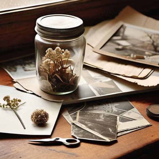
I still remember the smell of a studio in Providence during my sophomore year—a heavy, intoxicating mix of spray adhesive, old newsprint, and the metallic tang of X-Acto blades. I was hunched over a light table, my fingers stained with ink, trying to force a sense of cohesion out of a chaotic pile of discarded magazines. There was a specific, beautiful tension in that process; you couldn’t just hit `Cmd+Z` when a tear went too deep or a glue smudge ruined the grain. That physical struggle is exactly what’s missing from our perfectly polished, pixel-perfect interfaces today. We’ve traded the tactile friction of analog collage for a sterile, frictionless convenience that often leaves our work feeling hollow and uninspired.
In this piece, I’m not going to sell you on some expensive, curated “aesthetic” or tell you that you need a specialized kit to get started. Instead, I want to share the practical, messy reality of how to actually use analog collage to inject genuine soul back into your digital compositions. We’ll talk about the intentionality of texture, the value of the “happy accident,” and how to bridge the gap between the physical scrap and the digital canvas without losing the human touch that makes design worth doing.
Table of Contents
The Soul of Vintage Magazine Cutouts and Found Ephemera
There is a specific kind of magic found in the weight of a mid-century periodical. When I’m hunting through old archives, I’m not just looking for imagery; I’m looking for the ghosts of previous owners. A coffee stain on a page from 1964 or the slight yellowing of a corner tells a story that a high-resolution stock photo never could. Using vintage magazine cutouts allows you to tap into a pre-digital color palette—those slightly muted, offset lithography tones that feel grounded and intentional.
When you start gathering your ephemera for collage, you aren’t just collecting scraps; you are collecting fragments of time. I often find myself drawn to old transit maps or weathered postcards because they provide a structural depth that digital vectors lack. The goal isn’t to create something “perfect.” Instead, I look for pieces that invite tactile tension. By integrating these physical artifacts, you introduce a layer of history that forces the viewer to slow down and actually look at the work, rather than just scrolling past it.
Building Intentionality With Essential Collage Art Supplies

When you sit down to create, the tools you choose dictate the rhythm of your work. I’ve found that the friction of a heavy-weight paper or the specific resistance of a glue stick changes how I approach a piece. It isn’t about having an expensive studio; it’s about selecting collage art supplies that invite experimentation rather than perfection. I tend to gravitate toward archival-quality adhesives and a curated selection of ephemera for collage—things like old botanical prints or weathered postcards—that have a history written into their fibers.
The magic happens when you stop treating materials as mere assets and start treating them as collaborators. Instead of reaching for a digital brush to simulate depth, I find myself layering paper textures to build a physical topography. A piece of torn linen or a scrap of handmade washi paper adds a dimension of light and shadow that a screen simply cannot replicate. By choosing materials with inherent character, you aren’t just decorating a surface; you are building a foundation of intentionality that carries through to the final composition.
Five Ways to Keep Your Process From Becoming Too Polished
- Embrace the tear. Don’t reach for the precision scissors every time you want to move a piece; a jagged, hand-torn edge introduces a physical weight and a shadow that a digital vector can never replicate.
- Layer with purpose, not just density. It’s tempting to stack scraps until the composition feels heavy, but true depth comes from leaving “breathing room”—letting the paper grain or the background texture speak through the gaps.
- Respect the history of your materials. If you’re using a cutting from a 1960s travel brochure, let that specific halftone pattern or aged paper tone dictate your color palette rather than forcing it to match a modern hex code.
- Fight the urge to over-glue. I’ve seen too many beautiful compositions turn into a muddy mess because of excess adhesive. Use just enough to hold the vision, keeping the paper’s natural tension intact.
- Step away from the screen to evaluate. Once you’ve assembled a piece, move it to a different light source or look at it from a distance. Digital perfection often hides the very “friction” that makes a collage feel alive and human.
Finding the Friction
Stop chasing pixel-perfect smoothness; the real magic lives in the ragged edges and the slight misalignment of a hand-cut piece of paper.
Treat your physical supplies as extensions of your intent, not just tools, by selecting textures that carry their own history and weight.
Use analog collage not as a decorative layer, but as a way to inject deliberate, human imperfection back into an increasingly sanitized digital landscape.
The Friction of the Physical
“Digital tools offer us endless perfection, but perfection is often where creativity goes to die. Analog collage isn’t about being messy; it’s about embracing the resistance of the paper and the unpredictable grain of a vintage cutout to find a truth that a pixel simply cannot replicate.”
Ingrid Bellamy
Finding the Rhythm in the Imperfection
At the end of the day, analog collage isn’t about achieving a polished, pixel-perfect finish. It’s about the intentionality we bring to the table when we choose a weathered magazine clipping over a stock photo or a physical glue stick over a digital layer. By curating our own ephemera and investing in tools that actually respond to our hands, we move away from the mindless scrolling of digital assets and toward a deliberate act of construction. We’ve explored how the texture of found objects and the right set of tactile supplies can transform a simple composition into something that feels alive, grounded, and deeply personal.
As I sit here with my sketchbook, watching the light shift across my desk, I’m reminded that our best work often happens in the spaces between the lines. In an industry that is increasingly obsessed with speed and automation, I encourage you to slow down. Don’t be afraid of the tear in the paper or the slight smudge of ink; those are the fingerprints of your humanity. Use these methods to reclaim your creative agency and to build something that resists the frictionless void of the screen. Let your work be a testament to the beauty of the human touch.
Frequently Asked Questions
How do you balance the messy, physical nature of collage with the need for precision when transitioning a piece into a digital workflow?
It’s a delicate dance. I never try to “fix” the mess in Photoshop; that’s where the soul dies. Instead, I scan my work at the highest possible DPI to preserve every fiber and ink bleed. I treat the digital stage as a way to refine the composition and color balance, not to smooth out the edges. Let the scan be imperfect. The precision should come from your layout and typography, not from erasing the grit.
What are the best ways to preserve the delicate textures of old paper and ephemera when scanning them for high-resolution design work?
Don’t just scan and walk away. If you want to keep that toothy, tactile soul, you have to treat the scanner like a darkroom. Use a flatbed, not a feeder, and keep the glass pristine—even a fingerprint can kill the illusion of age. I always scan at a minimum of 600 DPI, often higher, to capture the micro-shadows in the paper grain. Most importantly, avoid the temptation to “auto-correct” the brightness; let the scanner capture the actual, imperfect tonal range.
How can I avoid the cliché "scrapbook" look and ensure my collage feels like a deliberate piece of brand storytelling rather than just a collection of random clippings?
The difference lies in restraint. A scrapbook is an accumulation; a brand story is a curation. To avoid that cluttered, accidental feel, you need a unifying visual thread—think a consistent color palette, a specific typographic scale, or a recurring geometric motif. Don’t just layer things because they look interesting. Ask yourself: how does this texture support the narrative? If a clipping doesn’t serve the core message, leave it on the cutting room floor.
