
I was sitting in my studio last Tuesday, hunched over a half-finished portrait, when I realized I was doing exactly what I hate: clicking through a dozen “lighting effect” presets in an attempt to find a shortcut. There is this pervasive, exhausting myth in our industry that mastering digital painting light is about finding the right layer blend mode or a flashy new brush pack. We’ve become so obsessed with the software’s ability to simulate luminosity that we’ve forgotten how to actually see. We aren’t painting light; we are just slapping glow effects onto a canvas and calling it a day, losing that essential sense of depth and intention in the process.
I’m not here to sell you on a new plugin or a complicated workflow that requires a PhD in mathematics. Instead, I want to talk about the intentionality of shadow and how to use light to guide the viewer’s eye with purpose. I’m going to share the fundamental principles I’ve gathered from decades of moving between physical ink and digital pixels—the kind of knowledge that focuses on observing reality rather than mimicking a filter. We are going to reclaim the craft, one thoughtful stroke at a time.
Table of Contents
Directional Light Sources to Honor the Human Touch

When we talk about directional light sources, we aren’t just discussing where the sun sits in a scene; we are discussing the narrative weight of a shadow. In my early days of physical drafting, you couldn’t just “undo” a heavy shadow. You had to understand how light traveled across a surface. In the digital realm, it is far too easy to default to a generic, flat illumination that strips a character of its soul. To avoid this, I suggest focusing on how light interacts with the edges of your forms. Implementing subtle rim lighting techniques can do more than just separate a subject from the background; it can define the very silhouette that gives your work its structural integrity.
Don’t treat light as a secondary layer applied at the end. Instead, think about the way light carves volume. When you establish a clear direction, you naturally invite the viewer to understand the physics of your world. This is where you must respect the value scale for artists, ensuring that your transitions from highlight to core shadow feel earned rather than slapped on. By being intentional with your light’s path, you bridge the gap between a sterile digital render and a piece that feels like it was touched by a human hand.
Using Value Scale for Artists to Find Depth
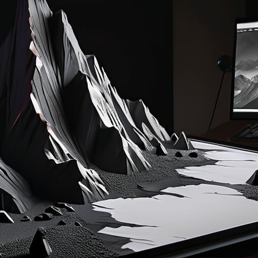
When I first transitioned from physical media to the screen, I felt a profound loss of weight. In traditional oil painting, the thickness of the pigment creates its own subtle shadows, but in a digital workspace, everything can feel dangerously flat. To combat this, I rely heavily on a disciplined value scale for artists. It isn’t just about making things darker or lighter; it’s about understanding the structural hierarchy of your composition. If your values are too close together, your subject loses its presence and begins to bleed into the background, becoming a mere ghost on the canvas.
True depth is found in the quiet transitions. I often find myself obsessing over ambient occlusion in digital art—those tiny, soft shadows where surfaces meet and light struggles to reach. These aren’t just technical checkboxes; they are the anchors that ground an object in reality. By carefully mapping out your light logic through a strict value range, you ensure that the viewer’s eye doesn’t just wander, but actually feels the volume of the form you’ve built. Don’t let your work become a wash of mid-tones; embrace the extremes to give your art its soul.
Beyond the Glow: Five Ways to Infuse Light with Intent
- Stop chasing the “brightest” color. In the physical world, light is often about what it obscures; in digital painting, try using desaturated, cooler tones for your highlights to prevent that plastic, over-saturated look that plagues amateur work.
- Respect the ambient occlusion. Light doesn’t just hit a surface and stop; it dances in the crevices. Pay attention to those tiny, dark pockets where surfaces meet—that’s where the weight of your object lives.
- Use light to dictate the narrative, not just the visibility. Ask yourself: is this light a harsh interrogator or a soft companion? The way you wrap light around a form tells the viewer how to feel before they even process the subject.
- Avoid the “airbrush trap.” It’s tempting to use a soft large brush for every gradient, but true depth comes from varied edges. Mix crisp, hard-edged shadows with soft transitions to mimic how light actually interacts with different textures.
- Remember that light is a relationship between two things. You cannot define a highlight without understanding the shadow it creates elsewhere. If you change your light source, you must commit to the ripple effect it has across the entire composition.
Bringing Intention to the Digital Canvas
Stop treating light as a mere filter; instead, use it as a tool for storytelling that guides the viewer’s eye through the composition.
Master your value scales to ensure depth is built through structural integrity rather than just adding more color.
Embrace the “friction” of your medium by prioritizing intentional lighting choices that mimic the subtle complexities of the physical world.
The Soul of the Shadow
Digital light shouldn’t feel like a mathematical calculation of lumens; it should feel like an intention. If you aren’t using light to guide the eye and respect the weight of your forms, you aren’t painting—you’re just adjusting brightness.
Ingrid Bellamy
Finding the Light in the Digital Void

Mastering light in a digital environment isn’t about discovering a new plugin or finding the perfect preset; it’s about understanding how luminosity interacts with form. We’ve looked at how intentional directional sources can ground your subject in a physical reality and how a disciplined approach to the value scale prevents your work from flattening into a mere collection of pixels. When you treat light as a structural element rather than a decorative layer, you move away from the sterile perfection of the machine and toward something much more visceral and alive. It is the difference between simply filling a canvas and actually sculpting with light.
As you close your sketchbook and turn back to the screen, I want you to remember that the tools are secondary to your intent. The digital medium offers us infinite control, but that control can easily become a trap of over-polishing that strips away the soul of the work. Don’t be afraid of a little shadow or the slight imperfection of a soft edge. Use the light to tell a story, to guide the viewer’s gaze, and to honor the inherent friction of the human experience. At the end of the day, our goal isn’t to create a perfect image, but to create a meaningful one.
Frequently Asked Questions
How can I prevent digital lighting from looking too "perfect" or plastic when I'm trying to maintain a painterly feel?
The problem is that digital tools love a perfect gradient, but perfection is the enemy of soul. To break that plastic sheen, stop relying on soft airbrushes for everything. Introduce intentional imperfection. Use textured brushes that mimic the resistance of physical media, and allow your edges to stay slightly “lost.” Don’t be afraid of a little grit or a stray, unblended stroke; that’s where the life lives. Let the light feel felt, not just calculated.
Is there a way to simulate the way light interacts with physical textures, like paper grain or heavy impasto, in a digital environment?
You can’t just use a “grain” filter and call it a day; that’s just noise. To truly mimic impasto or paper tooth, you have to think about how light catches the physical peaks and valleys of a surface. I usually layer subtle, high-contrast textures using blend modes like Overlay or Soft Light, then manually paint in the tiny highlights where the “paint” would catch the light. It’s extra work, but it restores that necessary friction.
How do I balance using high-contrast lighting with the need to keep my color palette cohesive and intentional?
It’s a delicate tension, isn’t it? When you push the contrast, you risk shattering the harmony you’ve worked so hard to build. My approach is to treat light as a color itself, rather than just a white overlay. Instead of using pure white for your highlights, pull a desaturated version of your most luminous local color. This keeps the light tethered to your palette, ensuring the drama serves the composition rather than fighting it.
