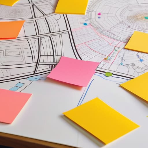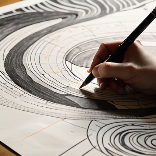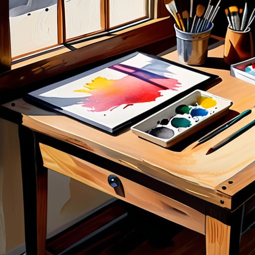
Visual storytelling through effective visual design.

Using Visual Design for Storytelling

I remember sitting in a dim studio back in the late nineties, the air thick with the scent of spray adhesive and the rhythmic snip-snip of X-Acto blades against heavy cardstock. We weren’t clicking through pre-made templates or prompting an algorithm to generate a mood board; we were physically wrestling with every line and every shadow to ensure the narrative held weight. Today, I see “visual storytelling” being treated like a mere checkbox—a way to decorate a landing page with pretty, hollow vectors that satisfy an SEO requirement but fail to move a single soul. We’ve traded the intentionality of the craft for a frictionless, automated aesthetic that often leaves the viewer feeling nothing at all.

I’m not here to teach you how to use the latest flashy software or how to chase fleeting design trends. Instead, I want to talk about how we can reclaim the soul of our work by focusing on the purpose behind the pixel. I’m going to share what I’ve learned from two decades of moving from physical paste-ups to digital interfaces, offering you a grounded approach to building narratives that actually respect the human connection. We will explore how to use imagery not just to fill space, but to honor the person on the other side of the screen.

Table of Contents

Mastering Visual Composition Techniques to Honor the Human Touch

Mastering Visual Composition Techniques to Honor the Human Touch

When we talk about visual composition techniques, I often find myself thinking less about “rules” and more about intentionality. In my studio, I don’t just look for what looks balanced; I look for where the eye rests and why. It’s the difference between a layout that feels mathematically perfect and one that feels alive. If every element is fighting for attention, the user loses their way. Instead, we should use negative space as a breathing room, allowing the core message to settle.

I’ve always been drawn to how cinematic storytelling principles can be applied to static design. In film, a frame isn’t just a pretty picture; it’s a carefully constructed environment that dictates emotion through light, shadow, and depth. When we apply this to a digital interface or a brand identity, we aren’t just arranging icons or text. We are creating a rhythm of engagement. By understanding how a viewer’s gaze moves across a screen, we can guide them through a journey that feels unforced and intuitive, honoring the way people actually experience the world around them.

Using Color Theory in Narrative to Evoke Real Emotion
Using Color Theory in Narrative to Evoke Real Emotion.

When we talk about color, I find it’s easy to fall into the trap of choosing palettes based on what’s trending on Dribbble or what looks “clean.” But if we want to move beyond mere decoration, we have to treat color as a form of non-verbal communication in art. Color isn’t just a stylistic choice; it is a psychological anchor. When I’m working on a brand identity or a digital interface, I think about how a sudden shift from a muted, desaturated sage to a sharp, jarring ochre can mimic the feeling of a realization or a moment of tension.

Applying color theory in narrative requires us to stop thinking about hues as static properties and start seeing them as temporal tools. Just as a cinematographer uses lighting to guide the eye, a designer can use chromatic shifts to signal a change in the user’s emotional state. It’s about creating a sense of rhythm. If every screen is equally vibrant, nothing feels significant. We have to allow for intentional moments of visual quiet to ensure that when color finally arrives, it actually carries the weight of the story we are trying to tell.

The Intentionality Checklist: Five Ways to Avoid Visual Noise

  • Prioritize Negative Space as a Narrative Tool. Don’t feel the need to fill every pixel. In my sketchbook, the white space tells me where to breathe; in your design, it tells the viewer where to focus. Silence is often more communicative than a crowded layout.
  • Choose Typography That Carries Weight. Type isn’t just a vehicle for information; it has a voice. If you’re telling a story of heritage, a sterile geometric sans-serif will feel like a lie. Select typefaces that respect the emotional context of your words.
  • Embrace Imperfect Geometry. Digital tools push us toward mathematical perfection, but perfection is often sterile. Introducing subtle, human-scale irregularities—much like the slight grain in a film photograph—can make a digital interface feel lived-in and trustworthy.
  • Establish a Visual Hierarchy Based on Human Sightlines. We don’t process screens like scanners; we process them like people. Guide the eye through a logical sequence of importance, ensuring the most vital part of your story is the first thing felt, not just seen.
  • Use Texture to Ground the Digital Experience. Flat design can sometimes feel untethered from reality. By incorporating subtle textures or organic gradients, you provide a tactile sense of depth that bridges the gap between a cold glass screen and the physical world.

The Intentionality of the Visual Narrative

Stop treating visuals as mere filler; every element on the screen must earn its place by serving a specific, functional role in the user’s journey.

Leverage the tension between color and composition to trigger genuine emotional responses rather than relying on predictable, automated design patterns.

Prioritize the “friction” of human connection by designing layouts that respect how people actually see and feel, rather than optimizing solely for mindless scrolling.

The Soul of the Sequence

Visual storytelling isn’t about the sheer volume of assets we throw at a user; it’s about the intentionality of the gaps between them. We need to stop designing for eye-tracking heatmaps and start designing for the way a human heart actually follows a rhythm.

Ingrid Bellamy

The Intentionality of the Final Frame

The Intentionality of the Final Frame.

We have explored how composition acts as a guide for the eye and how color serves as the emotional heartbeat of a narrative. But as we pull these threads together, remember that visual storytelling is not a checklist of technical achievements. It is the delicate act of balancing structure with soul. Whether you are adjusting the weight of a typeface or the saturation of a brand palette, every choice should be a deliberate step toward clarity. When we move away from purely decorative elements and focus on meaningful visual hierarchies, we stop merely filling space and start creating experiences that actually resonate with the person on the other side of the glass.

As you return to your workstations, I encourage you to step back from the pixels for a moment. Pick up your sketchbook, look at the way light hits a physical object, or observe the natural friction of the world around you. The most powerful stories aren’t found in the most complex software, but in the intentionality of the craft. Our goal shouldn’t be to automate the beauty out of design, but to use our tools to amplify the nuances of human connection. Design with purpose, design with restraint, and most importantly, design to honor the human touch.

Frequently Asked Questions

How do I maintain a sense of intentionality in my visual narrative when I'm forced to work within the constraints of rigid, automated templates?

Templates often feel like cages, but I’ve learned to see them as grids rather than boundaries. Don’t fight the structure; instead, look for the micro-moments where you can inject soul. It’s in the deliberate choice of a serif, the specific weight of a line, or the way you use negative space to let a concept breathe. Even within a rigid system, intentionality lives in the small, human decisions that refuse to be automated.

At what point does visual complexity stop being "rich storytelling" and start becoming unnecessary digital noise?

Complexity becomes noise the moment it stops serving the narrative and starts serving the designer’s ego. When you add a texture or a layer, ask yourself: Does this deepen the user’s understanding, or am I just afraid of white space? If an element doesn’t anchor the eye or evoke a specific feeling, it’s just friction. True richness comes from intentionality, not accumulation. If it doesn’t help tell the story, get rid of it.

How can we use visual storytelling to create a sense of tactile warmth in interfaces that are inherently cold and glass-based?

We solve this by leaning into imperfection. Digital interfaces feel cold because they strive for a mathematical precision that doesn’t exist in the physical world. To inject warmth, I look toward subtle grain, soft-edged shadows, and organic textures that mimic paper or film. It’s about introducing a controlled amount of “noise”—the kind of visual friction that reminds a user there is a human intention behind the glass, rather than just a sterile algorithm.


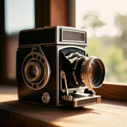
Mastering analog photography techniques with film.

Practicing Film Photography in a Digital Age

I remember the first time I sat in a darkroom at RISD, the air thick with the sharp, vinegar scent of developer and the low hum of a ventilation fan. There was no “undo” button, no instant preview, and certainly no algorithm to fix my mistakes. It was just me, the mechanical click of a shutter, and the terrifying, beautiful weight of intentionality. In our current era of instant gratification, I see so many people treating analog photography techniques like a mere aesthetic filter—a way to slap a grain preset on a digital file to make it look “vintage.” But if you aren’t willing to embrace the physical limitations of the medium, you aren’t actually practicing the craft; you’re just chasing a ghost.

I’m not here to sell you on expensive, niche gear or peddle the myth that you need a master’s degree to shoot film. Instead, I want to share the practical, hard-won lessons I’ve gathered from years of working with both light and shadow. We are going to strip away the pretension and focus on the actual mechanics of light, exposure, and patience. My goal is to help you master the tactile friction of the process so that every frame you capture feels earned, rather than accidental.

Table of Contents

Mastering Manual Camera Controls for Intentionality

Mastering Manual Camera Controls for Intentionality.

There is a specific kind of tension that exists between your fingers and the dials of a mechanical camera. When you move away from the safety of auto-mode, you aren’t just adjusting light; you are making a series of deliberate choices that define the soul of the frame. Mastering manual camera controls requires you to stop reacting to the scene and start interpreting it. It’s about understanding how a slight shift in your shutter speed can transform a moment from a frozen instant into a purposeful blur.

I find that most beginners fear the mistake, but in the world of 35mm film aesthetics, the “error” is often where the character lives. Instead of chasing a mathematically perfect exposure, I encourage you to experiment with your film exposure settings to see how much shadow you can afford to lose. Sometimes, underexposing a shot by a half-stop is exactly what you need to let the natural texture of the grain breathe. It’s not about technical perfection; it’s about the intentionality of the friction you create between the lens and the light.

Decoding the Soul of 35mm Film Aesthetics

Decoding the Soul of 35mm Film Aesthetics

When we talk about 35mm film aesthetics, we aren’t just discussing a visual style; we are discussing a way of seeing. In my design work, I often find myself fighting against the clinical perfection of digital sensors. Digital is often too “correct,” whereas film possesses a beautiful, inherent imperfection. It’s in the way light bleeds into the shadows and how the film grain characteristics provide a texture that feels alive, rather than just a layer of digital noise applied as an afterthought.

This texture is what gives a photograph its weight. Unlike a pixel, which is a mathematical coordinate, a grain of silver halide is a physical reaction to light. When you lean into this, you stop trying to capture a perfect image and start trying to capture a feeling. Whether it’s the subtle color shifts in the highlights or the way a certain stock handles high-contrast scenes, these elements create a sense of depth that digital struggle to replicate. It’s that specific, organic friction that makes a print feel like it has a history before you’ve even held it in your hands.

The Ritual of the Frame: Five Ways to Slow Down

  • Stop treating your shutter like a trigger; treat it like a decision. Before you press down, check your composition one last time. Is the light hitting the subject with purpose, or are you just capturing a moment because it happened?
  • Lean into the light rather than fighting it. In the digital world, we overexpose to save the shadows, but with film, let the highlights breathe. Sometimes a slightly underexposed frame holds more mood and intention than a perfectly “correct” one.
  • Embrace the physical feedback of your gear. I find that actually feeling the tension in a manual focus ring or the mechanical click of a shutter helps me connect with the scene. If you aren’t feeling the camera, you aren’t really present in the shot.
  • Don’t fear the grain. We spend so much time in design trying to smooth out every pixel, but in film, grain is the texture of reality. It’s the visual equivalent of a heavy paper stock—it gives the image weight and a sense of place.
  • Practice the art of the “discarded” frame. Not every roll needs to be a masterpiece. Allow yourself the luxury of making mistakes—blown-out skies or motion blur—to learn where the boundaries of your medium actually lie.

The Intentionality of the Frame

Stop viewing manual settings as a technical hurdle and start seeing them as a creative choice; every adjustment to your aperture or shutter speed is a deliberate decision that shapes the final narrative.

Embrace the unpredictability of film grain and light leaks as essential textures rather than errors, allowing the medium’s inherent imperfections to provide the human warmth that digital perfection lacks.

Slow down your process to respect the scarcity of the roll, treating each shot not as a disposable data point, but as a physical artifact that requires your full presence and focus.

The Value of the Wait

In a world obsessed with instant gratification and pixel-perfect clarity, there is a profound, quiet power in the delay. Analog photography isn’t about the final image; it’s about the discipline of the process—the way manual settings force you to actually look, to feel the weight of your decisions, and to accept that beauty often lives in the imperfections we can’t simply undo with a click.

Ingrid Bellamy

The Beauty of the Slow Build

The Beauty of the Slow Build photography.

Ultimately, moving away from the instant gratification of digital sensors isn’t about being a Luddite; it’s about reclaiming the intentionality of the creative process. By mastering manual controls and learning to read the unique language of 35mm grain, you stop merely capturing light and start composing a narrative. We’ve discussed how the mechanical friction of a manual shutter and the chemical unpredictability of film create a depth that an algorithm simply cannot replicate. It is in these technical nuances—the slight overexposure, the deliberate choice of ISO, the physical act of winding the film—that we find the true soul of the image.

As I sit here at my desk, looking between my latest typeface specimen and the Leica I spent all morning cleaning, I’m reminded that the best tools don’t do the work for us; they demand more of us. Analog photography is a discipline of patience in a world that has become far too fast. Don’t be afraid of the mistakes or the wasted frames. Those “errors” are often the most honest parts of your work. I encourage you to step away from the screen, pick up something mechanical, and embrace the friction of making something real.

Frequently Asked Questions

How do I balance the technical learning curve of manual settings without losing the creative flow of the moment?

The trick is to stop treating your camera like a math problem and start treating it like an extension of your hand. Don’t try to master every dial in one afternoon. Instead, pick one variable—maybe just aperture—and let it become muscle memory. Once the technicality moves from your head to your fingertips, the friction disappears. You aren’t calculating light anymore; you’re simply feeling it. That’s when the flow returns.

Is it worth investing in high-end vintage glass, or can I achieve a soulful look with more affordable, entry-level lenses?

Look, I’ll be honest: you don’t need a Leica lens to find soul. High-end vintage glass offers predictable perfection and micro-contrast, but there’s a specific magic in the “imperfections” of cheaper, older optics. Those entry-level lenses often have a softer fall-off and a bit more character in the flares. If you’re chasing a feeling rather than clinical sharpness, start with the affordable stuff. Let the lens’s quirks become part of your visual language.

How can I translate the tactile, imperfect qualities of film into my digital design workflow without it looking like a cheap filter?

Stop looking for a “grain” slider. To truly translate film into digital, you have to replicate the physics, not just the surface. Instead of slapping a texture over a finished layout, build imperfection into the foundation. Use organic color palettes derived from actual film stocks, introduce subtle chromatic aberration in your typography, and embrace slight, intentional misalignments. It’s about recreating the way light actually hits a medium, rather than just masking a digital perfection.

Boosting creative productivity in artistic work.

Improving Productivity in Creative Work

I was sitting at my desk last Tuesday, staring at a perfectly optimized, color-coded task manager, and felt absolutely nothing. We’ve been sold this lie that creative productivity is a math problem to be solved with more apps, more notifications, and more seamless automation. But there is a profound emptiness in a workflow that leaves no room for the unpredictable mess of actual thought. We are so obsessed with removing friction that we’ve accidentally stripped away the very resistance required to spark an original idea.

I’m not here to sell you a new subscription or a “hacker” method to squeeze more output out of your brain. Instead, I want to talk about reclaiming the intentionality of your work. I’m going to share how I integrate tactile, analog rituals with digital precision to build a rhythm that actually honors the craft. This isn’t about doing more; it’s about building a sustainable, human-centric approach to creative productivity that respects your process instead of just chasing a finished screen.

Table of Contents

Mastering Flow State Techniques Without Losing Yourself

Mastering Flow State Techniques Without Losing Yourself

We often treat the “flow state” like a holy grail, something to be hunted down and captured through rigorous scheduling. But in my experience, chasing that peak performance can feel more like chasing a ghost than actually doing the work. If you spend your entire day trying to force a high-octane focus, you aren’t actually designing; you’re just performing. I’ve found that true creative energy management isn’t about how many hours you can stare at a retina display, but about knowing when to step back and let the subconscious do the heavy lifting.

Instead of trying to force a constant state of intensity, I lean into rhythms of oscillation. This means pairing deep, concentrated sessions with periods of intentional, low-stakes movement—like sketching in my notebook or simply cleaning a lens. By managing your cognitive load through these natural breaks, you prevent that hollow, fried feeling that precedes a crash. It’s about building a relationship with your focus that honors your capacity for both high-tension execution and the quiet, necessary drift that allows new ideas to actually take root.

Protecting Creative Energy Management From Digital Noise

Protecting Creative Energy Management From Digital Noise

The problem with our current digital landscape isn’t just the distraction; it’s the constant, low-level hum of notifications that fractures our attention before we even realize it’s gone. We treat our focus like an infinite resource, but in reality, it’s more like the light in a darkroom—precious, sensitive, and easily ruined by a single stray beam. Effective creative energy management isn’t about doing more; it’s about aggressively guarding the quiet spaces where real thinking happens.

I’ve found that the most effective way to combat this is through intentional cognitive load management. This means setting hard boundaries with your tools. If your Slack is pinging while you’re trying to refine a typeface or map out a brand architecture, you aren’t actually working; you’re just reacting. I’ve started adopting more asynchronous work habits, treating my deep-work blocks as sacred, offline intervals. By silencing the digital noise, we stop performing “busyness” and start returning to the actual craft of design. It’s about reclaiming the ability to sit with a single problem until it reveals its solution.

The Tactile Edge: Five Ways to Anchor Your Process

  • Reintroduce physical friction. Before you touch a mouse or open Figma, spend fifteen minutes with your sketchbook and a pen. There is a cognitive connection between the hand and the brain that a digital stylus simply cannot replicate; let the messiness of a sketch dictate the direction before the software forces you into alignment.
  • Curate your digital environment with intention. We often mistake a clean desktop for a clear mind, but true focus comes from limiting your toolset. Pick one primary environment for deep work and close every single tab that doesn’t serve the immediate task. If it isn’t essential to the current stroke, it’s just noise.
  • Honor the “incubation” phase. Productivity isn’t a linear climb; it’s a series of peaks and valleys. When you hit a wall, don’t try to power through with more caffeine and more clicks. Step away. Let the problem sit in the back of your mind while you do something analog—like cleaning a lens or walking—to let your subconscious do the heavy lifting.
  • Set boundaries for “perfect” versus “done.” As designers, we are prone to the infinite loop of micro-adjustments. Establish a hard stop for the refinement phase. If you find yourself moving a kerning pair by a fraction of a pixel for the tenth time, you aren’t being productive; you’re just avoiding the vulnerability of finishing.
  • Build a ritual for transition. The shift from administrative tasks to deep creative work requires a mental gear change. Create a sensory cue—a specific playlist, a certain scent, or even just clearing your physical desk—that signals to your brain that the time for reacting to notifications is over and the time for intentional creation has begun.

The Intentionality Checklist

Stop chasing pure speed; instead, build intentional pauses into your workflow to ensure your tools are serving your vision rather than dictating it.

Curate your digital environment with the same rigor you would a physical studio, ruthlessly removing any notification or app that interrupts your tactile connection to the work.

Prioritize the “messy middle” of the creative process, allowing for analog sketching and physical friction to prevent your output from feeling sterile and automated.

The Illusion of Efficiency

True productivity isn’t about how many pixels you can move in an hour; it’s about protecting the quiet, uncomfortable spaces where a real idea actually has room to breathe.

Ingrid Bellamy

Reclaiming the Craft

Reclaiming the Craft through intentional creative focus.

Ultimately, creative productivity isn’t about how many pixels you can move in an hour or how many tasks you can check off a digital list. It’s about the discipline of protecting your focus—whether that means mastering your flow state or setting hard boundaries against the relentless hum of digital noise. We’ve talked about managing energy and navigating the distractions of a hyper-connected world, but the core truth remains: your best work happens when you respect the friction of the process. When we stop trying to automate every spark of inspiration, we actually create the space necessary for true intentionality to take root.

As you close your laptop and pick up your pen, remember that the tools are meant to serve you, not the other way around. Don’t be afraid of the slow days or the messy sketches that don’t immediately translate to a clean interface. There is a profound, quiet power in the deliberate pace of a craftsman. In a world that demands instant, frictionless output, I challenge you to hold onto your humanity. Build a practice that honors your unique perspective, and trust that the most meaningful designs will always come from a place of deep, human presence.

Frequently Asked Questions

How do I maintain a sense of tactile intentionality when my entire workflow is tethered to a digital screen?

You have to build physical bridges back to your process. I never start a project in Figma; I start with my sketchbook and a heavy fountain pen. There is a specific resistance in paper that forces you to slow down and actually think before you click. Even if the final output is pixels, keep a tactile anchor nearby—a physical color swatch, a textured print, or a vintage Leica. Don’t let the screen become your entire world.

At what point does optimizing a creative process stop being helpful and start becoming a distraction from the actual work?

It happens the moment you start prioritizing the tool over the task. If you’re spending more time tweaking your Notion templates or color-coding your task manager than actually moving pixels or sketching ideas, you’ve crossed the line. Optimization should be a quiet scaffolding that supports your work, not a performance you put on for yourself. When the process feels more “polished” than the creative output itself, you aren’t working; you’re just procrastinating with better aesthetics.

How can I integrate "messy" analog habits, like sketching or handwriting, into a high-speed professional digital environment without losing momentum?

Don’t view analog as a detour; view it as the foundation. I keep my sketchbook open right next to my tablet. When a concept feels flat or too “perfectly” digital, I step away for five minutes to scribble with a fountain pen. That slight resistance of nib on paper forces a level of intentionality that a cursor can’t replicate. Use the mess to find the soul, then bring that grit back into your digital workspace.

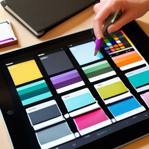
Testing design with color accessibility tools.

Testing Color Accessibility in Design

I remember sitting in a dimly lit studio back in the late nineties, staring at a physical color proof that looked vibrant under my desk lamp but turned into a muddy, unreadable mess once it hit the printer. It was a visceral lesson in how easily our visual intent can fail the people actually using it. Today, we don’t have to deal with ink drying on paper, but we face a new kind of chaos: a digital landscape cluttered with expensive, bloated software that claims to solve everything. Most of these color accessibility tools are just more noise—overpriced plugins that give you a checklist but fail to teach you the intentionality required to design for real human sight.

I’m not here to sell you a subscription to a massive enterprise suite or feed you a list of automated shortcuts that strip the soul out of your work. Instead, I want to share the lean, functional toolkit I actually use when I’m refining a brand’s visual language. We are going to look at the most effective color accessibility tools through the lens of purposeful craftsmanship, ensuring your palettes aren’t just aesthetically pleasing, but genuinely inclusive.

Table of Contents

Mastering Uiux Color Contrast Ratios With Purpose

Mastering Uiux Color Contrast Ratios With Purpose

When we talk about UI/UX color contrast ratios, we aren’t just checking boxes for a technical audit; we are deciding who gets to participate in the digital experience. I’ve seen too many designers chase a trendy, low-contrast aesthetic—that soft grey on white look—only to realize they’ve effectively locked out anyone with even minor visual fatigue. It’s a lazy shortcut that sacrifices usability for a fleeting sense of “minimalism.”

To do this right, you need to integrate WCAG compliance testing directly into your creative process, rather than treating it as a final hurdle. I prefer to build my inclusive design color palettes from the ground up, testing the legibility of every pairing before I even touch the high-fidelity mockups. It’s about intention. By utilizing deuteranopia simulation tools during the sketching phase, you can see how your color choices translate for users with color vision deficiencies. This isn’t about limiting your creativity; it’s about ensuring that the intentionality of your craft actually reaches the person on the other side of the screen.

Building Inclusive Design Color Palettes That Resonate

Building Inclusive Design Color Palettes That Resonate

When we talk about building inclusive design color palettes, we often fall into the trap of treating accessibility as a final checkbox—a tedious hurdle to clear before launch. But if we view color through the lens of intentionality, it becomes something more profound. It’s about creating a visual language that doesn’t exclude anyone based on how their eyes process light. Instead of just picking a trendy neon or a muted pastel because they look good in a mood board, we need to integrate visual impairment design principles into the very foundation of our color studies.

This means moving away from “vibe-based” design and toward a more disciplined, empathetic approach. I’ve found that the most successful workflows involve running deuteranopia simulation tools early in the process, long before the high-fidelity mockups are finished. By seeing our work through the eyes of someone with color vision deficiency, we stop designing for our own aesthetic preferences and start designing for human reality. It’s not about limiting your creative expression; it’s about ensuring that your brand’s message actually reaches the people it was meant for.

Practical Rituals for Testing Color Without Losing the Soul of Your Design

  • Stop treating contrast checkers like a final hurdle; integrate them into your sketching phase. Use a tool like Adobe Color or WebAIM early on so you aren’t forced to overhaul a beautiful palette because it fails the legibility test at the eleventh hour.
  • Look beyond the WCAG numbers and test for real-world conditions. A high-contrast ratio on a pristine studio monitor might still fail a user trying to read your interface under harsh sunlight or on a low-quality mobile screen.
  • Use simulators to experience your work through different visual lenses. Tools that mimic color blindness aren’t just for compliance—they help you understand if your brand’s “personality” survives when the color information is stripped away.
  • Don’t rely solely on hue to convey meaning. If a tool tells you your red and green statuses are too close in luminosity, don’t just tweak the shade; add an icon or a pattern. True accessibility respects the user’s cognitive load, not just their retinas.
  • Build a “safe” palette of accessible neutrals before you get experimental. I always establish a foundation of accessible grays and blacks using a contrast tool first; once the structure is sound, I can layer in the more temperamental, expressive colors.

The Intentionality of Inclusive Color

Accessibility isn’t a checklist to satisfy a client; it’s a fundamental way of respecting the person on the other side of the screen.

Don’t let automated tools make your final decisions—use them to inform your choices, but keep your eye on how color actually feels in a real-world context.

True craftsmanship means designing for the edges of human perception, ensuring your palette works for everyone, not just those with perfect vision.

Beyond the Contrast Ratio

We need to stop treating accessibility tools like a final checkbox in a compliance audit. A tool shouldn’t just tell you if your text is readable; it should remind you that there is a living, breathing person on the other side of that interface who deserves to see the world exactly as you intended.

Ingrid Bellamy

Beyond the Hex Code

Designing color accessibility Beyond the Hex Code.

At the end of the day, mastering color accessibility isn’t about checking a box or satisfying a compliance auditor; it’s about the technical rigor we bring to our craft. We’ve looked at how to balance contrast ratios without sacrificing aesthetic soul, and how to build palettes that embrace inclusivity rather than treating it as an afterthought. Using these tools—whether they are contrast checkers or color blindness simulators—allows us to move past guesswork. When we prioritize these standards, we ensure that our intentionality as designers translates into a functional reality for every single user, regardless of how they perceive the light hitting their screen.

As I sit here at my desk, watching the ink dry on my latest typeface sketch, I’m reminded that the best design always leaves room for the human element. We are living in an era of rapid automation, but a machine can’t feel the empathy required to design for someone with visual impairments. It takes a person. Don’t let the convenience of digital tools make you lazy; instead, use them to reclaim the craftsmanship that makes digital spaces feel truly human. Let’s stop designing for the pixels and start designing for the eyes that actually have to navigate them.

Frequently Asked Questions

How do I balance the strict mathematical requirements of contrast ratios with the need to maintain a brand's specific aesthetic identity?

It’s the classic tension: the math of WCAG versus the soul of a brand. I’ve seen too many beautiful identities get flattened by “safe” gray-scale palettes. Don’t treat accessibility as a constraint that kills your aesthetic; treat it as a design challenge. If your brand’s primary hue fails the ratio, don’t abandon it—tweak the luminance or find a companion shade that honors the spirit of the color while meeting the requirement. Precision shouldn’t come at the cost of character.

Are there tools that help me test how my color palettes hold up for users with various types of color blindness, rather than just checking contrast?

It’s a common trap to stop at contrast ratios and assume the job is done. Contrast is the floor, not the ceiling. To see how your palette actually behaves, I rely on simulators like Color Oracle or the vision impairment simulators built directly into Figma and Adobe. They don’t just give you a pass/fail; they let you experience the world through different lenses—protanopia, deuteranopia, and beyond. It’s about seeing the nuance, not just the math.

When I’m working in the early sketching phase, how can I integrate accessibility checks without breaking my creative flow?

Don’t wait for the high-fidelity stage to think about contrast; that’s when the “perfection” of the UI often masks fundamental flaws. Instead, keep a simple contrast checker or a dedicated browser extension open alongside your workspace. I often use a physical grayscale swatch next to my screen during sketching to mentally test legibility. If a concept fails the eye test in black and white, no amount of vibrant color will save it later.

Designing with texture in digital graphics.

Adding Texture to Digital Designs

I remember sitting in my studio back in the late nineties, surrounded by the scent of spray mount and the literal grit of paper stock under my fingertips. There was a weight to things then—a physical resistance that told you exactly where a design succeeded or failed. Today, as I watch designers chase high-resolution grain overlays just to mask a lack of depth, I can’t help but feel we’ve lost the plot. Too many people treat designing with texture like a superficial coat of paint applied to a flat, lifeless surface. We’ve traded intentionality for mere decoration, forgetting that true texture should evoke a sense of presence, not just act as digital noise to fill empty space.

I’m not here to give you a list of trendy asset packs or tell you how to make your UI look “vintage” by slapping a noise filter on it. Instead, I want to talk about the purposeful application of tactile elements to create meaningful digital experiences. I’ll be sharing what I’ve learned from decades of moving between the physical and the digital, focusing on how you can use grit, grain, and depth to honor the human touch. We are going to move past the fluff and get back to craftsmanship.

Table of Contents

Materiality in Graphic Design Restoring the Weight of Digital Objects

Materiality in Graphic Design Restoring the Weight of Digital Objects.

When I sit at my desk, I often find myself looking at my vintage Leica, thinking about how its weight informs the way I shoot. There is a physical consequence to every movement. In the digital realm, however, we’ve drifted toward a sterile, frictionless vacuum where everything feels weightless and, frankly, disposable. We need to bring back a sense of materiality in graphic design to combat this. It’s not about making a screen look like paper; it’s about acknowledging that digital objects should have a perceived presence, a sense of gravity that tells the eye where to land.

By integrating subtle grain or paper tooth, we can establish a clearer visual hierarchy through texture. Instead of relying solely on size or color to command attention, a change in surface quality can signal a shift in importance or a change in context. When we use these layers thoughtfully, we aren’t just decorating; we are providing the user with navigational anchors. We are giving them something to hold onto in a medium that often feels far too slippery.

Digital Texture Application Moving From Filling Space to Creating Purpose

Digital Texture Application Moving From Filling Space to Creating Purpose

When we talk about digital texture application, I want us to move past the idea of using grain just to hide a flat gradient. That’s lazy. Instead, think about how a subtle paper tooth or a slight linen weave can guide the eye. Texture shouldn’t just be a decorative layer; it should be a tool for establishing visual hierarchy through texture. By varying the grit or the density of a pattern, you can signal to a user what is interactive and what is merely foundational. It’s about creating a roadmap for the eyes using tactile cues rather than just bigger fonts.

I often find myself looking at my old Leica cameras to remind myself how light interacts with physical surfaces. In a digital layout, we can mimic that depth by adding organic elements to design that break up the sterile perfection of a vector line. If everything is mathematically perfect, nothing feels real. When you introduce a controlled amount of imperfection, you aren’t just filling space—you are creating a sense of presence. The goal is to use these elements to ground the user, making the interface feel less like a math equation and more like a workspace.

Five Ways to Infuse Intentional Friction

  • Stop chasing “noise” and start looking for grit. Texture shouldn’t just be a decorative overlay that obscures your content; it should act as a subtle layer of resistance that gives the eye a place to rest and the mind a sense of place.
  • Respect the hierarchy of the grain. If your texture is fighting your typography for attention, you’ve failed. The grain should sit behind the message, providing a foundation of character without compromising the legibility of your type.
  • Think in terms of light, not just patterns. Real-world materials—the tooth of a heavy watercolor paper or the brushed surface of aluminum—react to light. When you design digitally, simulate how a texture might catch a shadow or a highlight to give it a sense of three-dimensional weight.
  • Avoid the “filter trap.” There is a massive difference between a carefully constructed grain and a generic, low-resolution brush stroke slapped onto a vector. If you can’t explain why a specific texture is there, it’s probably just digital clutter.
  • Use texture to signal transition. Just as a physical designer might switch from a smooth silk to a rough linen to change the mood of a brand, use subtle shifts in tactile qualities to guide a user through different emotional stages of a digital experience.

The Intentionality of Friction

Texture is not a decorative layer to be applied at the end; it is a functional tool used to give digital elements weight, presence, and a sense of place within a composition.

Avoid the trap of “digital noise”—if a texture doesn’t serve to ground the user or provide tactile feedback, it’s just visual clutter that obscures your core message.

Respect the friction of the human hand by designing interfaces that feel like they were crafted with intention, rather than generated by an algorithm seeking perfection.

The Soul in the Grain

Texture isn’t a decorative layer we apply to hide a lack of depth; it’s the digital equivalent of a thumbprint—a necessary, imperfect friction that reminds us there is a human on the other side of the glass.

Ingrid Bellamy

The Intentional Interface

The Intentional Interface: texture in digital design.

Ultimately, designing with texture isn’t about adding decorative noise or masking a lack of concept. It is about the deliberate reintegration of materiality into our digital workflows. We’ve spent too long chasing a sterile, frictionless perfection that leaves the user feeling disconnected from the medium. By focusing on the weight of our digital objects and applying texture with specific, functional intent, we bridge the gap between the cold pixels of a screen and the tactile intuition of the human hand. When we treat texture as a structural element rather than a superficial layer, we create work that feels grounded, purposeful, and truly resonant.

As I sit here at my desk, moving between my sketchbook and my monitor, I am constantly reminded that our tools should never strip away our humanity. The goal isn’t to mimic the physical world perfectly, but to honor the sensory logic that makes us feel alive. As you move forward with your next project, I challenge you to look past the smoothness of the interface. Ask yourself where the friction belongs. Don’t just design for the eye; design for the soul of the person behind the glass. Let’s build a digital landscape that values the craft as much as the code.

Frequently Asked Questions

How do I introduce subtle texture without compromising the legibility or accessibility of my typography?

Treat texture like a background hum, not a solo performance. I often tell my clients to think of it as a grain in a film photograph—it should enrich the atmosphere without obscuring the subject. If you’re working with type, keep your textures in the neutral, low-contrast ranges. Use subtle noise or paper grains on the canvas itself, but never overlay them directly onto the letterforms. If the texture competes with the stroke, you’ve lost the purpose.

At what point does adding tactile elements cross the line from "intentional craftsmanship" into mere visual clutter?

It crosses the line the moment the texture begins to compete with the information. If I have to squint through a layer of digital grain just to read a headline, the craftsmanship has failed. Texture should act like the tooth of a high-quality paper—it supports the ink, it doesn’t obscure it. If the element isn’t reinforcing the hierarchy or providing a sense of weight, it’s just noise. Don’t decorate; communicate.

How can I maintain a sense of material weight in a design system that needs to remain scalable across different screen resolutions?

Scalability often becomes an excuse for sterilization. To keep that sense of weight, stop thinking in static pixels and start thinking in ratios. Instead of fixed textures, use mathematical relationships—like subtle grain overlays or noise levels—that scale proportionally with your container size. It’s about preserving the feeling of a surface rather than the exact density of the dots. If the texture feels like it’s fighting the resolution, you’ve lost the intentionality.

Common ui design patterns for interfaces.

Common Patterns in Interface Design

I remember sitting in a dimly lit studio back in the late nineties, the smell of spray mount and fresh ink thick in the air, meticulously hand-cutting letterforms for a layout. There was a physical weight to every decision, a tangible sense of consequence that seems to have evaporated in our current era of “drag-and-drop” efficiency. Today, I see designers treating ui design patterns like a collection of pre-fabricated Lego bricks, snapping them together without a second thought for the soul of the interface. We’ve become so obsessed with speed and “standardization” that we’ve forgotten that these patterns aren’t just shortcuts; they are the connective tissue between a human being and a digital tool.

I’m not here to give you a sterile catalog of buttons and toggles that you can copy-paste into your next Figma file. Instead, I want to talk about how to use these structures to respect the user’s rhythm and preserve the intentionality of craft. I promise to share a perspective rooted in decades of seeing what actually holds up under scrutiny, helping you move past mindless repetition toward a design language that truly empowers the person on the other side of the screen.

Table of Contents

Applying Usability Heuristics to Respect Human Friction

Applying Usability Heuristics to Respect Human Friction.

When we talk about usability heuristics, it’s easy to treat them like a sterile checklist provided by a textbook. But in practice, these aren’t just rules to pass a test; they are the guardrails that prevent a digital experience from feeling hollow or frantic. If we lean too heavily on automation, we strip away the intentionality that makes a tool feel like an extension of the person using it. Instead of just checking boxes, I look at how these principles can manage the cognitive load. For instance, when implementing interaction design patterns, I ask whether the motion feels earned or if it’s just digital noise meant to distract.

True craftsmanship lies in the balance between efficiency and awareness. Applying ux design best practices shouldn’t mean removing all resistance from a workflow; sometimes, a little bit of “good friction”—like a confirmation step during a critical action—is exactly what preserves the user’s sense of agency. We need to design interfaces that acknowledge the human on the other side of the glass, respecting their rhythm rather than forcing them to keep up with a relentless, frictionless machine.

Visual Hierarchy in Ui Guiding the Creators Eye

Visual Hierarchy in UI Guiding the Creators Eye.

When we talk about visual hierarchy in UI, we aren’t just talking about making the most important button a brighter color. That’s the surface-level approach. To me, true hierarchy is about managing the cognitive load of the person on the other side of the glass. If everything is shouting for attention, nothing is heard. I often find myself sketching out layouts in my notebook first, stripping away the noise to see if the essential path remains clear. We need to use scale, weight, and negative space to create a natural resting place for the eye, ensuring that the user isn’t constantly fighting against the layout just to find their bearings.

Integrating these layers effectively requires a deep understanding of user interface design principles that prioritize intent over decoration. It’s easy to get lost in a sea of complex design system components, but the goal should always be clarity. Whether you are working with dense desktop dashboards or simplified mobile interface elements, your job is to curate the experience. You aren’t just arranging pixels; you are orchestrating a sequence of discovery that respects the user’s time and mental energy.

Patterns with Purpose: 5 Ways to Avoid Design Laziness

  • Stop treating patterns as a checklist. A pattern shouldn’t just exist because it’s standard; it should exist because it understands the user’s mental model. If a component doesn’t serve a specific functional intent, it’s just visual noise.
  • Respect the rhythm of the interaction. When implementing navigation patterns, consider the “micro-moments” of friction. A well-placed transition or a subtle change in state can guide a user through a flow without making them feel like they’re being rushed through an automated assembly line.
  • Prioritize legibility over “cleverness.” I see too many designers breaking established patterns just to be trendy. If your custom input field makes a user pause to figure out how to type, you haven’t designed a feature—you’ve designed an obstacle.
  • Build for the “imperfect” user. Real people don’t interact with interfaces in sterile, laboratory conditions. Design your patterns to be resilient; ensure they hold up when a user is distracted, when the lighting is poor, or when they are navigating with a heavy thumb on a mobile device.
  • Maintain a consistent tactile language. Whether it’s the shadow depth on a card or the weight of an icon, your patterns should feel like they belong to the same physical toolkit. Consistency builds trust, and trust is the foundation of any meaningful digital craft.

The Intentionality of the Interface

Stop treating UI patterns as a checklist of features; instead, view them as a way to respect the user’s rhythm and protect the mental space required for real work.

True visual hierarchy isn’t just about making things big or bold—it’s about creating a logical, quiet path that guides the eye without demanding constant, exhausting attention.

The most successful digital tools are those that embrace a certain level of “human friction,” allowing for thoughtful pauses rather than pushing for mindless, frictionless consumption.

The Trap of Aesthetic Automation

UI design patterns shouldn’t be used as a shortcut to fill a layout; they are the structural bones that allow a user to move through a digital space with intention. When we lean too heavily on the “standard” just because it’s easy, we lose the tactile rhythm that makes a tool feel human.

Ingrid Bellamy

Beyond the Grid

Mastering UI design Beyond the Grid.

Ultimately, mastering UI design patterns isn’t about memorizing a library of components or blindly following the latest trends on Dribbble. It is about understanding how usability heuristics and visual hierarchy work together to create a cohesive, intuitive experience. When we apply these patterns with intention—respecting the user’s rhythm and guiding their eye through a thoughtful hierarchy—we move away from mere decoration and toward true utility. We must remember that every pattern we implement is a choice to either reduce unnecessary cognitive load or to add clutter that obscures the user’s purpose.

As we look toward a future increasingly dominated by automated generation, my hope is that we don’t lose sight of the intentionality of craftsmanship. Let your patterns be more than just digital placeholders; let them be the quiet architecture that supports human creativity. The goal is never to build something that looks perfect on a high-resolution screen, but to build something that feels right in the hands of a person trying to accomplish something meaningful. Keep your sketches close, keep your standards high, and never forget that design is most powerful when it serves the human on the other side of the glass.

Frequently Asked Questions

How do we balance the efficiency of standard UI patterns with the need for a brand's unique, tactile identity?

It’s a delicate tension. If you lean too hard into standard patterns, you end up with a sterile, “template” feel that lacks soul. If you ignore them, you break the user’s mental model. I find the balance in the details: use the standard layout for the heavy lifting—navigation, buttons, form fields—but inject the brand’s DNA through typography, micro-interactions, and intentional whitespace. Let the structure be familiar, but let the texture be unmistakably yours.

At what point does following established design patterns cross the line from "intuitive" to "soulessly automated"?

It crosses the line when the pattern becomes the destination rather than the vehicle. If you’re choosing a layout simply because a library suggested it, you’ve stopped designing and started assembling. Intuition respects the user’s mental model; automation ignores it in favor of efficiency. When we stop asking why a component exists and only focus on where it fits, we lose the intentionality that makes a digital space feel human.

How can we implement these patterns to support a creator's workflow without adding unnecessary digital friction?

We avoid friction by designing for flow, not just clicks. Instead of burying tools under layers of menus, we should implement progressive disclosure—showing only what’s necessary at the exact moment it’s needed. It’s about creating a quiet environment where the interface recedes, allowing the creator to stay in their zone. Think of it like a well-weighted fountain pen; the tool shouldn’t demand your attention, it should simply extend your hand.

Graphic designer designing for print.

Preparing Digital Designs for Print

I can still smell the sharp, chemical tang of the darkroom and the heavy scent of fresh ink from the offset presses at my first studio job. There was a specific, heavy tension in the air back then—a realization that once you hit “print,” there is no undo button. In our current era of endless digital iterations, I see too many designers treating designing for print as an afterthought, a mere export of a web file that somehow survives the transition to a physical medium. They forget that you aren’t just arranging pixels; you are negotiating with paper weight, ink absorption, and the unforgiving physics of light and shadow.

I’m not here to give you a sanitized checklist of technical specs that you could find in any software manual. Instead, I want to share the intentionality that comes from decades of seeing how design lives in the real world. We are going to strip away the fluff and focus on the tactile reality of the craft. I’ll show you how to respect the medium so that your work doesn’t just occupy space on a desk, but actually commands attention through its physical presence.

Table of Contents

Mastering Margin and Safe Zone Setup

Mastering Margin and Safe Zone Setup guide.

When I first started working with physical paste-ups, there was no “undo” button for a misaligned margin. That sense of consequence stays with me, even now that everything is digital. In your margin and safe zone setup, you have to account for the mechanical reality of the guillotine. I always tell my clients: don’t just design to the edge. You need to build in a generous buffer—the safe zone—to ensure that your critical typography and logos don’t get swallowed by the trim. It’s about creating a visual breathing room that protects the integrity of the composition.

Beyond just avoiding the cut, you have to consider how the paper actually behaves. A margin that looks spacious on a backlit monitor can feel suffocating once it’s pressed onto a heavy, textured stock. I tend to push my margins slightly wider than “standard” because intentional white space provides a structural anchor for the eye. If you’re rushing through your print production workflow, it’s tempting to ignore these gutters, but a mistake here isn’t just a digital error; it’s a physical waste of material.

The Nuance of Paper Stock Selection Guide

The Nuance of Paper Stock Selection Guide.

Choosing a substrate is where your digital vision finally meets the physical world, and it’s often where the most profound mistakes happen. You can’t treat a heavy, uncoated cotton stock the same way you treat a slick, coated gloss. When I’m consulting for agencies, I always remind them that the paper isn’t just a background; it’s a participant in the design. A porous, uncoated paper will drink up your ink, leading to significant dot gain and color profiles shifting away from what you saw on your calibrated monitor. If you’re working with deep, moody blacks, a high-absorbency stock might turn your crisp typography into something muddy and indistinct.

I tend to approach this by thinking about the “hand-feel” of the final piece. A heavy, textured cardstock demands a certain level of restraint in your layout—it asks you to respect its presence. Conversely, a lightweight, smooth stock allows for more intricate, fine-lined details. Before you finalize your files, consult a detailed paper stock selection guide tailored to your specific printer. You need to understand how the weight and tooth of the material will interact with your ink density, because once that press runs, the tactile reality is permanent.

The Final Layer: Small Details That Make a Big Difference

  • Stop relying on your monitor’s glow to judge color. RGB is a trick of light; CMYK is a reality of ink. Always run a physical test print on a low-end inkjet before committing to a massive production run, because what looks like a soft charcoal on my screen might end up looking like a muddy sludge on heavy cardstock.
  • Respect the ink trap. When you’re working with fine serifs or tight kerning, remember that ink spreads slightly as it hits the fibers of the paper—a phenomenon called dot gain. If your type is too delicate, the physical reality of the ink will swallow your hard work, turning elegant strokes into illegible blobs.
  • Design with the grain in mind. Paper isn’t a flat, digital plane; it has a direction. If you’re planning a fold or a heavy bind, consider how the grain of the stock will affect the crispness of your layout. Folding against the grain is a quick way to end up with cracked, amateurish edges that ruin the tactile experience.
  • Check your resolution, but don’t obsess over “more.” We need 300 DPI for a reason, but more isn’t always better—it’s just more data. Focus instead on the clarity of your vector paths and the intentionality of your raster images. A high-res file with poor composition is still just a loud, messy mistake.
  • The “Human Touch” test. Before you hit send to the printer, hold your sketchbook or a piece of heavy stationery. Imagine your design living in that physical space. If the layout feels like it’s fighting the weight of the page rather than sitting comfortably within it, go back to the drawing board. Design should feel held, not just printed.

The Intentionality of the Final Object

Treat your digital file as a blueprint for a physical reality, not just a collection of pixels; every decision you make on screen must account for how ink interacts with fiber.

Respect the limits of the medium by designing with margins that allow the paper to breathe, ensuring the layout feels grounded rather than crowded.

Never underestimate the tactile weight of your choices, because the success of a print piece lies in the sensory connection between the reader’s hand and the material itself.

The Soul of the Tangible

Digital design is about pixels that vanish the moment a screen goes dark, but print is a commitment to physical reality; you aren’t just arranging colors, you are negotiating with the grain of the paper and the way light hits a finished surface.

Ingrid Bellamy

The Final Impression

Creating The Final Impression through print design.

Designing for print is a discipline of patience and precision. We have moved from the technicalities of margins and safe zones to the sensory decision of paper weight and texture, but the core principle remains the same: you are creating something that exists in the physical world. It isn’t enough to simply export a high-resolution PDF and hope for the best. You have to account for the mechanical realities of the press, the way ink bleeds into fibers, and how light hits a specific finish. When we respect these constraints, we stop fighting the medium and start working with it to create something that feels intentional rather than accidental.

As we continue to navigate an increasingly ephemeral digital landscape, I find myself returning to my sketchbook more often than my tablet. There is a weight to a well-designed physical object that a screen can never replicate. My hope is that you approach your next print project not as a chore of technical specifications, but as an opportunity to honor the human touch. Whether it is a minimalist brand identity or a complex editorial layout, remember that your work is destined to be held, felt, and kept. Let that tactile responsibility guide every choice you make.

Frequently Asked Questions

How do I effectively balance the tension between high-contrast digital colors and the more muted reality of physical ink absorption?

This is where most designers lose the thread. Digital screens use light to create vibrancy, but ink relies on absorption and physical spread. To bridge that gap, stop designing for the monitor and start designing for the substrate. I always build in a “dullness buffer.” I intentionally desaturate my digital palette by about 10-15% and check my values against physical proofs. If it looks too clinical on screen, it’ll likely feel lifeless once it hits the paper.

When choosing a paper weight, how much does the intended tactile "feel" of the brand influence the technical decision of stock selection?

It’s everything. In my experience, the weight of the paper is the silent ambassador of your brand. If you’re designing for a high-end boutique, a flimsy 80lb text stock will undermine even the most sophisticated typography. You aren’t just choosing a technical specification; you’re choosing a sensory handshake. I always tell my clients: don’t let the digital mockup fool you. You have to account for that physical gravity—the way a heavy, uncoated stock commands respect before a single word is read.

Beyond the standard bleed settings, how can I better prepare my files to respect the physical limitations of traditional binding methods?

Think beyond the bleed and consider the gutter. When you’re working with perfect binding or even a simple saddle stitch, the inner margin—the gutter—is where the design goes to die if you aren’t careful. I always tell my clients to add extra breathing room near the spine. If your text sits too deep in that fold, it becomes a physical struggle to read. Respect that tension; give your content space to exist without being swallowed by the binding.

Diagram showing the user journey mapping process.

The Process of User Journey Mapping

I remember sitting in a dimly lit studio back in the late nineties, surrounded by the smell of spray adhesive and the tactile weight of heavy cardstock, trying to map out a brand’s physical touchpoints with nothing but X-Acto blades and intuition. Today, I see agencies drowning in bloated, over-engineered software that promises to automate the soul out of the process. We’ve turned user journey mapping into this sterile, algorithmic exercise where we chase “frictionless” perfection at the expense of actual human connection. We are so obsessed with smoothing out every bump that we forget a journey is supposed to be felt, not just processed through a seamless, mindless funnel.

I’m not here to sell you on a new suite of expensive SaaS tools or a way to make your workflows look prettier for a stakeholder presentation. Instead, I want to talk about how we can use user journey mapping to rediscover the intentionality of the human experience. I’m going to share what I’ve learned from decades of designing both physical and digital interfaces about finding the value in the pauses, the pivots, and the purposeful friction that makes a user feel truly seen.

Table of Contents

Identifying User Friction Through Deep Empathy Mapping Techniques

Identifying User Friction Through Deep Empathy Mapping Techniques.

When we talk about empathy mapping, I find that most teams fall into the trap of treating it like a checkbox exercise. They grab a sterile customer journey map template, fill in the quadrants with superficial assumptions, and call it a day. But true empathy isn’t about documenting what a user does; it’s about understanding why they hesitate. I’ve learned that the most valuable insights come from looking for the unspoken tension—that split second where a user pauses, frowns, or second-guesses their next click.

To get there, you have to move beyond surface-level data and lean into more rigorous user experience research methods. Instead of just observing a path, I try to sit with the discomfort of the user. Are they feeling overwhelmed by choice? Is the interface demanding too much cognitive load? By identifying user friction through these deeper emotional layers, we stop designing for efficiency alone and start designing for clarity. We aren’t just smoothing out a path; we are ensuring that every interaction feels intentional and respectful of the person on the other side of the screen.

Visualizing User Paths to Honor Human Intent

Visualizing User Paths to Honor Human Intent

When we move from the raw data of empathy maps to the actual sketching of paths, there is a temptation to reach for a sterile customer journey map template and plug in the findings like a math problem. I’ve seen this happen too often in agency settings—where the visual output becomes a polished, lifeless infographic that satisfies a stakeholder but ignores the actual human pulse. To me, visualizing user paths shouldn’t be about drawing a straight line from point A to point B. It’s about capturing the detours, the hesitations, and the moments where a user pauses to think.

I prefer to approach this stage by treating the map more like a blueprint than a flowchart. Instead of just mapping customer touchpoints as a series of clicks, I try to visualize the emotional weight of each interaction. If a user is navigating a complex interface, their path isn’t just a technical trajectory; it’s a series of micro-decisions influenced by their environment and intent. When we design with this level of granular detail, we stop building mindless corridors and start creating spaces that actually respect the user’s agency.

Five Ways to Keep the Human Element in Your Maps

  • Stop chasing the “frictionless” myth. A journey without resistance often feels hollow; instead, look for the moments where a user needs to pause, think, and make a deliberate choice. That’s where the real connection happens.
  • Ditch the sanitized personas. When I map a journey, I don’t want to see “User A, age 25-34.” I want to know what they were holding in their hand, what their room looked like, and what kind of mental fatigue they were carrying when they opened your app.
  • Use analog tools to find digital truths. I still find that sketching out a flow with a fountain pen on heavy paper reveals structural flaws that a mouse and keyboard tend to smooth over. If a path doesn’t make sense on paper, it won’t make sense on a screen.
  • Map the emotional residue, not just the clicks. A user might successfully complete a task but leave feeling depleted or patronized by an over-automated interface. Document the “aftertaste” of each touchpoint to see if your design actually respects their time.
  • Audit the “dead zones.” We often focus on the high-traffic paths, but the most critical design failures happen in the quiet gaps between interactions. Map the silence—the moments where the user is left waiting or wondering what comes next.

The Intentionality of the Path

Stop designing for frictionless perfection; instead, look for the meaningful pauses in a user’s journey where they actually engage with the craft.

A map is only as good as the empathy behind it—if you aren’t accounting for the human messiness of a user’s intent, you’re just drawing lines on a screen.

Use your visual maps to protect the creator’s agency, ensuring the digital path serves the person using it rather than forcing them into a pre-set automation.

The Fallacy of the Frictionless Path

We often mistake a seamless, frictionless user journey for good design, but true craftsmanship lies in recognizing where a user actually needs to pause, think, and engage. If we automate away every moment of intentionality, we aren’t designing a tool; we’re just building a treadmill.

Ingrid Bellamy

Beyond the Map

Empathy in user journey mapping: Beyond the Map.

At its core, user journey mapping isn’t just a technical exercise in plotting touchpoints or streamlining a conversion funnel. It is a commitment to seeing the person behind the cursor. We’ve explored how deep empathy allows us to identify those crucial moments of friction, and how visualizing paths can help us honor the intentionality of human movement. When we move away from chasing a frictionless, automated void and instead focus on where a user actually pauses to think, we stop designing for data points and start designing for living, breathing people.

As you return to your desks—or your sketchbooks—I encourage you to look at your maps not as final blueprints, but as evolving dialogues. The most beautiful digital experiences aren’t the ones that feel like they were generated by an algorithm; they are the ones that respect the rhythm of human interaction. Let’s commit to building systems that don’t just bypass the user’s intent, but actively empower it. After all, the goal isn’t to eliminate the struggle, but to ensure that every moment of effort feels deeply purposeful.

Frequently Asked Questions

How do we distinguish between "good" friction that fosters intentionality and "bad" friction that simply frustrates the user?

It comes down to agency. Bad friction is a wall; it’s a broken link, a confusing menu, or a loading spinner that offers no feedback. It’s noise that interrupts the creative flow. Good friction, however, is a pause. It’s that deliberate moment—like a confirmation dialog before a destructive action or a subtle tactile cue—that forces a user to step back from autopilot and re-engage their intention. One creates resentment; the other fosters craftsmanship.

In an increasingly automated landscape, how can we map a journey without losing the nuances of the human touchpoints?

We have to stop designing for the “frictionless” ideal. In my experience, a journey without friction is a journey without soul. To keep the human touch, we must map the pauses—the moments where a user hesitates, thinks, or feels a sense of tactile agency. Instead of smoothing over every bump with automation, look for where the digital experience can mirror the weight of a physical interaction. Map the intention, not just the click.

How do you translate a messy, empathetic empathy map into a clean, functional visual path without stripping away the soul of the data?

The mistake most designers make is treating an empathy map like a data cleanup project. When you sanitize that mess, you lose the very nuance that makes the insight actionable. Instead of smoothing out the edges, I use the “sketchbook method”: I look for the recurring emotional tensions—the jagged parts—and treat those as my primary waypoints. Don’t aim for a sterile flowchart; aim for a map that highlights where the human struggle actually lives.

Exploring various different illustration styles.

Exploring Different Illustration Styles

I remember sitting in a dimly lit studio back in the late nineties, the air thick with the scent of spray mount and fresh ink, meticulously hand-cutting acetate for a brand identity. There was a physical weight to every decision we made. Today, I watch as designers scroll through endless, algorithmically-generated libraries, picking out illustration styles like they’re selecting a flavor of soda. It’s become far too easy to treat visual language as a mere commodity—a way to fill empty white space without actually saying anything meaningful. We are losing the intentionality that comes from understanding why a line curves or why a texture feels grounded.

I’m not here to give you a superficial list of what’s “trending” on Pinterest or what an AI can spit out in ten seconds. Instead, I want to help you navigate the vast landscape of illustration styles by looking through a lens of purpose and craft. We are going to strip away the digital noise and focus on how to choose visual languages that respect the human hand and serve your brand’s core message. My goal is to give you the framework to make decisions that feel deliberate, ensuring your work stands out because it actually has something to say.

Table of Contents

The Soul of Visual Storytelling Methods

The Soul of Visual Storytelling Methods.

When we talk about choosing a way to represent an idea, we aren’t just picking a filter or a preset. We are deciding how much of the creator’s presence we want the viewer to feel. I’ve always found that the most impactful visual storytelling methods are those that lean into the tension between precision and imperfection. When you look at the current shift toward minimalist illustration trends, there is a risk of falling into a sterile, overly polished void. If everything is perfectly smoothed out, you lose the narrative weight that makes a brand feel alive.

The real magic happens when you consider the friction between hand-drawn vs digital styles. There is a specific kind of honesty in a line that wavers slightly, or a texture that feels like it was pulled from a charcoal stick rather than a mathematical equation. It isn’t about being “messy” for the sake of it; it’s about using artistic composition principles to guide the eye toward the emotion of the piece. We should use our tools to highlight the intent, ensuring the medium never overshadows the message.

Balancing Vector Art Aesthetics With Purposeful Design

Balancing Vector Art Aesthetics With Purposeful Design

There is a certain clinical coldness that often accompanies vector work. When we lean too heavily into perfect mathematical curves and infinite scalability, we risk losing the very thing that makes a brand feel alive: its pulse. In my experience, the trap many designers fall into is prioritizing the convenience of vector art aesthetics over the actual intent of the message. A perfectly smooth Bezier curve might be technically flawless, but if it lacks a sense of weight or direction, it’s just digital noise.

To avoid this, I find myself constantly weighing hand-drawn vs digital styles during the ideation phase. It isn’t about choosing one over the other; it’s about introducing intentional imperfection into the digital space. Even within a strict vector framework, you can mimic the slight irregularities of a physical stroke to ground the work. When we apply these artistic composition principles with a bit of restraint, we move away from sterile, “template-ready” graphics and toward something that feels curated. The goal is to use the precision of the tool to enhance the story, not to let the tool dictate a soulless uniformity.

Five Ways to Keep Your Illustrations from Losing Their Pulse

  • Stop chasing trends and start chasing intent. Before you pick a style, ask yourself what the illustration is actually doing for the user. If it’s just there to act as digital wallpaper, it’s wasting space. Every stroke should serve the narrative or the navigation.
  • Embrace the “imperfect” line. We spend so much time cleaning up vectors until they look sterile and soulless. Don’t be afraid to leave in a bit of organic texture or a slight variation in line weight. That subtle friction is what makes a digital interface feel like it was made by a person, not a machine.
  • Respect the hierarchy of the hand. An illustration shouldn’t compete with your typography; it should dance with it. If your typeface is high-contrast and sharp, a soft, grainy charcoal style might provide the perfect counterweight. If your type is heavy and utilitarian, keep your visuals lean.
  • Build for longevity, not for the current “aesthetic.” I’ve seen too many brands pivot their entire visual language every six months because they wanted to look “modern.” Pick a style that reflects your brand’s core values, something that will feel as intentional in three years as it does today.
  • Use color as a functional tool, not just decoration. A limited, purposeful palette does more for brand recognition than a rainbow of gradients. Use your color choices to guide the eye toward the most important part of the story, rather than letting the illustration become a distraction from the task at hand.

Moving Beyond Decorative Filler

Stop treating illustration as mere visual noise; every stroke must serve a functional purpose within the brand’s narrative.

Prioritize styles that retain a sense of “human friction”—even in digital spaces—to prevent your work from feeling sterile or automated.

Choose your medium based on the message, ensuring the tension between vector precision and organic imperfection supports the user’s experience.

The Intentionality of Line

An illustration style shouldn’t just be a decorative skin applied to a layout; it should be a deliberate choice that honors the rhythm of the message and the tactile reality of the person on the other side of the screen.

Ingrid Bellamy

Finding the Balance Between Tool and Intent

Finding the Balance Between Tool and Intent.

Choosing an illustration style shouldn’t feel like browsing a menu of presets just to satisfy a layout requirement. We’ve looked at how vector art provides the clean scalability needed for modern interfaces, but we’ve also explored how more textured, organic methods can breathe life into a digital space. The goal isn’t to pick the trendiest aesthetic from a library; it’s to select a visual language that aligns with your brand’s core values and respects the user’s cognitive load. Whether you lean into the precision of geometric shapes or the warmth of hand-drawn lines, the decision must be anchored in purposeful communication rather than mere decoration.

As we move further into an era of rapid automation, it is easy to let the machine dictate our visual vocabulary. But I urge you to resist that pull toward the frictionless and the generic. Use these styles as extensions of your own perspective, not as replacements for it. When you approach a project, remember that every stroke—even a digital one—carries the weight of a decision. Let your work reflect a deliberate human intention that technology can mimic but never truly replicate. Build something that doesn’t just fill a screen, but actually says something meaningful.

Frequently Asked Questions

How do I choose an illustration style that aligns with a brand's core values without it feeling like a superficial trend?

Stop looking at what’s trending on Dribbble and start looking at the brand’s “why.” If a company values transparency and grit, a polished, overly-smooth corporate Memphis style will feel like a lie. You have to match the visual texture to the brand’s temperament. Ask yourself: Does this style respect the core message, or is it just wearing a costume? True alignment comes from choosing a visual language that feels inevitable, not just fashionable.

At what point does a specific aesthetic style start to interfere with the actual usability and clarity of a digital interface?

It happens the moment the style begins to compete with the function. If a user has to pause—even for a millisecond—to decipher whether a decorative flourish is a button or just “art,” you’ve failed. When we prioritize a specific aesthetic over cognitive ease, we aren’t designing; we’re decorating. A beautiful interface that obscures its own utility isn’t craftsmanship; it’s just noise. Design should guide the eye, not trap it.

How can we integrate more "human" or hand-drawn elements into a workflow that is increasingly dominated by automated and AI-generated assets?

It starts with intentionality. Don’t let the software dictate the finish; use it as a base, then reintroduce the friction. I often take a digital sketch and run it through a physical process—ink on paper or a quick charcoal study—before bringing it back into the workflow. Even something as simple as layering a subtle, scanned paper texture or a slightly irregular line weight can break that sterile, mathematical perfection that AI tends to default to.

A professional person designing icons.

The Process of Designing Custom Icons

I remember sitting in a cramped studio in Providence, surrounded by the smell of rubber cement and the tactile grit of X-Acto blades, where every mark had to be deliberate. Back then, you couldn’t just click a button to fix a mistake; you lived with your choices. Today, I see so many designers treating the process of designing icons as a mere exercise in filling digital real estate with trendy, hollow shapes that look great in a portfolio but fail the moment they hit a real user’s workflow. We’ve traded meaningful symbolism for a polished, soulless aesthetic that prioritizes “looking modern” over actually communicating.

I’m not here to feed you a list of trendy software shortcuts or tell you how to chase the latest algorithm-friendly style. Instead, I want to talk about the intentionality behind the mark. I’m going to share what I’ve learned from decades of shifting from physical paste-ups to pixels, focusing on how to create symbols that respect the user’s cognitive load. We are going to strip away the fluff and focus on building an icon system that functions with the same precision as a well-tuned vintage Leica.

Table of Contents

Mastering Visual Communication Principles Through Form

Mastering Visual Communication Principles Through Form.

When we strip away the trends, we’re left with the raw geometry of a symbol. To me, a great icon isn’t just a decorative element; it is a distilled piece of language. To achieve this, you have to lean heavily into visual communication principles that prioritize clarity over cleverness. If a user has to pause for even a second to decode what a glyph represents, the design has failed. It’s about finding that sweet spot where the weight of a stroke and the curvature of a corner convey an immediate, intuitive message.

This requires a disciplined approach to construction. I always advocate for a rigorous grid system to ensure pixel perfect icon design, preventing that dreaded blurriness that occurs when a vector doesn’t align with the screen’s natural raster grid. But beyond the technical math, there is the matter of soul. Whether you are working with complex vector graphics for icons or simple monolinear paths, every choice must reinforce the semantic meaning in symbols. We aren’t just drawing shapes; we are building a visual vocabulary that speaks to the user without saying a word.

Finding Semantic Meaning in Symbols and Shapes

Finding Semantic Meaning in Symbols and Shapes

When we strip away the decorative flourishes, we are left with the raw architecture of a symbol. To me, a shape is never just a collection of paths; it is a vessel for intent. If you are building a library of user interface iconography, you have to ask whether a sharp angle or a soft radius actually serves the user’s mental model. A jagged edge might suggest precision or danger, while a rounded corner communicates approachability. This is where semantic meaning in symbols becomes the bridge between a mere drawing and a functional tool.

I often find that designers get lost in the technicalities of vector graphics for icons, obsessing over anchor points while forgetting the emotional weight of the silhouette. A symbol should act as a shorthand for an action or an object, requiring zero cognitive load to decipher. If a user has to pause for even a second to wonder what a shape represents, the design has failed. We aren’t just filling pixels; we are creating a visual language that respects the user’s time and intuition.

Five Ways to Reclaim Intentionality in Iconography

  • Prioritize legibility over decoration. It’s easy to get lost in the details of a complex vector, but if an icon loses its essence when scaled down to 16 pixels, it has failed its primary job. Strip away the noise until only the necessary structure remains.
  • Respect the grid, but don’t be a slave to it. While a consistent pixel grid ensures sharpness and prevents blurring, leave enough breathing room for the character of the shape to emerge. A perfectly mathematical icon often feels sterile and lifeless.
  • Maintain a consistent visual weight. Whether you are working with strokes or solid fills, the optical weight must feel harmonious across your entire set. If one icon feels “heavier” than its neighbor, it disrupts the user’s cognitive flow and creates a sense of unpolished friction.
  • Design for the context of use, not just the screen. An icon shouldn’t just exist in a vacuum; it needs to function within a specific interface hierarchy. Consider how much “work” the icon is doing—is it a primary navigational anchor or a subtle secondary hint?
  • Embrace the “human” error in your curves. Digital tools make it too easy to create mathematically perfect arcs that feel robotic. Occasionally, I find myself adjusting a path manually to give a shape a more organic, intentional feel that resonates better with the human eye.

The Intentional Iconographer’s Checklist

Prioritize clarity over decoration; an icon should never force a user to pause and wonder what it does, as true design should minimize cognitive friction rather than adding to it.

Respect the scale and the grid, ensuring that every stroke serves a functional purpose within the digital interface instead of just acting as visual filler.

Maintain a consistent visual language that honors the brand’s soul, treating each symbol as a deliberate piece of craftsmanship rather than a generic asset pulled from a library.

The Weight of a Single Pixel

An icon shouldn’t just be a visual shorthand for a function; it should be a tactile bridge between the user’s intent and the machine’s response. If a symbol lacks a soul, it’s just digital clutter—and we have enough of that already.

Ingrid Bellamy

The Weight of the Smallest Detail

The Weight of the Smallest Detail icon.

Ultimately, designing icons is not a task of mere decoration or a way to fill the white space on a mobile interface. It is an exercise in precision that requires us to balance geometric rigor with the nuances of human recognition. We have explored how form dictates communication and how the semantic weight of a single curve can change a user’s entire perception of a tool. When we move away from the temptation of generic, automated assets and instead focus on intentionality and craftsmanship, we create a visual language that feels earned rather than merely rendered. Every stroke must serve a purpose, ensuring that the icon functions as a bridge between the user’s intent and the digital response.

As we move further into an era of rapid automation, I urge you to hold onto the friction of the human hand. Do not let the ease of modern software strip the soul from your work. Instead, use these tools to amplify your ability to create symbols that resonate on a deeper, almost visceral level. Whether you are sketching on paper or refining vectors on a screen, remember that your goal is to build meaningful connections. Design with the respect that your users deserve, and treat every pixel as an opportunity to honor the beautiful, complex reality of the human experience.

Frequently Asked Questions

How do I maintain visual consistency across an icon set without making everything look overly clinical or automated?

The trick is to find a shared DNA rather than a rigid template. If you follow a mathematical grid too strictly, you end up with that sterile, “uncanny valley” look that feels hollow. Instead, establish a set of core constraints—maybe it’s a specific corner radius or a consistent stroke weight—and then allow for subtle, organic variations. Consistency should feel like a family of related characters, not a factory line of identical parts.

When does an icon stop being a helpful signpost and start becoming unnecessary visual noise?

An icon becomes noise the moment it demands more cognitive energy than the action it represents. If I have to pause for even a second to decode a symbol, the design has failed. We often fall into the trap of “decorative minimalism,” adding glyphs just to satisfy an aesthetic itch. But if an icon doesn’t provide immediate clarity or functional direction, it’s just clutter. True design respects the user’s focus by staying out of the way.

How can I balance the need for pixel-perfect precision with the organic, imperfect qualities that make a brand feel human?

I find the answer in the tension between the grid and the hand. Use the grid for your structural foundation—it provides the necessary clarity and scalability. But once that framework is set, introduce “controlled imperfection.” Think of it like a woodblock print: the alignment is intentional, but the slight variations in ink density or line weight are what breathe life into it. Don’t polish away the soul of the mark; let the geometry guide, but let the human touch decide.