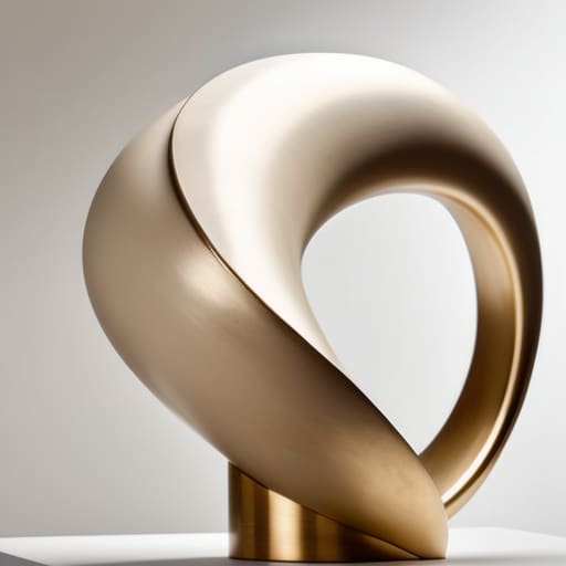
I remember sitting in a dimly lit studio back at RISD, my fingers stained with ink and my lungs slightly heavy from the scent of spray adhesive and solvent. I was working on a physical maquette, trying to understand how light hit a curved edge, feeling the actual resistance of the material against my palms. Today, when I look at modern UI design, I see a terrifying trend toward the sterile and the weightless. Everyone is chasing flat, frictionless perfection, completely ignoring how sculptural form can breathe life into a digital space. We’ve traded the soul of tactile depth for a sea of lifeless, mathematical planes that feel like they have no gravity at all.
I’m not here to lecture you on abstract aesthetics or how to chase the latest trend cycle. Instead, I want to talk about how we can bring a sense of intentional weight back to our interfaces. I’m going to share what I’ve learned from decades of moving between the physical and the digital, showing you how to use sculptural form to create depth that actually serves a purpose. My goal is to help you build digital tools that don’t just fill a screen, but actually feel meaningful to hold.
Table of Contents
Navigating the Tension of Organic vs Geometric Forms
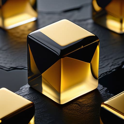
When I sit at my desk, sketching out new typeface weights or layout grids, I often find myself caught in the tug-of-war between the rigid and the fluid. In digital design, we tend to default to the safety of the grid—those perfect, predictable geometric forms that keep everything aligned and “correct.” But there is a sterility in perfection that can alienate a user. To find true depth, we have to lean into the tension of organic vs geometric forms. It’s about introducing a soft curve or an irregular silhouette into a structured environment to create a sense of life.
The real magic happens when you start playing with sculpture mass and void. It isn’t just about what you place on the screen, but the intentionality of the negative space surrounding it. When we treat a UI element as more than just a flat container, we begin to understand how weight and emptiness interact. By balancing these opposing forces, we move away from mere decoration and toward a design language that feels grounded, almost as if you could reach out and feel the tactile qualities of the interface.
Mastering the Intentionality of Sculpture Mass and Void
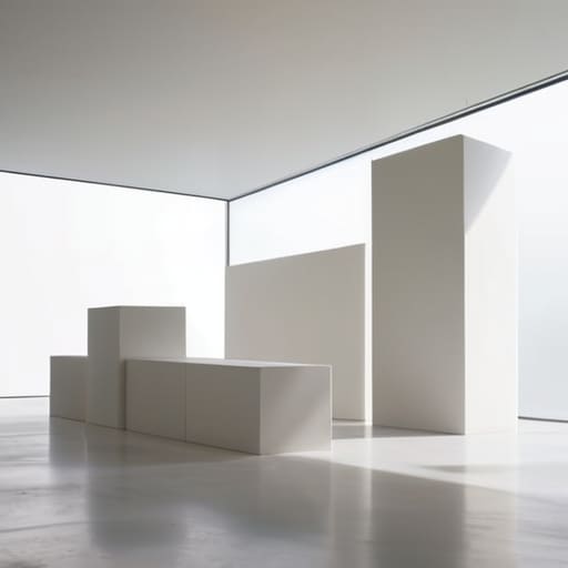
When we talk about digital interfaces, we often default to a flat, weightless logic. But if we want to move beyond the superficial, we have to understand the interplay of sculpture mass and void. In my own practice, I find that the most compelling layouts aren’t just about where you place an element, but about the negative space that surrounds it. A void isn’t just an empty gap; it is a deliberate structural choice that gives the “solid” parts of your design room to breathe.
Think of your UI components as physical objects with actual gravity. When you apply the principles of three-dimensional composition to a digital canvas, you stop thinking in layers and start thinking in volumes. You begin to ask how a shadow might suggest depth, or how the proximity of two elements creates a sense of tension. This isn’t about adding unnecessary bevels or drop shadows to mimic old skeuomorphism; it’s about using light and shadow to establish a hierarchy of presence. By mastering the balance between what is there and what is purposefully left out, you create a digital environment that feels anchored, intentional, and deeply human.
Five Ways to Bring Weight and Texture to the Flat Screen
- Stop treating your layouts like flat planes; think of them as three-dimensional environments where elements have actual mass and can cast subtle, intentional shadows.
- Embrace the “imperfection” of the curve. In a world of mathematically perfect vectors, introducing a slight, hand-drawn irregularity can give a digital object the soul of a physical sculpture.
- Use negative space as a physical material. Don’t just leave areas empty; treat your voids as if you were carving them out of stone, ensuring the “missing” parts are just as communicative as the visible ones.
- Respect the hierarchy of tactile weight. A primary call-to-action shouldn’t just be a different color; it should feel “heavier” or more substantial than the secondary elements surrounding it.
- Test for digital friction. If an interaction feels too slick or frictionless, it loses its sense of presence. Introduce subtle resistance through motion or depth to remind the user they are interacting with something meaningful.
Finding the Soul in the Structure
Stop treating digital space like a flat canvas; approach your layouts as three-dimensional environments where mass and void dictate how a user actually feels their way through an interface.
Balance the sterile perfection of geometric grids with the subtle, imperfect tension of organic forms to prevent your work from feeling like a soulless automation.
Every shadow, curve, and depth you add must serve a functional purpose, ensuring that sculptural elements guide the eye rather than just acting as decorative noise.
## The Weight of Digital Space
“In an age where pixels feel weightless and disposable, we have to stop treating the screen like a flat surface and start treating it like a medium. True sculptural form in design isn’t about adding decoration; it’s about using light, shadow, and mass to give a user something they can almost feel with their eyes.”
Ingrid Bellamy
The Weight of What We Build
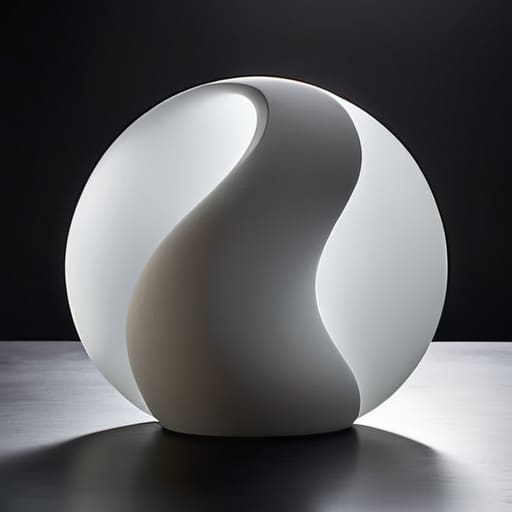
As we pull these threads together, it becomes clear that sculptural form in digital design isn’t about adding decoration; it is about managing the relationship between presence and absence. We’ve looked at how the dance between organic curves and geometric precision creates a sense of life, and how the deliberate use of mass and void gives a user interface a sense of gravity. When we stop treating the screen as a flat, infinite void and start treating it as a three-dimensional space where elements have weight and consequence, we move away from mere decoration. We move toward intentionality.
Ultimately, my hope is that you approach your next project not as a series of pixels to be arranged, but as a series of shapes to be carved. In an age where automation can churn out endless, frictionless layouts, there is profound value in the deliberate tension of a well-placed shadow or a heavy, grounding element. Don’t be afraid to let your designs feel substantial. By honoring the principles of sculptural form, we do more than just build better interfaces; we reclaim the craftsmanship that makes digital experiences feel deeply, undeniably human.
Frequently Asked Questions
How do I balance these heavy, sculptural elements without making the interface feel cluttered or overwhelming for the user?
It comes down to negative space—or what I like to call “breathing room.” Think of your interface like a gallery wall; if every inch is covered, the viewer’s eye has nowhere to rest. You balance weight by being ruthless with your margins. Use generous white space to frame those heavy, sculptural elements. Let the void do the heavy lifting. If an element feels overwhelming, it’s usually because it hasn’t been given enough room to exist.
In a medium that is fundamentally flat, what are the most subtle ways to introduce a sense of physical mass and depth?
It’s a bit of a paradox, isn’t it? We’re working with light on a flat plane, trying to trick the eye into feeling weight. I find the most success in the subtle stuff—not heavy drop shadows that look like 2005 web design, but rather through layered opacity and micro-gradients. Think about how light actually hits an edge. If you can master the way a soft shadow suggests a slight elevation, you create a sense of presence without breaking the interface’s cleanliness.
Is there a point where pursuing a highly tactile, sculptural aesthetic begins to compromise accessibility or functional clarity?
There is absolutely a tipping point. When we chase the “feel” of a tactile interface so hard that we sacrifice legibility, we’ve failed as designers. A beautiful shadow or a complex bevel means nothing if a user can’t tell where a button ends and the background begins. Don’t let the pursuit of texture obscure the hierarchy. If the aesthetic creates friction for the user rather than the creator, it isn’t craft—it’s just noise.
