I was sitting at my drafting table last Tuesday, the smell of ink and old paper filling the room, when I watched a prompt-engineered image flicker across my monitor. It was technically perfect—mathematically flawless, hyper-saturated, and utterly hollow. There is this pervasive, exhausting myth circulating in our industry that generative art is a shortcut to “pure creativity,” as if stripping away the struggle of the process somehow yields a better result. To me, that’s not innovation; it’s just aesthetic automation. We are being sold the idea that the output is everything, while the soul of the work—the intentionality behind every line and curve—is being treated as an inconvenient friction to be smoothed away.
I’m not here to tell you how to write better prompts or how to ride the latest hype cycle. Instead, I want to talk about how we can use these tools to expand our agency rather than surrender it. I promise to share a perspective rooted in decades of actual craft, focusing on how to integrate generative art into a workflow that still honors the human hand. We’ll explore how to keep the tension, the grit, and the intentionality alive in a world that is increasingly obsessed with the easy button.
Table of Contents
- Beyond the Algorithm Machine Learning Art Techniques
- Navigating Ai Driven Aesthetic Exploration With Intent
- Guarding the Grain: Five Ways to Keep Your Generative Work From Losing Its Soul
- Reclaiming Intent in the Age of Automation
- The Tension Between Output and Intent
- The Intentional Path Forward
- Frequently Asked Questions
Beyond the Algorithm Machine Learning Art Techniques
When we peel back the curtain of the interface, we find that these tools aren’t magic; they are built on specific, rigorous frameworks. I often think about generative adversarial networks explained through the lens of a classic design critique. You have two neural networks locked in a constant, productive tension—one acting as the creator and the other as the critic. It’s a digital version of the iterative process I used to undergo with my old mentors, where every stroke was judged against a standard of truth. This friction is what allows the machine to move past mere randomness and toward something that feels intentional.
However, the real depth lies in how we approach computational creativity in digital art. It isn’t enough to simply press “generate” and hope for a happy accident. To truly master these machine learning art techniques, we have to treat the algorithm like a highly sophisticated, slightly unpredictable medium—much like the unpredictable way light hits a specific roll of film. We aren’t just consumers of an output; we are curators of a mathematical possibility space, guiding the chaos toward a sense of purpose.
Navigating Ai Driven Aesthetic Exploration With Intent
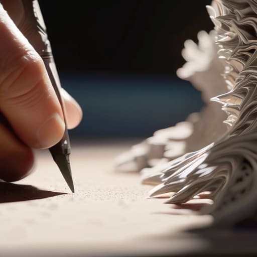
When I sit down with my sketchbook, the friction of the pen against the paper dictates the pace of my ideas. There is a deliberate slowness to it. In contrast, the speed of AI-driven aesthetic exploration can feel like driving a car with no brakes; you can reach a destination incredibly fast, but you might miss the nuances of the landscape along the way. The danger isn’t in the technology itself, but in the temptation to let the machine make the final aesthetic decisions. If we treat these tools as a “set and forget” solution, we lose the very essence of what makes design meaningful.
To truly integrate these tools, we have to treat them more like a complex new medium—similar to how I view code-based visual art—rather than a magic wand. It’s about finding the sweet spot where the algorithm provides the raw material, but the human eye provides the curation and the soul. We should use these systems to push past our own cognitive biases and explore visual territories we couldn’t reach alone, ensuring that every output remains a reflection of human intent rather than just a statistical probability.
Guarding the Grain: Five Ways to Keep Your Generative Work From Losing Its Soul
- Treat the prompt as a starting point, not a finish line. If you find yourself simply accepting the first high-fidelity result the machine spits out, you aren’t designing; you’re just curating. The real work begins when you push back against the output.
- Introduce intentional friction. AI thrives on smoothness and mathematical averages, which often results in a “plastic” aesthetic. Bring in the grit—layer in scanned textures, hand-drawn linework, or analog imperfections to break that digital sheen.
- Master the anatomy of the tool. Don’t just treat the software as a black box. Understand how the weights and parameters actually influence the visual structure. The more you understand the mechanics, the more you can direct the chaos rather than being a passenger to it.
- Maintain a physical reference library. When the screen starts feeling too sterile, step away. Look at a vintage typeface, a weathered lithograph, or the way light hits a film emulsion. Use these tactile truths to ground your digital explorations.
- Focus on the “Why” before the “How.” Before you touch a single slider, define the intent behind the piece. Generative art is most powerful when it serves a specific conceptual purpose, rather than just being a display of computational complexity.
Reclaiming Intent in the Age of Automation
Generative tools are not replacements for the creative mind, but sophisticated brushes that require a steady, intentional hand to guide them.
True distinction in design comes from the friction of human choice—the decision to deviate from what the algorithm suggests.
We must prioritize the “why” behind a visual output, ensuring that every automated element serves a purpose rather than just filling digital space.
The Tension Between Output and Intent
Generative art shouldn’t be a race toward a frictionless finish line; the true value lies in how we use these tools to amplify the intentional, sometimes difficult, choices that make a design feel alive.
Ingrid Bellamy
The Intentional Path Forward
We have navigated the technical landscape of machine learning and the delicate balance of aesthetic exploration, but the core takeaway remains the same: tools do not possess vision. Generative art is not a replacement for the designer’s eye, but rather a vast, complex extension of it. Whether we are wrestling with prompt engineering or refining a model’s output, the goal is to move past the initial novelty of “automation” and toward a deeper integration of purposeful craftsmanship. If we treat these algorithms as mere shortcuts to bypass the thinking process, we lose the very essence of what makes design meaningful. We must ensure that the technology serves our intent, rather than allowing our intent to be diluted by the sheer speed of the machine.
As I sit here with my sketchbook, watching the light shift across my desk, I am reminded that the most profound breakthroughs rarely come from the path of least resistance. The future of our industry lies in our ability to embrace the beautiful friction of the creative process—the mistakes, the iterations, and the stubborn refusal to settle for “good enough.” Let us use these new digital frontiers to amplify our humanity, not to mask it. Design is, and always will be, a deeply human endeavor. Use the algorithm to expand your horizon, but never let it hold the pen.
Frequently Asked Questions
How can we maintain a distinct personal style when the underlying models are trained on everyone else's work?
It’s a valid fear. When the model is a mirror of the collective, it’s easy to get lost in the average. To stay distinct, you have to stop treating the prompt as a destination and start treating it as a raw material. Don’t let the AI dictate the composition; use it to iterate on your own sketches or specific color theories. True style lives in the intentional deviations—the parts where you push back against the machine’s tendency toward the middle.
Where is the line between using generative tools for exploration and letting them dictate the final aesthetic?
The line is drawn at intentionality. When you use a tool to iterate through a hundred color palettes in seconds, you’re exploring. But when you accept the first output because it “looks good” without questioning why it works, you’ve surrendered. To me, the distinction lies in the friction. If you aren’t pushing back against the machine—refining, correcting, and injecting your own visual logic—you aren’t designing; you’re just curating an algorithm’s whim.
How do we integrate these automated processes into a professional workflow without losing the intentionality of the design phase?
We have to treat these tools like a new type of lens, not a replacement for the eye. I start by using generative models for rapid prototyping—exploring color stories or texture studies that would otherwise take hours of manual labor. But the “design” doesn’t happen in the prompt; it happens in the curation and the refinement. I bring the output back to my sketchbook, stripping away the digital noise to find the core intent.