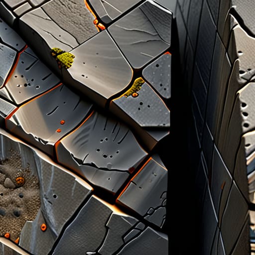
I remember sitting in a dimly lit studio back in the late nineties, my fingers stained with ink and my eyes aching from staring at a lightbox. We were obsessing over the way light hit a physical paper stock, trying to replicate that subtle, toothy resistance with nothing but grit and intuition. Now, I see digital artists rushing toward hyper-realistic shaders, thinking they can solve everything with more processing power. But here is the truth: texture mapping shouldn’t just be about wrapping a high-resolution file around a mesh to hide a lack of soul. If you’re just using it to mask technical shortcuts, you aren’t designing; you’re just filling space.
In this piece, I want to strip away the jargon and get back to the intentionality of the craft. I’m not here to give you a technical manual on software presets or a lecture on polygon counts. Instead, I’m going to share how to use texture mapping to honor the tactile imperfections that make a digital object feel like it actually exists in the physical world. We’ll look at how to find that perfect balance between digital precision and the beautiful, messy friction of human touch.
Table of Contents
- Honoring Tactility Through Advanced Uv Unwrapping Techniques
- The Pbr Workflow Explained Building Truth Not Just Pixels
- Small Adjustments for a More Human Surface
- The Soul in the Machine: Final Thoughts on Tactile Digitalism
- The Soul in the Surface
- Beyond the Digital Surface
- Frequently Asked Questions
Honoring Tactility Through Advanced Uv Unwrapping Techniques
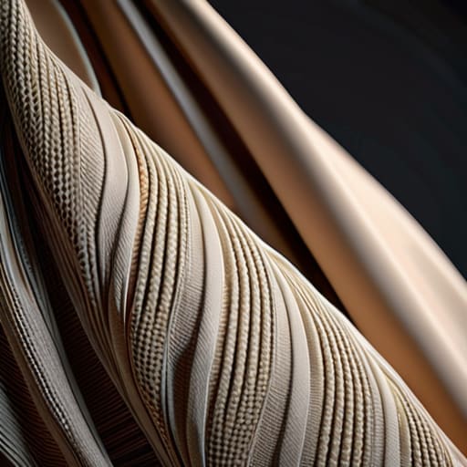
When we talk about UV unwrapping techniques, we often get bogged down in the technical geometry of flattening a 3D object. But for me, it’s more than just a mathematical necessity; it’s the foundation of how we translate physical soul into a digital space. If your seams are poorly placed or your islands are distorted, you lose that sense of continuity that makes an object feel “right.” I’ve found that the most successful digital assets are those where the UV layout respects the natural flow of the material, much like how a well-cut pattern dictates the drape of a heavy linen fabric.
The goal isn’t just to avoid stretching, but to prepare a canvas that can handle the complexity of a modern PBR workflow explained through light and shadow. When you approach your layout with intention, you aren’t just mapping pixels; you are defining how light will eventually interact with the surface. By minimizing distortion during the unwrapping phase, you ensure that your diffuse and specular maps work in harmony rather than fighting against jagged, unnatural transitions. It’s about creating a structural integrity that allows the digital surface to finally feel grounded in reality.
The Pbr Workflow Explained Building Truth Not Just Pixels
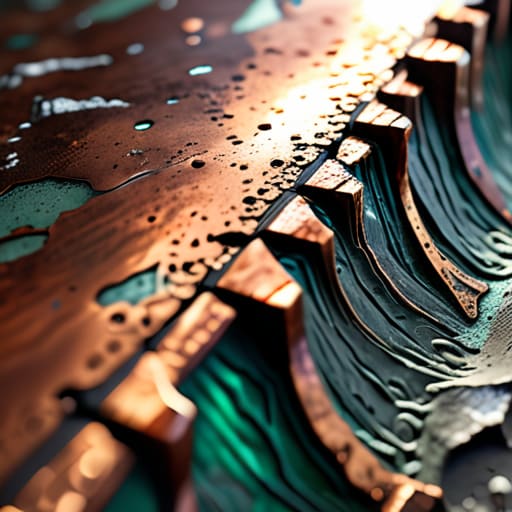
When we talk about the PBR workflow explained, we aren’t just discussing a technical checklist; we are talking about a commitment to physical reality. In the old days of CG, we relied on “faking it” with clever lighting tricks, but Physically Based Rendering demands that we respect how light actually behaves when it hits a surface. It moves us away from arbitrary color choices and toward a system where diffuse and specular maps work in concert to simulate true reflectivity and energy conservation.
To me, this process feels less like coding and more like layering a physical medium. When you move beyond simple color, you begin to understand the nuance between a normal map vs displacement map. While a normal map can trick the eye into seeing depth through light manipulation, a displacement map actually reshapes the geometry, providing that heavy, structural integrity that a digital object needs to feel grounded. It is the difference between a photograph of a stone wall and a wall you can actually feel the grit of under your fingernails. We aren’t just painting pixels; we are simulating the soul of the material.
Small Adjustments for a More Human Surface
- Stop chasing mathematical perfection in your UV shells. A tiny bit of overlap or a slightly irregular seam can actually mimic the way physical materials are manufactured, preventing that “too perfect” digital sheen that screams artificiality.
- Prioritize micro-imperfections over macro-patterns. Instead of applying a heavy, uniform grain across an entire model, focus your texture maps on the high-contact areas—the edges where a hand would rest or the corners where dust naturally settles.
- Respect the light by layering your maps with intention. Don’t just rely on a single diffuse texture; use your roughness and specular maps to tell the story of how a surface has aged, reacting to light exactly as a weathered piece of wood or brushed steel would.
- Avoid the “tiling trap” by breaking up repetitive patterns. If you find yourself repeating a texture every few centimeters, introduce subtle, non-repeating decals or hand-painted variations to disrupt the rhythm and give the eye something organic to settle on.
- Work with a sense of scale in mind. Before you dive into the fine details, ensure your texel density is consistent across the object. There is nothing that breaks the illusion of reality faster than a surface that looks sharp in one spot and muddy in another.
The Soul in the Machine: Final Thoughts on Tactile Digitalism
Stop treating texture mapping as a checklist of surface data; treat it as the digital equivalent of a physical patina that tells the story of an object’s existence.
Precision in your UV unwrapping isn’t just about technical efficiency—it’s about preserving the integrity of the form so that light and shadow interact with your surfaces with intention.
True PBR mastery lies in the balance between mathematical accuracy and the beautiful, imperfect grit that reminds the viewer there is a human hand behind the screen.
The Soul in the Surface
Texture mapping shouldn’t be an afterthought or a way to mask a low-poly model; it’s the digital equivalent of a thumbprint on a ceramic bowl. If we aren’t using it to introduce the subtle, beautiful friction of the real world, we’re just painting over emptiness.
Ingrid Bellamy
Beyond the Digital Surface
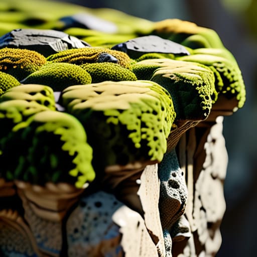
At its core, mastering texture mapping isn’t about accumulating more high-resolution assets or chasing the latest shader complexity. It is about the intentional marriage of UV precision and the physics of light. We’ve looked at how thoughtful unwrapping prevents the distortion of a story, and how a PBR workflow allows us to build materials that respond to their environment with honesty rather than artifice. When we stop treating textures as mere overlays and start treating them as the fundamental skin of our digital creations, we bridge the gap between a hollow mesh and a living, breathing object.
As we move further into an era of increasingly automated rendering, I find myself returning to my sketchbook more often. It reminds me that beauty often lies in the deliberate imperfection—the slight scuff on a metal edge or the uneven grain of weathered wood. My hope is that you use these technical workflows not just to achieve realism, but to inject a sense of soul into your work. Don’t let the tools flatten your vision; instead, use them to honor the tactile world we inhabit. After all, the most profound digital experiences are those that make us feel like we could reach out and actually touch the craftsmanship.
Frequently Asked Questions
How do I maintain a sense of organic imperfection without making the textures feel muddy or distracting?
It’s a delicate balance. I often tell my clients that imperfection shouldn’t be a layer you slap on top; it should be baked into the logic of the material. To avoid that “muddy” look, focus on micro-contrast. Instead of heavy, dark grime, use subtle variations in roughness and specular maps. Aim for the way light catches a slight scratch or a worn edge. If the detail doesn’t serve the story of the object, leave it out.
At what point does the pursuit of hyper-realism start to compromise the intentionality of the original design?
It happens the moment the technical complexity begins to drown out the concept. When we get so lost in the pursuit of every microscopic pore or fiber that we forget why the object exists in the first place, we’ve lost the plot. Hyper-realism becomes a distraction if it serves the engine rather than the story. If the texture is just noise meant to show off a shader, you aren’t designing anymore—you’re just simulating.
How can I balance high-resolution texture detail with the need for efficient, performant digital workflows?
It’s the classic tension: we want every microscopic grain of leather or etched metal, but we can’t ignore the reality of hardware limits. I’ve found the answer lies in smart hierarchy. Don’t spread your texel density thin across everything. Focus your resolution on the “touchpoints”—the areas where the user’s eye (or virtual hand) lingers—and use clever tiling or procedural noise for the vast, secondary surfaces. It’s about intentionality, not just raw data.
