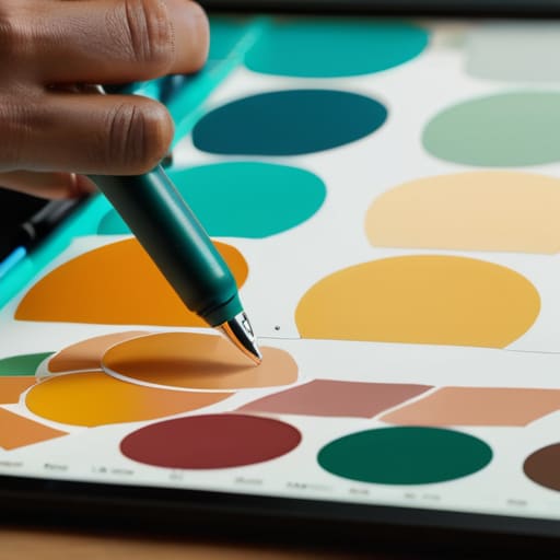
I remember sitting in a cramped studio back in the late nineties, surrounded by the sharp, chemical scent of spray adhesive and the tactile weight of physical color chips. We didn’t have algorithms to tell us what “felt” right; we had our eyes, our intuition, and a deep respect for how light actually hits a surface. Nowadays, I see so many designers treating color theory application like a math problem to be solved by a plugin or a generative AI prompt. They’re chasing trends and saturating screens with neon palettes that look great in a portfolio mockup but feel completely hollow when a real human actually tries to use the interface.
I’m not here to give you a lecture on the physics of light or a list of hex codes to copy-paste. Instead, I want to talk about how we use color to respect the user’s attention and guide their journey with intention. I’m going to share the practical, battle-tested ways I approach color to ensure it serves a purpose rather than just filling space. We’re going to move past the superficial aesthetics and focus on building meaningful connections through thoughtful, disciplined design.
Table of Contents
Mastering Color Wheel Principles to Empower Creators

When I first started working with physical pigments, you couldn’t just hit “undo” if a hue felt wrong. You had to understand the underlying logic of how colors lived together. Today, we have infinite digital swatches at our fingertips, but that abundance often leads to a lack of discipline. To truly master color wheel principles, you have to stop viewing color as a decorative layer and start seeing it as a structural tool. It’s about intentionality—choosing a palette that doesn’t just scream for attention, but instead provides a sense of rhythm and stability to the interface.
I often find that designers get lost in the pursuit of “vibrancy” and forget the quiet power of analogous color combinations. Using colors that sit side-by-side on the wheel creates a sense of calm, cohesive breathing room that respects the user’s cognitive load. On the flip side, if you need to signal an action or a shift in importance, that’s where you lean into the tension of complementary color schemes. The goal isn’t to overwhelm the eye; it’s to use contrast to establish a clear, functional path through the work.
Using Visual Hierarchy Through Color to Guide Intent

When we talk about visual hierarchy through color, we aren’t just talking about making a button pop. It’s about respect—respecting the user’s cognitive load and their limited attention. If everything on your canvas is screaming for attention with high-saturation hues, nothing actually gets heard. I’ve seen too many junior designers lean on heavy, clashing tones to create “excitement,” when what they really need is a sense of order.
Instead, think about how you can use color temperature in branding to establish a sense of priority. A warm, energetic accent against a muted, cool-toned background creates a natural path for the eye to follow. This isn’t about decoration; it’s about using the psychology of color in design to signal what matters most. When you master this, you stop fighting for the user’s attention and start guiding their intention with a quiet, confident hand. It’s the difference between a cluttered flyer and a piece of intentional, functional design.
Five Ways to Use Color Without Losing the Soul of Your Design
- Stop chasing trends and start looking at context. A neon palette might look striking in a portfolio mockup, but if it creates eye strain for a user trying to read a long-form article, you’ve failed the primary purpose of the design. Color should support the content, not compete with it.
- Respect the power of neutrals. I see too many young designers terrified of white space or grey scales, trying to force every pixel to be “on brand.” True sophistication comes from knowing when to let the eye rest. Use your neutrals to create breathing room so your primary colors actually mean something when they appear.
- Test for accessibility, not just aesthetics. It’s easy to pick a beautiful, low-contrast pairing that looks “minimalist” on your high-end monitor, but if a user with visual impairments can’t distinguish your text from the background, your design is broken. Accessibility isn’t a checkbox; it’s a fundamental part of intentional craft.
- Build a palette with a clear hierarchy. Don’t give every color equal weight. Choose one dominant hue to establish the mood, one secondary color for support, and one high-contrast accent for the moments that actually require action. If everything is shouting, nothing is being heard.
- Remember that color is felt, not just seen. Before you commit to a scheme, think about the tactile sensation it evokes. Is it the warmth of an old film photograph or the cool, sterile precision of a technical manual? Match your color temperature to the human intent behind the project.
The Intentionality of Color
Stop treating color as a decorative afterthought; use it as a functional tool to direct attention and respect the user’s cognitive load.
Build your palettes with purpose, ensuring that every hue serves the core brand identity rather than just following a fleeting digital trend.
Remember that true accessibility isn’t a checkbox—it’s about using contrast and color to ensure your design remains usable and inclusive for every human eye.
## Color as a Tool, Not a Decoration
“Color shouldn’t just be a way to make a layout pop; it should be a way to honor the user’s intent. When we use color theory with purpose, we aren’t just decorating a digital surface—we are building a roadmap that respects the human eye and guides the hand.”
Ingrid Bellamy
Beyond the Palette
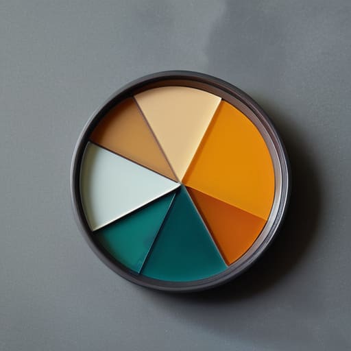
At the end of the day, applying color theory isn’t about memorizing a list of hex codes or chasing the latest trend on Dribbble. It’s about understanding how those hues interact with the human psyche and the way we navigate digital environments. We’ve looked at how the color wheel provides a foundational map, and how we can use contrast to establish a clear, intentional hierarchy. When you stop treating color as a decorative afterthought and start using it as a functional tool, you move away from mere decoration and toward true communication. Remember, every shade you choose should serve a specific purpose, guiding the eye and respecting the user’s cognitive load rather than overwhelming it.
As you head back to your workstations, I encourage you to step away from the screen for a moment. Look at the way light hits a physical object or how the ink bleeds slightly into the grain of a sketchbook page. There is a richness in the physical world that we often try to sanitize in our digital work. Don’t be afraid of a little grit or a subtle shift in tone that feels intentionally imperfect. Our goal shouldn’t be to create sterile, automated perfection, but to build digital experiences that honor the friction of human touch. Design with purpose, and let your color choices be the bridge between the machine and the person on the other side.
Frequently Asked Questions
How do I maintain a sense of tactile warmth in a brand palette when I'm working primarily with high-saturation digital screens?
It’s a constant battle. Digital screens tend to glow with an artificial intensity that can feel clinical, even aggressive. To fight that, I stop looking at pure hex codes and start thinking about texture. Introduce “imperfect” neutrals—think of the slight warmth in aged paper or the grit of a lithograph. By layering desaturated, earthy undertones beneath your vibrant colors, you create a visual depth that mimics the way light hits a physical surface.
At what point does a color scheme stop being a functional tool for guidance and start becoming visual noise that distracts from the core design?
It happens the moment you stop using color to signal meaning and start using it to signal presence. When every element is shouting for attention, nothing is actually being heard. If you find yourself adding a “pop” of color just because a layout feels empty, you’ve crossed the line. Color becomes noise when it disrupts the user’s intent rather than facilitating it. If the hue doesn’t serve a functional purpose, it’s just clutter.
How can I balance the need for accessible, high-contrast color combinations with the desire to create more nuanced, subtle brand identities?
It’s the classic tension: the demand for legibility versus the desire for elegance. I don’t think you have to choose. Instead of relying on high-contrast color alone to create hierarchy, use scale, weight, and negative space to do the heavy lifting. You can keep your palette soft and nuanced by ensuring your functional elements—like body text and primary buttons—meet accessibility standards, while letting your brand’s atmospheric, subtle tones live in the backgrounds and decorative accents.
