
I was sitting at my desk last Tuesday, cleaning the internal gears of a 1970s Leica, when I realized how much we’ve lost in the rush toward seamlessness. There is a specific, tactile resistance when you turn a manual focus ring—a tiny, mechanical conversation between the machine and your fingertips. Somewhere in the transition to digital, we traded that soul for “frictionless” speed, but in doing so, we’ve made our interfaces feel hollow. We tend to treat microinteractions in ui as mere eye candy, throwing bouncy, high-velocity animations at a screen just to satisfy a trend report, rather than using them to honor the natural rhythm of a person actually using a tool.
I’m not interested in teaching you how to make your apps look “playful” or trendy. Instead, I want to talk about how we can use these small moments of feedback to restore a sense of intention to our digital craft. I’m going to share what I’ve learned from two decades of design to help you implement microinteractions in ui that serve a purpose, rather than just filling space. We’re going to focus on meaningful feedback that respects the user’s intent, ensuring every digital nudge feels as deliberate as a well-placed ink stroke.
Table of Contents
Using Visual Cues in Digital Products to Honor Intent

When we talk about visual cues in digital products, we aren’t just talking about making things move; we are talking about establishing a dialogue. In my early days of print design, a tactile notch or a specific paper weight told you exactly how to handle a piece of media. In the digital realm, we lose that physical weight, which is why we must rely on user interface feedback mechanisms to bridge the gap. A subtle shift in a button’s shadow or a slight change in color when a cursor hovers isn’t just “fluff”—it is a way of acknowledging that the user’s intent has been recognized.
If these cues are too loud, they become a distraction; if they are too quiet, the user feels lost in a void of inaction. The goal is to manage cognitive load and interface feedback so that the technology recedes into the background. I’ve always believed that the most successful digital tools are the ones that feel intuitive, almost as if they are anticipating your next move without demanding your full attention. We should use motion to guide the eye, not to hijack it, ensuring every movement serves a clear, functional purpose.
Mastering Ux Design Motion Principles for Meaningful Connection
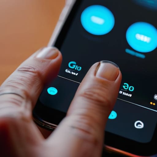
When we talk about movement in a digital space, there is a tendency to treat motion as decoration—a way to make a product feel “premium” or “slick.” But if we look at it through the lens of craftsmanship, motion is actually a language of causality. To truly master ux design motion principles, we have to stop asking “how does this look?” and start asking “how does this explain?” A well-timed transition shouldn’t just be a pretty slide; it should serve as a bridge that helps the user understand where they just were and where they are going.
If motion is too frantic or lacks a clear logic, you aren’t enhancing the product; you are simply increasing the cognitive load and interface feedback loop to a point of frustration. I’ve seen too many interfaces where elements pop in and out without any sense of spatial relationship. Instead, use motion to provide a sense of continuity. When an element expands from a button to a full-screen modal, that movement tells a story of growth and hierarchy. It respects the user’s mental model by providing a logical thread through the interaction, ensuring the digital experience feels as grounded and intentional as a physical one.
Five Ways to Keep Microinteractions Grounded in Craft
- Prioritize feedback over flourish. A microinteraction should never feel like a decoration; it should act as a quiet confirmation that the user’s intent was understood, much like the tactile click of a well-made Leica shutter.
- Respect the user’s tempo. Avoid heavy, sweeping animations that force a person to wait for the interface to catch up. The movement should feel like a natural extension of their own rhythm, not an interruption to it.
- Design for the “frictionless” trap. While we often strive for seamlessness, a tiny moment of intentional resistance—like a slight haptic pulse or a subtle color shift—can prevent errors and give the user a sense of agency.
- Maintain visual hierarchy through motion. Use subtle shifts in scale or opacity to guide the eye, rather than using loud, distracting transitions that pull attention away from the core task at hand.
- Test for emotional resonance, not just technical success. Ask yourself: does this interaction feel hollow and automated, or does it possess a sense of intentionality that makes the digital space feel inhabited and human?
The Intentionality of Motion
Microinteractions aren’t decorative flourishes; they are the digital equivalent of tactile feedback, serving to confirm a user’s action and provide a sense of closure.
Avoid the temptation to over-animate; every movement must justify its existence by guiding the eye or reducing the cognitive load of a transition.
Respect the user’s pace by ensuring that motion feels like a natural extension of their intent, rather than a distraction that interrupts their flow.
The Soul in the Small Details
A microinteraction shouldn’t feel like a digital flourish or a piece of visual noise; it should feel like the subtle click of a well-made Leica shutter—a quiet, purposeful confirmation that the tool is listening to the human behind it.
Ingrid Bellamy
The Quiet Power of Intentional Motion

At the end of the day, microinteractions aren’t just about adding a bit of polish or making a button bounce; they are about the dialogue between the user and the interface. We’ve explored how visual cues can guide a person through a task without overwhelming them, and how mastering motion principles allows us to create a sense of rhythmic continuity rather than digital chaos. When we get these small moments right, we stop building mere interfaces and start building responsive environments that acknowledge the user’s presence and respect their cognitive load.
As we move further into an era defined by rapid automation and generative tools, I find myself leaning harder into the value of the small, deliberate choice. It is easy to let a machine smooth everything out into a frictionless, characterless void, but true craftsmanship lies in knowing when to introduce a moment of meaningful friction. Let’s commit to designing tools that don’t just occupy space on a screen, but actually honor the human hand behind the click. Design is a service, and our best work will always be the kind that makes a person feel seen, not just processed.
Frequently Asked Questions
How do I know when a microinteraction has crossed the line from being helpful to just being digital clutter?
It’s a fine line, and honestly, it’s one we cross too often. You know you’ve drifted into clutter when the animation begins to compete with the task at hand. If a user has to wait for a flourish to finish before they can proceed, you haven’t designed an interaction; you’ve designed an obstacle. If it doesn’t provide immediate feedback or clarify an action, it’s just noise. If it feels like decoration rather than direction, strip it back.
Is there a way to design these subtle movements without sacrificing the performance or speed of the interface?
It’s a valid fear. We often mistake “fluidity” for “bloat,” but they aren’t the same. To keep things snappy, focus on CSS transitions rather than heavy JavaScript libraries whenever possible; they’re lighter on the browser. Also, keep your easing curves simple. If an animation takes longer than 300ms, it starts feeling like friction rather than grace. Aim for subtle, purposeful motion that complements the interface’s speed instead of competing with it.
How can I ensure that microinteractions feel consistent with a brand's physical identity when moving from print to digital?
Think about the weight of the paper or the tactile resistance of a lever in a vintage Leica. That’s your brand’s physical soul. When moving to digital, don’t just copy colors; translate that sensory experience into motion. If your print identity is heavy and structured, your microinteractions should feel deliberate and grounded, perhaps with a slightly slower, more weighted easing. If it’s airy, let the animations breathe. Consistency isn’t just a hex code; it’s a shared rhythm.
