I remember sitting in a cramped studio back in the late nineties, the smell of spray adhesive and ozone from a heavy plotter hanging thick in the air. Back then, we didn’t have “seamless” everything; we had physical layouts that required a steady hand and a real sense of scale. Today, I look at modern user interface design and often feel like we’ve traded that tactile soul for a polished, frictionless void. We’ve become so obsessed with making everything “invisible” and “effortless” that we’ve forgotten that meaningful interaction requires a bit of intentional weight.
I’m not here to feed you the usual industry jargon or tell you how to chase the latest trend in micro-interactions. Instead, I want to talk about how we can bring purpose back to the screen. I’m going to share what I’ve learned from two decades of moving between physical and digital craft, focusing on how to build interfaces that actually respect the user’s intelligence. We’ll skip the hype and look at how to design with a sense of humanity and restraint, ensuring your work serves a function rather than just filling up empty pixels.
Table of Contents
Navigating the Nuance of Ux vs Ui Design Principles

I often find myself in conversations with junior designers who treat the distinction between UX and UI as a mere technicality, but to me, it’s the difference between the skeleton of a building and the way the light hits the windows. When we talk about ux vs ui design principles, we aren’t just discussing different stages of a checklist; we are discussing the relationship between logic and emotion. UX is the structural integrity—the way a user moves through a space without tripping over invisible hurdles. UI is the tactile grace that makes that movement feel intentional.
If the user experience design workflow is flawed, no amount of beautiful typography or polished buttons will save the product. You can have a stunningly aesthetic interface, but if the user feels lost or frustrated, the design has failed its primary purpose. I always tell my clients that true craftsmanship requires a balance: you need the rigorous, invisible logic of UX to guide the way, paired with a strong sense of visual hierarchy in interface design to ensure the eye knows exactly where to rest. It’s about creating a cohesive language where the function and the form are finally in conversation.
Visual Hierarchy in Interface Design Guiding the Creative Eye
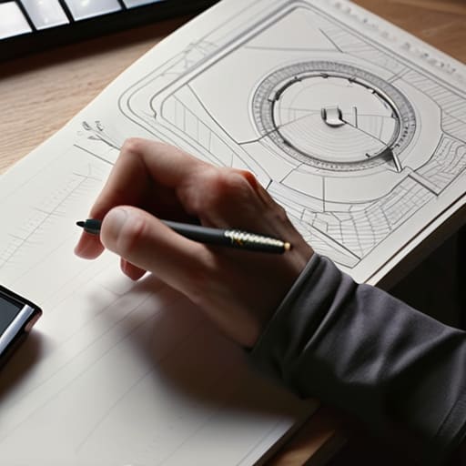
When I sit down with my sketchbook to map out a new layout, I’m not thinking about where to put the prettiest elements. I’m thinking about where the eye needs to land first. Effective visual hierarchy in interface design isn’t about shouting for attention; it’s about a quiet, structured conversation between the screen and the user. If everything is bold, nothing is bold. We often fall into the trap of trying to make every call-to-action pop, but true craftsmanship lies in knowing what to leave in the shadows to let the primary intention breathe.
I’ve found that the most successful interfaces respect the natural scanning patterns of the human eye. By playing with scale, weight, and even the subtle use of negative space, we create a path that feels intuitive rather than forced. It’s a delicate balance—using design system components to maintain consistency while ensuring that the most vital information doesn’t get lost in the noise. We aren’t just arranging pixels; we are curating a sequence of discovery that respects the user’s cognitive load.
Five Principles for Designing with Intention
- Respect the negative space. It’s tempting to fill every pixel to prove your productivity, but white space isn’t “empty”—it’s a functional tool that gives the user’s eyes a place to rest and process information.
- Prioritize legibility over trendiness. I’ve seen too many beautiful, experimental typefaces fail because they ignored the basic human need to read without strain. If the typography isn’t functional, the design has failed its primary mission.
- Design for the “fat finger” and the distracted mind. We often design for perfect, idealized users on high-resolution monitors, but real life is messy. Ensure your touch targets are generous and your interactive elements are forgiving of human error.
- Maintain a consistent visual language. Don’t reinvent the wheel with every new screen. Use a disciplined system of buttons, icons, and spacing so that the user learns your interface intuitively rather than having to solve a puzzle every time they click.
- Embrace purposeful friction. Not every interaction should be instantaneous and frictionless. Sometimes, a deliberate pause or a confirmation step is necessary to signal that a meaningful action has occurred, honoring the weight of the user’s intent.
The Intentionality of the Interface
Prioritize purpose over decoration; every element on the screen must earn its place by serving a specific function or guiding a user’s intent.
Respect the user’s cognitive load by using visual hierarchy to create breathing room, rather than overwhelming them with endless, frictionless choices.
Design for the human on the other side of the glass, ensuring the interface feels like a tool that empowers them rather than a system that merely manages them.
The Soul in the System
A great interface shouldn’t feel like a frictionless void; it should feel like a well-weighted tool in a craftsman’s hand—intentional, responsive, and deeply respectful of the person holding it.
Ingrid Bellamy
The Intentional Interface
At its core, mastering user interface design isn’t about mastering the latest software suite or chasing every fleeting aesthetic trend. It is about the delicate balance between the structural logic of UX and the visual clarity of UI, ensuring that hierarchy and function work in tandem rather than in competition. When we stop treating pixels as mere decoration and start viewing them as tools for communication, we move away from clutter and toward meaningful interaction. We must remember that every shadow, every typeface choice, and every margin is a decision that either invites the user in or pushes them away.
As we move further into an era of automated generation and frictionless automation, I urge you to hold onto the intentionality of the craft. Don’t be afraid of a little friction if it means creating a more thoughtful, human experience. The most successful interfaces aren’t the ones that disappear entirely, but the ones that respect the user’s presence and honor their agency. Let your work be a testament to the idea that technology should serve us, not just distract us. Build with purpose, design with restraint, and never lose sight of the human hand behind the screen.
Frequently Asked Questions
How do I maintain a sense of tactile craftsmanship when working within the constraints of a standardized design system?
It’s a tension I feel every day. Standardized systems are built for efficiency, but efficiency can often feel sterile. To find the soul in the system, look at the micro-interactions. Don’t just use the default corner radius; think about the weight of a shadow or the specific, intentional timing of a transition. It’s about finding the “human” in the margins—using those rigid components to build something that feels considered, rather than just assembled.
Where is the line between making an interface "seamless" and stripping away the intentional friction that helps a user actually process information?
The line is drawn at cognitive engagement. “Seamless” shouldn’t mean “thoughtless.” When we remove every micro-moment of friction, we risk creating a passive experience where the user glides right past the substance. If a user can complete a task without a single moment of reflection, they haven’t actually processed the information—they’ve just followed a path of least resistance. Real design uses subtle friction to signal importance, forcing the eye to pause and truly see.
How can I ensure that my pursuit of minimalist aesthetics doesn't accidentally compromise the functional accessibility of the interface?
Minimalism shouldn’t mean subtraction for the sake of emptiness; it should mean clarity. I often see designers strip away too much, leaving users guessing. To avoid this, treat accessibility as a core design constraint, not an afterthought. Check your color contrasts, ensure your typography remains legible at small scales, and never sacrifice intuitive affordance for a “clean” look. If a user has to hunt for a way forward, your minimalism has failed.
