
I remember sitting in a dimly lit studio back in the late nineties, staring at a physical color proof that looked vibrant under my desk lamp but turned into a muddy, unreadable mess once it hit the printer. It was a visceral lesson in how easily our visual intent can fail the people actually using it. Today, we don’t have to deal with ink drying on paper, but we face a new kind of chaos: a digital landscape cluttered with expensive, bloated software that claims to solve everything. Most of these color accessibility tools are just more noise—overpriced plugins that give you a checklist but fail to teach you the intentionality required to design for real human sight.
I’m not here to sell you a subscription to a massive enterprise suite or feed you a list of automated shortcuts that strip the soul out of your work. Instead, I want to share the lean, functional toolkit I actually use when I’m refining a brand’s visual language. We are going to look at the most effective color accessibility tools through the lens of purposeful craftsmanship, ensuring your palettes aren’t just aesthetically pleasing, but genuinely inclusive.
Table of Contents
Mastering Uiux Color Contrast Ratios With Purpose

When we talk about UI/UX color contrast ratios, we aren’t just checking boxes for a technical audit; we are deciding who gets to participate in the digital experience. I’ve seen too many designers chase a trendy, low-contrast aesthetic—that soft grey on white look—only to realize they’ve effectively locked out anyone with even minor visual fatigue. It’s a lazy shortcut that sacrifices usability for a fleeting sense of “minimalism.”
To do this right, you need to integrate WCAG compliance testing directly into your creative process, rather than treating it as a final hurdle. I prefer to build my inclusive design color palettes from the ground up, testing the legibility of every pairing before I even touch the high-fidelity mockups. It’s about intention. By utilizing deuteranopia simulation tools during the sketching phase, you can see how your color choices translate for users with color vision deficiencies. This isn’t about limiting your creativity; it’s about ensuring that the intentionality of your craft actually reaches the person on the other side of the screen.
Building Inclusive Design Color Palettes That Resonate
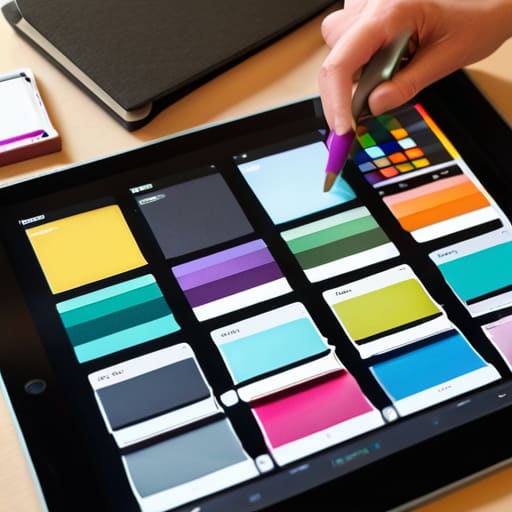
When we talk about building inclusive design color palettes, we often fall into the trap of treating accessibility as a final checkbox—a tedious hurdle to clear before launch. But if we view color through the lens of intentionality, it becomes something more profound. It’s about creating a visual language that doesn’t exclude anyone based on how their eyes process light. Instead of just picking a trendy neon or a muted pastel because they look good in a mood board, we need to integrate visual impairment design principles into the very foundation of our color studies.
This means moving away from “vibe-based” design and toward a more disciplined, empathetic approach. I’ve found that the most successful workflows involve running deuteranopia simulation tools early in the process, long before the high-fidelity mockups are finished. By seeing our work through the eyes of someone with color vision deficiency, we stop designing for our own aesthetic preferences and start designing for human reality. It’s not about limiting your creative expression; it’s about ensuring that your brand’s message actually reaches the people it was meant for.
Practical Rituals for Testing Color Without Losing the Soul of Your Design
- Stop treating contrast checkers like a final hurdle; integrate them into your sketching phase. Use a tool like Adobe Color or WebAIM early on so you aren’t forced to overhaul a beautiful palette because it fails the legibility test at the eleventh hour.
- Look beyond the WCAG numbers and test for real-world conditions. A high-contrast ratio on a pristine studio monitor might still fail a user trying to read your interface under harsh sunlight or on a low-quality mobile screen.
- Use simulators to experience your work through different visual lenses. Tools that mimic color blindness aren’t just for compliance—they help you understand if your brand’s “personality” survives when the color information is stripped away.
- Don’t rely solely on hue to convey meaning. If a tool tells you your red and green statuses are too close in luminosity, don’t just tweak the shade; add an icon or a pattern. True accessibility respects the user’s cognitive load, not just their retinas.
- Build a “safe” palette of accessible neutrals before you get experimental. I always establish a foundation of accessible grays and blacks using a contrast tool first; once the structure is sound, I can layer in the more temperamental, expressive colors.
The Intentionality of Inclusive Color
Accessibility isn’t a checklist to satisfy a client; it’s a fundamental way of respecting the person on the other side of the screen.
Don’t let automated tools make your final decisions—use them to inform your choices, but keep your eye on how color actually feels in a real-world context.
True craftsmanship means designing for the edges of human perception, ensuring your palette works for everyone, not just those with perfect vision.
Beyond the Contrast Ratio
We need to stop treating accessibility tools like a final checkbox in a compliance audit. A tool shouldn’t just tell you if your text is readable; it should remind you that there is a living, breathing person on the other side of that interface who deserves to see the world exactly as you intended.
Ingrid Bellamy
Beyond the Hex Code
At the end of the day, mastering color accessibility isn’t about checking a box or satisfying a compliance auditor; it’s about the technical rigor we bring to our craft. We’ve looked at how to balance contrast ratios without sacrificing aesthetic soul, and how to build palettes that embrace inclusivity rather than treating it as an afterthought. Using these tools—whether they are contrast checkers or color blindness simulators—allows us to move past guesswork. When we prioritize these standards, we ensure that our intentionality as designers translates into a functional reality for every single user, regardless of how they perceive the light hitting their screen.
As I sit here at my desk, watching the ink dry on my latest typeface sketch, I’m reminded that the best design always leaves room for the human element. We are living in an era of rapid automation, but a machine can’t feel the empathy required to design for someone with visual impairments. It takes a person. Don’t let the convenience of digital tools make you lazy; instead, use them to reclaim the craftsmanship that makes digital spaces feel truly human. Let’s stop designing for the pixels and start designing for the eyes that actually have to navigate them.
Frequently Asked Questions
How do I balance the strict mathematical requirements of contrast ratios with the need to maintain a brand's specific aesthetic identity?
It’s the classic tension: the math of WCAG versus the soul of a brand. I’ve seen too many beautiful identities get flattened by “safe” gray-scale palettes. Don’t treat accessibility as a constraint that kills your aesthetic; treat it as a design challenge. If your brand’s primary hue fails the ratio, don’t abandon it—tweak the luminance or find a companion shade that honors the spirit of the color while meeting the requirement. Precision shouldn’t come at the cost of character.
Are there tools that help me test how my color palettes hold up for users with various types of color blindness, rather than just checking contrast?
It’s a common trap to stop at contrast ratios and assume the job is done. Contrast is the floor, not the ceiling. To see how your palette actually behaves, I rely on simulators like Color Oracle or the vision impairment simulators built directly into Figma and Adobe. They don’t just give you a pass/fail; they let you experience the world through different lenses—protanopia, deuteranopia, and beyond. It’s about seeing the nuance, not just the math.
When I’m working in the early sketching phase, how can I integrate accessibility checks without breaking my creative flow?
Don’t wait for the high-fidelity stage to think about contrast; that’s when the “perfection” of the UI often masks fundamental flaws. Instead, keep a simple contrast checker or a dedicated browser extension open alongside your workspace. I often use a physical grayscale swatch next to my screen during sketching to mentally test legibility. If a concept fails the eye test in black and white, no amount of vibrant color will save it later.
