
I remember sitting in a dim studio back in the late nineties, the air thick with the scent of spray adhesive and the rhythmic snip-snip of X-Acto blades against heavy cardstock. We weren’t clicking through pre-made templates or prompting an algorithm to generate a mood board; we were physically wrestling with every line and every shadow to ensure the narrative held weight. Today, I see “visual storytelling” being treated like a mere checkbox—a way to decorate a landing page with pretty, hollow vectors that satisfy an SEO requirement but fail to move a single soul. We’ve traded the intentionality of the craft for a frictionless, automated aesthetic that often leaves the viewer feeling nothing at all.
I’m not here to teach you how to use the latest flashy software or how to chase fleeting design trends. Instead, I want to talk about how we can reclaim the soul of our work by focusing on the purpose behind the pixel. I’m going to share what I’ve learned from two decades of moving from physical paste-ups to digital interfaces, offering you a grounded approach to building narratives that actually respect the human connection. We will explore how to use imagery not just to fill space, but to honor the person on the other side of the screen.
Table of Contents
- Mastering Visual Composition Techniques to Honor the Human Touch
- Using Color Theory in Narrative to Evoke Real Emotion
- The Intentionality Checklist: Five Ways to Avoid Visual Noise
- The Intentionality of the Visual Narrative
- The Soul of the Sequence
- The Intentionality of the Final Frame
- Frequently Asked Questions
Mastering Visual Composition Techniques to Honor the Human Touch

When we talk about visual composition techniques, I often find myself thinking less about “rules” and more about intentionality. In my studio, I don’t just look for what looks balanced; I look for where the eye rests and why. It’s the difference between a layout that feels mathematically perfect and one that feels alive. If every element is fighting for attention, the user loses their way. Instead, we should use negative space as a breathing room, allowing the core message to settle.
I’ve always been drawn to how cinematic storytelling principles can be applied to static design. In film, a frame isn’t just a pretty picture; it’s a carefully constructed environment that dictates emotion through light, shadow, and depth. When we apply this to a digital interface or a brand identity, we aren’t just arranging icons or text. We are creating a rhythm of engagement. By understanding how a viewer’s gaze moves across a screen, we can guide them through a journey that feels unforced and intuitive, honoring the way people actually experience the world around them.
Using Color Theory in Narrative to Evoke Real Emotion
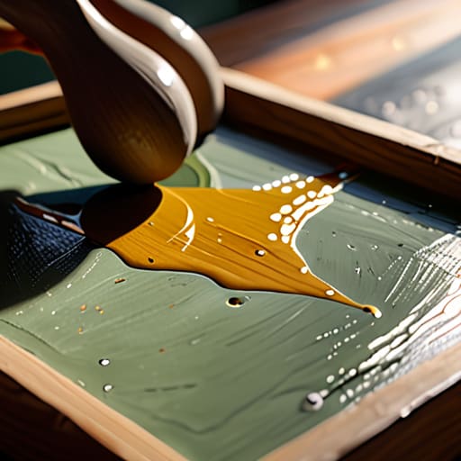
When we talk about color, I find it’s easy to fall into the trap of choosing palettes based on what’s trending on Dribbble or what looks “clean.” But if we want to move beyond mere decoration, we have to treat color as a form of non-verbal communication in art. Color isn’t just a stylistic choice; it is a psychological anchor. When I’m working on a brand identity or a digital interface, I think about how a sudden shift from a muted, desaturated sage to a sharp, jarring ochre can mimic the feeling of a realization or a moment of tension.
Applying color theory in narrative requires us to stop thinking about hues as static properties and start seeing them as temporal tools. Just as a cinematographer uses lighting to guide the eye, a designer can use chromatic shifts to signal a change in the user’s emotional state. It’s about creating a sense of rhythm. If every screen is equally vibrant, nothing feels significant. We have to allow for intentional moments of visual quiet to ensure that when color finally arrives, it actually carries the weight of the story we are trying to tell.
The Intentionality Checklist: Five Ways to Avoid Visual Noise
- Prioritize Negative Space as a Narrative Tool. Don’t feel the need to fill every pixel. In my sketchbook, the white space tells me where to breathe; in your design, it tells the viewer where to focus. Silence is often more communicative than a crowded layout.
- Choose Typography That Carries Weight. Type isn’t just a vehicle for information; it has a voice. If you’re telling a story of heritage, a sterile geometric sans-serif will feel like a lie. Select typefaces that respect the emotional context of your words.
- Embrace Imperfect Geometry. Digital tools push us toward mathematical perfection, but perfection is often sterile. Introducing subtle, human-scale irregularities—much like the slight grain in a film photograph—can make a digital interface feel lived-in and trustworthy.
- Establish a Visual Hierarchy Based on Human Sightlines. We don’t process screens like scanners; we process them like people. Guide the eye through a logical sequence of importance, ensuring the most vital part of your story is the first thing felt, not just seen.
- Use Texture to Ground the Digital Experience. Flat design can sometimes feel untethered from reality. By incorporating subtle textures or organic gradients, you provide a tactile sense of depth that bridges the gap between a cold glass screen and the physical world.
The Intentionality of the Visual Narrative
Stop treating visuals as mere filler; every element on the screen must earn its place by serving a specific, functional role in the user’s journey.
Leverage the tension between color and composition to trigger genuine emotional responses rather than relying on predictable, automated design patterns.
Prioritize the “friction” of human connection by designing layouts that respect how people actually see and feel, rather than optimizing solely for mindless scrolling.
The Soul of the Sequence
Visual storytelling isn’t about the sheer volume of assets we throw at a user; it’s about the intentionality of the gaps between them. We need to stop designing for eye-tracking heatmaps and start designing for the way a human heart actually follows a rhythm.
Ingrid Bellamy
The Intentionality of the Final Frame

We have explored how composition acts as a guide for the eye and how color serves as the emotional heartbeat of a narrative. But as we pull these threads together, remember that visual storytelling is not a checklist of technical achievements. It is the delicate act of balancing structure with soul. Whether you are adjusting the weight of a typeface or the saturation of a brand palette, every choice should be a deliberate step toward clarity. When we move away from purely decorative elements and focus on meaningful visual hierarchies, we stop merely filling space and start creating experiences that actually resonate with the person on the other side of the glass.
As you return to your workstations, I encourage you to step back from the pixels for a moment. Pick up your sketchbook, look at the way light hits a physical object, or observe the natural friction of the world around you. The most powerful stories aren’t found in the most complex software, but in the intentionality of the craft. Our goal shouldn’t be to automate the beauty out of design, but to use our tools to amplify the nuances of human connection. Design with purpose, design with restraint, and most importantly, design to honor the human touch.
Frequently Asked Questions
How do I maintain a sense of intentionality in my visual narrative when I'm forced to work within the constraints of rigid, automated templates?
Templates often feel like cages, but I’ve learned to see them as grids rather than boundaries. Don’t fight the structure; instead, look for the micro-moments where you can inject soul. It’s in the deliberate choice of a serif, the specific weight of a line, or the way you use negative space to let a concept breathe. Even within a rigid system, intentionality lives in the small, human decisions that refuse to be automated.
At what point does visual complexity stop being "rich storytelling" and start becoming unnecessary digital noise?
Complexity becomes noise the moment it stops serving the narrative and starts serving the designer’s ego. When you add a texture or a layer, ask yourself: Does this deepen the user’s understanding, or am I just afraid of white space? If an element doesn’t anchor the eye or evoke a specific feeling, it’s just friction. True richness comes from intentionality, not accumulation. If it doesn’t help tell the story, get rid of it.
How can we use visual storytelling to create a sense of tactile warmth in interfaces that are inherently cold and glass-based?
We solve this by leaning into imperfection. Digital interfaces feel cold because they strive for a mathematical precision that doesn’t exist in the physical world. To inject warmth, I look toward subtle grain, soft-edged shadows, and organic textures that mimic paper or film. It’s about introducing a controlled amount of “noise”—the kind of visual friction that reminds a user there is a human intention behind the glass, rather than just a sterile algorithm.
